Buroker Week 5

Chapter 6: 

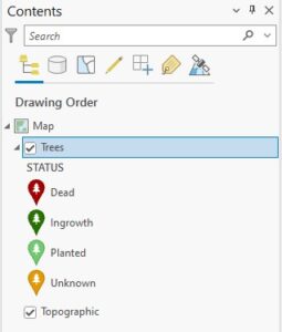
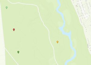
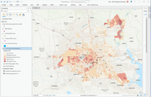
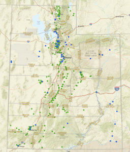
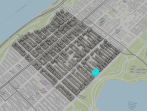
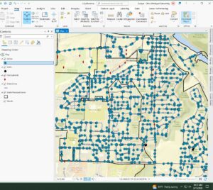
Exercise 6A: On page 206, when the book asked me to open the catalog pane, expand databases, click TreeInvenory.gdb and click domains, no domains showed up in the domains window. The book says I should have a Hazard and LandUse domain but I do not. I was not able to complete exercises 6B and 6C because I couldn’t complete 6A and there was not an option to upload a finished map to pick up where I finished. B and C use arc online and the arc collector mobile app with the published treeinventory map from 6A.

Chapter 7: 

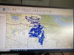
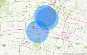
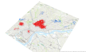
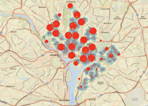
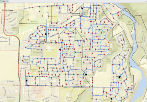
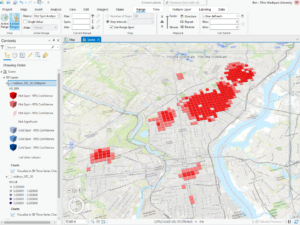
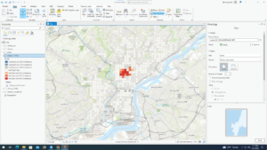
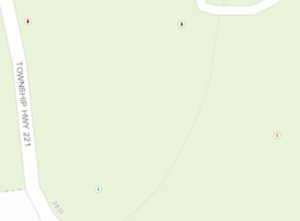
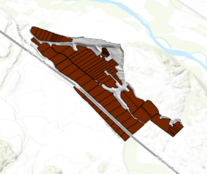
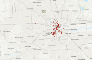
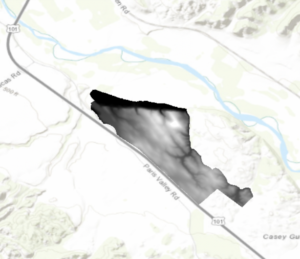
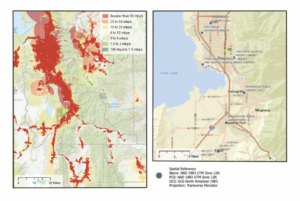
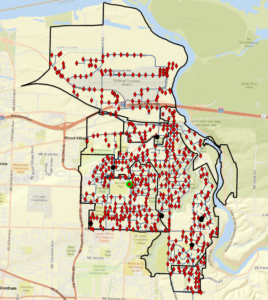
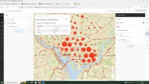
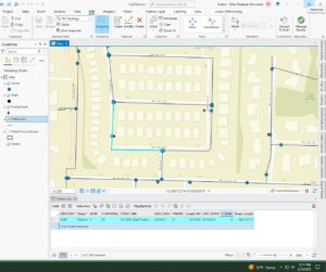
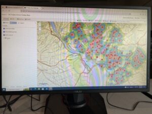
Exercise 7A: This exercise went smoothly with no issues, I was able to open the data and generate the map without a problem. However, when I got to Exercise 7B: I wasn’t able to do the rematching step because when I typed in the addresses no unmatched addresses appeared. I wasn’t able to do exercise 7C because I couldn’t complete B and rematch the addresses. The image below is what my map looked like after completing chapter 7, without the rematching step being done. I wonder if we had let the GIS automatically rematch (pg. 247), instead of clicking no and trying to do it ourselves it would have been able to do this step.

Chapter 8: 

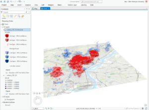
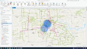
The exercises from chapter 8 went well. I was apprehensive about making the space time cube because it sounds so complex but the GIS cooperated and I was able to complete all the steps. I think the end results are really cool, specifically being able to visualize the robbery hotspots 3 dimensionally.

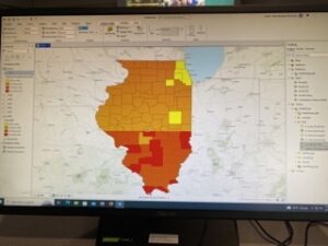
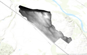
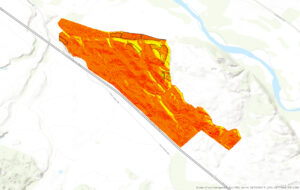
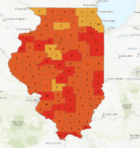
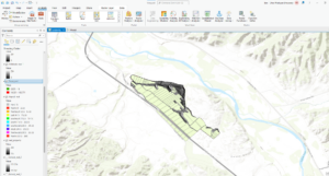
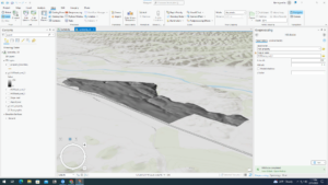
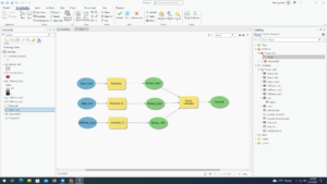
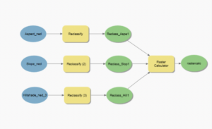
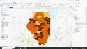
Chapter 9: I got through exercises 9A and B smoothly but couldn’t finish exercise 9C because the reclassify tool from the model builder portion of the exercise did not have the same table built into it as the table in the book (pg. 344). I didn’t have a start, end, and new table like you need for the exercise and therefore couldn’t complete the model builder.

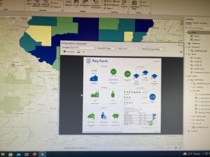
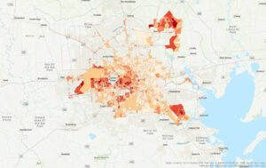
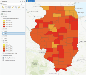
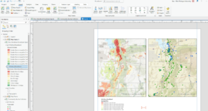
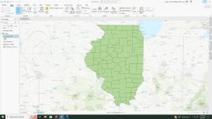
Exercise 10: I completed 10A and B without issue until the very end of 10B where I had to change the county names to a brown color. I couldn’t get the symbology to appear on the map and look like the pictures from the book, even though I think I followed the instructions to a T. i got lost in all the formatting that we had to do at the very end of chapter 10. I couldn’t find all the panes and tools that they were asking for and also couldn’t get my maps to format the way they needed to. Also, when I uploaded the map on the left it appeared in the shape of a football and the best I could do was format it zoomed in like it is now. This was frustrating and definitely something that I could use some more experience with.

Big idea reflection: These chapters built on the work we did last week while also introducing new skills. I think I had an easier time working through the steps and was more comfortable with Arc Pro. I enjoyed feeling like I knew my way around, although I was still frustrated at times by not being able to find things or by the GIS not doing what I wanted it to. In terms of big ideas, I thought that the space time cubes from chapter 8 were really interesting and I can see how they can be used to illustrate patterns and create really beautiful interactive maps. I also appreciated the hillshades and extract by mask/mosaic-ing we did in Chapter 9 because these are things that I have done with Dr. Rowley. Using the book to show me the proper way to do this was excellent and I appreciate having a concrete place to look if I ever get stuff mosaic-ing or generating hillshades in future research.

Munroe Week 5

Chapter 6 went smoothly at the start, but soon failed me when I transferred the data to ArcOnline. I started by setting up a domain for a tree inventory, specifically classifying trees by planted, ingrowth, unknown and dead. I completed all of the symbology and fields on ArcPro and shared it as a web layer. Once I opened up the new layer on the map viewer, none of the trees showed up on the map (as seen in the first picture). This was disappointing but I was reassured that this was a recurring problem with other students and decided to skip over the rest of the chapter, which helped with the efficiency of getting the other chapters completed. Chapter 7 was a tad easier to complete, and while there were a few roadblocks I managed to finish the chapter and produce a map somewhat like the one featured by the author. This chapter worked with preparing project data by joining a table and managing symbology, geocoding location data through address locator and rematching addresses, and using geoprocessing tools to analyze vector data. This included creating buffers, merging and dissolving features, clipping features, selecting by attribute and location and creating a spatial join. I thought it was beneficial that this chapter focused on correcting data. From personal experience, I’ve had many mess ups on my data and it’s very helpful to have guidance through these issues. After correcting data, I was able to produce a map of Houston showing zoning districts, bike lanes and potential retail sites. This exercise reminded me of a lab in remote sensing involving selecting a potential home for Dr. Rowley in Delaware. Chapter 8 also gave me problems, and I tried three times to make the data work but was unsuccessful. The purpose of this chapter is to create a kernel density map, perform hot spot analysis, explore the results in 3D and animate the data. I was able to narrow down robberies in January 2014 Philadelphia and use that to create a kernel density map and create a hotspot analysis but was unable to continue with a space time cube. My map (as shown below) had hot spots drawn to a bigger size which didn’t have enough data to produce the space time cube. I then went on to the next chapter. Chapter 9 was focused on mapping a winery with preparing data, deriving new surfaces and creating a weighted suitability model. I was also familiar with some of the exercise with refreshers from remote sensing, in particular creating a mosaic raster and deriving hillshade and slope. I had no big issues with this chapter and was able to zip by pretty quickly. I did have a final issue at the end with my model when I couldn’t find the model raster in my geodatabase. Luckily this was the final step and Krygier let me off the hook. Lastly, chapter 10 encompassed all of the steps of GEOG112. This chapter was concerned with applying detailed symbology, labeling features, creating a page layout and sharing the project. I found this chapter to be rewarding as it makes me happy to have a final copy of a map I created. I think this was pretty self explanatory and a good refresher of everything basic covered in the book. I didn’t have any issues with this chapter but I did think that the second map on the page (the one of Provo) should’ve had a legend to explain the points on the map. I’m happy to be done with this book but I think it will also be beneficial to retouch on some of the chapters I had issues with, as I’m always trying to improve my skills in GIS.


Skidmore Week 5

Chapter 6
Much like chapter 1, this chapter’s goal is to have the reader make the audience use different ArcGIS Online features. In this chapter, you create data that can be analyzed and used in ArcGIS Online.

Chapter 7
In chapter 7 you use multiple features to geocode data associated with a map. In this case, you match addresses to the correct businesses or create a zone within walking distance from a bike path to a company.

Chapter 8
In chapter 8 you create a density map that is used to make a 3D map of the data using cubes. This is then used to show how the frequency of crime happens at hotspots over a certain amount of time. The time used is 1 month period over a year.

Chapter 9
In chapter 9 you are analyzing the suitability of a vineyard at a location. In this example, you create an elevation map of a vineyard to find the slope of the location. This then allows you to see where certain areas are suitable but also allows you to analyze how much shade is found in the location over a certain amount of time.

Chapter 10
In chapter 10 you are mostly creating labels and boundaries for your map. This is helpful for the person making the map but also is better for future people that may look at the map in the future to understand the boundaries and the features better.

Luna – Week 5

Chapter 6

  • I could not do any of the chapter 6 work because of the issues I had with 6a. Here are the things I tried though:
    • I completed the steps of the entirety of 6a.
    • I first of all used the file I originally downloaded and while the Trees database showed up, nothing would show up, even when I changed the symbology, which led me to discover that there was nothing in the attribute table at all.
    • Then, Krygier suggested I download the file onto an external hard drive, so I did that, but the Trees database did not show up at all. 
    • I then was told that I needed to unzip the new file, which is why the database wasn’t showing up at all, so I unzipped the file.
    • Once I unzipped the file, I had the same trouble that I had at first where the database had no data in the attribute table, so I published and skipped the rest. 

Chapter 7

Chapter 8

Chapter 9

  • No part of the property is in complete shadow.
  • Three or maybe four planting sites have relatively low slope topology.
  • None of the planting sites are in shadow at 2:00 p.m.
  • The planting site that is closest to El Camino Rd is the best site to plant a new vineyard.

Chapter 10

  • I had a lot of trouble with 10c, particularly with the titles, but the rest worked fine, so here is what I was able to do.

Richardson – Week 4

Getting to Know ArcGIS 

Chapter 1 

For some reason, a problem that I ran into during this exercise was that my color legend for school walking areas would disappear, even though it was a visible layer at that time. I turned the layer on and off again probably about 3 times before it stuck with my figure, and I was able to complete the exercise. 

Chapter 2 

Something I also struggled with, that I think others did too, was getting the World_Data.mxd into ArcGISPro. Once I did, the instructions were pretty easy to follow. This program was a little more familiar to be than ArcOnline, so I had an easier time following these steps 


Step 5 Answer: On which continents are PM concentration highest?

There is a high quantity of urban PM concentration in Africa, the Middle East, and the majority of Asia. 


Examine the contextual ribbon 

Question 2: If you close your contents pane, how do you restore it? – go to the View tab in the top ribbon, then click on “contents” in the Windows ribbon


How do you find a geoprocessing tool? All geoprocessing tools are located in the Analysis ribbon, and within the tools tab that you can scroll through and find the specific geoprocessing tool. 


Question 4: Which city has the largest population? Shanghai, China


Measuring Distances: The distance between Lima, Peru, and Rio de Janeiro, Brazil is approximately 2,328.61 miles. 


Question 1: What is the height of the tallest building in this layer? 

339.758


Chapter 3 


Extract Part of a Data Set: 

Question 5: What is the field name that indicates the state within which the county features are located? – STATE_NAME

How many residents of Wayne County are between the ages of 22 and 29 years old? – 10,575 people 


3b

Question 3: How many years of data are represented in the table? 

6 years – 2004 – 2010

3c

Question 3: What percentage of households has an income of less than $15,000 per year? 

9.3%


3d

When I tried to import the IL_food_deserts.lyrx, there seemed to be an error in the import and there was a red ! next fo the IL_food_desert in the contents bar, and the data was not showing up on top of the 2010 percentages. 


Chapter 4

4a

I was able to load the FireHydrant.shp file into the map, but when I tried to use the feature class to geodatabase tool, it would not load the WaterLines.shp, WaterPressureZones.shp, or Wells.shp. I had to use the Feature Class to Feature Class tool again for all of the shape files separately. 

Question 8: 

How many vertices does the selected line have? 4 vertices


4c – when i attempted to separate zone 2 using the select and split tool, the tool would not insert the line across the zone in order to split the zone. Therefore, I would not merge the zones with one another. Then of course, when it was time to draw the polygon around the figure, i could not do that because there was no area to select, because I was unable to separate the polygon


Chapter 5

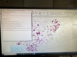
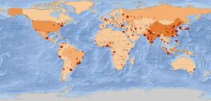
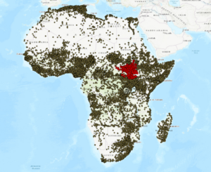
5a: question 4: can you name the types of conflict events that are recorded in this dataset? 
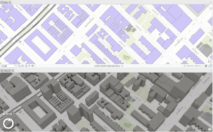
Battle – no change of territory, strategic development, riots/protests, remote violence

Once I hit the section in 5a discussing ‘proceed through preconfigured tasks’, when i went to click on the task file, the file was empty, and there was no data. I could not select ‘create conflict maps’, and therefore, the rest of 5a was unachievable since this file was empty. 

5b: since I was unable to complete section 5a, I had to import both of the maps of South Sudan and  Rwanda into the file. However, when it was time for the model builder section, the same thing was happening to me as it was in the first section. The tool box was empty with no data, and therefore, the rest of the exercise could not be completed. Im not sure if this is a mis linkage between the data set and ArcGIS, because all of my data is in my own flash drive, and the maps are accessible and I can reach the shape files, but none of the tools in the catalog pane show any data in them. 

VanderVelde – week 4

Chapter 1:

sign in and join an organization, explore a public map, configure the map symbology, configure map pop-up windows, save a map.

For the map that is the DC public schools, make sure that you open the map viewer and not the map viewer classic. For page 17, looking for the symbol pane go to the government shapes and scroll down until you see a purple school building. This a bit different than what the book asks but you get to the correct symbol. *I lied, its a different school icon with a darker background, the POI exists I just cant use my eyes sometimes.

Chapter 2

2A. Start a new arcGIS Pro project using an exported map and a new folder connection, Modify map layers by changing viability rearranging the order in which layers are drawn, navigate around the map and explore map features and attribute tables, use the select tool.

  •  PM concentrations are highest in Africa. If you close your contents pane you restore it by searching contents in the search bar and re-opening it. Shanghai has the largest population.

2B. customize the appearance of the map using symbols and labels, use the measure tool to find the approximate distance between cities, examine and add a basemap, create a map package for sharing.

2C. Start a new project and add a layer of polygons that represent buildings in NYC, use the bookmark tool, convert a 2D map to a 3D map, and then extrude features based on the building height attribute to visualize building in a more realistic perspective.

  • The tallest building is 339,758242

Chapter 3

3A. add data to a project, select features by attributes, export the selection to a new datasets

  • STATE_NAME, 10575 residents.

3B. join data tables, apply informative symbols, import layer symbology, use the swipe function to compare layers, overlay additional data

  • 7 years of data is represented in the table.
  • I do not see a clear correlation between obesity and income rates, the data is a bit hard for me to interpret from this display of whether or not there is a clear connection. Further analysis would be needed for a real conclusion.

3C. add a new field, calc field values, display a new field, calc summary stats, examine info graphics

  • 17.7% of the households in Illinois had an income of less than $15,000 per year.

3D.relate tables, spatially join data

  • there are 4 food deserts in knox county

Chapter 4

4A. Convert shape-files to Geo-database feature classes, map x and y points, establish an attributes domain.

4B. configure snapping options, create a line feature, enter attribute data

  • 4 vertices in the selected line

4C. split polygons, merge polygons, modify lines and points, add map notes

  • object: 6, zone: 2, Shape length: 46451.125704, Shape area: 44732594.632114
  • the shape value was split between the 2 new zones

Chapter 5

5A. set up a project, proceed through per-configured tasks, author a task

  • Battle-no Change to territory, strategic development, riots/protests, Violence against civilians, remote violence
  • 14211 fatalities between 2010 and 2018

5B. define the data, add operations to Model Builder, Fill out the tool perimeters, run the model, convert a model to a Geo-processing tool

  • There were 71 fatalities against civilians in Rwanda from 2010-2018
  • was told to skip the last part of this lab due to error in GIS program :/

5C. Define the data, execute a command using python, use a custom script tool, package the project

  • computer doesn’t want to save the tables anymore and is continuing to error my process. will work off of a hard drive now 🙂

DeMaggio- Week 4

Chapter 1-

Chapter one was basically going over the basics of GIS. We went over basic map symbology and how to change and manipulate a features symbology to better fit the needs of our map. Chapter one, unlike the other chapters, had us work with ArcGIS online rather than ArcGIS Pro. I assume it’s to help us get familiar with basic functions and features that we end up using in the proceeding chapters. Some key terms that were covered we vectors, rasters, and attributes.

Chapter 2-

Chapter 2 went more in-depth into topics and terms that we’ve gone over in previous readings. Some of the main objectives we had were to go over more of the basics such as importing map documents, examining and exploring the contextual ribbon, and selecting features. That was primarily in 2a, however, in 2b we started to label features, and base-maps, as well as package and share the maps. Chapter 2c was especially new as it involved creating a 3D scene for the first time and getting familiar with its functions. I thought this chapter was especially fun because it was my first time working with ArcGIS Pro. I, unfortunately, forgot to take pictures of the work.

Chapter 3-

Chapter 3 was one of the more challenging chapters for me in terms of bugs and information that I needed not being included, so I had to skip a step or 2 during the exercises. 3a went into topics like adding additional data to a map, and selecting features by certain attributes. 3b was very intensive on using data tables, as well as using the swipe function. Using the swipe function with separate layers was probably one of the most vital skills I learned during this chapter. Instead of turning off and on different layers of the same area over a period of time I was able to use the swipe function and was able to see a more distinct difference between the different counties that we were analyzing in Illinois. It was easier to see the change and progress over time,

Chapter 4-

Chapter 4 was equally challenging because of technical bugs and whatnot. Chapter 4 was the smallest scale map we had worked with so far, making all of the exercises more precise. This chapter dealt more with specific positions and using x,y coordinates and attribute domains. Towards the end of the chapter in 4c was where I had the hardest time, but it was the most growth I had experienced throughout chapter 4; using and editing different polygons on maps was the most frustrating this I have done so far, but I did eventually get it down. There were also other steps we had previously done that were implemented into this chapter such as linear features that gave us a function we’ve already learned, but used it within a different context, which I thought was useful.

Chapter 5-

Chapter 5 was very beneficial and unlike chapters three and four, didn’t have any complications. We were given one map layer of conflict within Africa, and throughout the chapter learned to make one base-map layer into several different layers and isolating them into individual countries within Africa. The book had us go through definition queries that allowed us to isolate the layer into one area and one specific conflict, such as riots/protests or violence against civilians. There was also another emphasis on the symbology of a layer, more specifically on graduated symbols to show different concentrations of a specific feature. Towards the end of the chapter we had begun to create new layer files by using Python to script them, which honestly was difficult at first but I can see it becoming a very useful skill later on.

Steed – Week 5

Getting To Know ArcGIS by Michael Law and Amy Collins, Chapter 6: Collaborative mapping

Notes and Comments

  • The idea that a group of users can work together to gather and record information–also known as crowdsourcing.

Exercise Notes and Screenshots

  • An organization is a shared online workplace that is tied to your software license.
  • Using domains helps maintain data integrity and does not allow other values to be entered during data collection.
  • The data type determines what kind of data that the field can store; the alias can be used to refer to the attribute field by a different name; and the domain determines which existing domain the field can use.
  • A tree inventory map allows urban forest managers to identify areas in which tree conditions can be poor and so prioritize maintenance.

Getting To Know ArcGIS by Michael Law and Amy Collins, Chapter 7: Geoenabling your project

Notes and Comments

  • You can create features from information that describes or names a location—typically an address—through a process called geocoding.
  • An address table—a list of addresses for features that you want to map and that are stored as a database table or a text file.
  • Reference data—commonly from a streets layer, on which the addresses can be located.
  • An address locator—a file that contains the reference data and various geocoding rules and settings.
  • You can use overlay analysis tools to identify and visualize how potential retail site locations may serve customers in the neighborhood.

Exercise Notes and Screenshots

  • When you geocode the table of retail locations, you will use the reference data to create an address locator to create point features that represent the locations of the addresses (also known as locator styles).
  • When you geocode an address, the address location is interpolated from the range of addresses found on a given segment.
  • A locator determines other settings for geocoding, including what comprises a matched address, search parameters, and tolerance for spelling errors.
  • Rematch Addresses pane allows you to review which addresses are unmatched or insufficiently matched.
  • Buffers are polygons that are created around a feature at specified distances.
  • The Clip tool extracts features using other features as a “cookie cutter” or trim boundary.

Getting To Know ArcGIS by Michael Law and Amy Collins, Chapter 8: Analyzing spatial and temporal patterns

Notes and Comments

  • Crime mapping analysts can use GIS to identify spatial patterns to gain a better understanding of the role of location, proximity, and opportunity, while providing key decision-makers with information to put crime prevention solutions in place.
  • Temporal data is data that has a time attribute.

Exercise Notes and Screenshots

  • A kernel density calculates the density of features in an area around those features and is one of the most common techniques in crime mapping.
  • The Optimized Hot Spot Analysis tool is used to find statistically significant hot spots and cold spots of robberies.
  • Creating a space-time cube can help you aggregate the robbery points, and visualizing it will help you understand how the robbery data is distributed over a geographic area.
  • A persistent hot spot is a location that has been statistically significant hot spot for 100 percent of the time-step intervals with no discernible trend indicating an increase or decrease in the intensity of clustering over time.
  • An intensifying hot spot is a location that has been a statistically significant hot spot for 90 percent of the time-step intervals.
  • A new hot spot is a location that is a statistically significant hot spot for the final time step and has never been a statistically significant hot spot before.
  • The Calculate button ensures that the full time extent—start time and end time—is specified.

Getting To Know ArcGIS by Michael Law and Amy Collins, Chapter 9: Defining suitability

 Notes and Comments

  • A raster is composed of a grid of cells, instead of discrete x,y coordinates, that define geographic entities. The cells contain values that are used to record and define geographic phenomena on the surface of the earth.
  • A surface, which is made up of raster cells, can be discrete data, which means that it shows distinct and discernible regions on a map, such as soil types, or it can be continuous data, which means that there are smooth transitions between variations in the range of data.
  • Map algebra—a language that combines GIS layers—is fundamental to raster analysis.
  • NoData means that no values were recorded for that cell.

Exercise Notes and Screenshots

  • Aspect is used to determine which direction each part of the ground primarily faces—north, south, east, west, or in between.
  • A hillshade is a surface layer that depicts shadows to model the effect of an illumination source (usually the sun) over the terrain of the land.
  • Azimuth is the direction of the sun, expressed in positive degrees from 0 to 360, measured clockwise from north.
  • Altitude is the angle of the sun above the horizon.
  • No portion of the property is in complete shadow.
  • Four of the planting sites contain mostly low-slope (less than 14 percent) topology.
  • Two of the potential planting sites include at least some land that faces south, southeast, or southwest.
  • None of the potential planting sites are in shadow at 2:00 pm in mid-September.
  • The location closest to Paris Valley Rd is a planting site that meets the slope and aspect criteria and also has decent sun exposure at 4:30 pm.

Getting To Know ArcGIS by Michael Law and Amy Collins, Chapter 10: Presenting your project

Notes and Comments

  • In a layout, you can arrange common elements, including the map, map labels, a title, legend, scale bar, north arrow, captions, and additional graphics.
  • A good map not only provides facts but also persuades opinion. You will want to think about the context of the data and frame the results to match the geographic area of the phenomena.

Exercise Notes and Screenshots

  • There are around 18 areas that are fixed wireless technology.
  • Labels are based on one or more feature attributes and placed near or on a feature.
  • Dynamic labeling is when ArcGIS Pro places labels for all features in a layer with a single click based on predetermined labeling rules.
  • When you use the Maplex Label Engine, you have access to a new set of label placement properties that allow you to control how labels are oriented, formatted, and palce in feature-dense areas, and how conflicts between labels can be resolved.
  • Label classes are used to specify detailed aspects of how labels are positioned and symbolized.
  • A map layout includes map frames and other elements, such as scale, legend, north arrow, and more.
  • ArcGIS Pro has rulers, guides, and a grid to help you arrange map elements on a page.
  • Map frames are containers for maps in your page layout. They can contain any map in your project, including 3D scenes.
  • A legend will help your map readers understand the meaning of your map.
  • A scale bar is a dynamic element that provides an indication of the size of features and distances on the map.
  • A north arrow is a dynamic element that indicates the orientation of the map.

Utah County Broadband Map

McConkey – Week 4

Week 4 Post 

Chapter 1:

The first chapter explains the basics of GIS, namely what it is and its potential uses. The chapter explains that point, line, and polygon data is referred to as vector data and that a set of features that are grouped and displayed together are referred to as a layer. Maps are usually composed of multiple layers, which is useful for turning them on and off particular features. When features have corresponding data that relates to them, that information is known as attribute data. Features are great for visual analysis, but when features also contain attribute data the potential for analysis skyrockets. GIS provides many tools that can manipulate, sort, and summarize large data sets for a wide range of uses. The rest of the chapter takes you through exploring ArcGIS online.

Chapter 2:

This chapter covers the basics of 2D and 3D maps in ArcGIS Pro. Skills described include importing a map document, creating folder connections, examining feature attributes, measuring distances, adding base maps, creating bookmarks, and creating a 3D scene. Overall, this chapter lays the groundwork for starting most projects and familiarizing oneself with the general layout of tools in the main ribbon, as well as manipulating layers under the Contents tab. 

  1. Africa
  2. Go to the View tab and click on the Contents button
  3. The geoprocessing tools can be accesses by clicking the Tools button on the Analysis tab
  4. Shanghai has the largest population
  5. The tallest building is 339.75 ft

Chapter 3: 

Chapter 3 focuses on geospatial relationships and manipulating data. The first thing you do is practice extracting data from an established dataset. The chapter also instructs how to join data tables and how to calculate summary statistics. I could not get the swipe function tool to work, which was weird. Other problems were mostly due to changes in the interface, so there wasn’t congruency with the instructions.

  1. State_Name
  2. 10,575
  3. There are seven years represented
  4. There doesn’t seem to be any correlation 
  5. About 26%
  6. There are 4 food deserts in Knox County

Chapter 4:

Chapter 4 deals with building a geodatabase so that you can convert shapefiles to feature classes and perform other related functions. I particularly enjoyed manipulating the polygon features by splitting and merging them. Overall, this chapter follows the same format as the others.

  1. 4
  2. It automatically updates to show the new area of each of the new zones

Chapter 5:

Chapter 5 is a very important chapter because it covers how to streamline work flows or tasks with the use of GIS’s built in model builder and through Python. Python is a tricky coding language, but it works along the same principals of model builder, which is why I really like that they let you play around with model builder first. 

  1. Armed conflicts and acts of violence, generally speaking.
  2. 14,211
  3. 71
  4. There were 41 riots/protests and 12 fatalities
  5. Select Layer by Attribute and Summary Statistics
  6. 26,323

(Sorry if my pictures look weird. I had the original screenshots saved in a google doc, but they wouldn’t paste over so I had to rescreenshot them and then upload them.)

Week 4 – Hollinger

Chapter 1

Chapter 1 was pretty straightforward. I didn’t have any problems with it, but it did help me make connections to some of the topics we learned about in the Mitchell book. Some of the topics I remembered from the Mitchell book were vectors, rasters, and attributes.

It was neat seeing how the layers could be turned on and off so that not everything was visible at once when trying to work on the map. One thing I did run into was on step 12 of exploring the map, I did not see an Enable Outline button, but I just skipped past it after looking for a while and it didn’t seem to make much of a difference. I also thought it was really neat how you could filter the data really easily so the map only showed certain types of incidents. 

My favorite feature of this chapter was probably the popup windows. As a data major, I feel like we often just look at big data sets without much context. This however took parts of the data and gave them geographical context that you could visualize, which was super interesting to look at. This helped me understand how maps could be used to categorize crimes and how that data can be applied to high-crime areas to make them safer.  

Here is a map of my work for chapter one:

Chapter 2

Exercise 2A: Exercise 2A was again pretty easy and straightforward to me. It did take a second to find all of the buttons since I wasn’t familiar with the software at all. I did get a little confused finding the ESRI Press folder but it turns out I just missed the part where you had to download it at the front of the book. Importing the map and making the folder connection was pretty simple. It was also interesting to see the difference in how the popups looked in ArcPro vs. Online. Ultimately, this section didn’t have you change much, but really just look around and learn how to use the tools like explore and select. 

Exercise 2B: I liked how you got to play around more with the data and symbology in this section more than in Chapter 1. The option to edit and change the size of the symbols and the visibility range so you couldn’t see labels until a certain extent was really neat because it helped make the map less cluttered. I also recognized the use of graduated symbols from the Mitchell book. I could also see how measuring the distance between features could be really useful. I don’t remember base maps being mentioned in the Mitchell book, but I could have just missed it. I thought the different types of base maps could be beneficial. Streets might be more useful in city areas, while oceans are more useful when looking at a larger view of the world. 

Exercise 2C: Exercise 2C and I did not get along. There was a problem, which I think was with the folder connection and path where I couldn’t save my project in the 3D folder and because of that couldn’t access the files in that folder to do the activity. So, I ended up having to skip this activity. 

Here is my picture from Chapter 2 A and B:

Chapter 3

Exercise 3A: A new function I learned about was Attribute Query: a request for features in a table that meet user-defined criteria. This was really useful for selecting and narrowing down your map to only a certain area (Illinois in this case) from a broader region. I could see this being used to focus on only specific counties in a state, or maybe even certain areas in a park or preserve. 

Exercise 3B: This section also applied concepts of symbology discussed in the Mitchell book, like graduated colors. I also thought it was interesting to see the classification method of natural jenks from the Mitchell book on an active map and how drastically changing the values of classes can change the map. The importing layer symbology process got a little repetitive after doing it 6 times, but it wasn’t a super complicated process. After that, I only ran into 1 problem here, which was that apparently the appearance tab is actually called the feature layer tab so it took me a while to find the swipe tool. 

Exercise 3C: After I created the new map, and tried to add a new Perc_change field to the attribute table, I ran into a problem where it wouldn’t load, but eventually it did the next day although it wasn’t in the place it said it would be in the book. Calculating the field value was really easy. I expected it to be more complicated than filling in a few boxes. The analysis and summary statistics were the same way. I did like the graphic infographic produced. It was a different but still visually appealing way to see the data. Although you did lose some of the geographic contexts when looking just at the infographic. 

Exercise 3D: I did not run into any problems with this section. It was short and to the point. I liked the visual application of food deserts. That was one of the applications I wrote about in my week 1 post so it was interesting to get to work with it myself. The process for spacially joining data was again surprisingly simple and I did not expect it to be just a few quick drop-down boxes. The way that this allows the number of food deserts to be shown in each county was really useful. I could see how it could be used in situations where maybe there are too many features to be displayed in one area so instead of overcrowding the number could just be displayed. It makes it easier to see the number of features without having to count them. 

Here’s a screenshot of my final Chapter 3 map:

Chapter 4 

Exercise 4A: I also didn’t run into any problems with this exercise. I thought the process of building a geodatabase wasn’t too complicated. I had a little trouble finding the tools at first, but once I figured out how to search for them it was simple. Changing the symbology was again pretty straightforward. I liked the use of different symbols to showcase the difference between wells and fire hydrants etc. I could see how this would be applied to making different features distinct from each other in different contexts. I understood mapping the attribute values with points x and y and the attribute domains. Attribute domain: a set of valid values, or a numerical ranger, to which attributes in each field must be limited. I think this would be useful when you have to establish differences between similar attributes. 

Exercise 4B: I had a problem with finding the bookmark in Exercise 4B. When I looked on the bookmark tab it just said “No bookmarks.” Ultimately, I just ended up zooming in and finding the area that needed to be edited. Using the select tool to edit the pipe was pretty simple. Entering the attribute value was straightforward as well. This would be useful to describe a feature, especially if you took it off the map the information of location could still be provided in the data set. 

Exercise 4C: Merging the polygons and choosing the attributes to preserve were again simple popups through the edit tool. It was similar to selecting the pipeline in exercise 4B. However, I ran into the bookmark issue again when it came to the move bookmark. I ended up just finding the spot and selecting it again. I thought it was nice how you can move vertexes instead of having to delete and replace the whole feature. This makes for faster editing which I feel will be useful when working on larger projects. Drawing the polygon in adding map notes was also similar and it reminded me of the process similar to adding the pipeline in 2B.  

Here are my images for Chapter 4:

Chapter 5

Exercise 5A: This exercise was in building and executing tasks. Having the preset tasks made doing things like the definition queries really simple. I understood how this was useful to save time and prevent errors. However, what I did not understand was whether these tasks are made by the user to be executed by the same user or someone else. I feel like it would not make sense to make a task for yourself to do instead of just doing it. 

Exercise 5B: This exercise brought back the definition queries to limit the extent of the data to certain areas like countries and again used graduated symbols. These two concepts are easy for me at this point. Then we had to use a model builder. I understood how to build the model, but I didn’t really understand what it was for until the model ran. I feel like the book could have been clearer on that. It also talked about how you could make certain processes so they took parameters and change the values over and over again. I think this would be useful if you needed to do the same process with different values in the data. 

Exercise 5C: Again no issue on this exercise. I thought seeing the python command was really interesting as it is more similar to the code I am used to seeing in my computer science classes than doing processing through drop-downs and functions in GIS. I definitely prefer the dropdowns more. It makes the process a lot more simple. Seeing the code and how it is used in different or custom geoprocessing tools was very interesting and I feel like it can make the software flexible to do things outside of the limits of the buttons you find on the screen.

My chapter 5 pictures: