Here is my final!
Author: ejvander
Home town: Holland & Zeeland Mi Parents: Don & Lise Topp, Martin & Melissa VanderVelde Major: ENVS Minor: Botany Fun Fact: I have 2 swim records for the OWU Varsity swim team and was a captainWeek 5: Delaware Data inventory – VanderVelde
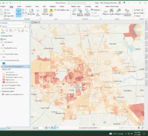
1. Address Point: The Address_Points layer is intended to support appraisal mapping, 911 Emergency Response, accident reporting, geocoding, and disaster management. The layer provides the capability to reverse geocode a set of coordinates to determine the closest valid address and is intended to provide 911 agencies with information needed to comply with Phase II 911 requirements.
2.Annexation: This data set contains Delaware County’s annexations and conforming boundaries from 1853 to present.
3. Building Outline: This dataset consists of building outlines for all structures in Delaware County, Ohio. The layer was originally created from 2008 Orthophotos.
4. Condo: This data set consists of all condominium polygons within Delaware County, Ohio that have been recorded with the Delaware County Recorders Office.
5. Delaware County E911 Data: The Address_Points layer is intended to support appraisal mapping, 911 Emergency Response, accident reporting, geocoding, and disaster management. The layer provides the capability to reverse geocode a set of coordinates to determine the closest valid address and is intended to provide 911 agencies with information needed to comply with Phase II 911 requirements.
6. GPS: This dataset identifies all GPS monuments that were established in 1991 and 1997.
7. MSAG: The Master Street Address Guide (MSAG) polygon feature set of the 28 different political jurisdictions such as the townships, cities and the villages that make up Delaware County. This data set was created to facilitate the process of locating the boundaries of the cities, the villages, and the townships within Delaware County, Ohio.
8. Municipality: This data set consists of all municipalities within Delaware County, Ohio.
9. Parcel: This dataset consists of polygons that represent all cadastral parcel lines within Delaware County, Ohio.
10. Precinct: This dataset consists of Voting Precincts within Delaware County, Ohio.
11. Recorded Document: This dataset consists of points that represent recorded documents in the Delaware County Recorder’s Plat Books, Cabinet/Slides and Instruments Records which are not represented by subdivision plats that are active. They are documents such as; vacations, subdivisions, centerline surveys, surveys, annexations, and miscellaneous documents within Delaware County, Ohio. This dataset was created to facilitate the process of locating miscellaneous documents within Delaware County, Ohio as it relates to the cadastral land base.
12. School District: This data set consists of all School Districts within Delaware County, Ohio.
13. Street Center line: The State of Ohio Location Based Response System (LBRS) Street_Centerlines depict center of pavement of public and private roads within Delaware County. Address Range data was developed from data collected by field observation of existing address locations and by adding addresses using building permit information. Both versions of this layer are available on our website for download. The LBRS Street_Centerlines is a spatially accurate topologically correct representation of the road system. It is intended to support appraisal mapping, 911 emergency response, accident reporting, geocoding, disaster management, and roadway inventory that conforms to Ohio Department of Transportation Roadway Inventory Standards.
14. Zip Code:This data set contains all zip codes within Delaware County, Ohio. In 2003, Delaware County zip codes were carefully evaluated and cleaned-up based on cross referencing between the Census Bureau’s zip code file from the 2000 census, the United States Postal Service website, and tax mailing addresses from the treasurer’s office. The zip code layer was then created in 2005 by dissolving all Delaware County parcels by their property addresses. Tax exempt parcels and dedicated roads with no zip codes were manually populated based on their location within the zip code layer.
15. Subdivision: This data set consists of all subdivisions and condos recorded in the Delaware County Recorder’s office.
16. Survey: Survey points is a shapefile of a point coverage that represents surveys of land within Delaware County, Ohio. These surveys are found in documents in the Recorder’s office and the Map Department. At this time old surveys found in the Old Survey Volumes (1 – 11) located in the Map Department are not included.
17. Tax District: This data set consists of all tax districts within Delaware County, Ohio.
18. Delaware County Contours: 2018 Two Foot Contours & 2018 Two Foot Contours for Delaware County Ohio in File Geodatabase format.
19. PLSS: This data set consists of all the Public Land Survey System (PLSS) polygons in both the US Military and the Virginia Military Survey Districts of Delaware County. This data set was created to facilitate in identifying all of the PLSS and their boundaries in both US Military and Virginia Military Survey Districts of Delaware County.
20. 2022 Leaf-on Imagery: 2022 Imagery 12in Resolution
21. Dedicated ROW:This data set consists of all lines that are designated Right-of-Way within Delaware County, Ohio.
22. Original Township: This dataset consists of the original boundaries of the townships in Delaware County, Ohio before tax district changes affected their shapes.
23. Hydrology: This dataset consists of all major waterways within Delaware County, Ohio. This data was enhanced in 2018 with LIDAR based data.
24. Map Sheet: all map sheets within Delaware County, Ohio
25.Farm Lot: This data set was created to facilitate in identifying all of the farmlots and their boundaries in both US Military and Virginia Military Survey Districts of Delaware County.
26. Township: This data set consists of 19 different townships that make up Delaware County, Ohio.

VanderVelde – Week 5
Chapter 6:
6A. Set up a domain, set up a feature class fields, symbolize features, publish features
– tree inventory shared file in “TreeInventory3” :/
6B. create a map, set up additional data display options, share a map & 6C. start ArcGIS collector, collect a tree location and enter the data, view the map in arcGIS pro.
-finished the map on my phone onto chapter 7 🙂
Chapter 7:
7A. Join a table, symbolize using graduated colors
7B. Create an address locator, Geo code addresses, Rematch Addresses & 7C. Create buffers, Merge and dissolve features, Clip Features, Select by attribute and location, Create a spatial join
Chapter 8:
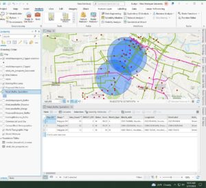
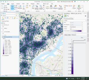
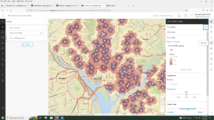
8A. Select by attribute, Create a kernel density
The data did not transfer properly so for steps 10-15 the steps had to be modified so that the layer could be created and the kernel density could be created.
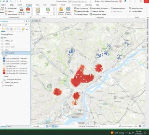
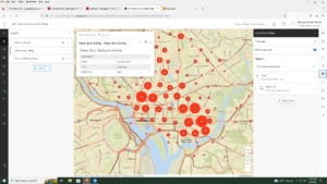
8B. Run the Optimized Hot Spot Analysis Tool, Create a space-time cube, Visualize a space-time cube, Run the Emerging Hot spot analysis tool.
8C. Switch to a local view, change 3D visualization styling & 8D. enable time, animate using the Time slider, Animate using the range slider
Chapter 9:
9A. convert a line feature to a polygon feature, clip rester layers, merge rasters
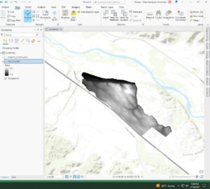
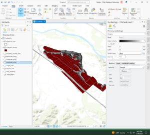
9B. Derive an aspect surface, derive a slope surface, Derive a hill shade surface, Visually compare analysis outputs,
- nothing is completely in shadow right now.
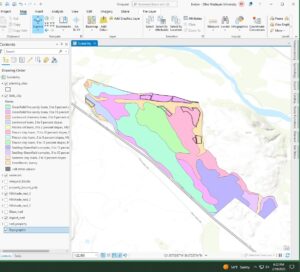
- 4 planting sites have mostly low slope topology
- one planting site has some land facing either south, southwest, or southeast.
- none of the planting sites are in shade at this time
- yes we can identify planting sites that would have enough sunlight in the afternoon and would be best
9C. reclassify criteria rasters, combine criteria rasters.
- Greenfield fine sandy loam soil from 9-15% slopes, xerorthents and loamy soil, and rincon clay loam soil with 15-30% slopes
- some potential sites have been planted
Chapter 10:
10A. create a definition query, fine tune the symbology, apply symbol layer drawing
- There are 3 areas of fixed wireless technology
10B. label features using the Maplex label engine
10C. add a layout to the project, insert map frames, insert a legend element, insert a scale bar, insert a north arrow, insert dynamic text, a title and rectangles
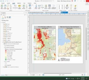
10D. export a layout to a PDF file, save a layout file, package and share a project template.
I finished!!
VanderVelde – week 4
Chapter 1:
sign in and join an organization, explore a public map, configure the map symbology, configure map pop-up windows, save a map.
For the map that is the DC public schools, make sure that you open the map viewer and not the map viewer classic. For page 17, looking for the symbol pane go to the government shapes and scroll down until you see a purple school building. This a bit different than what the book asks but you get to the correct symbol. *I lied, its a different school icon with a darker background, the POI exists I just cant use my eyes sometimes.
Chapter 2
2A. Start a new arcGIS Pro project using an exported map and a new folder connection, Modify map layers by changing viability rearranging the order in which layers are drawn, navigate around the map and explore map features and attribute tables, use the select tool.
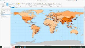
- PM concentrations are highest in Africa. If you close your contents pane you restore it by searching contents in the search bar and re-opening it. Shanghai has the largest population.
2B. customize the appearance of the map using symbols and labels, use the measure tool to find the approximate distance between cities, examine and add a basemap, create a map package for sharing.
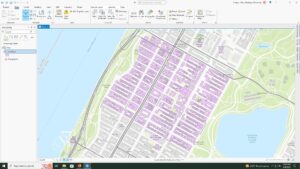
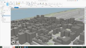
2C. Start a new project and add a layer of polygons that represent buildings in NYC, use the bookmark tool, convert a 2D map to a 3D map, and then extrude features based on the building height attribute to visualize building in a more realistic perspective.
- The tallest building is 339,758242
Chapter 3
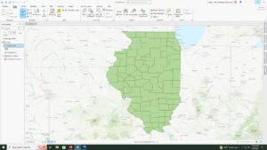
3A. add data to a project, select features by attributes, export the selection to a new datasets
- STATE_NAME, 10575 residents.
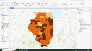
3B. join data tables, apply informative symbols, import layer symbology, use the swipe function to compare layers, overlay additional data
- 7 years of data is represented in the table.
- I do not see a clear correlation between obesity and income rates, the data is a bit hard for me to interpret from this display of whether or not there is a clear connection. Further analysis would be needed for a real conclusion.
3C. add a new field, calc field values, display a new field, calc summary stats, examine info graphics
- 17.7% of the households in Illinois had an income of less than $15,000 per year.
3D.relate tables, spatially join data
- there are 4 food deserts in knox county
Chapter 4
4A. Convert shape-files to Geo-database feature classes, map x and y points, establish an attributes domain.
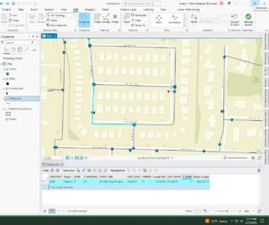
4B. configure snapping options, create a line feature, enter attribute data
- 4 vertices in the selected line
4C. split polygons, merge polygons, modify lines and points, add map notes
- object: 6, zone: 2, Shape length: 46451.125704, Shape area: 44732594.632114
- the shape value was split between the 2 new zones
Chapter 5
5A. set up a project, proceed through per-configured tasks, author a task
- Battle-no Change to territory, strategic development, riots/protests, Violence against civilians, remote violence
- 14211 fatalities between 2010 and 2018
5B. define the data, add operations to Model Builder, Fill out the tool perimeters, run the model, convert a model to a Geo-processing tool
- There were 71 fatalities against civilians in Rwanda from 2010-2018
- was told to skip the last part of this lab due to error in GIS program :/
5C. Define the data, execute a command using python, use a custom script tool, package the project
- computer doesn’t want to save the tables anymore and is continuing to error my process. will work off of a hard drive now 🙂
VanderVelde – Week 3
Chapter 5:
Chapter 5 focuses on why map what’s inside, defining your analysis, 3 ways of finding what’s inside, drawing areas and features, selecting features inside an area, overlaying areas and features. why map what’s inside an area is to monitor whats occurring inside or to compare the area to other areas. Defining your analysis is to find what is inside an area by either drawing a boundary on top of features, using an area boundary to select features or list the features and summarize. To do this you need to know how many areas you have within your data, are the features discrete or continuous. continuous features are seamless geographic phenomena and can be summarized like soil type and precipitation. What information is needed for an analysis like is it a count, list or summary? And do you need to see the features that are only within the area or can features that are partly within an area be counted/ used. 3 ways of finding whats inside are drawing areas and features, selecting the features inside of the area and overlaying the area and features. Drawing is good for finding if features are inside of an area but are visual only = no information. Selecting the features inside of the area is good for getting a list or summary of all the features within an area but does not tell you whats inside each of the several areas. Overlaying the areas and features finds out which features are inside and summarize how many features by area but requires more work/processing. Drawing areas and features uses GIS to draw on top of features making discrete features see-able and allowing for a sense of the range of continuous values to be made. Selecting the features inside an Area is a method to specify the features and the area. The system checks to see if each feature is within the area, and selects the corresponding rows of data to feature inn the data table. To use this data you can create a report on the selected features with a count, frequency or summary of the numeric attributes per the features. overlaying the features and areas is a method to find discrete features and summarize, calc the continuous categories or class inside one or more areas. This is done with overlaying the areas with discrete features or overlaying the areas with continuous categories or classes.
Chapter 6:
Chapter 6 focuses on why mapping what’s nearby, defining the analysis, 3 ways of finding whats nearby, using straight line distance, measuring distance or cost over network, and calculating cost over a geographic surface. why map what’s nearby is to find out what’s occurring within a set distance from a feature as well as what’s within traveling range. This can help determine areas that are sustainable/ capable of supporting a specific use. Defining your analysis is to find what is nearby and deciding how to measure nearness and what information needed for analysis to help then choose which method to use. For this we should know what are we measuring and whether its using a distance or cost. and if the distance is over flat or rough terrain. The 3 ways of finding what’s nearby is using a straight line, distance or cost over a network and cost over surface. Distance for a straight line is good for defining an area around a feature and creating a boundary around them but it only gives a rough estimate for travel distance. Distance over a cost network is for measurement travel over a fixed infrastructure but requires an accurate network layer. Cost over surface is used for measuring overland travel and calc how much area is within that travel range but requires more data prep to build the cost surface. using straight-line distance is how to see which features are within a given distance of a feature/source. Creating a buffer around this feature can be useful as well as selecting which features within the distance like a buffer but not quite. Creating a distance surface. measuring distance or cost over network is a GIS method that ID’s all the lines in a network within a given distance, time or cost of a source location. these sources are termed centers. calculating cost over a geographic surface allows for figuring out what is nearby when traveling over the land, this needs a raster layer within each cell value of the travel cost from nearest source cell. To do this we must specify the cost, modify the cost distance, where the information is coming from should also be specified as well as summarizing whats within the distances found.
Chapter 7:
Chapter 7 focuses on why a map changes, defining your analysis, 3 ways of mapping change, creating a time series, creating a tracking map, measuring and mapping change. Why maps change is to anticipate refuter condition’s and then to decide what course of action should be taken as well as evaluation the results of an action policy. defining your analysis is for when the map does change by showing a location and condition of features at each date and then from this we can calc and map the difference in each value for each feature between the 2 dates. for this we need to know types of change, the geographic features, how to measure the time between and how it will affect the geographic patterns on the map and the information you need from the analysis. there are 3 ways of mapping change, time series, tracking map and measuring change. Time series is good for movement or change in a character but visual comparison between 2 maps must be done to comprehend. Tracking map does movement but can be hard to read if there are a lot of features. Measuring change is for a change in character but doesn’t show actual conditions at each time and the change clac between 2 times only, no more. Creating a time series but you’re making a map for several times and dates a couple of times and the need to consider how many maps and the range of values. To show a change in location, change in magnitude or character, the number of maps to show and looking at the results of all of this. Creating a tracking map shows the position of a feature(s) at several dates/time. measuring and mapping change is to calc the difference in values between 2 dates and map features based on the value calculated. discrete features and data summarized by the area must be known. As well as continuous categories or classes with continuous numeric values.
VanderVelde – week 2
Chapter 1:
This chapter had 3 main topic, what is GIS analysis, understanding the geographic features and understanding the geographic attributes. It explained that GIS analysis is the “process for looking at geographic patterns within the data and the relationship between features.” This is done by framing the question or what information is needed. The question poised that creates the need for a map often decided how to approach the analysis. So you need to understand your data and then choose a method. From there process the data and then look at the results. This last step can help decide whether the information used is valid or whether you should return to step one and re-run the analysis with different data or a different method. For understanding the geographic features, the type of feature can affect the steps of the analysis process. The types of features are discrete, such as lines and locations that can be pinpointed. Continuous phenomena, which is like a temperature or precipitation and is given a value. Features summarized by the area are the counts/density of individual features such as population and number of things in a region. There are also 2 ways of representing geographic features, vectors and rastor. A vector model has a feature in a row on a table and the features are given a address with a x and y location in space. these features can be discrete, events lines or areas. For a rastor model, the features are a matrix of cells in a continuous space, with each layer representing an attribute. Any type of feature can be represented using either vector or a rastor model but discrete and data summarizations by the area are usually represented through a vector model. For understanding the geographic attributes, the values need to be known. Categories, ranks, counts amounts and ratios are all attributes. Categories group similar things together, ranks put features in order from high to low and are used when direct measures are hard or represents a combination of factors. Counts and amounts show a total number and is the actual number of features on a map. ratios shows the relationship between two qualities and rare made by dividing one quantity by another for each feature. For continuous and noncontiguous values, categories and ranks are noncontiguous while counts amounts and ratios are continuous values.
Chapter 2:
Chapter 2 focuses on why map thins, deciding what to map, how to prepare your data, making the map and how to analysis geographic patterns. Pertaining to the first question, mapping things can show you where action is needed, or what locations meet a criteria. For deciding what to map, you need to decided on what information you need for an analysis. Such as the location of the features in comparisons to a deciding factor like the example the book had, crimes compared to the police departments location. how the map will be used is also important because some features are not relevant to a topic and can muddy a maps purpose. For preparing the data, assigning geographic coordinates is something usually done via the data brought in, the same for assigning a category for the values. Making the map, there are many different types of maps, such as mapping only a single feature, such as only showing the roads or buildings. Knowing what GIS does with the locations of each feature and how it stores the location within the map. using a subset of features, this is more commonly done for individual locations. Mapping by category and displaying a feature by the type can be used. Choosing the symbiology of a map is also important as if you’re mapping individual locations using a single marker in a different color for each category of the locations can break of the map to be more legible. Changing eh locations to all have the same color but different shapes is harder to read and thus wouldn’t be recommended for this type of map. taking in to account how the map will be viewed also can help with the symbiology such as is it digital or a physical map on a poster. Analyzing geographic patterns is to ensure that the map presents the information clearly.
Chapter 3:
Chapter 3 focuses on why to map the greatest and lowest values, what needs to be mapped, how to understand the qualities within the map, creating classes, making the map with these in mind and looking for patterns. Mapping the extreme values can help people find what meets their criteria and to take action. or to see the relationships between locations. What to map is based on knowing what features you’re mapping as well as the purpose for the map. these factors will help decide how to present the features and qualities to see patterns in the map. Feature type and what is being explored within the data or presented in the map also help with what to map. Understanding the quantities of thing like counts and amounts which show total numbers are important for qualitative maps. Ratios for these maps show the relationship between two quantities and are useful when summarizing by area, with the most common ratios being averages, proportions and densities. Ranks are useful when direct measures are difficult or the quantity represents a combination of factors. Creating classes within a map groups values into their own symbols or being in the class. this requires a trade off between the presentation of the values are the generalization of said values. Mapping individual values present an accurate picture of the data when the features are not grouped together. but this requires the readers to understand more information especially if the map contains lots of values. Using the classes to group similar values features helps by assigning them the same symbol. you can do this by creating classes manually. Classes can also be created using a classes based on a larger set of features such as a population census. Making the map discusses that the GIS program gives you different options for creating your map such as graduated colors, graduated symbols, charts, contours and 3D perspectives. each have advantages and disadvantages based on the information they provide and the limitations of using such a option. Map type is also important as it may show discrete lines or area and whether or not you have spatially continues phenomena’s that are used. Creating 3D perspectives are used most often with continuous phenomena and help viewers visualize the surface of an area such as the height and magnitude of the area. Looking for patterns helps to present that map more clearly and can be used to compare different parts of the map. The relationships between locations of features such as the highs and lows of values help understand how the phenomena behaves.
Chapter 4:
Chapter 4 features on a maps density, deciding what to map, the two ways of mapping density, mapping density for defined surfaces and creating a density surface. Map density show the highest and lowest concentrations of features and where. Deciding what to map helps to decide what method to use based on the information needed for the map. Two ways of mapping density show that you can map by defining the area or by density surface. Defined areas can be a dot or calculated a density of each surface. Density surface is usual created in GIS as a raster layer with each cell layer getting its own value providing more detailed information but requires more effort by the creator. Mapping density for defined areas, based on the two methods for mapping density. Calculation the density value for each defined areas. Creating the dot density map is a method where each area is mapped based on the total count/amount and each dot must be specified on its representation. The dots don’t represent actual locations of features. If there are individual features but want to map density summarized by defined areas, GIS can summarize features for each polygon area. Creating a density surface are raster layers that GIS calculates a density value for each cell layer.
VanderVelde – Week 1
Hello,
 My name is Evelyn VanderVelde, I am a senior majoring in Environmental Science with a minor in Botany. I hail from Holland, Michigan, and part of Zeeland, Michigan as well (duel households for the win).
In Chapter 1: “GIS a short introduction” by Schuurman, GIS is defined in many ways, primarily by what its intended use purpose entails. The research that uses GIS morphs the format to each individual user, so a city planner uses GIS much differently than a biological researcher. “It is not a piece of software, but a scientific approach to a problem.” The question of how to best use GIS is based on the question of “where” the data is and “how to encode” the data. GIS is also inherently visual in its applications which creates the importance of color and symbology within this new mapping field. “Visualization is used to manufacture meaning from data, through rendering it in image form. GIS incorporates ongoing research into geographic visualization but, more to the point, it is based on the very principles that have recently brought scientific visualization to the fore” (Schuurman, 8) It’s also stated that people reason much better with visuals than with other types of data that is more numerical or literary. I found this interesting as previously in my other GIS class we always focused on having visually enticing and simplistic in its interpretation for all types of viewers, but I don’t think any definition like this was brought up. It makes a lot more sense to me as to why the visual components of my maps on GIS were so heavily stressed previously. The blurred boundary between definitions of GIS is confusing for me as well as there is no set criteria for which I should create my maps. This conflict though could be helpful as it gives more liberty artistically.
- Geomorphologist: studies how the earth’s surface is formed and changed by rivers, mountains, oceans, air, and ice. The study of the land around us.
- ESRI = Environmental Research Systems Inc.
GIS Applications:
Source: https://developers.arcgis.com/python/samples/detecting-swimming-pools-using-satellite-image-and-deep-learning/
Source for python:https://pythonapi.playground.esri.com/portal/home/item.html?id=2f8f066d526e48afa9a942c675926785
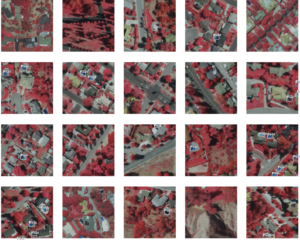
For this link, I looked up swimming pool detection and found this link via the ArcGIS developers themselves. I was given the coding to add swimming pool detection to my maps and the infrared needs in order to be able to label uncovered pools in residential areas. The image to the left shows multiple images that were used to train the ArcGIS system in finding swimming pools in residential areas.