Here’s my final. Thank you!
https://drive.google.com/file/d/1xqjW_ob8ZaNES7mFojVd0VcE0bo22uh1/view?usp=sharing
Geography 291: Geospatial Analysis with Desktop GIS
Module 1: 8/26/2026 to 10/16/2026, OWU Environment & Sustainability
Here’s my final. Thank you!
https://drive.google.com/file/d/1xqjW_ob8ZaNES7mFojVd0VcE0bo22uh1/view?usp=sharing
Zip Code – This dataset contains all of the zip codes within Delaware county, which are sectioned to specific parcels of land.
Recorded Document – This dataset shows the location of assorted Delaware County documents and records such as surveys, annexations, centerline surveys, vacations, and subdivisions. The feature layer displays the location of said documents as a point shapefile layer.
School Districts – All the school districts (and the boundaries that make up them) within Delaware county are contained in this dataset.
Map Sheet – This is a dataset that contains all the map sheets within Delaware County. Map sheets are a map or chart in a series of maps.
Farm Lot – This contains all the farm lots in Delaware County recognized by the US Military and the Virginia Military Survey Districts.
Township – This data layer shows the 19 different townships making up Delaware County.
Street Centerline – The location of the centerlines of all public and private roads are depicted by this layer (line shapefile). The layer was created from data yielding from field observation and addresses from building permits.
Annexation – This dataset shows Delaware Conty’s conforming boundaries and annexations from 1853 to the present and is updated monthly.
Condo – This dataset contains information on as well as polygon shapefiles to represent all of the condominiums residing in Delaware County, which is recorded by the Delaware County’s Recorder’s Office.
Subdivision – This dataset contains all of the subdivisions and condos that have been recorded with the Delaware County Recorder’s office.
Survey – This shapefile consists of points representing all surveys of land within Delaware County. Older surveys may not be included.
Dedicated ROW – This dataset displays all the designated Right-of-Ways within Delaware County through parcel data.
Tax District – Published by the Delaware County Suitor’s real estate office, this dataset contains all of the recognized taxa districts in Delaware County.
GPS – This dataset shows data points corresponding to all of the GPS monuments established in 1991 and 1997.
Original Township – This dataset shows all the original Delaware’s townships and their boundaries before tax district changes altered the boundaries.
Hydrology – This dataset shows all the major waterways within Delaware County and is updated monthly.
Precinct – This data layer consists of the voting precincts in Delaware County as defined by the Delaware County Board of Elections.
Parcel – This dataset shows all the parcel lines within Delaware County through the use of polygons.
PLSS – This data depicts all the Public Land Survey System polygons within Delaware County.
Address Point – This data layer contains all the certified address points within Delaware County. Data of homes, schools, and businesses are all recorded.
Building Outline – This dataset shows all the building outlines in Delaware, Ohio. The building outline layer is different from the address point data set as multiple distinguished buildings may share the same address data.
Delaware County Contours – Data expressed as two-foot contours for Delaware county, which shows changes in topography and elevation.
Chapter 6:
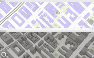
This chapter was meant to focus on collaborative mapping, using ArcGIS Pro, ArcOnline, and the app ArcGIS Field Maps to manipulate data (shapefiles), publish maps, and input data across interfaces. The chapter starts out okay but there’s a domino effect of errors that unravels quickly. I pretty much had the same issues that Holling and the others specified. For instance, I was able to get one tree symbol, but I wasn’t able to figure out how to change its status value or add more trees. I also had errors when trying to publish features such as the topography layer not being supported. I wasn’t able to figure out how to publish my map as the book instructs, so I eventually was not able to proceed through the rest of the chapter. Instead, I decided to read through the remaining instructions and follow them as much as I was able.
Chapter 7:
This chapter deals with geocoding or the process of transforming a description of a location such as a pair of coordinates, an address, or a name of a place to a location on the earth’s surface. This chapter has you analyze data from Houston, Texas to perform geocoding tasks such as symbolizing by color for median household income and creating buffers around bike lanes. Something was wrong with my median household income data and I wasn’t able to tell if it was joined properly. In summary, I did not have as many problems with this chapter compared to the others and I admired its examples of proximity analysis.
Chapter 8:
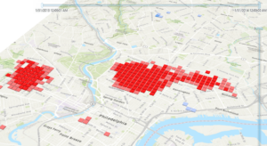
Chapter 8 covers analyzing spatial and temporal patterns by having you create a kernel density map, perform a hotspot analysis, visualize the hotspot analysis in 3D, and animating the data. I came across a couple of problems with this chapter, but they were mostly manageable or resulted from my own errors. For some reason, I had more crimes for the robbery_jan layer when selecting by attribute than what appears in the book. I made sure the date range was the same, so I am not sure what went wrong. Animating the data was weird. I could not tell if the animation was just being choppy but running properly or whether I had messed up somewhere in the instructions. I retraced my steps, but I did not notice any errors. All in all, it was interesting to see how the interpretation of the map could easily change when converting it to 3D and by editing the symbology making the 3D map more readable.
Chapter 9:
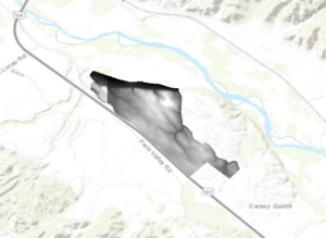
Chapter 9 instructs how GIS can be used to determine which areas are most suitable for a land-use change/purpose, a common use for GIS. This chapter took me a while, although some of it was more so review for me as I have performed some of the many of the same functions under other GIS projects that also dealt with determining suitability. You first start out the chapter by learning how to use the Extract by Mask tool to clip a digital surface model or DSM. The chapter then teaches you how to merge raster layers (the DSMs) by using the Mosaic To New Raster tool. The rest of the chapter deals with analyzing the landscape for suitability through various means: aspect, slope, and hillshades.
Chapter 10:
Chapter 10 details how to properly present your generated maps by showing you how to optimize your symbology and create a readable page layout. I had some troubles in the first half when altering the symbology, some resulting from the change in interface. One error I had was that the different values had the same color symbology even though I selected Unique Values. I figured out that I was editing the wrong layer because I had them named wrong. After I used the right layer, the problem solved itself and I was able to get different colors for the varying values. Formatting the page layout for the final maps was a review for me, but a much-needed one. I already knew how to add a north arrow and legend, but editing them as well as adding the spatial reference was informative. I had a problem adjusting the maps to the areas of interest so I adjusted the map manually by comparing them to the images in the book. My resulting maps resemble what the book has, but they are not exactly the same. In conclusion, this was a good chapter even though I encountered some problems, and I believe this is the best topic to end on.


Week 4 Post
Chapter 1:
The first chapter explains the basics of GIS, namely what it is and its potential uses. The chapter explains that point, line, and polygon data is referred to as vector data and that a set of features that are grouped and displayed together are referred to as a layer. Maps are usually composed of multiple layers, which is useful for turning them on and off particular features. When features have corresponding data that relates to them, that information is known as attribute data. Features are great for visual analysis, but when features also contain attribute data the potential for analysis skyrockets. GIS provides many tools that can manipulate, sort, and summarize large data sets for a wide range of uses. The rest of the chapter takes you through exploring ArcGIS online.
Chapter 2:
This chapter covers the basics of 2D and 3D maps in ArcGIS Pro. Skills described include importing a map document, creating folder connections, examining feature attributes, measuring distances, adding base maps, creating bookmarks, and creating a 3D scene. Overall, this chapter lays the groundwork for starting most projects and familiarizing oneself with the general layout of tools in the main ribbon, as well as manipulating layers under the Contents tab.
Chapter 3:
Chapter 3 focuses on geospatial relationships and manipulating data. The first thing you do is practice extracting data from an established dataset. The chapter also instructs how to join data tables and how to calculate summary statistics. I could not get the swipe function tool to work, which was weird. Other problems were mostly due to changes in the interface, so there wasn’t congruency with the instructions.
Chapter 4:
Chapter 4 deals with building a geodatabase so that you can convert shapefiles to feature classes and perform other related functions. I particularly enjoyed manipulating the polygon features by splitting and merging them. Overall, this chapter follows the same format as the others.
Chapter 5:
Chapter 5 is a very important chapter because it covers how to streamline work flows or tasks with the use of GIS’s built in model builder and through Python. Python is a tricky coding language, but it works along the same principals of model builder, which is why I really like that they let you play around with model builder first.
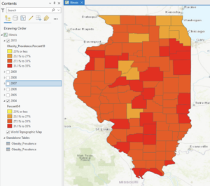
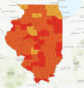
(Sorry if my pictures look weird. I had the original screenshots saved in a google doc, but they wouldn’t paste over so I had to rescreenshot them and then upload them.)
Chapter 5:
Chapter 5 deals with mapping what’s on the inside a designated area. Sometimes you will already have boundaries available in ArcMap but other times you will need to draw this area or areas on top of the features manually. The chapter lists several reasons you might want to map data inside a boundary, but as always it is important to keep in mind what you are trying to accomplish and how that will affect your approach. Mapping a single area will be different than mapping multiple areas while handling discrete or continuous data will affect your approach. Mitchell also notes that it is important to have some type of label whether it is a number or a unique name for each area mapped. The three ways of finding what’s inside are described as drawing areas and features, selecting the features inside an area, and overlaying the areas and features. Drawing areas and features are the easiest and most simple method, but it really only gives you a visual representation and not information about the features inside. Selecting the features inside an area allows you to get info on what is happening in a single area, but you are not able to see what is happening in each of several areas. For example, a map of parcels within a watershed using this method will let you see which parcels are within the watershed, but may not distinguish the type of parcels. With this method, you can use GIS to create a report of the selected features or statistical summaries. This data can come in the form of a count, frequency, or as a summary of a numeric value (i.e. sum, average, median, or standard deviation). Overlaying the areas and features avoids this by allowing you to see what is within each of several areas (i.e. parcel type), but it requires more time and processing than the other methods. Overall, I really liked this chapter and the examples provided.
Chapter 6:
Chapter 6 deals with mapping what’s nearby a feature. There are many reasons why you might want to find out what is occurring within a set distance of a feature or to find out what is within traveling range. Reasons could involve legal policy decisions, business or environmental precautions, or simply a scientific analysis of an area. While distance can define or measure the proximity or features, travel costs may also be used. Travel costs, which may include time and money, may vary even if the distance between a set of features is the same due to other factors. For instance, it will cost a car more gas money to traverse a highly trafficked area rather than a relatively low trafficked area. It would also take less time for a deer to cross a valley to get to a stream than it would to cross a deeply forested area. In this way, the valley has a lower travel cost. Something to keep in mind is whether you are considering the curvature of the earth in your distance calculations or not. The planar method is used for smaller areas that can generally be observed as flat, while the geodesic method is used for larger areas where the curvature of the earth is taken into account. You may not think the curvature of the earth would need to be considered when dealing with relatively small areas, but major bridge constructions sometimes have to account for the earth’s curvature as the tips of supporting structures will be further apart from each other than they are at their respective bases. Information from an analysis can come in the form of a list, a count, or a summary of statistics.The reading describes three ways of finding what’s nearby: straight line distance, distance or cost over a network, and cost over a surface. As always, each method has its own uses, pros, and cons. Straight-line distance is used for defining areas of influence near a feature or selecting features at a set distance around a source, which gives an approximation of travel distance. Distance or cost over a network measures travel distance or cost of location over a fixed network or infrastructure, but requires a network layer. Cost over a surface is used for measuring overland travel costs and determines how much area is within the travel range. The rest of the chapter goes over these methods and guides you through making and modifying distance maps. Overall, I liked this chapter even though distance cost was a new concept for me. The chapter does a good job of describing why it might be important to calculate the distance between features (with the respect of area).
Chapter 7:
Chapter 7 informs why it may be important to map change over time. Mapping changes over time is one of my favorite uses of GIS technology as it can be applied to countless environmental questions. Mapping changes over time is a great way to visualize patterns and predict future changes. This could involve examining weather patterns, changes in land use, or changes in population density. When mapping change it is important to remember the types of changes that exist. For instance, the book outlines changes in location, character, or magnitude, which all can describe geographic phenomena. Recognizing the types of features, such as discrete or continuous, is vital for choosing the appropriate method to map change. Measuring the time pattern is also key to mapping change. The three types of time patterns described are trends, before and after events, and cycles. Snapshots may be used to capture a set of conditions at one point in time, such as land cover or population data. Summarizing can be used to map discrete events that are not continuous in time. An example of this would be summarizing the daily precipitation for a region into monthly averages, which may show trends in weather patterns and may allude to the overall climate of the region. When mapping trends it is necessary to consider intervals, the number of dates, or total period. For instance, depicting urban sprawl annually may have as much of an impact when comparing the sprawl across several decades. For mapping cycles, a snapshot or summarization over a period can be used depending on whether the data is continuous or discrete. The chapter also lists three ways of mapping change. A time series is good for depicting changes in boundaries, surfaces, or values of discrete areas, which can lead to a strong visual impact. Tracking maps are great for showing movement in discrete locations, area boundaries, or linear features. These maps can become cluttered and difficult to read if there are more than a few features. The measuring change method involves showing the actual difference in values or amounts between two times only. This type of map only shows the change and not the actual conditions at either time. The rest of the chapter delves deeper into these methodologies and how to apply them appropriately. In conclusion, I don’t think the book could have ended on a better chapter since the earth and its features are constantly changing. As human beings, we are fascinated by change, so being able to map change is really rewarding and can lead to new insights to our behavior and geographical phenomena.
Mitchell opens by explaining how much GIS has grown with developing technologies. Mitchell proceeds to delve into the main theme of Chapter 1 by defining GIS analysis and concisely describing how to conduct such analysis in a recommended series of steps. The steps are framing the question, understanding your data, choosing a method, processing the data, and examining the results. Mitchell then explains the types of geographical features and how they are represented. The three types of features are discrete, continuous, and summarized by area. Discrete features can be easily plotted on a map because they describe whether the feature is present or not. Discrete features may be represented by dots, lines, or other methods. A discrete feature might be a dot representing the location of a well or a curved line representing the path of a river. Continuous phenomena are features such as weather and temperature. Continuous phenomena can be constantly changing. The areas between sample points (ex. weather station) require interpolation to produce a value. Meanwhile, summarized data represents counts or density of features within an area’s boundary (ex. zip code parcels colored depending on the average number of households). Mitchell goes on to describe vectors and rasters, which are ways of representing features. In regards to vectors, each feature is a row in a table and is defined by x and y values in space. Vectors can include dots, lines, and areas (shapes). Features in a raster are represented as a matrix of cells in continuous space. Mitchell then explains the different types of geographical features in more detail, even though some are self-explanatory. The geographical features include categories, ranks, counts, amounts, and ratios. The chapter ends with a brief summary of working with data tables. One thing that I admire from Mitchell’s writing is how he includes several examples of potential features or applications. Various maps are included throughout the text, which brings clarity and emphasis to these ideas. The writing has a typical but well-structured pattern in which information is brought forward. Once a new term is introduced, it is defined and an example of its application is typically included. The flow of information is more easily digestible with this structure and the graphics serve as a great visual aid.
The second chapter covers the topic of mapping and why it is important. There’s a lot fewer GIS vocabulary terms in this chapter as it pertains mostly to concepts. Ultimately, creating maps helps you see where features are present or absent and to recognize patterns. Sometimes finding these patterns is the goal of the map. Mitchell reminds the reader that it is important to keep the audience in mind when making a map. What data is depicted, and how the data is presented affects the overall clarity of the map. Therefore, mismanaging the presentation of data can make a map unnecessarily complicated. Making sure your map expresses the information in the most efficient and clear way possible is something I’ve put a lot of thought into when working on previous projects, so I’m glad Mitchell touches on this simple but important concept in a lot of depth. I never knew this, but Mitchell states that it is usually best to have no more than seven categories on a map. Apparently the majority of people can distinguish up to seven colors or patterns on a map, but begin to have more difficulty discerning information when there are additional categories. Logically, this makes sense as having too many categories can easily clutter a map. Mitchell makes it clear that the amount of categories or symbols used should be chosen given the purpose of the map. He also expresses that when color coding regions on a map, it is a good practice not to use random colors but to instead assign similar categories to similar colors. In a lot of cases, this can improve clarity. For example, a land use map may use light green for lightly forested areas and a darker green for deeply forested areas. Alternatively, you can combine the use of different colors, shapes, and thicknesses when appropriate. The example Mitchel uses is for a road/transportation map. In this case, it is a good idea to make freeways thicker than highways and highways thicker than local streets. It is also a good idea to use familiar symbols when possible. For instance, most people associate two parallel lines connected with a series of horizontal lines as a railroad track. It would not be good to utilize the common railroad pattern for a highway or vice versa. At the end of the chapter, Mitchell asserts that it is important to use statistical analyses when quantifying the relationship between features or patterns.
Chapter 3 pertains to mapping the most and the least and is the most comprehensive chapter thus far. Mapping the most and least of something is a good way to visualize relationships between places. This includes discrete features, continuous phenomena, and data summarized by area. Mitchell makes note that data is generalized to create patterns. To expand on this, I believe since maps are a reflection of the real world, data is almost always generalized to some degree. Moreover, there is a lot of reiteration in the beginning of the chapter. I appreciate this approach as it helps you remember and retain what was learned in chapter 1. Mitchell reviews counts and amounts, ratios, and ranks specifically, which are important terms to keep in mind as they can all be grouped into classes. I actually went back and discovered that the explanation on ranks is verbatim to that from chapter 1, and the same map is used as an example as well. Mitchell then goes on to explain classes and how to use them both manually or with a standard scheme. The four most common schemes (natural breaks, quantile, equal intervals, and standard deviation) are defined and mapped for an easy comparison. Each type of scheme has its advantages and disadvantages, but none are necessarily better than another because each scheme should be used depending upon the distribution of data itself. For example, if the data is heavily skewed, then an equal interval will provide a misleading result. Next, the ways in which quantities can be expressed are covered. As with the different scheme types, each quantitative type has its purpose and its own advantages and disadvantages. Graduated symbols vary in size, which is good since people naturally associate symbol size with magnitude. Graduated colors accomplish a similar thing, but with areas and continuous phenomena. Colors are not always associated with magnitude, but people tend to assume ‘dark’ means more and ‘light’ means less. I am most unfamiliar with charts, but the text describes the use of charts very well. Charts make it easier to read patterns or feature values, but they may obscure patterns by compromising visuality. Contours, or contour lines, make it easy to see the rate of change over an area, but individual feature values may be harder to determine. Contour lines are great for depicting air pressure gradients or changes in elevation. Additionally, 3D perspective views grant a high visual impact and can depict elevation very well. However, this style of map makes reading individual feature values more difficult.
Chapter 4 deals with mapping density. While density maps are not very good for examining the location of individual features, they are reliable for looking for patterns and for mapping areas of different sizes. While it is true that you can examine the location of features by plotting the location of all the features on the map, it may be difficult to truly differentiate the different concentrations within the map accurately. Density maps utilize a uniform areal unit, such as square miles or hectares, which allows a clearer more precise image of the distributions. Potential applications for density mapping include census data analysis, crime analysis, or plotting the distribution of businesses. There are two approaches to density maps. The first technique involves basing your density map on features summarized by a defined area(s). The second involves creating a density surface. A density surface is typically created as a raster layer with each cell in the layer being assigned a density value. This provides more detail, but at the cost of more effort. Under defined area(s), a density map can be produced using a dot map or by calculating density values for each area of interest. For a dot map, each dot represents a specific number per feature. For example, a single dot can represent 5 businesses or 100 people. The dots are distributed randomly in their area, but the density can be observed by how close or far dots are relative to each other. The rest of the reading instructs how to create a dot density map, creating a density surface, and explaining the calculations GIS does for these procedures. Mitchell explains how to use the appropriate methods and when, including potential real life examples along with corresponding maps.

Hi, my name is Jay McConkey. I’m from Cambridge, Ohio and I am a senior and an Environmental Science and Geography major. My academic interests include GIS, remote sensing, mycology, and plants. My other interests include reading books or manga and running. I have recently started a crochet kit, so maybe I’ll develop a new hobby this year. It’s been a while since I’ve taken a GIS class so through the course I will be brushing up on my previous GIS skills while aiming to master new ones as well.
Having experience with ArcMap, I wondered how the author would describe GIS to the unfamiliar. The opening passage surprised me as the reading begins expanding on the uses of GIS and how it is utilized by many people in many ways. I honestly didn’t know that Starbucks credits its success to the use of GIS software, but it doesn’t surprise me given the scope of what can be done using GIS. This makes me ponder other potential uses for GIS, other than the examples Schuurman describes (landscape architecture, surveying, ect.).Furthermore, it is interesting to read about the origins of GIS and how at the early stages the biggest limitation was technology. Given how much computing power has improved in the last couple of decades, it is no surprise to see the scope of GIS advance just as much The origins of GIS are framed just as interestingly. I had no idea just how messy the origins actually are, but I really like Schuurman’s analogy of GIS to a calculator. It makes sense since modern GIS has some many tools and built-in calculations, but you still have to know which calculations to use and when. The fact that these techniques are more accessible, broadens their potential application.
One aspect of GIS that is brought up is the power of imagery. Schuurman states that GIS commonly refers to ‘geographical information science’ as well as ‘geographical information systems.’ I feel like, at this point, GIS is so complicated and involved in so many sciences that it is impossible to fully define in a single sentence. Schuurman elaborates on this later in the readings when she states that GIScience is used to provide justification for GISystem functions. Schurrman also talks about how GIS digitizes physical data which is therefore manipulated in a way that the user interprets the world. This reminds me a great deal of one of my first GIS assignments given by Dr. Rowley. He had us use remote sensing to classify a GIS satellite footprint as disturbed and undisturbed land. We all classified our maps slightly differently according to our own personal biases. This made each of our maps slightly, or wildly different and showed us how GIS data is interpretable. Furthermore, emphasis is placed on the importance of visuality and how humans use visuals to comprehend concepts or statistics. The subject of colors, textures, and symbols in map-making is fascinating to me and is something I would like to learn more about. Another interesting inclusion that Schuurman describes as an interest of GIS users is whether GIScience is inherently gendered. This fascinates me, because I do not fully understand how a geographical system could be gendered, but I have a feeling it stems from past geographers who are mostly male.
GIS Applications:
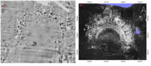
The first GIS application I looked into was ground penetrating radar, which is used for archeological studies. The source I found described a new processing tool, which automates certain processes and identifies anomalies. With the ground penetrating radar and GIS, the team was able to analyze buried structures. The image below is an Ancient Roman theatre that is currently underground.
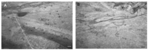
 One of my academic interests is mycology, so I looked up related GIS applications with fungi and found a study using GIS to assess the distribution of fairy rings. Overall I found the study interesting and I hope to come across more research that uses GIS to study fungi. The picture below was taken from an airplane and includes the fairy rings are identified.
file:///Users/jaymcconkey/Downloads/remotesensing-14-03459-v2.pd
https://www.sciencedirect.com/science/article/pii/S1754504821000027