Buroker Week 1,2,3

First Week

ArcOnline Exploring: I have previously logged into my arconline account in Dr. Krygier’s earlier GIS class (before the 191 and 192 modules). I enjoy working with ArcOnline and think it is a good addition to the desktop GIS software. I find it relatively easy to navigate and use to view and make maps. Every time I go on it I am surprised by how many tabs and different buttons/capabilities there are, and this time was no different. I’m excited to hopefully understand the function of all of these tabs at the end of the course. 


Get Started: What is ArcGIS Online. Readthrough: I think one of the most exciting things about arc online to me is that you can work on maps collaboratively and virtually with other users and organizations. This is an incredibly powerful tool to connect people and to accomplish projects with people in far away locations. I read about this in the “Get Started” tab in the “Share and Collaborate” section and can see this being super useful when working with a professor or in a professional capacity and not having to go on a desktop machine or share drives/folders. I was interested in the app section of the read-through, because I haven’t had much experience with ESRI (?) apps beyond ArcOnline and ArcPro, so clicking through them on arconline was interesting. There is a large span of content/ industries covered by the apps, and it really highlights how diverse and powerful GIS can be. I was particularly interested in the GeoPlanner app, and a bit more research showed that it can be used to design and plan buildings and other structures in accordance with the geographic information of the area.


Getting Started Course(s): I had already completed the ArcGIS Online Basics course, so chose to do the “Basics of JavaScript Web Apps” because I am anticipating having to make a Web App for an independent study with Dr. Rowley and think this may be useful. My first impression is that using HTML format for web pages is familiar, because of work that I have done with Dr. Krygier in previous classes. That feels good and is making me excited about potentially being able to do this (the coding is a little scary). The section on software development kits (SDK’s) and introducing maps to online apps makes sense and I feel is applicable to what I want to do with Dr. Rowley.


Interesting ESRI online training: The “Get Started with ArcGIS QuickCapture” seminar seems interesting. It focuses on how you can use QuickCapture to take images and make them into data to be used in arc. I was interested in this because it includes “rapid data capture from moving ground or air-based vehicles” which could potentially include remotely sensed data. Another course of interest is the “Creating and Sharing GIS Content Using ArcGIS Online

“ because I am interested in being able to share maps that I make with other people. I think this might provide some insights on how to share maps in a variety of ways.


GIS Application Areas: Making interactive web maps using arc online. I know I’ve talked about it before but this website details how you can make these maps and post them online which is something I’m very interested in doing at the moment. It is a 13 page pdf tutorial of how to do this. This website details how to map flood risk areas with arc online. I think this is an interesting topic and is something that the remote sensing class worked on doing in ArcPro on the desktop machines. I think it would be interesting to see how the online software compares and if there are any major differences.


Second Week : Chapters 1 & 2:

My first impression reading chapter 1 is that the capabilities of Arc online are immense. There is so much powerful stuff that the software can do. It’s pretty amazing. Learning about the five main types of content supported by arc online, data, layers, web maps and scenes, tools, and apps, was really helpful and explanatory. I also found the attachments section, starting on page 17, very interesting because I have never been able to attach a picture of ppt or video to an Arc map before and this could be a super informative and useful addition to a map.
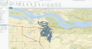
 

Chapter 1: 

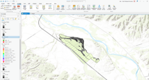
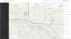
This is the Redlands attractions map from Exercise 1. It was kind of tedious to make with the new ArcOnline software but generally pretty straightforward and workable. The others parts of the chapter were also straightforward and easily completed when working slowly and methodically.
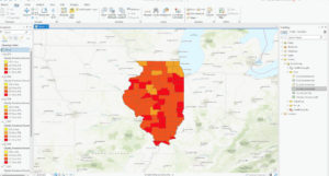
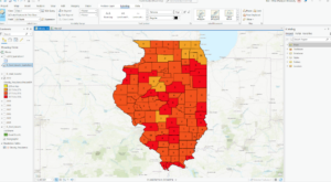
Chapter 2: 

I wasn’t able to correctly code in a new expression in chapter 2 and so I didn’t have the growth rate (2010-2020) pop-up  when I clicked on specific cities. The book’s description of the expression generator tab was different from what it actually looked like so this was kinda difficult. 

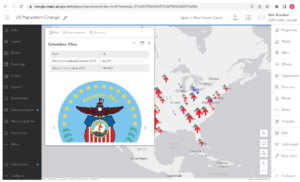
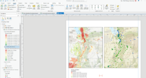
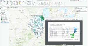
This is what my map looked like after 2.4. I couldn’t find the “sample chapter2 owner.gtkwebgis” so I was not able to do the tutorial for 2.5 and 2.6.


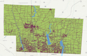
I can see the sort of techniques we used in chapters 1 and 2 being used with the Delaware data for the school districts. I could potentially see us generating a map similar to the map in chapter 2 with the Delaware county school district. We could also use the techniques from chapter 1 in order to make a similar map from subdivision data. Highlighting where all of the subdivisions are in Delaware County.

Buroker Week 5 (Data Inventory)

  • Go to the Delaware County Ohio GIS Data Hub and click on All Files. Review the available data (click on each and read the Data Summary): create (in your posting for the week) the name of each data layer and a few sentences about the data:
  1. Zip Code: This file is a dataset with all the zip codes within Delaware County, Ohio. The zip code layer was created in 2005 and is updated as needed through coordinating with the US post office. 
  2. Recorded Document: This dataset serves to facilitate the process of locating miscellaneous Delaware County documents by showing the locations of said documents. Examples of documents include vacations, subdivisions, centerline surveys, surveys, annexations, etc.
  3. School district: This dataset shows all of the school districts in Delaware County.
  4. Map sheet: Is a dataset of all the map sheets in Delaware County. Map sheets are a series of map pages where each page shows a specific map extent.
  5. Farm lot: This map shows all the farm lots in Delaware County, as defined by the US Military and the Virginia Military Survey Districts. This data set can be used to identify farm lot locations within the County.
  6. Township: This data set illustrates the 19 different townships which make up Delaware County. 
  7. Street centerline: This map shows the center of pavement of public and private roads within Delaware County. This basically shows where all the public and private roads in Delaware County are located.
  8. Annexation: This data set maps annexations and conforming boundaries in DELCo from 1853 to present. It is updated when annexations or conforming occurs.
  9. Condo: This dataset lists/illustrates all condominium polygons that are recorded with the Delaware County Recorder’s office.
  10. Subdivision:  This dataset lists/illustrates all subdivisions and condos that are recorded with the Delaware County Recorder’s office.
  11. Survey: This shapefile shows point coverage that represents surveys of land within DELCo. The surveys are found in the Recorder’s office and in the Map Department.
  12. Dedicated ROW: This dataset contains all of the road right of way Polygons in the county.
  13. Tax District: This is the dataset which illustrates all of the tax districts in DELCo.
  14. GPS: This dataset identifies all of the GPS monuments established in Delaware County in 1991 and 1997. The coordinates are in U​​niversal Transverse Mercator Northing and Easting.
  15. Original Township: This dataset illustrates the original Delaware townships before they were changed by tax district changes.
  16. Hydrology: This dataset shows all of the major waterways within DELCo.
  17. Precinct: This dataset illustrates the voting precincts in the county and is maintained by the Delaware County Auditor’s GIS Office. 
  18. Parcel: This dataset holds all of the Parcels within Delaware County. They are stored as cadastral geomentries and are maintained by the Auditor’s GIS Office. Changes to the dataset are represented by recorded documents within the Recorder’s Office.
  19. PLSS: This dataset illustrates the Public Land Service System polygons for the county. It was created to help identify all of the PLSS and their boundaries within the US Military and Virginia Military Survey Districts of Delaware County.
  20. Address Point: This dataset is a spatially accurate representation of all the certified addresses within Delaware County and is maintained by the Auditor’s GIS office.
  21. Building outline: This dataset illustrates the building outlines for all structures in Delaware County. The layer was first created from 2008 orthophotos but was updated in 2010 and again in 2018. 
  22. Delaware County Contours: This dataset is 2018 two foot contours for Delaware County. It is in File Geodatabase format. I don’t know what they represent but I believe contours can represent continuous things like elevation, temperature, precipitation, pollution, or atmospheric pressure.


  • Create a new folder on the external drive you have been using for the GTK ArcGIS Pro tutorial. Call the new folder Delaware GIS Data. Download (to the Delaware GIS Data folder) (as .shp files) these three data sets: Parcel, Street Centerline, and Hydrology (search for this last dataset on the Delaware site if you don’t see it in the list). Create a new ArcGIS Pro project and open these three layers. Create a map that shows all three and save a screenshot and include it in your weekly posting.

Buroker Week 5

Chapter 6: 

Exercise 6A: On page 206, when the book asked me to open the catalog pane, expand databases, click TreeInvenory.gdb and click domains, no domains showed up in the domains window. The book says I should have a Hazard and LandUse domain but I do not. I was not able to complete exercises 6B and 6C because I couldn’t complete 6A and there was not an option to upload a finished map to pick up where I finished. B and C use arc online and the arc collector mobile app with the published treeinventory map from 6A.

Chapter 7: 

Exercise 7A: This exercise went smoothly with no issues, I was able to open the data and generate the map without a problem. However, when I got to Exercise 7B: I wasn’t able to do the rematching step because when I typed in the addresses no unmatched addresses appeared. I wasn’t able to do exercise 7C because I couldn’t complete B and rematch the addresses. The image below is what my map looked like after completing chapter 7, without the rematching step being done. I wonder if we had let the GIS automatically rematch (pg. 247), instead of clicking no and trying to do it ourselves it would have been able to do this step.

Chapter 8: 

The exercises from chapter 8 went well. I was apprehensive about making the space time cube because it sounds so complex but the GIS cooperated and I was able to complete all the steps. I think the end results are really cool, specifically being able to visualize the robbery hotspots 3 dimensionally.

Chapter 9: I got through exercises 9A and B smoothly but couldn’t finish exercise 9C because the reclassify tool from the model builder portion of the exercise did not have the same table built into it as the table in the book (pg. 344). I didn’t have a start, end, and new table like you need for the exercise and therefore couldn’t complete the model builder.

Exercise 10: I completed 10A and B without issue until the very end of 10B where I had to change the county names to a brown color. I couldn’t get the symbology to appear on the map and look like the pictures from the book, even though I think I followed the instructions to a T. i got lost in all the formatting that we had to do at the very end of chapter 10. I couldn’t find all the panes and tools that they were asking for and also couldn’t get my maps to format the way they needed to. Also, when I uploaded the map on the left it appeared in the shape of a football and the best I could do was format it zoomed in like it is now. This was frustrating and definitely something that I could use some more experience with.

Big idea reflection: These chapters built on the work we did last week while also introducing new skills. I think I had an easier time working through the steps and was more comfortable with Arc Pro. I enjoyed feeling like I knew my way around, although I was still frustrated at times by not being able to find things or by the GIS not doing what I wanted it to. In terms of big ideas, I thought that the space time cubes from chapter 8 were really interesting and I can see how they can be used to illustrate patterns and create really beautiful interactive maps. I also appreciated the hillshades and extract by mask/mosaic-ing we did in Chapter 9 because these are things that I have done with Dr. Rowley. Using the book to show me the proper way to do this was excellent and I appreciate having a concrete place to look if I ever get stuff mosaic-ing or generating hillshades in future research.

Buroker Week 4

Ben Buroker

2/10/23

Geog 191

Dr. Krygier


Chapter 1:

The section about spatial data and attribute data was interesting. This might help design research questions and allow me to understand if I have the necessary data to answer specific questions. An example is that the location of a hospital is spatial data, information about that hospital, like name, available rooms, specializations, staff, and patients, is all attribute data. With this data, it is possible to perform spatial analysis and understand the patterns and other ways in which the hospital works. It’s crazy about how easy it is to make a web map nowadays and how accessible GIS has become. I feel like knowing how to make a web map and share it online will be useful for the research I’m doing with Dr. Rowley. 

Arc Online Activity 1: I don’t know how to do the step that says, “In the context pane, click Configure pop-ups…” on page 26. 

I was able to finish up the exercise from chapter 1, and everything was looking great but as soon as I finished the last step, the School Walking Areas all disappeared from the map. Even though all of the layers are visible. I trouble-shot it but was unable to make them reappear so I’m a bit stuck on that.

Chapter 2: 

This chapter starts right up with exercise 2a in Arc Pro on the desktop. I had a really hard time finding the World_data.mxd file to import into ArcPro. I think that the issue was that I was trying to save my project to my personal external hard drive (?). As soon as I made a new map and saved it to the computer, the file was the first option right there when I tried to import a map… 


Above is what my map looked like at the end of 2B. I then attempted to complete exercise 2C, which is experiencing 3D GIS, but was not able to find the buildings.shp file that I was supposed to use for this exercise. It is not where the book says it should be and I was not able to find it or get it to miraculously show up no matter what I tried.


Chapter 3:

This was what my map looked like after completing exercise 3A+B/ I tried to add the IL_med_income.lyrx to the map but it just went on top of the existing layers and I couldn’t figure out how to make it go beneath and show up as pretty dots like in the book.

This is my map after exercise 3D. 3D had a lot of different things that we had to do, and I encountered small hiccups that I was able to fix/work through. I think a lot of the issues I dealt with were my own fault and a result of me trying to go too fast and not fully reading the instructions.


Chapter 4:

This is the map that I ended with for Chapter 3. I struggled at the end of this chapter when the book asked us to use the “edit vertices” tool in the eastern part of Illinois for that small map section. I couldn’t properly select the line using “bookmarks”, I don’t think I ever made any bookmarks.


Chapter 5:

This is the map I ended with after Chapter 5. This chapter went pretty smoothly and I feel like I was learning how to properly navigate bringing the data into the map. This whole time I was having issues finding the data the book was asking me for. I figured out how to search within the catalog pane and learned that if I typed in the exact file name (or something close) it would show me the files even though they seemed hidden or out of place. This was kinda a duh moment, but was key to me being able to actually efficiently work through the lessons. 


Overall Reflection and “Big Ideas”:

I struggled initially because I didn’t download the data from the very beginning of the book, after I downloaded it and solved that issue things got a lot easier. It was still hard to find the data and sometimes it wasn’t in Arc Pro or even in the folder connection. I thought that having the ability to use the files already in the data folder in order to start the next exercise with a fresh perfect map was really useful. Instead of being totally stumped by one hiccup, if you couldn’t figure it out you could go ahead and start again. I had a hard time thinking about big ideas while doing these chapters. I think I was overwhelmed with the amount of exercises there were to do as well as by how confusing the stuff we were doing was. Most of the time I felt like I wasn’t able to understand how the processes I was doing were connecting to a bigger goal for each map. The names of the tools and the number of steps we had to do before seeing any change in the map made me forget about what we were doing. I appreciated seeing some connections to the work we did in the OG GIS class, like joining attribute tables. As I was working I was thinking about if I would be able to replicate any of the steps I was doing, either apply them to a unique dataset, or to recall the steps and be able to do them again. I definitely couldn’t without the instructions.

Buroker Week 3

Chapter 5:

Mapping what’s inside can be used to decide if action needs to be taken. For example in times of emergencies, maps can be used to show what areas are at risk. You can also use multiple maps to compare what is “inside” of different areas. Using an area boundary allows you to select features that you will be mapping and therefore create the “stuff” that you are mapping inside. Understanding your data is once again an important part of the process of mapping what’s inside. You must know whether you are mapping what’s inside a single area or several areas, because this will affect how to best map the data. If it’s a single area you can easily monitor activity or summarize information within that area. If it’s multiple areas, you can see how much of a specific thing is specific areas and compare them. There are also three different ways to find what’s inside an area, drawing areas and features, selecting the features inside the area, and overlaying the areas and features. Drawing areas and features allows you to find out whether features exist within the area or not, but only give you surface level information (you can’t get information about the features inside an area). Selecting the features inside the area results in a list or summary of features inside an area, but doesn’t separate information by area (you only get a list of features inside all areas combined together). Overlaying the areas and features allows you to find out which features are inside each area, and summarizes how many or how much is in each area. This gets the most expansive information, and solves the issues from the other two methods, but takes the most time and effort processing. The choosing a method section on page 148 will be useful for choosing a method if I ever have to do this in the future. The section on selecting features inside an area shows a bunch of example maps that look to me like they show the data very well and are “good” maps. The map and section on page 177 about overlaying areas with continuous values is really cool. I like the way that the GIS is able to combine elevation surface and a watershed layer and show how the elevation and watershed mesh together.

Chapter 6:

This chapter highlights why it can be important to map what’s nearby. Traveling range is an important component of doing this, and is defined by distance, time, and cost. Understanding what’s within the traveling range of an area can help you better understand how that area can be used and serve important purposes. The first step in the process of mapping what’s nearby is figuring out how to define and measure “near”. Making a definition like this feels important because “near” can mean a lot of things and a baseline definition would make things a lot easier. This nearness can be defined by either a set measurable distance, or by travel to and from a specific feature. You can find what’s nearby using straight-line distance,  or by measure cost over a network or over a surface. Using straight-line distance is the simplest and in my opinion most intuitive. Cost over a network and over a surface seemingly gets more complicated and involves more thinking/understanding. Useful ways to choose a method are found on page 191 and involve thinking about if you can define an area of influence, need a quick estimate of travel time, are measuring travel over fixed infrastructure, or are measuring overland travel. I think the way that you can use straight-line distance around a specific feature to find distance is really cool. I liked the example map of the selected parcels surrounding or within 100 feet of the road. I also think creating a buffer feature could be really useful and is something I’d like to practice doing. Once you have point-to-point information, you can create a map that color-codes locations by distance from the source (and closest to the source), make a spider diagram, or map source features using graduated point symbols. A spider diagram is when the GIS draws a line between each location and the nearest source. You can do this with multiple different sources and create a map that resembles a multicolored spider-web, comparing and representing the different patterns between source features.

Chapter 7:

Mapping change feels like a different thing than what we’ve been reading about because it’s a future phenomenon. This can be useful because it allows people to anticipate future conditions. You’re able to map expected conditions by looking at historical conditions and to eventually anticipate future needs. In order to best map change, you need to understand the types of features you are mapping. Features that move can be mapped using discrete features. These features can be tracked as they move through space. They include features you can map paths for (like hurricanes, a vehicle or animal), linear features (like a changing stream channel), or an area feature (like a fire boundary or oil spill). You can map change in three ways, time series, single tracking map, or map the differences in values between two times or dates. Time series show movement or change in character and have a strong visual impact. Tracking maps show movement and better show subtle change. Mapping change shows changes in character and shows the actual difference in amounts or values. If you generate multiple maps over different dates, it can be important to correctly decide the number of maps to show. By showing fewer maps, farther apart in time you can make the change in values easier to show, but less nuanced. Showing a bunch of maps with dates more closely together in time, you can reveal more detailed patterns about the change. Also, it can be helpful to include tables and charts that summarize data along with your maps. A tracking map is a map where the movement of individual features is mapped using a series of contiguous points. You can add a line connected points to emphasize the path the feature followed or even map the points at equal intervals to see how far the feature moved in a set time. Mapping continuous categories or classes is more complicated than mapping other features because it involves combining two layers, for both date and time. I get a little bit confused when it starts talking about raster data and areal extent. I feel like I’m going to have to do some more reading and investigating to understand this.

Buroker Week 2

Chapter 1:

The most common GIS analysis tasks are mapping where things are, mapping the most and the least, mapping density, finding what’s inside, finding what’s nearby, and mapping change. These are all analysis tasks that we can do in GIS, with a plethora of different datasets. GIS analysis is the process for looking at geographic patterns in your data and at relationships between features. There are four types of geographic features, discrete features, continuous phenomena, features summarized by area, features summarized by area. The two distinct methods or models used to represent geographic features in GIS are vector and raster. A vector model involves each feature as a row in a table, and each feature represents either discrete locations, events, lines, or areas. Differently, the raster model represents features as a matrix of cells in continuous space. I have some experience working with both vector and raster, and have never fully understood what the difference is and what is actually going on within the computer. Even after reading this section of the chapter I still feel somewhat confused about what is really going on. Each individual layer represents one attribute and almost all analysis happens by combining layers to create new layers with new cell values. Attribute values are important for understanding geographic attributes. Attribute values are categories, ranks, counts, amounts, and ratios. Very simply, categories are groups of similar things which allow you as the researcher to organize data. Any feature with the same value in a category is alike in some way, and different from a plethora of other features with other values. It is a sorting tool. Ranks are just what they sound like, they rank features in order from high to low and are often used when direct data isn’t available. Counts and amounts show total numbers. Count being the actual number of features on a map, and an amount being any measurable quantity associated with a feature. Ratios show relationships between quantities and are made by dividing one quantity from another. Ratios are important when disparities exist between features or areas, such as large and small geographic areas.


Chapter 2:

I think the idea of altering or catering a map to specific stakeholders is very interesting and plays into the discussion on making a map. I’m excited to see what the chapter has to say about this section. When thinking about deciding what to map, it is important to recognize what information you are ultimately wanting to display or understand through your analysis of the map and to think about how you will use your map. These questions guide what features are displayed or contrasted and ultimately the answers to these questions shape the choices of the mapmaker and ultimately the impact of the map. I’m confused about the section titled “making your map”, it uses the phrase “you tell GIS which features you want to display and what symbols to use to draw them”. I don’t understand how the symbols and drawing function and what this does or does not do to a map. Using a single layer (mapping a single type) draws all feature types with one single symbol, which can still reveal patterns, even though they solely show where features are. Conversely, using a subset of features allows you to map all features in a data layer based on a category value. This allows you to map all crimes, select burglaries and map only those, even selected commercial burglaries from there. This layering allows the discovery and illustration of more and more patterns. I’m starting to have some more clarity about symbols and drawing, I think reading about different ways to map is helping me better understand the role of layers. You can also map using categories. You would therefore be drawing features using different symbols for each category value. This can potentially provide insights about how places work at a deeper level than simply single groupings, like crop type (simple) and species (complex). It is important to choose the symbols you use to display your map categories because they help to reveal patterns within the data. This is a section I will definitely dog-ear and come back to when it is time to pick symbols. Ultimately, if you do all the stuff listed above, you should be able to potentially recognize some geographic patterns within the maps you create. This will come to fruition if the map presents information clearly. Things to look out for are features that appear to be clustered, uniformly spaced, or randomly distributed.


Chapter 3:

This chapter begins by discussing the ability map makers have to add more meaning and value to their maps by mapping “most and least”. This involves mapping features based on quantities which can add another level of information (more than just the locations of features as discussed in the previous two chapters). In order to achieve this, you must map the patterns of features with similar values. In order to do this it is essential to know the types of features you are mapping, and again, the purpose of your map so that you can present the patterns.The types of features that you can map are discrete features, continuous phenomena, or data summarized by area. The discrete features are individual locations, linear features, or areas. Continuous phenomena are areas or a surface of continuous values. Data summarized by area is usually shown through shaping each area based on its value or charts that show the amount of each individual category in each area. I am still somewhat confused about what each of these three features look like in practice. I had a hard time contextualizing the examples the book gave. Quatinies, such as counts or amounts, ratios or ranks, can also help you decide the best way to present data. After ascertaining the quantities you have, you generate classes in order to best show them on the map. The essential part of generating classes is that there exists a trade off between accurately presenting data values and generalizing the values to see patterns on the map. Swinging too far in either direction decreases the accuracy of the map and can shift the impact of the data. I appreciate the example maps which show how different the same data can look based on different class schemes. I remember learning about how the natural breaks, quantile, equal interval, and standard deviation classes are different and alter your map projection. I appreciated reading about these and learning more about how they work. I feel like the “making a map” and “choosing a map type” will be more easily understood if I have a map of my own that I am trying to make and can more easily compare the different options to. Currently it is somewhat difficult for me to get through all that information without a baseline map to compare the different options to.


Chapter 4:

Chapter four focuses on how mapping density can elevate a map and allow you to elevate your maps. A density map allows you to use a uniform aerial unit, like hectares or square miles to measure the number of features and clearly see distribution. This is good for things like the number of people in a census or in a county. I think we did this in the previous GIS class with our state county maps. The two ways you can create a density map are by shading defined areas based on a density value or by creating a density surface. Point or line data is typically mapped using a density surface, which looks kinda like a topographic map with varying bands of intensity. When mapping density by defined area, you can use a dot map to represent the density of individual locations. This doesn’t show the specific density centers, just the individual points. Mapping by density surface, as stated above, allows you to see the density centers. I feel a bit overwhelmed by the math that goes into creating a density surface. Does the GIS do this math or is it something done by hand? I remember doing some very basic math for generating classes for the county data we used in the other class, so I feel like it could go either way. In order to display the density surface you generate, you can use either graduated colors or contours. Each class you pick (from chapter three) will show the graduated colors differently, and therefore change the way the map looks. So it is important to understand what you want to show, and which class illustrates it the best. Using contours is a bit different and does a good job showing rate of change across the surface. If the contours are more closely spaced, this means the rate of change is higher. This one actually looks more like a topographical map with differently spaced lines. In the density surface the lines are blended and not defined.

Buroker Week 1

Hi! My name is Ben Buroker and I am a junior at OWU. I am an environmental studies and geography double major with a minor in Spanish. I love being outside hiking, surfing, running, swimming, and skiing and am on the lacrosse team. 

The first thing that strikes me about the PDF was the multifaceted applications of GIS. I hadn’t made the very obvious connection that the police or car navigation systems would be using GIS. I am slightly confused about the section in the beginning of the reading where they talk about who the reading is made for. The use of the phrase “catholic encompassing interested physical and social geographer” is throwing me off because I don’t see how this connects to the framing of this reading. It also strikes me how important and useful GIS is for state/local governments or municipalities. I thought that the explanation of how ‘layers’ first started was really interesting. I actually feel like it makes me understand the layers that I’ve put into GIS more than before. I don’t even want to think about the level of intelligence and thought and design that went into developing a GIS system. The section about ESRI solidified for me how beyond my scope of interest the computer science side of GIS is. I appreciated the section on visualization and the amount of importance they give to visualization when working with GIS. In my experience, being able to properly convey information through your maps is the most important piece of the puzzle. It doesn’t matter how well you know the program, or how fancy you can make your map, if people don’t understand it or are unable to contextualize or get any meaning from it. The field of GIScience is interesting to me. Are we in this class doing GIScience? When, if ever, is working with GIS not GIScience? I am interested in the section on B2B and B2C portals and the role of GIS in them. I’ve never heard of GIS’s effect on businesses in this manner and would be interested to know what GIS specifically allows businesses to do nowadays versus 100 years ago. I’m almost positive the power of GIS and what businesses have access to is intimidating.

I read an article about the myriad effects that GIS can have on agriculture, specifically about agricultural and natural resource management. Things that GIS and remote sensing (drones) can help with are crop inventory, crop yield analysis, nutrient and water stress, and land use and land cover.

Source: Marshet Nigatu Gebeyehu, 2019. “Remote Sensing and GIS Application in Agriculture and Natural Resource Management,” International Journal of Environmental Sciences & Natural Resources, Juniper Publishers Inc., vol. 19(2), pages 45-49, May.

My second article is about applying GIS for solar power plant site selection in Makkah, Saudi Arabia. The article discusses the current demand for electricity in Saudi Arabia and the unique geography that allows solar to be such a worthwhile investment and option for this specific area. It also discusses how GIS was used to generate a number of maps that were relevant to the study. They were looking at different locations to build test sites, and needed to know about ground elevation, the roads, and the electric grid in the surrounding area.

Source: https://www.scirp.org/journal/paperinformation.aspx?paperid=115795