Hi! I am Jade Fondran, a sophomore studying Zoology and minoring in Environmental Science. I am from Euclid, Ohio a suburb of Cleveland. I have a dog, two cats, and three fish.

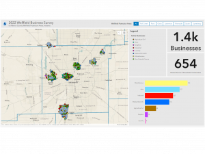
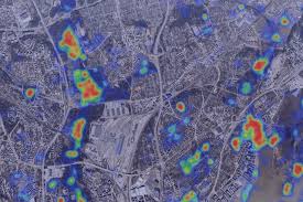
Before reading this article I was unaware at how prevalent GIS is in each of our lives. I was surprised to know that a company like Starbucks uses GIS in order to strategically place each of their locations. I found this specific quote explaining GIS to be interesting “It is not a piece of software, but a scientific approach to the problem: ”how do we define crisp boundaries to demarcate fuzzy and changeable phenomena?” ” I thought this was an insightful way to explain how GIS can be used for many different things.
The identity crisis of GIS began in the 1960s when Ian Mcharg was determining how to fit a highway into the landscape properly. He used overlays of paper with forests, streets, buildings, etc on each layer and determined the best route. This overlay method became the basis for GIS and other spatial analysis techniques. This concept of overlaying paper was translated into one of the earliest GIS systems on a computer. I always find stories of how some of the first computers worked and how they were created to be very fascinating.
In a later section, What Does the Acronym GIS Stand For? The Two Faces of GIS , it explains how important the translation of spatial phenomena is made into digital terms. Slight differences can change the results for analysis, and it is important for GIScience. I found it interesting that GIS is multifaceted and is not just one thing. Overall, I found this reading insightful and thoroughly introduced me to what GIS is and how important it is to society.
- “GIS Application on Endangered Sharks”
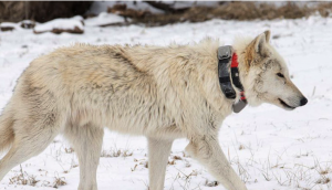
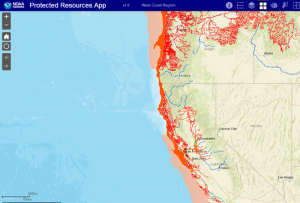
GIS is used very often when determining where animals are most threatened. Making it very important to those who work in conservation. For example, the picture I found shows areas in which habitats of certain animals are protected under the Endangered Species Act. This specific example was made by NOAA Fisheries in order to make it easier for the public to identify protected areas.
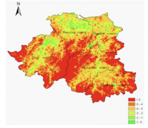
2. “GIS application on plants”
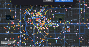
GIS application can be used frequently when dealing with agriculture. For example, it can be used to help determine crop growth while analyzing fertilizer, soil type, and terrain. This map shows “Fertilizer application assessment based on data from field equipment, processed with EOSDA Crop Monitoring.” GIS software is very important in many aspects of agriculture and benefits all who utilize it in order to have the most efficient practices.
https://sites.owu.edu/geog-291/wp-content/uploads/sites/208/2025/01/print.pdf
Sources:
https://www.fisheries.noaa.gov/feature-story/new-app-makes-endangered-species-habitat-easy-find
https://eos.com/blog/gis-in-agriculture/