Here is my Data Inventory and Final Exam:
Geography 291: Geospatial Analysis with Desktop GIS
Module 1: 8/26/2026 to 10/16/2026, OWU Environment & Sustainability
Chapter 6:
For me Chapter 6 was a bit confusing, I first did not really realize that there is a link between ARCPro and ARCOnline. I certainly didn’t realize that the maps created in ARCPro are able to be viewed in the Online ARC app. When I got to the online part I was not able to view my work in my Online account. This is probably because I did not link it correctly and or was not signed into the account on the desktop. I am not sure why there was no link after the second time because I made sure I was logged in. I still was unable to view the map in my Online account so I had to move on.
Chapter 7:
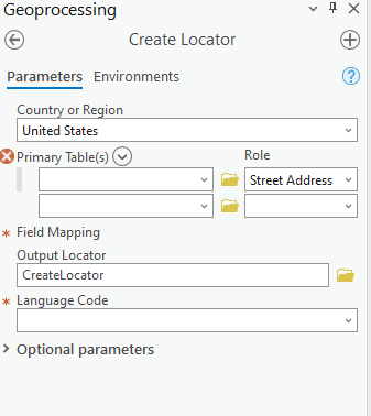
While making this map here I was not able to download the Roads file, but I shortly realized that there was already a road feature in the map. This feature was already built into the map so the Road connection file was not needed for this part of the chapter. The Create locator image shows that there was no road link, just street address. This means the roads are already there and in the attribute table there are already general street addresses linked to the road file.

Chapter 8:
Here in Chapter 8 we had to create a working animation map on the violence in Philly. We created a 3d map of where the high risk areas are throughout the city. Instead of making a graduated color map we put the map on its side and show the data through height of “towers” These columns that are shown in the map show the number of thefts in the area and if the column is higher than the one next to it then in that specific area there has been more theft and violence.
Chapter 9:
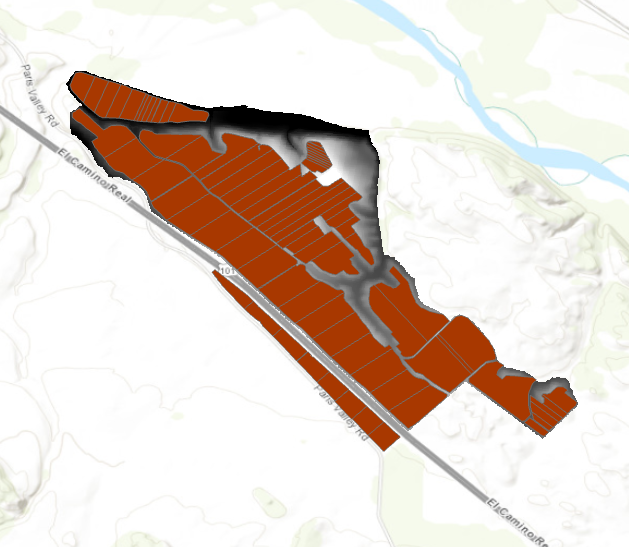
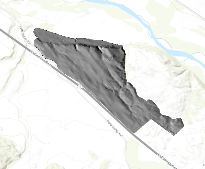
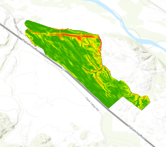
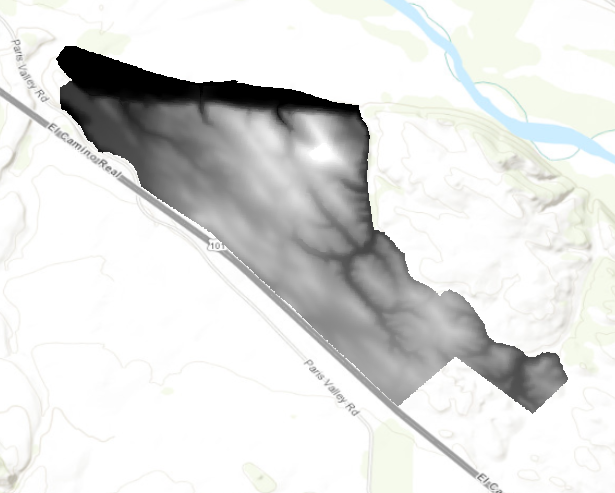
Chapter 9 was I think the longest chapter of them all solely based on the sheer amount of maps that we had to create. We had many different layers in our map that showed many different things. We made an elevation map, a vineyard plot map and two hillshades one with a set sun and one from the camera. In ARCPro we were able to create our own shade because there is a function that lets you choose azimuth and altitude of the sun. This will affect the look of the map because the location of the sun is being changed. The only issue that I had with this chapter was that I was unable to run the suitability part of the lab. Even though I was unable to do the last part of the chapter I felt that I learned and reinforces my skills with elevation, hillshade and plot maps.
Chapter 10:
Chapter 10 was a little choppy for me because I really wanted to finish the chapter but after a couple of times of running the function I was just unable to finish it. I got the first part of the map done with the wifi strength throughout the area. Once I got to the last section I tried to run the function 3-4 times but there was no change or adaptation to the map. The legend and scale part of the chapter was very simple because I have done so many of them before just learning where the button is in ARCPro was nice to find out because the location of that feature changed.
Chapter 1:
I found chapter one to be pretty simple and straightforward in ARCOnline and was able to create all of the maps except one of them. I had a bit of trouble finding my information/data for the request and speeding map. This was the only issue that I had in this chapter and I think it is due to either my initial link to the data got messed up or the information was in the wrong place so I could not find it.
Chapter 2:
I would say this is the easiest one that I have done so far because I have also done this in a separate class with Krygier. I have done a lot of work in ARCPro now so finding where the toolbox is and the location of all the functions are pretty easy to find for me. For some of the measurements and population numbers I found the largest population, China to be 14,608,512. I was also able to get a couple of distances from the measure function so the distance between Toronto and NYC are 350 miles and Calgary to Toronto is 1627.86 miles.

Chapter 3:
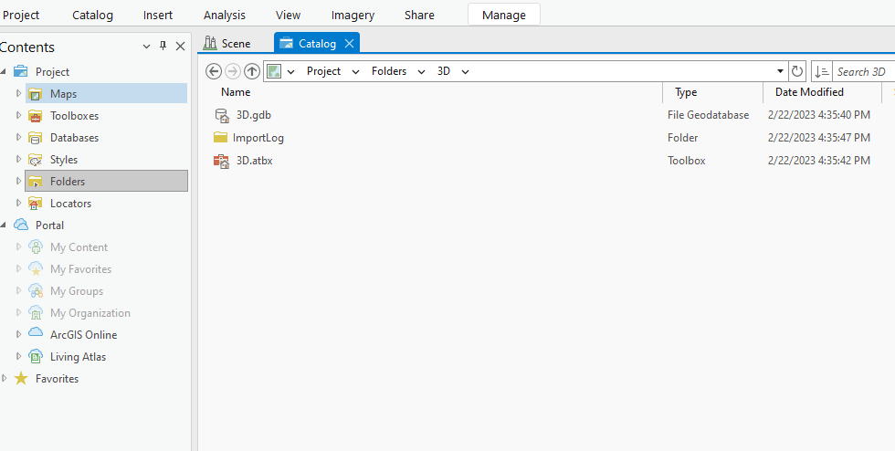
This Chapter was going well until I got to the shapefile step because when I went to input the shapefile into the map there was no Shapefile to be found. The steps leading up to the shapefile went well, I was able to see the fips codes and how they divide each state, county and town up with different number codes. Below I have the catalog open in ARCPro where the shapefile should be, I am not sure why it is missing from the folder but this could be because the folder link to the map was incorrect or the file is in a different location.
Chapter 4:
I feel like I have not linked any of these chapters correctly in ARCpro because everything was going well in the chapter until I got to open the attribute table and found that there was no domain section in the table view. Because the rest of the information is in the table I believe the table must have had a screw up because every other section is found in the table but the one DOMAIN section I was looking for.
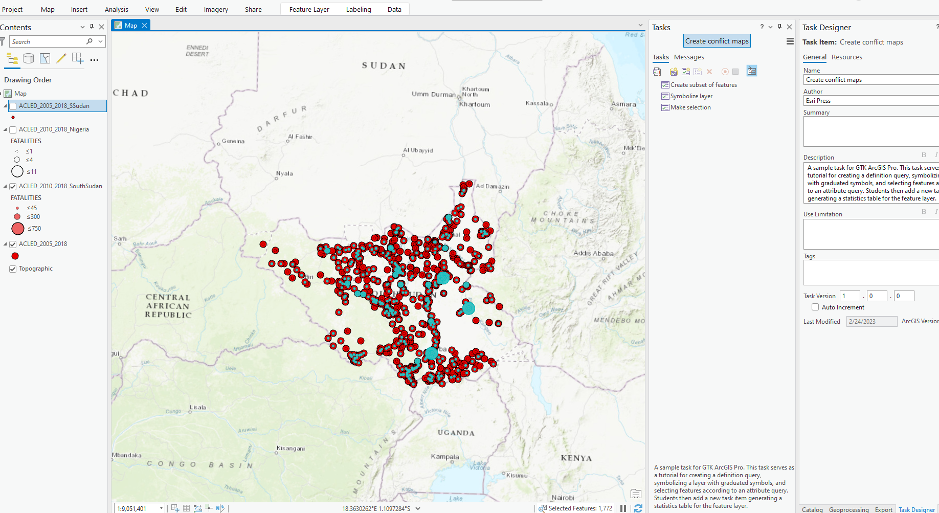
Chapter 5:
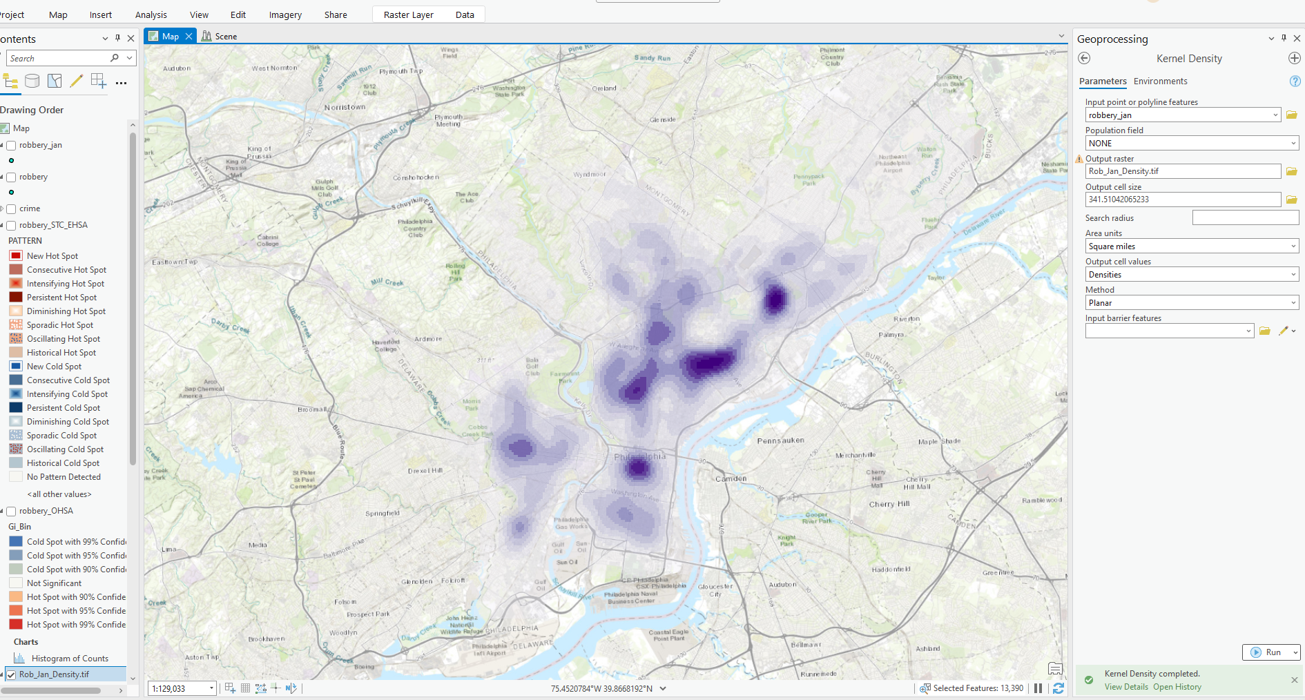
Some of the information found here are things like fatalities, thefts, riots and protests and this was also another easy chapter to get through. I believe I did 5b a little wrong because I see more points on my map then I do in the book but the function behind the data was pretty easy to follow. I will definitely be using these attribute table skills on my projects later on this semester.

Chapter 5: In this chapter the book really explained how to define a map and how to show the information on the page. The three main things that I got from this was showing a clear boundary, a dataset to show your information and visual appeal which makes it easier for the reader to understand the information on the map. By initially creating a boundary you are then able to find what you are trying to portray whether it is showing information through a data set or physically separating areas based on aerial visuals. In order to show data or try to show the people an issue in the area there needs to be clear data that counteracts the claim of the map. The book uses land cover as an example for one of their maps, you can either separate this the different land uses by acquiring data with locations of areas or if you know the area you can separate and boundary off areas as you see fit. The map using the data would be more precise but I believe one that is separated by humans would have more effect on the people. I say this because the information would be through human experience and they are able to see the use of the land including whether it is a healthy area or not. The data would not be able to do this because it would just be in numbers and locations, there is no human interaction with the data or thought put into their separation. So by creating boundaries around the outside of the map you are able to identify an area then by using data or general knowledge you can create a map to put purpose to the information being portrayed inside.
Chapter 6: I would say this chapter is almost the first chapter that really explains some of the features you can use in ARC. The chapter explained the process of finding a location and what information needs to be available for the software to accurately measure an area. The main point from this part is the fact that you need to have two separate layers one being the source layer and one being the surrounding layer. This means the source layer is the map that you are physically creating and the surrounding layer is the map that you are going to measure off of. The book says that by being able to measure distance you can find the square footage of an area, the distance from point A to point B and you can even create routes for cars and transportation by using this surrounding layer. The surrounding layer is something like google earth, an image that does not have the best resolution which is why the source layer will have the better resolution. Because the google earth map is linked to the correct coordinates when you measure on the source map the measurements will be precise. By being able to have this supporting layer underneath the map that you are creating you are also able to have an image surrounding the study area so people can find landmarks that they know of when creating the map.
Chapter 7: This chapter was really about the different ways you can show data on your maps and how to show data over time and or any changing data. I would say the most important part of this chapter would be the fact that you can show several time periods in one map because you are able to link the data to the map. Being able to create time scale maps you are then able to show people in a short video or gif what is going on in a certain area like, population change, hurricane surge times and even wildfire spread over a several day period. This is a great way to inform the people because you can show them what has been happening in the last couple of years and or even show them the danger they could be in during a natural disaster. There are also ways that you can create singular point time maps which can show things like 911 call locations and their timestamps. These point maps are also very helpful when tracking oil spills, wildfires and really any danger that spreads due to the fact that points would be put on a map for the time the spread reaches that location. These maps can show anything from population change to land use change to vegetation change. All of this information would be linked to data which allows the maps to also show graphs and tables as needed. These tables and graphs can show the change to people in numbers so instead of just showing them with images which can broaden the audience of the map.
The first chapter in the Textbook was a serious overview of the breakdown of how GIS runs and can be run. They go through all of the different maps to create while in ARC and how they can show your information in that one map or image. They state that there are two ways to represent geographic features one being in vectors and the other rasters. I have worked with rasters before in classes using ARC desktop but I do not think that I have ever used Vectors. The book states that raster models are one easier to manipulate and two people have a wider range of use for rasters. Vectors are a set of coordinates or data that is plugged into the image to connect lines or show large number changes. Another difference between Raster and Vector models is that rasters are made up of pixels that are taken from a camera lens while vectors get all of their information from a table in the GIS software. So throughout this chapter it really shows and tells us what GIS can actually do and how it does it. I know that there are more aspects to ARC because I have done a map that was not mentioned in the first chapter. Although they didn’t mention it in the first chapter I know that Hillshades will show up later in the textbook but this first chapter was really more of how each aspect works and what it can show. Towards the end of the chapter they move into Data tables and how they can be used to show specific data. Some of the data that they show in the book are things like population change, income throughout an area, land use, people per household, ect. There are many different things arc can achieve using data tables because you are able to link these tables with specific areas in your map so the changing data does not move from where the data has come from.
I would say the focus of the second chapter was to give purpose to the maps that you create and the reason that they were made. It gives just a few examples of the maps that can be created through GIS. They explain the different features that can be linked to the data you are trying to portray, one of them being coordinate pairing. By pairing coordinates the map becomes more precise so you are able to show your data in a more exact way. The book is really looking for the reason the map is being made and how it can help the people or show the people what is happening in that specific area. They also state that by creating separate maps you are able to show a wide range of information because some of the data may correlate with other sets of data. The book uses the example of residential vs commercial areas; they then were able to show assaults, burglaries, thefts and auto thefts in both areas by only using two maps. This is a great example because it gives just a glimpse of how much information can be put into one map or even 2. Another part of the chapter that was mentioned was scale and how it affects the data and the validation of the data. An example they used was how they categorize different features of land. If you are looking at 100 square miles the categories are going to be rough areas whereas if you are looking at a 25 square mile area it would be more precise instead of just showing the general areas.
In chapter three the three main things that I took away from the chapter were the classes, map creation, and looking for patterns in maps. All three of these features are needed to create a map that shows specific data. In map creation you need to first find out what you are going to portray in the map, then the why factor which is for what reason you are creating the map. This would mean what information and audience that you would want to attract. As you are gathering information for the map you are then able to see patterns throughout the area you are studying. This would mean something like income, as they used in the book to show that there is a very clear drop off in income while you exit the heart of income but towards the outskirts the change is very slow. In the chapter it says you are able to see where there is rapid or gradual change in the information portrayed. The last and biggest part of this chapter would have to be the classes because I believe it has the most effect on maps that include data and information. Classes allow you to see patterns in the map so when you take the accurate data that has been gathered you are able to generalize values and show the gradual or rapid change in values across the map. Patterns and classes can be seen in many different ways because it all depends on how precise the classes are and what type of classification you use. There are classifications for all different sets of data in order to portray them correctly on the map. By having classifications you are able to create a much stronger and accurate map because you are using reliable data with thought out classifications.
Chapter 4 was a great one to follow three because it gave me the why for mapping with classes. The chapter says the classes can be used to show density if there is a color shade to them with higher values on one end. The second way the chapter says you can map density is by using a dot map or just dots. So instead of using color to show the information on the map you would use a cluster of dots to show the values. Each dot would represent a certain number in your data and then dots are placed accordingly to match with the data. I think this would be a little rough on the eyes but it is an easy way to show simple data to people and get the point across without any questions. Later on in the chapter they go on to use graduated colors to show density in the maps that they create. So instead of using dots to show numbers they are linking colors with certain numbers in the data to show a fading effect on the map. They use the color read and I believe that this is much easier to read and understand rather than trying to count the amount of dots in a certain area. I believe Graduated Colors are the better option when it comes to showing information for density on a map because people would be able to read it easier and other features would be able to be shown on the map like landmarks or roads. By being able to show roads and landmarks people can see where the map is located and really be able to relate to the map and stay interested because they have seen the area before.

My Name is Carl Mazabras and I am a Geography Major with a Business Minor. I am from New Canaan Connecticut which is 45 minutes outside of NYC. I am on the lacrosse team here at OWU and along with playing lacrosse some of the things I like to do are fish, work, play video games and spend time with my buddies. I have been interested in GIS ever since I took my first class with Dr. Rowley and have even completed a couple of GIS projects throughout my years here at OWU.
Throughout the reading I was able to see a lot of similarities in the breakdown of GIS with how the software works on the computers. The one area that stood out to me was the different layers we are going to have while creating the maps. The three visible layers in the first chapter are land use, land parcels and streets which is very similar to ARC GIS. Last year in the 112 class with Dr. Krygier we did a state population map with many different layers. Those layers consisted of roads, county boarders and state outline. Each of those layers were shown in the hot bar on the left first of the GIS software which could all be turned off or on it just depended on what we wanted to portray. To me this chapter is a great start because it really explains how the software will work without really telling you this is how the software works. I feel that people without any knowledge of ARC GIS will see the relationship from the book when they start to work in ARC because the entire software is based around layers that can be turned off and on to show different maps without changing the area being mapped. Layers can be showing different data or you can even put the layers into a timeline and show the history of an area. In 112 we had 12 layers each layer was in intervals of 10 years and the data linked to each year was the population for that county. We were able to show the population change and growth in the last 120 years working on one map with a ton of different layers.
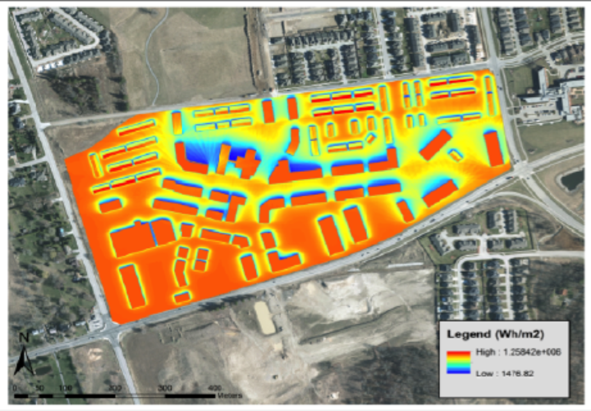
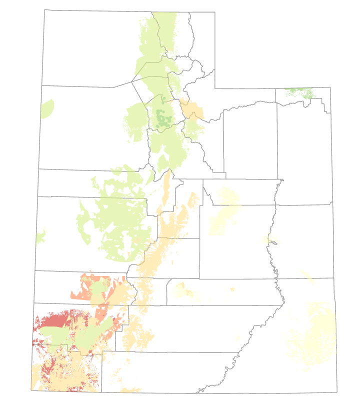
You can use GIS to map out areas for potential solar farms and I have a huge interest in renewable energies so this would be right up my ally. You can use drones to get perfect pictures of the buildings or areas that you want to put solar down. Below I have a map of solar insolation which is showing the wattage of energy that is hitting in the colored area red being high and blue being low. Another way you can use GIS is to map an area for construction to see what the land is made of by doing soil composition testing which has been done a larger scales but not yet done at a small scale like a singular property or block.