Preface
The book covers ArcGIS Pro (desktop), ArcGIS Online (web maps), Living Atlas (ready made data), StoryMaps, and Dashboards. It has three parts: using maps then preparing data and analyzing it. Note: I have no Windows PC, so I ran ArcGIS Pro in Windows 11 through Parallels on my MacBook.
Chapter 1: Introducing ArcGIS
- I already knew most of the terminologies from previous readings but doing hands on work with them made much big of a difference compared to seeing screen shots or reading about them.
- Subsidized FQHC clinics cluster in dense, poor parts of Pittsburgh, while urgent care clinics sit in the suburbs.
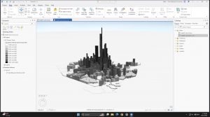
- The 3D scene shows population density far better than shades of gray.
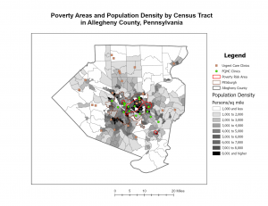
Question: How do planners decide reachable distane for people without cars?
Chapter 2: Map Design
- The subject gets bright colors, and context gets gray.
- My quantile choropleth breaks (830 to 11,595) get wider at the top, so the data is skewed.
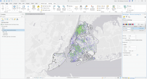
- The dot density map shows two groups (under 18 and over 60) on one map.
- Fixed a broken data source (the red “!”) using Repair Data Source.
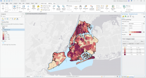
Question: Can quantile classes mislead when a few values are much larger than the rest?
Chapter 3: Maps for End Users
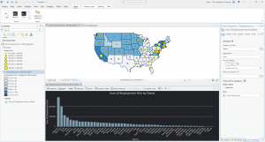
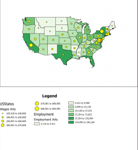
- Built a two map layout of arts employment and wages by state.
- The bar chart shows California (290k) and New York (200k) far ahead in arts jobs.
- I’ll finish the online parts (sharing, StoryMaps, Dashboards) and follow up.
Question: Is employment per 1,000 people a fairer comparison than total jobs?