Huntington Week 4

1.1 This was a good tutorial and I was glad to discover arcGIS is very similar to other programs I’ve used in terms of basic navigation and UI design, so it all felt pretty familiar.

1.2 Standard stuff, moving around the map, making different layers visible at different levels, pop-up windows and some very basic SQL.

1.3 More in depth info about using and manipulating attribute tables, fields of view for attribute data, and using the Statistics tool.

1.4 Symbols are fun! Learned how to change symbols and colors with the symbol window. Learned how to alter labels and add feature classes to the map. 3D maps are so cool. I love this.


2.1 Changing symbol colors, outlines etc. Learned how to change feature colors using unique values to make maps easier to understand.

2.2 Learned how to change label properties, use the conflict resolution tool to prevent overlaps, and edit/ remove pop-up windows for each layer.

2.3 Learned how to make a sub selection of data in a feature layer using SQL and changed the symbology to be more legible.

2.4 Was corrupted, did not work.

2.5  Learned how to analyze data to create symbology that displays the overlap between 2 sets of data.

2.6 Learned how to make normalized population maps and show multiple overlapping layers without turning one off.

2.7 Learned how to create a dot density map and alter the dot size and characteristics.

2.8 Learned how to set the visibility for different zoom levels on individual layers.

3.1 All of the chapter 3 files were corrupted except for 3.3 which was missing. Redownloading the files did not fix this.

Shaw Week 4

Chapter 1

1.1: It took me a long time to figure out how to get the program up and running.

1.2: I am still trying to figure out how to navigate the program but the book and slides are slowly helping.

1.3: The tutorial mainly focuses on how to use the attribute table and the summary statistics tool.

1.4: I was having issues with the 3d model and being able to see it but I believe other people were going through the same issue

Chapter 2

2.1: Still getting used to GIS and how it operates. Learning to display polygons. 

2.2: Learned how to use pop ups, remove duplicate labels, and label features.

2.3: This section was easy to understand, the street icons made it very crowded.

2.4: This section was corrupt and I was unable to display the contents for the neighborhood.

2.5: I was having trouble with this section and figuring out how to have the icons appear. 

2.6:  I was having an issue changing the percentages on this section by doing it manually, I must not be noticing something but I got it as close as I could.

2.7: Was easy to navigate.

2.8: I am not really sure what this section was asking me to do but I believe I completed it, it can also be due to the fact that navigating the west village and lower manhattan seemed like an issue.

Chapter 3

3.1: I was having issues with this one, the top map kept disappearing and I am not sure what I did wrong.

3.2: This section was the easiest one out of the chapter.

3.3: I do not have tutorial 3.3, I downloaded the folder twice and it did not appear. 

3.4: This was the hardest section to do

.

Week 4 Brock

Chapter 1:

Tutorial 1-1

  • This tutorial served as a great introduction for learning how to navigate ArcGIS Pro. I learned how to set up projects for future use, save a project into an .aptx file, and add and remove a basemap.

Tutorial 1-2

  • Learned how to use a pop up window, zoom in feature, zoom in to raster feature class, bookmarks, and search for a feature.

Tutorial 1-3

  • Learned how to work with attribute data, open a table, work with the fields view of an attribute table, select records and features of a map feature class, and obtain summary statistics.
  • All attributes are those provided by a Census Bureau. You can change the order, names, and display names of attributes.

Tutorial 1-4: This tutorial popped up with an error, so I wasn’t able to complete it

Chapter 2:

Tutorial 2-1

  • Learned how to symbolize qualitative attributes and display polygons using unique value symbols

Tutorial 2-2

  • Learned how to label features and configure pop-ups, change label properties, remove duplicate labels, and manage pop-ups

Tutorial 2-3

  • Learned how to filter with definition queries, create a definition query, and symbolize figure and ground features. 

Tutorial 2-4: 

  • The layer that this tutorial wanted me to use said that it did not have a valid data source so I imported the neighborhood data set to fix this issue. Learned how to create choropleth maps for quantitative attributes, create a choropleth map, and extrude a 3D choropleth map.

Tutorial 2-5

  • Learned how to display data using graduated and proportional point symbols and create a map of graduated-size points

Tutorial 2-6

  • Learned how to normalize populations maps with custom scales, create a choropleth map with normalized population and custom scale, and import symbology and use swipe to compare features

Tutorial 2-7

  • Learned how to create dot density map

Tutorial 2-8

  • Learned how to set visibility ranges for labels and feature layers

Chapter 3:

Tutorial 3-1

  • Learned how to build layout and charts, create a layout and add maps to it, resize and place maps, add guides and snap maps to the guides, insert legends, insert text, and create charts

Tutorial 3-2

  • Learned how to share maps online, set properties online, share maps in ArcGIS Online, Use map viewer in ArcGIS online, change the style of a layer, and configure pop-ups

Tutorial 3-3

  • Learned how to create a story in ArcGIS online, add blocks to the introduction, add a sidecar block with a map, add content for the left panel of the map, enable navigation, add credits, and previous and publish a map

Tutorial 3-4 

  • Learned how to create a dashboard in ArcGIS Dashboards, add a map element to the dashboard, add a table element, adjust the dashboard, add a serial (bar) chart, add interactions to the dashboard, and finish a dashboard


*for some reason all of my other screenshots have disappeared, so unfortunately this is all that I could provide.

Bechina Week 4

Chapter 1

1.1

Right off the bat, I like how straightforward the directions are. Though, there could be a bit more detail with where to save files… but, I understand the book may not be written to save files to hard drives.

1.2

I really appreciate how the book first tells you what tab to go to, then group, then the individual features. It makes it a lot easier to navigate things. Learning how to zoom in and out seemed a bit silly to me, but I guess it doesn’t hurt to go over that. 

1.3

I was very surprised at how many “tools” there were in the “toolbox.”

1.4

I ran into a problem in this section… when trying to open the 3D map, I got an error that said “failed to open map view.” I couldn’t figure out how to troubleshoot this so I just read the rest of the tutorial and moved onto the next section.


Chapter 2

2.1

Starting off chapter 2, it was refreshing to see a map other than Pennsylvania… It was getting old. It is interesting to see a map that requires a lot of zooming in to distinguish features.

2.2

This section took me two tries to get down. On my first try, my labeling got all messed up and I restarted from scratch. On my second try, I found it a lot easier. I think I was just rushing through the first time.

2.3 

This section was pretty straightforward and didn’t give me any issues. I liked experimenting with the street width and color just because it’s so detailed and can easily get overcrowded.

2.4 

I had to skip this section as well because it was not opening for me. I made sure to read the tutorial in the book though.

2.5

Chapter 2, tutorial 5 was a very straightforward section. I was overwhelmed initially when the under 18 symbols were so big but it was an easy fix.

2.6

Using the swipe feature to reveal the map underneath was very cool.

2.7

This section really explained why values of certain things are important when considering how detailed you want to be.

2.8

When I first opened this map and zoomed in and out, I noticed how cluttered the school symbols became when I zoomed out a lot, so it was nice that we fixed this in step 3.

Chapter 3

3.1

I enjoyed making the chart in 3.1. It felt like a very advanced version of making charts with google sheets in high school.

3.2

It was very cool to be able to “publish” what I was doing on Arc online. When I was trying to change the symbol color online, I couldn’t do it. I wasn’t seeing a color option like the tutorial said.

3.3

Learning how to publish work in 3.3 was pretty tedious and I was anxious for it to be over. It was pretty cool though.

3.4

3.4 was also a pretty tedious section and I am glad to be done with it.


Gassert, week 4

Ch 1

1.1:  It took me a little bit to sort everything out as I have not used an application like this before, so getting everything started was a little shaky for me. 

1.2: I had a rough time figuring everything out, but after a while things started coming together.

1.3: Being someone that doesn’t understand numbers very well, I had to figure out what the numbers all meant (including some google searches to help me find out what the numbers mean). That was not a fun time, BUT, I’m hoping that’ll change later on once I get the full gist of it.

1.4: I was not able to see a 3D version. Others seemed to have this issue too, so that eases my mind to know I’m not missing something or doing something wrong!

Ch 2

2.1: I’m not sure if I did this 100% correctly. I understand how to change the colors, but the symbol names don’t seem to totally match what’s in the book.

2.2: It took me a bit to find where all the tabs were. I had to go back a few times to figure out how to toggle layers to see where everything is.

2.3: This step was a little unclear to me. I’m not sure if the software didn’t match up here, but I couldn’t find all the tabs.

2.4: This 3D part worked, so I’m not sure why the 3D part 1.4 didn’t. This map looked pretty cool.

2.5: I couldn’t figure out how to get the circle symbol icons to come up. The color gradient worked just fine, but I couldn’t get the circles.

2.6: I got through this part just fine, but I’m not understanding what information it’s trying to tell me. I see the labels and the differences on the map, but I feel like the differences between the two datasets were a little off. 

2.7: This part I understood and got through with ease. This information is easier to read.

2.8: I did everything right here except for the neighborhood labels. I didn’t see what the book was telling me to click on in the application.

Ch. 3

3.1: I got a little lost with the two maps and which one was supposed to be which (it said one of them twice on the application, which ever the green map pop up was). I got the heights right and had to figure out how to make the text bigger.

3.2: I logged in and figured out the site. I took a little while,to navigate the site, but got a hang of it eventually.

3.3: I struggled a bit with finding where I needed to go on the website. I didn’t really understand how this section was supposed to work.

3.4: I couldn’t find the dashboard thing like the book says. I got the map up, but some things the book said didn’t add up with what I was doing.

Nagel Week 4

Chapter 1

  • 1.1: Took forever to get things up and running, granted I can barely work a calculator, let alone a computer. Once things did work though, the introduction was simple and didn’t take long to finish.
  • 1.2: Seeing the different variations and attributes are interesting, but it takes a long time to actually get there and get the different options selected or deselected.
  • 1.3: While I do like to be able to see where the data comes from, there’s a lot of information and it takes a considerable amount of time to navigate through everything to get to the right thing.
  • 1.4: The 3D view and different symbols/colors for different areas are interesting, though figuring out how to vertically rotate the 3D view was a challenge.   

Chapter 2

  • 2.1: Changing the colors and the different options on the palette are cool, although the end result did not entirely look like the picture in the book.
  • 2.2: Section teaches how to label features and change labels. I was not certain I did it right though as no name popped up over the West Village area.
  • 2.3: Slightly more time consuming than the others as changing from tab to tab to change color and symbol is fairly tedious
  • 2.4: Initially broken at first as the neighborhood content section was corrupted and had to be repaired. Was also unclear in asking to move the one tab above the 3D section and not on top of it instead.
  • 2.5: A short section but it did not work. There was no template section nor an area in which I could choose different shapes from as there was prior.
  • 2.6: I suppose learning how to import layers is going to be important at some point. Splitting between the two layers was interesting to see though.
  • 2.7: Short so not much to say for this one other than that there is something inherently satisfying about dot graphs.
  • 2.8: Short but a little confusing as I thought for a minute I had done the same thing twice in a row

Chapter 3


  • 3.1: This one was a struggle to get through. Trying to get parts of maps and labels to snap to an axis was difficult, and a lot of different tabs to navigate through.
  • 3.2: Now I’m even slightly more confused. Took me some time to figure out how to share it, but doing stuff on WebGIS rather than the actual program.
  • 3.3: Took an extremely long time to do, and I’m not very confident in having my work shared online for all to see.
  • 3.4: Shorter and a bit more clear in what it wanted, but halfway through I got stuck with the dashboard as I was unable to find the option to delete x and y value fields.

Hagans Week 4

Chapter 1- Overall, I think this first chapter was a very good introduction to ArcGIS and I’m now more familiar and comfortable with GIS techniques. I like how the book is very explicit with what to do, but also explains how what it’s telling you to do will change the map. Also, I enjoyed the “Your Turn” sections throughout the book so far, because as the book explained, it really helps with the muscle memory of performing these actions and forces you to learn to do things on your own. I also think these gave me a better understanding of where everything is located on ArcGIS Pro. The first few tutorials were focused on showing us how to move around and navigate a map using the Explore button and bookmarks. Additionally, Tutorial 3 showed me how to click on a data point and pull up the summary statistics. Tutorial 4 was very interesting because it taught me how to add, label, and remove a feature class. We also made 3D maps, which is a really interesting way to visualize the data. Below are 2 images comparing the map of 2D data to the map of 3D data. The end of this chapter focused heavily on symbology and assigning unique symbols that can help distinguish between feature classes. This section familiarized me with the Symbology pane and how to change the map’s visuals. Overall, I didn’t have any problems with this chapter and I enjoyed putting what we’ve been reading about into practice. 

Chapter 2-  The second chapter was still fairly easy, but I think it was a little more challenging than Chapter 1 and I did run into a few problems. Overall, the chapter went more into depth about symbolizing maps, using graduated symbols, scales, and dot density maps. I think the most confusing part of this chapter was choosing which methods to use in choropleth maps because it seems like you would need a pretty good understanding of statistical concepts like data distribution. I was just pressing whichever method the book told me to, but if I had my own set of data with a particular distribution, I’m not sure I would know which scale or method to assign it that would display it the best. Another slightly confusing part of this chapter was the definition query because I think this part may be a little too computer science-ey for me. I learned how to remove duplicate labels, change font size and color, and more about 3D maps. Another cool thing this chapter taught me was how to change the Visibility Range of a feature layer so that it can appear or disappear when you zoom in or out. I think that this aspect of ArcGIS helps with navigating the map and reduces the cluster and busyness by only presenting data when you’re zoomed to the correct visibility range. Below is a picture of some of the feature layer labels when zoomed in. The other picture shows the colors of the map that are displayed as Unique Values with some cool colors.

Chapter 3-  Chapter 3 was interesting because it incorporated the web version of ArcGIS. This chapter started out by teaching us how to make a map layout, add legends, use the ruler to line things up, and export a map. I liked learning how to make the map layouts because I think this would be important for using a map for an educational purpose and presenting it to people. This chapter also taught me how to create a chart based on the data from the map. I have a picture of one of the graphs below, and I thought it was cool how you could select certain data points within a feature layer to include in the graph. This graph only shows the employment of 10 states, rather than all 50. Once again, I think this is an important technique that allows you to visualize the data better and look at trends without being overwhelmed by an entire dataset. After this tutorial, they switched to ArcGIS Online, which I have some experience with, but not as much as with ArcGIS Pro, so there was a bit of a learning curve, but luckily it seems pretty intuitive. I think the web version is very user-friendly and easy to use, but seems to lack some of the more advanced features of ArcGIS Pro. This section taught me how to share a map on ArcGIS Online and how to create an ArcGIS StoryMap. Creating a StoryMap seems fun, but I think it would be even better if I weren’t copying and pasting random text into a box and I was using my own words, maps, and data. Nevertheless, it was a good way to introduce how to use ArcGIS Online to reach a broader audience because of its cool visuals. Below is a screenshot from the ArcGIS StoryMap it had us make, where we could upload a map from ArcGIS Pro that can be navigated online.

Mulloy Week 4

Chapter 1

1-1 — I do not have any questions or comments on this chapter overall. I am very confident in my computer abilities and knowledge, so learning this program has been very easy for me, as much knowledge has transferred over.

1-2 — This section was very simple and mostly just covered how to navigate the  programs menus and maps.

1-3 — This tutorial was about learning how to use the attribute tables and the summary statistics tool to get statistical information from the map.

1-4 — This section was all about learning how to label things and add or change symbols for features. I could not get the 3d Map to open.

Chapter 2

2-1 — This taught how to assign different colors to different feature classes.

2-2 — This taught how to label features and change the label properties. It also teaches how to manage pop ups when selecting a feature.

2-3 — I found the part regarding setting each symbol to a different shape and color tedious from previous sections, however knowing how to separate features based on other classifications is very useful. 

2-4 — For this one, I ended up running into a problem where the source data was not set for the “Neighborhoods” layer, and I had to manually set it. Luckily, it was pretty easy to find it, because the file paths were all named logically.

2-5 — This was a very short section on a very simple concept that expanded off previous ones, just using symbols to explain

2-6 — Learning how to import settings from a different layer and apply the same parameters to another layer is incredibly useful for comparing the two layers.

2-7 — This section showed how to use density dot maps, which is the other density map we learned of in the previous book.

2-8 — This taught how to adjust which features/labels can be seen from different zoom levels. This is very useful to prevent clutter, however I wish other virtual maps allowed me to change these min/max of visibility. I often find myself unable to determine what area of a map I’m looking at when zoomed too far in. 

Chapter 3

3-1 — It’s strange, I feel, that map layouts were introduced at the very beginning and are not mentioned again until this point.

3-2 — Using WebGIS was a nice change of pace. I feel this is far simpler to navigate than Desktop, but it also feels more limited.

3-3 — I quite enjoyed being able to learn how to display my data in a meaningful and organized way, even if they did just tell me to copy and paste everything.

3-4 — This final section of this chapter was about how to create and assign data to graphs, charts and dashboards. It was quite interesting and at this point of the class it feels like we’re getting to the point where this information can really be applied to the real world and used in meaningful ways.

Howard Week 4


Disclaimer: I do not have access to the book right now, just the files and the screenshots, so I am going from memory when discussing the tutorials because I don’t want to ask to take away one of the class copies while everyone who has them is working hard. I am using a lot of screenshots to prove I did the material since I can’t talk too much about what each tutorial was like.

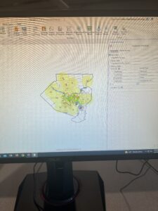
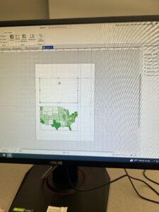
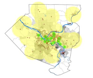
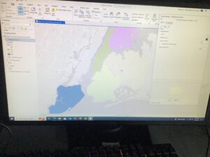
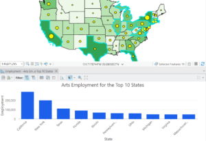
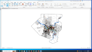
1-1: I liked that this tutorial culminated into a finished product by the way of that image. It helped me make sense of everything better.
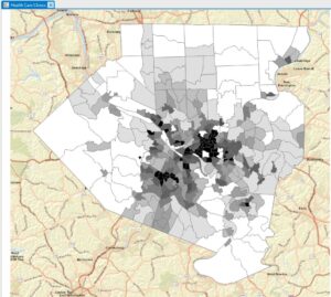
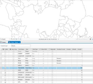
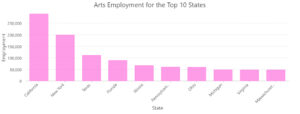
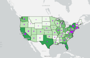
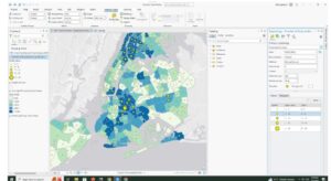
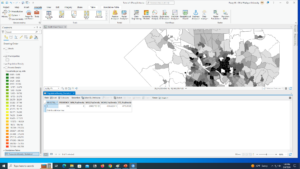
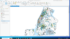
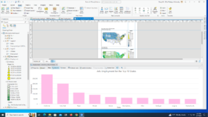
1-2: Screenshot (8).pngHere is the finished table for this tutorial. I feel like learning about tables will be very useful.

1-3: Screenshot (9).png I don’t really remember much about this tutorial unfortunately, but I think it was about tables again.
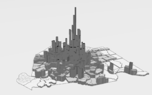
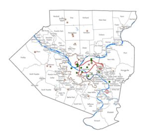
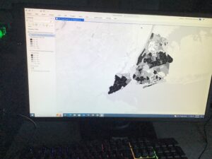
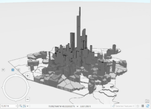
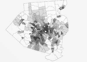
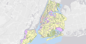
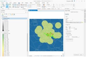
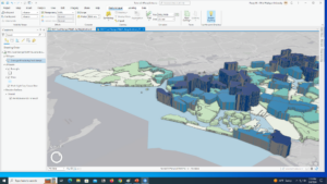
1-4:Screenshot (10).pngThe 3-d aspect was really cool! It’s really interesting to me how these graphics work and how the 2-D map I was acquainted with transformed into this.
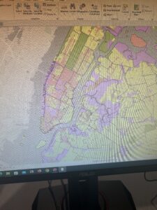
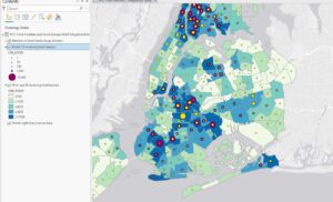
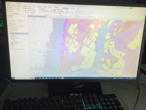
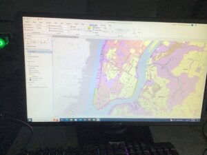
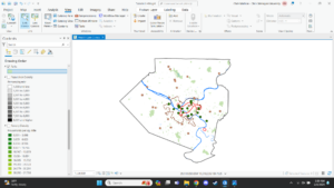
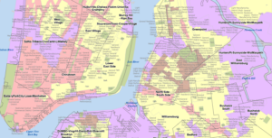
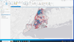
2-1:Screenshot (11).pngI enjoy working with symbology, that process seems to make more sense to me than others. Plus, it just looks nice.

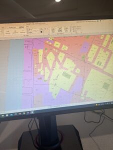
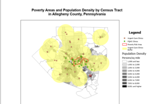
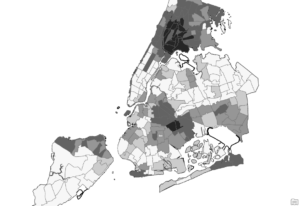
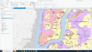
2-2: I believe this one was making mini-labels to label each different color/type of land use. I like that you are able to do that, I think it makes identification of your contents easier.
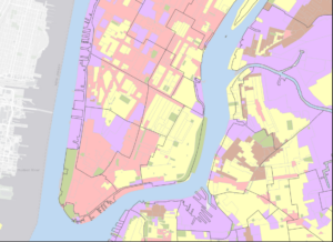
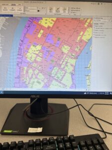
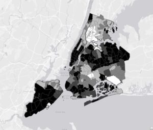
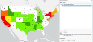
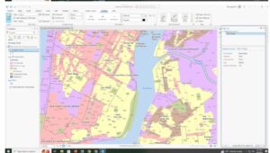
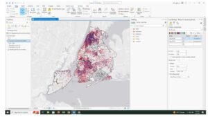
2-3: Screenshot (12).pngAnother example of correct symbology.

2-4:Screenshot (13).pngThe field that the book asked for was not popping up for me in any way for some reason, so I attempted to use the ObjectID one which must have been a very wrong choice because my final result was no colors and nothing popping up on the map. I wasn’t able to really do this tutorial.
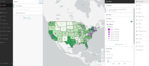
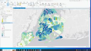
2-5: Screenshot (15).pngBack on track with this tutorial, I was able to actually do this one. Here’s yet another screenshot of symbology because I guess that’s what I mainly took pictures of.

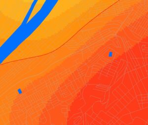
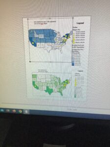
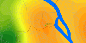
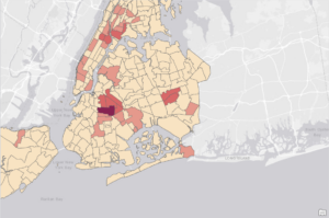
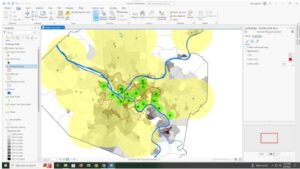
2-6: The swipe feature that lets you see one data set underneath another was actually really cool. I wouldn’t have thought of that being a thing but I think if you were presenting this map as a project it would make the audience more engaged.
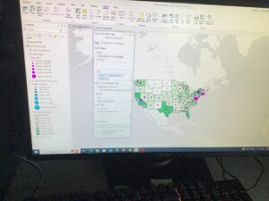
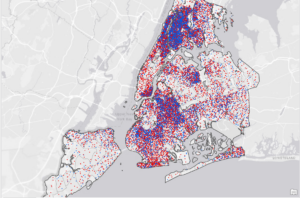
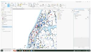
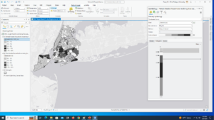
2-7: Screenshot (16).pngYet another symbology screenshot. I guess you can say my main takeaway from these tutorials is that I like colors and symbols a lot. Did I really not take pictures of anything else?
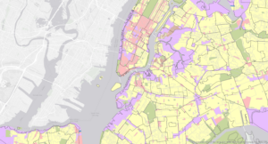
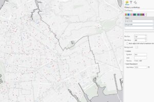
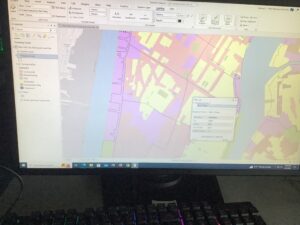
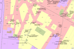
2-8: Screenshot (17).pngI had some issues with the labeling on this one I think. I couldn’t get the labeling to only go on the West Village bookmark like the book asked. Not sure what I could’ve done wrong other than I must’ve missed something small.
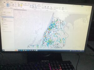
3-1: Screenshot (18).pngCouldn’t find the “click text, expand position, and for height, type .45” that the book said to do, so I instead made the Offset Y .45 instead because it seemed close enough to me and thats what I could think of. Also manually moved the text box to look like the one in the book. I think for this one I was just not thinking hard enough. I did search forever for that height section though.
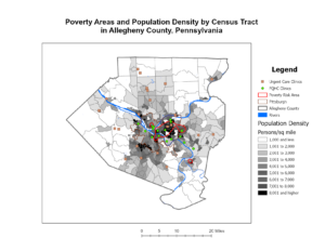
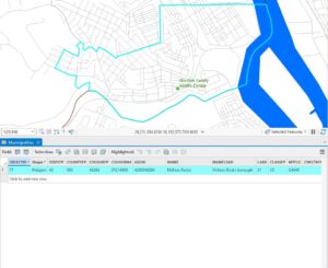
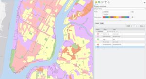
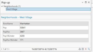
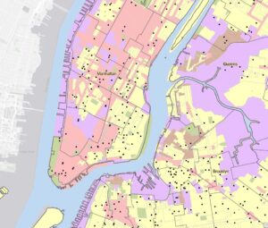
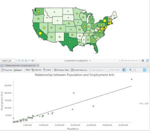
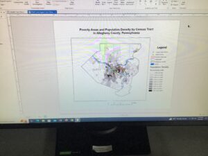
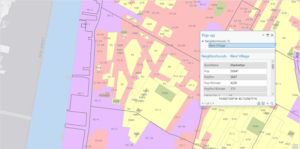
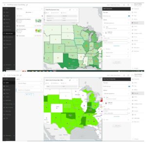
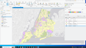
3-2: Screenshot (20).pngHere is the completed version of this map, with the correct information in the popup (because for some reason throughout these chapters that didn’t happen for me all the time). Right as I had kind of figured out the software, we switched to the website, which was way different and interesting to try to understand.
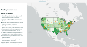
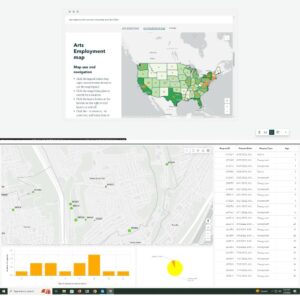
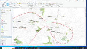
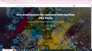
3-3: Screenshot (21).pngCreating a story was very different from what I was originally expecting my coursework to be like in this class. I think the style of the story is sleek and interesting and makes showing your information more engaging. I can absolutely see this being used for a multitude of things.

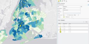
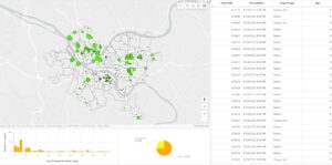
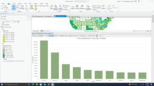
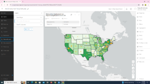
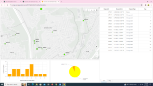
3-4: Couldn’t seem to figure out how to do the “Adjust your dashboard” section. Dragging the map and docking it weren’t coming up as options for me for some reason. The rest of 3-4 I was able to do. The idea of a dashboard to show information is interesting, I liked all the ways you can customize one.

Overall, the work this week was different from what I expected by the preliminary readings, and took longer than I anticipated. I also struggled to get the software up and running at the beginning, as I had to do a software update and click around to have the beginning map show on my screen, because it didn’t for some reason. There’s a lot more tutorials for next week, so I’m already setting aside more time than this week to work on everything.

Schtucka week 4

1.1 – I was intimidated at first having to put my reading into practice, but the book makes it so easy. I love how it talks you through it and understands that it is the reader’s first time using the software.

1.2 – I don’t like how we learned about pop-up windows here but then didn’t use them again until chapter 3. 

1.3- Using the attribute table confused me at first, but after working with it a few times and some trial and error I think I have it down. I will keep this section in mind though as a reference for when I have to use one next

1.4- For some reason, I could not get the 3D version of the Population Density to work. I restarted and tried multiple times and was not able to get it.

2.1 – Learning how to use a symbol was so much easier than I thought it would be. 

2.2- I found this section relatively easy. It was a lot of repeating the same process over and over. It is useful to know how to turn off repeating labels.

2.3- One section in this tutorial wanted me to make ManhattanStreets a ground feature and I wasn’t sure how to do that so I skipped that step. 

2.4- Creating a 3D choropleth map was the highlight of this assignment. It took me a few tries to get it right, but it was so rewarding in the end. 

2.5- I really enjoyed reading about graduated sizes in Mitchell, so getting to do them was really cool. A repeating trend in this book is everything actually being a lot simpler than I thought it would be. 

2.6 – This section was a little confusing for me. It felt like I was just doing what the book said but didn’t actually understand it. I’ll have to go back and read about it more and do some individual research.

2.7- Reading about dot density maps they seemed more complex than actually making them. I also found it interesting changing the dot value around and playing with the features. 

2.8- I think it is really useful that you are able to change what features show when you zoom. I had a lot of fun making this section.

3.1- While creating my map titles I had a had time figuring out number 6 in the Insert Text section. It says to Click Text, expand Position, and for Height, type 0.45. However, my Position did not have height, but there was a size section that I found height in and use that, however, it did not look like the example.

3.2 – It was a good change of pace to go to ArcGIS online after working in ArcGIS Pro itself for so long. ArcGIS online is equally as easy to navigate as the ArcGIS Pro software, and I like how the online version mirrors the functions and wording as the software. 

3.3 – I felt like this section was very repetitive. I would have liked just reading about creating the website instead of actually copying and pasting what they wanted me to. 

3.4 – I really liked this section! I thought it was really interesting to build my own dashboard and be able to customize it with what I think is the most important and make it how I want to look visually.