Hameed Week 2

Chapter 1: Unveiling the Power of GIS:

Mitchell’s first chapter serves as an eye-opener to the world of Geographic Information Systems (GIS), elegantly laying out the foundational stones of spatial data representation, including the critical distinction between vector and raster data formats. As someone new to GIS, I found this distinction not only fascinating but fundamental to understanding how GIS analyses can be applied to various real-world scenarios, from urban planning to environmental management. The chapter goes beyond mere definitions, delving into the significance of GIS in decision-making processes by illustrating how spatial data, when effectively analyzed, can unveil patterns and relationships that are not immediately obvious. This brings me to ponder the depth of impact these data formats have on the analysis outcome. How do vector and raster influence analytical precision and applicability in real-world scenarios? Moreover, Mitchell’s examples prompt a curiosity about the tangible impacts of GIS in critical decision-making areas. Are there notable case studies where GIS analysis directly influenced outcomes in urban planning or environmental conservation? This reflection not only deepens my appreciation for GIS’s analytical power but also sparks a keen interest in exploring its practical applications further.

Chapter 2: Deciphering Data Models and Representation:

Mitchell’s second chapter ventures deeper into the realm of spatial data models, shedding light on the pivotal roles of discrete and continuous data, alongside the concepts of scale and resolution in GIS. This exploration is crucial for anyone aiming to master GIS, highlighting how the selection of data models significantly influences the accuracy and visualization of spatial analyses. The nuanced discussion around scale and resolution, in particular, resonates with me as it underscores the intricacy of geographic data representation. As I delve into the complexities of data models, I’m led to question the extent to which the choice between discrete and continuous models affects the analytical outcomes in environmental studies. Furthermore, Mitchell introduces the critical aspect of metadata management, which is vital for understanding and interpreting large datasets. This raises another pertinent question: In the context of extensive GIS projects, what are the best practices for managing and utilizing metadata to enhance data quality and reliability? The chapter not only broadens my understanding of the technical aspects of GIS but also encourages a deeper consideration of the methodological choices that underpin effective spatial analysis.

Chapter 3: Mastering Spatial Analysis Techniques:

In the third chapter, Mitchell dives into the core of GIS functionality—spatial analysis techniques. Through a comprehensive examination of overlay analysis, buffer analysis, and spatial interpolation, the text unveils the sophisticated arsenal of tools available for dissecting and interpreting complex spatial relationships. This exploration is particularly enlightening for me, showcasing the multifaceted applications of GIS in tackling environmental and urban planning challenges. Each technique is presented with practical examples, illustrating how GIS can be employed to address real-world problems through meticulous spatial analysis. This prompts me to reflect on the broader implications of these techniques: How can they be effectively applied to understand and mitigate environmental issues, and what challenges might analysts encounter when translating these sophisticated methodologies into actionable solutions? Mitchell’s discussion not only equips me with a deeper understanding of spatial analysis capabilities but also ignites a curiosity about the practical challenges and opportunities in applying GIS techniques to environmental and urban planning projects

Andisman, Week 3

Chapter 4 Mapping Density

Mapping density allows for the visualization of the concentration of the values that you are studying, therefore, displaying patterns potentially indicating what action needs to be taken if areas meet your criteria. Mapping density is often displayed through degrees of color and can be in a general/fuzzy display like weather radar or clear separation such as with states, or through the distribution of symbols such as in dot density. Density can be achieved by simply mapping the locations of features. Using measurement units such as hectares or square miles, map density shows you distribution across the area. Density can be useful for something like population. It is important to note the difference between mapping features and feature values. Features could be the locations of businesses, or feature values could be the number of employees at each business, and therefore the patterns visualized with density can be very different and used for different purposes. There are two ways to create a density map, either by defined area or by creating a density surface.  Density value for an area is calculated by dividing the total number of features or total value of features by the area of the polygon. A density surface is typically created with GIS as a raster layer. This is a more detailed approach but requires more work. Use map density if you already have data, lines, or points summarized by area. On the other hand, use density surface if you have individual locations, sample points, or lines.  


Chapter 5: Finding What’s Inside

This chapter explores three ways to see whether an activity is happening inside an area or summarize information from multiple areas to compare. An example of this could include monitoring specific types of arrest, or chemical exposure. This can be done within a single area, or several areas. This chapter also recalls differentiating discrete vs. continuous features. The first of the three ways to find what’s inside is to draw areas and features by making a map that shows the boundaries of the area. This approach visualizes whether or not the features you’re looking at are inside or outside an area, and you need a dataset containing the boundary of the area and another dataset containing the features. Another approach is selecting the features inside the area. You do this approach by specifying the area and the layer containing the features so that GIS can select a subset of features inside the area. This approach is beneficial for generating a list/summary of features in an area and needs a dataset containing the areas, a dataset containing the features, and, if any, attributes you want to summarize. Finally, the last approach is overlaying the areas and features. With this approach, GIS combines the area and features to create a new layer with the attributes of both. It is good for finding features that are present in multiple areas, and needs a dataset containing the areas and a dataset with the features. When selecting which approach to use, consider the guidelines for choosing: If you have a single area and only need to see the features inside, use the draw the areas and features approach. On the other hand, if you have a single area but need a list or summary of discrete features fully or partially inside. Finally, use the overlay option if you have multiple areas or need a summary of continuous values. 


Chapter 6: Finding What’s Nearby

This chapter focuses on the aspects of looking outside the target area’s boundaries and assessing what is nearby within a set distance. It can help for  tasks such as monitoring  occurrences, examining nearby relevant factors, or addressing impacted nearby areas. ‘Traveling range’ is a noteworthy term for this chapter, and can be measured by distance, time, or cost. Similar to finding what’s inside, there are three approaches to finding what’s nearby. You can measure straight line distance, measure distance or cost over a network, or measure cost over a surface. It is important to understand and consider the nearby features because what is outside the focused area may be highly relevant to the internal mapped area. This outside distance is called the feature’s area of influence. Straight line distance is used for defining an area of influence around a feature, creating a boundary, or selecting features within the distance and is a relatively easy approach that measures distance. Though, it only gives a rough approximation of travel distance. Distance/cost over a network is used to measure travel over a fixed infrastructure and has the capability to measure distance or cost, though can be more in depth because it requires an accurate network layer but offers a more precise result. Finally, using cost over a surface is used for measuring overland travel and calculating how much area is within the travel range. It has the ability to measure cost and gives you the ability to combine several layers, however, it requires some data preparation to build the cost surface.  


Andisman, Week 2

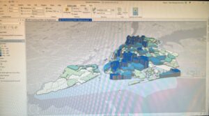
Chapter 1: Introducing GIS Analysis

Furthering an idea from the Schuurman reading that states that the effectiveness of GIS is up to the understanding of the assumptions used to govern the compilation, analysis, and visualization of the data determine how accurate or applicable the data is, the Mitchell book quickly reinforces this topic by informing the reader that, “To do effective GIS analysis, you still need to know how to structure your analysis and which tools to use for a particular task.” Between these two sources making a clear, repeated articulation of this idea, it is evident that one must understand that GIS is a complex process that cannot be properly executed without a thorough understanding of its application and assumptions. To me, this stresses that one cannot passively use GIS. Though it is a computer program meant to simplify data processing, visualize complex information, and take away human handwork, it is not a simple application by any means. GIS, though it can indeed range to degrees of complex research, is found in our everyday lives without us often thinking about it. The Mitchell book addresses that the most common geographical mapping tasks that are done are “Mapping where things are, Mapping the most and least, Mapping density, Finding what’s inside, Finding what’s nearby, Mapping change.”

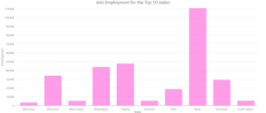
For a stepwise consideration of the approach to GIS, you begin an analysis by “framing the question.” This entails determining what information it is that you need, and is often in the form of a question. For example, how many banks were robbed in 2019? Increased specificity will improve your approach. The data must also be understood, because the type of data will determine the specific method that you need for your approach. After this building of foundation, you will choose a method. Following this, you will process the data with GIS, and then interpret the results. 

Other things to be aware of are the different types of geographic features. Some of these features, and their definitions as explained by the text, include:

  • Discrete Features – “For discrete locations and lines, the actual location can be pinpointed. At any given spot, the feature is either present or not.”
  • Continuous Phenomena – “Continuous phenomena such as precipitation or temperature can be found or measured anywhere. These phenomena blanket the entire area you’re mapping—there are no gaps. You can determine a value (annual precipitation in inches or average monthly temperature in degrees) at any given location.”
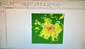
  • Interpopulation – “Continuous data often starts out as a series of sample points, either regularly spaced, such as sampled elevation data, or irregularly spaced, such as weather stations. The GIS uses these points to assign values to the area between the points, in a process called interpolation.”
  • Centroids – Center points
  • Summarized Data – “Represents the counts or density of individual features within area boundaries.” For example, the number of businesses in each zip code. The data value applies to the entire area, but not to any specific location within it. 
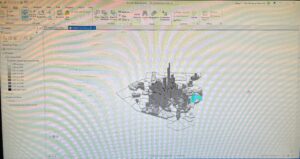
  • Vector Model – “Each feature is a row in a table, and feature shapes are defined by x,y locations in space (the GIS connects the dots to draw lines and outlines). Features can be discrete locations or events, lines, or areas. Locations, such as the address of a customer or the spot a crime was committed, are represented as points having a pair of geographic coordinates.” Much of the work with vector data involves summarizing the data. 
  • Raster Model – “With the raster model, features are represented as a matrix of cells in continuous space. Each layer represents one attribute (although others can be attached), and most analysis occurs by combining the layers to create new layers with new cell values.” The cell size used with affect the analysis results and the look of the map, and should be determined based on the original map scale and minimum mapping unit. 
  • Geographic Attribute Types 
    • Categories – Groups of similar things 
    • Ranks – Used to put features in order, relatively
    • Counts; amounts – Show total numbers of features on a map; any measurable quantity associated with a feature
    • Ratios – The relationship between two quantities. Types include proportions and densities. 
  • Counts, amounts and ratios are continuous values


Use of the two models can be applied to essentially any feature type, however, it is typical for discrete features and data summarized by area to be used with the vector model, continuous data with either, and numeric values using the raster model. An additional note that discrete features can be use with raster when combining the with other layers in a model. Care should also be taken when selecting a map projection and coordinate system as this can be a point of error if not from an established GIS database.  


Chapter 2: Mapping Where Things Are 

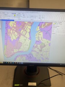
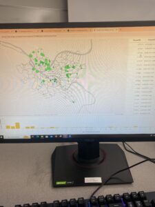
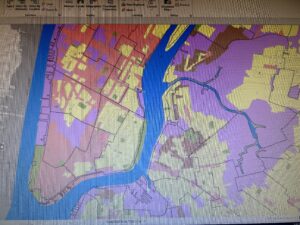
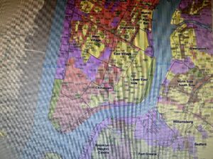
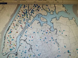
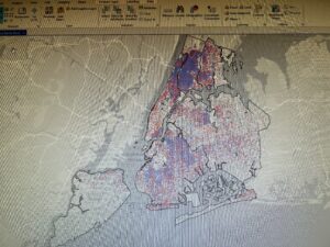
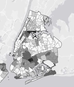
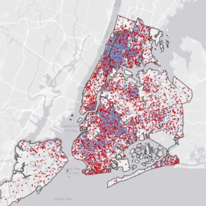
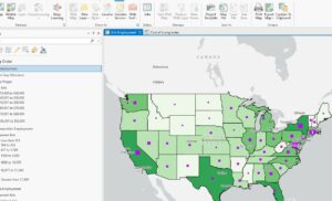
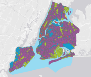
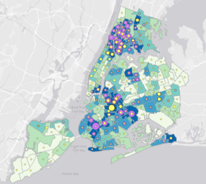
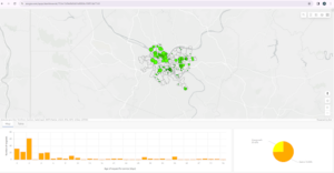
Using the distribution of features on a nap rather than individual features is the right way to approach visualizing the patterns present in the map and therefore allow you to better understand what you’re mapping. The function of mapping is to show you where things are, where you need to take action, or what areas meet your criteria. Analyzing the locations of features and the patterns that they present ultimately allows you to explore the causes of the patterns. In order to search for geographic patterns in data, you map the features in a layer through they use of different symbols. When displaying mapping to an audience, it is important to provide the appropriate amount of information. An unfamiliar audience will need to see detailed information, whereas a familiar audience will not need as much context. Additionally, the size of the area mapped also influences how much detail should be included. As preparation for making a map, the features mapped will need to have geographic coordinates assigned, and, optionally, have a category attribute with a value for each feature. When mapping features by type, each feature must have a code that identifies its type. To do so by adding a category, create a new attribute in the layer’s data table and assign the appropriate value to each feature. Finally, to create the map, tell the GIS which features you want to display and with what symbols to use to draw them. This can be mapped in a single layer or show them by category values. Mapping with a single feature would have all features drawn using the same symbol. Single feature mapping can be useful to visualize differences. Mapping a subset of features can also be used to reveal patterns that aren’t apparent when mapping all features. Features mapped by category would be done by drawing different symbols for each category value and can provide an understand of how a place functions. It is also important to note that if you are showing several categories on a single map, do not display more than 7 colors, otherwise it will be too different to differentiate the categories and patterns, especially when mapping an area that is large relative to the feature size. If using more than 7 categories, it can be beneficial to group them to aid in the visualization of patterns. The use of less categories by grouping can cause some information to be lost, but can make understanding more simplified. Explicit description must be included in the report or map to explain groupings if used. At this point, I recognize that the use of GIS itself is also a process of layering. Each step has precise checkpoints and considerations that must be done in the proper order. Just as the final output of GIS is a map of layers and interpretation, so is the process to create a mapping. This chapter summarizes the importance and techniques in making legible and comprehensible maps. 


Chapter 3: Mapping the Most and the Least

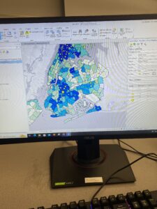
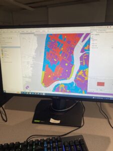
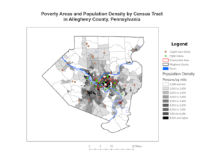
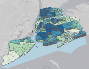
Mapping the most and the least allows for a comparison of places based on quantities to find places that meet specific criteria, give direction for action, or examine relationships. Quantities associated with discrete features, continuous phenomena, and data summarized by area can be mapped this way. Highs and lows can be visualized on maps in ways such as thinner/thicker lines, larger/smaller symbols, or shades of colors. Quantities can be counts, amounts, ratios, or ranks and are mapped by assigning symbols to features based on an attribute that contains a quantity. Counts; amounts = Show total numbers of features on a map; any measurable quantity associated with a feature. Note: If summarizing by area, using counts/amounts can skew patterns if the areas vary in size and ratios should instead be used to accurately represent the distribution of features. Ratios are particularly useful when summarizing by area and show you the relationship between two quantities and are created by dividing one quantity by another for each feature. They can be useful to even out differences between large and small areas, or areas with many/few features to more accurately show the distribution of features. The most common ratios used are averages, proportions, and densities. Averages: Comparing places that have few features with those that have many. Proportions( often a %): Show what part of a whole each quantity represents. Densities: Show where features are concentrated. Be careful not to create ratios from other ratios! Ranks are useful when direct measure are difficult or the quantity represents a combination of factors because they show relative values rather than measured values. After determining the types of quantities that you have, you decide how to represent them on the map by grouping the values into classes, and classes are especially valuable when used in maps for public discussion because it allows for faster comprehension. As a way to search for patterns in raw data, though it is slightly more complex, individual values can be mapped to be helpful if you are unfamiliar with the data, are looking for subtle patterns, or are deciding how to group values into classes. When manually creating classes, this should be done if you are looking for features that meet specific criteria or values. Alternatively, standard classification schemes should be used if you want to group similar values to look for specific patterns in the data. Four of the most common schemes are ‘natural breaks,’ ‘quantile,’ ‘equal interval,’ and ’standard deviation.” Reference to this chapter can specify the details and differences of the different classification schedules. This chapter further summarizes that knowing the purpose and audience of the map is a key factor in forming an effective, understandable, and accurate map. 

Andisman, Week 1

  1. Introduction: Hello! My name is Payton Andisman. I am a senior majoring in Biology with a minor in music performance. Outside of classes, I enjoy being involved with theater, fitness, and listening to podcasts. I am taking this class for its skills that can be useful in the environmental science fields. 
    1. Schuurman reading comments and thoughts: 

    I learned that the roots of GIS date back to the 1960’s where early visualizations were done by hand and not computer. Unlike Spatial Analysis that generates information from maps or data alone, ‘mapping’ represents geographical data, with varying degrees of consistency, in a visual form. It does not create more information than was originally provided, but does provide a valuable means for the brain to discern patterns. Over the course of its development, modern GIS is an outcome of both social and technological developments. GIS is a tool of visualization that is governed by the human interpretation of data and computer algorithms, allowing for the intuitive understanding of data. I noted Schuurman’s description of the “love hate relationship” with GIS because of its faults and biases, indicating how even with the advanced computing technology, it is up to the understanding of the assumptions used to govern the compilation, analysis, and visualization of the data that determine how accurate or applicable the data is. 

    I was intrigued by a portion of the first page:  “philosophical implications of using GIS for research, planning, marketing, environmental management, or other tasks.” I was curious how this would go on to be described because “philosophical” wasn’t the word that I expected to be paired with a data compiling software. Before reading on, I wondered what similarities and differences might be involved with the implications of GIS software for important studies  vs. the moral concerns of AI software. 

    Additionally, the introduction articulated that GIS’s reach lies far beyond the boundaries of scientific research and extends into a vast array of fields. Use of this software and understanding of its methods can be a valuable tool for many careers, projects, and of course, scientific data.

3.

Application: A personal interest of mine is the field of coffee growing and roasting. I looked into GIS and coffee farming on Google Scholar and found many examples of GIS being used for the study of and planning for coffee farming.  

This map shows: “Potential Arabica coffee yield (t ha−1) predicted using ordinary kriging in the ten agroecological zones based on actual yields (tha−1) measured at sample sites.” https://journals.plos.org/plosone/article?id=10.1371/journal.pone.0107449 

Another application that GIS can be a part of is the study of animal migration. This map “shows the migration routes of White Storks fitted with transmitters received by satellite over Turkey. This data can be used by the Turkish, Israel, US, NATO Air Forces, to avoid collisions with migrating.” https://www.researchgate.net/profile/Judy-Shamoun-Baranes/publication/267385744_Development_of_a_GIS-based_Bird_Model_Migration_Model_for_the_Middle_East/links/54c0df870cf216

Rose Week 4

Chapter 1


This chapter was a good run through of some of the basic actions of ArcGIS pro. Also looked at some of the attributed data and feature classes within the map. Some of the things within this chapter were difficult but others very easy to understand. Definitely comes with just usage of the program. Like others I had issues with chapter 1-4 which is unfortunate because seeing the 3D model would be very interesting. So far the tutorials have been pretty straightforward and easy to follow. 

Chapter 2


This chapter started diving much deeper into what ArcGIS has to offer. Much of it dealt with the symbolization on the maps and how to change it. My chapter 2-4 had issues running and could not complete that one however. I found the maps really interesting as they looked at New York City, Manhattan and the West Village specifically. This interested me as I used to live in New York City(in Queens though) and much of the data was on food pantries and soup kitchens which is stuff I like to focus on as an HHK major. I had some minor issues finding smaller tabs and windows it asked me to click but I eventually found them and again it probably just comes with usage of the program and familiarity with it. 

Chapter 3


This chapter really focused on finalizing maps we create. The first chapter focuses on organizing the maps and creating charts and tables to complement the data being used. The other sections  showed us how to share maps online and put them in ArcGIS online within our organization along with changing some features and pop ups. For some reason chapter 3-3 did not download for me and could not do the tutorial.

This was a ton of content and definitely should have started earlier in the week so I think I messed up on a few things but I will know for next week to start much earlier and give myself time to get through at my own pace and doing the tutorials carefully.

Miller Week 4

1.1 – Was a little bit difficult trying to get things going, until I realized that I needed to extract the files. Once done, the book made the steps easy and simplistic.
1.2 – A lot more steps than the previous tutorial, but the steps were easy to follow. The zoom in steps seem to be quite useful, and the search for feature steps seem thorough to me. It now feels like I am starting to actually use GIS.
1.3 – A lot easier to understand than part 2 of chapter 1. The attribute tables made more sense to me, although I am still quite confused on their overall purpose. It feels like I am taking baby steps into the world of GIS.
1.4 – This part of the chapter focused on changing fonts and point formats, along with adding new features. The 3D part did not work for me as well. Probably needs to be updated.

2.1 – Adding and color coding the different residential zones was easier than expected. It seemed like GIS did a majority of the work.
2.2 – Learned how to label features and to configure what pop ups that I want. I followed all the steps for pop ups, but they would not appear when I clicked on the neighborhood. ‘
2.3 – This process seemed quite easy to me, as it seemed like a combination of parts 1 and 2 of chapter 2. This section made me feel more confident, as there was some “review” from previous sections.
2.4 – This process was quite interesting to do, and I am glad that the 3D model actually worked! The steps were also easier to follow.
2.5 – By far the most simplistic steps to follow compared to the other sections. The reasoning behind using the defined interval method made sense to me.
2.6 – It seemed cool to me that you could compare similar data to two different groups. The swipe option was really interesting, as it made it easier to show the actual comparisons side by side.
2.7 – Really cool to actually learn how to use dot density. Although the amount of dots can be overwhelming, it does a good job at specifying specific locations on a map.
2.8 – This part showed how to have specific feature names and points appear and disappear as you zoom in and out. This can be useful, as having too many names/points can be overwhelming.

3.1 – First started off with building layouts for maps and legends in order to transition them from GIS to paper. It was also cool to actually be able to interpret the data through figures such as the bar graph.
3.2 – Sharing the GIS Pro work was easy to do, but the steps for navigating the website were difficult to understand. It may be that the website got updated, or that I am just not understanding the website.
3.3 – Worked on actually publishing something in a website and professional format on the GIS website. Took a lot of time to do so, but it was quite cool to do so.
3.4 – Was able to create a dashboard on the GIS website. The steps were fairly straightforward to follow, and I was able to share and make the URL link work.

Bryan Week 4

Chapter 1

  • A feature class is a building block for displaying geographic features on a map. Feature classes are vector data and have corresponding attributes for each feature.
  • A Raster dataset is a major type of spatial data. A raster is an image made up of pixels- a common example is satellite imagery.
  • A file geodatabase is a folder with the extension.gdb that stores feature classes, raster datasets, and other files. 
  • A project is a file with the extension.aprx that contains one or more maps and related items.
  • This tutorial was quite easy to follow, as long as I didn’t try to read too many steps at a time. This can get easily overwhelming, especially since I have never been very good with computers. Surprisingly, the step I struggled most with was exporting, although I’m not quite sure what I did wrong on my first attempt.
  • Seeing the map and layers visually helped me better understand how GIS can be used for analysis. While I still don’t fully understand the process for making these maps, it’s definitely helpful to be able to pull them up and look at each layer of data
  • Overall, this tutorial was quite easy to follow. However, some of the technical terms, while sort of explained, felt unapproachable to someone with little technical experience/ knowledge.
  • In 1.4, I ran into an error and was unable to open the 3D map.


Chapter 2
2.1- I found that in this tutorial, some instructions were left out or incorrectly written, making it a bit difficult to follow along without help from another.However, the content itself wasn’t difficult.
2.2- This chapter was pretty easy to follow, although I have a habit of forgetting how to do something 30 seconds after being shown, so I managed to get through most of the tutorial without having the labels applied. Anyways, I figured it out in the end
2.3- This tutorial was a lot easier than I thought it would be initially, and only took a few minutes to do. However, I think some things in the textbook could be worded better.
2.4- I received an error message stating that I did not have a valid data source on step two and was unable to complete the tutorial.
2.5-This one was super easy and I was able to complete it in a few minutes. I’m beginning to have a better grasp on using the program.
2.6- This one was actually a lot of fun. I’ve grown more comfortable with the software, and being able to see the various layers at ease was really interesting.
2.7- This map was very interesting to analyze, and the first where I’ve really focused on the patterns being revealed.
2.8 This one was very fun to complete, and it was really cool seeing immediate results from my work.


Chapter 3
3.1- I followed the instructions, but for some reason, the Arts Employment map would not load in. I am unsure of what caused this error.
3.2- For some reason, the sharing feature was simply not working. The buttons it wanted me to press were fully grayed out, even though I followed all prior instructions. I am unsure if this is my fault, or an error in the program.
3.3- This tutorial just fully does not exist in my files, and I am unsure as to why.
3.4- I was able to successfully log into ArcGis online, but the sharing feature is still not working for me. Am unsure as to why, but I was unable to complete this tutorial.
Overall, this chapter was full of errors and I was unable to complete most of it.

Katterhenrich Week 4

Chapter 1

This chapter of tutorials helped me understand the foundational concepts needed to use ArcPro easily. I found the information I learned in this chapter useful in establishing the basics for navigating ArcPro for the upcoming chapters. Overall I gained a solid introduction to ArcGIS, learned how to navigate maps, worked with tables of attribute data, got an introduction to symbolizing and labeling maps, and worked with 2D and 3D maps. My favorite part was the 3D map.

Chapter 2 

This chapter had a lot of tutorials but I liked how quick they were. Here, I learned how to symbolize maps using qualitative attributes and then add labels to them, as well as how to use definition queries to create a subset of map features. The chapter also taught me how to symbolize maps using quantitative attributes, understand 3D scenes, and symbolize maps using graduated and proportional point symbols. It was also interesting to see how normalized maps are created with custom scales, how dot density maps are created, and how to add visibility ranges for interactive map use.  The only hard part about this chapter was finding the bookmarks it told the user to zoom in on in some steps. I had to keep googling parts of New York because the book just assumed I knew where West Village and Lower Manhattan were. I also really liked how colorful the maps were.

Chapter 3 

Although this felt like the longest chapter, I found this one interesting because of how it used ArcGIS online. Making the interactive reports and maps was fun. This chapter taught me how to build map layouts and charts, as well as how to share, use Map Viewer, and create and use Storymaps and Dashboards all in ArcGIS Online. 

Askill Week 4

Chapter 1- 

This chapter was doable. Starting off was a little rocky but once I got the map pulled up, I was able to start going through the experiments. The first tutorial was really helpful with orienting myself with the main pages in ArcGis Pro. I was able to do most parts of this chapter. 

Chapter 2- 

There were a few times in this chapter where I just got stuck and couldn’t finish the tutorial because I couldn’t find the button. Google helped a little. Especially in tutorial 5 of chapter 4, I couldn’t find the template symbol. But overall, I got most of the tutorials done, they just might be missing a few things. For tutorial 6, when I entered the value of 0.02 or 0.04, it would delete that column and I didn’t know how to stop it from doing that. I manually changed the percentages on the left side of the screen. 

Chapter 3- 

I successfully shared the two maps for tutorial two. But the first tutorial was kind of confusing and challenging. I got the maps labeled but couldn’t find the button for the bar graph. I tried googling and searching on ArcGis on the command search but still couldn’t find it. 

Health Care Clinics.pngHealth Care Clinics.pngHealth Care Clinics.pngNew York City Zoning and Land Use.png

Roberts Week 4

Chapter 1

1-1 This was a good introduction to navigation the Arc program. As someone who isn’t very technologically inclined it was difficult at first, but I think the book did a surprisingly good job at being clear in instructions. It was neat learning some of the basic features and I felt like I was learning a lot pretty quickly. The only issue I had was figuring out how to add a buffer, as my buffers were white and opaque, which made half of my map appear as missing.

1-2 The second project was much easier to me than the first, most likely because I was getting used to the controls and learning from a book rather than a video or live instruction. I liked seeing the raster layer and navigating the map to see different information and views. I could easily see the bookmarking being a useful feature when working on a project.

1-3 I had several issues come up where I got stuck, but was able to work through it after re-reading the book a few times. The information in the tutorial was very helpful and I could see how bringing up the statistics for something such as population density could be a useful feature.

1-4 The text symbol section took me a little bit to find (I was expecting it to fall under ‘symbology’ like in the previous step) but once I did locate it, it was pretty simple to adjust.The 3-D feature was also something completely different but very cool.

Chapter 2

2-1 This section was pretty short and straightforward compared to the others. I thought that adjusting the colors was sort of fun and helpful at the same time. It made the map look organized and easier to read.

2-2 The zone labelling took me a few minutes to figure out, as I was looking for the labelling option on the ‘content’ tab on the left when in reality it was on the top. After I figured this out, though, everything else went relatively smoothly. The labelling features make map reading super easy, clean-looking, and pleasing to the eye.

2-3 I found this tutorial to be pretty easy enough to follow. In fact, reading and completing the symbology section made me realize a mistake that I made in a previous tutorial and I could tell exactly where I went wrong. The only part that I got confused on in this tutorial was what a ‘ground feature’ was and how to make ManhattanStreets one, but otherwise I think it went well.

2-4 This tutorial started a bit strangely, as I had to ‘repair a layer’s data’, which wasn’t referred to in the books, However, it was a fairly simple fix, I just had to open the file for ‘neighborhoods’ for it to repair itself. The rest of the tutorial went flawlessly- the 3-D map was super cool and I could see it being very practical for emphasizing a pattern with visuals.

2-5 The use of graduated and proportional symbols in the symbology panel was a change from what we’ve been using. I think it’s pretty simple to navigate and can have a very cool and useful result.

2-6 I had a little bit of an issue with the rounding on this tutorial. I was able to put ‘decimal places= 0’ for the display on the contents panel, but the histogram under the symbology panel did not round at all, contrary to what the book states is supposed to happen. Interestingly enough, I had no issue with entering the upper values for the manual interval classes and histogram. The ‘swipe’ feature to reveal an underlying layer is pretty neat; I could see it being useful for presentations or just dramatic effect.

2-7 I noticed that the book is providing fewer and fewer steps for certain processes, such as opening and adjusting symbology. I haven’t had an issue with this, which shows that I’ve learned quite a bit, which is nice to think about. This tutorial was super quick and a simple introduction to dot-density maps, which are great visual tools.

2-8 This tutorial was pretty straightforward and easy for me to execute. It actually helped me understand why my labelling was acting strange in one of the earlier tutorials

Chapter 3

3-1  This tutorial was a bit of a change of pace from the map-making, so it presented a bit more difficulty for me. I was unable to find the ‘catalog’ pane and therefore unable to save the maps as a file. I also had an issue where each individual part of the legend had the bold word ‘legend’ above it instead of just at the top of each map’s whole legend, as is showed in the textbook. Fortunately, I did find creating the chart to be simple enough and was able to do so without any major issues.

3-2 This tutorial was a bit difficult for me because I could not locate the ‘MapSharing.pdf’ or even the file explorer that was supposed to contain it. However, I was able to successfully share the maps and continue the rest of the steps listed in the tutorial on my personal computer using the arcGIS website.

3-3 I quickly realized while working on this tutorial that I was supposed to open the PDF from 3-2 externally, which helps me understand how to avoid repeating the mistake. The whole create a story feature seems really cool. It’s very easy to navigate and is a clean way to present information.

3-4 This tutorial was pretty simple and I completed it without any major issues. The only note/concern I had was in the very last step, creating a menu for the dashboard, I had no ‘menu’ option after I clicked ‘add element’, which was a little confusing.