Nair – Week 4

Chapter one:


Chapter one of Getting To Know ArcGIS to me is divided into two parts. The first part is an introduction to GIS and all the basic concepts. This part was very similar to Mitchell’s book. Terms like raster, vector, attributes, layers, and base maps were also referred to again in this book. The first page also mentions hardware as an essential part of GIS, which was interesting to me because I’ve never considered it one. Examples of solving global problems with GIS were brought up. Hardware was also mentioned as an essential part of GIS which seemed interesting to me since I didn’t consider it as one. 

The second part is more about ArcGIS and ArcGISPro. ArcGISPro is a part of the ArcGIS Desktop suite and is designed for GIS professionals to use. ArcGIS provides ready-to-use spatial data and related GIS services, such as global base maps, geocoding, and much more. ArcGIS Pro is organized into projects which contain maps, layouts, layers, tables, etc. It makes use of ArcGIS Online, which provides a backdrop as you add on your layers. It also contains geoprocessing tools that involve an operation that manipulates spatial data, such as creating a new dataset or adding a field to a table. The chapter then instructed on using the ArcGIS software.

The first step was to log in to ArcGIS Online, which was nice since I got to play around with the software without having to download it. There were a lot of public maps and features available, which could help beginners like me to get used to the software.  There was a variety of base maps provided. Turning on all the layers on the map suddenly made it crowded, however, there were advanced features available that helped make it more readable. The layer modifications feature seemed cool and practical, which could also help us analyze.                                                                             

Chapter Two: 

The second chapter acts as an introduction to ArcGIS Pro. I struggled through it a bit. I had a hard time importing the data because I didn’t know where to download it from. However, since all the students were in the lab, we figured it out together(Turns out the data was in the preface!). I also struggled with opening the catalog pane, but I was able to navigate the software once I imported the data.

In exercise 2A, different layers could be turned on and off based on what the user is trying to analyze. There were a couple of questions that could help provoke analytical thinking in the reader, which was interesting. There were also filtering features that would help explore quantifiable values effortlessly. 

In exercise 2B, I closely looked at symbols and the configuration of features. Symbology refers to the way GIS features are displayed on a map. They are useful for making the map look more presentable and conveying meaning to the readers. Here, “Cities” is a graduated symbol because the larger the population, the larger the symbol. For symbology, I chose small pink circles because I thought they looked cute. I also like how multiple base maps with dynamic graphics were provided to add to the existing map.  

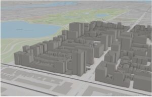
In exercise 2C, I worked on 3D maps, which are more engaging when compared to 2D ones. I struggled with importing the database, but with a few clicks here and there, I figured it out. The chapter mentioned Extrusion — the stretching of flat 2D features vertically so that they appear three-dimensional. The maps can also be easily converted from 2D to 3D. Exploring the 3D maps is one of the coolest things I’ve ever done so far this semester. 

Chapter three: 

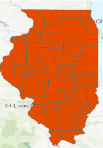
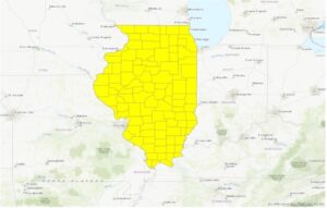
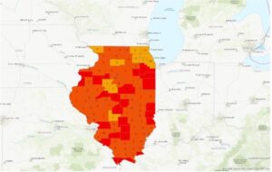
The third chapter closely focuses on geospatial relationships. The chapter referred to combining datasets and deriving statistics, and it reminds me of a project I did recently where I used Xarray and Python to perform Climate Geospatial Analysis. In exercise 3A, I struggled A LOT with opening the database. One would think the third time’s the charm but clearly not. As I went ahead, I found a couple of confusing things: Selecting a particular portion on the map(Illinois Boundary) and the mentions of future chapters. Some terms were briefly explained, and then had a ‘TIP’ section that said we’ll study them in the next few chapters. I’m sure the author had a good reason for doing so, but this kind of+ sidetracked me from my path. I was able to add Illinois later using the Select By Attribute Feature. I was also stuck on exporting the selection to a new dataset for hours and hours. I also found some differences in the software and the text(slight ones), which took me a while to figure out.   

In exercise 3B, we incorporated tabular data into our existing attribute table. Columns in this exercise were called fields. I found appending the tables and data very easy. Next, we worked on adding graduated symbols, which is the process of using the same symbol with different colors for features. It was easy for me to figure out how to add those to the map, and the software was also very accessible. Different classification methods mentioned in the previous textbook(Mitchell) were also referred to here. Adding maps from different layers for all the years from 2004-2010 and comparing them was fascinating.    

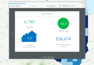
In exercises 3C and 3D, we calculated data statistics and connected datasets. I struggled with creating a null field in this one. However, I was slowly able to figure it out. I found it easy to calculate summary statistics and examine infographics. Connecting the spatial datasets in exercise 3D helped in the analysis and was also deemed insightful.                  

Chapter four: 

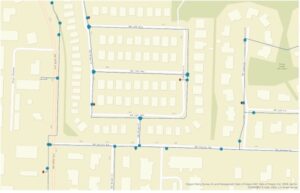
In chapter four, we focused on creating and editing datasets. Accessing the database and getting started with the project was much easier this time. In exercise 4A, I got comfortable with using the geoprocessing pane. I ran into some errors while incorporating ‘Valves.csv’ into the map but figured it out with some time. I also learned how to set an attribute domain. I found some differences between the data shown in the software and the one in the textbook. However, I was able to add it to the map properly. 

In Exercise 4B, I learned snapping and got comfortable with terms like vertex, endpoints, edge, or intersection. I struggled a lot here with the editing features and spent hours on getting my map with the one on the software. I found this exercise to be the hardest of the three exercises in this chapter. In exercise 4C, I split the water pressure zones into two parts and explored their differences. I found it easy to snap, split the sections, and understand the instructions given in the textbook. I also found it easy to merge the polygons and modify lines and points. 

Chapter five: 

Chapter five focused on facilitating workflows, creating a geoprocessing model, and using Python in GIS. Opening the database was easy, and I was glad I was making progress.  In exercises 5A and 5B, we worked on performing repeatable workflow tasks and geoprocessing models. It was easy to get through and did not stress me out as much as the first three chapters.  I found the ‘Tasks’ feature in the View tab very helpful as they had clear-cut instructions and made selecting specific places easy.     

In exercise 5C, we incorporated Python into the software, which I found exciting. I want to keep finding ways where GIS can be integrated with technology more. I got through the entire exercise quite comfortably. I found that a lot of the things in this exercise I have done before for other projects in a similar manner.  I enjoyed this exercise a lot.  

Overall: 

I struggled quite a lot while going through these chapters. However, by the end, I was able to pick up the pace and apply some sort of knowledge. I think with enough practice, I can get somewhere with ArcGIS Pro. I also want to take this time to thank all the people who show up to the lab at 9 am every day because I’ve been stuck a few times and we’ve all helped each other out. 

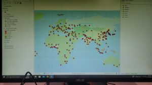
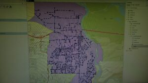
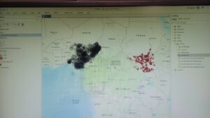
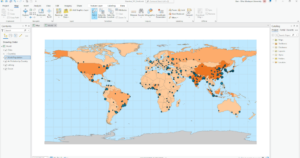
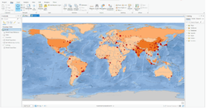
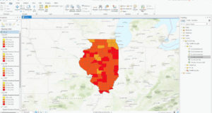
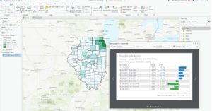
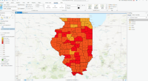
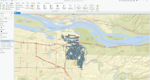
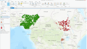
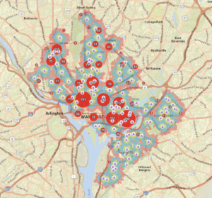
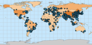
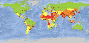
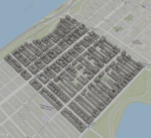
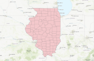
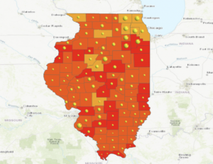
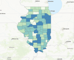
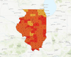
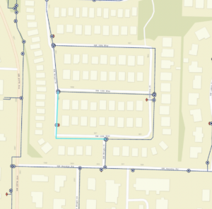
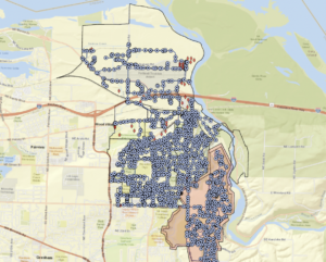
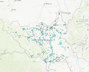
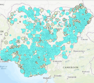
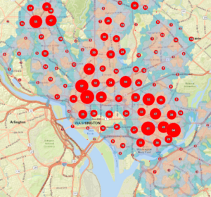
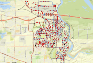
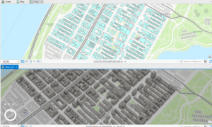
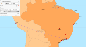
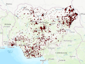
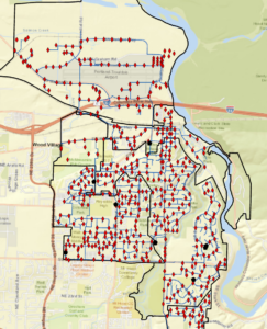
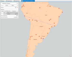
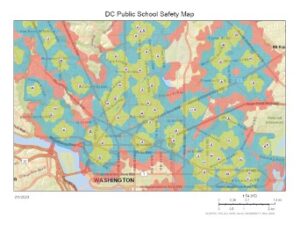
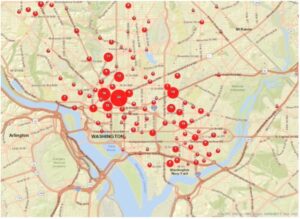
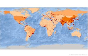
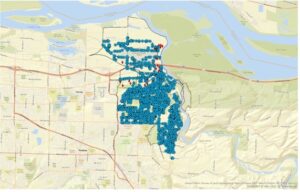
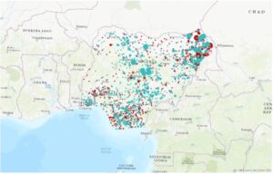
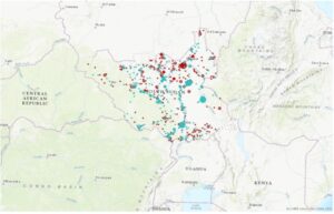
Here are some of the screenshots of my maps while I was working on them: 


Buroker Week 4

Ben Buroker

2/10/23

Geog 191

Dr. Krygier


Chapter 1:

The section about spatial data and attribute data was interesting. This might help design research questions and allow me to understand if I have the necessary data to answer specific questions. An example is that the location of a hospital is spatial data, information about that hospital, like name, available rooms, specializations, staff, and patients, is all attribute data. With this data, it is possible to perform spatial analysis and understand the patterns and other ways in which the hospital works. It’s crazy about how easy it is to make a web map nowadays and how accessible GIS has become. I feel like knowing how to make a web map and share it online will be useful for the research I’m doing with Dr. Rowley. 

Arc Online Activity 1: I don’t know how to do the step that says, “In the context pane, click Configure pop-ups…” on page 26. 

I was able to finish up the exercise from chapter 1, and everything was looking great but as soon as I finished the last step, the School Walking Areas all disappeared from the map. Even though all of the layers are visible. I trouble-shot it but was unable to make them reappear so I’m a bit stuck on that.

Chapter 2: 

This chapter starts right up with exercise 2a in Arc Pro on the desktop. I had a really hard time finding the World_data.mxd file to import into ArcPro. I think that the issue was that I was trying to save my project to my personal external hard drive (?). As soon as I made a new map and saved it to the computer, the file was the first option right there when I tried to import a map… 


Above is what my map looked like at the end of 2B. I then attempted to complete exercise 2C, which is experiencing 3D GIS, but was not able to find the buildings.shp file that I was supposed to use for this exercise. It is not where the book says it should be and I was not able to find it or get it to miraculously show up no matter what I tried.


Chapter 3:

This was what my map looked like after completing exercise 3A+B/ I tried to add the IL_med_income.lyrx to the map but it just went on top of the existing layers and I couldn’t figure out how to make it go beneath and show up as pretty dots like in the book.

This is my map after exercise 3D. 3D had a lot of different things that we had to do, and I encountered small hiccups that I was able to fix/work through. I think a lot of the issues I dealt with were my own fault and a result of me trying to go too fast and not fully reading the instructions.


Chapter 4:

This is the map that I ended with for Chapter 3. I struggled at the end of this chapter when the book asked us to use the “edit vertices” tool in the eastern part of Illinois for that small map section. I couldn’t properly select the line using “bookmarks”, I don’t think I ever made any bookmarks.


Chapter 5:

This is the map I ended with after Chapter 5. This chapter went pretty smoothly and I feel like I was learning how to properly navigate bringing the data into the map. This whole time I was having issues finding the data the book was asking me for. I figured out how to search within the catalog pane and learned that if I typed in the exact file name (or something close) it would show me the files even though they seemed hidden or out of place. This was kinda a duh moment, but was key to me being able to actually efficiently work through the lessons. 


Overall Reflection and “Big Ideas”:

I struggled initially because I didn’t download the data from the very beginning of the book, after I downloaded it and solved that issue things got a lot easier. It was still hard to find the data and sometimes it wasn’t in Arc Pro or even in the folder connection. I thought that having the ability to use the files already in the data folder in order to start the next exercise with a fresh perfect map was really useful. Instead of being totally stumped by one hiccup, if you couldn’t figure it out you could go ahead and start again. I had a hard time thinking about big ideas while doing these chapters. I think I was overwhelmed with the amount of exercises there were to do as well as by how confusing the stuff we were doing was. Most of the time I felt like I wasn’t able to understand how the processes I was doing were connecting to a bigger goal for each map. The names of the tools and the number of steps we had to do before seeing any change in the map made me forget about what we were doing. I appreciated seeing some connections to the work we did in the OG GIS class, like joining attribute tables. As I was working I was thinking about if I would be able to replicate any of the steps I was doing, either apply them to a unique dataset, or to recall the steps and be able to do them again. I definitely couldn’t without the instructions.

Luna – Week 4

Getting To Know ArcGIS

  • Chapter 1  Question Answers and Screenshots
    • There were no questions for this chapter, but as a whole, I thought using the website was an approachable way to introduce the basic functions.
  • Chapter 2 Question Answers and Screenshots
    • PM concentrations are highest in Africa.
    • I used my search bar to restore the Contents pane and find a geoprocessing tool.
    • Shanghai has the largest population.
    • The height of the tallest building is 339 ft.
  • Chapter 3 Question Answers and Screenshots
    • The field name that indicates state is STATE_NAME and there are 10,575 residents between the ages of 22 and 29 years in Wayne County.
    • 7 years are represented by the table.
    • Obesity was more common in lower income cities in 2010.
    • There are four food deserts in Knox County.
  • Chapter 4 Question Answers and Screenshots
    • The selected line has 4 vertices.
    • Shaper_Area decreased.
  • Chapter 5 Question Answers and Screenshots
    • I can name the types of conflict events.
    • There were 14,211 fatalities in South Sudan between 2010 and 2018.
    • There were 71 fatalities in Rwanda between 2010 and 2018.
    • There were 41 violence against civilians events in Rwanda and 12 of those were fatal. 
    • Summary Statistics and Select are combined in this script.
    • 26,323 Nigerian fatalities resulted from violence against civilians from 2010 and 2018.

Munroe Week 4

Getting to Know ArcGIS  by Amy Collins and Michael Law: chapters 1, 2, 3, 4, and 5

While increasingly frustrating in tasks, I enjoyed working with these few chapters as it’s the first real “hands-on” activities we’ve been able to do in this class. The first chapter was focused on the basics of GIS, much like we read in the previous book. It was a good refresher, as jumping into five tutorials was a good amount to take on. The key takeaway was that GIS is all about connecting spatial data, information that represents real-world locations and the shapes of geographic features and the relationships between them, and attribute data, information about spatial data. The first chapter then opened up into talking about how information has become more widely available within the past few years, as government agencies and NGOs are becoming more willing to put their data out on the internet. The principles and concepts remarked in the first book are reiterated once again, and the authors also make a point to talk about the difference between ArcPro and ArcOnline. The second chapter starts with the first tutorial of the assessment, with mapping the relationships of schools, walking distance to schools and transportation safety issues in Washington DC. The second assessment focuses on distance between major cities, looking at ranking population in datasets and classifying countries by air pollution statistics.  The second chapter also works with 3D modeling in New York City. In all, the second chapter focuses on extracting parts of datasets, tabular data, data statistics and connecting spatial datasets. The third chapter works on mapping food deserts and obesity rates in Illinois counties, using attribute tables and diagram features to display data with the map. The fourth chapter works on building and maintaining a dataset, this time for Troutdale, Oregon, a suburb of Portland. This exercise puts you in the shoes of a city planner keeping track of data for the city. This chapter helps build geodatabases, create features and modify features. Finally, chapter five focuses on the continent of Africa, specifically the countries of Rwanda, Nigeria and South Sudan. These exercises focus on managing a repeatable workflow using tasks, creating a geoprocessing model and running a python command and script tool. I found myself getting frustrated toward the end of this assignment, as the directions became less explicit from the authors. I have to constantly remind myself to go slow, remember what I’ve learned from the previous chapter, and try my best to figure out a solution before seeking help from a fellow student or Dr. Krygier. I think I’ll go through these exercises again once I have more free time to better understand the steps and become more comfortable with the program.

Skidmore Week 4

Chapter 1:
At the beginning of chapter 1, the author goes over the uses of GIS and spatial analysis. They discuss that using GIS gives the viewer a unique view of data that can be seen in correlation to geographic features. Modern GIS is host to a swath of information and collaborators that allow for real-time interaction among a large group of people. The Open Data movement has grown in the GIS field from where it took a few specialists to make a map to now anyone can make a map due to the data available. The only data that is being protected is copyrighted or private but primarily all data that is needed is open to anyone who needs it. Then the chapter goes into information that has already been covered in the previous books such as vector or raster maps and attributes. In ArcGIS Pro projects are the spaces that contain your work, in these spaces, you can view multiple maps. Geoprocessing is the tool that is used to do your spatial analysis within ArcGIS Pro. The tutorial in this section gave a general overview of some of the features in ArcGIS and showed use cases such as accidents related to public schools.

I originally started this out by doing a summary for every chapter then I realized that was kind of dumb overall since there is not enough to cover in each chapter. After chapter 1 the book focuses on giving the reader practical uses for ArcGIS Pro. Chapter 2 main goal seems to be to introduce some of the basic features when looking at and manipulating a map in the program. None of the chapters deals with data analysis but rather spatial analysis on a basic level. Chapter 3 starts with a more advanced spatial analysis by removing unnecessary data but then turns in more of the data analytics side of ArcGIS Pro by creating new data sets and adding data to tables. Chapter 4 focuses on how to combine spatial analysis with data analysis, and also shows some basic ways it may be used in real scenarios. Much of chapter 5 is associated with how to streamline processes that you may be doing multiple times in an analysis.

These chapters showed how ideas or concepts in the previous book can be applied to the ArcGIS Pro software. Much of what is happening in these chapters is to show normal or common steps or processes used in GIS analysis to have a basic understanding of these processes. At times I think this book lacks some explanation or practical understanding of some tasks which is partly due to the quickly updating software the book is based on but beyond that none of the tasks were too difficult.

PS: Tell people to read the preface to get the Geospatial scenarios (I did not know about this until Thursday)

.

Steed – Week 4

Getting To Know ArcGIS by Michael Law and Amy Collins

Chapter 1: Introducing GIS

Notes and Comments

  • A GIS is composed of five interacting parts that include hardware, software, data, procedures, and people.
  • Spatial data—…information that represents real-world locations and the shapes of geographic features and the relationships between them—involves using coordinates and a suitable map projection to reference this data to the earth (e.g., the location of a hospital).
  • Attribute data—information about spatial data (e.g., information about the hospital).
  • Dynamic and interactive maps on the internet, known simply as web maps, are ideal for allowing many users to access and quickly locate features and visualize data.
  • The open data movement provides agencies and the public with authoritative data and enables all levels of government to develop new tools and applications.
  • Point, line, and polygon data is also called vector data.
  • Features of the same type—such as trees, roadways, or buildings—are grouped together and displayed as layers on a map.
  • You can record and collect measured values for any location on the earth’s surface to form a digital surface, also known as a raster.
  • ArcGIS Pro uses ArcGIS Online basemaps, which provides a backdrop or frame of reference as you add your own layers.

Exercise Notes and Screenshots

  • Pay attention to the names of each subject—some of them are very similar.

Getting To Know ArcGIS by Michael Law and Amy Collins

Chapter 2: A first look at ArcGIS Pro

Notes and Comments

  • It offers 2D and 3D visualization and analysis within an intuitive, easily navigable interface

Exercise Notes and Screenshots

  • Using a project template (.aptx) is usually the quickest way to start a project. Templates are shareable project packages, including the specific basemaps, connections, datasets, toolboxes, or add-ins that are most helpful for your project.
  • The countries with the highest PM concentrations are Uruguay, Angola, Sudan, Chad, Niger, Mali, Iraq, Egypt, Pakistan, and Bangladesh.
  • If the content pane is missing, I utilize the search bar to return it.
  • The city with the largest population is Shanghai, China.
  • Symbology refers to the way GIS features are displayed on a map.
  • Single symbol—one symbol is used for all features in a layer.
  • Unique values—used for categorical data, different symbols represent various attributes.
  • Graduated colors—used for quantitative data, different colors represent different value ranges.
  • Graduated symbols—used for quantitative data, symbols increase in size with increased values.
  • The height of the tallest building is 339.8 meters.
  • Extrusion is the process of stretching flat 2D features vertically so that they appear three-dimensional.

Getting To Know ArcGIS by Michael Law and Amy Collins

Chapter 3: Exploring geospatial relationships 

Notes and Comments

  • The power of GIS extends far beyond exploring digital maps. You can combine datasets, enrich them with new attributes, derive statistics from them, and obtain new information based on their relationships.

Exercise Notes and Screenshots

  • The field name that indicates the state within which the county features are located is “STATE_NAME.” In Wayne, Ohio there is 10,575 people between the ages of 22 and 29 years.
  • Definition queries are helpful when you want to work with a subset of data in a map while maintaining the source data.
  • Attribute query—a request for features in a table that meet user-defined criteria.
  • Using an attribute join operation, you can append the spreadsheet table (the join table) to your existing attribute table (the input table), provided you have a common attribute field in each table—for instance, a feature name or numerical identifier.
  • I cannot find the years of data that are represented in the table.
  • There are various classification methods:
    • Manual interval classification, equal interval classification, defined interval classification, quantile classification, natural breaks (jenks) classification, geometric interval classification, and standard deviation classification.
  • I was not able to verify a correlation between income and 2010 obesity. I believe I messed up with importing symbology from 2009 to 2010.
  • The percentage of households that had income of less than $15,000 per year is 17.7%.
  • There are 13,115 food deserts in Knox County.
  • A spatial join allows you to define a spatial relationship between two layers (a target layer and a join layer) and combine their attributes in a new output layer.

Getting To Know ArcGIS by Michael Law and Amy Collins

Chapter 4: Creating and editing spatial data

Notes and Comments

  • A shapefile is a simple, stand-alone data format. It stores geometry and attribute data for one set of features.
  • A geodatabase is a storage container, in which sets of features are grouped into feature classes. The geodatabase can also store rasters and special geodatabase elements that facilitate capabilities that are not available with other data formats.

Exercise Notes and Screenshots

  • A coordinate system defines features’ positions on the earth’s surface.
  • A geographic coordinate system uses latitude and longitude to define the locations of points on the surface of a sphere or spheroid.
  • A projected coordinate system uses a mathematical equation (the map projection) to transform latitude and longitude coordinates into Cartesian or planar coordinates for display on a flat map.
  • ArcGIS employs on-the-fly projection, which means that it applies the projected coordinate system of the first layer added to all subsequent layers.
  • Metadata is textual information about the dataset.
  • An attribute domain is a set of valid values, or a numerical range, to which attributes in each field must be limited.
  • Snapping allows you to accurately connect features, such as waterlines and values, without impossibly precise sketching.
  • There are four vertices on SW 19th
  • The Shape_Area value of the original water pressure zone split in half.

Getting To Know ArcGIS by Michael Law and Amy Collins

Chapter 5: Facilitating workflows

Notes and Comments

  • A task item might capture an entire workflow or one piece of a more complex solution.
  • Modelbuilder is a geoprocessing environment that allows you to easily link one tool to another and run a set of operations one after another with the click of a button.

Exercise Notes and Screenshots

  • Tasks are helpful to standardize business operations and promote best practices for a repeatable workflow.
  • Yes, I can name the types of conflict events that are recorded in this dataset.
  • A definition query limits the display of features to features that meet user-defined criteria.
  • According to ACLED statistics, 14,211 fatalities resulted from conflicts against South Sudanese civilians between 2010 and 2018.
  • A model allows you to string multiple geoprocessing tools together and run them automatically with the click of button.
  • There were 71 fatalities that resulted from conflicts classified as violence against civilians in Rwanda from 2010 to 2018.
  • There were 41 events classified as riots/protests that occurred in Rwanda between 2010 and 2018. As a result of these events, there was 12 fatalities.
  • Python is a programming language that, in the GIS context, is used to script geoprocessing workflows and build custom geoprocessing tools.
  • The two geoprocessing tools that are combined in this script are Select and Summary Statistics.
  • There were 26,323 fatalities that resulted from conflicts classified as violence against civilians in Nigeria from 2010 to 2018.

Chlebowski – Week 3

Chapter 5:

This chapter starts with explaining how to classify specific areas of interest as well as the types of data inside these distinct boundaries. The book gives three types of methods for mapping such phenomena: drawing the area and features, selecting the features inside the area, and overlaying the areas and features. Each are used when specific reasons for mapping or types of data are present. For example, you would want to overlay the areas and features if you wanted a display of all the types of features in many different areas as well as if you had a single area but are dealing with displaying continuous data values. Then, the types of ways that these data or features inside the areas can be displayed was discussed. It talked about how counts, frequencies, and numeric statistics like the means and medians of data can be used to classify how much data is in each area of discussion. Within their explanation of how overlapping data can be displayed, I found it very clever how they were able to overlap a color scale of workers in specific areas with a floodplain by using a transparent type of blue on top of the different shades of orange and red. When they mentioned the two different types of methods of overlaying areas on areas (vector and raster) I was and still am a bit confused on what causes slivers in the vector method. It defines them as small areas where the boarders get slightly offset when overlaying areas, but I am confused how this occurs, as I would assume that the only way this might occur is if the data itself is accurate only within a specific area, and thus if two areas have boundaries that are close enough to each other to make a zone that is ambiguous, that would be a sliver, maybe. Finally, I really like the idea of using histograms to supplement multiple types of data in a single area, which makes comparing the different types of data a lot easier than just having the key to show which values are what.

Chapter 6:

Measuring how close something is by cost is very unique; I did not really think that this was a valid way of measurement, but it does have its uses. Travel cost is a real concern for many people to get from one place to another, but it can vary from person to person (because cars and milage and traffic and stuff). Also, the distinct bands comparison method for distances is really neat too, having ring values within a specific ring arc distance to display the count of specific data is a cool way of displaying it. Personally, I really do not think of distance areas in terms of within, let’s say, 1000-2000 feet in a ring, so this type of display is really interesting. Cost over a surface is one method of finding what is nearby that they explained, and I think that it has some really unique applications, especially with terrain. You would have to need extremely specific raster data of how certain terrain is easier or harder to traverse, indicating that harder terrain will be less cost effective to traverse than the ladder. Spider diagrams are quite the useful tool in determining the relationships and rough distances of two objects from two or more source points in a spiderweb-like formation. Setting travel parameters when using cost as a measurement is shown to be quite tricky, as there are many external factors and assumptions that are needed be made to determine cost quantities. When dealing with time, estimated traffic, turns, and speed limits must be made very precisely and made into a formula to determine how fast or slow a specific road route is. These types of assumptions are also made when creating cost layers, which can give impressions on the ease or cost of moving or building on specific land is by the specific qualities of the land being surveyed.

Chapter 7:

Mapping change is something that I did in GEOG 122 (whooo) which is super awesome for the cross-ciriculumativity! Mapping areas or things that do not change in location is what I am familiar with (being the changing populations numbers of counties in a state by decade), but mapping moving data like the path and speed, or size of a hurricane is a whole different ballgame than from what I am used to.  The time patterns that are commonly used when displaying change are trends, before and after, and cycles. Time can also be summarized by grouping events that happened in timely proximity to each other together. These can be displayed in cyclic patterns like in the use of many different versions of the same area, denoting the time differences, and also with discrete data by using point locations and different colors to describe the different times of day/year that the events happened at that location. The three specific ways that mapping change can be done is by a time series, tracking map, and measuring change. Tracking maps are really neat as they show the spread of movement of data from an initial start area to newer area boundaries denoted by time. Additionally, measuring change by denoting the amount, percentage, or rate of change is something that I remember doing very briefly in Human Impacts on the Environment. We did color compositions of land data and had to denote changed land with specific colors kind of like the map in the book concerning the change in forest cover after a hurricane, except our map was full of color and every area was assigned a specific label in the color composition. A more similar representation to what we did was like the book example of land cover change in 1914 vs 1988, where the whole map is covered in data categories.

Mazabras-Week 3

Chapter 5: In this chapter the book really explained how to define a map and how to show the information on the page. The three main things that I got from this was showing a clear boundary, a dataset to show your information and visual appeal which makes it easier for the reader to understand the information on the map. By initially creating a boundary you are then able to find what you are trying to portray whether it is showing information through a data set or physically separating areas based on aerial visuals. In order to show data or try to show the people an issue in the area there needs to be clear data that counteracts the claim of the map. The book uses land cover as an example for one of their maps, you can either separate this the different land uses by acquiring data with locations of areas or if you know the area you can separate and boundary off areas as you see fit. The map using the data would be more precise but I believe one that is separated by humans would have more effect on the people. I say this because the information would be through human experience and they are able to see the use of the land including whether it is a healthy area or not. The data would not be able to do this because it would just be in numbers and locations, there is no human interaction with the data or thought put into their separation. So by creating boundaries around the outside of the map you are able to identify an area then by using data or general knowledge you can create a map to put purpose to the information being portrayed inside. 


Chapter 6: I would say this chapter is almost the first chapter that really explains some of the features you can use in ARC. The chapter explained the process of finding a location and what information needs to be available for the software to accurately measure an area. The main point from this part is the fact that you need to have two separate layers one being the source layer and one being the surrounding layer. This means the source layer is the map that you are physically creating and the surrounding layer is the map that you are going to measure off of. The book says that by being able to measure distance you can find the square footage of an area, the distance from point A to point B and you can even create routes for cars and transportation by using this surrounding layer. The surrounding layer is something like google earth, an image that does not have the best resolution which is why the source layer will have the better resolution. Because the google earth map is linked to the correct coordinates when you measure on the source map the measurements will be precise. By being able to have this supporting layer underneath the map that you are creating you are also able to have an image surrounding the study area so people can find landmarks that they know of when creating the map. 


Chapter 7: This chapter was really about the different ways you can show data on your maps and how to show data over time and or any changing data. I would say the most important part of this chapter would be the fact that you can show several time periods in one map because you are able to link the data to the map. Being able to create time scale maps you are then able to show people in a short video or gif what is going on in a certain area like, population change, hurricane surge times and even wildfire spread over a several day period. This is a great way to inform the people because you can show them what has been happening in the last couple of years and or even show them the danger they could be in during a natural disaster. There are also ways that you can create singular point time maps which can show things like 911 call locations and their timestamps. These point maps are also very helpful when tracking oil spills, wildfires and really any danger that spreads due to the fact that points would be put on a map for the time the spread reaches that location. These maps can show anything from population change to land use change to vegetation change. All of this information would be linked to data which allows the maps to also show graphs and tables as needed. These tables and graphs can show the change to people in numbers so instead of just showing them with images which can broaden the audience of the map. 


Munroe – Week 3

Chapter 5

Chapter 5 is concerned with defining and analyzing what’s inside of the areas you’ve created using ArcMap. To begin, the chapter discusses defining analysis, specifically how many areas and what features are inside the areas. If you were to select a single area, you’d be focused on a specific, controlled area which could be something like a manually drawn territory or a natural boundary. Multiple areas would pertain to zip codes, disjunct parks or counties. Then, you have to determine if the features are discrete or continuous, where discrete are unique, identifiable features and continuous are seamless geographic phenomena, either spatially continuous or continuous values. Then, you need either a list, count or summary. With this step, you also need to determine if your values can be partially inside or outside of the boundaries, and how you want to quantify them. The chapter then discusses the three methods of finding what’s inside. These are drawing areas and features (which are good for finding out whether features are inside or outside an area), selecting the features inside the area (getting a list or summary of features inside an area) and overlaying the areas and features (good for finding which features are inside which areas and summarizing how many or how much by area). When you’ve selected features in the area, you can visualize results by count, frequency, or a summary of numeric attributes, using either mean, median or standard deviation. The chapter then finishes with how to overlay areas and features. First, overlaying areas with discrete features then overlaying areas with continuous categories or classes, where GIS tags each feature with a code or the area it falls within and assigns the area’s attribute to each feature. Second, overlaying areas with continuous categories or classes, where GIS uses vector or raster method to overlay areas with continuous categories or classes. Lastly, Mitchell mentions overlaying areas with continuous values, where GIS finds out which cells fall within each area and calculates the statistic for the characteristic you’re interested in and assigns the value to each cell it’s identified.

Chapter 6

Chapter 6 moves on to finding what’s nearby. A theme I’ve caught on to with these chapters is that Mitchell always wants to start with defining analysis. For this chapter, he talks about measuring what’s near whether it’s by set distance or travel to feature, cost or distance, or distance over flat plane or using earth’s curvature. Then, he asks us for the necessary information, meaning list, count, summary, distance or cost ranges, specifically inclusive rings or distinct bands. Mitchell goes further with defining three ways of finding what’s nearby. Straight line distance (good for creating a boundary or selecting features at a set distance around a source), distance or cost over a network (good for finding what’s within a travel distance or cost of a location), or cost over a surface (good for calculating overland travel cost). For straight line difference, you can either create a buffer to define a boundary and find what’s inside, select features to find features within a given distance, calculate feature-to-feature distance to find and assign distance to locations near a source, or create a distance surface to calculate continuous distance from a source. For measuring distance or cost over a network, you first specify the network layer, assign street segments to centers and set travel parameters. You can also specify more than one center and select surrounding features to be included in the map. Lastly, with calculating cost over a geographic surface, you begin by specifying the cost (where GIS totals the cost as it crosses each cell from the source, assigning a cumulative cost to each cell in a new layer it creates) and then modify the cost distance.

Chapter 7

The book finishes with mapping change, where we once again define our analysis. Mitchell mentions two types of change: change in location (seeing how features behave so you can predict where they’ll move) and change in character or magnitude (showing how conditions in a given place have changed). The type of features you choose to map also matter. They can either be discrete (physically move) or change in character or magnitude (events that represent geographic phenomena that change location). Additionally, you have to quantify time. It can be a pattern (trend, before and after or cycle) or partition (two or more times or dates or several time periods). Once you’ve determined this, you have to decide what you want to take away from the analysis. It can be how much it has changed (talking about change in magnitude or percent change) or how fast it changed (measuring the rate of change over time). There are three ways of mapping this information. The first is a time series, showing changes in boundaries, values for discrete areas or surfaces which is good for movement of change in character. This is good for strong visual impact, but readers have to visually compare the maps to see where and how much a change has occurred. The second is a tracking map, good for showing movement in discrete locations, linear features or area boundaries. This makes it easier to see movement and rate of change especially when subtle, but can be difficult to read if there are more than a few features. The third is measuring change, showing the amount, percentage, or rate of change in a place which is good for change in character.  This will show actual difference in amounts or values, but doesn’t show actual conditions at each time and is calculated only between two times.