Here is my final!!!!!!!
Author: chewy
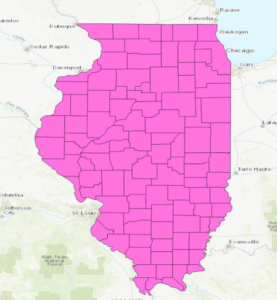
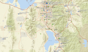
arguably pretty coolChlebowski – Data Inventory
Data Layer:
Zip Codes – shows areas of all the Delaware County zip codes
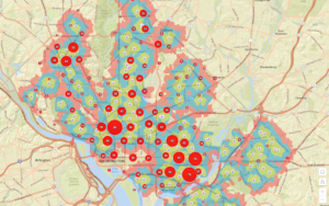
Recorded Document – shows points across Delaware county of all of the spots of the recorded documents of the “Delaware County Recorder’s Plat Books, Cabinet/Slides and Instruments Records”. These are documents that record events like subdivisions and annexations in the area.
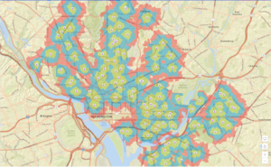
School District – a map of all of the existing school districts that exist in the bounds of Delaware, Ohio. There are twelve of them that exist in Delaware, which include ones that span large areas like Olentangy and Buckeye Valley and ones that barely sneak in the edge of Delaware like Northridge and Johnstown-Monroe.
Map Sheet – shows areas across Delaware County of all of the map sheet locations
Farm Lots – shows areas and the boundaries of all of the farm lots in Delaware County
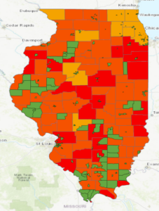
Township – similar to the school district data layer, this layer gives the geographic bounds of all of the townships that are located in Delaware County. Very interesting to see the intricacies of the township shapes, with blocky ones like Brown and Kingston and messy ones like Delaware and Sunbury.
Street Centerline – shows areas of private and public streets and pavement areas in Delaware County
Annexation – shows all of Delaware’s annexations and changes in boundary lines from 1853 to present
Condo – shows all condominium polygons in Delaware that have been recorded by the Delaware County Recorder’s Office
Subdivision – shows all subdivisions and condos recorded by the Delaware County Recorder’s office
Survey – shows all points of individual land surveying that have occurred in Delaware County
Dedicated ROW – shows all areas and streets in Delaware that are designated Right of Way passage areas
Tax District – shows areas of all of the Delaware tax districts as defined by the Delaware County Auditor’s Real Estate Office
GPS – shows points of all GPS monuments that were established between 1991 and 1997
Original Township – shows the areas of the original township boundaries before tax districts changed their shapes
Hydrology – shows all of the major waterways in Delaware County, which is very neat as it obviously shows large waterways like the large reservoirs like Alum Creek’s and Delaware’s but it also shows small offshoots of major rivers like the Delaware Run
Precinct – shows areas of all voting precincts in Delaware County
Parcel – shows polygons that distinguish all cadastral parcel lines in Delaware County
PLSS – shows the areas of all of the Public Land Survey Systems in Delaware
Address Point – shows all the points of certified addresses in Delaware, wow there are a lot of addresses!
Building Outline – shows polygons of all of the structure and building outlines in Delaware last updated in 2018
Delaware County Contours – picture of the contour lines in Delaware County

Chlebowski – Weeks 4 & 5
Chapter 1:
No button to expand outline or to enable outline or turn it off
Due to this, I just turned off the outline color for the School Walking breaks
No specific fill tab to color, I just picked red like they asked (lame, bottom tier color).
No clustering tab in content pane, had to click aggregation tab to find clustering
Chapter 2:
Catalog pane is a small icon hiding at the top with geoprocessing and full extent
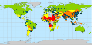
Unimportant to the technicalities of the exercise, but it is interesting how the heavy air pollution centers of the U.S. like in Southern California and on the upper east coast get balanced out by the less polluted urban areas to make the U.S. have less than 40 PM concentrations. I would assume the U.S. to not be in such a decent standing by PM concentrations.

Chapter 3:
Us_cnty_enc.shp attribute table was not able to be opened
Export features did not have separate output location and output name categories, only one category for output named output feature class
I just ran it in the default output location with no fancy name
Important note: any mention of the attribute tab is talking about the feature layer tab

Chapter 4:

Literally isnt a domain column in the WaterLines attribute table grrrrrrrrrrrr
Chapter 5:


Chapter 6:

Chapter 7:
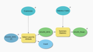
Exercise 7b number 8: candidate A is not 2407 Southmore, Houston, TX, 77004
In fact this address simply is not even in the unmatched category like was requested

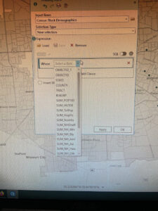
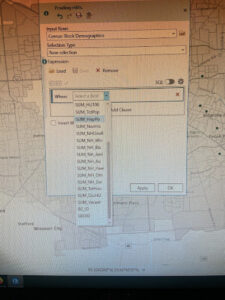
Page 264: the expression Median_HHI is greater than 63250 was not able to be made because Median_HHI was not an option on the initial input for the expression
Chapter 8:
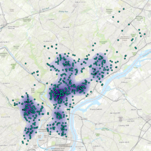
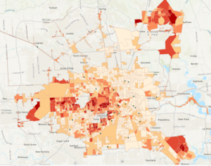
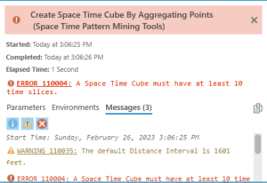
After running the Optimized Hotspot Analysis tool, my map had many grids with empty data after many attempts at rerunning it and making sure the data imputed was the correct ones

Then, the Create Space Time Cube By Aggregating Points tool would not run, gave me this error (probably based on the above problem)
Chapter 9:
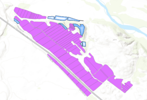
Planting_sites did not have an option for hollow fill in the symbology so I just used gradient fill instead
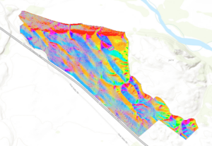
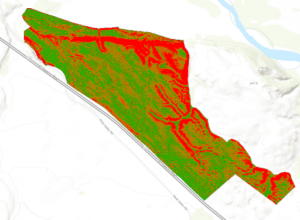
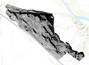
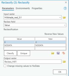
The third reclassify tool with Hillshade_ned_3 did not have any values, nor any start or end columns to enter data into
Chapter 10:
By the way I did realize how to adjust the transparency of layers, forgot it was under feature layer whoops

adjusting the position of the layers on the paper was difficult i just did my best to make it look at neat as possible without messing everything up
Chlebowski – Week 3
Chapter 5:
This chapter starts with explaining how to classify specific areas of interest as well as the types of data inside these distinct boundaries. The book gives three types of methods for mapping such phenomena: drawing the area and features, selecting the features inside the area, and overlaying the areas and features. Each are used when specific reasons for mapping or types of data are present. For example, you would want to overlay the areas and features if you wanted a display of all the types of features in many different areas as well as if you had a single area but are dealing with displaying continuous data values. Then, the types of ways that these data or features inside the areas can be displayed was discussed. It talked about how counts, frequencies, and numeric statistics like the means and medians of data can be used to classify how much data is in each area of discussion. Within their explanation of how overlapping data can be displayed, I found it very clever how they were able to overlap a color scale of workers in specific areas with a floodplain by using a transparent type of blue on top of the different shades of orange and red. When they mentioned the two different types of methods of overlaying areas on areas (vector and raster) I was and still am a bit confused on what causes slivers in the vector method. It defines them as small areas where the boarders get slightly offset when overlaying areas, but I am confused how this occurs, as I would assume that the only way this might occur is if the data itself is accurate only within a specific area, and thus if two areas have boundaries that are close enough to each other to make a zone that is ambiguous, that would be a sliver, maybe. Finally, I really like the idea of using histograms to supplement multiple types of data in a single area, which makes comparing the different types of data a lot easier than just having the key to show which values are what.
Chapter 6:
Measuring how close something is by cost is very unique; I did not really think that this was a valid way of measurement, but it does have its uses. Travel cost is a real concern for many people to get from one place to another, but it can vary from person to person (because cars and milage and traffic and stuff). Also, the distinct bands comparison method for distances is really neat too, having ring values within a specific ring arc distance to display the count of specific data is a cool way of displaying it. Personally, I really do not think of distance areas in terms of within, let’s say, 1000-2000 feet in a ring, so this type of display is really interesting. Cost over a surface is one method of finding what is nearby that they explained, and I think that it has some really unique applications, especially with terrain. You would have to need extremely specific raster data of how certain terrain is easier or harder to traverse, indicating that harder terrain will be less cost effective to traverse than the ladder. Spider diagrams are quite the useful tool in determining the relationships and rough distances of two objects from two or more source points in a spiderweb-like formation. Setting travel parameters when using cost as a measurement is shown to be quite tricky, as there are many external factors and assumptions that are needed be made to determine cost quantities. When dealing with time, estimated traffic, turns, and speed limits must be made very precisely and made into a formula to determine how fast or slow a specific road route is. These types of assumptions are also made when creating cost layers, which can give impressions on the ease or cost of moving or building on specific land is by the specific qualities of the land being surveyed.
Chapter 7:
Mapping change is something that I did in GEOG 122 (whooo) which is super awesome for the cross-ciriculumativity! Mapping areas or things that do not change in location is what I am familiar with (being the changing populations numbers of counties in a state by decade), but mapping moving data like the path and speed, or size of a hurricane is a whole different ballgame than from what I am used to. The time patterns that are commonly used when displaying change are trends, before and after, and cycles. Time can also be summarized by grouping events that happened in timely proximity to each other together. These can be displayed in cyclic patterns like in the use of many different versions of the same area, denoting the time differences, and also with discrete data by using point locations and different colors to describe the different times of day/year that the events happened at that location. The three specific ways that mapping change can be done is by a time series, tracking map, and measuring change. Tracking maps are really neat as they show the spread of movement of data from an initial start area to newer area boundaries denoted by time. Additionally, measuring change by denoting the amount, percentage, or rate of change is something that I remember doing very briefly in Human Impacts on the Environment. We did color compositions of land data and had to denote changed land with specific colors kind of like the map in the book concerning the change in forest cover after a hurricane, except our map was full of color and every area was assigned a specific label in the color composition. A more similar representation to what we did was like the book example of land cover change in 1914 vs 1988, where the whole map is covered in data categories.
Chlebowski – Week 2
Chapter 1:
This chapter really sets the table for the idealization and tenants of how you need to have when in the mindset of making a map, both physically and mentally. These two ideas are different from each other but also very important, because as it is made known by this section, simply having data to map is not all that is needed to start on the creation of said map. Firstly, there are different types of physical data that can be used (vector and raster), which both can be used to represent most if not all types of feature types. Being comprised of X and Y coordinates, vector data is most usefully utilized in discrete features and area bound data, while raster data is most commonly utilized with continuous numeric data like elevation maps. Despite this chapter being very wordy with its introductions of the many types of features and approaches that can be done in mapping, I found it very interesting to look through, especially with the colored illustrations to compliment the text. It seems very elementary but showing how two different approaches at showing data can be done both in words as well as with pictures (especially when the one way of mapping something is very clunky or scattered) to compare them and see which is more advantageous for the end goal of the map was a great idea. I thought the final sections about attribute values was an apt summary of how you can play around with your data to make it accessible to the viewers. Many of these reminded me of the population project in GEOG 112, where we were given big census data and allowed to play around with it as much as we wanted, but eventually made to chop it down into digestible, readable data for the viewers. Utilizing ratios and counts/amounts is perfect for this, especially when there is so much raw data that you do not absolutely want to use every last piece of.
Chapter 2:
The beginning of this chapter jumps into deciding what to map, and from this answer, how to map such idea. While this is a rather personalized question to ask, it is quite important as it is really easy to map too many things and confuse the meaning of the map. I learned this from experience, especially when you are given a bunch of types of data from a specific area and want to provide your reader with as much of it as possible. It is here where you have to keep your specialized reason for mapping in mind, as the point and execution of your map will be most clear if you keep as many extracurriculars out of the map interface as possible; you would not want to confuse your reader from your main point. The part about categorical mapping was pretty neat, especially the part where it expressed that in general you should not exceed seven categories of data, since after seven it is apparently difficult to distinguish one from another. This is probably due in part to (1) there are only so many colors that can look totally different from each other with a background color and a separate color for boundaries and (2) seven may just be the arbitrary limit of a map having too much going on in terms of categories. Scale is also very important, which I learned from the GEOG 112 project, when working with categories of data. Having smaller scaled sections of data with many categories can be tricky, as sections that are similar in numeric value but in adjacent quadrants can look the same when they are not, especially if you are using a 2-color scale to distinguish all of the categories. Using the full range of colors in a small area of boundaries, I have also learned, can be less advantageous to the reader, as it may require more looks at the legend to distinguish the different categories as opposed to a 2-3 color scale.
Chapter 3:
The start of the chapter brought up an interesting point about how maps are made with different purposes. For example, if you are making a map to explore relationships between two things, you would limit the use of information that is not relevant and try to display the data in multiple different ways to show how deep the relationship is. On the other hand, if you are making a map to explore the results of a finding, utilizing all of the data in the result is most likely the best approach to show the full extent of what was tested and what was found. It talks later in the chapter about the different methods of splitting up or classifying categories via natural breaks, equal interval, and standard deviation. The first two I have heard about and used but I was unfamiliar with standard deviation being used in this way, as “each class is defined by its distance from the mean value of all the features”. Displaying data based on its distance from the mean seems very specialized, as I cannot recall any times where I have seen this done in graphic form. When in the making maps portion, they mentioned the use of graduated symbols when measuring volumes or numeric values in area. I always thought that graduated symbols were a strange choice when expressing the size of numeric values, since the size of a specific shape can be hard to quantify in my opinion. While having to constantly check a legend or key to determine what size relates to what, it can be hard to determine such size when there are too many categories of size, especially if the area in question has a smaller scale.
Chapter 4:
One of my favorite techniques used in density maps are the contour lines. I think that showing the rate of change across a surface of the highest densities is a really cool approach and one that is unique to many of the other methods that they mentioned like dot diagrams, color gradients, etc. A use for them that I am aware of is with isobars in determining the rate of change in pressure across a weather map. In this scenario, determining the rate of change is very important as high rates of change in pressure can allow storms and bad weather to permeate in these areas, making it very crucial to be able to map and identify these areas. Additionally with the methods of displaying density information, I think dot density maps are quite neat in its simplicity and straightforward idea in showing what places has higher density values, but I do think they can make a map a fair bit cluttered at times. The book mentions that you can try to avoid this by making the size of the dot small enough so that it obstructs as little of the boundary lines as possible, but I still feel that even if the dots are small, they can still make the boundary lines confusing to follow, especially in spaces where the scale is small or if there are small areas of high dense areas near each other, like in a density map of a U.S. state’s counties. Counties with very high density will have a hard time being distinguished from one another from an eye that is not familiar with their placement on a map. Also, I think that density surfaces are really great tools to show density while preserving boundary line integrity, but the type of very precise locational data that would be needed to accomplish this makes the actual creation of such maps really specialized for very exact data. Map density area is a lot more generalized and can be done with more simple data, but it requires much less data processing, and it is gives decent ideas of where densities are located in a larger area of land, which might just be what a person is looking for as opposed to the exact regions of density increase within boundary lines.
Chlebowski – Week 1

Howdy!
My name is Gabriel Chlebowski and I am a junior zoology and environmental science major from Toledo, Ohio. Some of my interests include animal behavior, geography, music, sports, and kayaking. GIS has always been super fascinating to me since I have always loved maps growing up, so I am very curious about this course to see if my knowledge of the discipline can be expanded upon 🙂
One of my favorite sections of Chapter 1 was explaining the human condition that it is easier for people to discern information through visual displays like maps as opposed to more textual approaches of displaying information like in tables. They point to a pretty straightforward but also slightly comical example of showing tuberculosis rates in a table format with percentages next to state zip codes. As strange as it sounds, without mapping software or a skilled cartographer, such data would be left in that format, which is very indigestible in my opinion. In addition, I did not know that not only do people “reason” using images, but such is processed differently in the brain that text. I think that the way that data can be processed via images is very special and really gives GIS great purpose in the realm of data analysis. This was especially true in the example of John Snow’s Cholera maps, a story in which I found extremely fascinating. The data by itself was not ample enough to draw any conclusions in where the source of the sickness arose, yet the use of mapping allowed Snow’s intuitions to lead him to the holes in the data, allowing for follow-up questions to reveal that the public wells were at fault. These types of stories are one of the many reasons why I find this type of data analysis so interesting. Maps can offer extreme amounts of information about a place or event that is much more in-depth and layered (pun) than a table with a contextual description. It takes extreme care and large amounts of precision to work the data into the visual in the correct fashion as to be the most presentable and apt as possible for the intended audience. Briefly mentioned in the chapter, the use of specific colors when discerning data is another way in which visualization can lead to more precise analysis, which is an area that extremely piques my interest.
The first of the two GIS applications I found was an older report on seagrass abundance monitoring in the realm of dugong population health. The map accompanied from it is very old (article published in 1993), but it is very informative on the locations of seagrass off of the coast of Australia. The subject area is of interest for me as I wrote a research paper on factors that negatively affect dugong population size, in which seagrass availability and quality were of the upmost importance. 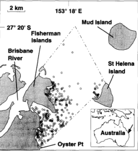
An efficient method for estimating seagrass biomass – ScienceDirect
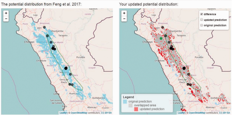
The second application is a type of online armadillo occurrence tracker called Armadillo Mapper (AM). This GIS tool automatically makes a range map of armadillos in the subparamo habitats of Peru based on user online input that shows on the map as potential occurrence. This is important to the knowledge of the hairy long-nosed armadillo (Dasypus pilosus), as their compiled map shows a larger range than the established one by the International Union for Conservation of Nature (green circle on both maps).
Sources:
Feng X, Castro MC, Linde E, Papeş M. Armadillo Mapper: A Case Study of an Online Application to Update Estimates of Species’ Potential Distributions. Tropical Conservation Science. 2017;10. doi:10.1177/1940082917724133
Long, B. G., Skewes, T. D., & Poiner, I. R. (1994). An efficient method for estimating seagrass biomass. Aquatic Botany, 47(3-4), 277–291. https://doi.org/10.1016/0304-3770(94)90058-2