Here’s my final! 🙂
Author: aanair
Nair – Data Inventory
- Zip code: This dataset contains all zipcodes within Delaware County, Ohio. These zip codes were carefully evaluated in 2003 and cleaned up based on the Census Bureau’s zip code file from the 2000 census.
- Recorded Documents: This dataset contains points that represent recorded documents in the Delaware County Recorder’s Plat Books, Cabinet/Slides, and Instrument Records.
- Farm Lot: This dataset contains all the farm lots in the US Military and the Virginia Military Survey Districts of Delaware.
- Township: This dataset contains 19 different townships that make up Delaware County.
- Street Centerline: This dataset contains the data on the center of pavement of public and private roads within Delaware County. It intends to support appraisal mapping, 911 emergency response, accident reporting, geocoding, etc.
- Annexation: This dataset contains Delaware County annexations and conforming boundaries from 1853 to the present.
- Condo: This dataset contains all condominium polygons within Delaware County, OH.
- Subdivision: This dataset contains all subdivisions and condos recorded in the Delaware County Recorder’s Office.
- Survey: Survey points is a shapefile of a point coverage that represents surveys of land within Delaware County.
- Dedicated ROW: This dataset contains all lines that are designated Right-of-Way within Delaware County, OH. This data is line data that is created through the daily updates of Delaware County’s Parcel Data.
- Tax District: This dataset contains all the tax districts within Delaware County, OH.
- GPS: This dataset identifies all GPS monuments that were established in 1991 and 1997. It is updated based on need and published monthly.
- Original Township: This dataset contains the original boundaries of all the townships in Delaware County, OH.
- Hydrology: This dataset contains all the major waterways within Delaware County, OH.
- Parcel: This dataset consists of all Parcels within Delaware County, OH.
- PLSS: This dataset contains polygons depicting the boundaries of the two public land survey districts within Delaware County, OH.
- MSAG: This dataset contains the boundaries of the 28 different political jurisdictions, such as townships, cities, and villages that make up Delaware, OH.
- Municipality: This dataset contains all municipal boundaries in Delaware County, OH.
- Address Point: This data is maintained by the Delaware County Auditor’s GIS Office. This dataset represents all certified addresses in Delaware County. OH.
- Building Outline: This dataset contains building outlines for all the structures in Delaware County, OH. It was last updated in 2018.
Nair – Week 5
Chapter six:
Chapter six focused on collaborative mapping. One thing I noticed was that in exercise 6A, the chapter mentions an “empty row” below the LandUse row, but I found no empty row below the software( I found out later that someone had already made those changes and used the computer before me). The only thing I got stuck on was publishing the web layer since I didn’t sign into ArcGIS Online. This exercise was easy to get through, and I didn’t struggle as much as I did last week.
In exercise 6B, I worked on adding the tree inventory web layer to my map. The work was all done on ArcGIS Online(the web browser). It was very laid back, and I didn’t have much trouble setting up everything. In exercise 6C, I learned how to work on the ArcGIS Collector app. I found that the app name had changed because it showed ArcGIS Field Maps instead of Collector. However, those are the only problems I have had with this chapter. Chapter six felt very laid back and less chaotic compared to the last five.
Chapter seven:
Chapter seven focused on geo-enabling the project. Exercise 7a went pretty well, and I didn’t have to fuss around a lot. One thing I noticed is that there is no “Appearance” tab, as mentioned in the textbook. Symbology is a part of the Feature Layer tab. Exercise 7b, too, was quite easy to operate, except I couldn’t find the “locate” pane for the last step. Exercise 7c was great at first, but then I started struggling with finding the “Data Management” pane. I just used the merge tool from the edit tab to move forward with the project.
Chapter eight:
Chapter eight focused on analyzing spatial patterns. I’ve created a kernel density map using Python before, so I was very excited to get started with exercise 8a. The exercise was pretty easy, although it did mention the appearance tab, which I can’t find on the software anymore. Exercises 8b and 8c also turned out to be very chill and fun to explore.
Chapter nine:
It was easy to get through this chapter, I didn’t have any problems while working with it.
Chapter ten:
The only problem I had in this chapter was that my map didn’t fully match the map shown in the textbook

I think overall, I’ve definitely gotten better at handling the software.
Nair – Week 4
Chapter one:
Chapter one of Getting To Know ArcGIS to me is divided into two parts. The first part is an introduction to GIS and all the basic concepts. This part was very similar to Mitchell’s book. Terms like raster, vector, attributes, layers, and base maps were also referred to again in this book. The first page also mentions hardware as an essential part of GIS, which was interesting to me because I’ve never considered it one. Examples of solving global problems with GIS were brought up. Hardware was also mentioned as an essential part of GIS which seemed interesting to me since I didn’t consider it as one.
The second part is more about ArcGIS and ArcGISPro. ArcGISPro is a part of the ArcGIS Desktop suite and is designed for GIS professionals to use. ArcGIS provides ready-to-use spatial data and related GIS services, such as global base maps, geocoding, and much more. ArcGIS Pro is organized into projects which contain maps, layouts, layers, tables, etc. It makes use of ArcGIS Online, which provides a backdrop as you add on your layers. It also contains geoprocessing tools that involve an operation that manipulates spatial data, such as creating a new dataset or adding a field to a table. The chapter then instructed on using the ArcGIS software.
The first step was to log in to ArcGIS Online, which was nice since I got to play around with the software without having to download it. There were a lot of public maps and features available, which could help beginners like me to get used to the software. There was a variety of base maps provided. Turning on all the layers on the map suddenly made it crowded, however, there were advanced features available that helped make it more readable. The layer modifications feature seemed cool and practical, which could also help us analyze.
Chapter Two:
The second chapter acts as an introduction to ArcGIS Pro. I struggled through it a bit. I had a hard time importing the data because I didn’t know where to download it from. However, since all the students were in the lab, we figured it out together(Turns out the data was in the preface!). I also struggled with opening the catalog pane, but I was able to navigate the software once I imported the data.
In exercise 2A, different layers could be turned on and off based on what the user is trying to analyze. There were a couple of questions that could help provoke analytical thinking in the reader, which was interesting. There were also filtering features that would help explore quantifiable values effortlessly.
In exercise 2B, I closely looked at symbols and the configuration of features. Symbology refers to the way GIS features are displayed on a map. They are useful for making the map look more presentable and conveying meaning to the readers. Here, “Cities” is a graduated symbol because the larger the population, the larger the symbol. For symbology, I chose small pink circles because I thought they looked cute. I also like how multiple base maps with dynamic graphics were provided to add to the existing map.
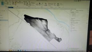
In exercise 2C, I worked on 3D maps, which are more engaging when compared to 2D ones. I struggled with importing the database, but with a few clicks here and there, I figured it out. The chapter mentioned Extrusion — the stretching of flat 2D features vertically so that they appear three-dimensional. The maps can also be easily converted from 2D to 3D. Exploring the 3D maps is one of the coolest things I’ve ever done so far this semester.
Chapter three:
The third chapter closely focuses on geospatial relationships. The chapter referred to combining datasets and deriving statistics, and it reminds me of a project I did recently where I used Xarray and Python to perform Climate Geospatial Analysis. In exercise 3A, I struggled A LOT with opening the database. One would think the third time’s the charm but clearly not. As I went ahead, I found a couple of confusing things: Selecting a particular portion on the map(Illinois Boundary) and the mentions of future chapters. Some terms were briefly explained, and then had a ‘TIP’ section that said we’ll study them in the next few chapters. I’m sure the author had a good reason for doing so, but this kind of+ sidetracked me from my path. I was able to add Illinois later using the Select By Attribute Feature. I was also stuck on exporting the selection to a new dataset for hours and hours. I also found some differences in the software and the text(slight ones), which took me a while to figure out.
In exercise 3B, we incorporated tabular data into our existing attribute table. Columns in this exercise were called fields. I found appending the tables and data very easy. Next, we worked on adding graduated symbols, which is the process of using the same symbol with different colors for features. It was easy for me to figure out how to add those to the map, and the software was also very accessible. Different classification methods mentioned in the previous textbook(Mitchell) were also referred to here. Adding maps from different layers for all the years from 2004-2010 and comparing them was fascinating.
In exercises 3C and 3D, we calculated data statistics and connected datasets. I struggled with creating a null field in this one. However, I was slowly able to figure it out. I found it easy to calculate summary statistics and examine infographics. Connecting the spatial datasets in exercise 3D helped in the analysis and was also deemed insightful.
Chapter four:
In chapter four, we focused on creating and editing datasets. Accessing the database and getting started with the project was much easier this time. In exercise 4A, I got comfortable with using the geoprocessing pane. I ran into some errors while incorporating ‘Valves.csv’ into the map but figured it out with some time. I also learned how to set an attribute domain. I found some differences between the data shown in the software and the one in the textbook. However, I was able to add it to the map properly.
In Exercise 4B, I learned snapping and got comfortable with terms like vertex, endpoints, edge, or intersection. I struggled a lot here with the editing features and spent hours on getting my map with the one on the software. I found this exercise to be the hardest of the three exercises in this chapter. In exercise 4C, I split the water pressure zones into two parts and explored their differences. I found it easy to snap, split the sections, and understand the instructions given in the textbook. I also found it easy to merge the polygons and modify lines and points.
Chapter five:
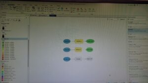
Chapter five focused on facilitating workflows, creating a geoprocessing model, and using Python in GIS. Opening the database was easy, and I was glad I was making progress. In exercises 5A and 5B, we worked on performing repeatable workflow tasks and geoprocessing models. It was easy to get through and did not stress me out as much as the first three chapters. I found the ‘Tasks’ feature in the View tab very helpful as they had clear-cut instructions and made selecting specific places easy.
In exercise 5C, we incorporated Python into the software, which I found exciting. I want to keep finding ways where GIS can be integrated with technology more. I got through the entire exercise quite comfortably. I found that a lot of the things in this exercise I have done before for other projects in a similar manner. I enjoyed this exercise a lot.
Overall:
I struggled quite a lot while going through these chapters. However, by the end, I was able to pick up the pace and apply some sort of knowledge. I think with enough practice, I can get somewhere with ArcGIS Pro. I also want to take this time to thank all the people who show up to the lab at 9 am every day because I’ve been stuck a few times and we’ve all helped each other out.
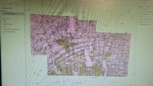
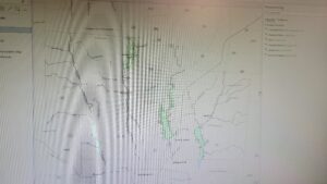
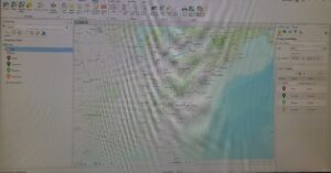
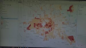
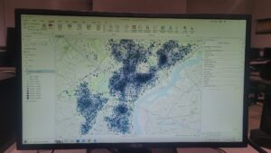
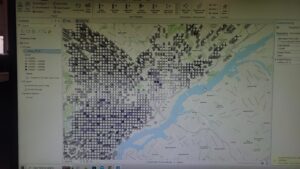
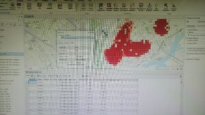
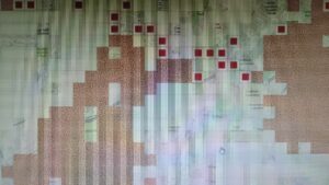
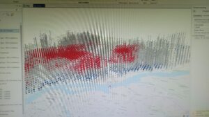
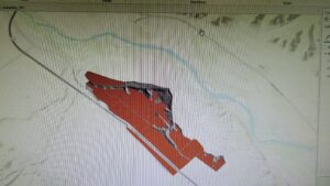
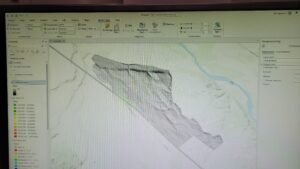
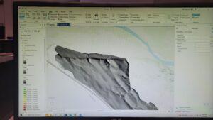
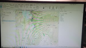
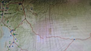
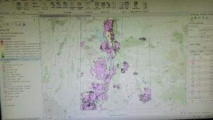
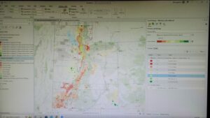
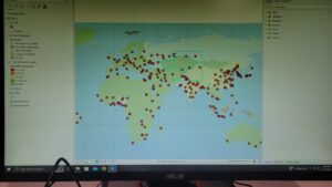
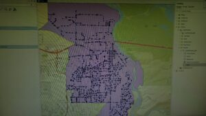
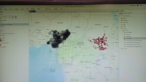
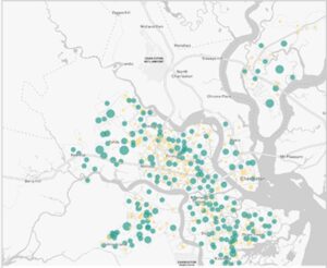
Here are some of the screenshots of my maps while I was working on them:

Nair – Week 3
Chapter Five:
Chapter five focuses on mapping what’s inside a particular area. In the broad spectrum of things, this idea of mapping what’s inside seemed a bit irrelevant to me, but the chapter made it seem very important. People map what’s inside an area to monitor or to compare several areas to each other. It becomes easier for people to know whether to take action by observing what’s occurring in a region. The chapter also mentions that the first thing that we need to do is define our analysis and identify the type of our data. We can choose a single area or multiple areas for analysis. I think in places like India, where areas are divided into multiple sections(like pavements), it might be easier to get started with a single one and then move to multiple regions. Multiple areas include continuous (geographic phenomena) and discrete(unique, identifiable), like zipcodes and state parks. The mathematical terms, like list, summary, and count, used in Chapter three were also mentioned here as a way to use GIS to analyze information. Another thing the user can choose is whether to include features that fall completely outside/inside or partially a part of the area boundary. We can use GIS to overlay the protected area and the land cover areas.
Mitchell mentions the three ways of finding what’s inside, namely:
- Drawing areas and futures.
- Selecting the features inside the area.
- Overlaying the areas and climate.
Initially, each one of them is divided into their pros and cons using the compare table shown in chapter three. The chapter then elaborates on these three types throughout till the end and how they are related to discrete features. frequency, count, and how their results can be used.
Chapter Six:
Chapter six focuses on what’s nearby. Similar to chapter five, it goes in on the importance of certain aspects of geographic locations. GIS helps find out what’s occurring within a set distance of a feature. It helps identify the area and the elements inside that area that are affected by an event or an activity. Finding a traveling range which is measured using distance, time, or cost, helps define an area served by a facility. The chapter starts by asking the reader to define their analysis and identify their type of data. The author mentions that it’s also essential to choose if “what’s nearby” is set by distance or some other range. Distance is one way of deciding nearness, but it can also be measured using cost. In my mind, the word cost is always associated with money, but here it is used for time. One of the interesting things mentioned in the textbook is choosing whether to use a flat plane or use the curvature of the earth.
The terms list, count, and summary from chapter three were mentioned again here to help the reader choose the best method of analysis. Distance and cost can be single or multiple ranges. Multiple ranges can either use inclusive rings or distinct bands. Like chapter five, There are three ways to find what’s nearby:
- Straight line distance — Specifying the source feature and distance
- Distance or cost over a network — Specifying the source locations and a distance or travel cost along each linear feature.
- Cost over a surface — Specifying the location of source features and a travel cost.
The pros and cons are also mentioned to compare the methods and choose whatever is best for the reader. These three types were then further elaborated throughout the end by mentioning their subtypes and instructions, how GIS can be used for this, and how the result obtained can be analyzed. To me, this chapter was heavily similar to chapter five in the way it was structured.
Chapter Seven:
Chapter seven focuses on mapping the change. Mapping change is very important as it helps find predictions that can be further used to take action. My TPG Draft Proposal Project for ENVS110 was based on predicting change(flood risk), so additional policies could be made to protect marginalized communities. To define the analysis, we need to understand the types of change. Geographic features can change in location or magnitude. Change in the location usually helps us see how features behave so we can predict where they will move next, for example, by forecasting hurricane patterns. Change in magnitude helps understand how conditions in a particular place have changed, for example, to observe land cover or vegetation in an area. Knowing the type of feature also helps choose the best method for mapping. There are two types of features — features that move and features that change in character or magnitude. Discrete features that can be tracked as they move through space and events that represent geographic phenomena are the two subtypes of moving features. Discrete features that change in the quantity of an attribute associated with them, Data summarized by areas that are quantities are associated with features within a defined area, Continous categories that show the type of features in a place, Continous values that are continuous quantities, for example, pollution levels, these are all subtypes of magnitude changing features. Three types of time patterns can be measured:
- A trend that indicates whether something is increasing or decreasing.
- Mapping conditions before and after an event lets us see the impact.
- Cycles show recurring patterns that reveal information about the behavior of the features.
A snapshot or a summary can be used to display feature locations or characteristics two or more times. To map trends, determining an interval, the number of dates, and the total period can help. It is important to know how much and how fast the magnitude has changed after the analysis. There are three ways of mapping change:
- Time Series – Good for showing the change in boundaries, values for discrete values or surfaces
- Tracking Map – Good for showing movement in discrete locations, linear features, or area boundaries.
- Measuring Change — Good for showing the amount, percentage, rate, or place.
Similar to chapter five, the methods were laid down in a comparison table with their pros and cons to help the reader choose the best method for themselves. Next, the chapter gave instructions on creating a time series by showing the change in character or location. To create a tracking map, we can map individual features, linear features, contiguous features, or events. To measure and map changes types of character-changing features can be used. The chapter provides detailed instructions even for complicated situations, like mapping when there are negative values or if the boundary or category of definitions has changed.
Nair – Week 2
Chapter 1:
The first chapter acted as an introduction to the book. The process of analysis was given in a detailed manner. I liked how the chapter said framing questions was the first way to start analyzing data. Understanding data, choosing a method, processing the data, and looking at the results were explained briefly as a part of the process. I liked the different types of maps under the Geographic Features Category to show maps summarized by area, discrete or continuous phenomena. I thought the maps co-relating businesses with areas/zip codes were interesting because I have always associated GIS maps with disaster management or weather, so this felt new. I knew that Geographic features could be represented using vectors, but this was my first time coming across the “raster” method, which is the representation of a matrix of cells in continuous space. Most of the analysis in this method occurs by combining layers to create new layers with new cell values. The book also included important tips like using the perfect-sized cell instead of too large or too small of a size for a more precise map. I will keep this information in mind when I start making actual maps on the software. Geographic attributes were divided into multiple things like categories, ranks, counts, amounts, ratios, etc and even working with the data tables seemed very math-oriented and statistical than something more social sciencey than I previously assumed. There was a lot of calculation and selection used to summarize data. Overall, different concepts for different types of analysis’ were mentioned, and I found them useful because understanding them will help me get a better idea of what kind of analysis I would like to do. Also, I’ve been trying to find an intersection between technical and social sciences, and I’m trying to see what kind of doors GIS opens up for me there.
Chapter 2:
The second chapter focused more on the concept of mapping. It talked about how maps are prepared and bought into this world. I’ve never had the chance to map stuff before, except for one data visualization project where I visualized the crime rates in each state in India. I like how the entire process is laid out and explained in a well-detailed manner. I feel like for someone with zero to little experience with mapping, this chapter can be helpful since it starts with understanding the location and what exactly we want to map and then goes on to prepare our data and how we can map single or multiple types or by category. Some sections specified how GIS can be used to make these maps more efficient. It was interesting to see the use of maps to quantify thefts, burglaries, and crime in specific locations. It also made me think about other places where we can use maps to resolve nationwide issues like this. Maps give you information that will help analyze further to find solutions. A few things that my dorky self would enjoy doing while mapping is choosing symbols and colors(Also, the chapter makes use of pastel colors for maps, so I find it very cute.)
Mapping is usually looked at as something simple, however, the chapter mentions things like the usage of maps or maps that use eighteen zoning categories. The chapter also describes how ArcGIS provides base maps, which can be used as reference features for mapping. This will help me when I start working on the software.
Chapter 3:
The third chapter takes mapping into detail. Looking at the title — Mapping the Most and Least, makes me think that chapter will talk more about quantifiable skills required to make maps. I liked the business analogy used at the beginning of the chapter to explain why we need to map the most and least quantities. This chapter, just like the previous two chapters, had detailed instructions on specific map-making processes. It mentioned things like displaying areas using graduated colors while surfaces are displayed using contours or 3D view. The next page also included a splotchy green map that looked really cool. The chapter also included things that could potentially sidetrack us from the main task, like exploring data or presenting a map and how to explore data in a way to see emerging patterns and questions. Economic and statistical terms were used throughout, like counts, amounts, ratios, ranks, proportions, etc. All the terms were clearly defined, which was helpful for someone like me who has never been in an ECON class before. The chapter made use of multiple formulae to make sure that the data was accurate and precise.
The chapter noted that similar quantities should be grouped in one class together to make it easier for the student to make the map. Mitchell mentions various classification plans, namely standard deviation, quantile, and natural breaks, and their advantages and disadvantages. As I suspected before, the chapter’s primary focus was to explain how stats and math are used to create maps.
Chapter 4:
The fourth chapter focuses on mapping according to density, and similar to chapter three, it consists of various economic and statistical terms. It starts with explaining why map density is essential and can be used in multiple areas with a specific type of data. Density maps can be helpful when looking at patterns. It helps with areas with a higher concentration, so I’m assuming that people with no knowledge will also be able to decipher the maps. The author also mentions that its important to decide what to map and what kind of data will be used so that it is compatible with the style. The book mentioned two ways of mapping according to density — By defined area, where you calculate a density value for each area using dot maps, and by density surface, which uses the raster layer mentioned in the first chapter. Each cell in the layer gets a density value based on the number of features within a radius of the cell. Different comparing methods and ways to choose them were mentioned in the book to make it easier for students when they start mapping.
Like chapter three, this chapter also included specific class ranges and colors for ratios for shaded maps. The book instructs on creating different types of dot density maps on different scales of data. It goes further on how to calculate density values by converting density units to cell units, searching for radius, and using different calculation methods and contours.
Nair – Week 1

Hey everyone, I’m Aninditha Nair(I know it is hard to pronounce so “Anin” works just fine) I am a freshman, majoring in Computer Science and Data Analytics and minoring in Environmental Science and Dance. I’m from a small town near Mumbai, India. Currently, I’m involved in the Campus Programming Board and Horizons International. I want to learn GIS because I really want to understand new facets of environmental science and technology.
Reading Schuurman’s chapter one gave me an insight into GIS and helped me connect it to my specific interests. I found it interesting that GIS is used so extensively around the world, especially for organ donations and epidemiology, which I had no idea of. It is also amazing how different people in different countries implemented GIS in one form or another and how it is called an inevitable development. I liked the mention of spatial data analysis because, during ENVS110, my TPG proposal project made use of spatial data to analyze marginalized communities for flood risk and management.
I had a misconception that GIS was all about geography and cartography, and even though those constitute a lot of it, it was nice to see so much computation and technology being involved in the process. I also think it is interesting to notice that GIS now often refers to Geographic Information Science and not Geographic Information Systems. I didn’t know that GIS had two different types of identities. The black box identity seemed intriguing to me, and how researchers were more curious about what underlies the technology than the application of existing technology.
Reading the chapter also made me realize the similarities between GIS and my data analytics class. GIS allows the visualization of spatial data and also provides a means of utilizing fuzzy data. Similarly, for Data Analytics, we accumulate data and visualize it to analyze further and find better solutions. I’m also amazed to find out that India is at the forefront of e-governance technologies and implementation using GIS(I swear I’ve lived in India all along, I’m just dumb). In the end, the chapter summarized every single chapter in the book in a succinct manner. I feel more comfortable and prepared with the course now that I have a small gist of what the entire book is going to be about.
For the GIS applications, I looked at the application for Racial Equity. I specifically looked at ESRI GIS HUB and their ways of addressing racial inequalities. They go through a four-level-process: Engage communities →Map and analyze inequities →Operationalize best practices →Manage performance. They use maps and spatial analysis to reveal and understand inequities in experiences and outcomes within communities. Another application I found interesting was the application for Climate Models. I was unaware of the fact that GIS and Climate Modelling could be so intertwined. A GIS-based analysis of the tornado in Joplin, Missouri, in 2011 shows how combining weather and climate information can be useful when it comes to answering questions like, “How many miles of roadways were in the tornado path?”, and “Which roads likely need to have signs replaced or debris cleared?”
Sources:
https://gis-for-racialequity.hub.arcgis.com/
https://www.esri.com/about/newsroom/arcuser/mapping-and-modeling-weather-and-climate-with-gis/