Buroker Week 2

Chapter 1:

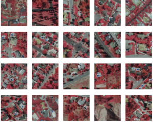
The most common GIS analysis tasks are mapping where things are, mapping the most and the least, mapping density, finding what’s inside, finding what’s nearby, and mapping change. These are all analysis tasks that we can do in GIS, with a plethora of different datasets. GIS analysis is the process for looking at geographic patterns in your data and at relationships between features. There are four types of geographic features, discrete features, continuous phenomena, features summarized by area, features summarized by area. The two distinct methods or models used to represent geographic features in GIS are vector and raster. A vector model involves each feature as a row in a table, and each feature represents either discrete locations, events, lines, or areas. Differently, the raster model represents features as a matrix of cells in continuous space. I have some experience working with both vector and raster, and have never fully understood what the difference is and what is actually going on within the computer. Even after reading this section of the chapter I still feel somewhat confused about what is really going on. Each individual layer represents one attribute and almost all analysis happens by combining layers to create new layers with new cell values. Attribute values are important for understanding geographic attributes. Attribute values are categories, ranks, counts, amounts, and ratios. Very simply, categories are groups of similar things which allow you as the researcher to organize data. Any feature with the same value in a category is alike in some way, and different from a plethora of other features with other values. It is a sorting tool. Ranks are just what they sound like, they rank features in order from high to low and are often used when direct data isn’t available. Counts and amounts show total numbers. Count being the actual number of features on a map, and an amount being any measurable quantity associated with a feature. Ratios show relationships between quantities and are made by dividing one quantity from another. Ratios are important when disparities exist between features or areas, such as large and small geographic areas.


Chapter 2:

I think the idea of altering or catering a map to specific stakeholders is very interesting and plays into the discussion on making a map. I’m excited to see what the chapter has to say about this section. When thinking about deciding what to map, it is important to recognize what information you are ultimately wanting to display or understand through your analysis of the map and to think about how you will use your map. These questions guide what features are displayed or contrasted and ultimately the answers to these questions shape the choices of the mapmaker and ultimately the impact of the map. I’m confused about the section titled “making your map”, it uses the phrase “you tell GIS which features you want to display and what symbols to use to draw them”. I don’t understand how the symbols and drawing function and what this does or does not do to a map. Using a single layer (mapping a single type) draws all feature types with one single symbol, which can still reveal patterns, even though they solely show where features are. Conversely, using a subset of features allows you to map all features in a data layer based on a category value. This allows you to map all crimes, select burglaries and map only those, even selected commercial burglaries from there. This layering allows the discovery and illustration of more and more patterns. I’m starting to have some more clarity about symbols and drawing, I think reading about different ways to map is helping me better understand the role of layers. You can also map using categories. You would therefore be drawing features using different symbols for each category value. This can potentially provide insights about how places work at a deeper level than simply single groupings, like crop type (simple) and species (complex). It is important to choose the symbols you use to display your map categories because they help to reveal patterns within the data. This is a section I will definitely dog-ear and come back to when it is time to pick symbols. Ultimately, if you do all the stuff listed above, you should be able to potentially recognize some geographic patterns within the maps you create. This will come to fruition if the map presents information clearly. Things to look out for are features that appear to be clustered, uniformly spaced, or randomly distributed.


Chapter 3:

This chapter begins by discussing the ability map makers have to add more meaning and value to their maps by mapping “most and least”. This involves mapping features based on quantities which can add another level of information (more than just the locations of features as discussed in the previous two chapters). In order to achieve this, you must map the patterns of features with similar values. In order to do this it is essential to know the types of features you are mapping, and again, the purpose of your map so that you can present the patterns.The types of features that you can map are discrete features, continuous phenomena, or data summarized by area. The discrete features are individual locations, linear features, or areas. Continuous phenomena are areas or a surface of continuous values. Data summarized by area is usually shown through shaping each area based on its value or charts that show the amount of each individual category in each area. I am still somewhat confused about what each of these three features look like in practice. I had a hard time contextualizing the examples the book gave. Quatinies, such as counts or amounts, ratios or ranks, can also help you decide the best way to present data. After ascertaining the quantities you have, you generate classes in order to best show them on the map. The essential part of generating classes is that there exists a trade off between accurately presenting data values and generalizing the values to see patterns on the map. Swinging too far in either direction decreases the accuracy of the map and can shift the impact of the data. I appreciate the example maps which show how different the same data can look based on different class schemes. I remember learning about how the natural breaks, quantile, equal interval, and standard deviation classes are different and alter your map projection. I appreciated reading about these and learning more about how they work. I feel like the “making a map” and “choosing a map type” will be more easily understood if I have a map of my own that I am trying to make and can more easily compare the different options to. Currently it is somewhat difficult for me to get through all that information without a baseline map to compare the different options to.


Chapter 4:

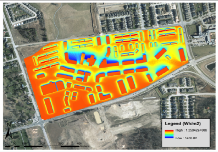
Chapter four focuses on how mapping density can elevate a map and allow you to elevate your maps. A density map allows you to use a uniform aerial unit, like hectares or square miles to measure the number of features and clearly see distribution. This is good for things like the number of people in a census or in a county. I think we did this in the previous GIS class with our state county maps. The two ways you can create a density map are by shading defined areas based on a density value or by creating a density surface. Point or line data is typically mapped using a density surface, which looks kinda like a topographic map with varying bands of intensity. When mapping density by defined area, you can use a dot map to represent the density of individual locations. This doesn’t show the specific density centers, just the individual points. Mapping by density surface, as stated above, allows you to see the density centers. I feel a bit overwhelmed by the math that goes into creating a density surface. Does the GIS do this math or is it something done by hand? I remember doing some very basic math for generating classes for the county data we used in the other class, so I feel like it could go either way. In order to display the density surface you generate, you can use either graduated colors or contours. Each class you pick (from chapter three) will show the graduated colors differently, and therefore change the way the map looks. So it is important to understand what you want to show, and which class illustrates it the best. Using contours is a bit different and does a good job showing rate of change across the surface. If the contours are more closely spaced, this means the rate of change is higher. This one actually looks more like a topographical map with differently spaced lines. In the density surface the lines are blended and not defined.

Skidmore Week 2

Chapter 1:
Since the book was published the use and abilities of GIS have grown, from making maps to analysis that can solve problems. GIS analysis is finding patterns within your data, starting with a question. To decide what method to use to obtain your data you will need to understand the data you are working with. To understand GIS analysis you need to understand the geographic features you will be working with; discrete, continuous phenomena, or summarized. Discrete locations can be pinpointed with their exact location. Continuous blanket the entire area of your map, these can either be continuous or non-continuous data. If the data is non-continuous the software will use interpolation to fill in the gaps. Summarized data represent data within a given area, not specific points given as the density of individual features. These features can be shown using vectors which are defined as a location within a table that can be connected to create areas or a raster model which uses a matrix of cells that can be increased or decreased in size. A map projection system converts data from global or rounded data to a flat or 2D plain so it will distort some features. To do the analysis you need to separate your data into categories, ranks, counts and amounts, or ratios. When working with data for a GIS analysis you will need to create tables for your information these come as selecting, calculating, and summarizing.

Chapter 2:
When doing GIS analysis mapping is a large part of the work because it allows you to see patterns forming. Knowing your audience is important when deciding how complex a map should be or the data that is being mapped. Before creating your map you will need to assign values to your data for their location and code on the map. Creating the map requires you to tell GIS what feature you want to be present in the final product. Often used in this process is single-type mapping where the data is only shown by one symbol on the map. Once you have done the above steps GIS then takes the data and symbols with the geographical location and creates a map that matches your inputs. Instead of having all data present on one layer, you can create subsets so that there are categories within that correspond with different symbols. When creating different categories you can also change the size of different symbols based on key values within your table. If you are doing this though you will want to keep in mind your audience because most people cannot distinguish more than 7 different categories. One key thing is included features that are recognizable for people unfamiliar with the area such as street names. Even if you have found a pattern in your map you still need to find if it is statically backed.

Chapter 3:
When mapping man people want to find the most and the least amount found in the patterns. To decide how to map these you will need to know whether your data is continuous or non-continuous. To understand your data you will want to keep in mind your audience and whether you are presenting the data. If you want to find a deeper analysis you will have to explore your data further than the patterns on the map. Counts show how many of a thing are found on a map whereas amounts are the value associated with each item. Ratios are used to smooth out data and are useful when summarizing data within an area. Ranks are used when the mapped data is hard to quantify and show relative values. Once you understand the data you are working with you will need to assign values and symbols to the items which come with the trade-off of showing things accurately or generalizing. Individual items when mapping lead to complex data that is hard to read for certain audiences, whereas creating classes generalizes that data allowing for an easy analysis for some. When creating classes you can either do it yourself which is normally for more specific data or use previous breaks mentioned these include, natural breaks, quantile, equal interval, or standard deviation. To decide on which of these methods you need to use you will typically create a bar chart to see how the data is distributed across the x-plain. In doing these methods outliers may be found that can cause a problem with your analysis these can be a problem with your data set, wrong, or involved. The final step in creating classes is how many are you going to include and how will you show these on your map. If you have properly done the correct method in separating them this step should be easy and some GIS software will automatically make the classes continuous. Now that you have quantified your data you will need to map it, the normal reaction is to make the mapped complex but that should not happen. Graduated symbols are typically used for volumes or rank in linear systems, whereas graduated colors are mapped to show continuous data within the specified area. Charts are used typically for a quick study of the area and not complex data. Contour lines show the rate of change from one set of data to the next and are typically used for spatial data. The most complex form of this data visualization is the 3D form which is typically used to allow the audience to better visualize the surface of the data. The most important part of 3D data is the viewer location since larger sets of data will block the view of other data and allow for worse analysis. The next two z-factor which exaggerate the data for easier visual separation of data and the light source which is the location of the source help the audience better view the patterns.

Chapter 4:
Mapping density rather than individual locations better allows you to see concentrations. You can either map points and lines or summarized data with density maps. You can either map density features such as businesses or feature locations such as employees per location. Density defined by area is where you map each location then divide and then summarize the data within a given polygon size to create density or by a surface that uses a raster model to create density per cell. A dot density map is a method of density defined by are but rather than a shaded color within an area, it uses dots to represent your data which better allows for a generalized area to be more accurately shown specifically population density. In a raster model cell size is the most important decision and that does not change is density surface. Along with cell size, another thing to keep in mind is the search radius which defines how many features will be calculated within each cell. There are two types of calculations used in the GIS simple method which uses rings around the cell and the weighted method which uses a mathematical function. Areal units are what define the legend of the map rather than cell units. When graphing density surface it can either be shown in graduated colors or contours.

Richardson – Week 2

Eliza Richardson 

27 January, 2023 

ArcGIS Week 2 Blog Post


Chapter 1 

Mitchell begins the first chapter with laying out some necessary information needed for GIS mapping, and how to decide the best way to represent your chosen data. You first need to understand the data, choose a method, process the data, and then contribute results. These results could either be discrete (location of businesses in the state of Ohio) or continuous (counties color coded by number of businesses). They would both display the same data, but with a different application and meaning of the data. Discrete data can be represented with a vector model, which is better for individual points, and continuous data can be represented with the raster model, which is better for widespread data. Mitchell then describes the types of attributes that you can describe your data with; categories, ranks, counts, amounts, or ratios. An example of categories could be types of employment in Franklin county. You could categorize each household on what kind of field they are employed in. Ranks may relate to things like the redlining maps; which neighborhoods are more likely to be accountable for a loan and pay a mortgage on time. Then be sorted into ranks of A – D. Counts and amounts refers to any measurable quantity, such as the amount of employees at various businesses. Ratios can be separated into proportions and densities. For example, you can map the average number of people per household by county to see which counties have the most people living in each home. 

A lot of the information covered in this chapter are things that I have heard discussed and have used when doing GIS projects in other courses, but it is very helpful seeing them all spelled out in front of you so that you can maximize the efficiency of your data. In other courses, I felt like I wasn’t presenting my data in the most optimal scenario, and I could have used a better consensus of the way to maximize the presentation of it. 


Chapter 2

GIS is so important in the development of so many different fields. Using GIS, “police can map where crimes occur each month, and whether similar crimes occur in the same place or move to other parts of the city.” and “wildlife biologists studying the behavior of bears may want to find areas relatively free of roads to minimize the influence of human activity.” (Mitchell 24) In order to create a map that represents your data, you first need to link your data to geographical coordinates. You can then link the subset of your desired data to the geographical coordinates in order to create the image you want to portray.  However, if you don’t want to portray too much information to digest in your figure, then it will be too difficult for the reader to understand the purpose of the map. If you have a detailed description, you could categorize them into smaller portions in order to make the message of the figure clearer. Mitchell states that no more than 7 categories should be used on a map or else the message of the data will be lost. The fewer categories you can evaluate in one image, the easier it makes for the reader to understand and compare each subset. In addition, the scale of the map and the amount of categories can make the patterns difficult to see for the reader, and can get lost in the figure. Keep It Simple Stupid. 

However, if you need to include all of the categories in order to portray the message of the data  completely, one way to do this is to create multiple maps of the same geographical area, but with different data that it is showing. If you want to show 15 data points, you can subset them into categories, and then make another map for each category that you subset the data into. This makes it so that you can still provide all of the data necessary to reach a full conclusion, but still allow for the maps to be decipherable. 


Chapter 3

When exploring data, it is important to keep in mind the purpose of the figure, and what the figure should be telling the reader. Are you evaluating the data? Or are you trying to find a pattern? Or an answer? Based on the goal of the data, then you can choose the way you want to graph your data. One way that you can evaluate one data point is through classes. This is very similar to rankings, but you can assign an upper and lower limit to which values fall within the rank, to represent the entirety of the region. For example, if you are trying to evaluate soil quality, you can assign a value of 8 to the top 15% of soil, and separate all soil regions based on the following 15% to show which areas have the best soil quality. You could also classify a region into percentiles, and represent the bottom 25th percentile, middle 25-75 percentile, and top 75th percentile separately. Mitchell goes through the various ways that you can section data. Keep in mind that not all of these sectioning strategies will be optimal with your data, and you must choose depending on the layout of your data.  Natural breaks (jenks) which is when data is separated based on where there is a jump in values. Natural breaks are good for mapping a data set that is not evenly distributed and has clusters of information. Quantile contains an equal number of features. Quantile is good for comparing areas that are roughly the same size, and for data points that are relatively equally distributed. Equal interval is when the difference between the high number and the low number are the same for each section. Is good for data that does not have a large variance in value and for presenting nontechnical information like precipitation and temperature. Standard deviation is when “features are placed in classes based on how much their values vary from the mean.” (Mitchell 68) This is good for seeing which values are above and below the mean, and how far above and below they are. 


Chapter 4

Mapping density is very important when trying to distinguish trends in the area. There are two ways to create a map by density: “based on features summarized by a defined area, or by creating a density surface.” (Mitchell 109) By using a defined area to create a density map, you can use predetermined boundaries, such as counties or countries, to determine the density of that area as a whole, compared to another section of the region. By using a density surface, you can see the variation in density across the area as a whole, not simply where boundary lines occur. You should use a density map if  “you have data already summarized by the area, or lines or points you can summarize by the area”. This is easier than creating a density surface, but can cause some inaccuracy, especially if you are analyzing a large area. You should use a density surface if “you have individual locations, sample points, or lines.” This requires more data processing on the authors part, but is more precise in the long run. Another way you can add to a density map is to add a layer of the density points overtop of the map. That way you can see where the individual points are coming from, but also the overall trend for boundaries in the data. Another way to change the variability of the density map is to change the cell size. If it is hard to distinguish where the dense places are on the map, try making the cell sizes larger so that you get a closer look at parts of the data. To distinguish non dense areas between dense areas, you should use a color gradient to make a visual representation of how the density fades between geographical regions. However, if you have too many gradient points, it will be difficult to distinguish where the points are falling on the graph, and the difference between each region. Again, you don’t want to include too much information so that it is hard for the reader to comprehend.

Munroe – Week 2

Chapter 1

Chapter 1 focuses on understanding GIS analysis and better framing data to fit the needs of your map. This chapter’s structure gives us a bottom-up approach to GIS, starting with the basis of geographic features, as this shows us how our data will be represented. Mitchell talks through a few examples, such as discrete features, continuous phenomena, and features summarized by area. Further, he talks about the difference between vector and raster models. The vector model centers feature as “a row in a table, and feature shapes defined by x,y locations in space” and areas defined by borders represented as closed polygons. The raster model is different, displaying features as “a matrix of cells in continuous space.” Any part can be displayed using either model, but it’s important to be conscious of which will be more visually appealing to the viewer. Discrete features and data summarized by area as usually represented with the vector model, while continuous numeric values are defined using the raster model. Endless categories can be represented by either the raster or vector model. I’m already pretty familiar with coordinate systems, with experience from GEOG112, so this section was not of great need. Mitchell finishes the chapter by talking about understanding geographic attributes, specifically attribute values. He lists categories, ranks, counts, amounts, and ratios. Types are used to group similar things and can be represented using numeric codes or texts. Classes put the features in relative order when direct measures are complex. Counts and amounts are used to show total numbers, while ratios establish relationships between quantities, usually resulting in a percentage. This is all data-driven and extremely important, as maps are just products of data. Mitchell finishes the chapter by talking about data tables, which helps us understand how to convey selected attribute values properly. 

Chapter 2

Chapter 2 begins by mentioning the means by which you’re making your map. This reminds me once again of GEOG112 and KryKrygier’smic book regarding the information and audience your map needs to have to be successful and engaging. Mitchell progresses to the basics of making your map, starting with mapping a single type, where you draw all features using the same symbol. Then, he moves on to mapping by category, where you draw features using a different symbol for each category value. Mitchell makes a point that when choosing how many categories to project, it’it’sportant to look at the visual appeal of each map with its scale to judge which would be better for your audience. If you have over seven categories, it may be useful to summarize certain categories to fit together, as to not distract the audience or deter away from the meaning of the map. If youyou’reing symbols to display categories, it’it’sso important to prioritize colors over symbols, as colors are more effective to be visualized and grouped together. For example, when showing maps that have distinct categories like soil and geology maps, combining the projected features with their prospective color to a two-or-three letter code can help the viewer better see the projection, even with an included table showing the values. The same goes for implementing reference features into the map. The ultimate goal with mapping information clearly is for the viewer to recognize and establish patterns. This helps prove the data that youyou’vepped and shows that youyou’vepped something meaningful and necessary. It should be clear and evident with what youyou’reying to prove to the audience. My goal throughout this course when using ArcMap will be centered around this point, as I want my work to be successful, evident and clear with useful information being pulled from the data visualized on the map.

Chapter 3

Chapter 3 is focused on quantitative data, as mapping the most and the least helps us compare relationships between places. This helps show where help, intervention or policy is needed or of least concern. One way to do this is by shading. The darker an area, the higher the quantity of data is being reported from that location. To do this, data is summarized, usually using ratios, and set into categories with the highest percentage being darker in value versus the lowest being lighter in value. Mitchell speaks specifically on the purpose of the map, begging the question if youyou’reploring the data or presenting a map. If youyou’reploring data, youyou’retively looking for patterns and relationships versus presenting a map where you already know the pattern and relationship youyou’reying to prove. Keeping this in mind will help you build and promote a map of true purpose. Mitchell then dives back to the first chapter, recapping on quantitative data being interpreted as counts and amounts, ratios or percentages, each specific in their own characteristics and useful for differing scenarios. The chapter then turns to creating classes, specifically how to group your data to represent values accurately and efficiently. Once youyou’veeated classes and a corresponding legend, choosing an appropriate color scheme is necessary as it will help put the spotlight on your data. As mentioned before, higher percentages being darker and lower percentages being lighter is a recommended option. Mitchell mentions natural breaks, quantile, equal interval and standard deviation. Further, he mentions the different options to show quantities like graduated symbols, graduated colors, charts, contours and 3D perspective views, each is very specific and Mitchell dives into each to show the accurate ways of using them to show data. It’It’sportant not to go overboard, though, because you still want the viewer to be able to comprehend the data easily and come away from the map with the accurate interpretation and information.

Chapter 4

Chapter 4 turns to mapping density, in particular how to show where certain objects or data are concentrated which is great for census tracts or counties varying in sizes. Mitchell recommends starting with the question “Do”you want to map features or feature values?” D”nsity of features uses the example of locations of business, versus the features values which has an example of number of employees at each business location. The density will obviously shift, with more workers at certain locations and more businesses in another location. Because you want your map to be easy to comprehend, it’it’sportant to ask this question before beginning the process of making your map. Moving along, if you map by defined area, you create a shaded density map with area boundaries. If you choose to map by density surface, you create a map that almost looks like a weather radar, with density sprawling over area boundaries. To create these calculations, you first have to define and create categories. Relying on information from chapters 2 and 3, you can extrapolate your data to fit your tables and then take those quantities and create corresponding classes, specifically with a graduated color scheme. You can also create a density surface using GIS, where GIS calculates a density value for each cell in the layer which shows where point of line features are concentrated. To do this, you need information about cell size, search radius, calculation method and units. The cell size determines how coarse or fine the patterns will appear, while the search radius will construct how generalized the patterns in the density surface will be. There are two calculation methods you can use, the first being simple which counts only those features within the search radius of each cell while the weighted method uses a mathematical function to give more importance to features closer to the center of the cell and units will let you specify the areal units in which you want the density values calculated. You can also imply contours, but that makes the map more rigid and helps show the values of the legend easier. After completion, the density surface will replicate a weather radar map and can help the viewer find where the selected data is more likely to be found.

Steed – Week 2

Chapter 1

This chapter introduced readers to GIS analysis, the manners in which it can be applied, and the technical terms used to describe its functions. First, the author provided a clear definition of GIS analysis, and then described the five ways in which geographic data should be analyzed: (1) frame the question, (2) understand your data, (3) choose a method, (4) process the data, and (5) look at the results. Next, Mitchell distinguishes the various feature types, which includes discrete, continuous, and summarized features. These are important because they determine how to move forward with the given data (e.g., if we know our boundaries are discrete, then we know exactly where to pull our data points). Then, the author describes how each geographic feature can be modeled—through either vector or raster models. In addition, Mitchell defines map projections and coordinate systems, and explains how the shape of our globe impacts their applications. Finally, this chapter describes different attributes that characterizes data (e.g., categories, ranks, ratios, etc.).

Overall, I think this chapter was critical in understanding some of the jargon that has been used in the past here at Ohio Wesleyan that I have neglected to do more research about. Although the information in this chapter is definitely basic, I think by starting out with this advice with accompanying examples, I will find it easier to understand the ArcGIS application.

Chapter 2

This chapter explains the importance of mapping and discloses strategies that can be utilized to best represent data through map design. First, the author specifies that mapping can be used to analyze where action needs to occur in a geographic space, to explore the causation of (an) event(s), or to search an area for a specific criterion. Then, Mitchell mentions the necessary steps to prepare data for mapping. He stated that users need to ensure that geographic coordinates and category values (if needed) are assigned to each feature. If not, Mitchell indicates that there a variety of issues that could occur. Next, Mitchell articulates how GIS works in creating a map for both single and categorical features that are prescribed by the users. In addition, the author provides tips for users to make their map as clear as possible to audiences. Finally, Mitchell discusses how to analyze geographic maps to look for patterns. He clarifies that pattern formation is one of the critical pieces of creating a map, so it is important that these steps are followed successfully.

As suspected, this chapter added to what we just learned from the first chapter. For example, Mitchell consistently reverberates terms such as “continuous” and “raster,” which were just defined in the first chapter. Additionally, this section gave great guidance to avoid mistakes when creating maps. For example, he said “if you’re showing several categories on a single map, you’ll want to display no more than seven categories,” and also, “if the pattern are complex or the features are close together, creating a separate map for each category can make patterns within a particular category—and even across categories—easier to see.” Not only will these tips allow me to avoid making unnecessary mistakes, but also it creates a better understanding of why there are specific tasks that users need to make.

Chapter 3

This chapter focused on mapping intervals of values and explained which methods of mapping are necessary based on the type of feature. First, the author examined the importance of graphing maps with varying quantities and reverberated some of the information that was discussed in chapters 1 and 2 (specifically, discrete, continuous, and summarized features). Next, Mitchell defined the various quantities like counts and amounts, ratios and ranks. Then, he begins to explain how these quantities can be divided into classes either manually or through the use of classification schemes. The four classification schemes he describes are natural breaks (jenks), quantile, equal interval, and standard deviation. Each of these class separation tools allow for geographers to better understand given data sets, but they must be used in the right manner. For example, natural breaks are good for mapping uneven data sets, but quantiles are not (they are known for comparing areas that are roughly the same size). Furthermore, Mitchell explains how to deal with outliers in data sets and defines the differences between various map types for understanding discrete, continuous, or summarized areas. Finally, the author describes how users should be able to visualize patterns in their maps, and how to make it clearer for their audiences.

Although this reading bares some similarities between chapters 1 and 2, the author was able to provide guidance for why and how classes should be assembled for a given data set. In addition, it was able to differentiate between different map types, which is useful for when I apply this knowledge to the ArcGIS application. I am curious how the author will be able to build from this to describe map densities in the next chapter without reverberating the same information.

Chapter 4

This chapter describes the importance of density maps and explains how to create the two distinct types: (1) by defined area and (2) by density surface. First, as the previous chapters, he reverberates some of the primary information for why you should have an objective in mind when creating maps of any kinds. However, he describes that for density maps, they are “useful when mapping areas…which vary greatly in size.” Then, the author describes in greater detail the two distinct types of density maps. He says, map density by area when “you have data already summarized by area, or lines or points you can summarize by area.” On the other hand, Mitchell states to create a density surface when “you have individual locations, sample points, or lines.” Then, he goes into broader detail about each type with how each are calculated, displayed, and finally analyzed.

Honestly, I found this section to be a little redundant, but I understand its importance. Without a firm understanding of density maps, there’s a lot of data that cannot be properly analyzed. In addition, this sort of mapping is commonly what I see when I go to various databases. It is fairly easy to interpret, and from the sounds of it, pretty easy to map on your own—if you know some basic math.

Luna – Week 2

Chapter 1 of the book really focuses on the basics of GIS. It firstly discusses the chapters of the book and the way that they are ordered so that they teach you to do the basic process that is followed in GIS. Next, this chapter works to make the reader understand geographic features. Firstly, the types of features are covered, including discrete features (features with real locations that can be specified), continuous phenomena (occurrences that are experienced and measured everywhere using locations with boundaries or random sample points), and features summarized by area (the measurement of the features within certain boundaries that apply to the whole area rather than a specific place). Then, the chapter talks about methods of modeling features. The first of these methods is the vector model, where each feature has its own table row and the shapes of these features are shown by their coordinate location on the graph. In the raster model, which is the second method, features are shown using cells in space. This part of the chapter also talks about map projections (shows locations of a spherical globe on a flat map) and coordinate systems (specify units that are for finding the features in a flat space). The next section discusses geographic attributes and the types of them, which are the continuous ones, including categories (groups) and ranks (orders), and the noncontinuous ones, including counts (number of features on a map), amounts (measurable feature quantities), and ratios (relationships between quantities). Finally, the last section covers the use of data tables, talking about the operations used including selecting, calculating, and summarizing. This chapter, as a whole, did a very good job of showing what GIS is all about and why it is needed using the types of features that it is used for to show its need.

Chapter 2 of the book is more about mapping and what goes into that process. The first part of the chapter says that it is important to map things because maps can either show what places meet the requirements, where the most action is needed, or why things are happening. The second part talks about how to decide what to map, firstly saying that the user initially needs to ask what information is actually needed when the analysis is done and how the map will be used. The third part covers how to prepare the data being used, which requires assigning geographic coordinates and category values. The next section of the chapter talks about actually making the map that all of this will be on. This part talks about mapping features of the same type using the same kind of symbol, GIS’s purpose of storing the location as points or shapes, and mapping using feature subsets, which is said to be more common than using individual locations. Next, the books discussed mapping categories, saying that GIS works to store category values for each of the features in the data, making it able to display certain features based on their type. Symbols or colors can be used to differentiate these groupings but the book instructs the user to be careful because too many colors or symbols can make things confusing. This section also suggests that the user use reference features, or landmarks to make it more meaningful to people. Finally, the last section of this chapter discusses interpreting patterns that can be seen in maps. This chapter is a very digestible introduction to actually being able to do things in GIS. While the first chapter talked a lot about the history and use, this one left me feeling better prepared for using the program. 

Chapter 3 is about mapping the most and least, which is said to be useful because it can assist in finding data points that fit in the needed criteria. In order to do this, the values need to have quantities assigned to them, which can be assigned to discrete features, continuous phenomena, or information summarized by area. The next section of this chapter covers the quantities and actually understanding them by more deeply explaining counts, amounts, ratios, and ranks. After this, the book talks about grouping the quantities together into classes, which is said to be particularly useful when it comes to some kind of public presentation because it allows easy comparisons. The text points out that while charting individual values is more accurate as a whole while also allowing raw data patterns to be seen, it is much more effort. Classes, on the other hand require less effort and can be either made manually (when using specific criteria or specific comparisons) or by a standard classification scheme (when grouping to search for patterns). The classification schemes, that are chosen by determining how data is distributed, include natural breaks (finds inherent patterns in data to separate based on those), quantile (each class has the same number of features), equal interval (each class has the same data range), and standard deviation (classes are defined by their distance from the average). This part also talks about outliers and deciding how many classes to use. Lastly, this chapter teaches the reader how to actually make a map using graduated symbols or colors, charts, contours, and 3D views, while also explaining how to effectively use each of those components. This chapter really helped me understand the different ways to interpret data when it comes to GIS, which is different from the past two chapters and will help me when making maps.

Chapter 4 covers the topic of mapping density, and therefore concentrations, of features, which is helpful in recognizing patterns. This chapter talks about how to decide what to include in the map, which requires knowing what kind of data is being used and what kind of values need to be included, meaning either locations or features of the locations. There are two ways to map density. The first uses features summarized by area and should be used when there is previously summarized data or defined borders while the second includes making a density surface using the GIS and should be used when looking for the concentration in features. Next, this chapter talks about how to map density in defined areas, which can be done by finding a density value for those areas, making a map with dot density, or asking the GIS to summarize the features. Lastly, this chapter explains how to create a density surface. The GIS defines an area based on the radius that the user specifically determines, counts the number of those features in that circle, and divides that counted value by the area of the circle. The way that the GIS determines this relies on multiple factors, including cell size (the coarseness of the patterns), search radius, calculation method (either simple or weighted) and units. The density surface is then displayed with contour lines, which connect equal density points on that generated surface, or graduated colors, which can either be used by creating custom ranges or commonly used classification schemes. Finally, the user must view and interpret the result, which mainly involves finding patterns that depend on what kind of density surface was made. This chapter was a bit more confusing for me, but still helped me to further my understanding in the topic of GIS, especially once I get to do it for myself.

Mazabras-Week 1

My Name is Carl Mazabras and I am a Geography Major with a Business Minor. I am from New Canaan Connecticut which is 45 minutes outside of NYC. I am on the lacrosse team here at OWU and along with playing lacrosse some of the things I like to do are fish, work, play video games and spend time with my buddies. I have been interested in GIS ever since I took my first class with Dr. Rowley and have even completed  a couple of GIS projects throughout my years here at OWU.

Throughout the reading I was able to see a lot of similarities in the breakdown of GIS with how the software works on the computers. The one area that stood out to me was the different layers we are going to have while creating the maps. The three visible layers in the first chapter are land use, land parcels and streets which is very similar to ARC GIS. Last year in the 112 class with Dr. Krygier we did a state population map with many different layers. Those layers consisted of roads, county boarders and state outline. Each of those layers were shown in the hot bar on the left first of the GIS software which could all be turned off or on it just depended on what we wanted to portray.  To me this chapter is a great start because it really explains how the software will work without really telling you this is how the software works. I feel that people without any knowledge of ARC GIS will see the relationship from the book when they start to work in ARC because the entire software is based around layers that can be turned off and on to show different maps without changing the area being mapped. Layers can be showing different data or you can even put the layers into a timeline and show the history of an area. In 112 we had 12 layers each layer was in intervals of 10 years and the data linked to each year was the population for that county. We were able to show the population change and growth in the last 120 years working on one map with a ton of different layers.

You can use GIS to map out areas for potential solar farms and I have a huge interest in renewable energies so this would be right up my ally. You can use drones to get perfect pictures of the buildings or areas that you want to put solar down. Below I have a map of solar insolation which is showing the wattage of energy that is hitting in the colored area red being high and blue being low. Another way you can use GIS is to map an area for construction to see what the land is made of by doing soil composition testing which has been done a larger scales but not yet done at a small scale like a singular property or block.

McConkey – Week 1

Hi, my name is Jay McConkey. I’m from Cambridge, Ohio and I am a senior and an Environmental Science and Geography major. My academic interests include GIS, remote sensing, mycology, and plants. My other interests include reading books or manga and running. I have recently started a crochet kit, so maybe I’ll develop a new hobby this year. It’s been a while since I’ve taken a GIS class so through the course I will be brushing up on my previous GIS skills while aiming to master new ones as well. 

Having experience with ArcMap, I wondered how the author would describe GIS to the unfamiliar. The opening passage surprised me as the reading begins expanding on the uses of GIS and how it is utilized by many people in many ways. I honestly didn’t know that Starbucks credits its success to the use of GIS software, but it doesn’t surprise me given the scope of what can be done using GIS. This makes me ponder other potential uses for GIS, other than the examples Schuurman describes (landscape architecture, surveying, ect.).Furthermore, it is interesting to read about the origins of GIS and how at the early stages the biggest limitation was technology. Given how much computing power has improved in the last couple of decades, it is no surprise to see the scope of GIS advance just as much The origins of GIS are framed just as interestingly. I had no idea just how messy the origins actually are, but I really like Schuurman’s analogy of GIS to a calculator. It makes sense since modern GIS has some many tools and built-in calculations, but you still have to know which calculations to use and when. The fact that these techniques are more accessible, broadens their potential application.

One aspect of GIS that is brought up is the power of imagery. Schuurman states that GIS commonly refers to ‘geographical information science’ as well as ‘geographical information systems.’ I feel like, at this point, GIS is so complicated and involved in so many sciences that it is impossible to fully define in a single sentence. Schuurman elaborates on this later in the readings when she states that GIScience is used to provide justification for GISystem functions. Schurrman also talks about how GIS digitizes physical data which is therefore manipulated in a way that the user interprets the world. This reminds me a great deal of one of my first GIS assignments given by Dr. Rowley. He had us use remote sensing to classify a GIS satellite footprint as disturbed and undisturbed land. We all classified our maps slightly differently according to our own personal biases. This made each of our maps slightly, or wildly different and showed us how GIS data is interpretable. Furthermore, emphasis is placed on the importance of visuality and how humans use visuals to comprehend concepts or statistics. The subject of colors, textures, and symbols in map-making is fascinating to me and is something I would like to learn more about. Another interesting inclusion that Schuurman describes as an interest of GIS users is whether GIScience is inherently gendered. This fascinates me, because I do not fully understand how a geographical system could be gendered, but I have a feeling it stems from past geographers who are mostly male.

GIS Applications:

The first GIS application I looked into was ground penetrating radar, which is used for archeological studies. The source I found described a new processing tool, which automates certain processes and identifies anomalies. With the ground penetrating radar and GIS, the team was able to analyze buried structures. The image below is an Ancient Roman theatre that is currently underground.

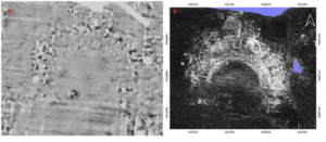
One of my academic interests is mycology, so I looked up related GIS applications with fungi and found a study using GIS to assess the distribution of fairy rings. Overall I found the study interesting and I hope to come across more research that uses GIS to study fungi. The picture below was taken from an airplane and includes the fairy rings are identified.


file:///Users/jaymcconkey/Downloads/remotesensing-14-03459-v2.pd

https://www.sciencedirect.com/science/article/pii/S1754504821000027

VanderVelde – Week 1

Hello,

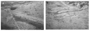
My name is Evelyn VanderVelde, I am a senior majoring in Environmental Science with a minor in Botany. I hail from Holland, Michigan, and part of Zeeland, Michigan as well (duel households for the win).

In Chapter 1: “GIS a short introduction” by Schuurman, GIS is defined in many ways, primarily by what its intended use purpose entails. The research that uses GIS morphs the format to each individual user, so a city planner uses GIS much differently than a biological researcher. “It is not a piece of software, but a scientific approach to a problem.” The question of how to best use GIS is based on the question of “where” the data is and “how to encode” the data. GIS is also inherently visual in its applications which creates the importance of color and symbology within this new mapping field. “Visualization is used to manufacture meaning from data, through rendering it in image form. GIS incorporates ongoing research into geographic visualization but, more to the point, it is based on the very principles that have recently brought scientific visualization to the fore” (Schuurman, 8) It’s also stated that people reason much better with visuals than with other types of data that is more numerical or literary. I found this interesting as previously in my other GIS class we always focused on having visually enticing and simplistic in its interpretation for all types of viewers, but I don’t think any definition like this was brought up. It makes a lot more sense to me as to why the visual components of my maps on GIS were so heavily stressed previously.  The blurred boundary between definitions of GIS is confusing for me as well as there is no set criteria for which I should create my maps. This conflict though could be helpful as it gives more liberty artistically.

  • Geomorphologist: studies how the earth’s surface is formed and changed by rivers, mountains, oceans, air, and ice. The study of the land around us.
  • ESRI = Environmental Research Systems Inc.

GIS Applications:

Source: https://developers.arcgis.com/python/samples/detecting-swimming-pools-using-satellite-image-and-deep-learning/

Source for python:https://pythonapi.playground.esri.com/portal/home/item.html?id=2f8f066d526e48afa9a942c675926785

For this link, I looked up swimming pool detection and found this link via the ArcGIS developers themselves. I was given the coding to add swimming pool detection to my maps and the infrared needs in order to be able to label uncovered pools in residential areas. The image to the left shows multiple images that were used to train the ArcGIS system in finding swimming pools in residential areas.