Shaw Week 5

Chapter 4:

4.1 – I do not have this section

4.2 – I do not have this section

4.3 –  Had a difficult time with this section, it kept saying invalid syntax and I am not sure what was wrong.

4.4 –  This tutorial was very short and made it incredibly easy to follow.

4.5 – Very easy to understand.

4.6 – Easiest tutorial to follow, the hierarchy table was interesting.


Chapter 5:

5.1 – This map was very interesting because it is different from what we have been making and is now a curved map.

5.2 – This section had many coordinates on the map. 

5.3 – This section is easy as I feel it is just to get used to the coordinates. 

5.4 – This section kept failing, and the tutorial was very confusing. 

5.5 – I had troubles with this section, the excel sheet was not working and downloading the tiger files gave me trouble.

5.6 – This section was easy,


Chapter 6:

6.1 – This section was very easy. It got me used to the attribute tables again.

6.2 – Had difficulty with the outlining part of the section and was unable to figure out how to get the rest of the blocks 

6.3 – Section was not difficult, all I had to do was search for the merge tool

6.4 -I am having an issue inserting the input dataset, I think the data in 6.2 I had trouble with was supposed to be saved and put into this section.

6.5 –  This section was very easy and I did not have any issues 

6.6 – I was having trouble with the tract layers.


Chapter 7:

7.1 –  This section was easy, selecting buildings was easy but splitting the last one posed a challenge.

7.2 – The tutorial was easy and had no issues.

7.3 –  This section was very easy as the only thing to do was the smooth polygon tool.

7.4 – This section was very lengthy but I was able to figure it out. 


Chapter 8:

8.1 – Was very simple to follow 

8.2 – My end result did not look like the photo in the book but it was very close.

Rose Week 5

Chapter 4


I had some issues with chapter 4. For some reason tutorials 4-1 and 4-2 did not get downloaded to the flashdrive I have all my work on so I was unable to do them. I am not sure why but this also occurred in the previous part as well. However, I was able to do the rest of the tutorials. In these I had to do filtering and linking some of data and carrying out attribute queries. I also carried out a spatial join of the burglary data along with using some more symbology. I had some issues with the last tutorial when creating a joined table however as I kept on saying I could not before the join due to the fact there was nothing to join so I am not sure what I did wrong. 


Chapter 5


The first two tutorials in the chapter went smoothly as it was just adjusting the map and the format it is viewed in. The third tutorial was also pretty straightforward in manipulating coordinate systems. However on 5-4 I had issues as when I went to go for the export features tool and went to change the output feature class, I did not have CouncilDistricts saved in my Chapter5.gdb for some reason. I am not sure what is going on with somethings not being saved or downloaded onto my flash drive but because of this I was unable to finish 5-4. I had issues again with the last two tutorials as well. I don’t think I was saving or extracting the data correctly from the outside sources. This led me to have issues importing that data into the maps.


Chapter 6


Chapter 6 was one of the longer chapters just based on how manyt tutorials there were, not so much of the content or how long they took. This chapter focused on geoprocessing which had me use various different tools to process, merge, and manage some of the data. For the most part these tutorials went smooth but often had little hiccups toward the send of sections with running some functions or joining data. However it was interesting to look at New York City again as I used to live there. 


Chapter 7


This chapter was fairly short and had us manipulating and digitizing some of the landmarks on maps. Most of this chapter was straightforward but there were areas that confusing and left me stuck when trying to mess with some of the layers and features.


Chapter 8


Short chapter talking about geocoding. In this chapter we messed with some stuff using zipcodes in various areas. I am not entirely sure what was happing however but the tutorials were straightforward besides in a few areas I had issues with but not too bad.


Howard Week 5

4-1: For the section “Use database utilities in the catalog pane”, I was unable to do the copy and paste sections from part 2 and 3, paste just wasn’t showing up for me. I was able to finish the rest of the section, and since it asked you to delete everything at the end, it ultimately didn’t matter.

 Screenshot (22).png

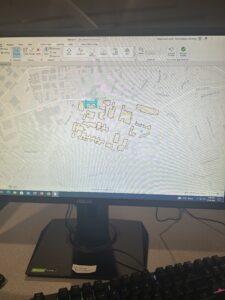
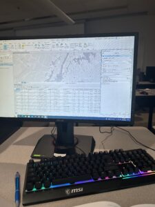
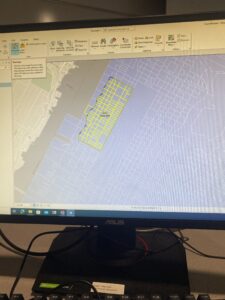
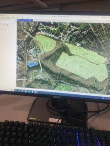
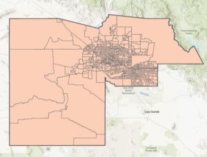
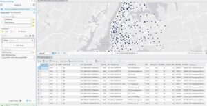
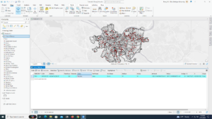
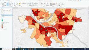
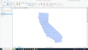
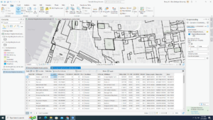
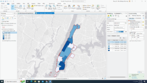
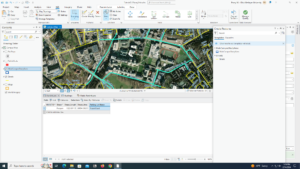
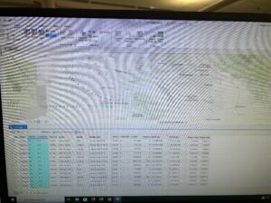
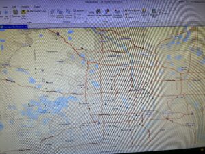
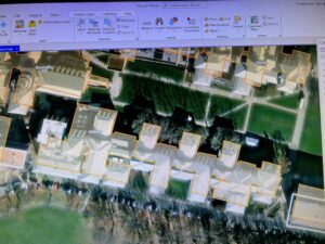
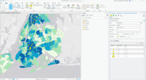
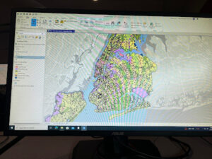
4-2: Tracts was not in my contents page for some reason. I ended up going to the catalog pane, to folders, and right clicking tracks to add it t0 the map. Showed up on my contents page then. Hope that’s right. Actually, for delete unneeded columns, my table did not end up looking like the one in the book, instead of fully deleting even though I clicked it all the unneeded columns were just in a lighter gray. Because of this, I was completely unable to finish the section. And it was a long section.

 Screenshot (23).png

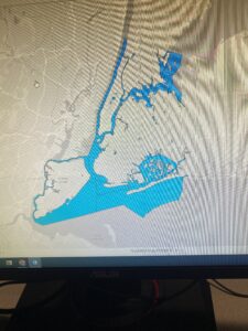
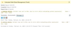
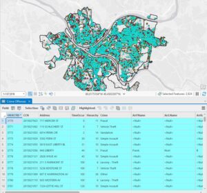
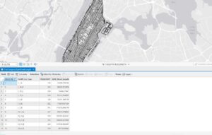
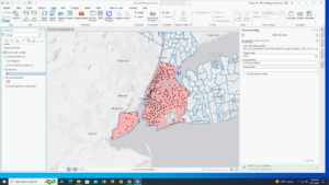
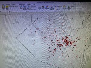
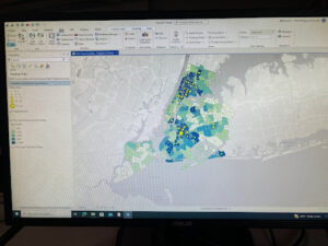
4-3: After I was doing the section correctly, I opened the crime offenses attribute table and when there should’ve been 444 remaining features, there was still 3924. My SQL expression looked like the one in the book, so I do not know why this happened. At the end of the tutorial, I ended up with two people instead of just one too.

 Screenshot (24).png

4-4: This was a short tutorial and one I was able to do 100% successfully, thank god.

4-5: This tutorial was also short and I had no problems with.

4-6: Same as the last 2 tutorials. The latter half of the 4 tutorials were a lot easier than the first half.

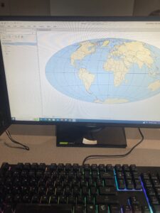
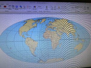
5-1: I had no idea there were around 5200 projected coordinate systems and over 100 map projections. How would you even know what’s best for what you’re trying to do?

5-2: Again, there are so many coordinate systems and map projections.

5-3: This one was interesting. I don’t really understand why I was changing the projected coordinate systems and why this matters so much.

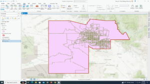
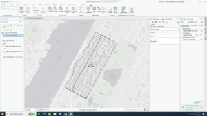
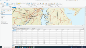
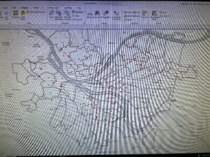
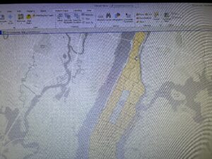
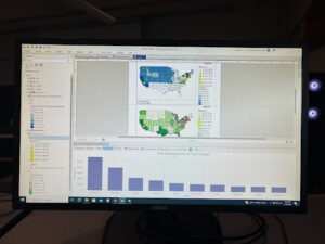
5-4: CouncilDistricts was not in my Chapter5,gbd, so I used municipalities because it seemed close enough. I also did not have libraries in it.

 Screenshot (28).png

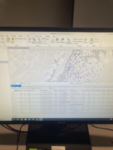
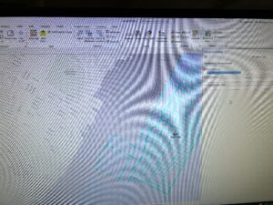
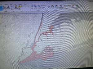
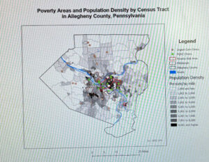
5-5: This tutorial is really confusing. Column JK, which I was supposed to keep, was not the same as what the book said it should be- it was females not living in a place. And there was no column SE at all, so I was unable to do this section. When moving to the next section, I was unable to find most of the census shapefiles and I am not sure why. Because I couldn’t do this, I couldn’t do the next section. So I pretty much was unable to do this entire tutorial except downloading the data at the beginning.

 Screenshot (30).png

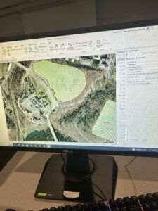
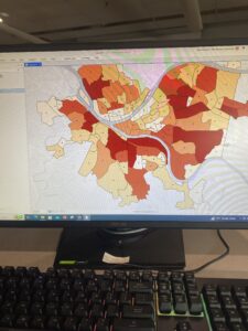
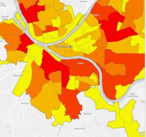
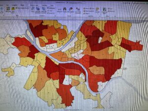
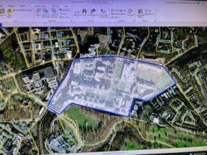
5-6: Eliminating the land use for everything else other than just the county is interesting. Actually looking at the data is really cool though, and seeing the difference in development. Also, ground features wasn’t an option to symbolize the elevated contours layer for me, so I just changed the color to a similar one instead. I am not the biggest fan of the textbook assuming we know how to do everything we previously learned 100% perfect, as I don’t have the best memory.

6-1: This one was fairly easy and makes sense why this would be useful.

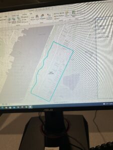
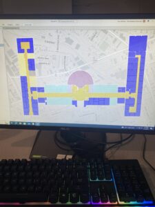
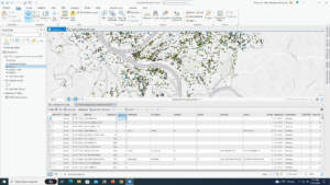
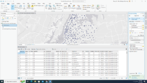
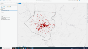
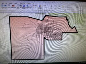
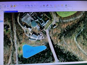
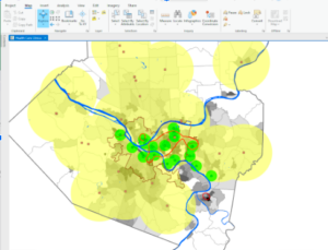
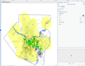
6-2: I am unsure of how to export the selected features as UpperWestSideBlockGroups to Chapter6.gdb. Also, I couldn’t find UpperWestSideStreetsForGeocoding, so I couldn’t clip streets either.

 Screenshot (40).png  Screenshot (41).png

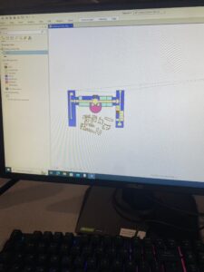
6-3: This tutorial seems really useful. Being able to combine all that data and clear up the contents page makes for much easier map readability.

6-4: Pretty much the same as the last tutorial. I have the same thoughts on it too.

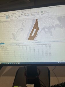
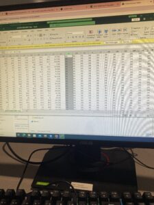
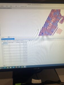
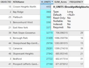
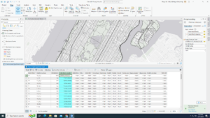
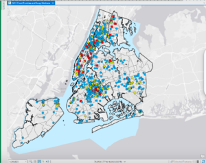
6-5: I do not see SUM_Street_Length in my attributes table, only Street_Length. I’m pretty sure I did this section right so I’m not sure why it’s not appearing for me, even when the table is refreshed

 Screenshot (44).png

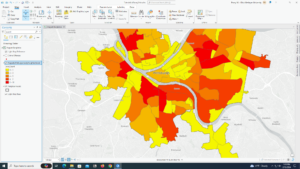
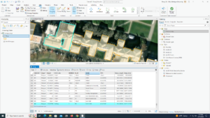
6-6: I don’t think I joined the tables right at the end. I didn’t really see how I could do it, clicked around and found something called join, but got a lot of null sections. I wish the book could explain in more detail how to do some steps, because even though it’s later on in the book there’s so much information that its hard to remember it all.

 Screenshot (45).png

6-7: I liked the background behind this tutorial. It reminds me that GIS is used for really important and possibly life-changing information, like separating the disabled people in half between 2 fire companies so in the heat of the moment no one gets left behind because of not remembering.

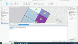
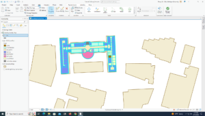
7-1: I don’t know where a constructions toolbar is, so I couldn’t click the add button and move the vertex points of the art building. I had issues with splitting the buildings too, but this is probably just a me thing.

 Screenshot (47).png

7-2: It took me awhile to do this tutorial, as working with these polygons was finicky for me, but I eventually  was able to do everything in the tutorial.

7-3: Well this tutorial was easy. I can understand how smoothing out the polygons can help with viewer comprehension.

7-4: I feel like this is something I would never remember how to do. It looks pretty cool though.

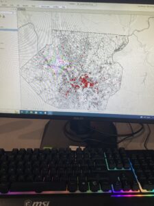
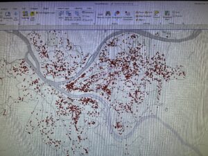
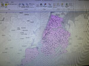
8-1: For me, the rematch addresses pane doesn’t have a “pick from the map button”, so I couldn’t finish the “rematch attendee data by zip code” section. The next section, “symbolize using the collect events tool” didn’t work for me either, as when I tried to run the tool I kept getting “collect events failed” multiple times, even with changing some things up.

 Screenshot (50).png

8-2: My only issue with this tutorial is that the basemap, World Light Gray Canvas Base, didn’t load for some reason. Otherwise this one made sense.

 Screenshot (51).png

Bryan Week 5

Chapter 4
4.1- This tutorial felt pretty simple in comparison to chapter 3, and I was able to complete all the steps easily.
4.2- After calculating the PopYouthUnder20 field, I received a warning and several of the values were labeled as null. I am unsure as to why this happened. This also occurred while calculating the PercentPopYouthUnder20. I believe this might have interfered with the rest of the tutorial.
4.3- I found this one to be pretty easy to understand, but also pretty repetitive.
4.4- I appreciated how short and straightforward this tutorial was.
4.5- I didn’t struggle at all with this tutorial, and found it to be enjoyable.
4.6- I got confused on the “your turn” part of the tutorial, as I was unsure what table it was wanting me to open as the usual attributes table was not an option. Because I was unable to add this new code, I was unable to complete the tutorial.


Chapter 5
5-1: This tutorial was very straightforward and easy to follow, and I was able to complete it in just a few minutes.
5-2: This one was pretty much the exact same as the last tutorial, so it only took me a few minutes. However, I noticed that the program seemed to struggle with loading all of the states, as it took about a minute or so to fully refresh.
5-3: I found this one to be relatively boring, as it was mostly just confirming if already existing settings were correct. However, the California UTM map did not load.
5-4: It worked properly.
5-5: The link and download did not work properly, and had a very long waiting time. I was unable to complete this tutorial.
5-6: I was unable to access NLCD, even after verifying that I was logged into ArcGIS Online and restarting the app.


Chapter 6
6-1: I got stuck on the “your turn” part, as the Pairwise Dissolve tool kept failing. I am pretty sure I inserted the information correctly, so I am unsure as to why this problem occurred.
6-2 – 6-3: Fairly uneventful and easy to go through. The main part I struggled with was understanding when I needed to search for a file to input, or simply name the field. The book wasn’t very clear on this.
6.4- The book did not clarify which append tool to use, so I had to guesstimate. I think I used the right one in the end.
6.5- I found this one to be fairly easy, and I didn’t encounter any errors.
6.6- I found this chapter to be very repetitive, as it was mostly “Open this table. Now close it”. I did get a bit confused on the joining step, but I was able to figure it out in the end.
6.6- It seems like the tracts layer for the second map was not working.


Chapter 7
7.1- I actually found this one to be interesting and a nice change of pace. It was enjoyable to see my actions immediately have an effect on something tangible.
7.2 I was able to complete the work and found it interesting
7.3- This tutorial was easy to follow and only took a few minutes.
7.4- It was really cool to see how the map transferred into the tiny version, though I’m very happy the text had pictures because the wordings were very unclear.


Chapter 8
8.1- This tutorial went smoothly, and I found no errors or continuity flaws in the text.
8.2- Everything worked well in this text, and I was able to finish it quickly.

Askill Week 5

4.1- Couldn’t get the tracts to paste inside of maricopatracts. The paste button was not available. 

4.2- Didn’t do the second step (zoom to layer) but got through half of it before encountering more problems. My tracts table did not look like the one in the book. Then arcgis pro crashed and tracts was lost. 

4.3- My dot map didn’t turn blue. It still stayed multicolored. Got the code correctly. 

4.4- Fully completed. Only one page long 

4.5- Simple. 

4.6- Saw the difference in the hierarchy tables. 


***I had problems downloading data.

5.1- Complete. It was cool to see a different perspective on the map. 

5.2-.4- Completed easily. The shorter chapters are easier to understand because there’s not a lot of steps to mess up on. 

5.5- I got the first part downloaded in the folder, but I couldn’t extract the second part from data.census.gov to the folder. It downloaded the table but there was no way to put it inside the folder. 

5.6- I entered the data but it didn’t outline the county. My only options were land use 1 or 2. I added the data for Minneapolis into my drive but when I went into ArcGis Pro it didn’t show up when I hit add data. 


6.1- Struggled to find manhattan neighborhood, but found it eventually. Complete. 

6.2- Complete. 

6.3- Easy. Only had to do one thing. 

6.4- Done.

6.5- Done. 

6.6- Complete.  It was cool to see the different areas on the map. 

6.7- This was probably just a me problem, but I couldn’t find fire company 76. 

*This chapter was mamangable. Most of the tutorials were on the shorter side, which makes it easier. 


7.1- Little confused about this tutorial. 

7.2-  I made my red parking lot in the middle of a field. And then I drew the red over the parking garage. 

7.3- My map didn’t look exactly like the one in the book, but it was very similar. 

7.4- Got the different shapes and colors to match. Complete. 


8.1- Fairly simple. It was nice to see Ohio finally being used in GIS. I liked the street view. 

8.2- Complete. The first thing I did, didn’t change the map at all. So, I probably didn’t do that right. But the end result looked like the photo in the book.


Schtucka week 5

4.1 – My youth population gbp did not have a tracks feature class in it but it had cities and PopYouth so I just finished the tutorial using only those two.

4.2 – I don’t like how objectID is also known as fid, it was confusing. Also, my attribute table also did not look like how the book showed.

4.3 – This section was really hard for me to understand, I feel like it took me way longer than it should have.

4.4 – I liked this tutorial because I feel like this will be good to know in the future. 

4.5 – I also liked this tutorial because it will be nice to know in the future. I also find graduated symbols interesting so it was fun to see a new way to use them.

4.6 – This section was interesting because I had to apply my knowledge from the first part of the chapter and it was fun to see what I am able to do with loose instruction.

5.1 – It was interesting to see the different map projections that are used. 

5.2 – This section feels like 5.1, it was also interesting for the same reason. 

5.3 – I liked getting out of the GIS software and going back to the arcgis.com to learn new ways to utilize the website within the software. However, a lot of this section was redundant with just having to check which coordinate system a lot of the different layers were using. 

5.4 – In the contents pane, there was no right click option for Display XY data, instead, i had to use XY Table To Point in Geoprocessing to get the same results 

5.5 – Column JK is “Estimate!!Female!!Workers16yearsandover!!PLACE OF WORK!!Not living in a place – column EG was the right column

  • Column SE was not the right one for female, IQ 
  • I did up until Join data and create a choropleth map. I could not for the life of me figure out how to export the data into Chapter5.gdb and was not able to continue through the section because of that

5.6 – After downloading the data for Bicycle Count, and converting to points, it says that there is an error for every data point and it won’t let me create a graduated symbol layer because of it.

6.1 – This section is cool because it combines stuff from previous chapters while adding new details to them. 

6.2 – I like the select by location filter, it was really fun to use.

6.3 – The Merge feature tool is really easy to use, but I had a hard time finding it at first and tried to use the wrong Merge tool. 

6.4 – I feel the same way about 6.4 that I do about 6.3. The Append tool really easy to use, but it was hard to find due to the kinds of append tools. 

6.5 – It was cool to see a new type of tool, however, I don’t know in what other context I would be able to use this tool. 

6.6 – This section was interesting, but my Calculate Geometry Attributes tool settings didn’t line up with what the book was saying, but it was close enough where I was able to still figure it out. 

6.7 – I feel like a lot of these sections are doing the same thing, I know they aren’t, however, all of the tools are getting conjoined in my head because of how similar they are and I will have to go back in the book to differentiate between them.  


7.1 – I really like the move feature. It’s cool how you are able to just pick up a polygon. 

7.2 – I also liked this section, it was it was simple but definitely useful information to know

7.3 – Smoother features tool adds a better appearance to the map and it is fun to do. However, I don’t like how it makes a new feature instead of just changing the original one. 

7.4 – I have used AutoCAD in the past, and it was interesting to see how it can be used inside of ArcGIS.

8.1 – This section was interesting to see and do because of the amount of data points that it has, it was cool to sort and fix zip codes.

8.2 – I feel similarly about this section and 8.1, it was fun to play around with the different address points. 

Benes Week 5

Chapter 4: 

  • 4.1– This was pretty straightforward and easy to understand. I learned how to create a new project and add necessary data. 
  • 4.2– This started off strong but then I couldn’t find how to turn off base maps. I struggled to find the information in the tracts portion of this section. Therefore I just continued on to the next portion. I didn’t understand this tutorial, I think I might have messed something up or didn’t understand the wordings. 
  • 4.3– This was a good section and it went smoothly. I felt that I was able to get a grasp of the concepts and what was happening. 
  • 4.4– Short and easy. I was able to input the correct attributes and get the correct table. 
  • 4.5– Easy to understand and straightforward. My map looked like it was supposed to and I feel confident in my ability to use this type of information. 
  • 4.6– This section was easy to understand and wasn’t too difficult. 

Chapter 5: 

  • 5.1– This was really cool to see the change from a flat map to a curved map of the world. 
  • 5.2– I understood this section. I don’t know if this was just the program but when I would zoom in some of the states would disappear then reappear.
  • 5.3– the beginning was easy. However once I got to the California UTM I couldn’t see anything on my screen. 
  • 5.4– When I was working on the KML Data I got a notification at    the Geoprocessing layering failed. Not sure what went wrong. 
  • 5.5– I struggled with the excel sheet. I couldn’t find the columns that were to be kept. For instance in Column JK it was (Estimate!!Female!!Workers 16 years and over!!..) whereas in the book it stated that Column JK Was (Male!!Estimate!!MEANS OF TRANSPORTATION TO WORK!!Bicycle). I couldn’t Finish this tutorial because I couldn’t get the data correct from the excel sheet resulting in me not being able to download and upload the file to ArcGIS Pro. 
  • 5.6–  Straightforward and I understood the process of downloading shape files and inputting them into ArcGIS.

Chapter 6: 

  • 6.1– I couldn’t do the pairing dissolve portion with the fire battalion. I am not sure why but It wasn’t running. I understood the process though. 
  • 6.2– This wasn’t too difficult, however I did get stuck on the last portion. It wanted to pairwise cut but the correct file wasn’t on the dropdown menu therefore this process couldn’t be completed.
  • 6.3– The process I am understanding but when I tried to merge the information for the waterparks, the system wouldn’t run the merge. I am not sure what I did wrong but I followed the previous directions. 
  • 6.4– This section wasn’t too bad. I understood the concepts and found this easy to add the information into the attribute table. 
  • 6.5–  This section was straightforward and I understood what I was working on.  
  • 6.6–  I liked this section and it was going smoothly until the very end where I couldn’t merge the Brooklyn information together properly. 
  • 6.7– Straightforward tutorial. I messed up with the running of the tool at the end but I figured out that I needed to select the file from the folder not just the dropdown menu.

Chapter 7: 

  • 7.1– This one was easy and straightforward. I understood what was going on. 
  • 7.2– This tutorial was going smoothly until I got to the part with the configure toolbar. I looked for it and couldn’t find it therefore I skipped that portion. After that the rest of the tutorial wasn’t too bad. 
  • 7.3– Quick and easy. However when it got to your turn section I couldn’t figure out how to save the file into the folder. 
  • 7.4– Pretty straightforward. However at the very end I couldn’t transform the building to the smaller version. The transform button didn’t show up. 

Chapter 8: 

  • 8.1– I ran into an issue with the properties of the PARegion ZIP. However, after I smoothly got through the majority until getting to the rematching the addresses. I couldn’t figure out how to complete that because when I went through the steps it would just open the attribute table. Once I skipped over that step the rest of the tutorial went smoothly. 
  • 8.2– This was straightforward and I understood the concepts.

Week 4 Maglott

ArcGIS Pro 3.1

Chapter 1 

I found the previous extent button, which is located in the navigation group, really helpful for jumping back to previous areas you were analyzing. This is a lot easier than trying to move the map around and relocate the area you were in.I also found the bookmark feature beneficial for the same reason. Something I notice about the street when zooming in is that they adjust along the road to the area that you are zooming into. This is helpful because if you are trying to analyze an area that is surrounded by certain streets, then you do not have to keep moving the map over to look at the road name, it automatically adjusts toward that area. I also thought that the shortcut of holding the ctrl key and clicking a checkbox to clear all the feature classes was helpful. The symbology feature, which you get to by right-clicking the feature class is also helpful for adjusting the shape, color, and size of symbols. I think my favorite part of this chapter was being able to convert the map from a 2D map to a 3D map. I think this could potentially be helpful if you needed to know information about the shape of a building or how tall it is compared to other buildings.

Chapter 2

This chapter went over a lot about the abilities and uses of the symbology pane. You can label the villages and rivers by right-clicking the feature classes and selecting labeling properties. This allows you to change symbol characteristics as well as set the values for the symbols. You can also import Symbology by selecting the stacked three lines( options) and clicking Import Symbology. I thought the swipe tool, which can be accessed by clicking the feature class, selecting the feature layer at the top of the screen, and clicking swipe in the compare group. This allows you to view the layer underneath the top layer by clicking and dragging the pointer across the screen. However, you can clear the swipe tool by selecting Explore underneath the map tab. I thought the dot density symbology was an interesting way to display data. I found it interesting that when the dot value was smaller, more dots were made, and when it was larger, there were less dots. I think this is because the dot value is the number of people each dot represents, which would explain why when the dot value is bigger, fewer dots are shown and vice versa.

Chapter 3:

I liked learning how to create a layout and add maps to it. This seems especially helpful to look at two maps side by side. A layout can be made by clicking insert, new layout, and selecting the type and size you want. The maps are added by selecting insert, clicking map frames, and selecting the default of the map you want to add. Then, you just create a box by dragging the mouse across the layout. The maps can be edited by right-clicking and selecting properties, which opens the element tab with map options. I also thought that using the rulers and added guides to help center and align the maps was a clever way to place the maps in line with each other. Legends can also be added to the map by clicking Insert, Legend, and selecting the legend you want. By clicking and dragging the mouse, you can add the legend to the map. I also liked the addition of the bar chart, which I feel could be helpful based on what data you are looking for. The bar chart can be made by clicking the feature class, clicking data at the top of the screen, and then selecting the create chart under the visualize group. Other charts are also available under the Create chart button. The third and fourth sections of this chapter have a lot a beneficial tools and tips for presenting your data as a story map. However, the amount of content in these chapters was very dense. It is definitely something I will want to go back and review again. 

Week 4 Tuttle

Chapter 1

Once I finally figured out how to download the tutorial I have had a much smoother time working on the assignment. Chapter 1 took me about an hour to complete and I did not have any trouble. I thought the 3D model was really interesting and I really enjoyed being able to manipulate the map to explore how a map can look in 2D vs. 3D. Chapter 1 was pretty short. Once I got it open the manual has been pretty easy to understand and I haven’t had any problems so far.

Chapter 2

Chapter 2 was much longer than the first chapter. It introduced me to conditional data and symbology. I feel like the big takeaway from this chapter was being able to edit the map so that it is more clear for the reader. I had a hard time with 2-4. I could not figure out how to do the label layering and I ended up skipping it because the words didn’t match up with the ArcGIS tool. I can feel myself getting more comfortable with the application and even noticed myself working ahead and changing the colors of certain points without being prompted.

Chapter 3

This chapter was my favorite one. I actually ended up deleting 3-1 on accident but when I redid it, it was much faster. As frustrated as I was when it happened, I think having to redo it actually made me more comfortable with the software. 3-2 has us upload to ArcGIS online. I could not sign into the pro version. It repeatedly gave me the popup that I did not have that type of account. I could not complete the rest of chapter three because it ended up locking my account for a certain time. I plan on returning once the time is up and if I still can’t figure it out, ask Dr. Krygier for help. I could sign in the ArcGIS online, it was very odd because I had signed in on ArcGIS Pro yesterday.

Hameed Week 3

Chapter 4
Mitchell’s fourth chapter introduces us to the concept of mapping density, a technique that has increasingly captivated my interest for its ability to visualize the concentration of geographical phenomena, such as population or occurrences of events. Through different methods like color gradation, dot distribution, and symbol variation, density mapping offers a lens to discern underlying patterns that might suggest actionable insights. This chapter meticulously explains how density can be represented in two fundamental ways: by defined areas or through creating a density surface, each with its applications depending on the type of data at hand. For instance, a density surface, generated as a raster layer in GIS, offers a detailed view suitable for individual data points or samples, making it an invaluable tool in environmental studies for analyzing pollution dispersion or wildlife habitats. This exposition prompts me to question the practical steps involved in transitioning from raw data to a polished density map. Specifically, how do GIS analysts choose the most appropriate method for their specific data type, and what challenges do they face in ensuring the accuracy and interpretability of density maps? Furthermore, considering the application of density mapping in urban planning, what are some examples where this technique has directly influenced policy or planning decisions, especially in the context of resource allocation or emergency response planning?

Chapter 5
In Chapter 5, Mitchell explores spatial query techniques that allow us to determine activities or characteristics within specific geographical boundaries. This discussion is pivotal, revealing three primary methods for identifying what’s inside an area: mapping area boundaries, selecting features within boundaries, and overlaying areas and features to merge data layers. Each approach serves a distinct purpose, from visualizing spatial relationships to generating detailed summaries of features within an area. This granularity in analysis fascinates me, especially when considering the potential to monitor and manage phenomena like chemical exposure or crime rates within delineated zones. It raises the question: How do analysts decide which method to employ based on their specific objectives, and what are the implications of these choices on the comprehensiveness and accuracy of the analysis? Additionally, the chapter’s focus on discrete versus continuous features prompts further inquiry into how this distinction affects the selection of spatial query techniques in various contexts, such as environmental monitoring or urban development projects. Are there particular scenarios where one method significantly outperforms the others, and how do these techniques adapt to the complexities of large-scale, multi-layered GIS projects?

Chapter 6
Chapter 6 shifts the focus to proximity analysis, a concept that resonates with me due to its wide applicability in both everyday life and specialized fields. Mitchell introduces methods for assessing what lies beyond a target area’s boundaries, such as measuring straight-line distances, distances over a network, or cost surfaces. This chapter not only broadens my understanding of how GIS can be used to evaluate the influence of nearby features but also highlights the strategic importance of determining areas of influence for planning and decision-making. For example, the discussion on network-based analysis versus cost surface analysis illuminates the nuanced considerations in capturing the true costs of movement or access, particularly in urban planning or emergency services deployment. This leads me to ponder the criteria that guide the choice among these methods, especially in contexts requiring high precision, such as habitat connectivity studies or infrastructure development planning. What challenges do GIS professionals encounter when integrating proximity analysis into comprehensive spatial evaluations, and how do they mitigate these obstacles to ensure the reliability of their conclusions? Additionally, the concept of an area of influence invites further exploration into how these analyses can be leveraged for environmental conservation efforts, such as identifying critical wildlife corridors or assessing pollution spread from industrial sites