Maglott-Week5

Chapter 4: 

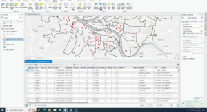
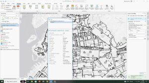
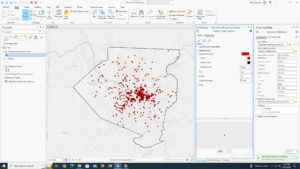
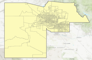
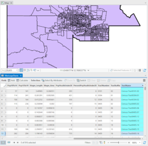
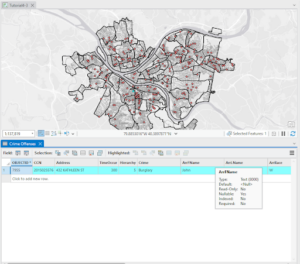
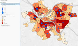
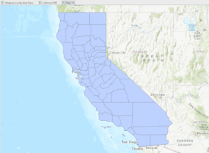
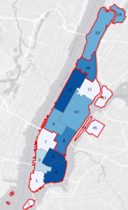
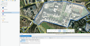
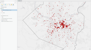
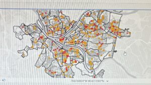
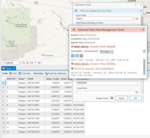
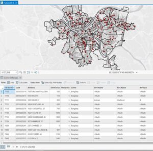
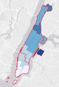
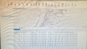
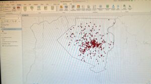
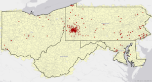
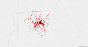
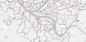
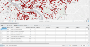
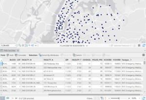
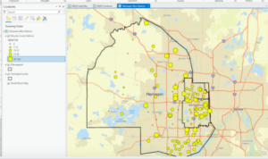
I ran into some issues at the beginning of chapter 4. I had no problem making the folder connection and converting the shapefile to a feature class. This main issue began when there was no Tracts feature class under YouthPopulation.gdb. Another issue I ran into was that I did not have Tracts in my content pane. This meant that I had trouble doing the majority of tutorial 4-2. The tutorials afterwards had much less issues. I thought that the select by attributes tools was interesting and a good way to narrow down larger data sets to find exactly what you are looking for. I was really impressed with when the Select by Attributes tool was used to figure out who may have committed the unsolved burglary. Another odd issue I ran into was in tutorial 3, when I changed the burglary symbol to dark red. The points still showed up as a teal color unless I was actively zooming in or out, then they would change to red. This didn’t affect my work, but was odd.

Chapter 5: 

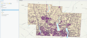
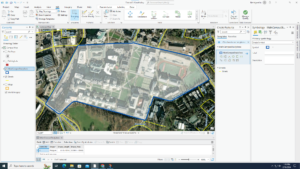
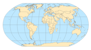
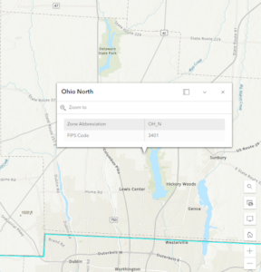
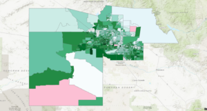
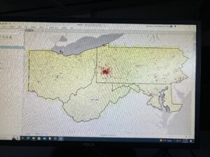
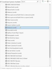
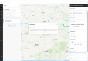
I thought that the ability to change the map from a rectangle to an oval/ more 2D sphere shape was useful. This was done by clicking properties for the map, going to coordinate system, Projected coordinate system, world, and then clicking Hammer-Aitoff(world). I’m curious what the other options under the Projected coordinate system look like. I noticed that looking at some of the zone abbreviations for Ohio cities the zone abbreviation has the state abbreviation(OH for Ohio) and then the letter after it seems to be what part of Ohio ( North, East, South, or West) the city is found. I ran into a few issues in this section but got them figured out. I found that sometimes when I downloaded data into a folder and then tried to open it in Arc, the file and data would not be there so I would have to close and reopen Arc and then I could find the folder with the data I needed to add.

Chapter 6

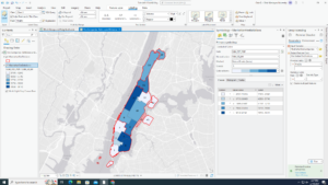
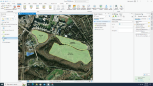
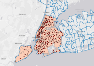
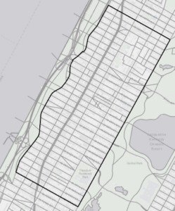
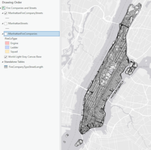
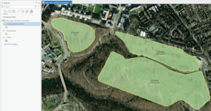
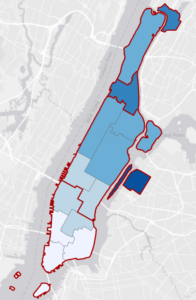
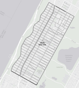
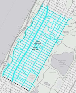
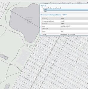
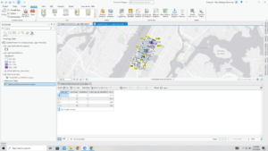
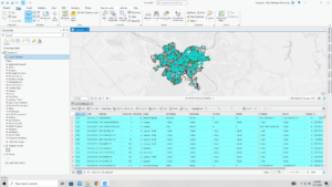
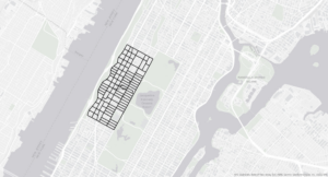
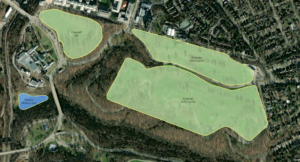
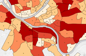
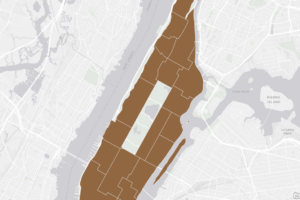
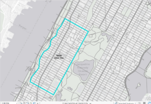
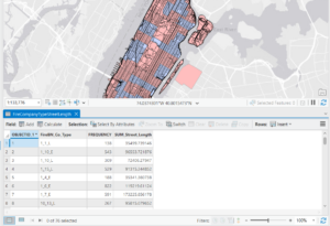
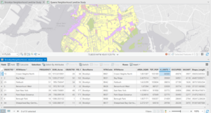
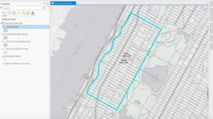
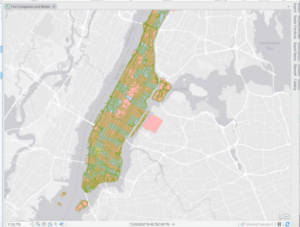
In this chapter, it introduces new tools like the Pairwise Dissolve tool and the Pairwise Clip tool. The Dissolve tool removes the inner lines from a neighborhood while maintaining the outer boundary. The Clip tool can be used to create street segments that can be added to your study area. I could not figure out how to save the Streets as UpperWestSideStreetsForGeocoding with the Select by Location tool but somehow the streets still ended up getting cut cleanly for the neighborhood. This chapter also uses the merge tool, to merge feature classes into one, and the Append tool, to add features to feature classes that already exist. I thought section 5 was cool where we intersected the Manhattan Fire Company and Manhattan Street feature classes and this allowed us to see what streets were served by which fire station. The Union tool was also introduced which allowed us to combine table data together on the map. This section seemed to go by pretty quickly and gave me fewer issues than the last chapter.

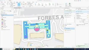
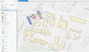
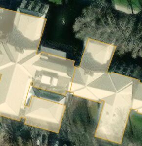
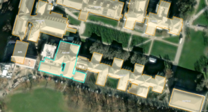
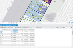
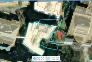
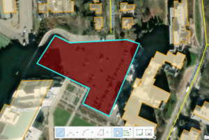
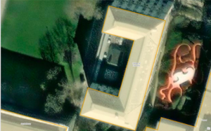
I thought it was cool that you could adjust the outlines of the buildings with the buildings by using the select tool and then move in the edit tab. I had issues getting the lasso tool to just move one point and not the whole polygon, but was able to fix the issue by selecting the stretch proportionally button. This chapter introduces the smooth Polygon tool to make the edges of the polygon more rounded instead of straight segments. 

Chapter 8

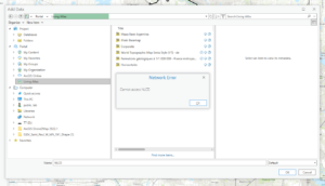
I ended up having a lot of trouble with this chapter. I’m not sure if others had a similar issue, but when I was using the Create Locator tool, it would not accept the Output Locator name even when I tried to save it to different places than the book listed. This was an issue because the locator was needed to do the other work in  this chapter. I met with Krygier and we still were unable to figure it out so he told me to skip this chapter.

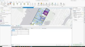
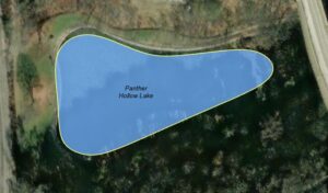
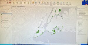
Delaware Data & Inventory : Map with 3 layers (Parcels, Street Centerlines, and Hydrology)

Mulloy Week 5

Chapter 4

4-1 — This tutorial taught how to add new data to a project and make it readable by the program.

4-2 — I had an error with this tutorial. The book says to type “!GEOID10!” in the section where you calculate field for GEOIDNum, but in actually “!GEOID!” without the “10” worked perfectly fine, and gave me the ID without the leading zeros. Additionally, there was another error where they asked me to create 3 text fields through the attributes table which is not where you add fields.

4-3 — Much of this tutorial felt repetitive, as I believe we already learned (or at least it was very straightforward) how to select a range, and then only view selected items in the attribute table. Learning SQL was helpful, though.

4-4 — 4-4 Was about how to use Spatial Join to aggregate data.

4-5 — I simply could not get this one working, the tool would not run and I was unable to figure out why.

4-6 — I had accidentally broken the data value once when I wrote the inputs/outputs wrong, as the book did not disclose which was the proper logic. I managed to fix it later, though.

Chapter 5

5-1 — I’m a really big nerd for Map projections so this tutorial I found really interesting. It was fun to play with the different world maps.

5-2 — This chapter was the same as the previous, more or less, but for the U.S. instead of the world.

5-3 — I felt pretty confused over the purpose of this tutorial. I understand that it was to change the Coordinate systems the map used, but it had a bunch of extra information or things it wanted me to do that felt completely arbitrary or irrelevant.

5-4 — This was a confusing and conflicting Chapter. I couldn’t find the “Display XY Data” option they were talking about. Then, they said to delete the Libraries Table, but there were later steps that required the Libraries Table.

5-5 — Completing this section requires waiting 40 minutes for a 1.4 Gigabyte download.

5-6 — I received an error message when trying to access NLCD that said “Network Error: Cannot Access NLCD”

Chapter 6

6-1 — This tutorial was incredibly confusing, and I was barely able to figure out what it wanted for the final part of it. My only question is what does normalization do? The final “Your Turn” asked for symbolizing with graduated colors using the field Sum_TOT_POP and normalizing it with Sum_SQ_MI.

6-2 — This taught how to select certain features within an area, then how to clip them to fit entirely within it.

6-3 — I encountered an error at the end in which I was unable to merge the NYC Waterfront Parks into one layer. There was not much information on the error message so I was unsure how to fix it.

6-4 — This showed how to use the append tool to merge data.

6-5 — This section showed how to merge data from an area feature to streets. It seems useful to be able to know what streets are in what division.

6-6 — This was more about merging and summarizing data from tables.

6-7 — When told to do the summary statistics for the total number of disabled people per Fire zone, I was able to figure out which was the correct Input, case field, and statistic field to input to get the proper summary statistics without looking back at the book.

Chapter 7

7-1 — This quick section covered how to edit polygons on maps. It’s nice to finally learn how to edit features after 7 chapters of tables and computing

7-2 — Learning to create the features for the feature class finally was also nice.

7-3 — Having smoothing done by an algorithm seems to be helpful so I wouldn’t have to worry myself about making it perfectly smooth.

7-4 — The transform tool was slightly hard as I could not find the exact vertex of the layer I was transforming.

Chapter 8

8-1 — I wish that more often the book would tell us exactly what each part of each tool does and why it’s needed. It can be confusing just filling out these tools without it. This chapter’s introduction was very helpful in understanding the tools, though. I feel like I was really understanding what the tools did and how they worked rather than just confused clicking.

8-2 — This section I feel the same way, although this was slightly more confusing, as none of the fields were explained fully for the create locator tool. I think that maybe a table or chart that fully explains each tool we use would be helpful.

Katterhenrich Week 5

Chapter 4: This chapter was informative in describing what databases are as well as what they are useful for. It taught me how to import data into file geodatabases into new projects, how to modify attribute tables, and use the field tool. I found it useful how it walked me through how to join tables, carry out attribute queries, and aggregate point data to polygon summary data. I like how there were some parts where I could use creativity in the presentation of the data/map using symbology.

Chapter 5: This chapter was beneficial when it came to understanding how to work with world map projections and even us map projections. I now know how to set a projected coordinate system and how to work with vector data and examine their different formats. It was interesting to see how US Census Bureau spatial and tabular data (map layers and data tables) could be used in Arc and the book aided in navigating how to work with this data. The only problem I had was with the spreadsheet!

Chapter 6: This chapter showed me how to dissolve block group polygons to create neighborhoods and fire battalions and divisions meaning the interior lines from the block groups are removed but the outer boundary lines are preserved. It also showed me how to form a study area through the extraction and clipping of a neighborhood using its attributes. I learned how to create a single water map by merging several water features as well as how to create one layer of fire and police stations by appending their separate layers. It was helpful to gain practice and understanding in using Union, intersect, and Tabulate tools to combine features and tables for geoprocessing.

Chapter 7: This chapter introduced GIS tools that helped me gain an understanding of editing, creating, and deleting polygon features and creating and digitizing point features. With the tutorials, I was able to spatially adjust features and use cartography tools to smooth features. It also had me work with CAD drawings, or computer-aided design drawings, changing their features to align them with GIS maps. I don’t think I did the aligning properly but I found the process to be really interesting and useful.

Chapter 8: In the tutorials in this chapter I learned about the geocoding process and geocoding using zip codes and addresses using streets. I learned that you can use geocoded survey data for many things like marketing, philanthropy, or just forms of communication with users.

Week 5 Huntington

4.1  In this tutorial I learned how to set up a GIS project and create folder connections. I also learned how to convert outdated filetypes into ones used by modern GIS, import data tables, and modify geodatabases.

4.2  I learned how to sort information a whole bunch of different ways in attribute tables. I can add new fields, calculate them using values from other fields, sort them, remove them.

4.3 was corrupted, even after redownloading.

4.4 This was a very short tutorial about creating spatial joins.

4.5 Another very short tutorial about creating central points for polygons and making point layers.

4.6 Another short tutorial about creating a new table to join new information to existing data.

5.1 Now I know how to change the coordinate projection method on a global scale.

5.2  Now I know how to change the coordinate projection method on a continental scale, these really could have been 1 tutorial.

5.3 Learned how to find and set a coordinate projection for a smaller local system

5.4 Learned about X,Y format for coordinates, how to integrate it into a map, and how to convert more file types into feature classes.

5.5 This tutorial isn’t working

5.6 Same for this one

6.1 Learned how to use the pairwise dissolve tool create new groupings.

6.2 Learned how to use the pairwise clip tool to cleanly select an area.

6.3 This tutorial isn’t working

6.4 Short tutorial, learned to append features onto different datasets.

6.5 Learned how to use the pairwise intersect tool.

6.6 Learned how to use the Union tool to combine feature classes.

6.7 Learned how to apportion data from two feature classes using the Tabulate Intersection Tool.

7.1 Learned how to manipulate and edit polygons. Making all the buildings line up was very satisfying.

7.2 Learned how to create my own polygons, also very satisfying.

7.3 Broken.

7.4 Also Broken.

Tuttle Week 5

Chapter 4

I had a little bit of difficulty with 4-1, but 4-2 was interesting and I enjoyed being able to edit the attribute table. It made me feel like I understood what I was doing. Being able to edit and condense the material made the tutorial much easier. It was definitely a long winded section of the tutorial but I felt like I learned a lot in this section. 4-3 was confusing because I kept getting the time and dates wrong when I would input it into the expressions. Once I got that it was much better. The pictures in the tutorial were helpful during this section. 4-4 and on were all on one map. I liked getting to play around with the map and use the symbology to create the most digestible map.

Chapter 5

5-1,2, and 3 were all relatively straightforward. My map ended up looking very similar to the map that was in the tutorial. 5-4 was difficult because whenever I would input the features it would say that it did not exist. This is becoming a trend that I see as I get deeper into the chapters. I plan on addressing this later in the week. 5-5 was easy to download and deleting the excel columns was easy thanks to Liberty! I saved the file and did everything as the book asked, but once again I would not import the files. I’m not sure if I missed a step, but I have reread the book and tried downloading it a different way and I can’t seem to figure out where I went wrong. For 5-6 I was in the process of quitting and deciding I didn’t know how to do it. I ended up figuring it out. It was gratifying figuring out how to download something off of the internet and successfully finishing the module

Chapter 6

This chapter was pretty smooth sailing. I didn’t spend too much time on any particular section. 6-3 was the fastest because we really had to merge the different water datasets so that it can all be displayed as NYCWater. We used the attribute table a lot more often in this chapter and I have definitely gotten much better at moving throughout the table and knowing what to do. I noticed myself working through bits of the sections without needing to read every single word of the tutorial. I feel like I’m getting the hang of it.

Chapter 7

Chapter 7 introduced the move tool which has been my favorite addition so far. I feel like I actually got the hang of it very quickly and I probably spent too much time trying to make the polygons and the map line up exactly. The only problem I ran into was in 7-4. I lined up all of the links and hit transform but it never moved. I let it run for quite a while and still the pieces did not move. I moved on from the project after a while because I was at a standstill.

Chapter 8

Chapter 8 was really short and only had two modules. Doing all of the toolbars is getting much faster. If this chapter had been earlier in the book I probably would have had a hard time moving through the chapter. It definitely took focus. If I did incorrectly input something there was a red message which I thought was helpful. That’s definitely better than if it just let you run it and the whole system would just be wrong. That happened in 8-2 but once I realized the mistake it was a very simple fix and my map ended up looking just like the tutorial. 

Bechina Week 5

Chapter 4

4.1 I had a little trouble when I was inputting my data because I couldn’t see my contents tab. Eventually I figured it out and was able to open the tab. Because I tried so many times to import the data, I had to delete a few files that were duplicates. 

4.2 I had a small issue with calculating the GEOIDNum column. The book says that the expression should read “GEOIDNum = !GEOID10!” but when the system created it, the “10” did not autofill, so I wrote it in myself. This gave me an error so I just took out the 10 and it worked fine. I also had a small issue when calculating the TractName but it was a quick fix. I just had to click “Apply” instead of “Ok.”

4.3 I had to go back and redo work a few times in this section. I don’t know if it was me, or if the directions were unclear, but I kept messing up.


4.4  This section was very easy for me. It was quick and simple.

4.5 This section was also pretty quick and easy. I tried to figure out how to increase the point size of the burglaries by neighborhood because they seemed too small to be useful… but I couldn’t figure out how to change the size. 

4.6 I almost immediately got stuck in this section. Once I went to the fields design view, I wasn’t able to edit the field to add any new fields (this was instruction from the “Your Turn” part). I couldn’t figure out how to add a field so I just moved on. The rest of the section went fine.

Chapter 5

5.1 The first thing I noticed about the world map was the lack of great lakes in the US 🙁 There are SO many different map projections!!!

5.2 I am surprised again at how many different map projections there are. When I clicked on different projections within Continental, North America, it would always load very slowly and look like the below image for a few seconds before fully processing. 

5.3 This whole section went pretty smoothly until the “Your Turn” section. Those are hard for me sometimes just because of the lack of detail. I got through it eventually though.

5.4 This section was fine. My favorite part was taking the color out of the NYSchoolDistricts Polygon.

5.5 This section was a bit frustrating. I couldn’t figure out which columns to keep (they did not match up to what the book said). After asking Krygier, he was able to share what Liberty found (thank goodness) and then it was no problem. After that, this section didn’t really get any easier. I had trouble using the Calculate Field tool and kept getting an error when I would run it.  

5.6  When I zoomed in and out, it took a while for the data to fill the page. It was very slow. It was fun to play with the other files in the Atlas. The “old timey labels” were cool. The later part of this section felt a little difficult because it wasn’t as specific with the directions, but I guess it made me figure it out and learn more. 

Chapter 6

6.1 This part went smoothly. At the end, when I had to symbolize the ManhattanFireBattalions with graduated colors, I was confused for a minute because I forgot how to change from single symbol to graduate colors. Then I remembered and it was fine. I couldn’t figure out the very last part, though; labeling the battalions. 

6.2 This section was not fun.

6.3 This part was nice and short and easy. I did have a little trouble with the “Your Turn” section though.

6.4 Loved this section. It was so simple and quick!

6.5 This was also a pretty straightforward section.

6.6 This section was fine. I forgot how to join the fields for a minute, but then I remembered.

6.7 It was cool to be able to use two maps and investigate how they relate to each other. 

Chapter 7

7.1 This section was fine. It was easy to play around with the edit tool to match the building up correctly. I didn’t have any problems until using the split tool. Mine looked a bit different than the books and I’m not sure if it worked. I think I did it right though because the next section went smoothly.

7.2 Doing the your turn section, I couldn’t figure out how to place the bus stop symbols. It took a minute of clicking around, but eventually I found it.

7.3 It was cool to see the shapes get smoothed out. I anticipate being able to use this tool in the future.

7.4 This part was very cool. Matching the edges up in order to make the figure smaller was cool.

Chapter 8

8.1 I forgot to save my file right away so the original file is gone. Oops! I liked this section though. While I completed it all ok, I feel like I might have not fully understood this section. 

8.2 This section was also a bit confusing and I’m not sure if I fully comprehended it. Yay I’m done!

Roberts Week 5

Chapter 4

4-1 This tutorial had a different start than the others, which at first confused I was able to gain understanding pretty quickly. I got stuck for a while but then was able to figure out my mistakes after I started it over.

4-2 Similar issues to tutorial 1; I had to restart due to the tribute tables missing information and some other minor issues that added up pretty quickly. However, after restarting I was able to retrace my steps and figure out where I went wrong.

4-3 This tutorial was much easier than the first two and used some concepts that I was familiar with from previous tutorials. I think overall it went very smoothly.

4-4 This tutorial was really short and simple. It was fun seeing the information displayed in an easy-to-read manner.

4-5 Similar to 4-4, this tutorial built upon previously mentioned concepts and I found it to be pretty easy and comprehensible.

4-6 I ended up getting stuck on this one simply because my data tab was missing and I couldn’t access the features that I needed to complete the fields for the UCRHierarchyCode table. Most likely it was a mistake on my part, but I wasn’t able to figure out where I went wrong.

Chapter 5

5-1 This tutorial was really short and simple- I had no issues and thought that seeing the different world projections was interesting.

5-2 I was able to complete this tutorial without any issues. It was very similar to the 5-1 tutorial but did help make the point that the projections only made a massive difference on a global scale and not nearly as much on a continental or regional scale.

5-3 This tutorial also went smoothly. I was a little confused about the lack of instructions on how to ‘add tracts’ until I realized that I actually remembered how to from a previous tutorial. It was pretty uplifting to see that I remembered and was able to execute the task with so little description (even if it wasn’t a very large task).

5-4 While I was able to navigate through some issues regarding not being able to locate files, I did get stuck because I could not locate the ‘Display XY Data ‘ under the right-click options for the libraries table.However, I was able to do the part after it (converting the KML file to a feature) without any trouble.

5-5 I was able to add most of the files (CountySubdivisions, MinnesotaTracts, and the HennepinWater ones) but the BikeWorkData never showed up in my census folder after I extracted it in the same way I did the others. This confused me because I had no issues with the other ones, but the BikeData one was missing.

5-6 The masking ability was really cool. The contrast between the county and the surrounding areas made it easy to focus on patterns present within Hennepin. However, later on in the tutorial, I had the same issue as I did in the last one where my file wasn’t in the place where I extracted it.

Chapter 6

6-1 At first I was a little uncertain that I was doing this tutorial correctly, but then when I compared my results with the one the book provides as an example I realized that I was actually on the right track.

6-2 This tutorial was pretty straightforward and I was able to work through it smoothly until the very end, during which I couldn’t figure out how to save the the streets for the ‘select by location’ section as the “UpperWestSideStreetsForGeocoding”

6-3 This tutorial was a short and simple way to explain how to use the merge tool. I found it very helpful and understood it very clearly with no issues.

6-4 Similar to 6-3, this tutorial is short and an easy-to-understand way to teach the functions and purpose of the ‘append’ tool.

6-5 I could see how the tool that this tutorial focused on, the Pairwise Intersect Tool, could be useful. Like the previous two, this tutorial was short and simple and I found it pretty comprehensive.

6-6 This tutorial went decently smoothly until the very end. I realized that I’ve had issues joining tables in the past tutorials that demanded it, so I’ll have to do further investigation as to why this is a recurring problem for me. However, other than the issues I ran into I found this tutorial pretty informative.

6-7 I didn’t run into any major concerns during this tutorial. I was able to navigate pretty accurately when comparing to the book and my tables were matched and organized in the same way.

Chapter 7

7-1 This tutorial went smoothly and was actually a little fun. Moving the outlines of the buildings onto their actual shape/location was like a puzzle. It was also a really efficient way to get familiar with new features while still being interesting.

7-2 This tutorial was a little bit more time consuming, but did a good job outlining the creation, manipulation, and deleting of polygons. I was able to create the polygons and feature classes pretty easily and I think the book did a good job at walking you through it with images.

7-3 This tutorial was short and simple. I had no issues with it and could see how this tool could be used to make information more presentable, clean, and professional-looking.

7-4 Besides my building being a bit further than the study area buildings baseman in comparison to the tutorial, I was still able to follow along all the steps and get a result that I’m pretty satisfied with.

Chapter 8

8-1 The only issue that I had with this tutorial was that at the very end the collect events tool sent the message “Collect Events failed”. I compared my input and output to what the book stated and they matched exactly, so I was a little confused as to where I went wrong.

8-2 Other than a few minor mistakes, I think the final tutorial for chapter 8 went pretty well. My circles representing the attendees appear a little clunky, but I think that they still get the message across and are close enough to what the book illustrates.

Hagans Week 5

Chapter 4-  This chapter dealt a lot with incorporating databases and data tables into ArcGIS Pro. This was the first chapter where we created our own map at the beginning instead of starting with one of the templates and preset data/feature classes. I think that creating the folder connections was slightly confusing and that I may have messed this part up slightly because my map did not look quite the same as the picture in the book. I think this part of the book is helpful because it teaches you how to import data sets and isolate variables to look at data easily. The first part of this chapter also showed me how to join a feature class attribute table with a data table. Once you join these two, you can then calculate the sums, and in the tutorial, I was able to calculate the percentage of the population that is less than 20 years old. Again, I think this is a really efficient way of isolating certain portions of the dataset that are more relevant to what you may be interested in. The ending of the second tutorial was slightly confusing, as it was coding in Python, which I have very little experience with, but I tried my best and followed the book closely to perform these actions. Some of the commands and buttons that the book mentioned were not in my Contents pane, so some of the tutorials were a little difficult. Also, this chapter went over how to make a date-range selection query and how to save it and use it later. This action selects certain points that fall within the date range specified. I also created a query for crime types, which selected only certain types of crime from the entire dataset. The queries can be used for a multitude of things, and the book even went over how to search for a specific person who committed a crime based on specific attributes. This chapter also built on knowledge from a previous tutorial and had me make a choropleth map, which I had to turn back a few chapters to remind myself how. I also reviewed how to make graduated symbols on a map. 

Chapter 5- This chapter went over map projections and different coordinate systems. Some of the tutorials were pretty short and just went over basic actions like how to change the coordinate systems, so this chapter went by pretty fast. Also, many of these tutorials went over how to use government databases to download geospatial data into ArcGIS and then project the data on the map. I was able to extract the raster features for Hennepin County and display land use and water features (although I think my screenshot of this map may have been left behind on one of the computers in the lab). As many other people have mentioned, the 5-5 and 5-6 tutorials were a bit messed up, and I was actually able to locate the correct columns in the Excel spreadsheet, but for some reason, my spreadsheet would not import correctly and display in ArcGIS, so I’m not sure what was going on. One thing I have noticed as I’m moving through these tutorials is that ArcGIS Pro updates very frequently, but the textbooks are not able to keep up with these updates quick enough, so many times the directions do not entirely match the locations and names of commands on ArcGIS. Other than the hiccup with the database, I was able to move through chapter 5 well. 

Chapter 6- Chapter 6 took a little time because I had to be really particular when manipulating the data to dissolve the block groups. Chapter 6 overall went a little more in-depth about the variety of tools available on ArcGIS Pro, like the Pairwise Dissolve tool, Clip, and some others to either combine or clip certain parts of the map to study them better. I was having trouble with some of the steps in Chapter 6-2, in the Your Turn section where we had to use the Select by Location tool to find where Manhattan Streets intersected with another layer. I think I played around with all of the options in the Select By Location section to the point where it at least looked like the picture in the book, and that was the closest I could get. Also, this chapter went over how to merge feature classes, and I was able to merge the bodies of water within New York City and all the waterfront parks in New York City. Another tool that I learned to use in this chapter was the Union tool, and I was able to calculate the total areas and acreage selected using this tool. Overall, I think this chapter was a little challenging, but it gave me a better understanding of some of the geoprocessing tools in ArcGIS Pro. 

Chapter 7- I actually really enjoyed the content in chapter 7, so this chapter seemed to move by really fast for me. This chapter went over some cartography skills and how to edit polygon features so that they fit the basemap better. Sometimes, the building polygons are not quite in the right spot, so you have to manually select them and move them to be in the right spot. Other times, you have to add vertices or rotate the polygon so that it fits well. I was having a little bit of trouble with the vertex points when I had to cut out some of the polygons in a U-shaped building, and the points weren’t placing initially, but I got it after repetitively clicking for a while. Also, sometimes polygons can be in one big massive shape over 2 different buildings, so you have to manually split the polygon and go into the attribute tables to add in the two specific names of the buildings. This chapter let us practice creating a feature class again, then we got to actually create polygons over oddly shaped parking lots. Cartography tools like the Smoothing Tolerance were also used to smooth the edges of grassy areas and ponds/lakes when the edges are a bit harsher than they are in real life. I had a bit of trouble rotating the building in chapter 7-4, but I was able to do the rest of the tutorial where I classified the layers.

Chapter 8- This chapter was very short and only had two tutorials that were both pretty easy. This chapter mainly went over geocoding and we were working with very large sets of data. Essentially, this chapter went over how to rematch addresses from a datasheet. I was surprised that it had data in Ohio too! Again, there’s not much to write about in this chapter other than the tutorials were pretty easy to understand and we were able to work with some ZIP codes and manipulate the symbology again.

Nagel Week 5

Chapter 4

  • 4.1-4.2: Incredibly confusing and frustrating, there were too many different instructions to browse to different folders that I didn’t even know existed or was extremely difficult to navigate this part Could not complete these parts as they all act as one part and towards the end of 4.1, the gdb files stopped displaying properly or were corrupted and I was unable to find the cause and didn’t want to restart after attempting to solve the problem for about three hours.
  • 4.3: Still long and too many things to keep track of, but I was able to get an idea of creating data ranges. This part of the chapter also broke around ž of the way through though and despite doing what the instructions said verbatim, the attributes table was not displaying the correct numbers.
  • 4.4: Short and to the point, a nice refresher from the other ones. I had forgotten how to make colored maps though so I had to relearn that part quickly.
  • 4.5: Easy to do, but I still don’t have a clue what a ‘centroid’ is given that the book doesn’t attempt to make any of the definitions in layman’s terms.
  • 4.6: Discusses joining different datasets for use in tables. Again not entirely sure what that entails but I got it done somehow.

Chapter 5:

  • 5.1: Discusses different coordinate systems used over time and how to change the appearance of a map based on the circumstances.
  • 5.2: Very short, not entirely sure what changed by switching to the Albers equal area projection.
  • 5.3: It is very interesting to see the opaque white layer over the actual map and watching where things such as roads and rivers intersect on the covering layer.
  • 5.4: Adding the X/Y data was almost impossible as it’s listed elsewhere from what it says in the book. Seeing the completed overlay was interesting though.
  • 5.5: Discusses adding US census data to a table. Unable to finish as some of the listed excel files in the book did not exist in the file.
  • 5.6: While using the raster data to create a legend of land use in the US was interesting, like several other chapter tutorials, this one also did not work as the Raster file was too large for the program to handle, even when extracting it from Living Atlas like the textbook instructed.

Chapter 6

  • 6.1: Not particularly interesting nor did I really understand what the section was trying to teach me.
  • 6.2: The select feature and seeing the outlined blue zones was interesting, but I did get stuck at the end when it wanted me to ‘select intersecting streets’.
  • 6.3: It is cool, if not somewhat satisfying, to be able to merge the individual water sections into one layer.
  • 6.4: Short and to the point, I understand adding data to the attributes data as shown.
  • 6.5: Another straightforward section in which I felt for the most part that I knew what was going on.
  • 6.6: Aside from a small issue when joining the table, this section went fairly smoothly.
  • 6.7: Very straight to the point, though I’m not entirely sure what changed or happened in this section.

Chapter 7

  • 7.1: Short, straightforward, and easy to understand. Cool to be able to pick up a ‘location’ and move/rotate its outline to match with the structure.
  • 7.2: Took a long time to figure out since there is no transparency slider but also making an outline isn’t as simple as connecting points as it creates an area for you so that required some trial and error. The snapping tool also did not match perfectly with the streets and only made straight lines.
  • 7.3: Very short and easy, not much else to say.
  • 7.4: Took me way too long to figure out what I was doing with the linking but I got there. Also side note but the shown building has an uncanny resemblance to Stuy Hall.

Chapter 8

  • 8.1: Had a couple of bumps getting to do what it wanted me to do but otherwise all was fairly straightforward. Interesting to see just how much data there actually is. Adding zip code dots to the map was also kinda cool as well as zooming out and seeing the overall map with all the red dots and clusters.
  • 8.2: Followed on and expanded on some of what was done in the previous section. Again, lots of data to work with that makes it a little confusing. Not entirely sure what I did as it all felt somewhat like a repeat of 8.1

Andisman, Week 4

Chapter 1 Introducing ArcGIS: Navigation, symbolizing, labeling, 2D / 3D Maps

1.1 

 Feature Class: The basic building block for displaying graphic features on a map. They are vector data with corresponding attributes for each feature.

Raster Dataset: A major type of spatial data that creates a raster, an image made up of pixels. A good example is satellite imagery.

File geodatabase: A folder with the extension .gdp that stores feature classes, raster datasets, and other related files.
Basemap: A layer that helps orient users to a location. Additional feature classes are placed on top of a basemap to provide specific information for visualization, analysis, or problem solving. 

1.2 

  • You can search for features using attribute values, such as the name of a street. 
  • Some feature classes can be set to be seen only when zoomed to a certain scale
  • You can access preset locations and scales using spatial bookmarks
  • You can read the attribute data of any feature by clicking the feature to show a pop up

1.3

  • Attributes allow you to search for useful information and mapped features
  • You can change the order of attribute columns in a table, change the names, see the data type of attributes, delete attributes, and make only certain attributes visible in the Fields of View menu
  • Press and hold shift with the selection tool on to select any subset of points. Hold shift and click to select one more multiple, hold control to deselect. 
  • The summary statistics tool can compute maximum, minimum, mean, and SD and writes the results on a new table

1.4

  • Symbols of feature classes can be changed by color, size, and shape
  • Features can be labeled with different fonts with added halos for improved readability
  • The contrast in population density within an urban area is difficult to appreciate using color symbology. 3D makes an impressive difference.

Chapter 2: 3D maps, dot density maps, visibility ranges, point symbols, symbolizing maps

2.1 

  • Thematic map: Consists of a subject layer or layers placed in spatial context with other layers, such as streets and political boundaries. TO choose layers for a thematic map, ask the questions “What layer or layers are needed to represent the subject” and “what spatial context layers are needed to orient map users to recognize locations and patterns of subject features?”. Often, but not always, the subject of thematic maps are vector layers (points, lines, or polygons)
  • An overall goal of thematic maps is to make the subject prominent while placing spatial context layers in the background
  • Lighter colors help reduce distraction and clutter, especially with border colors

2.2 

  • Two forms of text in ArcGIS are labels and pop-ups.
  • Functions for labeling are a little spread out between different tabs and access points, a little confusing to remember where all are located.

2.3

  • A definition query cam limit the features displayed to a desired subset of the larger collection, based on the values in the feature attribute table
  • A definition query is different from “Select By Attribute (ch.1)” because it is used to filter the features of a layer rather than select a temporary subset to work with. They both have a similar SQL (Structured Query Language) interface
  • Find Definition Query under right clicking the feature and selecting properties
  • Using an ‘Or’ connector makes a compound condition, so any record satisfying one of the two simple conditions will be displayed. If ‘and’ was used instead, no records would be selected because a facility cannot have more than one code value. 
  • Different shapes for symbology are important for users with color blindness or still being able to be distinguishable in black and white  copies 
  • Figure features are brightly colored and ground features are shades of grey

2.4

  • Numeric elements attributes should be broken into relatively few classes of roughly 3-9. 
  • To symbolize map features, you need only the sex of maximum values for the class, called break points. The minimum value is included in the class, but the maximum goes in the next classification. 
  • A choropleth map uses color in polygons to represent numeric attribute values, generally increasing in darkness of color where  shade would represent increasing value. 
  • Classification methods are used to display choropleth maps, and the default method is Natural Breaks (Jenks), which uses an algorithm to cluster values of the numeric attributes into groups, with boundaries of the groups (break points) defining classes
  • The Quantile method is easily understood and provides information about the shape of a distribution. It breaks a distribution into classes, each with the same percentage of data points. For example, quantiles with 4 classes each have 25% of the data observations
  • Other methods are the Defined Interval Method (uniform distribution with easily read numbers for break points) and the Geometric Interval method (increasing width interval distribution of break points)
  • Many attributes have skewed distribution
  • To make a 3D map, select feature layer, go to extrusion group, type, then base height. 

2.5

  • Graduated and proportional point symbols: Proportionally sized point symbols can display data such as a larger symbol indicating a larger data value

2.6

  • Chropleth maps of normalized population data have different uses from those of choropleth maps of population
  • Dividing a segment of the population by the total population to provide info about the makeup of an area = Normalizing
  • Density maps can also be normalized. Dividing population and other variables by their polygon areas, yielding a measure of spatial concentration.
  • Geometric Interval Method works well for representing the long tails of distributions skewed to the right, but the breakpoints aren’t easily read
  • Comparing a symbology layer through import layer and swipe to compare features can allow a quick visual comparison between datasets 

2.7

  • Dot density maps can denote quantitative values. An advantage over choropleth maps is that more than one variable can be displayed at the same time using different colored dots

2.8

  • GIS uses visibility ranges to automatically turn layers and labeling on and of, depending on zoom level
  • Map scale: The ratio of the distance between one point and another on your screen divided by the distance between the same two points in inches on the ground
  • Map scale is unitless, as a ratio that divides units. Therefore, you can use any distance unit
  • Scale is counterintuitive, similar to SAV ratios. The large number is actually a smaller scale, and the smaller is actually larger. 
  • Large scale shows feature labels turned on when zoomed in, and off when out. Features can also be turned off when zoomed in. 
  • Features and labels can have different visibility ranges to reduce clutter

Chapter 3: Maps for End Users: Building map layouts and charts, sharing maps on ARCGIS Online, use MapViewer in ArcGIS Online, Story Maps/Dashboards

3.1 

  • If making a report, it’s better to keep tables and maps as stand alone figures so they are separate and your layout is simple and clear
  • Right click a layout figure, click properties, under elements and placement size, you can change the sizing to be the same as other figures or resize a figure. Under layout, then Map, use Full Extent to make the figure properly fit the new sizing. 
  • Right click on the ruler to add a guide to place figures at the same boundary lines, and then drag them to the guide boundary lines to ‘snap’ them in place
  • ArcGIS will automatically generate and design a legend. Can be found under Insert -> map surrounds -> legend

3.2

  • To share/publish a map online, you must change a property of the map. You must also have a basemap layer. Right click the map under contents, click properties and then under general, make sure the ‘allow assignment of unique numeric IDs for web sharing…” is checked
  • You can modify map settings on the arcgis website

3.3

  • ArcGIS story maps allows you to create stories that include web based interactive maps, text, images, videos, and other content