Cailee Plunkett- Week 1

Hello, my name is Cailee Plunkett and I am a junior Environmental Science major from Cincinnati, Ohio. I am also a transfer student, so this is actually my first semester here at Ohio Wesleyan. I am very excited for these next two years and can’t wait to become more involved on campus. I love to hike and do anything that gets me outside, I love animals, and I am a runner.

Chapter 1:

What I found interesting about this chapter was just how many different uses GIS has, and how many people in different jobs and fields use it. For example, it can be used for farming and municipal management, but GIS can also be used to map complex networks that provide power, fuel, and water to a town or city. Waste collection routes are mapped using GIS. Even Starbucks has reportedly used GIS. I also thought it was interesting how the acronym “GIS” can be split into GISystems and GIScience, and that GIScience is almost the theory that underlies GISystems.


The Application of Remote Sensing and Geographic Information System (GIS) for Monitoring Deforestation in South-West Nigeria

In this article, GIS was used to detect deforestation in Southwest Nigeria between 1978 and 1995 and detect land use and land cover change in Southwest Nigeria as well as to assess the stability of the land. The results of the study show that in 1978, forest vegetation covered 88.25% of the surveyed area, and that this had decreased to 63.13% by 1995. With forest cover change, between 1990 to 2000, Nigeria had lost an average of 409,700 hectares of forest per year.

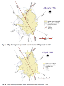
Urban Sprawl Development Around Aligarh City: A Study Aided by Satellite Remote Sensing and GIS

In this article, GIS was used to rapidly assess the developments of sprawl in Aligarh City. The results of this study show that the urban area of this city has increased around three times since 1971, and that around 1990, there was a sharp increase in land consumption as compared to population growth. As the city does not have a sewage treatment plant, with a growing urban area, there is less area for the water to drain into soils, and there will also be more flooding in low lying areas. By studying and watching for urban sprawl in an area over time, residential development can be better monitored.

References:

Peter, Yohanna, Innocent Reuben, and Emmanuel Bulus. “The application of remote sensing and geographic information system (GIS) for monitoring deforestation in south-west Nigeria.” Journal of Environmental Issues and Agriculture in Developing Countries Vol 4.1 (2012): 6.

Farooq, S., and S. Ahmad. “Urban sprawl development around Aligarh city: a study aided by satellite remote sensing and GIS.” Journal of the Indian Society of Remote Sensing 36.1 (2008): 77-88.

Jocelyn Weaver – Week 3

Mitchell ch. 5: Finding What’s Inside

Overall: Finding what is inside can let you see activities that occur in a certain area or summarize information for several areas for comparison.

  • To find what is inide you can draw boundary lines on top of a feature, use area boundary to select the feature inside and list or summarize them, or combine the area boundary and features to create summary

  • Finding what’s inside a single area

    • Service area around a central facility

    • A buffer that debines a distance around some feature

    • An administrative or natural boundary

    • Area you draw manually

    • The results of a model, such as boundaries of floodplain modeled in GIS

  • Finding what’s inside multiple areas

    • Contiguous – zip code/watersheds

    • Disjunct – state parks

    • Nested – 50 year old floodplains/area 1 or 2 miles within store

  • Discrete features: identifiable features, can list or count them or summarize a numeric attribute associated with them. 

  • Continuous features: seamless geographic phenomena, can summarize features

    • Spatially continuous categories – vegetation type/elevation

    • Continuous values – temperture, elevation, precipitation

  • Drawing areas and features: good for finding out whether features are inside or outside an area 

  • Selecting the features inside the area: good for getting a list or summary of features inside an area 

  • Overlaying the areas and features: good for finding out which features are inside which areas, and summarizing how many or how much by area

  • Statistical summaries include:

    • Count – total number of features inside area

    • Frequency – number of features with a given value, or within range of values, inside area, displayed as a table 

    • Sum – overall total

    • Average – mean

    • Median – middle of range of values

    • Standard deviation – average amount of values are from the mean

  • Vector or a raster method to overlay areas with continuous categories or classes

  • Vector – GIS splits category or class noundaires where they cross areas and creates a new dataset with the areas that result, then use data table for new layer to summarize the amont of each category in area

  • Raster – GIS compares each cell on the area layer to the corresponding cell of the layer containing the categories

Mitchell ch. 6: Finding What’s Nearby

Overall: Finding what is near lets you see what is within a set distance or tavel range of  a feature. Can monitor events in an area or find an area served by a facility or the features affected by an activity

  • Travel range is measured using distance, time, or cost. 

  • To find whats near you can measure straight-line distance, measure cost/distance over a network, or measure cost over a surface

  • Can calculate distance assuming the earth is flat (planar method) or curved (geodesic method)

    • Planar – good when area of interest is small like city, county, state

    • Geodesic – good for large areas such as large region, continent, or whole Earth

  • Once you have identified which feature are near source you can get a list of the features, a count, or a summary statistic 

    • Summary statistics can be: a total number, an amount by category, a statistical summary (mean, maximum, minimum, or standard deviation)

  • If you are specifying more than one range you can create either inclusive rings or distinct bands

    • Inclusive rings are useful for finding out how the total amount increase as the distance increases

    • Distinct bands are useful if you want to compare distance to other characteristics

  • Ways of finding what is nearby

    • Single-line distance: defining an area of influence around a feature, and creating a boundary or selecting features within the distance

    • Distance or cost over a network: measuring travel over a fixed infrastructure

    • Cost over a surface: measuring overland travel and calculating how much area is within a travel range

  • To create buffer you specify the source feature and the buffer distance, GIS draws line around feature, can have several source features with buffers around them

  • If you are finding individual locations near a source feature and you can GIS calculate the distance between each location and the closest source

Mitchell ch. 7: Mapping Change

Overall: GIS lets you map where thing move and knowing what’s changed can help you understand how thing behave over time, anticipate future conditions, or evaluate the results of an action or policy

  • Mapping change in character or magnitude shows you how condition in a place have changed. Change can be a feature or can be associated with a quantity with each feature

  • Can map discrete features that physically move or events that represent geographic phenomena that change location

    • Discrete features – change in character or in the quantity of an attribute associated with them

    • Data summatized by area – totals, percentages, or other quantities are associated with features within defined areas

    • Continuous categories – show the type of feature in a place, such as each land cover type

    • Continous values – these quantities are continuous, such as air pollution levels

  • Can map time 3 differnet ways:

    • A trend – change between two or more dates or timess

    • Before and after – conditions preceding and following an event

    • A cycle – change over a recurring time period, such as a day, month, or year

  • Snapshots show the condition at any given moment and are used to map phenomena that are continuous in time 

  • Summarizing is used for mapping discrete events in a particular place that are not continuous in time

  • Duration divided by the number of dates yields the interval

  • Number of dates you use depends on the consistency of the change

  • When calculating change in magnitude you subtract the numeric values associated with each feature

    • Can also calculate percentage to show which feature changed the most relative to their original value 

  • To measure change in type or category you sum the land area of each category and calculate the the actual or percentage difference between the dates

  • 3 Ways to map change:

    • Time series – Strong visual impact if change is substantial; shows conditions at each date/time

    • Tracking map – Easier to see movement and rate of change that with time series, especially if change is subtle

Measuring change – Shows actual difference in amounts or values

Abbey S- Week 3

Chapter 5: Finding What’s Inside

You can map what’s going on inside an area if you want to compare different areas or if you want to show what locations need action

  • What’s inside a single area vs multiple areas
  • Features either discrete or continuous

GIS can be used to:

  • Figure out whether a feature is inside of an area
  • Find all features in an area
  • Find number of features in an area

Some features may be partially in an area

  • Only use portion actually in the area

Three (3) ways to find what’s inside:

  1. Draw features/ areas
    1. Effective visual 
    2. Need dataset of area boundaries and dataset with features
  2. Selecting features within an area
    1. You determine the area/ layer, and GIS selects all features 
    2. Good summary of features in an area
    3. Cannot use for surfaces
  3. Overlaying areas and features
    1. Good for finding which features are in a number of areas
    2. Requires more processing

Based on the information provided in the book, it seems like the second method is not particularly effective. It cannot be used for surface features and overlaying features (method 3) allows you to see the same information. 

More details on each method:

Drawing areas/ features

  • Make sure it is easy to see what features are in the area
  • Locations and lines require different symbols/ thicknesses in order to differentiate them from each other
  • To map discrete areas:
    • Lightly shade the area
    • Make the area translucent or shade the area with a pattern
    • Draw only the boundary of the area
  • To map continuous data:
    • Same as discrete
    • Place a screen on the outside area to emphasize what’s in the area

Selecting features in an area

  • You determine the features and area, and GIS will let you know what features are within the boundaries of an area
  • GIS does not distinguish which areas the features are in (L)
  • You can use this method to generate a report of the results, which can be used to relay information to the masses

Overlaying areas with continuous categories/ classes 

  • GIS uses vector/ raster method to overlay info
  • Overlaying areas on areas requires slivers
    • Slivers are small areas that are slightly offset
    • An area with an areal extent less than the smallest dataset
  • Raster vs vector
    • Vector- more precise but more processing
    • Raster- more efficient, prevents slivers, but sometimes less accurate

Chapter 6: Finding What’s Nearby

What’s occurring around a feature?

  • Important for projects that need to be conscious of the surrounding area (development, demolition, etc.)
  • Measure line distance, distance/ cost over a network, or cost over a surface

Taking the curvature of the earth into account

  • Planar method is used for smaller areas such as cities, states, or countries 
  • Geodesic method good for regions and continents
    • Will be displayed with the curvature of the globe

Information from analysis 

  • List
  • Count 
    • By total 
    • By category
  • Summary statistic
    • Total amount
    • Amount by category
  • Statistical summary
    • Average
    • Minimum/ maximum
    • Standard deviation

Number of ranges

  • Inclusive rings- how total amount increases as distance decreases
  • Distinct bands- compare distance to other characteristics

Straight line distance:

  • Defines area of influence around an area
  • Quick ‘n easy
  • Only gives an approximation
  • Create buffer to define a boundary
  • Select features in order to find features in a given distance 
  • Calculate feature-feature distance to assign distance to locations
  • Create distance surface to find continuous distance from source

Distance/ cost over a network:

  • Measures travel over a fixed infrastructure
  • More precise 
  • Needs an accurate network layer
  • GIS identifies all lines in a network
  • Source locations in networks are centers
  • Street neworks 
    • Street segments (edges)
    • Intersections (junctions)
    • Tagged with cost to travel from center to surrounding locations (impedance value)
    • Set travel parameters
      • Can specify cost for turns from one segment to another
  • More than one center
    • GIS assigns segment to each concurrently

Cost over a surface:

  • How much area is within an overland travel range
  • Allows you to combine multiple layers
  • Needs data preparation
  • Creating a cost layer
    • The book uses an example of the cost between deer traveling through open forest vs thick underbrush, and how it would be easier for deer to travel through open forest (yay animals). Therefore, open forest= lower cost
    • Reclassify layer based on existing attribute

For me, this chapter really showed how specific you can get with GIS, especially when it came to determining traveling costs over a network or surface!


Chapter 7: Mapping Change

Mapping change allows us to make predictions on what the future could look like (big emphasis on meteorology) 

Types of change:

  • Location
    • How features will move
    • Can map features that physically move or geographic phenomena that change locations
    • Discrete features can be tracked as they move through space (organisms or meteorological events)
    • Events happen at different locations (earthquakes, deaths)
    • Showing patterns of movement for individual features or
    • Number of large yet distinct features 
  • Character/ magnitude
    • How conditions in a given place have changed
    • Discrete features are changes throughout a period of time
    • Data summarized by area are presented as percentages or totals
    • Continuous categories show the type of features in a place
    • Continuous values are quantities that fluctuate
    • Magnitude- similar issues as mapping most and least (ch. 3)
    • Character- the way categories are defined may differ between dates

Measuring time:

  • Three types of patterns
    • Trend- change between two periods
      • Increasing or decreasing?
    • Before/ after- self explanatory
      • Impact?
    • Cycle- change during recurring time period
      • Patterns?
  • Choosing time interval
    • Need to choose interval if given a range 
    • Should be long enough to show change, but include all info
  • Three ways to map change
    • Time series- change in boundaries, discrete areas, surfaces
      • Good visual impact, easy to understand 
      • Need comparisons
    • Tracking map
      • Showing movement of discrete locations, linear features, area boundaries
      • Easier to see subtle movement compared to time series
      • The more features, the harder to read
    • Measuring change
      • Show amount, percentage, rate of change
      • Shows difference in values
      • Omits actual conditions

Number of maps to show

  • Fewer maps spaced longer apart shows more drastic change
  • More maps account for possible patterns that may have been missed
    • More maps are more overwhelming for the viewer

Results

  • Showing tables and graphs can supplement what you are trying to show thru maps

Mapping linear features

  • Differentiate between each point with labels, colors, or symbols

Mapping contiguous features 

  • Draw boundaries for areas at each date/ time

Mapping events

  • Use different colors for each time period


Week 3- Will Sturgill

Week 3:
Chapter 5:
Key concepts=
  • It is important to map what is inside an area to monitor what is happening in that area and it is important to map several areas to compare these areas and what is taking place inside of the areas. 
  • It is important to define you analysis when mapping what’s happening inside of an area. It is equally important to evaluate and consider your data/ areas and what types of features are inside the areas.
  • The features inside of an area can either be discrete features or continuous features. Discrete features are unique and identifiable features, you can count them or list them. You can also summarize a numeric attribute associated with them as well. Discrete features are either locations, linear features such as streams, or discrete areas such as parcels.
  • Continuous features represent geographic phenomena and you can summarize the features for each area. A type of continuous features is spatially continuous categories or classes. You can measure this continuous feature by finding out how much of each category or class occurs inside the area you are mapping
  • Another type of continuous feature is a continuous value. These are numeric values that vary continuously across a surface and can include elevation and precipitation.
  • The three ways of finding what is inside the area of a map are drawing areas and features, selecting the features inside the area, and overlaying the areas and features.
  • All three methods mentioned above are good for individual reasons when it comes to finding what is inside the area of a map.
  • Drawing areas and features can be done using different methods that are required for different areas such as discrete areas or continuous features
  • Selecting features inside an area lets you use the results as a tool for analysis such as the frequency, count, and a summary of a numeric attribute.
  • Overlaying areas and features lets you find which discrete features are inside certain areas and summarize them. It also allows you to calculate the amount of each continuous category or class inside areas, and summarize continuous values inside areas.
  • When overlaying areas with continuous categories or classes the GIS uses either a vector or raster method. The vector method is more accurate but requires more processing and the raster method is more efficient since it automatically calculates the areal extent for you but is still less accurate. 
Definitions:
Frequency= the number of features with a given value, or within a range of values, inside the area, displayed as a table.
Chapter 6:
Key concepts=
  • This chapter is all about finding what is nearby and the purpose behind this is to find out what’s occurring within a set distance of a feature and to also find out what is within traveling range.
  • There are different ways of finding what’s nearby and this can be done by measuring straight-line distance, measuring distance or cost over a network, or measuring cost over a surface.
  • Nearby can be based on a set distance you specify, or on travel to or from a feature. Typically if travel is involved you would measure nearness by distance or travel cost
  • Travel costs can include things like time, money, and effort expended. These are considered travel costs because of the costs associated with each.
  • Taking the curvature of the earth into account is important for geodesic method and ignoring the curvature of the earth and measuring across a flat plane is called the planar method
  • The information needed from analysis can be summed up as a list, count, and summary. Each have their own purpose for the features that are mapped
  • Straight line distance is a good and simple way of finding what’s nearby, but measuring distance or cost over a network, or cost over a surface can give you more accurate measurements as to what is nearby.
  • Creating a buffer is important because you can use the line created by the buffer as a permanent boundary or use it temporarily to find out how much of something is inside the area. Creating a buffer is done by specifying the source feature and the buffer distance
  • GIS will also allow you to create buffers around multiple source features at once, and can also buffer each source differently depending on an attribute of each.
  • Finding individual locations near a source feature is useful if you need to know exactly how far each location is from the source instead of just figuring out if it falls within a certain distance from the source
Definitions:
Distance or cost over network= specify source locations and a distance or travel cost along each linear feature.
Cost Over a Surface= specify location of source features and travel cost, and creates a new layer showing the travel cost from each feature.
Chapter 7:
Key concepts=
  • This chapter was all about mapping change. Knowing what has changed can help with the analysis of the way things interact, predict future conditions, and evaluate the results of an action.
  • Mapping change can include showing the location and condition of features at each date, or calculate and map the difference in a value for each feature between two or more dates.
  • Mapping change in location can help to predict where features may move in the future
  • Mapping change in character or magnitude can show how the conditions in a given place have changed over time 
  • It is important to not that change in location and change in character are not mutually exclusive 
  • A trend is when there is a change between two or more dates and times, this typically occurs when measuring time
  • There are three ways to map change and these are, time series, measuring change, and tracking maps
  • A time series is particularly useful for showing change in character or magnitude for discrete areas and surfaces.
  • Measuring change is to show the amount, percentage, or rate of change in a place
  • A tracking map is another key concept and basically shows the position of a feature  or features at several dates or times (this is good for showing incremental movement). What examples could be used with a tracking map?
  • The last important key concept for the chapter is measuring and mapping change. Calculating the difference in value between two dates and then mapping the value of this is how mapping/measuring change takes place. There are various data/features you can measure and map change for including discrete features, data summarized by area, continuous numeric values, and continuous categories. 
Definitions:
Change in character or magnitude= how conditions in a given location change over time
Cycle= change over recurring time period

AJ Lashway Week 3

Chapter 5

Notes:

You can use an area boundary to define the features inside. These can be created on top of features, can be used to select features inside the area/summarize selected features, and combine the area boundary and features in order to create summary data.

Single areas can be sectioned off to let you monitor activity or summarize information. For example, a stream buffer that is off-limits for logging. Then there are multiple areas, that can compare what’s within several different areas in a contiguous fashion. Examples of these contiguous areas are zip codes and watersheds.

You can change what you’re analyzing using different feature attributes (as discussed in previous chapters). Sometimes features will bleed out of the area; there are a couple different ways to deal with this. You can only include features fully contained, include features that partially extend outside (would use counts), or include only portions that are inside of the area (would use amounts). This decision all depends on what you’re mapping and the level of precision required.


Vectors are typically used with continuous data and can result in slivers, which can be smoothed out with the GIS. You need to keep in mind the extent of the data, the degree of accuracy you’re dealing with, and only have very small slivers removed automatically. Anything slightly bigger should be removed manually to ensure that important data isn’t lost.

Vector is more precise, but requires more time and processing power; it requires the summarization of category values in the final table. Raster is more efficient, but can be less accurate. The accuracy will depend on the cell size, and slivers can still be created using raster.


Definitions:

  • Frequency– the number of features with a given value or within a range of values inside the area.
    • Represented with a bar chart or pie chart.
  • Sum– overall total or total by category.


Chapter 6

Notes:

You can use GIS to find out what’s nearby and how that’s relevant to the data set and audience you’re creating a map for. When dealing with distance, you must define “closeness,” as it’s very subjective. You need to quantify what is “near” and what is “far.”.

Buffers can be used to give features more definition. They can be used to add a literal buffer along stream banks to forbid logging, or just to simplify complicated data sets. Network layers connect edges through the GIS to allow different usages of distance and cost, and can be used in conjunction with buffers.


Definitions:

  • Travel costs– the effort or other detriment associated with one path/area over another.
  • Planar method– calculating distance assuming the surface of the earth is flat.
    • Used for short distances or small areas (county, city).
  • Geodesic method– taking into account the curvature of the earth.
    • Used for long distances (continent, earth as a whole).
  • Inclusive rings– bands of data ranges used to see relative changes at varying scales.
  • Distinct bands– for comparing distance with other characteristics.
  • Straight-line Distance– specify the source feature and distance, then uthe GIS finds the area or surrounding features.
    • Primarily used to create boundaries.
  • Distance or Cost Over Network– specify source locations and a distance or travel cost along each linear feature.
    • Used to find what’s within travel distance or cost over a fixed network.
  • Cost Over a Surface– specify location of source features and travel cost, and creates a new layer showing the travel cost from each feature.
    • It calculates the overland travel cost.


Chapter 7

Notes:

Maps can also be made to change in order to document past conditions and/or predict future events. You can go date by date, or hop between a certain/set period of time in a pattern (every two days, every other month, every 3 hours). Make sure to keep note of how exactly time is changing and its relationship with the feature(s).

Time patterns can be used to track movements over time. You can use lines between points to better emphasize findings as well. The distance between points can represent various speeds. For example, two dots that are closer together show a slower amount of movement of a hurricane over a 3-hour period than dots that are further apart after the same amount of time has passed.

Coloration and shading to emphasize change with continuous features. Equal time intervals being used for each feature is critical to seeing an accurate rate of change. Events mapped over time typically use color grades that represent different (but equal in length) time periods. If there are several events reoccurring at the same locations, you can use pie chart markers in place of simple dots.


Definitions:

  • Change in Location– see how features behave so you can predict where they’ll go.
    • Ex; bird migrations, hurricanes
  • Change in Character or Magnitude– shows how conditions in a given location have changed.
    • Ex; land cover change in a watershed
  • Travel– change between two or more dates or times.
  • Before & After– conditions preceding and following an event.
  • Cycle– change over a reoccurring time period.
    • Ex; day, month, year

Week 3 – Savannah Domenech

Mitchell Chapter 5:

Key concepts and definitions:

Boundary: a polygon that is placed on top of features and is used to select features within in order to list or summarize features or in order to combine the boundary and features to create summary data. Boundaries can be shaded areas that go in front or behind the outer area (this emphasizes the area itself) or they can be thick lines (this emphasizes the inner area).

Drawing areas and features: a method that allows you to visually find out whether features are inside or outside the boundary. This method is for working with one area.

Selecting the features inside the area: a method that provides a list or summary of features inside the boundary. This method is for working with one area.

Overlaying the areas and features: a method that determines which features are inside which boundaries and also summarizes features by area. This method is for working with several areas or single areas. Using the raster model is more efficient than using the vector model.

Count: the total number of features inside an area or boundary.

Frequency: the number of features with a certain value inside an area or boundary displayed as a table or chart.

Slivers: very small areas where areas are slightly offset from overlaying. Slivers should be merged into adjacent larger areas according to minimum mapping unit and data accuracy guidelines.

Minimum mapping unit: the smallest area input in a dataset.

Notes and Questions:

  • Finding what’s inside a single area lets you monitor activity or summarize information about the area and finding what’s inside numerous areas lets you compare the areas
  • You want to include features that are partially within the boundary if you are gathering a list or count of features
  • When looking to determine the amount of something within a boundary, you would only include the portion inside the area
  • Am I correct in understanding that overlaying the areas and features is selecting the features inside the area just with an additional step and that selecting the features inside the area is drawing areas and features just with an additional step?


Mitchell Chapter 6:

Key concepts and definitions:

Traveling range: determines what’s within a set distance of a feature. Distance, time, or cost can be used.

Travel costs: often termed the impedance value. Time, distance, and money are very common.

Planar method: used for calculating distance on a flat earth and in a relatively small area.

Geodesic method: used for calculating distance taking into account the curvature of the earth and in a relatively large region.

Inclusive rings: useful for determining how the total amount of something increases as distance increases.

Distinct bands: useful for comparing different distances to other characteristics.

Spider diagram: formed when GIS draws a line between each location and its nearest source. They are useful for comparing patterns between two or more source points.

Junctions: points where edges meet.

Turns: used to determine the cost to travel through a junction.

Edges: street segments or lines.

Turntable: a data table that contains the junctions which you want to assign a cost to.

General boundary: it connects the farthest reaches of the selected segments (forms a blob).

Compact boundary: it outlines the selected segments.

Mask layer: used for blocking the assignment of cost values to cells. You would assign the cells a very high value or no value at all to do this.

Notes and Questions:

  • Area of influence is typically measured using straight-line distance (putting a boundary of a certain radius, depending on the distance specified, around the chosen feature)
  • Travel movement is measured over a geometric network (for example roads). Travel costs can also be applied to this
  • Cost over a surface is used for overland travel and is useful for showing rate of change. It uses the raster model
  • When finding features near several sources you need to create separate straight-line buffers otherwise you won’t know which source (or sources) the feature is near
  • You should specify the maximum distance when finding what’s nearby
  • Distance ranges are created using graduated colors
  • If you need to be specific when calculating travel time (cost) include turns and stops
  • The source should be a different, distinguishable symbol than other features
  • To create a cost layer based on a single factor reclassify an existing layer for the attribute you want, and to create a cost layer based on numerous factors combine all the layers together after reclassifying each input layer
  • I understand the theory of how to find what’s nearby but I don’t know the technical steps to take


Mitchell Chapter 7:

Key concepts and definitions:

Time patterns (trend, before and after, and cycle): a trend map represents change between two or more times, a before and after map represents change preceding and following an event, and a cycle map represents change over a recurring period of time.

Tracking map: shows the position of a feature or features at several times. This is useful for showing incremental movement and geographic phenomena.

Trendline chart: shows a relative value as well as that value’s growth over time.

Notes:

  • You can map change by creating numerous maps showing the condition of features at each time or by calculating and mapping the difference in value for each feature
  • When mapping trends you need to determine the time interval
  • When mapping cycles you can map either snapshot or summarized data
  • When mapping before and after you want to use snapshots as close as possible to the event
  • When mapping discrete events you need to use summarized data and when mapping continuous data you can map summarized or snapshot data
  • Time series maps are good for showing changes in boundaries, values, or surfaces. You create one map for each time; however, you shouldn’t have more than six maps
  • A tracking map is good for showing movement in boundaries, lines, and discrete features
  • When mapping change in magnitude use the same classification scheme for all the maps
  • Quantile and equal interval schemes are useful for comparing values over time
  • You can generalize categories if historical categories vary from existing categories
  • To show movement in a trend map use different colors for each time period, to show movement in a before and after map use one color to represent the before and one color to represent the after, and to show movement in a cycle map use different colors for each time period
  • To emphasize the “from” in “from → to” change, map those categories in shades of the same color, and vice versa if you want to emphasize the “to”
Abbey S- Week 2

Chapter 1: Introducing GIS Analysis

Map uses:

  • Where things are
  • Most and least
  • Density
  • What’s inside
  • What’s nearby
  • Change

GIS can be simple, like a basic map, or a more complex figure with multiple layers (like an onion)

Geographic features can be discrete, continuous phenomena, or summarized by area

  • It’s important to understand what you’re mapping!
  • Discrete features can be pinpointed
    • Businesses represented by number of employees
  • Continuous phenomena are always present, and we map the changes (e.g. temperature)
    • Interpolation– values that are assigned to areas in between points
    • Non continuous data can be continuous if showing variation across a given location
    • Centroid– center points
  • Summarized data is used for density/ counts of individual points in a certain area
    • Would this mean the individual points would be discrete features, and the presence of a boundary is what makes it summarized data?

Geographic features can be represented using vector or raster

  • Vector-
    • Feature is a row on the table
    • Shapes are defined by x and y
    • Lines= coordinate pairs
    • Shapes= closed polygons
  • Raster-
    • Features are a matrix of cells in continuous space
    • 1 layer= 1 attribute
    • Sizing is important! Too large and info will be lost, too small and it takes longer to process

Geographic attributes:

  • Categories
    • Groups of similar things 
    • Represented by numeric codes or text abbreviations
  • Ranks
    • Order from highest to lowest
    • Used to compare features that are harder to quantify
  • Counts
    • Number of features on a map
  • Amounts
    • Measurable quantity associated with a feature
    • So a count would be the number of circles on a map, and an amount would be the number that each circle represents?
  • Ratios
    • Shows relationship between two quantities
    • Dividing one quantity by another
      • Proportions- part of a total value
      • Density- distribution of feature per unit area

Chapter 2: Mapping Where Things Are

Maps show where action is needed. It is important to know what features need to be present and how to display them.

Creating a map:

  • It needs to be relevant for your audience
    • Avoid unnecessary details
    • Smaller maps need to be concise and only show important aspects, while larger maps are able to provide more detail
  • Features need to be geographically assigned!
  • Categories help identify groups of features
    • Types and subtypes
    • If only one type, all features should be the same shape
  • Subsets used for individual locations
  • Context is important!

Categories can reveal patterns

  • Can provide an understanding of how a place functions
  • Most people can distinguish up to seven colors/ patterns on a map
    • I thought this was really interesting! Because of this, it is strongly encouraged that there are no more than seven categories displayed at once
    • The spacing of the categories also plays a role
      • I assumed that categories would be more easily distinguishable if they were spread out, but Mitchell says the opposite.
    • You may have to lose some information in the process of making it easy to read
      • How would you determine what information is needed the least? How often does this happen?

Grouping categories can change the viewer’s perception of the information

  • Assign detailed and general category codes
  • Create a table with detailed and general category codes side by side
  • Assign the detailed categories a symbol that represents the general category

Symbols

  • Size needs to be “just right”- large enough to be distinguishable, small enough as to not obscure
  • Use different widths to distinguish lines
    • Patterns as well ( dashed lines, dotted lines, etc.)

Geographic Patterns

  • Clustered distribution- Features more likely to be found near other features
  • Uniform distribution- Features less likely to be found near other features
  • Random distribution- Features likely to be found at any given location

Chapter 3: Mapping the Most and Least

Add a layer of information that can be useful instead of just a location on a map (What is the elephant population at this point, and why is it higher than the population at a different point?)

Can map all 3 types of quantities (discrete features, continuous phenomena, summarized area)

Continuous phenomena can be portrayed as a gradient of colors-

  • More saturated= most
  • Least saturated= least
  • Red= =high
  • Blue= low
  • etc

As I am going through the chapters, I noticed that Mitchell will repeat the same definitions for words previously mentioned. Some people may find that annoying but I appreciate the repetitiveness as it helps me remember what certain words mean.

Creating Classes

Simplicity is key when it comes to comparing values

  • Balance between portraying accurate data values and generalizing data enough to show a pattern
  • Map example:
    • Shading each area with a unique shade based on its data value can muddle the image (too many colors!)
    • It is much easier to create classes that each contain a range of the values (less color good)

Mapping individual values can be overwhelming for viewers. The data may be more accurate but not necessarily better.

Standard Classification Pyramid Schemes

  • Natural Breaks
    • Based on natural groupings of values
    • Use if data is unevenly distributed
  • Quantile
    • Each class has same number of features
    • Use if data is evenly distributed and you want to show relative difference between features
  • Equal Interval
    • Difference between high and low values is same for every class
    • Use if data is evenly distributed and you want to highlight the difference between features
  • Standard Deviation
    • Placed based on how far they deviate from the mean
    • Use if data is evenly distributed and you want to highlight the difference between features

How does one decide between equal interval and standard deviation?

Map type is dependent on type of features-

  • Discrete locations/ lines
    • Graduated symbols
    • Charts
    • 3D view
  • Discrete areas
    • Graduated colors
    • Charts
    • 3D view
  • Spatially continuous phenomena
    • Graduated colors
    • Contours
    • 3D view

In conclusion, you can’t go wrong with a 3D view


Chapter 4: Mapping Density

Shows you where the highest concentration of features are

More useful for mapping patterns

Looking at the images I can already tell that it is much easier to comprehend a gradient of density instead of a bunch of lines or dots

Two ways to map density-

  • Density map
    • Dot maps
    • Calculate density value to create a shaded map
  • Density surface
    • Raster layer
    • Requires more effort
  • Trade offs
    • Use density map if you have data summarized by area, but beware if you want exact centers of density
    • Use density surface if you have individual features and are prepared for more data processing

When creating a shaded map, make sure to limit the amount of colors/ shades used

Dot maps

  • Allows for more detail
  • Dots represent values in each area
  • Dots that are larger represent more values, and will therefore be more spread out
  • Make sure the boundary is larger than the dotted area

Density Surface

  • This is where I start to get lost
  • Cell size determines coarseness of the pattern
    • Smoother= more data processing
  • To calculate cell size:
    • Convert density units to cell units
    • Divide by the number of cells
    • Take the square root to get one side of the cell
  • When the cell size is too big, it starts to resemble a shaded map
  • Usually shades of a single color are used
    • Exception is standard deviation, where one color equals above mean, and another color equals below mean
  • Contour lines connects points
    • Lines closer together= rapid change
    • Lines farther apart= slower change


Jocelyn Weaver – Week 2

Mitchel Ch. 1: This introductory chapter starts off with defining GIS analysis as the process of looking at geographic patterns in your data and at the relationship between features. It discussed how we start the process of analysis by figuring out what information you need and the question you have at hand. It is important to take into consideration how the information will be used and who will be using it. The order of events to start is to choose a method of gathering your information, processing the data, and looking and reviewing the results. After you’re done if the data is not useful you can rerun it with different parameters. Geographic features can be discrete,  continuous phenomena, or summarized by area. Discrete features are actual locations that can be pinpointed and the feature can be either present or not. An example of this is businesses – as individual locations, streams – as linear features, and parcels – as discrete areas. Continuous phenomena allows you to determine a value at any given location; for example precipitation or temperature. It starts with a series of sample points that are either regularly or irregularly spaced. GIS then uses these points to assign values to the area between the points, which is called interpolation. Summarized data represents the counts or density of individual features within area boundaries. We also learn that geographic features are represented by vectors and rasters. Vector models put each feature in a row in a table and the feature shapes are defined by x,y location in space. Continuous data and discrete features and data summarized uses vector models. Continuous numeric values and continuous data uses raster models. The chapter highlights that all data layers you use should be in the same map projection and coordinate system to ensure the accuracy of the results when combining layers. Then it moves into talking about attribute values: categories, ranks, counts, amounts, and ratios. 


Mitchel Ch. 2: This chapter discusses different aspects of mapping and how they affect the maps. It goes over ways to make maps more efficient and how to effectively display the information you are trying to show. By looking at the different distributions of features on a map can help you see different patterns. Sometimes overlaying a lot of features and points to show patterns are effective, while on the other hand, making separate maps for different categories can make it easier for comparison. This is because it needs to be appropriate for the audience and the issue being addressed with the maps. When preparing the data you need to check that the features have geographic coordinates assigned to them because each feature needs a location in the geographic coordinates. Also, when you map features by type they need their own code that identifies which type it is in each feature. To add categories you need to create a new attribute layer in the data; many categories are hierarchical with major types divided into subtypes. When making the map you need to inform GIS what features you want to be displayed and what symbols to use to draw them. To map features as a single type, you draw all features using the same symbols. GIS stores the location of each feature as a pair of geographic coordinates or as a set of coordinates to define its shape. For example linear features are drawn by connecting many points. You can map features in a data layer or subset based on a category value, using a subset you have selected based on a category value. You can map features by category by drawing features using different symbols for each category value, this is stored in the layer’s data table. The chapter also goes over map scale and ways to make the map easier for views to understand, and or the way you change categories and change the way the readers perceive the information, which is extremely important. 


Mitchel Ch. 3: This chapter titled “Mapping the Most and Least” informs you about how doing both can help you find places that meet criteria and actions to be taken or emphasize the relationship between places. Mapping features based on quantities adds an additional level of information. By mapping this way it can help you decide how to best present the quantities to see the patterns on your map. Then the chapter goes into different types of features being mapped. Discrete features usually represent locations and linear features with graduated symbols, while areas are often shaded. For continuous phenomena areas are displayed using graduated colors while surfaces are displayed using graduated colors, contours, or 3D perspective view. Data summarized by area is usually displayed by shading each area based on its value or using a chart to show the amount in each category. It is important to understand the quantities you will be mapping to better present your data. Using counts and amounts allow to see the value each feature is given and shows you the actual number. Ratios show you the relationship between two quantities and are created by dividing one quantity by another, like averages, proportions, and densities. Ranks put features in order and can show realtice values rather than measured values. Examples are a scale with different colors saying excellent, good, fair, and poor. Classes group features with similar values by assigning them the same symbol, you can create classes manually or use a standard classification scheme. The different classifications schemes are natural breaks, quantile, and standard deviation. This chapter also talks about the importance of looking at outliers and how it might skew your results. You can put each outlier in its own class and use a special symbol for them. When creating a map you can you use graduated symbols, graduated colors, charts, contrours and 3D perspective views to show the quantities. 


Mitchel Ch. 4: This chapter covers the idea of density. Mapping density can show you the highest and lowest concentration of a feature. This is helpful for identifying patterns. A density map allows you to measure features using a unoform areal unit, such as square miles, so you can see the distribution. This can be particularly helpful when mapping an area, such as census tracts or counties, which can vary in size. To show density you can shade different areas based on the density values. Also, you can map density features, like location of businesses or feature values, like the number of employees at each business. You can map density in a couple different ways: graphically, using a dot map, or calculate a density value for each area. When creating a density surface it is created in GIS as a raster layer. You should map density by area when you have data already summarized by area, or lines or points you can summarize by area. You should create a density surface when you have individual locations, sample points, or lines. When creating a dot density map you map each area based on a total count or amount and specify how much each dot represents. The larger the amount represented by each dot, the more spread out they will be. Also, you can change dot size to emohasize the patters. When a density surface is created in GIS it defines a neighborhood around each cell center, then it totals the number of features that fall within that neighborhood and divides that number by the area og the neighborhood; that value is assigned to the cell. When picking a cell size it needs to be appropriate for the graph, smaller cells will take more time process while larger cells can lose detail and make the pattern disappear. 


Week 2 (Will Sturgill)

Chapter 1:

  • I have been a geography student here at OWU for over 6 semesters now. I have taken roughly 10 courses that all involved GIS in some way and I have to be honest it is refreshing to go back to the basics of what really makes up GIS and GIS data. I thought that this chapter did a great job of explaining what makes up GIS and why it is important to understand the geographic features and types of features. “Geographic features are discrete, continuous phenomena, summarized by area.” (Mitchell, 2020). This quote puts into perspective the three different types of geographic features used in GIS. Discrete features like locations and lines can actually be pinpointed on a map. Continuous phenomena such as temperature can typically be found or measured anywhere. Summarized by area means that the summarized data represents the density or counts of individual features within the area’s boundaries. All three are essential in explaining the first chapter and what it means to begin to analyze GIS data. 
  • The two ways geographic features can be represented in GIS are raster and vector. These are technically two different types of models within a GIS system. With the vector model each feature is a row in a table and this means that it is typically defined by x,y locations in space. This also includes the use of polygons that define an area based on the x,y location. They can also be defined by boundaries which can be legally defined or naturally occurring. 
  • With the raster model features are represented as a matrix of cells in continuous space. Each layer represents one attribute and analysis occurs by combining the layers to create new layers with new cell values. This distinction between raster and vector models is important to note because analysis occurs differently with the two different models. 
  • Cell size in a raster model affects the results of the analysis
  • Accurate results start with using the same map projection and coordinate system. Map projections translate locations on the globe to the flat surface of your map. 
  • A coordinate system specifies the units used to locate features in two-dimensional space and the origin point of those units. This is an important note because it shows what is happening behind the scenes when a certain coordinate system is used for the map and why there may be more than just one coordinate system
  • Geographic features have one or more attributes that identify what the feature is or describe it. These attributes are represented as values and are extremely important when creating a map. 
  • The different attribute values are categories, ranks, counts, amounts, and ratios. The main difference between some of these attribute values is if they are continuous values or if they are NOT continuous values.
  • Tables that contain the attribute values are important to work with in GIS and the different ways to work with them are selecting, calculating, and summarizing.


Chapter 2:


  • Mapping has become increasingly important and the best example of this provided by the chapter is that you can map where things are to show you where you need to take action. Police can do this by mapping where the most burglaries might take place in a city and wherever this area may be is where they can take action next.
  • This type of mapping analysis includes looking for patterns that occur and where these patterns might be.
  • Symbols are used to map features in a layer of a map to show these patterns.
  • Multiple features can be mapped at once using GIS to see if these features/attributes are occurring in the same place. An example of this is if police map two features, which are theft and assault, at once and see the connection of these two features occurring in the same place and determine that there is a pattern that shows and this pattern is that theft and assault are occuring in the same place/area.
  • The GIS map should be appropriate for the targeted audience and should properly address the issue at hand that the map is highlighting. 
  • GIS maps should also include areas of reference for an audience that may not be familiar with the area being presented.
  • Preparing your data for a GIS map includes creating a category attribute with a value for each feature and to also have geographic coordinates assigned.
  • When mapping each feature mapped must have a code that identifies its type of feature. Many maps will display categories based on hierarchical features and there may be some features that are listed as sub-categories based on the hierarchy used.
  • Mapping a subset feature in a data layer is helpful to determine patterns that are not easily seen when mapping all of the features.(this is commonly done for certain individual locations)
  • Mapping features by category can help with understanding how a certain place functions.
  • GIS helps with the above comment by storing a category value for each feature in the layer’s data table. 
  • The way you group categories can change the way readers perceive the information, for example creating a map with more than seven categories makes it difficult for the reader to see the patterns associated with the map. 
  • There are different methods of grouping categories that can alter the features that are being represented on the map.
  • Patterns on the map will become recognizable when mapping categories, whether it be a single category or multiple categories. 


Chapter 3:


  • Mapping the most and least in an area is important to see relationships between places, and to also see if a feature may meet a criteria or if action needs to be taken. 
  • To map the most and least you need to map features based on quantity associated with each.
  • Discrete features can be mapped using graduated symbols that are often shaded to show quantity. This is an important distinction between normally mapping discrete features and mapping them for quantity.
  • Continuous phenomena can be mapped for quantity by displaying graduated colors
  • Data summarized by area is usually displayed by shading each area based on its value or using charts to show the amount of each category in each area. 
  • It is also important to note again that people can recognize up to 7 colors on a map but after that it becomes difficult and distorted for people to analyze the data
  • An amount is different than a count because it is the total of a value associated with each feature, versus the count of the actual number of features on the map
  • Ratios show you the relationship between two quantities and are created by dividing one quantity by another for each feature. Common ratios include averages, proportions, and densities
  • Ranks put features in order from high to low and they show relative values rather than measured values. When direct measures are difficult this is when ranks come in to play.
  • Once the quantities are determined the next important step is to determine how to represent the data and this is commonly done by grouping the values into classes.
  • Classes group features with similar values by assigning them the same symbol.
  • Standard classification schemes can be used to look for patterns in the data.
  • There are various forms of classification schemes and each can be used for certain types of data and features that are represented in the map.
  • Outliers are extremely low and high values that can obscure the data represented and the class ranges as well. This means that outliers should be looked at closely because they could show errors in the database or even anomalies with the data.
  • This chapter mentions that the features and data values your are mapping must be consider when deciding what map type to use.


Chapter 4:

  • Chapter 4 deals with mapping the density of features and the purpose of this is to see possible patterns and where things may be concentrated.
  • Density maps are more useful for detecting patterns than for looking at the location of individual features.
  • There is a slight difference in mapping features and feature values. This difference is due to feature values being located in features themselves.
  • However you can also map individual locations. This is done by using a defined area and using a dot map to represent these locations. This is one way that density can be mapped
  • Another way that density can be mapped is mapping density by surface. A density surface is created in the GIS as a raster layer. Each cell in the layer gets a density value based on the number of features within a radius of the cell. This is a more precise way than mapping density via defined area
  • You can also map density for  a defined area by calculating a density value for each area and then shade each area based on this value
  • With GIS and mapping density, the size of the cell used (specifically for calculating density values) will determine whether the map has a smooth or rougher type of surface. This is the difference between using small cells compared to bigger cells.
  • Displaying density surfaces requires using graduated colors or contours. The reason for this is that each cell has a unique value and therefore requires classification which as stated before in previous chapters can be displayed graduated colors and contours.
  • Contours can be useful because they connect points of equal density value on the surface. As shown in previous chapters as well as chapter 4, contour lines are typically created automatically by ArcGIS.
  • The notes for this chapter above really show how detailed mapping density can be. I had never thought about the true detail and what all goes into mapping density so this chapter was a good insight to the detail of mapping density. 


  • Some extra notes: I did think that the reading was a bit lengthy for this week, however I found it to be extremely informative and helpful. I think it should be noted that the maps shown with each chapter were also really helpful in providing examples.

AJ Lashway Week 2

Chapter 1

Notes:

Map projection will be dependent on the scale of data, level of precision required, and where the data is located.

Definitions:

  • Discrete data– points or lines in space where a given feature is either there, or isn’t; there are ‘gaps’ in the map. Typically uses a vector model.
  • ex; streams, parcels of land, businesses
  • Continuous data– data covers the entire map, and you can determine the value for any given point. These are typically numeric values in raster, but can also be mapped using vector.
    • ex; temperature/heat maps, precipitation, soil type
  • Summarized data–  a given value applies to an entire area, not a specific location. Typically uses a vector model.
    • ex; number of businesses in a zip code, total length of streams in a watershed.
  • Vector model– features are shapes defined by “x, y” locations in space.
    • Can be discrete locations, events, lines, or areas.
    • Uses geographic coordinates (x, y).
    • Lines are a series of coordinate pairs.
    • Areas are closed polygons.
  • Raster model– features are a matrix of cells in continuous space.
    • Consists of multiple layers (typically), with each layer representing one attribute.
    • Can use varying cell size (examples on page 11).
      • Small cell sizes result in a more defined map, but requires more storage space. Large cell sizes will show patterns, but they lose the level of detail achieved with smaller sizes.
  • Attribute values– identify what the feature is, describe it, or represent some magnitude associated with the feature.
    • Types: categories, ranks, counts, amounts, ratios
  • Categories– groups of similar things
    • ex; roads: freeways, highways, local roads
    • ex; crimes: burglaries, thefts, assaults
  • Ranks– put features in order from high to low. Most often used when direct measurements are difficult, or if the quantity represents a combination of features.
    • ex; “scenic value” of rivers; area in mountain gorge ranks higher than area near a dairy farm
    • You can rank based on different attribute values
      • ex; soils of a certain type ranked the same in relation to suitability for growing a particular crop.
  • Counts & Amounts– shows you total numbers. Count is the actual number of features. Amount can be any quantity associated with the feature.
    • ex; amount: number of employees at a given business
    • They let you see the actual value of each feature as well as its magnitude compared with other features.
  • Ratios– shows the relationship between 2 quantities, created by dividing 1 quantity by another for each feature. They more accurately show the distribution of features.
    • ex; dividing (# of people in each tract)/(# of households)=(average # of people/household)
    • Proportions– show what part of a total each value is.
      • ex; number of 18-30 year olds/total population
      • They are often shown as percentages
    • Densities– show the distribution of features or values per unit area
      • ex; population of county/land area in miles squared= people/square mile
  • Selecting– used to specify features to work with, or to assign new attribute values to specific features.
    • select ATTRIBUTE = VALUE
    • Can also use (>), (<), and unequal (<>)
  • Calculating– used to assign NEW values to features in the data table.
    • select FIELD = VALUE → calculate ATTRIBUTE = VALUE
  • Summarizing– [summarize] the values for specific attributes to get statistics.
    • ex; create a new table → list a value for each type → add count of features

Questions:

Would the census population data from GEOG 112 be considered summarized data?

Why would you use a rank based on an attribute rather than just using the secondary attribute?

Chapter 2

Notes:

The amount of information shown on a particular map depends on what the map will be used for. You need to know the intended audience for the map and its purpose before starting, and plan accordingly.

The category values discussed in the previous chapter may have subtypes that add varying levels of detail. The same base map can then be expanded upon, depending on its purpose and the intended audience at the moment.

Even if you’re intending on focusing on a certain set of data, having surrounded data can help to contextualize the information and resulting patterns. If the data is discrete, showing these data sets on separate maps may make information more digestible. If the data is continuous, displaying all or a couple of categories on the same map is favorable in many cases. When it comes to categories and how many should be displayed, 7 is a good rule of thumb for a maximum. However, the distribution of features and scale of the map can affect this. You can display more features if they’re scattered than if they’re clustered together.

So, it’s good to experiment with how many categories are being displayed. Getting another set of eyes that aren’t familiar with the data set is probably crucial to ensure the map is understandable. This is also a good way of figuring out how the data is being perceived by the reader. Depending on how categories are grouped, that perception can change dramatically.

Definitions: 

  • Single type– when the same symbol is used for all features.
  • Reference features– landmarks/locations that can be used to ground a map in a certain area, and convey more meaning to the reader.
    • ex; major roads, locations of cities/towns, stores
    • They should be mapped in light colors or greys to avoid dominating the map.

Chapter 3

Notes:

Mapping based on quantities can give additional context that can give a better picture of what’s being represented. Again, knowing the purpose of the map being created will tell you how to make it and whether quantities will be beneficial.

Discrete data uses graduated symbols or shaded areas, while continuous data uses graduated colors, contours, or 3D perspective views.

When mapping based on quantities, you will want to start off with the basic data set and figure out what patterns are present. Then, make a map that helps highlight these patterns. Each feature included in the data set should only be incorporated in a way that best represents the data.

Definitions:

  • Quantities– a data set/set of points that have variation amongst the features.
    • These can be counts or amounts, ratios, or ranks
  • Class– a grouping of a range of similar data, typically used when features all (or mostly) have different values, and the data range is large. Classes will make it easier to identify patterns.
    • Natural Breaks– natural groupings of data values present in the individual sets.
    • Quantile– each class contains an equal number of features.
    • Equal Interval– the difference between the high and low values of each class is the same.
    • Standard Deviation– features are broken into classes based on how much their values vary from the mean.

Chapter 4

Notes:

Density mapping is helpful in cases where there are many features. It will be easier to read in some cases than individual points representing each feature. You’ll have to decide two major things: 1) whether to shade defined areas, or create a continuous density surface and 2) decide if you’re focusing on features themselves or on values associated with features.

In general, summarizing data with map density can make patterns more general, but easier to look at and identify specific numbers for overall areas. Map density should be used for already summarized data with defined borders. Density surfaces provide the most detail, but require the most effort by far to put together. These are best for concentrated data.

The level of specificity in a data set/range of area can greatly affect what the resulting map looks like. In density surface mapping, areas between features are estimated through interpolation. Interpolation can cause extreme highs and lows to vanish. So, while patterns are easier to see, there should be another map that shows locations of features to provide context.

Definitions:

  • Density– used to show where the highest concentration of features is.