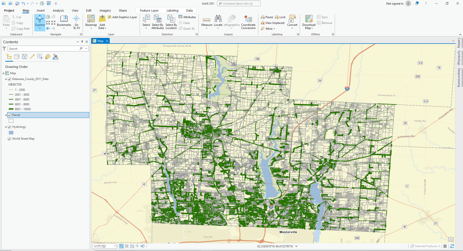
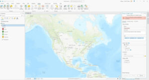
Chapter 5: Finding What’s Inside
> Finding what’s inside allows you to see whether an activity occurs inside an area or to summarize info. for several areas to compare
> You can draw an area boundary on top of features, use an area boundary to select the features inside and summarize them, or combine area boundaries and features to create summary data.
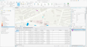
Selecting features inside the area:
> Good for getting a list or summary of features inside a single area
> Good for finding what’s within a certain distance of a feature
> You need the dataset containing the areas and a dataset with the features
Overlaying areas and features:
> Good for finding which features are in several areas or how much of something is in one or more areas
Using the results:
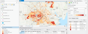
> Most common summaries include the count and frequency
Summary of a numeric attribute:
> Most common ones include the sum, average, median, and standard deviation
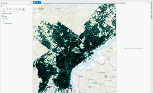
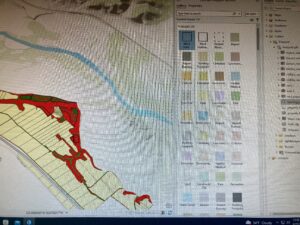
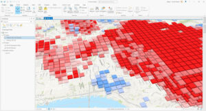
Overlaying areas with discrete features:
> The GIS tags each feature with a code for the area it falls within and assigns the area’s attributes to each feature
Vector method: GIS splits category or class boundaries where they cross areas and creates a new dataset with the areas that result. Each new area has the attributes of both input layers
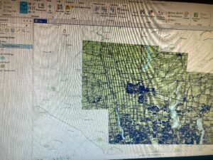
Raster method: When you combine raster layers, the GIS compares each cell on the area layer to the corresponding cell on the layer containing the categories. It then counts the number of cells of each category in each area, calculates the areal extent by multiplying the number of cells by the area of a cell, and presents the results in a table.
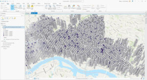
Chapter 6: Finding What’s Nearby
> Finding what’s within a set distance identifies the area, and the features inside the area, affected by an activity.
Things to consider:
> Is what’s nearby defined by a set distance, or by travel to or from a feature?
> Are you measuring what’s nearby using distance or cost?
> Are you measuring distance over a flat plane or using the curvature of the earth?
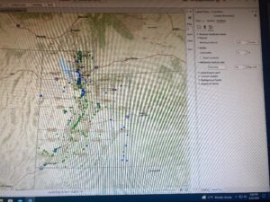
Info. you need from the analysis:
> List: example is a parcel ID and address of each lot within 300 feet of a road repair project
> Count: can be a total or a count by category
> Summary statistic: can be a total amount, an amount by category, or a statistical summary (standard deviation, average, etc.)
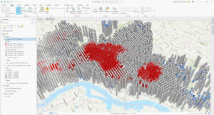
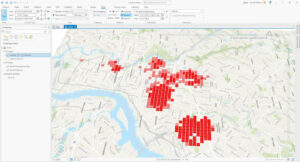
Finding what’s nearby:
> Straight line distance: specify the source feature and the distance, and the GIS finds the area or the surrounding features within the distance
> Distance or cost over a network: specify the source locations and a distance or travel cost along each linear feature
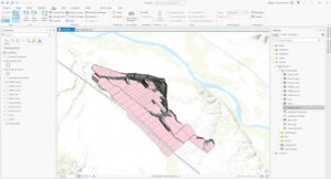
> Cost over a surface: specify the location of the source features and a travel cost. The GIS creates a new layer showing the travel cost from each source feature
Creating a buffer:
> Specify the source feature and the buffer distance
> You can save the line as a permanent boundary or use it temporarily to find out what or how much of something is inside the area
> If you have several source features, GIS can buffer each source at the same distance or have it draw a variable distance buffer based on an attribute of each
> You can also specify several source features and the GIS will create buffers around all of them at once.
> If you want to find features within the distance of more than one source feature, you’ll need to create separate buffers and select the features surrounding each
Spider diagram: if a location is near two or more sources, GIS draws a line to each
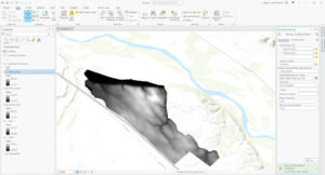
Creating cell distance ranges: each cell potentially has a unique value. You display the the values using graduated colors so you can see the patterns
> You can summarize either discrete features or continuous data within the distance
> You can limit the area for which the GIS calculates distance by specifying a maximum distance
Chapter 7: Mapping Change
> Geographic features can change in location or change in character or magnitude
> Mapping change in location helps you see how features behave so you can predict where they might move
> Mapping change in character or magnitude shows how conditions in a given place have changed.
The geographic features:
> You can map discrete features that physically move, or events that represent geographic phenomena that change location
> Discrete features can be tracked as they move through space
> Might be individual features you can map paths for (hurricanes, vehicles, animals, etc).
> Events such as crime or earthquakes can represent geographic phenomena that occur at different locations
Measuring time:
> You can measure time in trends, ‘before and after,’ and through cycles
> If you’re mapping trends, you need to determine the interval, the number of dates, and the duration. The duration divided by the number of dates gives you the interval.
Mapping change:
> Time series: good for showing changes in boundaries, values for discrete areas, or surfaces.
– Good for showing the patterns of individual movement if you’re tracking many features, such as 911 calls over time.
> Showing fewer maps, farther apart in time, may make a change in values easier to see
> Showing more maps closer together in time may reveal patterns that are missed when using fewer maps
> It is difficult to compare more than five or six maps at a time
> Tracking map: good for showing movement in discrete locations, linear features, or area boundaries.
– Good for showing incremental movement of discrete features
> Linear features are often mapped before and after an event
> Measuring change: measure and map change to show the amount, percentage, or rate of change in a place.