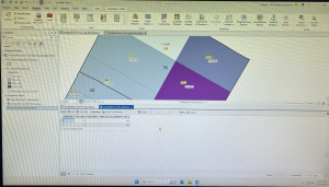
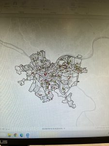
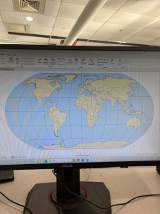
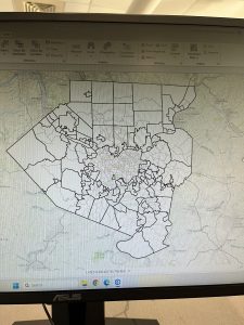
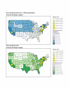
Rhoades Week 5

Chapter 4

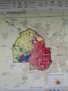
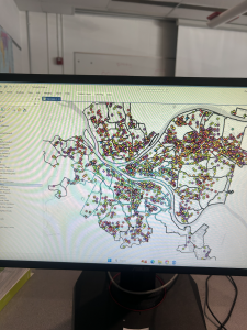
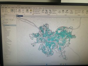
Chapter 4 was about working with spatial databases. I learned that a database is a container for the data of an organization, project, or othre undertaking for record keeping, decision-making, analysis, and research. I found this chapter to be more difficult than the previous chapters, but  I found it very interesting who individuals can utilize GIS to import databases directly into ArcGIS Pro. To me, this chapter was the most useful chapter that we have done yet. I can see myself importing data into the database and using it to analyze trends. I did have a bit of trouble importing the map, as it did say that there was a network error. I did have to switch over to another computer and this was resolved.

I also was able to learn about carrying out attribute queries. Linking tabular data to the spatial features in feature classes allows you to symbolize maps using the attribute values found in tables and enables you to find spatial features of interest using attribute data. An attribute query selects attribute data rows and spatial features based on attribute values. Something that I did have a question about was what SQL is. The chapter discusses how attribute queries are based on SQL, which is the de facto standard query language of databases and many apps, including ArcGIS Pro. I am interested in learning more about what SQL is what it entails. One of the more interesting parts of the chapters was viewing crime incidents. I found this to be very interesting. I never thought about how public health officials/law enforcement may be able to map criminal activity in order to look for areas of need and implement appropriate interventions. I did find the “your turn” on page 116 to be specifically hard, as I had a hard time locating the SQL view to remove the parenthesis.
Chapter 5

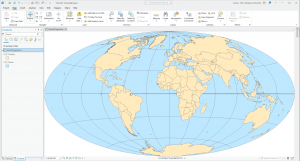
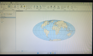
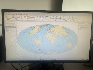
Chapter 5 was about spatial data, and I was able to change the geographic coordinate system to a projected coordinate system by setting the map properites, change the projected coodinate system to a different projected coordinate system by setting the map properites, and set the projected coordinate system for a local-level map by adding a first layer to the map an d specifying the display untis for the map. In 5-1 I learned more about world map projections. I discovered that geographic coordinate systems use latitude and longitude coordinates for locations on the surface of the earth, whereas projected coordinate systems use a mathematical transofmration from an ellipsoid or a sphere to a flat surface and two-dimensional coordinates. This section was very inetesting to learn about the various types of map projections- such as the Hammer-Aitoff projection.

I also found 5-3 to be very interesting, as I was able to change a map’s coordinate system. 5-4 allowed me to examine a shapefile. I was a little confused reading this section on page 134, and was wanting more clarification onn what a shapefile is and why they are important. I understand that a shapefile consists of at least three files with either .shp, .dbf, or .shx and each file uses the shapefile’s name but with a different extension, but I am not too sure how I would use it or what the importance is. I found tutorial 5-5 to be the most interesting, where I was able to work with US Census map layers and data tables. I learned that the advantage of downloading spatial data is that you have more flexibility in modifying it. I was able to download census TIGER files, and process tabular data in Microsoft Excel. I thought the process of adding and cleaning data in ArcGIS Pro was very interesting, and I would like to use this feature in the future, because it would be easy to analyze and interpret data within the same software- and not have to switch around programas.
Chapter 6

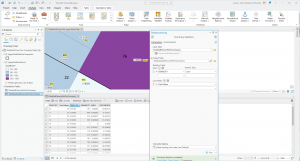
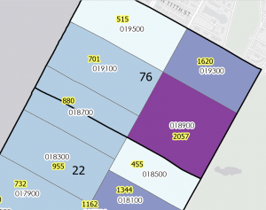
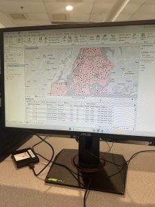
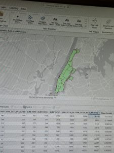
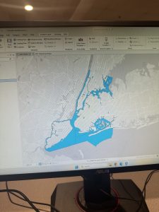
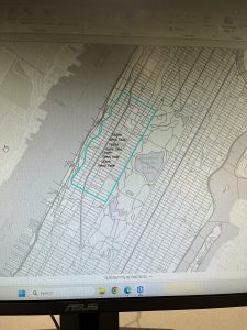
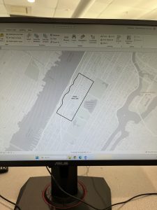
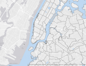
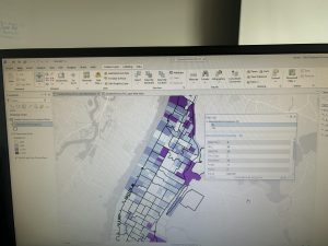
Chapter 6 is fundamentally about geoprocessing- which is a framework and set of tools for processing geographic data. 6-1 was about dissolving features to create neighborhoods and fire divisons and battakions. I learned about the pairwise dissolve took, which can aggregate block group attributes to the neighborhood level, using statistics such as sum, mean, and count. In 6-2 I was able to use select by location to create study area block grops. I found this to be very interesting, because the “your turn” was very interestnig I was able to interact within multiple layers. I was able to use the pairwise clip tool to cleanly create street segments. This was useful because clipping Manhattan streets with the Upper West Side boundary cuts off the dangling portions of the streets and creates a clean layer for display purposes. My personal favorite was doing 6-7 where I was able to understand study tracts and fire company polygons. It was very intersting to learn that responsbility for the tract’s population of persons with disabilities should be spilt approximately 50/50. I was able to select tracts to open the disability field, which showed that the population of persons with disabilities in tract is split 50/50 between fire companies 22 and 75, each with 400 persons. Census tract 019300 retains its full population of 1,620 persons with disabilities.

At the end of this weeks tutorial for chapters 4, 5, and 6, I feel as if my GIS skills are improving. At the beginning of the semester, I had no clue what GIS would look like in practice, and using map projections was a big surprise to me- because I did not envision this being a large part of GIS.
Njoroge Week 5

Chapter 4:

I found this chapter to be quite content heavy, but it was very interesting as it covered how geographers can import data into a geodatabase and manipulate it from within the app. This manipulation can be done in a myriad of ways, such as directly within the field view table or with the use of python expressions to combine or calculate fields. The chapter also covered the use of different tools such as the Calculate Field tool as well as how to select specific fields using generated expressions. It also had a section on centroids (the arithmetic mean of all the points within the polygon), and how they can be manipulated to influence the presentation of data within ArcGIS. I found this chapter to be the most interesting one we went over this week, and the one I found the most useful.


Chapter 5:

Chapter 5 went over the use of different map projections and how some can be more useful and cause less distortions in the display than others. The chapter also covered how to use and add coordinate (x,y) data; GPS units and many databases provide coordinate data, and said data can be used in GIS from a table to create point feature classes, such as libraries in Chicago. It also covered how exactly to work with outside sources like the US Bureau to import and work with spatial and tabular data. I thought this exploration of spatial data sources was interesting and the chapter explains it very well. I am excited to apply the information covered in this chapter to the final project for the end of the course.


Chapter 6:

This chapter focused on explaining how block groups, layers and features can be extracted and moved depending on the data needed. It covered how to dissolve block group polygons using the Pairwise Dissolve tool, extracting neighborhoods using attributes from a study area and intersecting features on different attributes. The chapter also went over how to merge, extract and append features using tools within ArcGIS. My favorite part of the chapter was learning how to use the Union tool on the different boundaries to create more detailed polygons. I thought it was a cool feature of ArcGIS to learn about. It did make me wonder about how many features can be merged at one time, and whether said features need to relate to each other or not.


Delaware Data Inventory:

Data Layer Name: Parcel
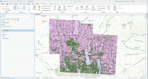
Description: This dataset shows the extent and ownership of parcel lines within Delaware, Ohio. It is a feature service, and is maintained by the Delaware County Auditor’s GIS Office. When viewed in GIS, it shows the boundaries of different parcels, particularly within the study area.

Data Layer Name: Hydrology
Description: This dataset contains all the major waterways within Delaware, Ohio. It is updated on an as needed basis and is published monthly. In GIS, using a different symbology from the rest of the parcel data can make it easier to distinguish and work with.

Data Layer Name: Street Centerline
Description: This data depicts the center of pavement of public and private roads within Delaware County. It falls under the Feature Service type, and appears with a simple line symbology when viewed within GIS.
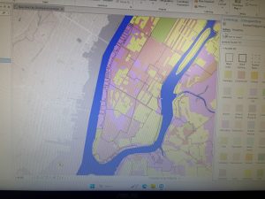
Screenshot:

Ramirez Week 5

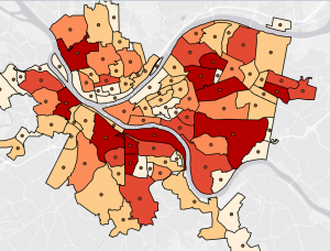
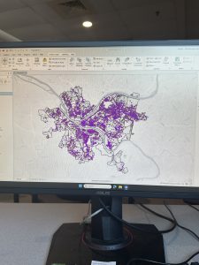
Ch 4: . In this chapter I learned how to create and work with databases. Following along with the rest of the chapter tutorials was much easier this time. Unfortunately I still had some technical issues so I could not complete all the tasks but I managed what I could. I thought it was not a very complicated task, and it reminded me of coding. Especially when I had to add the parenthesis around the crime and robbery in the SQL tab in tutorial 4-3. As well as having to create phrases such as the “where… is equal to…”  in the attribute tables. I believe that while coding, one has to be very specific about the data and the output it would create. Otherwise the data could be misinterpreted or the visual could come out wrong. Out of all the chapters, I believe that this was the easiest tutorial for me. I enjoyed adding colors and symbols to represent the crimes.  Although, it was a bit disappointing to notice all the crimes committed in the Pittsburg area on the map. Using GIS was a great tool to analyze these social issues, but I’m assuming this is not the first time GIS has mapped crimes or other city problems. I am unsure if the data is outdated but  I wonder if the crime rates have gotten worse, and what is the city doing to reduce crimes? Hopefully the same GIS software can be used to identify possible solutions to these crimes but also for other issues a neighborhood or area may encounter. Overall, I enjoyed this chapter especially tutorials 4-3 and 4-4, not only creating the data but as well as reading and understanding the maps. Particularly when the maps include important data regarding social issues such as low healthcare accessibility or low family income in certain neighborhoods. 

Ch 5: Using the GIS software to develop world maps was a fun tool, and converting it into a sphere was interesting.  This chapter was a good reminder of how to read maps using longitude and latitude coordinates. Mostly because I rarely use map coordinates so this was a nice skill to refresh especially for the GIS software. For the majority of this chapter, I understood the instructions more which made the process quicker and easier. I learned the importance of having coordinates in order to comprehend the data in certain areas such as the bicyclists in tutorial 5-5. I also learned that spatial data is easier to modify and change which is helpful in order to make map data accurate. Especially if borrowing data from other sources such as the data from the census website in tutorial 5-5. Throughout this chapter I learned how different types of maps can show different types of data. The tutorials throughout the chapter, used contours, raster, coordinates, and world maps to demonstrate different data. Sometimes these maps were used to show the same data in different ways. This reminded me of the other textbook where it explained all these different features and types of maps. It was interesting to see them into practice and how each map contributed differently to the data. However, I wonder why most of the map locations are normally from New York? I noticed that in other tutorials such as chapter two and chapter six, New York was also used as a reference. I am assuming that it is because New York has a large population so more data may be available, but I thought it was interesting. Nonetheless, I enjoyed being able to elaborate on previous data from the census website and use different maps to compare the data in similar areas.

Ch 6: In this chapter I learned about geoprocessing, which was something I was unfamiliar with before this tutorial. I also learned about the Pairwise Dissolve Tool which helped block attributes to their neighborhood level using statistics. I also learned that the Pairwise Intersect tool can summarize feature class data together into a group.  Furthermore, I learned how to use the Union tool to create a polygon layer and how to combine it with the Intersect tool. It was interesting to see how multiple tools and features came together to change the map output of certain data. For example, in tutorial 6-7, I had to use the Tabulate intersection tool to identify the number of people with disabilities. I put into practice my previous knowledge from the other tools  to navigate the tabulate intersection tool. Being able to understand the process of finding and using tools made the tutorials faster. It also helped me to quickly identify what I needed to do and where to find these features.  I learned how to use the toolbox tool as well as these specific features throughout the chapter. Although, sometimes  I would not find a specific tool, so I had to use the search bar which made the tutorial much easier to follow. At the end of this week’s tutorials I feel like I have gotten better at understanding and using the software. I feel more comfortable navigating the tool and tabs, as well as identifying certain features on a map.  I was also able to put into practice some of my map, statistics and technical skills throughout each tutorial. As I previously mentioned, I still had a few technological issues, but it was less compared to last week. Hopefully I will keep honing my GIS skills throughout the remainder of this course and especially for the final.

Mason Week 5

Chapter 4

Chapter 4 covered the process of creating different selections and selections by attributes. The selection by attributes feature allowed the user to select certain columns based on the different fields that were imputed. Additionally, there was the added feature of a definition query that can narrow down the attribute table depending on what the user is looking for. I had a bit of trouble differentiating when to use the definition query and selection query; however, I eventually figured it out. A large portion of the chapter was about creating calculations within the attribute table by using the calculate field button. One feature I learned about from chapter 4 was the Geoprocessing tool pane, which allowed me to use a search bar in order to find different tools. I assume that will be a tool I will be using a lot when I begin my final GIS mapping project. It was actually very interesting to see how one could utilize ArcGIS to narrow down the perpetrator of a burglary. I have definitely become well accustomed to the usage of the attribute table, and it helps to know its various uses, such as creating selection queries, viewing the selected records, and comparing numeric values. I had many questions when attempting to complete this chapter’s tutorial, one being how to create different active definition queries; however, I found the solution when I eventually realized that there was a different tool to make secondary selections through the selection by attribute tool. 

Chapter 5

Chapter 5 had covered the specific geographic pinpointing using latitude and longitude. Longitude is a measurement from east to west, while latitude is the measurement from north to south, and together they make up the coordinate system. Additionally, it had me venture out of GIS to attain data files from outside websites, such as the U.S. Census. I find that those skills in particular that it had walked me through will be useful in my final, as I will presumably have to find outside data to apply to my map. Moreover, it was the teaching of how to implement those files that will definitely help me in the future. It had also walked me through importing tables from Microsoft Word as well, which I had a tad bit of difficulty with, but I figured it out.  I would say one feature that I was left confused with was the add join tool, as it had caused a halt in my progress, as the instructions felt slightly unclear. Overall, this may have been the chapter I had the most trouble with, just simply because I had so much trouble with the add join tool, but overall, it was somewhat understandable. 

Chapter 6

Chapter 6 was definitely more straightforward than the previous chapter, and I found its content easier to digest. Much of this chapter consisted of finding different tools within the geoprocessing toolbox and navigating how to use them. Some of these tools include the pairwise tool, the merge tool, the clip tool, and many others, which are typically to alter different qualities on the map or in the datatables. Another helpful set of abilities within GIS is the selection group, which the chapter showed me how to use the three different methods for selection: select, select by attributes, and select by location. I imagine this would come in handy when trying to view traits on an attribute table for a specific location. I think it was cool to see New York used as an example for this chapter again, as it shows off the wide variety of traits that a location can have. Overall, I liked this chapter, and I found it interesting to explore all of the different types of tools that the application had to offer.

Azizi Week 2

Chapter 1: Introducing GIS Analysis

Some of the main things I picked up from this chapter were what GIS analysis actually means (not just making maps, but using geographic data to look for patterns and relationships), and how geographic features are represented as points, lines, and areas for real-world things. This chapter also discusses discrete vs. continuous data: how businesses or roads exist in specific places, whereas things like temperature or elevation change gradually across space. The author also goes into vector and raster data models, which are basically two different ways GIS stores information (points/lines/polygons vs. grid cells), and why map projections and coordinate systems matter since you’re taking a round Earth and forcing it onto a flat map, and if layers don’t match, things won’t line up in a right way.
It was interesting to learn how all of this actually matters once you start doing GIS analysis instead of just reading definitions. This chapter makes it clear that GIS is about asking geographic questions and using spatial data to try to answer them, and even simple mapping counts as analysis because you are already organizing data and looking for patterns in them. I also didn’t really think about how much the results depend on your choices, like how you frame your question, what data you decide to use, and how you process it. The chapter kind of shows that GIS is not neutral, and small decisions can change what story the map ends up telling.
Another part that stood out to me was how data is stored and connected behind the scenes. The section on vector vs. raster explains why one might be better than the other, depending on what you are mapping and how raster cell size affects both detail and processing time. The part about projections and coordinate systems is also important, since if layers don’t match, your relationships and measurements can be off. The attributes show how maps are tied to tables, with things like categories, ranks, counts, and ratios (like density or percentages), and how you can use queries, calculations (like people per household), and summaries to actually get meaning out of the data.
One thing I realized is how easy it seems to accidentally get misleading results without even realizing it. Like when you combine layers from different sources, I wonder how often people mess up coordinate systems or projections and don’t notice, and how much that actually changes the conclusions they end up drawing from GIS analysis.

Chapter 2: Mapping Where Things Are

Some of the key concepts I learned from this chapter were how the way you classify and group categories on a map can completely change the patterns you end up noticing. If you use too many detailed categories, patterns can get lost, but if you group things too broadly, trends become clearer while some important details disappear. This chapter also shows how much symbols matter in mapping, especially how color, shape, and size affect what stands out to you first. Colors are usually easier to tell apart than shapes, and even small things like line width can show hierarchy, like making freeways stand out more than smaller roads. I also learned that basemaps and reference features are supposed to support what you are mapping, not compete with it, which is why simpler, lighter basemaps usually work better. Another idea that stuck with me was that patterns on maps can look clustered, uniform, or random, and that what you notice can change depending on the scale you are viewing the map at.
Something that stood out to me in this chapter was how much the design of a map shapes the story it ends up telling. The examples showing how the same zoning data can look totally different just by grouping categories differently make it obvious that maps are not neutral. If “rural residential” is grouped with agriculture, the map feels more rural, but if it’s grouped with residential areas, the same place suddenly looks more urban. How symbols guide your attention was another important thing. When there are too many colors or the basemap is too busy, it actually becomes harder to see patterns, while simpler symbols and lighter backgrounds make clusters along streets or intersections way easier to notice. The part about analyzing geographic patterns helped me try to describe what I see on maps, like paying attention to whether things look clustered, evenly spaced, or random, and then thinking about possible reasons for those patterns.}
It is interesting how easy it would be to influence how people interpret a map without even trying to. Just grouping categories differently or choosing certain colors can make an area look more urban, more rural, safer, or more crowded than it actually is, even though the data itself hasn’t changed. It makes one realize that making maps comes with a lot of responsibility, because small design choices can really change the story people get.

Chapter 3: Mapping the Most and Least

Some of the main ideas I learned from this chapter were different ways of showing quantities on maps, especially using ratios, ranks, and classified values instead of raw numbers so comparisons between places are more fair and actually mean something. The chapter also went into common classification schemes like natural breaks, quantile, equal interval, and standard deviation, which are just different ways of grouping data based on how the values are spread out. Another important idea was outliers, which are really high or really low values that can throw off how patterns look on a map. It also talks about different visualization methods like graduated symbols, graduated colors, charts, contours, and 3D views, and how each one shows patterns differently depending on what kind of data you are mapping. Another important thing was that the number of classes you choose, and how you set the class ranges, can change what patterns stand out even when the data itself hasn’t changed.
I also learned that your map can tell a different story with the same data based on how you pick between natural breaks, quantiles, equal intervals, or standard deviation. They all highlight different things. Natural breaks make more sense when values are clustered unevenly since they separate natural groupings, while quantiles are more about relative position, like showing who is in the top or bottom group even if the actual values are still close. Equal intervals could be easy to understand, especially for things like temperature or percentages, but they can hide variation when a lot of values fall into the same class. Standard deviation is more about how far values are from the average, which is helpful for seeing what is above or below “normal,” but it can also hide the actual values and be heavily affected by extreme cases.
Again, just how I learned from other chapters, it can be very easy to mislead people with a map without even meaning to, just because of small design choices.

Gist Week 5

Chapter 4-

Chapter four focuses on importing data into file geodatabases, modifying attribute tables and fields, using Python expressions to calculate fields, joining tables, getting an introduction to SQL query criteria and carrying out attribute queries.  The part of chapter four below was tutorial 4-3, carrying out attribute queries. I had a little bit of trouble with the attribute queries and making sure everything was inputted correctly for it to be able to run. With a little bit of trial-and-error I was able to get the DateOccur values to appear. The little caution buttons that explains what was wrong about the function was extremely helpful to get the parenthesis inputted correctly. I liked the visuals of this map and all the different colors for each crime in the area. I had more trouble with the next part of getting just the frequencies for Burglary and Robbery, due to the colors glitching and not showing correctly. However, I was able to solve it and they eventually all turned the blue color in the picture on page 104. It was also very interesting to learn how to reuse a saved query to reuse a definition query. It was cool o see the number of crimes continue to go down with each step. I also liked how they connected the information I was using back to the area. In one part, it explained how violent crimes are normally clustered in specific areas, while crimes like burglaries are often more widespread. It was cool to read this and be able to visualize it with the map in front of me. The final part of this tutorial had you use multiple Select by Attributes to narrow down to the unsolved burglary to be John Bond. The next step was a Your Turn and had you create a choropleth map with gradient colors choosing your own color scheme. I appreciate these sections because they are helpful to then use the tools learned on your own.

Chapter 5-

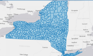
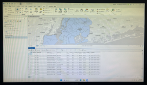
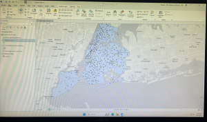
Chapter five focuses on spatial data and the learning goals including working with world and US map projections, set a projected coordinate system, work with vector data formats, and explore sources of spatial data. The first tutorial inserted below was 5-1. This tutorial was the easiest out of all I have done so far, but was helpful to see all the map options and types that can be used through the software. This tutorial had us start with a flat world map and convert it into a rounded version shown below. It was cool to see all the coordinate systems and to learn about the Hammer-Aitoff  (world) system that we used.  The Your Turn of this section had us do the same thing, but instead with the Robinson (world) projection. The next chapter focused more on the US map projections and the Albers equal-area projection for the country. Also shown below was tutorial 5-4. This tutorial focuses on working with vector data formats. This chapter was a little more complicated that the last few, and required you to find the certain tools it wanted you to utilize. The first step was importing a shapefile into file geodatabase, and being able to add that to the map. This step was self explanatory and I was able to find everything to get the purple overlay of New York City. This chapter also showed how to add X,Y data, which was more tricky to find. With a few google searches I was able to get to the coordinate graphs and tables inserted below. It had you visualize the amount of libraries, which are shown as dots, and the school district boundaries. It also has you learn to just highlight certain aspects, which was highlighting specifically the New York school districts. The rest of chapter five focuses on similar aspects.

Chapter 6-

The focus of chapter six is geoprocessing and dissolving block polygons to create divisions, merging water features, apportion data between polygon layers, and appending separate fire and police station layers to one layer. Chapter six covered a lot more complex topics as the last two, and the ones mentioned before were just a few of the learning goals of this chapter. The first few tutorials focused specifically on dissolving features to create neighborhoods, fire divisons, and battalions, extracting and clipping features for a study area, merging water features, and intersecting features. I was very interested by tutorial seven, photographed below. This tutorial focused on the Tabulate Intersection tool. I had some trouble with this chapter finding the tools section and where you can search for the tools needed in these tutorials. After finding it, the rest of the tutorial was much simpler. This tutorial had us look at tracts and fire company polygons specifically in Manhattan. Using the Tabulate Intersection, I was able to apportion the population of persons with disabilities to fire companies. I liked how we were able to visualize both the map and the table, and organize it in a cleaner way by ascending the numbers of the TRACT-ID. This allowed for easier location and made finding things much simpler. With the Your Turn portion, it had you use the Summary Statistics tool to calculate the total number of persons with disabilities in each fire company. It gave the data to input to get these numbers and what to place in the inpust and outpust table, field, statistic type, and case field. The photograph below is what I got in the table after inputting this data. Overall, I had more trouble with chapter six than the other chapters in this section, but it was a lot of useful GIS information.


Downing Week 5

GIS Tutorial for ArcGIS Pro: Chapter 4

I felt as though understanding the following chapters was easy, and I feel like the knowledge from last week carried over so that I knew what I was doing. After going through and reading Chapter 4, I completed Tutorial 4-3, which covered how to focus on attribute queries and how you can change them. The first two tutorials also went over this topic, which I found to be interesting. I didn’t know that you were able to change the coding so it displayed something else, and learning that was neat. The other tutorials also went over how to examine different tracts, which was helpful for the next chapters. 

Personally, Tutorial 4-3 was interesting and it taught me how to do new things. For example, the Select by Attributes button was used a lot during this tutorial and the others, which I thought was neat. It allowed me to get more comfortable with the Symbology pane as well, and it had me change the colors of a few things as well. I did have a little trouble going in and changing the parameters for the Select by Attributes, but it just took some getting used to. I also liked how it eventually narrowed it down to who committed the crimes in specific areas! 

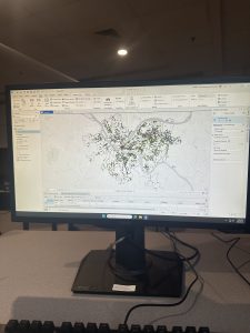
A general question I have is about the SQL toggle button – what does that stand for? I may have accidentally blipped over that part. However, I like when we can take the map and segment it into different parts using streets, types of crime, or even counties. It helps me understand how everything is supposed to look. Using the Hierarchy tab was cool and I know that will be helpful for the final exam as well. We also learned how to change the symbol, in this case it was crimes, and that was helpful to know as well. I feel like I was able to understand the key concepts of this chapter well. I have attached a screenshot of my work throughout this chapter. 

GIS Tutorial for ArcGIS Pro: Chapter 5

Chapter 5 involved a lot of maps, coordinates, vectors, and spatial data. I liked this chapter the most so far, I think just because it involved maps and the world, which was cool to me. I completed Tutorial 5-1 and 5-3 in order to expand my knowledge on how to change the parameters on a map. The most confusing part of this chapter was going through and looking at how the data was displayed in the Properties tab. There were a few instances in which we were instructed to change the coordinate system, and for some reason my project didn’t like that part. It took a couple tries for it to take, and eventually it did, but I feel like it helped me learn the concept a little more. 

Tutorial 5-1 was focused on world map projections, and we had to zoom, look at coordinates, and then change the coordinate projection. I had already learned to zoom from a different chapter, and that part was easy. It was cool to see how the map would change based on what projection we were using, and how the latitudes would change with that as well. It was a really short tutorial, and it specified that we should not use the Robinson projection for anything but the whole world, which is a helpful tip. I attached a screenshot of my Robinson projected map, which was after we zoomed and changed it to something else.

Tutorial 5-3 involved changing and setting the projected coordinate systems. I thought this was fun, and I enjoyed going in and changing the different settings. I also liked how we went through a different website than normal and we could choose a specific place to look at. This was for Allegheny County and represented the municipalities and tracts of that county. We had to go through and search in the Chapter 5 data on the hard drive, which wasn’t too difficult. I had a little trouble changing the color of the county from purple to white, but I was in the wrong section. I felt as if this chapter was very informative, and I have attached another screenshot of my work through this chapter. 

GIS Tutorial for ArcGIS Pro: Chapter 6

Chapter 6 was cool! I liked how specific we got into the details on an area of a map. One of my favorite parts was merging the water features into a large one. We continued the use of the Attribute Table and added a new tool, which was the Pairwise tool. It has different functions, and it took me a while to find it. I was able to use it to define specific battalion areas in Manhattan and New York City. The tutorial I found the coolest was Tutorial 6-2, which focused on extracting and clipping areas to study them. This one was located in the Upper West Side. 

Tutorial 6-2 allowed me to use different tools than what I have been using, and also to combine those tools with the Select by Attributes tool. It was neat how I was able to go in and manually select neighborhoods surrounding the Upper West Side that were not selected with my Pairwise tool. It was also helpful to learn how to save the data into the Chapter data on the hard drive itself; I feel like that will be useful for our future projects. I liked how we were able to single out a specific neighborhood out of a very large area, and decide what aspects of it we wanted extracted and what aspects we wanted clipped. 

Merging the waters, the firehouse and police stations, and using Union were all aspects that stood out to me in the continuation of the chapter. It was really important to note that the Calculate Geometry Attributes was helpful in this section. Although these tutorials are not super long, I found that they are in-depth but easy to understand as long as you take your time. One of the general things I have enjoyed learning is how we can take something very small, such as the Disabled Person Fire Company Study, and extract it out of a much larger map. I have attached a screenshot of my work throughout this chapter. 

Aslam Week 4

Chapter 1
In Chapter 1, I was finally introduced to ArcGIS Pro, and I have to say, I was immediately struck by the complexity of the interface.  There are just so many tabs, panes, and buttons, I didn’t even know where to look at first. However, as I followed the instructions in the tutorial, I began to get a better understanding of all the different elements.  This entire chapter focused on the basic fundamentals, such as opening a project, navigation, bookmarks, attribute tables, and learning to symbolize a map. All of these are probably basic, yet I quickly learned that they are also the foundation upon which all other learning will be built. One of the most important things I learned throughout Chapter 1 was the organization of ArcGIS. For instance, the top ribbon allows me to access different tools, which are then organized by different categories. Additionally, the Contents pane allows me to see the stacking of different layers. Turning different layers on or off, as well as moving them around, also helped me understand the construction of a map, piece by piece. Tutorial 1-3 was also very helpful, as I had never even opened an attribute table before. Learning about all the different data behind a feature helped me realize that there is a lot more to GIS than mapping, as there is also data management. Finally, with Tutorial 1-4, I learned about symbols and labels, which change the entire meaning of a map. At the end of Chapter 1, I must admit that I felt much less intimidated by the program. I didn’t become an expert, by any means, yet I began to get a sense of how the program thinks, which will be important throughout all the other chapters.
 

Chapter 2

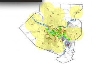
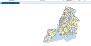
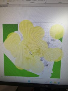
Chapter 2 was all about map design and the various methods of symbology. This was the chapter where I finally started to feel comfortable altering the way maps actually look. It seemed like almost every section required me to alter the colors, values, classification methods, and labels. Although at first this seemed quite repetitive, by the end of the chapter, I saw why this was so important to a GIS analyst. One of the biggest takeaways for me from this chapter was realizing that symbology is not just for looks; it actually affects the way a person will interpret the map. When I was working with different classification methods, the map looked completely different even though the numbers didn’t actually change. This really drove home the importance of choosing the appropriate symbology method for the data. One section that really stood out to me was the section on working with buffers. When I saw the yellow appear as the clinics were buffered, I finally saw the spatial relationships. No more guessing which clinics are close enough; this really helped me understand how someone would use this program to answer questions. I also found working with different datasets, especially the NYC zoning and land use dataset, really helped me speedily work with symbology and understand the visibility range. I finally saw why labels shouldn’t appear at all zoom levels. This chapter really helped me feel more comfortable and not as scared to alter the colors, shapes, etc. I think this chapter really helped me understand the connection between design and communication.


Chapter 3

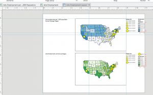
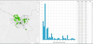
In Chapter 3, there was a shift from creating maps to a greater focus on sharing maps with those who do not use ArcGIS Pro. This chapter also involved a greater level of switching between ArcGIS Pro and ArcGIS Online, which was a little confusing at first since the interface was not quite the same as the book showed. However, once I got accustomed to where everything was, the instructions made a lot more sense. The first section, which was creating a layout, felt somewhat like a graphic design project. I had to place titles, a legend, a scale bar, and a map into very specific areas. This required the use of guides and grids to ensure everything was lined up correctly. I didn’t realize until I had to do this exercise how much goes into creating a final, clean-looking map. Tutorial 3-2 had me share a map to ArcGIS Online. Once this was done, I opened the map in ArcGIS Online, which was a very different experience than ArcGIS Pro. This was a surprise, as I had no idea how different these two platforms were until I had to use them. This section also introduced me to StoryMaps and Dashboards. StoryMaps seems like something that could be used to present a project or idea to others, as the format allows the reader to be walked through the project. It is very well-organized, easy to read, and follows a logical path. The Dashboard was probably the most interesting section of Chapter 3. I enjoyed seeing and creating the green dots on the map and the histogram next to it. I also enjoyed being able to click on different features on the map, which automatically changed the chart. Even though Chapter 3 was probably the most difficult chapter due to the constant switching between platforms, I think it helped me realize how GIS is shared with those who do not use GIS themselves.

Roberts week 4

Chapter 1
I know I’m doing this late. I forgot to make a post about it when I did it.
Chapter one showed me just how overconfident I was about this software. Not only did I accidentally start with the wrong tutorial, but it was a little frustrating reading through the correct tutorial and a lot of it just felt like the whole “click this, then click that” which I personally find to be a bit annoying.


Chapter 2

This one I am going to go a little more in detail about because I found this chapter to be highly finicky to deal with. Especially the feature of turning the map into a 3D plane and modifying the properties of the different areas on the map, neither of which I could fully do, particularly the 3D map which just straight up would not work. I was excited for this chapter since it would introduce the concept of creating points on a map (in the example they are food banks and whatnot) but it seems that in this tutorial all of these were immovable locations pre determined by the computer. (Either that or my hard drive remembered someone doing the tutorial last semester.) Changing the color of the different areas on the map was very fun though.

Chapter 3

At the risk of sounding pedantic, this was definitely the chapter I cared for the least, as it shifted away from the technical aspects of the software and leaned in hard on the online features of publishing and sharing the data through the ArcGIS servers.

Gregory Week 4

Chapter 1 

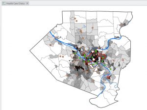
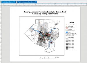
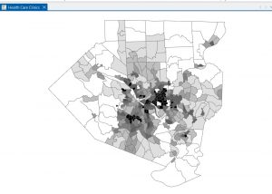
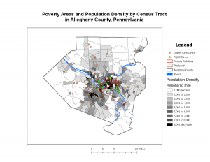
I went into Chapter 1 thinking ArcGIS Pro was just going to be pretty difficult considering I am not a big tech-person. I was wrong, the clear directions made it much easier and the only thing that overwhelmed me was the number of buttons! ArcGIS Pro is less of a “map maker” and more of a massive logic puzzle. What started as a simple view of health clinics in Allegheny County turned into a lesson on how data is actually constructed. It truly did help me understand that a map is simply just data, just in visual form.  Seeing population density break down into individual pixels was a reminder that GIS isn’t a perfect mirror of the world, it is an estimate. This statement brought me back to earlier discussions about how GIS users may have too much power, knowing that it can’t be as precise as we thought it could be makes me feel better. When I look at a map now, I think about how we are just looking at a decision someone made about where one pixel ends and another begins. Navigating the interface was also a bit of a learning curve. Features would disappear when I zoomed out, which felt like a bug at first. I eventually realized it’s a design choice to keep the map from looking like a cluttered mess. By the time I had the FQHC clinics layered over the poverty data, the patterns jumped out: specialized care is where the people are, but access to that care is a much more complicated story than just placing a dot on a screen.


Chapter 2

Chapter 2 forced me to rethink my sense of what is truthful in data. I used to think a map was just a factual representation, but this chapter proved that you could take the exact same dataset and tell three different stories just by changing the classification method. In saying that, I take back my statement of a map being a visual representation of data; in a way it is, though in another it is not. I spent way too much time toggling between Quantile and Natural Breaks. It’s mind-boggling how a Quantile map can make a neighborhood look like it’s in a state of emergency, while a Defined Interval map makes that same neighborhood looks perfectly fine. There isn’t always a right way to symbolize data, which is actually kind of terrifying when you think about how these maps influence policy. I am going back to my belief of GIS users having too much power, and this power is definitely being overlooked.


Chapter 3

In this last chapter, I learned how easy it is to get lost in the data and forget that someone who doesn’t know GIS will have to look at this. The shift from the “Analysis” view to the “Layout” view was surprisingly stressful. Suddenly, I’m worried about legend alignment and especially the font sizes (I spent a little too much time messing with that). Working on the layouts showed me that a map is only as good as its delivery. It’s a reminder that GIS is as much about translation as it is about geography. Though, the most interesting part was moving into Story Maps and Dashboards. That’s where the data actually starts to make total sense. Instead of a static PDF, you’re giving the user the power to click around and find their own answers. However, that also feels like losing control. If I set up a pop-up poorly or the zoom level is off, the user might miss the entire point of my work. In a way, it is a semi-risky choice of sharing information, but it definitely feels like the future of how we’ll consume spatial data.