Zip Code: All zip codes within Delaware County, and is updated and published monthly.
Street Centerline: The center of pavement of public and private roads in Delaware County, updated annually and published monthly.
MASG: Master Street Address Guide, represents the 28 different political jurisdictions in Delaware County.
Recorded Document: Points that represent recorded miscellaneous documents in Delaware County, it is updated weekly and published monthly.
Survey: Point coverage that represents surveys of land in Delaware County, it is updated daily and published monthly.
GPS: All GPS monuments that were established in 1991 and 1997, it is updated as needed and published monthly.
Parcel: Polygons that represent all cadastral (used for taxation) parcel lines in Delaware County, it is maintained on a daily basis and is published monthly.
Subdivision: All subdivisions and condos recorded in Delaware County, it is updated daily and published monthly.
School District: All the school districts in Delaware County, and is updated as needed and published monthly.
Annexation: Delaware County’s annexations and conforming boundaries from 1853 to present, and is updated as needed once an annexation has been recorded, and is updated monthly.
Township: Consists of the 19 townships that make up Delaware County, and is updated as needed and published monthly.
Tax District: All the tax districts in Delaware County, and is defined by the auditor’s real estate office. It is updated as needed and published monthly.
Address Point: Spatially accurate representation of all the certified addresses within Delaware County, and it is updated daily and published monthly.
Municipality: All municipalities in Delaware County.
Condo: All condominium polygons in Delaware County that have been recorded.
Precincts: All of the voting precincts in Delaware County, it is updated as needed and published by the Delaware County Board of Elections.
PLSS: Public Land Survey System polygons for both the US Military and the Virginia Military Survey Districts, and is updated as needed and published monthly.
Delaware County E911 Data: The State of Ohio Location Based Response System has a spatially accurate representation of all certified addresses in Delaware County, and it is updated daily and published monthly.
Farm Lot: All the farmlots in US Military and Virginia Military Survey Districts of Delaware County, updated as needed where the new surveys have been recorded.
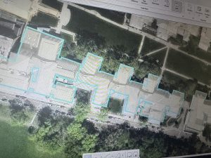
Building Outline 2023: All of the Building Outlines from 2023.
Railroads: The locations of all the railroads in Delaware County.
Dedicated ROW: All lines that are designated Right-Of-Way within Delaware County, it is updated daily and published monthly.
Original Township: The original boundaries of the townships in Delaware County before they were affected by tax district changes.
Building Outline 2021: The building outlines for all structures in Delaware County and is updated on an as needed basis.
Map Sheet: All map sheets within Delaware County.
Hydrology: All major waterways in Delaware County, it is updated as needed and published monthly.
ROW: All lines that are designated Right-Of-Way within Delaware County, it is updated as needed and published monthly.
2024 Aerial Imagery: Aerial images from 2024 of Delaware County.
Delaware County GIS Data Extract Web Map: Allows users to extract Delaware County GIS information in different formats.
2022 Leaf-On Imagery (SID File): 2022 imagery 12in resolution.
Delaware County GIS Data Extract: Allows users to extract Delaware County GIS data.
Address Points – DXF: The LBRS Address Points data provides a spatially accurate placement of addresses within a given parcel, and is updated as needed.
Delaware County Contours: 2018 Two Foot contours for Delaware County.
2021 Imagery (SID File): Images of Delaware County from 2021.
Street Centerlines – DXF: The LBRS Street Centerlines depict the center of pavement of public and private roads in Delaware County, and was collected by field observation.
Building Outlines – DXF: An image of the building outlines in Delaware County.
Auditor Logo: The logo of the Auditor’s GIS Office in Delaware County.
Fall Background: The background for different GIS data.
Building Outline 2024: The outlines of buildings in Delaware County from 2024.
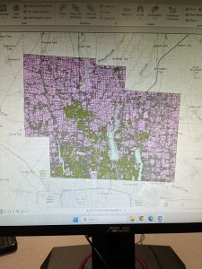
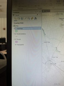
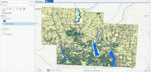
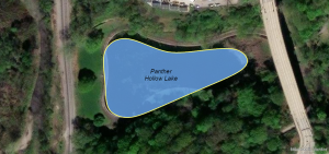
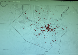
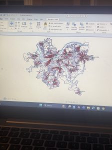
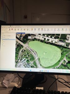
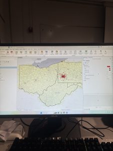
I put the Hydrology layer on top of the Parcel and StreetCenterline so I could actually see it. The Add Data feature was very helpful in this, and I have attached my map and an image of my catalog pane.