Walz – Week 5
Chapter 7:
Chapter 7 went over 3D webscenes in ArcGIS. A webscene is basically a 3D version of a web map, with there being different types of 3D scenes like global scenes (round earth) and local scenes (flat earth), and the chapter explaining how 3D is useful for more realistic views of data, like for modeling or visualizing buildings and landscapes.
- Scene layers are special 3D layers for large datasets; several types like point cloud layers, 3D object layers, or even integrated mesh layers which seem to be like a drone 3D model thing
- Surfaces like elevation, textures, shadows and lighting can be shown on 3D scenes along with things above and below the ground. Some tools also mentioned like ArcGIS, AR viewers can support this 3D workflow
- VR is virtual reality whereas AR is augmented reality and XR is all real and virtual combined environments
- Indoor GIS is a thing, which is useful for mapping things indoor as opposed to the typical outdoor mapping that GIS programs do
- ArcGIS urban is made for urban planning
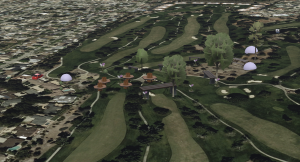
- Tutorial 7 had me create different web scenes. One of them used cyclone data where height showed wind speed, and colors showed wind pressure. Another section had me build a fun park using 3D object symbols. I added layers from GTKWebGIS and adjusted the symbols baked on attributes like Object type,size, and rotation. Each point type had a specific 3D symbol (trees, benches, rocks) and rotation/size affected how they appeared in the 3D viewer. I also changed the lake to a blue polygon and messed with shadows. I then tried to use the Web Appbuilder to make a 3D web app for my fun park but I couldn’t quite find all the buttons.
One application idea is creating a 3D web scene that can let users explore a local park’s landscape design in 3D. I would have a basemap of the park, add point layers for things like trees or benches, create a few slides for important areas like ponds or a walking path. Then I would add polygons for grass areas and try to make it look decent.