Chapter 7 talks about the pervasiveness of the 3D world and how it is often more convenient and effective to understand and analyze the world using 3D maps.
The focus of the chapter is 3D web scenes. Extended reality XR is fundamental to the 3D world and enhances GIS. XR includes AR, VR, and MR (mixed reality). 3D adds more to 2D maps, bringing advancements in data visualization, analysis, and communication. These advantages give 3D GIS more applicability across industries. Understanding the size and relative positioning of objects is a benefit of GIS 3D technologies, enhancing the experience of the audience. One other advantage of 3D GIS is that it supports the work of designers in formulating flexible scenarios in order to avoid mistakes down the road when doing that actual construction. Functions like fly-around, X-ray vision, or radar vision are possible with some 3D apps. 3D GIS has some powerful analytics capabilities as well.
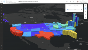
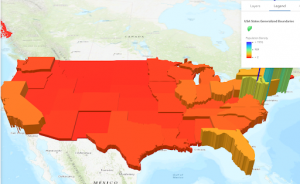
A 3D web scene can have various layers like a 2D web map. Scene layers stand out and the others are consistent from what we have been studying. Visually, there are two groupings for scenes. The photorealistic effect entails a recreation of reality by using photos to texture features. These types of scenes use imagery as the texture, beneficial for showing objects like cities. The cartographic effect uses the thematic techniques of 2D mapping and transforms them to 3D. Attribute-driven symbols are involved and these scenes show abstract, or even invisible features like population density and much more.
In addition, there are two view modes for scenes including the local mode which displays features on a flat 2D surface or a planar surface. Then there is global mode which displays features on a sphere. With both, data and things that have a large or small geographic area can be displayed as well as above ground or under ground phenomena. The next part of the chapter discusses the four main elements of scenes including surfaces, features, textures, and atmospheric effects. Surfaces are continuous measurements like elevation for instance with one value for a given coordinate x,y location. Surfaces aka digital elevation models (DEM), digital terrain models (DTM), or digital surface models (DSM). DEM is the overarching acronym encompassing DTM, and DSM. DTM, particularly, represents the bare ground without objects like plants or buildings. DSM represents the ground surface with objects on it. Features exist on, above, or below the surfaces and can be 2D layers of 3D scene layers. These are the operational layers of 3D apps.
Next, textures give exterior or interior covers of the 3D features, often using aerial imagery or cartographic symbols. Finally, the element of atmospheric effects including lighting and fog. A web scene can have 2D layers and as other 2D layers exist on the surface, feature layers can be configured with 2D or 3D symbols. They can have elevation configured as constant values, or have elevation from the z-values for feature layers and those z-values enabled. A web scene can also include 3D scene layers. These are cached we layers optimized for showing large almonds of 2D and 3D features.
There are 6 types of scene layers and the first is the 3D object scene layer. These show 3D objects like textured or untextured buildings. These can be created manually or automatically. Procedural modeling is more effective than manual modeling. ArcGIS CityEngine® can export scenes as scene layer packages (SLPK) from which you can publish 3D object scene layers (see figure). Second, there are building scene layers that allow for the visualization of complex digital models of buildings, interacting with all components of the building. Building scene layers are created from a building layer in ArcGIS Pro. The structure of this includes the overview which is the optional layer that can show the 3D building as a single layer. The discipline which integrates category layers and the work disciplines of a building like electrical and plumbing. The category layers which involve individual categories organized in disciplines and the properties can be adjusted. Finally, filter allows you to see the details in complex buildings, filtering for elements with specific attributes as solid and others in wire frame mode to clearly depict the distinction. The third type of scene layer is the integrated mesh scene layer. Integrated mesh data is formulated from large sets of overlapping imagery like using Drone2Map which converts raw, still imagery from drones into valuable information products. The resulting mesh layer can be shared to ArcGIS Online to make an integrated mesh scene layer. Drone2Map can also produce other products. Fourth, are point cloud scene layers which give a fast display of large volumes of symbolized point cloud data, which are generally collected using lidar or generated using Drone2Map from drone imagery. Lidar has emerged as an alternative to traditional methods of surveying. Lidar is an optical remote sensing technique that uses laser light to densely sample Earth’s surface. The product is a cloud of points with highly accurate x,y,z measurements. One final note for this type is that a point cloud scene layer can be converted to a scene layer package and uploaded to ArcGIS Enterprise or ArcGIS Online as a scene layer. The fifth type are point scene layers which are used to show large amounts of point data not possible with a point feature layer. These are automatically thinned which helps with performance and visibility for smaller scales. The process of automatic thinning entails that not all features are shown at small scales and so as you zoom in more features will emerge and be shown.
From ArcGIS Pro, a point scene layer can be made from a feature layer shared directly to ArcGIS Online as a web scene layer. Also, in ArcGIS Online, a point scene layer can be published from a hosted feature layer.
The 6th a final scene layer type is the voxel scene layer which represents multidimensional spatial and temporal info in a 3D volumetric visualization. For example, we can visualize oceanic data as voxel layers. A voxel layer can then be shared across ArcGIS. It is also possible to have a voxel layer accessible as a web scene layer.
The next section of the chapter explains the various products of ArcGIS involved in 3D scenes including ArcGIS Pro which we have worked with. ArcGIS CityEngine is another desktop app for advanced 3D creation. Photorealistic scenes can be made manually, rule packages can be formulated for generating large amounts of 3D objects in a group. Examples of application have been in urban design and filmmaking to create extensive urban environments. Thirdly there is ArcGIS Online and ArcGIS Enterprise, which we have read about and worked with. There is a range of other products that allow for the viewing and exploration of 3D scenes.
In terms of creating these web scenes, the three fundamental tools used to do so are Scene Viewer, ArcGIS Pro, and CityEngine. ArcGIS Pro seems to be the best and most efficient to use especially for what we are doing. The first step in creating a web scene is to choose a global or local scene for scene viewer and ArcGIS Pro. The second step is to select a basecamp and the third step is to add layers. Scene Viewer can use web GIS layers and ArcGIS Pro can use these along with local layers shapefiles. The fourth step is to configure the layers including things like pop-ups and labels. ArcGIS Online and Scene Viewer in ArcGIS Enterprise employ smart mapping and layers like feature layers can be shown in 3D using attribute controls. The fifth step in creating web scenes is to capture slides if needed. The sixth and final step is to save and share your scene. For scene viewer the scene is directly saved in ArcGIS Online but for ArcGIS Pro and CityEngine in order to share you must publish the web scene and its layers to ArcGIS Online or Enterprise. In some cases, layers may need to be converted to multipatch layers and scene layer packages.
The following part of the chapter discusses the role of XR, VR, and the metaverse in 3D GIS. The objective of VR and AR is to bring a location to users in a more dynamic, engaging, and intriguing way. Starting off with VR, this is a computer technology that uses headsets or multi-projected environments to to create 3D views, sounds, and other sensations that create a simulation of a physical presence in a virtual or imaginary environment. VR allows for the interaction with virtual features and items. With 2D and 3D maps users are outside of the map but with VR users can go inside. Immersion into the scenes generated from GIS data is made possible by the associated headset or helmets. ArcGIS 360 VR is a web app that allows you to view 360 VR experiences (3VRs) on desktop PCs, mobile devices, and VR headsets. The current version is browser-based. ArcGIS 360 VR can be used in a desktop web browser, a mobile web browser and in a VR headset. Next is XR which refers to all real-and-virtual combined environments and human-machine interactions, generated by computer technology and wearables. The X in XR represents a variable for any current or future spatial computing technologies. XR encompasses AR, VR, and MR. MR is the merging of real and virtual worlds to produce new environments where physical and digital objects coexist and interact in real time. As we learned, AR takes place in the physical world, with information or objects added virtually, overlaying the real work and this digital content. MR does not exclusively take place in either the physical world or virtual world, it is like a hybrid between AR and VR. Furthermore, a metaverse is a network of 3D virtual works focused on social connection. Metaverse involvement and efforts have proliferated and many tech companies pursue the metaverse market by developing things like XR headsets, wearable devices, virtual environments, AI, and more. GIS actors and professionals can play a significant position in building metaverses in that there will be more than one metaverse and the 3D environment can be virtual in metaverses for like gaming and real in metaverses for working. GIS has produced 3D scenes of the Earth’s terrain, airports, utility pipelines, and more. These can be further detailed for use as metaverse environments and avatars can work or play in these environments. Essentially, avatars are a user’s digital representation in the metaverse, which can range from a realistic 3D model to a fantastical character. The metaverse has some real and quite revolutionary capability and frankly what is opportunity for many areas of industry and life.
The book moves along to comment on Indoor 3D GIS basically involving moving GIS indoor and integrating the indoors with the outdoors. GIS has predominantly been based outdoors since its origin. These original implementations were helpful in some ways but unhelpful in others like navigating the complex indoor spaces of hospitals per se. On top of this indoor navigational elements, GIS can be used to manage indoor spaces, indoor emergency response, and more. Indoor GIS has two setbacks including the reality that GPS does not function well inside and indoor space is often in complex 3D formats making it difficult to model, store, and share precisely using indoor space data. ArcGIS Indoors is an indoor mapping system for smart building management which includes ArcGIS Indoors for ArcGIS Pro, ArcGIS Indoors Viewer, Indoor Space Planner, and ArcGIS Indoors for iOS and Android. First, ArcGIS Indoors for ArcGIS Pro allows for the creation and management of data and share maps and services to support other apps. ArcGIS Indoors Viewer functions to find a location or resource within a building or a site that includes several buildings. Indoor Space Planner is a browser-based app that allows you to plan occupant activity in indoor spaces. Lastly, ArcGIS Indoors for iOS and Android are native mobile apps that allow you to view indoor maps and interact with them by exploring, searching, saving, and sharing points of interest, reporting incidents related to indoor assets, and getting landmark-based directions. IPS are used (indoor positioning systems).
The ultimate section of chapter 7 is about integrating 3D mapping with urban planning and BIM. ArcGIS Urban is a web-based solution that applies GIS tech to urban planning. The objective with this is to streamline plan creation, analyze the impact of plans, visualize current projects, and facilitate public engagement. ArcGIS Urban has three components including a public-facing Urban Overview web app for standard browsers or mobile devices, a back-office Urban Design web app, and CityEngine for desktop workstations. There are four main types of contents including plans which are long-term (10 to 50 years) urban planning on a large scale. Secondly, projects are short-term (1 to 5 years) planning at the parcel level. Third are indicators which give insight about your work and your city. Fourth and finally there are ideas that entail feedback by the public on current or future planning activities. With an immersive 3D experience, ArcGIS Urban gives organizations the capacity to visualize proposed transformations, and thus enable planners and local governments and stakeholders to understand what changes might take place in their communities. GIS (Geographic Information System) and BIM (Building Information Modeling) are both data management technologies for the Architecture, Engineering, and Construction (AEC) industry. ACE has struggled historically with distinctions between GIS data and BIM. ETL is one way that has been used to facilitate common patterns of data integration. Extract-translate-load (ETL) is not very adaptable to change and needs constant maintenance as business needs and file format change. BIM as 3D graphics is in turn a quick, effective technique for producing good-quality visualizations for presentations and stakeholder review. However this eliminates BIM attribution, metadata, and georeferencing information. 3D graphics look good but have limited value. There are limitations to both. ArcGIS GeoBIM effectively integrates GIS and BIM through a web-to-web client integration approach by connecting ArcGIS with Autodesk Construction Cloud and BIM 360. ArcGIS GeoBIM provides a solution for exploring BIM, engineering documents, and project management issues in a geographic context to analyze risks, costs, and timelines. The result is that ArcGIS GeoBIM keeps AEC project documents and data organized in the original source locations, accesses GIS and BIM project content through a common web-based app experience, thus reducing the need to continually convert project data, and simplifies communication overall.
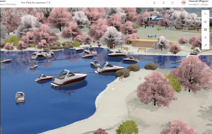
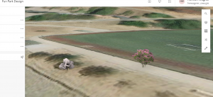
For the tutorial I used the StoryMaps app to explore Scene Viewer and various types of scene layers. I then created a thematic web scene and another web scene of a park design with a point layer styled with realistic 3D symbols. Finally I explored elevation to visualize 3D features both in the sky and underground and learned how to enhance a web scene by editing the underlying 2D data. There was a lot in this chapter on 3D GIS and while I didn’t get all of the details I got the just of it. The text points out at the end that 3D GIS cannot be fully explained in one chapter and so things were crammed together.
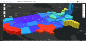
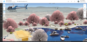
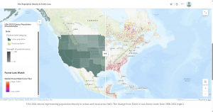
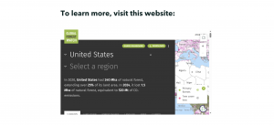
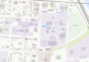
For an idea from chapter 7, I could use Scene Viewer to create a thematic web scene to do something similar to what the tutorial taught. I could make a cartographic scene displaying Latin America with colors symbolizing the total area and extrusion heights symbolizing the population density. I thought about this because I recently attended the OWU Hispanic Film Festival and we watched a film based in Colombia. I am a Spanish minor and so it would be nice to see the population density and patterns in SA and maybe compare that to the USA. Another idea is this: I talked to my mom today and she went walking in a park. What if I used Scene Viewer to use web GIS layers like an elevation layer to form a 3D terrain visualization of a hiking trail network. I would choose like the imagery or world topographic base map. I would use an elevation layer (DEM) to develop a local 3D scene that displays terrain, slopes/hills, and trail pathways. I could use StoryMaps for planning or storytelling purposes. I could add slides to kind of guide users through things whether it be an area of difficult maneuverability or just major locations. One final idea would be to create web scene of a building/business center/city design with a point layer styled with realistic 3D symbols. If I wanted to focus more environmentally, I could use a point scene layer to display all the trees in the city. I would first need a point feature layer to convert to point acne for 3D visualization. This would be cool to do for a city with not many trees to see how much urbanization has taken over and changed the land.