The blog does not allow you to insert formulas, so here is the file detailing my final.
Month: May 2024
chlebowski final
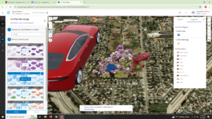
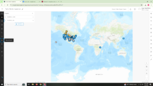
first web app is a story map of a compilation of ornithological research papers that talk about various topics like migration, sexual selection, social behavior, etc.
https://arcg.is/rXDb4
second web app is a slider of U.S. co2 emissions from transportation from 1970-2020
https://owugis.maps.arcgis.com/apps/instant/slider/index.html?appid=4de788ec6fac45faaa2033c9dbbce69a
i tried my hardest to get labels for each point on the map to show the numeric amount but they were being super strange and either doubling for some years or freezing on certain years so i just scrapped it
Miller Final
Final Part 1: For my first part of the final, I created an attachment viewer app that consisted of 4 historical points at Ohio Wesleyan University. My project consisted of 4 attribute fields, which were the name of the building, a brief description of the historical significance, the latitude, and longitude of where the building is located. All the information on the descriptions came from the Ohio Wesleyan website. I was able to map out the points and was able to use the instant app to display these points. Overall, it is a more simplistic version of the interactive map on the Ohio Wesleyan website.
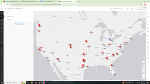
Final Part 2: For my second part of the final, I used another set of data from chapter 6. Specifically, I looked at the weekly trends of vaccination administered in certain parts of the United States. I first downloaded the data and was able to upload the data points on maps. Using what I learned in 6.5 and 6.6, I followed those steps to help me with this portion of the final. Overall, it was quite neat to see the final results, as it shows the gradual increase of vaccinations throughout the US. It also shows which regions where people were being vaccinated at higher rates. That overall trend tended to relate more to areas that had higher populations.
Miller Week 6
Chapter 7: This chapter covered 3D web GIS, which seems like a really unique and informative concept in GIS. 7.1 had me explore web scenes using a scene viewer. This section was a good introduction to the materials, as it showed me the basic tools of 3D web GIS. Section 7.2 had me make a thematic web scene. The direction that had me search for the living atlas did not work. Therefore, I used data that worked from GEOG 291, and I tried to make it as similar as possible to what the book wanted me to do. 7.3 had me create a web scene and add 3D features to the scene. This section took awhile, but it was really fun to figure things out. Section 7.4 had me work with elevation, as I added items both above and below ground. This section was quite easy and more review form the previous section. Section 7.6 had me add 3D objects to the map and showed me how to use the slice tool. A potential assignment for this chapter would be for me to create a 3D scene of a fun community, where the location would be here at Ohio Wesleyan University. I would add multiple similar objects, where some would show real items such as trees and cars. Other objects would be on the more imaginary side.

Miller Week 5
Chapter 6: This chapter introduced me to working with both spatial temporal data and real-time GIS. 6.1 had me create a map with real time layers. This was a lot of review from previous chapters, which made it easy to follow. 6.2 had me create a dashboard app. This was a good review from GEOG 291, so the steps were not that difficult. 6.3 had me continue work on the dashboard app, where I configured actions and targets. This section was quite cool to see the results take shape. 6.4 had me work with coding to configure advanced formatting. It was quite a long section, but I was thankfully able to make it work. Section 6.5 had me create a time-enabled feature layer. This was quite similar to what Chapter 1 had me do, which made it a good review. Section 6.6 had me create an instant app based on my work from section 6.5. This was another straightforward section and was also neat to see the finished product. A potential application assignment would be for me to look at weekly US Vaccination rates during the COVID era. I would pretty much follow the similar steps from section 6.5 and 6.6.

Miller Week 4
Chapter 3: 3.1 Started off by creating a 2D and 3D integrated web experience. This section took a while, but it was easy to follow through for the most part. I was unable to figure out the view’s navigation widget. Section 3.2 had me configure map actions. A fairly straightforward section, and it was cool to see the results. 3.3 had me configure the dynamic content, which I was easily able to do. 3.4 had me configure the table widget. This was another easy section, but it did take longer then the previous one. Section 3.5 had me create the filter and chart widgets. This section was another easy one, but it did take the longest. 3.6 had me create and mess with multiple pages. This was a nice and neat way to end this chapter. For this assignment, I could create a web experience that uses the battle data that I mentioned in Chapter 2. This would consist of maps of the locations of the battles, along with all the other criteria such as the proper widgets and multiple pages.
Chapter 4: The chapter focused on the survey app. 4.1 had me start off my designing a survey. This was quite a cool process, and I was able to complete the survey for the most part. The add rule section was not present when trying to do so. 4.2 had me take my own survey, which was really neat to do so. 4.3 had me create an editable feature layer with domains. I was able to figure out everything, but I was unable to complete the last steps since I was unable to select the change style button. 4.4 had me configure a web map and create forms off of that. Some of the material is outdated, but I feel like I was able to navigate through the updated material. 4.5 was quite similar to 4.2 section, which made it another interactive section. 4.6 had me create a quick capture project. The app seemed to be updated, which messed up a lot of the steps in this section. 4.7 was very similar to section 4.5 and 4.2. Section 4.8 had me add data using AuGeo, which was quite cool to do so. This section was quite easy and actually worked smoothly unlike some of the other recent chapters. 4.9 was another section where I downloaded and interacted with my data. A potential assignment idea would be to create a survey based on the approval of the food here at Ohio Wesleyan. I would ask questions about all areas on campus that would serve food. I would also add other important information that the requirements ask such as date and time.
Miller Week 3
Chapter 1: This chapter was quite a useful introduction into what the content of this class is actually about. Since I took GEOG 291 earlier in the semester, a lot of the information is quite familiar to me. However, I did learn new content, especially when working with GIS Online. When I started Chapter 1.1 it was actually quite a difficult start, since I barely used GIS Online in the previous course. However, I figured out that taking the steps slowly and trying not to rush through the steps helped things go by more smoothly and quickly. In 1.1, I learned how to publish data from a csv file, which was a neat way to introduce the chapter. 1.2 was a relatively easy section, which consisted of me adding a field and editing its own attribute values. 1.3 was a bit more complicated and a little more time consuming. This section had me create my own web map, which was overall a unique process. 1.4 was definitely the most challenging section out of all the sections. I was able to follow all the steps but some of the last few steps. Overall, I was able to publish on the app. An application idea for this chapter for me to create an attachment viewer that relates to historical buildings on campus. This would have captions on certain points on campus, along with the title of the building and the coordinates of the building.
Chapter 2: 2.1 started off by having me create a feature layer using geocoding. This was very similar to the 1.1 section, which made it a good review section. 2.2 had me configure the layer style, which showed population trends of the top 50 US cities. This was quite an easy and fun section to mess around with. 2.3 had me use code to create a new attribute layer. This section was quite difficult for me, but I was able to make things work. 2.4 was another easy chapter, where it had me add images and graphs to my layer pop-ups. 2.5 was working with storytelling, which a lot of it was reviewed from GEOG 291. I was not able to work the last step in this section however. 2.6 had me add finishing touches, and then had me finish off the story map by having me publish it. An application idea for this chapter would be for me to review a map of battles. Some data that I could put in would be comparing duration, significance, and death toll of battles in a particular war. I would create a story map that shows the locations of the battles as well as interesting data trends as well.

Tuttle Final
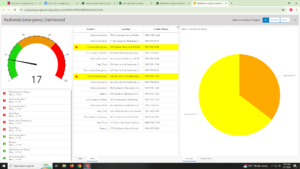
Final: For the first section I decided to do a survey. Because the library is no longer functioning as a library, I thought it would be interesting to collect data on where OWU students like to study in Delaware. I used Survey123 to create a survey. Personally, my favorite place to study is off campus so I added a feature that allows the person taking the survey to select on a map where their favorite study spot is. Here is a link to my survey, https://arcg.is/CmKbn I shared it with the public so it should be available to all. For the second section I decided to create a dashboard looking at drug overdosing in Ohio. I also added the layer of US Highways because I wanted to highlight the correlation between the two. I can’t figure out how to add it as a link on here, but it is public on my dashboard so I think that should be okay and relatively easy to find. It is labeled Ohio Drug Overdoses.
Tuttle Week 6
Chapter Seven: 3D was the bane of my existence in GEOG 291. I was not thrilled to see it back for the online version. I can’t say that I was overall surprised to see it but safe to say I was not thrilled when I opened up the chapter. Overall this section has been a lot easier to work with than the ArcGIS Desktop so I have higher hopes than what I accomplished during the 3D chapters last module. Tutorial Seven: Okay I came in with a chip on my shoulder. I actually did not mind this tutorial at all. It was much easier to deal with than the desktop version and I think it was really cool getting to make the map look exactly how I wanted it. I do wish there was a way to add the decals in the excel file. That would make manipulating the graphics much easier.
Tuttle Week 5
Chapter Six: Learning about handling real time GIS objects was interesting. It continues to overwhelm me a little bit that all of this data just exists and is collected for anyone to use. This is a little silly, but I think the biggest thing I learned from this chapter is just the simple importance of time and the different data types. Moving, discrete, stationary, and change were laid out so simply in this chapter and it was very easy to digest. Tutorial Six: Tutorial 6 was cool to see how to make a map. I can see myself making something like this for my final project. The second half of the tutorial was definitely easier than the first half. The first half I had a hard time following because the textbook was not really telling me every word that I needed to know.