Shaw Week 6

Chapter 7

The tutorial for this chapter allows you to learn how to create web scenes and 3D web apps. I did not have many issues doing this tutorial as it was very easy to follow and it was not as long as the ones in the past. In ArcGIS, 3D web maps are referred to as web scenes also known as 3D scenes. By using 3D it allows you to bring an extra dimension to 2D maps which often brings advantages in data visualization, analysis, and communication. In today’s world 3D GIS is a crucial component for research frontiers and hot spots which include digital cities. A web scene can also have multiple layers which include feature layers, map image layers, raster tile layers. Scenes have four main types of elements: Surface, features, textures, and atmospheric effects. Finding other applications of 3D maps would definitely be useful and interesting to learn.  An idea I have is to use a 3D model of Delaware and tie it to multi unit houses in the city and see how that affects the population density of certain parts of town.

Allo Week 6

I really liked this tutorial because it expanded the possibilities of the 3D maps. Overall, I didn’t have many problems following this one. The only thing that came up was that some objects in my scene looked out of proportion (like the huge cars). I wasn’t able to troubleshoot that part. I would like to know the other applications for 3D maps like this. I am still thinking about how I want to apply this to my final. One question I thought of during this week was whether we should use the data in the Delaware Data folder for the final.

I don’t really have many thoughts from this week. I noticed that I am picking up on a lot each week and each tutorial is easier than the last. I also move through them quicker now. As I mentioned before, I am still thinking about the possibilities of the final but I did think of one idea.  If I end up going with the grocery store idea, I can use the 3D features to make the buildings I want to showcase. 


chlebowski week 5

notes para chapter 6:

  • Looking at the highway cams and reading the various incident reports is pretty fun

  • Struggled a bit with 6.4, doing anything in the expressions area was a bit difficult to follow
  • Couldnt find the list tab on page 215 number 2 so i just skipped it, it seemed to not affect anything major, still was able to do the following steps


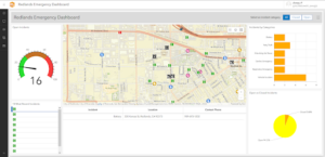
https://owugis.maps.arcgis.com/apps/dashboards/4742e5f075534fb080fea8d78b3ec1f8

https://owugis.maps.arcgis.com/apps/instant/slider/index.html?appid=4971fb47adbf4f3383ecf69c098d16db


a cool application that i did a bit in geog 112 was by choosing a state and looking at different counties and plotting the population change in the specific counties over time, using the instant apps to make the animation process a lot easier than it was by just taking a bunch of pictures and cycling them to show population change by color

a cool zoology application could be done at the state level like mentioned above but with conservation of counted species, for example using ebird data of sighted specific species in the counties around central ohio over the past 20 years to monitor which species population levels are staying the same, increasing, or falling

chlebowski week 4

Week 3

Notes para chapter 3:

  • 3.1 number 25 you do not click enter on your keyboard, instead click the url button again after inputting the correct url and then click x on the panel
  • 3.3 number 5 filter is named framework
  • 3.4 number 7 make sure to click customize to find the clear selection button
  • 3.5 number 21 there is no “year” value in the sort by tab, only category and value

https://experience.arcgis.com/experience/8b1fa5ec705b4d4cbf49ec6851c674ab/


Week 4

notes:

  • 4.1 number 8 there is no option for “imagery hybrid”, i chose imagery with labels instead
  • 4.1 number 9 single choice is called single option
  • Same with multiple choice and multiple select
  • 4.1 number 14 no set rule window, thus skipped
  • 4.3 number 4 keep selected define your own layer
  • 4.4 number 13 conditional variability is the settings button next the the required checkbox

a cool application could be to use the AuGeo to make a mini-tour guide aid using the first person pov function on the app using your camera. this could be done by inputting points on a map layer with a detailed description of the site, with a picture for people to eventually walk to and see in person. it would be pretty simple to make too, especially since location data and information can be manually inputted and clicked on the map layer without any additional inputs.

for the final project, i am definitely going to use a story map to explain a study or specific study organism and the various components of their life, most likely going to be a bird species due to the cool mapping ideas that can be done via migration data across a large area

Benes, Week 6

Chapter 7

  • Chapter seven was really interesting to go through. I liked how we got a new perspective with the scene viewer and how it was more complex with the data. I did have some trouble with some of the tutorials but for the most part I got the concepts.

Gassert, week 5

Ch. 6

Chapter 6 began with how to create a dashboard to display GIS information. It shows you updated info since it updates the changes for you. The book also guides you on how to use different tools for data collection. 


“Stream layers” are introduced here, which are basically features layers with live/real time data updates. It gives an example with traffic cameras to show how the real time updates work. 


Just as an idea for an application with real time footage, trail cams or other wildlife recording devices could be set up in a similar way to collect data on animal population, frequency, migration, etc. 

Quartson Week 5

What I liked about this chapter is that you can see exactly where something is and how it’s moving, all on a map. This chapter talks about  how to build dashboards that show this constantly changing information. It even explains how to use special tools to handle these live updates. Plus, there’s cool stuff about time sliders, so you can see how things have changed over time. This is probably the most interesting chapter for me. A potential idea I have is to use this application for  minor incidents in urban areas where other citizens could report to and help other people.

Schtucka week 5

I think that the real time aspect of WebGIS is really cool. It has the ability to update the position and location of an object as it moves spatially. This is made possible by the use of mobile phones, sensors, and the internet creating an abundance of data that is found in real time. To get more specific, the real time data is referred to as spatiotemporal data and it is found by observations of objects and events while they move or change through time. The book gives the example of when something is located and where it is located. This type of data has four main categories: moving, discrete, stationary, and change. Moving data can be considered as something that moves locations over time. This consists of objects like airplanes, buses, cars, etc. The second category of discrete data are just by chance occurrences. The book states that they are something that “just happens” and examples can be anything from criminal incidents to geotagged Instagram posts. The third kind of data is stationary. This kind of data is something that stays in one space, however, the value that it contains changes. The book gives examples of wind speed and direction and also water level gauges. The fourth data type is change. As the name suggests, these data are those that change or grow throughout time. The book gives the examples of wildfires, floods, urban sprawl, and LULC change. These categories of data are updated in two different ways: point in time or duration of time. Point in time references the one moment an event occurs and are usually put in a single attribute field. Duration of time is typically when something starts and ends. These types of recordings are usually recorded using two different attribute fields, one for starting and ending. 

For this section of the book, I would like to create a map that students would be able to use to look at reported crimes on campus. Students would be able to send in an instance, and the instance would then show up on the map and use an icon that would represent it. For example, a stolen bike would have a bike symbol, and gun shots could have a gun symbol. This would use discrete data and the time would be recorded as a point of time.

Tuttle Week 3

Chapter One: This was mostly an introduction to WebGIS and spent a lot of time going over exactly what it is. I think this was helpful because although I have already taken GEOG 291 and become familiar with ArcGIS, I am fairly oblivious to the information that the first chapter talked about. I found it interesting and honestly exciting that so many people could be connected through a website like this. Being able to connect and share information on a worldwide scale is something that I just knew nothing about before this. I am excited to learn how companies and individuals alike take advantage of WebGIS and how I can take advantage of it too. The tutorial one was also a very basic introduction to the software. I used my hard drive to download the zip file which took much less time than it did when I tried to do it in 291. It was way more intuitive than ArcGIS was. I enjoyed working on the app more than the map. Both were cool and I am already really excited to figure out how to make an app and what ideas I have for the final project.

Chapter Two: My biggest takeaway from this chapter was the different mapping styles. I enjoyed getting to see the different types with a little picture and sample description. I liked that a lot. I still am in awe of how exciting the online version of this is. I know I am the last person on earth to know about WebGIS but it is still so cool to me. Tutorial two was so interesting. It gave me big Apple website energy for the last few sections. I am enjoying slowly learning about the content without being thrown into it. I feel like that is a big difference from the first module. This is much easier to understand and I think it is more intuitive

Shaw Week 5

This chapter was a lot easier to follow from the ones from last week, it helped a lot more that we only had to focus on one chapter this week. The chapter started on how to create a dashboard which helps for displaying information. The dashboard also is extremely helpful because the information is constantly changing and the dashboard application constantly updates with the changes. I am not entirely sure what else the dashboard would be helpful for besides updates because the book does not discuss in a lot of detail.  I did like looking at the different tools and how they can be used for collecting data. This section also showed me new parts of ArcGIS online and how you can put multiple things on a page to display. This chapter also focused on stream layers and how ArcGIS online uses them to look at data and sort it. Looking at the real time traffic cameras were very cool. I am not really sure how I would make an application based on what this chapter taught. An idea that might work would be to use a time application in something like seeing the population of wildlife through the different seasons. This application could help with migration along with just seeing what kind of presence these animals have during different times of the year in different areas.