Fry Week 2

Chapter 1:

The first chapter is very similar to our reading from last week, it’s obviously designed to provide a solid introduction to GIS for beginners–like myself. The chapter breaks down the core concepts of GIS, discussing how spatial data is analyzed and represented visually through maps. The goal is to highlight the uses of GIS in understanding complex geographic patterns and relationships in an easily comprehending way.

One thing I took away is the distinction between the different types of data that can be handled in GIS. These include discrete, summarized by area, and continuous data. Discrete data represents specific features like buildings or roads, while summarized by area data aggregates information, such as population density in a region. Continuous data, like temperature or elevation, is represented as a gradual change over space. The chapter really emphasizes how GIS can handle this wide range of data types, making it a versatile tool for many types of analysis.

Another concept introduced in this chapter that I find to be important is the difference between vector and raster data models. Vector data uses points, lines, and polygons to represent objects that have clear boundaries, like roads or property lines. Conversely, raster data breaks the map into a grid of cells, ideal for representing continuous phenomena like weather patterns or land elevation. The chapter taught me that understanding these models is crucial when choosing how to map and analyze data effectively.

This chapter also includes the importance of map projections, it highlights how distorting the Earth’s curved surface onto a flat map often leads to inaccuracies. Lastly, it covers how GIS combines different data sources to reveal relationships and patterns, such as linking demographic data to geographic features, which enhances the value of maps as tools for various types of analysis. Overall, the chapter sets the stage for deeper exploration into GIS analysis, emphasizing its role in visualizing and interpreting a variety of spatial data.

Chapter 2:

Chapter 2 dives into the practical process of mapping and analyzing geographic patterns, it emphasizes how the choice of data and map design can influence the clarity and effectiveness of the message conveyed through the map. The chapter discusses the importance of selecting the right amount of information based on the map’s purpose and its intended audience. For example, urban planners might need a map that categorizes different road types, while a tourist map of a park should keep information simple for easy navigation. Too much detail can overwhelm the viewer, while too little can obscure key insights.

One of the applications for GIS that I find most fascinating is discussed in this chapter; the use of GIS to map crime rates in a city, helping law enforcement allocate resources more effectively. This highlights how GIS can be applied in unexpected areas like public safety, showing its versatility in various fields. The chapter also introduces the concept of finding the “center” of a cluster of features, using measures like the mean center or median center to identify patterns. Which reminds me of the use of GIS discussed in our reading from last week to find the source of contamination for a Cholera epidemic. However, the chapter also notes that outliers can skew these results, especially when there are fewer data points, emphasizing the need for accurate data input and careful organization.

Another key takeaway from this chapter is the power of layering data in GIS. Combining demographic data with environmental information on a single map gives the opportunity for deeper analysis and insight. This capability shows how the same dataset can be regrouped and analyzed from different perspectives. The chapter also touches on the technical side of mapping, including coding challenges, though it acknowledges that some of the more technical aspects can be difficult for beginners. As a whole, the chapter provides a solid foundation for understanding how GIS can reveal patterns and relationships, while also highlighting the importance of accuracy and data organization.

Chapter 3:

The third chapter takes a deeper dive into how GIS can be used to map and analyze numerical data in order to uncover trends and patterns. This chapter builds on the concepts introduced in the first two chapters, focusing on how the different types of data—discrete, continuous, and summarized—impact the way maps are created and interpreted.

The chapter revisits the distinctions between these data types but goes into more detail. For example, continuous data, like rainfall, is best mapped using gradient colors to show gradual variations across a bigger area. Discrete data, like car accidents, is represented with specific points on the map. Summarized data, such as average income in a neighborhood, creates a broader view by grouping data into bigger categories, making it useful for seeing patterns across areas.

Another major focus of this chapter is on grouping data into classes to make maps easier to understand. This is done through classification methods like equal interval, quantile, or natural breaks. Choosing the right classification method is pretty much crucial, and it can significantly affect how clear and useful the map is. This process is especially important when trying to communicate complex data in a visually simple way, which is a main function of GIS.

The chapter also touches on the design elements of map-making, such as the use of colors, symbols, and even 3D effects to make maps more engaging and informative. However, it stresses the challenge of balancing aesthetics with clarity—maps need to be visually appealing but still easy to interpret.

The chapter concludes with practical tips for designing maps that suit specific analysis purposes. It ties together the concepts of data types, classification, and map design, reinforcing that good map design is essential to effective GIS analysis. One key takeaway is that how you design a map—from selecting data to choosing visual elements—is what makes GIS such a powerful tool for communicating ideas and insights.

Grogan Week 2

In Chapter 1 of the Esri Guide to GIS Analysis, primarily the fundamentals of GIS are explained. GIS analysis is looking at geographic patterns within specific data and looking at the connection relationships. The steps to GIS analysis include asking a specific question, choosing the method that works for the data you are trying to discover, processing the data, and reading the results. Similar to GIS analysis I’ve participated in biological studies where it is better to get a more specific question when doing an experiment to get specific data. When reading the results at the end, there are specific types of features to look out for on the map. Those include discrete, continuous phenomena, or summarized by area. To me I would think discrete would not mean any specific location, but in fact that is quite the opposite. To me, I feel the most common feature is the features summarized by area. I also feel they are the easiest to read because of the clear area boundaries that they have. The two models that represent features are vector and raster models. I prefer the vector models because I prefer having hard boundaries when reading a map in most instances.

In Chapter 2 it features the actual mapping process. It emphasizes the need to carefully select the amount and type of information included in a map, depending on its intended purpose and audience. For example, urban planners may require a map with categorized road types to inform their decision-making, while a tourist map of a park should prioritize simpler information to aid navigation. Including too many categories or too little can either overwhelm the user or make the map difficult to use. The chapter also covers various methods for analyzing geographic distributions, such as finding the “center” of a cluster of features, which can be defined using different statistical measures like mean center, median center, or central feature. These centers help understand patterns like crime distributions or the most central locations in a set of data points. For example, a crime analyst may use GIS to track changes in crime patterns by comparing the center of auto thefts during different times of day. A key takeaway is that outliers can skew the results of these calculations, especially when there are fewer data points. Additionally, the chapter discusses how GIS maps rely on coordinate systems and data tables to assign locations and generate visualizations. The complexity of a map should align with its objective, balancing enough detail to convey meaningful patterns without overwhelming the viewer. Proper map scaling and categorization are essential for clarity, as too much detail or too broad a focus can obscure the main message the map is meant to communicate.

Chapter 3 of The Esri Guide to GIS Analysis, Volume 1 focuses on mapping quantities to reveal patterns and relationships between features. The key idea is that mapping the most and the least of something helps identify areas that meet specific criteria or require more resources. The type of data being mapped—whether counts, amounts, ratios, or ranks—determines how it should be represented. Once the data is classified, the map can use different symbols or group values into classes to make the patterns easier to visualize. To map quantities effectively, a standard classification scheme such as natural breaks (Jenks), quantile, equal interval, or standard deviation is used to group similar values. This helps identify patterns like clusters or trends in the data. Visualizing the data with bar charts can also aid in selecting the right classification scheme. Several mapping techniques are discussed in the chapter based on the type of data and features being mapped. Graduated symbols are ideal for mapping discrete locations, lines, or areas, while graduated colors are better suited for discrete areas or continuous phenomena. Charts are used to map data summarized by area, and contour lines show the rate of change in values across a spatial area. For visualizing continuous data, 3D perspectives are employed, where the viewer’s position and other factors like the z-factor are manipulated to provide a detailed view of the surface. The chapter stresses the importance of selecting the right map type and classification method based on the data’s characteristics and the map’s purpose. A well-designed map will clearly highlight where the highest and lowest values are, providing valuable insights into the distribution of the data.

Crane Week 2

Chapter 1

This first chapter gave me a very similar vibe to that of the first reading we were assigned. It very much had an intro style intended to introduce new GIS’ers such as ourselves to key ideas, such as understanding the basics of data tables and different identifiers on a GIS map.  To be honest, as much as I’m “understanding” the concepts that this chapter discusses, I’m definitely feeling some weird gap between hearing and seeing. By this I am meaning that without seeing more active examples its a bit harder to interpret the exact usage of any given features or attributes. However, despite my confusion I am seeing how when diving into the GIS application these concepts may come easier since I’ve already seen them. One notable thing that started to make me think this way is the difference between raster models and vector models. I think I sorta understand the general idea of what separates the two, but without using it and having to deal with the actual software I feel like I’m missing some pieces of the puzzle. Another good example would be continuous and discrete features, once again giving me a good general idea, but leaving a few foggy spots in my head. I think what I really took from this chapter is the mindset for acquiring the data needed to be able to make a map in the first place. It really sent it home for me that without data this whole application and process can be kinda useless.

Chapter 2

This chapter really drove home the idea of GIS being a tool for optimal human visualization. Pretty much everything talked about in this chapter at some point mentioned the way in which what is being map is going to be interpreted by another human being. When it comes to roads on a map it is important to have some sort of distinction between the different types of roads in a way that is easily perceivable among the other layers you’ve implemented. This specific example does not always apply though, the information that you want your map to have on it heavily depends on the audience that you intend to see and use the map. With the road example it would be very convenient for an urban planner to have all the roads on a map categorized in order to properly plan around them, but if your map is made to help tourists navigate some sort of park the addition of road categorization may take away from the information they need to not get eaten in the woods. It is important to be able to find the correct amount of information to feed into your map depending on what your are trying to convey and the space that you physically have to apply categories and coordinates to. If you do not have enough information layered on your map it could become very easy for the user  to be unable to locate the information they need. It is also equally easy to include too many categories to your map making it far too hard for anyone to reasonably navigate and use it. It is imperative to apply the correct data, and correct amount of the correct data to your map to make it legible.

Chapter 3

I’m immediately having issues figuring out how to properly write 300’ish words for this chapter, its about putting numbers on a map. However, I see the importance and value that goes along with knowing more about the process and ways that numbers can be visually interpreted through a map. One of the biggest factors relating to displaying numbers in your map is the generalization of those numbers. It is possible to be very specific with your data or generalistic and still properly convey the information. Within this idea of trying not to overcomplicate or undersell the information that your are mapping we can use similar ideas to that of the past chapters and integrate more systems of categorization. Using what are referred to as classes it can be easy to solve the problems surrounding the possible comprehension of your work. Further, there are even more labels for identification within the class system that can be used to organize, such as Natural Breaks or Equal Interval. At this point I can say that my mind is confidently jumbled with all of this information. Once again I think I’m understanding the descriptions and ideas being displayed to me, but without using the program yet I’m still kind of unsure how to properly implement all of these tools. The chapter moves on to talk about Graduated Symbols and Colors and I cant entirely tell if they are supposed to be within the class system or not, same for the charts. From this whole book I’m seeing the importance of organization and keeping things legible, but its hard to separate all of the different tools and situations I’ve been learning about without trying to use them. A lot of these ideas are blending together in my brain as all of them are just different ways of categorizing and organizing information to make it an interpretable as possible for the intended viewer. For example I understand the difference between Charts and Classes, but I doubt I could figure out how to use them in GIS. I may be thinking about this a but too deep for the time being though, I assume the class will dive deeper into the actual application of these ideas in the future, but I still feel some sense of confusion for sure.

Weber Week 2

Chapter 1: Introduction to GIS Basics

Chapter 1 gives a basic overview of Geographic Information Systems (GIS) and how they’re used to analyze spatial data and create maps. Since I don’t have much experience with GIS, this chapter was a great starting point to understand what it’s all about.

One of the main things I learned is that GIS can represent data in three ways: discrete, summarized by area, and continuous. Discrete data is about specific things like buildings or roads. Summarized data looks at groups, like population in a city. Continuous data, like temperature or elevation, shows gradual changes over a whole area. This helped me see how flexible GIS is.

The chapter also explains two main ways to show geographic data: vector and raster. Vector data uses exact coordinates to map things with clear boundaries, like property lines. Raster data breaks the map into a grid, which works better for stuff like weather patterns.

I also found it interesting how mapping large areas can cause distortion because the Earth is round, but maps are flat. Choosing the right map projection is a big deal to avoid these issues.

Another cool part was learning how GIS combines data. For example, you can link a table of population stats to a map of neighborhoods to see patterns. This connection between data and visuals is what makes GIS so powerful.

Chapter 2: The Importance of Mapping Locations

Chapter 2 talks about why mapping locations is so useful and how it can show patterns and connections you might not notice otherwise. For example, mapping crime data helps police know where to focus resources, and mapping health data can highlight areas that need more support.

One thing I found really interesting was how GIS can layer data. For example, you could map income levels and air pollution on the same map to see how they’re related. This layering makes GIS super versatile.

The chapter also points out how mistakes in data can mess up your results. If coordinates or other details are wrong, it can throw off the whole analysis. That’s why being careful with data is so important.

There’s a section on the technical side of GIS, like coding and making sure different data formats work together. Some of it was a little hard to follow, but it shows how much precision GIS needs.

Another thing I learned was about scale and resolution. A small-scale map shows a big area but with less detail, while a large-scale map focuses on a smaller area with more detail. Knowing this helps you pick the right map for your goal.

Chapter 3: Mapping Quantities

Chapter 3 dives into how GIS can map numbers to spot trends and patterns. It builds on what was covered in the first two chapters and gets into the details of how different types of data affect the maps you make.

It went over discrete, continuous, and summarized data again, but in more detail. For example, if you’re mapping rainfall, you’d use continuous data. If you’re mapping car accidents, you’d use discrete points. Summarized data, like average income in a neighborhood, gives a bigger picture.

A big focus was on how to group data into classes to make maps easier to read. You can do this manually or use methods like equal interval, quantile, or natural breaks. Picking the right method makes a big difference in how clear and useful the map is.

I also liked the part about using colors, symbols, and even 3D effects to make maps more engaging. But it’s tricky to balance making the map look good and keeping it easy to understand.

The chapter ends with tips for making maps that fit your purpose. It ties everything together and shows how to use what you’ve learned to make maps that really communicate your ideas. A key takeaway for me is that good map design, from picking data to deciding how it looks, is what makes GIS so powerful.

Counahan Week 2

Chapter 1: Introduction to GIS Basics

Chapter 1 introduces the foundational concepts of GIS, mapping, and spatial analysis. Since my prior knowledge of GIS is minimal, this chapter served as a helpful primer. I was surprised to learn about the broad range of features that GIS can map and the various methods of representation. One concept I found particularly engaging was the differentiation between “discrete,” “summarized by area,” and “continuous phenomena.” Each type serves a unique purpose, enabling GIS to handle diverse applications. The chapter also explains the two primary methods for representing geographic features: vector and raster models. Vector models utilize x and y coordinates to create tables, resulting in clearly defined borders and shapes. In contrast, raster models employ grids of cells, creating a smoother, layered representation. The side-by-side visual comparisons of vector and raster maps clarified when and why to use each model.Another fascinating aspect was the issue of distortion when mapping large areas due to the Earth’s curvature. This challenge highlights the complexity of GIS at scale. The chapter concludes with an overview of attribute values and their applications, offering practical examples and guiding the reader through data table integration within GIS systems.

Chapter 2: The Importance of Mapping Locations

Chapter 2 explores the significance of mapping locations and how this can reveal patterns and relationships. For example, mapping crime rates in a city helps law enforcement allocate resources more effectively. I found it fascinating to see how GIS is applied in unexpected fields, such as public safety. One takeaway from this chapter is the potential for human error to impact GIS accuracy. The text emphasizes the importance of meticulous data input and organization. Additionally, the ability to layer data on a single map—such as combining demographic and environmental information—underscores GIS’s versatility. This capability enables the same dataset to be regrouped for different analytical purposes. The chapter also touched on coding and the technical challenges associated with mapping. While I’m still grappling with some technical details, I appreciate the book’s effort to clarify common questions and explain the functions of various GIS features.

Chapter 3: Mapping Quantities

Chapter 3 narrows its focus to mapping quantities and understanding spatial relationships. This approach is particularly useful for identifying trends, such as areas with the highest or lowest rates of a given phenomenon. For instance, mapping plague deaths per capita can reveal critical hotspots. Key concepts include the types of data—discrete, continuous, and summarized by area—and how they inform map design. Discrete data involves specific points, lines, or areas, while continuous data represents broader surfaces. Summarized data, on the other hand, uses categorized shaded regions. Understanding these distinctions is essential for accurate representation. The chapter introduces data classification methods and their importance in creating effective maps. Classes group similar features, which can be represented manually or through classification schemes. Comparing schemes to find the optimal fit for a given dataset was particularly enlightening. The use of colors, symbols, and 3D visualizations adds depth to maps but also poses challenges in balancing clarity and detail. A key takeaway from this chapter is the “making a map” section, which provides practical guidelines for designing maps tailored to specific purposes. This chapter synthesizes concepts from Chapters 1 and 2, offering a more comprehensive understanding of GIS capabilities.


Henderson Week 2

Chapter 1:  Chapter 1 was meant to explain the basics of GIS, mapping, and spatial analysis. I know very little about GIS, so I found this chapter to be extremely helpful in clarifying what it is meant for and how it can be used in my field. I did not realize how many different things you could map and that there were multiple different methods of mapping something using GIS. I found learning about the different features, “discrete,” “summarized by area,” and “continuous phenomena,” to be the most interesting because each of them is unique and has its own methods and distinct uses. The chapter then dives into the two methods of representing geographic features. The first is vector models, where each feature is put in a table using x and y coordinates. Vectors have harsher lines, and each area is defined by a border. On the other hand, rasters are defined by their cells. There are no harsh lines, and they are often layered. I found the example maps showing the difference between vectors and rasters the most beneficial part of this chapter. Seeing a side by side comparison helped me understand when it is best to use what and emphasized the differences between them. One thing I had not considered or realized would be a problem is trying to map large areas. Due to Earth being spherical, large mapping systems can become distorted, and misshapen. This was interesting to read about and I will definitely keep it in mind when mapping throughout the semester. One of the last things chapter one talked about was attribute values. The book gave examples of each value, when they are used, what they are best used for, and what mapping them should look like. Lastly, the chapter starts to explain how to work with data tables in the GIS system.

Chapter 2: Chapter 2 starts by asking why it is important to map where things are. It explains that mapping individual features can be useful, but mapping an entire area is important for learning more information about the area as a whole. They gave the example of mapping an entire area based on crime rates so that police know which areas need the most attention. I found this interesting because I had not considered that police and other law enforcement jobs would use GIS to help them. The purpose of this entire chapter was to answer common questions about mapping and help clarify when it is best to use different parts of the GIS system. Something I noticed while reading was that most of the problems that arise when using GIS come from human error rather than problems with programming. I am glad that this is something that is acknowledged because it helped me understand how important it is to take your time when inputting data, assigning values, assigning coordinates, and so on. I was also impressed by how many different things you can do with GIS and the fact that you can layer things so that one map provides multiple types of information. Reading about how regrouping the same data in different ways was not only interesting but also a testament to how many things you can do with GIS. Something I am still struggling with is what the codes mean for information. I feel that I am still confused about some of the technicalities that come with mapping. Overall, I found this chapter extremely helpful because it provided a lot of information and went more in-depth with different features you can utilize while mapping.

Chapter 3: The last chapter this week starts by examining a more narrow topic than the two previous chapters. It focused on mapping the most and least of something. It is most useful to map the most and least to understand relationships between places, and see if a specific place meets your specific criteria. Through all three chapters this week I found the example maps to be the most useful to me. Reading about mapping is helpful but being provided a visual helped me understand the content significantly better. Mapping quantities was a term that I found very important. Quantities are the amounts or numerical values you need to be able to map something correctly. The next important topic in Chapter 3 was classes. Classes are when similar features are assigned a matching symbol so it is easier to see what the map will look like. You can do this manually or with a classification scheme. It is also beneficial to compare different schemes to find out which one would be best for your specific map. The section that compares the different schemes and explains each of their uses helped me a lot with understanding classes as a whole. A lot of the information in this chapter reminded me statistics. The classes, quantities, and outliers all reminded me of graphing for stats. The most important takeaway I took from the assigned reading this week came from the “making a map” section of this chapter. It laid out numerous examples, the advantages and disadvantages of each type and what each type is most used for. Since there are so many terms and things to remember when it comes to GIS, I think I will end up utilizing this chapter throughout the semester.  This chapter incoorporated the terms introduced in the two previous chapters and brought it all together.

Keckler Week 2

Chapter 1

I find it very intriguing how scientists are finding new ways to employ GIS aside from simply putting together maps alongside analyzing the space in and around those maps. Additionally, with the proliferation of remote sensing via drones and other contraptions, more spatial data in those harder to reach, ecologically sensitive, or other remote areas where new or different information can be recorded and applied in GIS software. 

With all of the details concerning how types of data and phenomena exist in GIS, I do wonder about the process to collect, record, and input the spatial data in order for it to be fit to analyze within the software. Is there a generalized set of data for most areas that can be accessed freely with the proper software– such as the Delaware Data from the Delaware County Auditor and co? Does the same thing exist for more precise topography around the globe? Also, who is accountable for updating data in areas lacking government use of mapping systems for tax purposes, etc.? 

Moving past that, there are the two types of representations for GIS features in vector and raster- which pique my interest in their differences. Vector models consist of XY coordinates, while raster models consist of expressions that somehow become continuous shapes. Each respective model takes up different amounts of shape and can be used for representing different types of data, but I wonder if there is another way to represent spatial data- especially since one model appears to be exponentially more complex than the other. Could there be any other way to represent continuous numeric data that would make doing so more accessible?

Chapter 2

One of the most critical aspects of mapping is that maps depict locations. Going a step further, is to use features within maps to analyze the various patterns within them in relation to locations and to each other. You could use these features to map out anything, really: bears, criminals, school zones, soybean fields, sewage leaks, etc. These features are given their own unique layer to be easily accessed and assessed. 

From that point, features are used for various purposes. If I wanted to assess the yield of soybeans, I would collect data- or review already collected data, compile and input information, then review. Once I know the yield of soybeans, I could compare previous yields and report to the Ohio Soybean Council or to the farmers directly and let them know how their soybeans are doing. Maybe there is also a pattern between the manner in which the soybeans are cultivated, such as with no-till or with limited chemical use, then I could analyze that information and communicate accordingly. Another possibility is that there is a relationship between soybean yield and location, then, I could record the coordinates of soybean fields in a particular area. I do wonder if the Ohio Soybean Council uses extensive GIS to strategically plant their monoculture fields. 

Shifting away from soybeans, GIS has a wide range of features that can be used to arrange, record, and track data. A major application of GIS mapping and analysis is for land-use and parcels, but there are many other possibilities- as established. GIS allows for easy assessment of distribution patterns from just taking a look at a zoomed-out map or through analyzing statistics for a statistically significant relationship.

Chapter 3

A highly important manner of GIS analysis is through mapping the most and least. An example of this would be mapping the amount of bubonic plague deaths per 10,000 people to detect hotspots where the bubonic plague is taking the most lives. There are three types of data: discrete, continuous, and data that is summarized by area. Discrete data represents bits of data including points of interest, lines, and areas. Meanwhile, continuous data represents entire areas or surfaces with continuous values- whereas discrete data is less encompassing. Summarized data represents shaded areas that are categorized- which can include discrete or continuous data.

The technicalities of GIS and map-making, in general, require an understanding of evaluating data and having the ability to apply that to a map. The many bits and pieces are the building blocks of GIS which allow users to visualize and express data. There are also many ways of quantitatively classifying data. Each means of classification, like the types of data, have their benefits and drawbacks that make them useful for different scenarios. Statistics play an important role in how many types of data within GIS are used and organized from standard deviation to outliers, and GIS has computing power to some extent for data classification. When creating a map, there are many options of the manner in which data is visually represented including symbols, colors, charts, contour lines, and 3D which, similarly to the ways of classifying data, have their pros and cons. The chapter provides a rudimentary guide for employing the various details that it discusses, but it is a bit difficult to retain every piece of information without something concrete to apply it to at the moment. There has been a lot of planning to shape GIS into what it is today.

O’Neill Week 2

Chapter One: The first chapter begins by sharing a few interesting advancements in Geographic Information Systems in recent years, including the fact that spatial data is more abundant and accessible than ever before. Spatial data scientists are discovering that they can use GIS for far more than just making maps and analyzing geographic phenomena. They can use it to address many of the world’s problems, which interests me because I’m not and don’t plan on being a geographer and it’s comforting to know that I can apply the skills I learn in this course to my field(s) of interest. 

The chapter then moves on to more practical facts about GIS analysis, including what it is: the process of collecting and interpreting spatial data to inform decision-making. It draws on many types of data, such as satellite imagery or sociodemographic statistics (among many, many other things). One thing it discusses is data interpolation. GIS uses interpolation to predict values from a series of sample points to represent continuous data more accurately. 

The chapter also talks about the types of attribute values. The book reads, “Each geographic feature has one or more attributes that identify what the feature is, describe it, or represent some magnitude associated with the feature.” An attribute value is just an amount or description that relates to an attribute, and they come in the following forms: categories, ranks, counts, amounts, and ratios. The book goes deeper into what each of these forms means and what they are used to represent. Pretty cool, reminds me of when I took AP Computer Science and Statistics when we talked about the different forms of data.

Chapter 2: Chapter 2 touches on the “whys” and “whats” of GIS, as well as on some technical details about GIS. Why map where things are in the first place? Mapping things out gives us insight and information about communities and areas that we would not have otherwise. By looking at the distribution of features on a map, you can pick up on patterns that will help you better understand the area you’re mapping. For example, Planned Parenthood could use GIS to map out where the most low-income people having unplanned pregnancies are in a city to learn what the best location could be for establishing a clinic.

The chapter also provides an explanation of how the GIS uses geographic coordinates to display features. It’s fascinating how the software translates location information into visual representations on a map. The distinction between mapping a single type and mapping by category was also enlightening. Mapping by category allows us to see how different types of features are distributed and whether they tend to occur in the same places. The chapter also highlights the importance of including reference features, such as roads or boundaries, to provide context and make the map more meaningful to the audience.


Chapter 3: This chapter explores how to map quantities to identify areas that meet specific criteria or to understand relationships between places. I found the distinction between mapping locations and mapping quantities to be important. Mapping locations shows where things are, while mapping quantities shows how much is at each location. I appreciated the breakdown of different types of quantities: counts, amounts, ratios, and ranks. Understanding the nuances of each type is essential for choosing the appropriate mapping method. The discussion on continuous and noncontinuous values also helped clarify how to group values for presentation. Classifying continuous values into discrete categories allows us to visualize patterns more easily.

The section on creating classes was particularly informative. The different classification schemes—natural breaks, quantile, equal interval, and standard deviation—each have their strengths and weaknesses. Choosing the right scheme depends on the distribution of the data and the message you want to convey. I also found the discussion on dealing with outliers to be relevant. Outliers can significantly skew the data and affect the map’s patterns. The suggestions for handling outliers, such as putting them in their own class or grouping them, provide practical solutions for dealing with this issue. The section on choosing symbols for graduated symbols and graduated colors provided valuable guidance for creating visually effective maps representing the underlying data. The distinction between using color alone and using a combination of color, width, and pattern to distinguish categories is very helpful.

Smith Week 2

CHAPTER 1

The first thing I read was something that really stuck out to me, never would I have guessed that GIS mapping has been around since before 1999. The supercomputers of that time used to take up entire rooms, now, we have the same computing power at our disposal every day. In the last sentence of the first paragraph, it says something along the lines of more people are doing spatial analysis than ever. This sparked a curiosity in me as a zoology major when Dr. Hankison asked us to participate in citizen science. This is where you voluntarily donate time to wildlife identification. So, my big question was, since there are more people engaging in GIS mapping than ever, are there voluntary websites where you can participate in research advancement? Being science-minded, logically, it makes sense that you start with a question, i.e.., “Where were the most burglaries last month?”  Understanding your data also makes sense logically before you can answer the question at hand, you must know what the parameters are and if you are required to acquire more information. Something I did not know that I learned as I read was that GIS mapping is not strictly limited to the general form of a map. GIS mapping can be used in forms such as values on a table or a chart. Yet another thing I found interesting was the layers you can add to maps, on page eight, it goes into further detail about overlaying areas with identifying features. I am quickly finding out that maps are not one-dimensional.  I did not realize the depth or amount of attribute values like categories, ranks, counts, amounts, and ratios.

CHAPTER 2

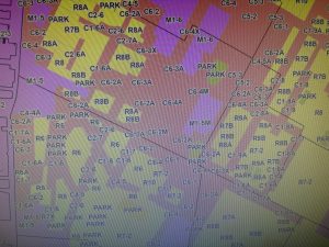
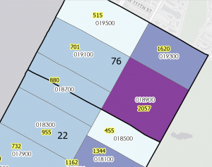
Akin to what I have previously stated about maps being omnidimensional when reading the opening paragraphs of chapter two, my view was broadened. prior to this, I would have stated that maps are finite and only show individual features, but According to Mitchell, they have the ability to show patterns as well. It was nice to see the book make connections I am passionate about, they mention how wildlife biologists study the behavior of bears and may want to find areas free of roads. As a zoologist, I feel that this was an applicable connection.  Under the section “Deciding what to map”  Mitchell doubles back on himself and makes it known that maps are not always complex and multidimensional they also can show simply where a business gets its most customers and, therefore can see where to target their ad campaigns. To build on that, you can make a seemingly one dimensional map into a very conceptual map. Mitchell goes on to explain that a business could use GIS mapping to not only see where their customers are but also categorize them by age. Prior to creating a map, you must make sure that things are mapped geographically appropriately and optionally have a category attribute with a value for each feature. I was originally confused when reading the section under assigning category values. The maps below the section offered great insight into everything I had read up to this point. It was nice to see the distinction between the “general zoning code” and the ” detailed zoning code.” Making your map is a section that I read, and I came to the conclusion that this will not be as overwhelming as originally anticipated. It seems close to using Rstudio, which I feel I am well versed in.


CHAPTER 3

Having taken Stats here at Ohio Wesleyan University, I understand the importance of mapping the least and the greatest. statistically speaking, it is most beneficial to gain values from the whole spectrum. A business will profit best by knowing where the entire data set lies. Mitchell fortifies this with his example of the catalog company using a map of young families in zip codes with the highest incomes. This is most beneficial because if they were to market to lower-income families, the chance they would buy would be much smaller due to the lack of excess funds to be able to splurge on expensive clothes. one thing I found extremely beneficial was the breakdowns that started on page 70. I was slightly confused about natural breaks, quantile, and equal intervals, etc… and more so when to use them. The book did a great job of laying them out, and I no longer have any questions. As I was reading this, I was  wondering to myself, “So I know how to work with standard deviation what do I do with outliers?” Thankfully, the book lays it out nicely, using natural breaks to isolate the outliers.  Interestingly, most map readers can only distinguish up to seven colors on a map, but four or five is the magic number. Another thing I found interesting was how complex the GIS software is. Never would I think that it would have the capability to make continuous class ranges by default and be able to define them.  I liked the chart they used on pages 80-81. the display of different features layed it out nicely of when to use what and why.

Hickman Week 2

Chapter 1:

One of the first things Chapter 1 mentioned was statistics. It can take large amounts of data and summarize it into small segments, for example, geographic analysis. It can help you find unknown values from values that have already been derived. Statistics has not always been used in GIS software until recently, when programs like CrimeStat and Spacestat started coming around. Using spatial statistics can help to find patterns in geographical locations. You can also find where those patterns are located on a map. You can also find if different features can relate to eachother. An example from the book was the relationship between the quality of infant health in relation to the neighborhoods across a country. Infant health may different in different neighborhoods. Chapter 1 also mentions different areas of work, like geostatistics to be able to study air pollution and soil contamination. To be able to start a geographic analysis, you need to know what information you are looking for. To be able to do this, you have to assume that the opposite of your hypothesis is true. After finding the data you want to use, you need to understand it. This means looking for a location and deciphering whether it is dicrete or continuous. Discrete means lines, points or areas. Continous feature are temperature and precipitation. Using summarized data will give you a the data of an entire area, rather than a specific location. There is nominal, ordinal, interval, and ratio data. Nominal data are features of a similar type. Ordinal data is as it says ordered. It can be either from high to low or low to high. Interval data tells you the regular magnitude. Ratio data is the relationship between two quantities. Interval data and ratio data go hand in hand, both being continuous. You will also need to choose a method, and then calculate the statistics. Once you find the significance of the statistics, you will also have to quation the results. An example the book gives is the idea of straight-line distance and the travel time when defining how close these features are to each other.

Chapter 2:

Chapter 2 is the measuring of geographic distributions. You can use GIS to find the center of a statistical distribution. The center is the extent to which featured are clustered or dispersed. The center can change depending on. the direction of the dispersion of the cluster. Sometimes the characteristic you are trying to find may not be apparent, which is when you would calculate a statistic. I liked the example of the crime analyst for comparing the distributions of different features. One way would be mapping the dispersion of auto thefts, assaults, and other thefts to see how the distributions occur. The crime analyst was also used as an example for tracking change. If they want to see the differencei n burgluries during the night and day, they watch the center for a few months for each night and day. There are three kinds of centers. The mean center is when there is no travel to and from the center. A median center is where you need to find the best location for something. It could be a location that is the shortest distance to all other locations, also known as a central feature. A central feature is the shortest total distance from the other features. The center can be found by location alone, or by an attribute value. An unweighted center is use for incidents that occur at a certain place and time. The weighted center is calculated for stationary features.  The median and central feature are calculated using the distance between the features in the data set. An outlier can skew the mean or median centers. The less features there are, the more an outlier could skew. “The standard distance measures the extent to which the distances between the mean center and the features vary from the average distance”(42).

Chapter 3:

Chapter 3 helps to identify patterns. Two ways to identify patterns is either by displaying the features or values on a map or using statistics to measure the extent of the clusters. The results would be tested to calculate the probability that the pattern did not happen by chance. Using the statistics method is more accurate. Local statistics can help find hotspots in a global statistic, however, sometimes global and local do not agree. Quadrat analysis is used when there is no direct interaction between features. The nearest neighbor index measures where the nearest neighborhood is to a feature, and then calculates the average. I feel that would be good for real estate when they are trying to sell houses and computing the nearest town to a neighborhood. The quadrat analysis measure the density of features, but not the proximity or arrangement between them. Two tests used to test the results of the quadrat analysis is the Kolmogorov-Smirnov Test and the Chi-square test. The Kolmogorov-Smirnov test calculates the proportions of quads for each line in a frequency table, as well as, the running cumulative total of the proportions. The chi-square is used to find the difference between two sets of frequencies.


In all, I think chaoter 3 was the most interesting. I have taken a statistics class in the past and this chapter made the most sense.