Chapter 9
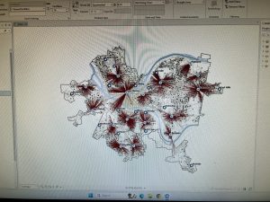
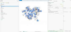
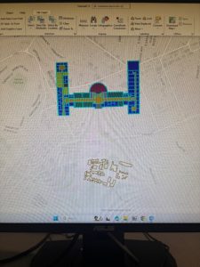
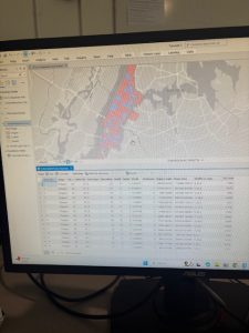
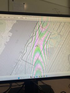
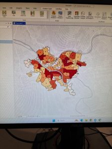
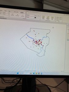
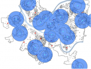
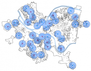
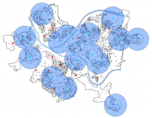
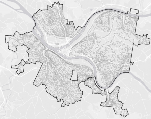
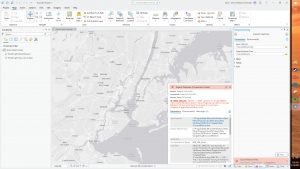
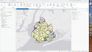
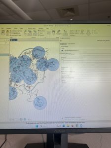
Starting with Chapter 9, this chapter emphasized the visual aspect of GIS to analyze spatial data. The first section started off well. I made the buffer zones representing the distance between public pools and local youth. Once I reached the second section in multiple-ring buffers, I began encountering some problems with the Spatial Join tool. When I would expand the “fields” section under the tool, the option to select an output field or merge tool were absent. I then encountered the same issue in the third tutorial that hindered my ability to fully complete the section. I also struggled with inputting the information for the gravity table. Moving to the fourth section, the fresh task was to use a tool to locate facilities. This section went well compared to the preceding two. As a pretty drastic shift from the work with public pool proximity was the cluster analysis of crime in the fifth and final tutorial. Thankfully, working with the GIS was smooth sailing and far less serious than the scatter of the serious crimes.
Chapter 10
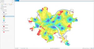
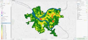
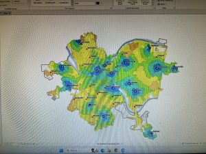
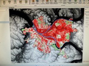
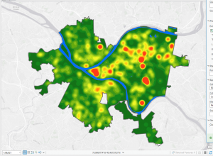
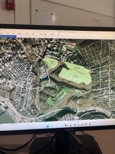
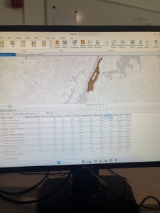
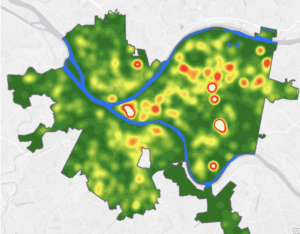
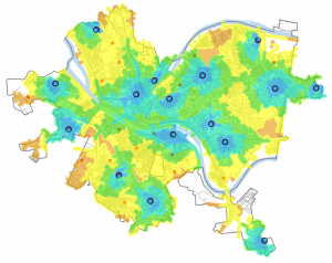
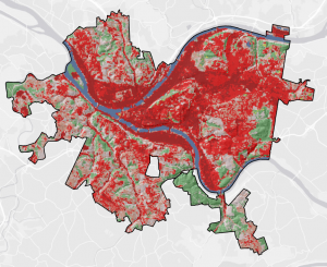
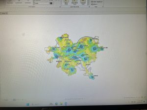
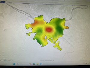
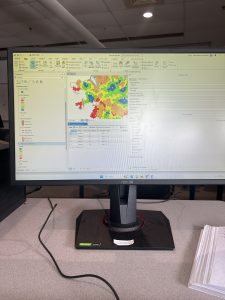
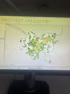
Next, was using Raster in Chapter 10. As per usual, I had a lot of weird troubles that I struggled to pinpoint the cause of. The first section started out alright, but then it took a turn for the worst. When I imported the raster dataset to become a file geodatabase, the program ran, but nothing was added to the contents pan. I could not figure out what the problem was because nothing popped up concerning anything incorrect on my information, but nothing changed or was added anywhere once it ran. Then, I had a bit of confusion about the Hillside Shade tool because there are three. However, I could not complete the section anyways because there was no NED_Pittsburgh that I could find in anything. Then, I could not change the symbology because I fumbled about every other preceding step. Continuing to the second tutorial of the chapter, the goal was to make a heat map. Thankfully, I could do this correctly, inputting all of the information correctly, selecting colors, and creating thresholds. For the final section of the chapter, the aim was to create a risk index model. As my pattern follows, things began orderly and grew unruly as I pushed forth through the tutorial. I struggled a bit with writing expressions properly, but I fixed everything to make it all work as intended.
Chapter 11
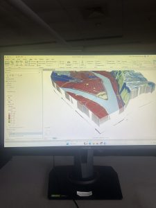
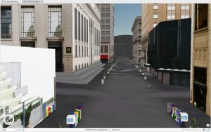
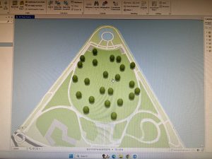
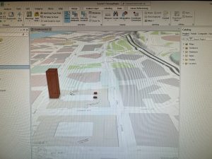
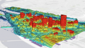
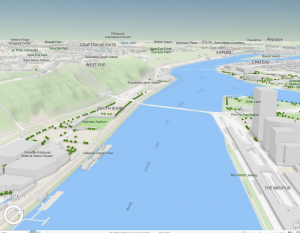
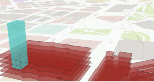
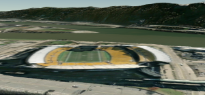
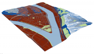
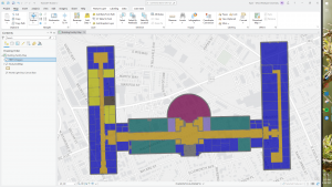
Finally, in Chapter 11, I fully realized the extent of my disdain for GIS on the desktop- or possibly just the school’s Wi-Fi. Using the 3D maps, I tried navigating past the command of pressing random buttons that correspond to movements. The navigation was abominable. Some of the keys would not move the map while others would have a five second delay before the map would move in the right direction. The additional capabilities that are expected from an ostensibly powerful system fall short of the expectations set and boasted in the book. The computer also froze for about ten minutes adding to my defeat. My qualms aside, the first two sections went swimmingly. I enjoyed the visual representation of trees on the map. Overall, everything for this section, though tedious, went about as expected. Drawing a bridge was a unique experience compared to what I did last semester in WebGIS, but my navigation quarrels still stand.