- PLSS: (Public Land Survey System) created to help identify PLSS boundaries in US Military and Virginia Military Survey Districts of Delaware County
- Township: Consists of the 19 townships that make up Delaware County
- 2024 Aerial Imagery: 3in aerial imagery of Delaware County from 2024
- Delaware County E911 Data: Consists of spatially accurate representation of all certified addresses within Delaware County with a point placed at the center of each address. This can be used by emergency services and appraisal mapping by sending in the coordinates of the address.
- Building Outline 2021: Satellite view showing outlines of Delaware County buildings from 2021
- Original Township: Original boundaries of Delaware townships before tax districts changed their shapes
- Zip Code: Consists of all zip codes in Delaware County as shown by the Census Bureau’s zip code file from the 2000 census, the United States Postal Service website, and tax mailing addresses from the treasurer’s office. Tax exempt parcels and dedicated roads without zip codes were positioned based on their location.
- School District: Consists of all school districts in Delaware county from Delaware County Auditor’s parcel records of the school districts.
- Building Outline 2023: Satellite view showing outlines of Delaware County buildings from 2023
- 2021 Imagery (SID File): 2021 Aerial Imagery of Delaware County
- Recorded Document: Points relating to recorded documents such as vacations, subdivisions, centerline surveys, surveys, annexations, and miscellaneous documents within Delaware County to more easily locate miscellaneous documents.
- Dedicated ROW: Line data that consists of all dedicated Right-of-Way within Delaware County
- Precincts: Consists of Voting Precincts in Delaware County and maintained by the Delaware County Auditor’s GIS Office.
- Delaware County Contours: 2 foot contours of Delaware County in File Geodatabase format.
- Building Outlines – DXF: Satellite view showing outlines of Delaware County buildings
- Address Points – DXF: Depicts spatially accurate placement of addresses within Delaware County. From the State of Ohio Location Based Response System. Points are placed at approximately the center of the building, and is intended for use for emergency services and appraisal mapping.
- Street Centerlines – DXF: Depicts the center of pavement of public and private roads within Delaware County. From the State of Ohio Location Based Response System. Address Range data taken from field observation and building permit information.
- Parcel: Consists of polygons that represent all cadastral parcel lines within Delaware County
- Street Centerline: Consists of spatially accurate topologically correct representation of the road system and center of pavement of public and private roads within Delaware County from the State of Ohio Location Based Response System. Address Range data taken from field observation and building permit information for use in emergency services.
- Condo: Consists of all condo polygons from the Delaware County Recorder’s Office.
- Subdivision: Consists of all subdivisions and condos from the Delaware County Recorder’s Office.
- Tax District: Contains all tax districts within Delaware County as defined by the Delaware County Auditor’s Real Estate Office.
- Address Point: Depicts spatially accurate placement of addresses within Delaware County. From the State of Ohio Location Based Response System. Points are placed at approximately the center of the building, and is intended for use for emergency services and appraisal mapping.
- Map Sheet: Consists of all map sheets within Delaware County
- Farm Lot: Consists of all the farm lots in the US Military and Virginia Military Survey Districts of Delaware County.
- Annexation: Consists of Delaware County’s annexations and conforming boundaries from 1853 to now.
- Survey: Points placed on surveys of land in Delaware County, not containing old survey volumes 1-11.
- 2022 Leaf-On Imagery (SID File): 2022 Imagery 12in Resolution
- Hydrology: Consists of all major waterways within Delaware County and was enhanced in 2018 with LIDAR based data.
- GPS: Consists of all GPS monuments that were established in 1991 and 1997 within Delaware County.
Isaacs Week 7
- Zip Code – Delaware County’s zip code layer was created by cleaning and reconciling 2000 Census data, USPS records, and county tax mailing addresses, then dissolving parcels by their property addresses in 2005. It is maintained collaboratively with the USPS, updated as needed, and published monthly.
- School District – Delaware County’s school district layer was created from the county auditor’s parcel records identifying district boundaries. It is maintained on an as‑needed basis and released as part of the county’s monthly data publications.
- Building Outline 2023 – Delaware County’s 2023 building outline dataset maps every building footprint in the county, derived from updated parcel and spatial records. It is maintained and refined as needed to reflect new construction, demolition, and accuracy improvements.
- 2021 Imagery (SID File) – this provides high-resolution aerial photography of Delaware County in 2021. It serves as a countywide visual base map used for mapping, verification of land features, and comparison against other years of imagery to track development and landscape change.
- PLSS – The PLSS dataset maps all Public Land Survey System polygons in both the U.S. Military and Virginia Military Survey Districts of Delaware County. It is updated whenever new surveys are recorded and published monthly to keep boundary information current.
- Township – This data set consists of 19 different townships that make up Delaware County, Ohio. This dataset is updated on an as-needed basis and is published monthly.
- 2024 Aerial Imagery – The 2024 aerial imagery provides a countywide set of high‑resolution photos of Delaware County captured in 2024, offering an up‑to‑date visual snapshot of land use and development. It is maintained as needed and published monthly as part of the county’s standard imagery updates.
- Delaware County E911 Data – the dataset contains the geographic information used for emergency response, including address points, road centerlines, and related location data needed for accurate 911 dispatching. It is updated as needed to reflect new development and ensure responders have the most current location information.
- Building Outline 2021 – maps all building footprints in Delaware County as they existed in 2021, based on county parcel and spatial records. It provides a snapshot of development at that time and is maintained as needed to keep the outlines accurate.
- Original Township – shows the historic township boundaries that Delaware County had before later changes. It is kept up to date as needed so these early boundary lines remain accurate for reference.
- Recorded Document – contains all official land‑related documents filed with Delaware County, such as deeds, surveys, and other property records. It is updated whenever new documents are submitted so the county’s land records stay current.
- Dedicated ROW – refers to road right‑of‑way areas that have been officially set aside for public roads in Delaware County. This dataset maps those dedicated road corridors and is kept up to date as changes or new dedications occur.
- Precincts – the voting areas that divide Delaware County into smaller sections for managing elections and assigning polling locations. This dataset maps those precinct boundaries and is updated as needed to reflect any official changes.
- Delaware County Contours – show the elevation lines across the county, illustrating hills, slopes, and terrain shape. This dataset helps with mapping, planning, and understanding how the land rises and falls.
- The Building Outlines – DXF – provides all building footprint shapes in Delaware County in a DXF file format for use in CAD and GIS software. It offers a clean, ready‑to‑use outline of every structure and is updated as needed to reflect new construction or changes.
- Address Points – DXF – contains all mapped address locations in Delaware County in a DXF format that can be used in CAD and GIS software. It provides precise point locations for homes, businesses, and other addressed sites, and is updated as needed to keep address information accurate.
- The Street Centerlines – DXF – shows all public roads in Delaware County as line features in a DXF format for use in CAD and GIS software. It provides an accurate map of the county’s road network and is updated as needed to reflect new or changed roads.
- The Parcels – It maps every property parcel in Delaware County, showing accurate boundary lines and ownership-related information. It is updated regularly to reflect new splits, combinations, and recorded changes in land records
- Street centerline – maps all public roads in Delaware County as single centerline paths, showing the official layout of the county’s road network. It is updated as needed to reflect new roads, realignments, or other changes.
- Condo – identifies condominium properties and their associated areas within Delaware County. It maps each condo unit as its own legal property, keeping the information current as new units are created or recorded.
- Subdivision – maps all officially recorded subdivisions in Delaware County, showing how larger parcels were split into lots and blocks. It is updated as new plats are filed so the county’s development patterns stay current.
- Tax District – shows the official tax boundaries used in Delaware County to determine which local authorities collect property taxes for each parcel. It is updated as needed so tax areas stay accurate when boundaries or jurisdictions change.
- Address Point – shows the exact mapped location of every assigned address in Delaware County, including homes, businesses, and other addressed sites. It is updated as needed to keep address information accurate for emergency response, mapping, and property records.
- Map Sheet – shows the grid of map sheet boundaries used by Delaware County to organize its official maps and GIS data. It provides a simple reference framework so users can locate features by sheet number.
- Farm Lot – shows the original agricultural lots that were surveyed and assigned when Delaware County was first laid out. These historic lot boundaries help trace early land division and are still used for reference in property research and mapping.
- Survey – It contains all officially recorded land surveys in Delaware County, including measured boundaries, bearings, and distances documented by licensed surveyors. It provides the legal, technical mapping of property lines and is updated whenever new surveys are filed or existing ones are corrected.
- 2022 Leaf‑On Imagery (SID File) – high‑resolution aerial photography of Delaware County taken during the growing season when trees have full leaves. It provides clear, detailed visuals for mapping, planning, and land analysis.
- Hydrology – Maps water related features like streams, rivers, ponds, lakes, and drainage systems. It shows how water moves across the landscape.
- GPS – This dataset identifes all GPS monuments that were established in 1991 and 1997. This dataset updated on an as-needed basis, and is published monthly.
Fry- Week 7
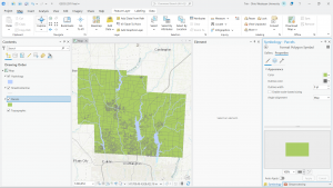
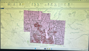
This week, without any reading and most likely the same as many of you did, I downloaded and prepared for the GOEG 291 final scheduled to be due next Friday. For this, I downloaded the necessary data from the Delaware County GIS Data Hub: the Parcels data, Street Centerline data, and the Hydrology data. I then organized this into a file labeled “Delaware GIS Data” on my laptop, extracted each dataset from its original zip file, and converted it to the necessary shapefile format. This created a new file folder for each data set that contained the usable data files. Once the files were in a usable format, I then created a new ArcGIS Pro map project and inserted the three dataset files. To do this, I selected the “Map” tab, then the “Add Data” selection under the “Layer” portion. This added each dataset as a layer on the “Contents” tab. Finally, I recolored the imported data layers (as they were all inserted as the same default pink color) to make each layer visible. As for the final project selections, I plan on doing the “selecting and classifying land uses”, “making new shape files from existing shape files”, and “mapping change” choices.
Deem Week 7
- Tax district – All tax districts in Delaware county, Ohio. Data is defined by the Delaware County Auditor’s Real Estate Office, is dissolved on the Tax district code, and is updated as needed and published monthly.
- Address Points DXF – Created by a partnership between the State of Ohio and Delaware county. Provides spatially accurate placement of addresses in Delaware County.
- Street Centerlines DXF – Shows paved roads within Delaware County. The data was collected by observing locations of existing addresses and adding addresses using building permit information.
- Parcel – This map shows parcel lines within Delaware County, Ohio, and includes cadastral data that shows land ownership information. This dataset maintained daily and updated monthly.
- Address Point – A spatially accurate map of all certified addresses within Delaware County. It is maintained by the Auditor’s GIS office in Delaware. Provides 911 services with address information and is updated daily, published monthly.
- Recorded Document – The dataset contains points representing recorded documents in the Delaware County Recorder’s Plat Books, Cabinet/Slides, and Instrument Records. It was created to streamline the process of finding documents and is updated weekly, published monthly.
- Zip Code – Contains all zip codes within Delaware County. Updated as needed and published monthly.
- Contains all school districts in Delaware County. Was created via the Delaware County Auditor’s records and is updated as needed, published monthly.
- Map Sheet – Contains all map sheets within Delaware County.
- PLSS – Contains all of the Public Land Survey System polygons to be used by the U.S. military and the Virginia Military Survey Districts of Delaware County. Maintained and updated as needed, published monthly.
- MSAG – Contains all 28 different political jurisdictions in Delaware County. Was created to locate the boundaries of the cities, villages, and townships of Delaware County. Updated as needed and published monthly.
- Municipalities – Contains all municipalities in Delaware County.
- Farm Lot – Contains all farm lots in the U.S. military and Virginia Military Survey Districts of Delaware County. Was created to identify all farm lots and their boundaries in Delaware County.
- Township – Contains all 19 townships that make up Delaware County. Updated as needed and published monthly.
- Street Centerline – Depicts paved public and private roads in Delaware County. Updated daily, published monthly.
- Annexation – Contains data on Delaware County land annexations and boundaries from 1853 to the present/ Updated as needed when an annexation is made and published monthly.
- Condo – Contains all condominiums within Delaware County that have been recorded with the Delaware County Recorder’s Office.
- Subdivision – All subdivisions and condos recorded in the Delaware County Recorder’s Office. Updated as needed and published monthly.
- Survey – Contains points representing land surveys within Delaware County. Updated daily and published monthly.
- Dedicated ROW – Contains all lines that are designated Right-of-Way within Delaware County. The data was created using parcel data. Updated as needed and published monthly, all changes are represented by recorded documents in the Delaware County Recorder’s Office.
- Building Outline 2024 – Outlines of buildings as of 2024.
- Building Outline 2023 – Outlines of buildings as of 2023.
- Railroads – Map of railroad locations in Delaware County.
- Precincts – Voting precincts in Delaware County. Dataset is maintained by the County’s GIS Auditor’s Office under the direction of the Board of Elections. Updated as needed and published as needed by the Board of Elections
- Delaware County GIS Data Extract Web Map – Web map that allows for Delaware County GIS data to be extracted in various formats.
- 2024 Aerial Imagery – Aerial map data collected in the spring of 2024.
- Delaware County E911 Data – 911 emergency response location data. Updated daily and published monthly.
- Building Outline 2021 – Building outlines of all structures in Delaware County, Ohio as of 2021.
- Hydrology – All major waterways in Delaware County. Enhanced in 2018 with LIDAR data, updated as needed and published monthly.
- GPS – All GPS monuments established in 1991 and 1997. Updated as needed and published monthly.
- Delaware County Contours – Map of Delaware county containing two foot contour data.
- Original Township – A dataset containing the original boundaries of the townships of Delaware County prior to a shape change caused by tax district shifts.
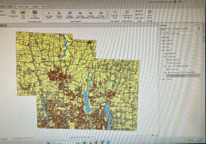
Edit: here is my map with the added layers prior to doing the final project. I plan on concept 1 “Selecting and Classifying Land Uses” and concept 2 “Making New Shape Files from Existing Shape Files”.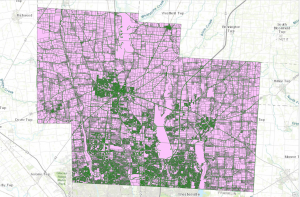
Obenauf Week 7
Final Project Data Summary:
- Zip Code
- Contains all zip codes within Delaware County, Ohio. The layer was created in 2005 after re-evaluation of the zip codes in 2003 by dissolving all Delaware County parcels by their property addresses. This dataset is published monthly and is updated on an as-needed basis through coordination with the USPS.
- School District
- This data set consists of all School Districts within Delaware County. Originally created via the Delaware County Auditor’s parcel records, it is updated as-needed and is published monthly.
- Building Outline 2023
- This dataset has an outline of all buildings and structures in Delaware County in 2023. Delaware County.
- PLSS
- This dataset consists of all the Public Land Survey System (PLSS) polygons in both the US Military and the Virginia Military Survey Districts of Delaware County. It was created to facilitate the identification of all of the PLSS and their boundaries. It is updated as-needed and is published monthly.
- Township
- This data set consists of 19 different townships that make up Delaware County, OH. It is updated as-needed and is published monthly.
- 2024 Aerial Imagery
- 2024 3in Aerial Imagery. Flown in Spring of 2024. Collection of maps and datasets. Published September 25, 2024.
- 2021 Imagery (SID file)
- Collection of images. Published March 11, 2022.
- Recorded Document
- Dataset consists of points that represent recorded documents in the Delaware County Recorder’s Plat books, cabinet/slides and instrument records which are not represented by active subdivision plats. This dataset is updated on a weekly basis and is published monthly.
- Dedicated ROW
- This dataset consists of all lines that are designated right-of-way within Delaware County. Created through the daily updates of Delaware County’s Parcel data. This dataset is updated on a daily basis and is published monthly.
- Delaware County E911 Data
- The State of Ohio Location Based Response System (LBRS) Address_Points data set is a spatially accurate representation of all certified addresses within Delaware County. Data is maintained by Delaware County Auditor’s GIS Office. The Address_Points layer is intended to support appraisal mapping, 911 Emergency Response, accident reporting, geocoding, and disaster management. The dataset is updated on a daily basis, and is published monthly.
- Building Outline 2021
- This dataset consists of building outlines for all structures in Delaware County, Ohio. The layer was updated in 2021. The dataset is updated on an as-needed basis.
- Original Township
- This dataset consists of the original boundaries of the townships in Delaware County, Ohio before tax district changes affected their shapes.
- Precincts
- This dataset consists of Voting Precincts within Delaware County, Ohio. This dataset is maintained by the Delaware County Auditor’s GIS Office under the direction of the Delaware County Board of Elections. This dataset is updated on an as needed basis and is published as needed by the Delaware County Board of Elections.
- Delaware County Contours
- 2018 Two Foot Contours for Delaware County Ohio in File Geodatabase format. Data was published April 9, 2020.
- Building Outlines – DXF
- Data consists of an image of specific building outlines in Delaware County using CAD drawings. Created on March 26, 2020, Last updated on May 15, 2023.
- Address Points – DXF
- The State of Ohio Location Based Response System (LBRS) Address Points data provides for a spatially accurate placement of addresses within a given parcel in Delaware County. The data was created through a partnership between the State of Ohio and Delaware County. The data is maintained by the Delaware County Auditor’s GIS Office. The Address Points indicate the location of the building centroid as best as possible.
- Street Centerlines – DXF
- The State of Ohio Location Based Response System (LBRS) Street_Centerlines depict center of pavement of public and private roads within Delaware County. Address Range data was developed from data collected by field observation of existing address locations and by adding addresses using building permit information.
- Parcel
- This dataset consists of polygons that represent all cadastral parcel lines within Delaware County, Ohio. The cadastral geometries are maintained by the Delaware County Auditor’s GIS Office. This dataset is maintained on a daily basis, and is published monthly.
- Street Centerline
- The State of Ohio Location Based Response System (LBRS) Street_Centerlines depict center of pavement of public and private roads within Delaware County. Address Range data was developed from data collected by field observation of existing address locations and by adding addresses using building permit information. This layer is updated on a daily basis for all fields but the 3-D fields which are updated on an annual basis, and is published monthly.
- Condo
- This data set consists of all condominium polygons within Delaware County, Ohio that have been recorded with the Delaware County Recorders Office.
- Subdivision
- This data set consists of all subdivisions and condos recorded in the Delaware County Recorder’s office. This dataset is updated on a daily basis and is published monthly.
- Tax District
- This data set consists of all tax districts within Delaware County, Ohio. The data is defined by the Delaware County Auditor’s Real Estate Office. Data is dissolved on the Tax District code. The data is updated on an as-needed basis and is published monthly.
- Address Point
- The State of Ohio Location Based Response System (LBRS) Address_Points data set is a spatially accurate representation of all certified addresses within Delaware County Ohio. The dataset is updated on a daily basis, and is published monthly.
- Map Sheet
- This dataset consists of all map sheets within Delaware County, Ohio
- Farm Lot
- This data set consists of all the farmlots in both the US Military and the Virginia Military Survey Districts of Delaware County. This dataset is maintained on an as-needed basis where new surveys have been recorded.
- Annexation
- This data set contains Delaware County’s annexations and conforming boundaries from 1853 to present. This dataset is updated on an as-needed basis once an annexation has been recorded with the Delaware County Recorders office. It is published monthly.
- Survey
- Survey points is a shapefile of a point coverage that represents surveys of land within Delaware County, Ohio. These surveys are found in documents in the Recorder’s office and the Map Department. This dataset is updated on a daily basis and is published monthly.
- 2022 Leaf-On Imagery (SID file)
- 2022 Imagery 12in Resolution. Information was published September 14, 2022.
- Hydrology
- This dataset consists of all major waterways within Delaware County, Ohio. This data was enhanced in 2018 with LIDAR based data. This dataset is updated on an as-needed basis and is published monthly.
- GPS
- This dataset identifes all GPS monuments that were established in 1991 and 1997. This dataset updated on an as-needed basis, and is published monthly.
- This dataset identifes all GPS monuments that were established in 1991 and 1997. This dataset updated on an as-needed basis, and is published monthly.
Moore Week 7
Final Project Data Summary-
Zip Code: Data set containing all zip codes within Delaware County, Ohio. Data is published monthly.
School District: A data set that consists of all School Districts within Delaware County, Ohio. It is updated on an as-needed basis and is published monthly.
Building Outline (2021, 2023, 2024): Data sets consisting of all building outlines in Delaware County. These are separate datasets corresponding to each year provided.
PLSS: Data set consisting of all the Public Land Survey System (PLSS) polygons in both the US Military and the Virginia Military Survey Districts of Delaware County. This dataset is maintained on an as-needed basis, where new surveys have been recorded, and is published monthly.
Township: A data set consisting of 19 different townships that make up Delaware County, Ohio. The dataset is updated on an as-needed basis andis published monthly.
2024 Aerial Imagery: Collection of images. 3in Aerial Imagery, Flown Spring 2024. Publish date is September 25, 2024, 7:45 pm.
Delaware County E911 Data: Address Points data set that is a spatially accurate representation of all certified addresses within Delaware County, Ohio. In particular, the State of Ohio Location-Based Response System (LBRS) Address Points. Used to do appraisal mapping, geocoding, report accidents, and manage disasters.
2121 Imagery (SID File): File used to summarize images of Delaware County from 2021.
Original Township: A dataset that consists of the original boundaries of the townships in Delaware County, Ohio, before tax district changes affected their shapes.
Recorded Document: A dataset that consists of points that represent items that do not match up with the subdivisions that are currently active on the Delaware County map. Documents such as vacations, subdivisions, centerline surveys, surveys, annexations, and other miscellaneous documents within Delaware County, Ohio.
Precincts: A dataset that consists of Voting Precincts within Delaware County, Ohio. It is updated on an as-needed basis and is published by the Delaware County Board of Elections.
Dedicated ROW: A data set that consists of all lines that are designated Right-of-Way within Delaware County, Ohio. line data that is created through daily updates of Delaware County’s Parcel data.
Delaware County Contours: 2018 Two Foot Contours for Delaware County Ohio in File Geodatabase format. Published April 9, 2020 at 9:51 AM. last updated on October 12, 2021 at 10:43 AM.
Building Outlines – DXF: Data consists of an image of specific building outlines in Delaware County using CAD drawings. Last updated on May 15, 2023, 7:04 PM.
Address Points – DXF: Dataset that uses LBRS to show a spatially accurate placement of addresses within a given parcel in Delaware County, or registered addresses in a shapefile. With Address Points indicating the location of the building centroid.
Street Centerlines – DXF: The LBRS Street Centerlines depict the center of pavement of public and private roads within Delaware County. Data was developed from data collected by field observation of existing address locations
Parcel: This dataset consists of polygons that represent all cadastral parcel lines within Delaware County, Ohio. It contains information like current owner, sale history, address, and number of rooms.
Street Centerline: Dataset that uses LBRS to depict center of pavement of public and private roads within Delaware County. Data was developed from data collected by field observation of existing address locations.
Condo: A dataset that consists of all condominium polygons within Delaware County, Ohio that have been recorded with the Delaware County Recorder’s Office.
Subdivision: A data set that consists of all subdivisions and condos recorded in the Delaware County Recorder’s office. Is updated on a daily basis and is published monthly.
Tax District: A data set that consists of all tax districts within Delaware County, Ohio. Defined by the Delaware County Auditor’s Real Estate Office, and is dissolved on the Tax District code. Data is updated on an as-needed basis and published monthly.
Address Point: A dataset that uses LBRS to provide a spatially accurate representation of all the certified addresses within Delaware County. Is updated as-needed daily and published monthly.
Map Sheet: A dataset that consists of all map sheets within Delaware County, Ohio
Farm Lot: A data set that consists of all the farmlots in both the US Military and the Virginia Military Survey Districts of Delaware County. Created to facilitate in identifying all of the farmlots and their boundaries in both the US Military and the Virginia Military Survey Districts of Delaware County.
Annexation: A data set that contains Delaware County’s annexations and conforming boundaries from 1853 to the present. Is updated on an as-needed basis once an annexation has been recorded at the Delaware County Recorder’s office.
Survey: (A shapefile) point coverage that represents surveys of land within Delaware County, Ohio. These surveys are found in documents in the Recorder’s office and the Map Department.
2022 Leaf-On Imagery (SID file): 2022 Imagery 12in Resolution. Published on September 14, 2022, 1:42 PM
Hydrology: A dataset that consists of all major waterways within Delaware County, Ohio. Was enhanced in 2018 with LIDAR-based data. Is updated on an as-needed basis and is published monthly.
GPS: A dataset that identifies all GPS monuments that were established in 1991 and 1997. Is updated on an as-needed basis and is published monthly.
Hydrology + Street Centerline + Parcels
Gist – Week 7
Final Project Data-
Tax District: Consists of all the tax districts within Delaware County. The data is updated as needed and published monthly. It is defined by the Delaware County Auditor’s Real Estate Office and is dissolved on the Tax District Code.
Parcel: Dataset consists of polygons that represent all cadastral parcel lines within Delaware County. This is maintained by the County Auditor’s GIS Office. Different attributes regarding the parcel records are maintained on the CAMA system on a daily basis and published monthly.
Address Point: This dataset is a spatially accurate representation of addresses within Delaware County. It contains Address_Points that indicate the location of the building centroid. This provides data to help appraisal mapping, 911 Emergency Response, accident reporting. geocoding, and disaster management. It can alter the set of coordinates to determine the closest valid addresses specifically for 911 Emergency Response teams.
Recorded Document: This consists of points that represent recorded documents in the Delaware County Recorder’s Plat Books, Cabinet/Slides and Instrument Records that are not represented by subdivision plats. This dataset was created to locate different documents within Delaware.
Zip Code: This data set contains all zip codes within Delaware County. The zip codes were carefully made and cleaned up in 2003 to later have the layer created in 2005. The layer created both right_zip and left_zip attributes for the county’s road centerline. This is updates as needed through the United States Postal Service.
School District: This dataset contains all the school districts within Delaware County. The data was created by the Delaware County Auditor’s parcel records of the school districts and is updated as needed.
Map Sheet: This dataset contains all the map sheets in Delaware County. It is a feature service and tags Land Data and Boundaries. There was not much more information on this specific file.
PLSS: This data contains PLSS (Public Land Survey System) polygons in the US Military and the Virginia Military Survey Districts of Delaware County. It helps identify all the PLSS and their boundaries.
MSAG: This dataset contains the Master Street Address Guide (MSAG) polygon with 28 different political jurisdictions. These include townships, cities, and the villages in Delaware County. This dataset was made to facilitate and locate each of these places and is updated on an as-needed basis.
Municipality: This dataset was made to consist of all the municipalities within Delaware County.
Farm Lot: This dataset consists of all the farm lots in both the US Military and Virginia Military Survey Districts of Delaware County. The dataset was created to help identify the farm lots and their boundaries.
Township: This dataset is a map of the 19 different townships hat make up Delaware County. This is updated on an as-needed basis and published monthly.
Street Centerline: The LBRS (The State of Ohio Location Based Response System) Street_Centerlines depict the center of pavement of both public and private roads in Delaware. The range data was created by collecting field observation of existing address locations and by adding addresses using building permit information. There are two versions available for download of this data.
Annexation: This dataset contains Delaware County’s annexations and conforming boundaries from 1853 to present. This data set is updated once annexation has been recorded on an as-needed basis.
Condo: This dataset consists of all condominium polygons within Delaware County. These are specific condos that have been recorded with the Delaware County Recorders Office.
Subdivision: This data set consists of all subdivisions and condos recorded in the Delaware County Recorder’s office. This is updated as needed and published monthly.
Survey: Survey points is a shape file of a point coverage that represents surveys of land within Delaware County. Surveys were scanned and kept as pdf filed by the Map Department and the GIS Office in Delaware.
Dedicated ROW: This data consists of all lines that are in the designated Right-of-Way within Delaware County. This data is line data that is created through the daily updates of the Parcel Data. All changes made are stored in the Delaware County Recorder’s Office.
Building Outline 2021/2023/2024: These are two separate datasets, one for each year. These include the building outlines of Delaware County in their designated year.
Railroads: This dataset includes all the railroads that lie within Delaware County and allow viewers to see their location.
Precincts: This dataset includes the Voting Precincts within Delaware county. This dataset is maintained by the Delaware County Auditor’s GIS Office under the direction of the Delaware County Board of Elections.
Delaware County E911 Data: This dataset is the State of Ohio Location Based Response System (LBRS). The Address_Points data set is a representation of all certified addresses in Delaware County.
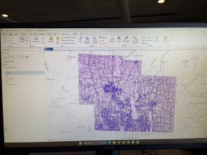
Inserted above is the image of my map after adding the three layers: Parcel, Street Centerline, and Hydrology
Rhoades Week 7
Zip Code: Contains all zip codes within Delaware County, Ohio. Published and updated monthly.
Street Centerline: Depict center of pavement of public and private roads within Delaware County, Ohio. Updated on a daily basis for all fields but the 3-D fields which are updated on an annual baiss, and is published monthly.
MASG: Stands for Master Street Address Guide, and is a representation of the 28 different political jurisdictions in Delaware County, Ohio.
Recorded Document: Consists of points that represent recorded documents in the Delaware County Recorder’s Plat Books, Cabinet/Slides and Instruments Records which are not represented by subdivision plats that are active. Documents such as; vacations, subdivisions, centerline surveys, surveys, annexations, and miscellaneous documents within Delaware County, Ohio. Updated on a weekly basis, and is published monthly.
Survey: A shapefile of a point coverage that represents surveys of land within Delaware County, Ohio. Surveys are found in documents in the Recorder’s office and the Map Department. The dataset is updated on a daily basis and is published monthly.
GPS: Identifies all GPS monuments that were established in 1991 and 1997. Dataset is updated on an as-needed basis, and is published monthly.
Parcel: Consists of polygons that represent all cadastral parcel lines within Delaware County. Dataset is maintained on a daily basis, and is published monthly.
Subdivision: Consists of all subdivisions and condos recorded in the Delaware County Recorder’s office. The dataset is updated on a daily basis and is published on a monthly basis.
School District: The dataset consists of all School Districts within Delaware County, Ohio. The dataset is updated on an as-needed basis, and is published monthly.
Annexation: The dataset contains Delaware County’s annexations and conforming boundaries from 1853 to present. Dataset is updated on an as-needed basis once an annexation has been recorded within the Delaware County Recorder’s office. It is published monthly.
Township: The dataset consists of 19 different townships that make up Delaware County, Ohio. The dataset is updated on an as-needed basis and is published monthly.
Tax District: This dataset consists of all tax districts within Delaware County, Ohio. The data is defined by the Delaware County Auditor’s Real Estate Office, and data is dissolved on the Tax District code. The data is uploaded on an as-needed basis and is published monthly.
Address Point: A spatially accurate representation of all certfiied addresses within Delaware County, Ohio. The layer provides the capability to reverse geocode a set of coordinates to determine the closest valid address and is intended to provide 911 agencies with information needed to comply with Phase II 911 requirements. The dataset is updated on a daily basis, and is published once a month.
Municipality: The dataset contains the municipality parcels that are within the MSAG and Township datasets
Condo: Consists of all condominimum polygons within Delaware County, Ohio that have been recorded within the Delaware County Recorders Office.
Precincts: Consists of Voting Precincts within Delaware County, Ohio. Maintained by the Delaware County Auditor’s GIS Office under the direction of the Delaware County Board of Elections. Dataset is updated on an as-needed basis and is published as-needed by the Delaware County Board of Elections.
PLSS: Consists of all the Public Land Survey System (PLSS) polygons in both the US Military and the Virginia Military Survey Districts of Delaware County. Created to facilitate in identifying all of the PLSS and their boundaries in both US Military and Virginia Military Survey Districts of Delaware County. The dataset is maintained on an as-needed basis where new surveys have been recorded, dataset is updated on an as-needed basis and is published monthly.
Delaware County E911 Data: The database uses the Location Based Response System (LBRS) and is used in 911 Emergency Response. The dataset is updated on a daily basis, and is published monthly.
Farm Lot: Dataset consists of all the farmlots in both the US Military and the Virginia Military Survey Districts of Delaware County. Dataset was created to facilitate in identifying all of the farmlots and their boudnaries in both US Miltary and Virginia Military Survey Districts of Delaware County. Dataset is maintained on an as-needed basis where new surveys have been recorded.
Building Outline (2021, 2023, 2024): Consists of all building outlines in Delaware County. Each of the three databases are updated within their respective years.
Railroads: Allows a user to view the locations of railroads that lie within Delaware County.
Dedicated ROW: Consists of all lines that are designated Right-of-Way within Delaware County, Ohio. This data is line data that is created through the daily updates of Delaware County’s Parcel data. Dataset is updated on an as-needed basis, and is published monthly.
Original Township: Displays boundaries of Delaware County townships prior to divison by tax divisions affected their shape.
Map Sheet: Dataset contains all map sheets within Delaware County, Ohio. Consists of 360 records.
Hydrology: Dataset consists of all major waterways within Delaware County, Ohio. Data was enhanced in 2018 with LIDAR based data. The dataset is uploaded on an as-needed basis and is published monthly.
ROW: A type of easement (right-of-way) that shows accessible street routes in the form of line data.
2024 Aerial Imagery: 2024 3in Aerial Imagery Flown Spring 2024. Published on September 25, 2024 at 7:45 PM EDT.
Delaware County GIS Data Extract Web Map: Web map used in Delaware County GIS Data Extract application that allows users to extract Delaware County, Ohio GIS data in various formats.
2022 Leaf-On Imagery (SID File): 2022 Imagery 12in Resolution, published on September 14 2022 at 1:42PM EDT
Delaware County GIS Data Extract: Allows users to extract Delaware County, Ohio GIS data in various formats. Published June 8 2020 at 6:23 PM EDT.
Delaware County Contours: 2018 two foot contours for Delaware County, Ohio in file geodatabase format. Published April 9, 2020 at 9:51AM EDT.
Street Centerlines — DXF: The LBRS Street Centerlines depict the center of pavement of public and private roads in Delaware County, Ohio and was collected by field observation
Auditor Logo: The logo of the Auditor’s GIS Office in Delaware County
Fall Background: The background for different GIS data
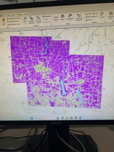
Here is my map that shows all three layers: Street Centerline, Hydrology, and Parcles:
Cherry week 5
Cherry Blog week 5
Chapter 4
So far, which is quite honestly to be expected, is that the instructions and process of what we’re doing in GIS are getting progressively more complicated. I really struggled with the beginning of the chapter, where we were working with a lot of export files. I’d realized when I got past that part of the assignment, and I was unable to do something a few steps later, that I had done that completely wrong and had to essentially restart my project.
This chapter altogether was a bit of a problem for me; I did learn quite a few new things regarding attribute tables and quite a few other things. I also liked seeing the crime data for 4-3 just because it looked interesting on the map.
(My computer is broken, so I can’t access the screenshots from this section.)
Chapter 5
So far, the steps for Chapter 5 have been pretty easy, especially in comparison to Chapter 4. Besides doing different things with properties, there seems to be a lot of stuff that we have done previously, such as adding data or symbology stuff.
Once I got to 5-5, where we were using Excel sheets, I was really confused, considering I’ve never worked with Excel sheets prior to this assignment, so it took me a lot longer than anticipated to do that section of the assignment. Although I was actually able to successfully import the information from the Excel sheet without too much trouble, that felt like a lot of accomplishment. I also feel like Excel is definitely something I will have to use in the future, so I am glad to get a little bit of experience using it.
It was also interesting learning about what a Choropleth map is in more detail. I know we have worked with them quite a lot, but it was interesting to learn how we can join data alone to create one.
Chapter 6 geoprocessing
For this chapter and especially the 6-1 section, I actually quite liked learning how to work with the pairwise dissolve tool. It was kind of interesting to see the process and see the sectioning of the units turn into neighborhoods. Also, far through this chapter, I feel like I’m working on and going through the process of quite a few different new things, or at least things that weren’t significant enough previously to remember doing. Although getting to the end of 6-2, where I was trying to do your turn section. The selection by location was easy, but I keep getting confused on how to properly export some features, so I was struggling to save the selection under a different name. Overall, this chapter was quite a lot easier than the last two, so I was able to move smoothly through the post of the chapter with only a few hiccups, which is one of the first chapters I have been able to do so with so far with GIS.
Aslam Week 6
Chapter 7
Chapter 7 was devoted entirely to editing existing features and creating new features, which turned out to be one of the most practical chapters so far in this tutorial. The tutorial has managed to cover a major portion of creating, moving, modifying, and deleting polygon features, which is quite different from what we have been doing so far in this tutorial.The chapter focused our attention on the fact that sometimes we, as GIS users, need to create our own spatial data. One of the most beneficial features of the tutorial is the use of the Modify Features pane, especially in choosing the vertices of specific buildings and making modifications to them as desired. We were taken through the tutorial step by step on how to utilize the Move, Rotate, Continue Feature, Reshape, and Split features, which showed us just how flexible ArcGIS Pro is, especially in making modifications to our features. We also learned the significance of precision in choosing our features because we need to be precise in choosing the feature that we would like to edit; otherwise, if we click slightly away from the feature, we may end up choosing the entire layer instead of the specific polygon. The most intriguing feature of the tutorial is the use of the smoothing edges feature. We learned how we can utilize the feature of smoothing edges on our features so that our features will be smoother instead of having jagged edges.Overall, this chapter helped me understand more about how GIS data is created, updated, and even corrected. I can definitely see myself using these tools again, particularly with any future assignments that require creating my own data or modifying data that already exists.
Chapter 8
Chapter 8, like the last chapter, was short, and I feel like I have a much greater understanding of what geocoding is, particularly. It explained to me that geocoding is the process by which a set of location fields, such as street addresses or ZIP codes, is matched to the corresponding locations within a feature class. It also walked me through the steps necessary to use the ZIP code data, which is a simpler process, but then went on to explain how to use a full table of street addresses with an address locator. What I think this chapter did particularly well was to explain each part of the process within the Geo processing pane, making it easy to understand the relationship between the table, the locator, and the feature class. It also explained to me the importance of reviewing the addresses before geocoding to make sure they correlate with the locator. Should the addresses not correlate correctly, then the percentage of matches will decrease, resulting in a potentially incorrect outcome. It also showed how to view the matches once the geocoding is done. Another useful section for me was the part where I learned how to add the newly geocoded points to the map and visualize their distribution. While this chapter focused more on the process of creating the points, there was still a lot of emphasis on the importance of visualization when reviewing the results to spot possible errors. As this chapter used both ZIP codes and addresses, there was a distinction between coarse-level and fine-level geocoding. This will likely prove to be useful later on in the course, as accurate location information is the basis for almost all types of analysis. I can certainly foresee this chapter proving useful to me when working on the final project or any assignment with a table that includes spatial data.
Chapter 9
Chapter 9 described one of the most used GIS tool types; buffer analysis. This chapter is one of the longer and more detailed ones because there are many ways of proximity measurement with geo processing tools. The chapter began with a tutorial on how to create a basic buffer around a feature at a specified distance and how the result differs when features are dissolved or not. The chapter also taught how to create multi-ring buffers and how to visualize data at different levels of proximity. This was a good approach to understanding how proximity affects data from a point or a polygon feature. The chapter also taught how to use various tools in the Geo processing pane. The chapter was also good at emphasizing the importance of setting input layers, choosing output locations, and making sure all parameters are filled out when running a tool. The chapter was also good at emphasizing the importance of keeping track of geo databases so that output layers are not lost, which can easily happen. What I thought was most interesting was how this chapter taught how buffers are a fundamental tool in many real-world analyses, including the ones in this chapter. The chapter taught how proximity could be used as a tool for analyzing and understanding different types of analyses, such as creating zones, finding areas of interest, and preparing for later network analyses. Although this chapter did not go in-depth with network analyses, it did show how buffers are a subset of this type of spatial analysis. Chapter 9 gave me a better understanding of spatial relationships and how to create meaningful proximity layers with the buffer tool in ArcGIS Pro.