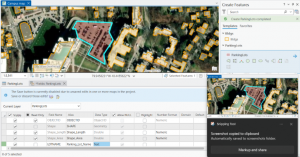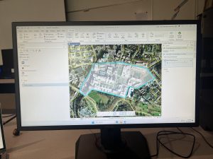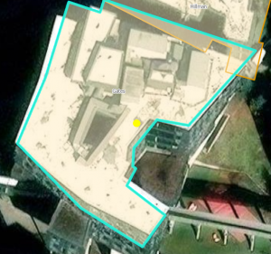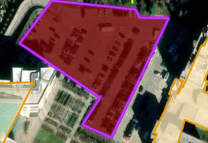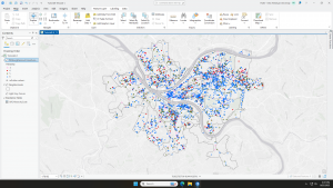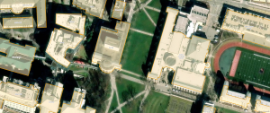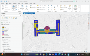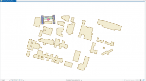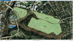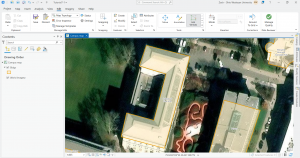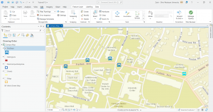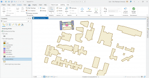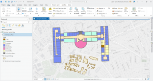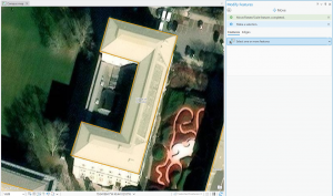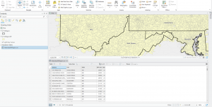

 Chapter 7: This chapter briefly went over how to modify and edit maps. While this chapter didn’t provide super important information, it was still very helpful. It gave me background on how to scale and move polygons within the map. Essentially, this chapter helped me design my maps to be more visually appealing. I only ran into a few problems within this chapter. One of them is my inability to split the buildings. I drew my shape around the building and double-clicked as instructed, but the two buildings in 7-1 didn’t split. It was interesting to apply polygons to not just buildings, but parking lots, and other features as well. This taught me how useful creating a digital version of it on the map can be. Another issue that I ran into was my inability to find the bus stop marker. I don’t think this is a big problem at all because I was able to use another symbol to mark the bus stop, but I thought I would note it. For future reference, it was good to learn that I have to import features from a downloaded building so that I can modify them.
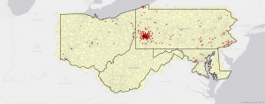
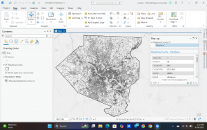
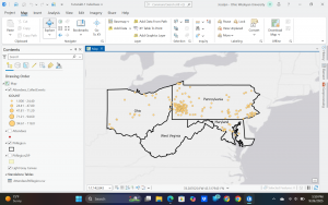
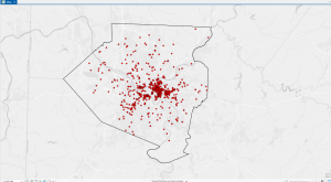
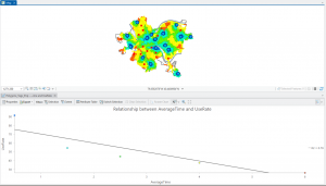
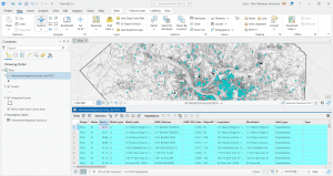
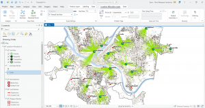
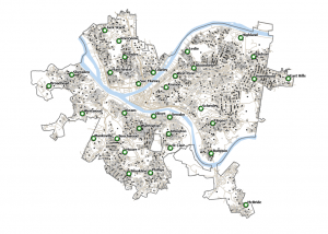
Chapter 8: This chapter was a little bit confusing to me. While I understood sort of what I was doing, I don’t think I could replicate it on my own or really explain how it enhanced the map. Something that the chapter talked about that I thought was really interesting was the Soundex key. This makes it so that if information is input in the map incorrectly, the system can assume what the user meant by matching it with similar items that are pronounced the same. This makes it so much easier for the map maker and provides more accurate data. Something that I didn’t really understand was how rematchi addresses work. I understand that you can change the information to be correct zipcode-wise, but in one of the steps, the book had me pick a random place on the map to rematch an address, which didn’t make any sense to me. Something that was useful was learning how to organize the data using graduated symbols. Instead of having to input the symbols one by one, the system was able to connect the zip codes with each other and assign them a symbol on its own. Towards the end of the chapter, it does a better job of explaining how this can be used for marketing tactics. This makes it a little easier for me to understand how this can be used. However, I have a question of why it has to be so specific. Wouldn’t you be able to apply the same marketing tactics with the information that the system estimates? Also, wouldn’t you be more focused on zip codes than rectifying street names?
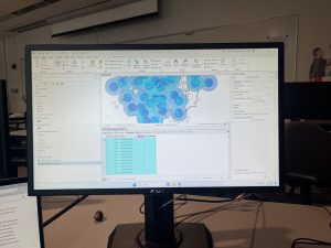
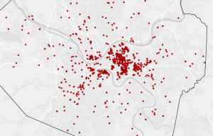
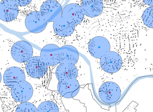
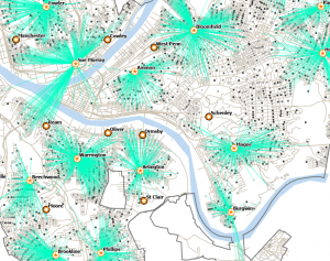
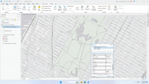
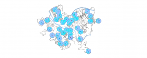
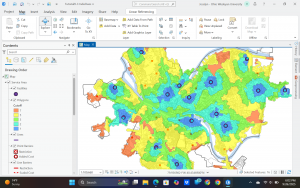
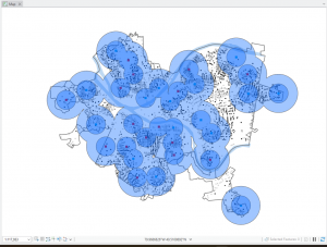
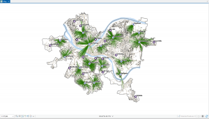
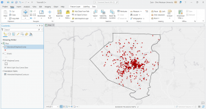
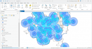
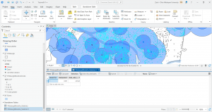
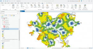
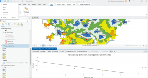
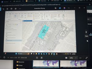
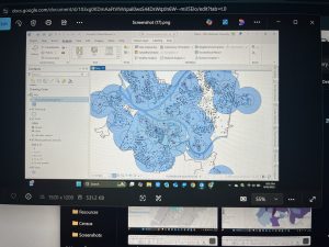
Chapter 9: This chapter provided insight into how to label areas based on how close they are to the things surrounding them. It provided how far certain people might be from an attraction and how that impacts whether they go to one attraction vs another one that might be a different distance away. You can do this by creating a buffer around the attraction and seeing how many people fall into the buffer. Something that I thought was super cool was that you can vary the size of the buffer and create multiple buffers with varying distances. I ran into a bit of a problem with the last part of 9-3. In this section, when using the spatial join tool, the author tells me that the information might not be available and that I have to lengthen the tool pane in order to see it and input it into the data. I looked around for a little bit, but was not able to find a way to lengthen the tool and select the data that I needed. The chapter went over how to create a spider graph out of specific locations. While I see how this can be useful when needing more accurate data, I prefer the buffer tool because it provides an image that is easier for the viewer to understand. In 9-5, it was super cool to see the patterns of people who commit crimes and where they commit them based on their age demographics.