Chapter 4 we learned about working with spatial databases and databases in general. A database is a container for the data of an organization, project, or other undertaking for record keeping, decision making, analysis, or research. A file geodatabase is ESRI’s simplified database for storing geospatial data. Although geodatabases have a simple format, they are powerful spatial data containers and they allow data tables to be related and joined.
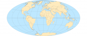
Chapter 5. Starting with working with world map projections. Geographic coordinate systems use latitude and longitude coordinates for locations on the surface of the Earth, whereas projected coordinate systems use a math transformation from an ellipsoid or a sphere to a flat surface. Next we gained experience with projections commonly used for maps of the continental US. You can either get accurate shapes and angles or areas but not both. After that setting projected coordinate systems came next. For medium and large scale maps use localized projected coordinate systems specifically tuned for a defined area to minimize distortion. Next, we worked with vector data formats which is essentially reviewing file formats commonly found for vector spatial data as well as geodatabases previously covered. Then we learned how to download geospatial data.
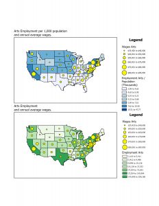
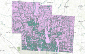
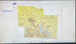
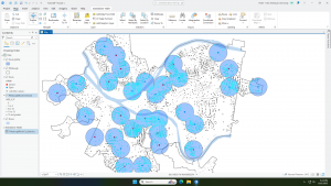
Chapter 6 geoprocessing is a framework and set of tools for processing geographic data. You must use geoprocessing tools to build study areas in a gis and perform tasks. We learned how to extract a subset of spatial features from a map using attribute or spatial queries; aggregate polygons into larger polygons; append layers to forma single layer; and use intersect, union, and tabulate intersection tools to combine features and attribute tables for geoprocessing.