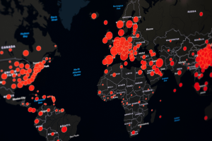
The first thing Chapter 4 introduces is mapping densities. Mapping densities is what allows you to look at patterns over areas rather than individual features. In the examples, it includes an area map and uses different shades of red to show each density and the space it covers. Another example used the same shades of red but put the colors within county lines to measure a census track. It shows examples of how you can either map density in defined areas or by density surface. For a defined area, you would use a dot map; and for density surface you utilize the GIS raster layer described in the previous chapters. While continuing learning about GIS, one thing that interested me was how GIS is similar to a choose your own adventure. There are so many different types of maps, and values to show that each requires their own process and customization. Each GIS is completely unique depending on what can best show your information. This was especially true for densities when the chapter included a chart of what to do depending on what density you are graphing. Another interesting piece of this chapter was the description of what the software does when graphing density. I enjoyed the inclusion of the image showing GIS creating a radius around the specific cell center to then create a smooth surface of the density amount. The cell size changes based on how detailed the pattern will appear on the map. It also showed how you can use contour lines to specifically show the rate of change within the data. Another interesting feature that surprised me was how much math GIS uses. I imagined it to be more similar to coding, rather than having different equations that it has shown in these first few chapters.
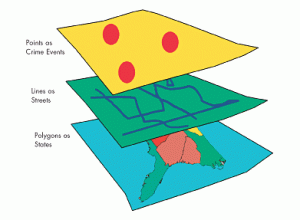
The focus of Chapter 5 is to map inside an area to monitor what is occurring inside of it. To do this you have to either draw a boundary line on top, use an area boundary (selects or summarizes features inside), or combine the boundary and features. With this, it explains you can include multiple areas so you need to determine how many you have. The chapter gives lots of examples of both single areas and multiple areas and shows what the final product could look like. The inside data can be categorized as either continuous or discrete features. The continuous features being seamless, geographic phenomena, and discrete being unique, identifiable features. You can also graph the information in either a list, count, or summary. It also lets you use lines to show specific features within the boundary lines. Similarly to the last chapter, I think it is fascinating to see all the options and examples of how to customize the map being created. This chapter also explains that there are three ways to specifically find what is inside. The first way is through drawing areas and features which is good for seeing one of few features inside or outside a single area and is made through a dataset containing boundaries and the features. The next method is selecting features inside the area which is good for getting a summary of features within an area and is created through a dataset of the areas and specific attributes. The final way is by overlaying the areas and features which is good for finding how much of something is in one or more areas, and is created by having data containing the areas, a dataset for features, and any specific attributes. From what I read, the third option is basically a combination of the previous two. This chapter also goes into detail about the calculations behind GIS and how you can find the mean, median, and standard deviation of the data being graphed. It also allows you to overlay the areas and features explained to create more complex models.
Rather than finding what is inside, Chapter 6 is all about finding what is nearby. The main purpose of mapping what is nearby is to find out what is occurring within a set distance of a feature and what is in traveling range. To start, you have to measure what you consider near through distance or travel cost. While distance measures specifically how close something is, cost is a way to measure without distance. One common cost is time, money, or effort expended, which all together equal travel cost. When measuring distance, you have to be specific about whether it is over a flat plain or using the curvature of the Earth. This also is started by determining whether you need a list, count, or summary. One thing I am noticing after reading up to 6 chapters is the patterns in GIS. While each different type of map and feature appears to be confusing and different, oftentimes the processes are similar and involve the same steps and decisions. When determining how many distance or cost ranges to include, you can include inclusive rings or distance bands. Inclusive rings show how the total amount increases as the distance increases. The example it used to help clarify was that you can use the rings to see the number of customers within 1,000 feet, 2,000 feet, and 3,000 feet, and note how the number increases. Distance bands compare distance to other characteristics. This example was that you could find the number of customers within 1,000 feet, the number between 1,000 feet and 2,000 feet, and the number between 2,000 feet and 3,000 feet. Distance bands can basically split up inclusive rings to find more specific data. Similar to finding what is inside, there are also three ways of finding what is nearby! These include straight line distance, finding the area of surrounding features within your selected distance; distance/cost over a network, specifying distance or travel cost along the linear feature; and cost over a surface, a new layer showing the travel cost from each source feature. Like the last chapter, I found it helpful that this one also includes a graph explaining what each one is used for and the pros and cons. This reading goes into specifics over each method and includes lots of images and examples to make it easily understood.