GIS Tutorial for ArcGIS Pro: Chapter 4
I felt as though understanding the following chapters was easy, and I feel like the knowledge from last week carried over so that I knew what I was doing. After going through and reading Chapter 4, I completed Tutorial 4-3, which covered how to focus on attribute queries and how you can change them. The first two tutorials also went over this topic, which I found to be interesting. I didn’t know that you were able to change the coding so it displayed something else, and learning that was neat. The other tutorials also went over how to examine different tracts, which was helpful for the next chapters.
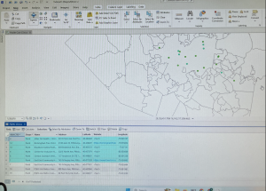
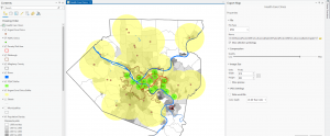
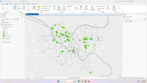
Personally, Tutorial 4-3 was interesting and it taught me how to do new things. For example, the Select by Attributes button was used a lot during this tutorial and the others, which I thought was neat. It allowed me to get more comfortable with the Symbology pane as well, and it had me change the colors of a few things as well. I did have a little trouble going in and changing the parameters for the Select by Attributes, but it just took some getting used to. I also liked how it eventually narrowed it down to who committed the crimes in specific areas!
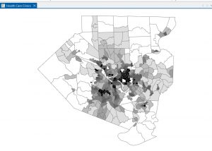
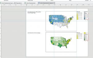
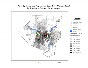
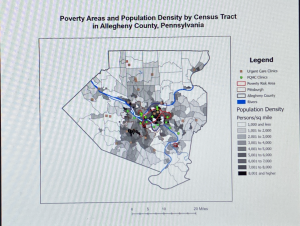
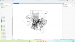
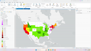
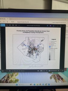
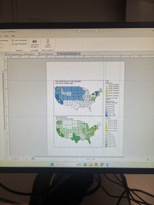
A general question I have is about the SQL toggle button – what does that stand for? I may have accidentally blipped over that part. However, I like when we can take the map and segment it into different parts using streets, types of crime, or even counties. It helps me understand how everything is supposed to look. Using the Hierarchy tab was cool and I know that will be helpful for the final exam as well. We also learned how to change the symbol, in this case it was crimes, and that was helpful to know as well. I feel like I was able to understand the key concepts of this chapter well. I have attached a screenshot of my work throughout this chapter.
GIS Tutorial for ArcGIS Pro: Chapter 5
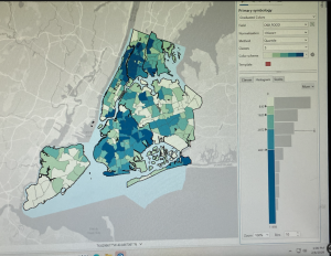
Chapter 5 involved a lot of maps, coordinates, vectors, and spatial data. I liked this chapter the most so far, I think just because it involved maps and the world, which was cool to me. I completed Tutorial 5-1 and 5-3 in order to expand my knowledge on how to change the parameters on a map. The most confusing part of this chapter was going through and looking at how the data was displayed in the Properties tab. There were a few instances in which we were instructed to change the coordinate system, and for some reason my project didn’t like that part. It took a couple tries for it to take, and eventually it did, but I feel like it helped me learn the concept a little more.
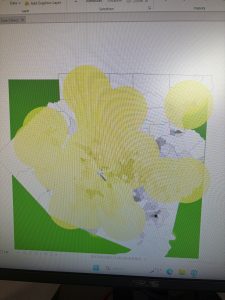
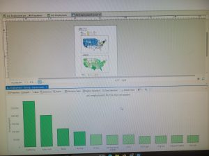
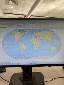
Tutorial 5-1 was focused on world map projections, and we had to zoom, look at coordinates, and then change the coordinate projection. I had already learned to zoom from a different chapter, and that part was easy. It was cool to see how the map would change based on what projection we were using, and how the latitudes would change with that as well. It was a really short tutorial, and it specified that we should not use the Robinson projection for anything but the whole world, which is a helpful tip. I attached a screenshot of my Robinson projected map, which was after we zoomed and changed it to something else.
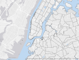
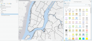
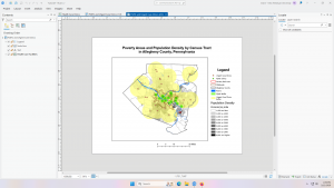
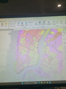
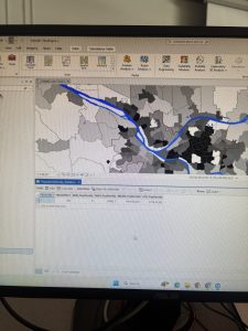
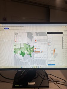
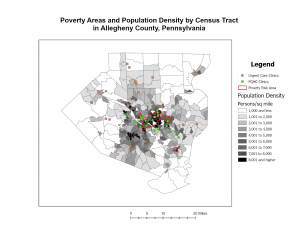
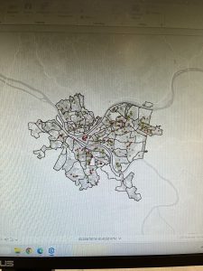
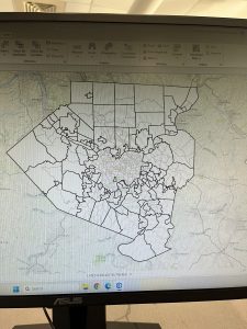
Tutorial 5-3 involved changing and setting the projected coordinate systems. I thought this was fun, and I enjoyed going in and changing the different settings. I also liked how we went through a different website than normal and we could choose a specific place to look at. This was for Allegheny County and represented the municipalities and tracts of that county. We had to go through and search in the Chapter 5 data on the hard drive, which wasn’t too difficult. I had a little trouble changing the color of the county from purple to white, but I was in the wrong section. I felt as if this chapter was very informative, and I have attached another screenshot of my work through this chapter.
GIS Tutorial for ArcGIS Pro: Chapter 6
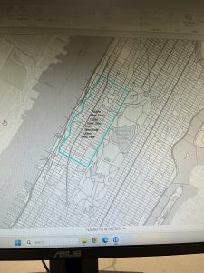
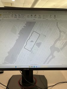
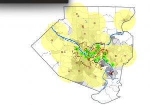
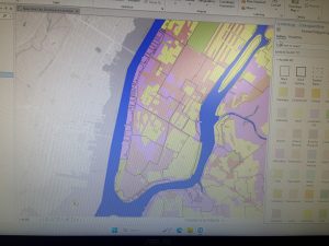
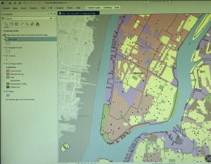
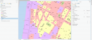
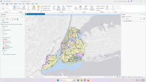
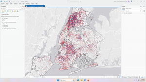
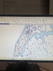
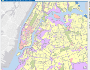
Chapter 6 was cool! I liked how specific we got into the details on an area of a map. One of my favorite parts was merging the water features into a large one. We continued the use of the Attribute Table and added a new tool, which was the Pairwise tool. It has different functions, and it took me a while to find it. I was able to use it to define specific battalion areas in Manhattan and New York City. The tutorial I found the coolest was Tutorial 6-2, which focused on extracting and clipping areas to study them. This one was located in the Upper West Side.
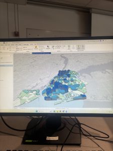
Tutorial 6-2 allowed me to use different tools than what I have been using, and also to combine those tools with the Select by Attributes tool. It was neat how I was able to go in and manually select neighborhoods surrounding the Upper West Side that were not selected with my Pairwise tool. It was also helpful to learn how to save the data into the Chapter data on the hard drive itself; I feel like that will be useful for our future projects. I liked how we were able to single out a specific neighborhood out of a very large area, and decide what aspects of it we wanted extracted and what aspects we wanted clipped.
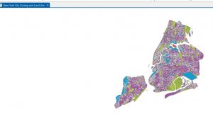
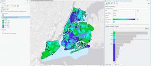
Merging the waters, the firehouse and police stations, and using Union were all aspects that stood out to me in the continuation of the chapter. It was really important to note that the Calculate Geometry Attributes was helpful in this section. Although these tutorials are not super long, I found that they are in-depth but easy to understand as long as you take your time. One of the general things I have enjoyed learning is how we can take something very small, such as the Disabled Person Fire Company Study, and extract it out of a much larger map. I have attached a screenshot of my work throughout this chapter.