I HAVE ALSO AWARDED ALEX AN HONORARY PHD IN ORGANIZATION AND COMPLETION STUDIES. CONGRATULATIONS.
JOHN B. KRYGIER, PHD
Geography 291: Geospatial Analysis with Desktop GIS
Module 1: 1/14/2026 to 3/3/2026, OWU Environment & Sustainability
I HAVE ALSO AWARDED ALEX AN HONORARY PHD IN ORGANIZATION AND COMPLETION STUDIES. CONGRATULATIONS.
JOHN B. KRYGIER, PHD
Chapter 4 of the ESRI book is about the usage of density maps to find patterns among features and between different locations. Density maps are good for showing things like population per capita, and what a map represents changes when density is calculated. My immediate thought/comparison was that this is how elections are manipulated. Another way density can be altered is by mapping features or values within the features, which also changes what viewers will see. Mapping with dots shows the features themselves, and patterns can be found in the clusters of dots. Then you can add layers that show feature values, which could show different relationships than just what the dots represent. Another useful way to show density is to shade defined areas like counties or cities with lighter and darker tones to show the density of a feature or population within. Using dots, though, seems to be more useful for seeing patterns at a glance and is kind of aesthetically pleasing but looks like it requires a lot more messing with to get a good result. Then, there’s more explanation of making the raster layer around the dots, and finally a bit about using contours which looked a lot like a classic topographical map to me. Also, I’m not really sure how the centroids in defined areas work, or what the use of mapping them first is? I think that might have just been an image to show how the calculation is made. The chapter’s explanation of how different shapes and ways of layering discrete features helped me understand how shaded surfaces are useful, and they seem to work best in combination with other layers.
Key Terms:
-Defined areas
-Contours
-Density Values
Chapter 5 concerns mapping features and values inside of other shapes which can be defined loosely by the map maker, by natural boundaries, or administrative/county ones. Mapping what’s inside one area shows the viewer patterns within, but mapping features within multiple defined areas allows for the areas to be compared. Now, I’m starting to understand the usefulness of vectors vs. rasters and how rasters can be used for showing continuous values, classes, and categories, the latter being a classic elevation map and all three showing natural boundaries. Then you have to decide what in the area you want to analyze but once you decide that it seems like the program kind of figures it all out. Once again it seems pretty intuitive to anyone who’s ever told a computer what to do, you just have to decide what you want it to do. You can draw or select an area, or overlay another one to choose the area you want to examine. As with other methods, the one with the least drawbacks takes more time and processing power. For overlaying, it works well and looks nice to shade the area you are looking at, like a watershed, and then parcels and features under it. It’s then up to you to decide if you want to examine only entire parcels within the area or the parts of parcels that touch it.The examples here are where I really start to see the layering that was described in the first reading. GIS can then be used to calculate values within the chosen area. The section on overlaying features gets more in depth with this, and refers back to a lot of the density based calculations in the previous chapter.
Key Terms:
-Drawing
-Overlaying
Selecting
Chapter 6 is about mapping distances and objects surrounding a feature. Often, this is used for things like travel time. As someone without a car I think it would be interesting to map things like easiest bus routes to and from a location. The book mentions travel distance displayed in geometric patterns in things like roads, which would suit that perfectly, and mapping roads by travel times which could be adjusted for any form of transportation. An important choice here is the choice between showing distance from a feature or mapping out travel costs, and cost would be especially useful for bus riders. Then you once again have to choose an area and whether you need a list of parcels or features, a count, or a statistical summary. The area can be a straight line (radial) distance from a feature, a network of linear features like roads, or a continuous raster. The straight line doesn’t give any information about travel times, the network distance requires roads, and the raster requires more planning and data. Also, the concept of buffers around things like roads and streams might be a good use for one of my project ideas for 110. The chapter then goes back to the concept of ranges to make the data more understandable by using cost layers.I appreciated the note that cost can be money, time, or effort. That’s ART GIS, and the idea of layers and specifically a mask layer to remove areas from the data feels very photoshop coded to me. This might be a bit of a tangent and unimportant but the maps in this chapter were cool looking, and on that note with the program, I still appreciate that it does the hard math for you.
Key Terms:
-Straight Line Distance
-Network
-List, count, or summary
Chapter 4: Mapping Density
Mapping density helps see patterns of where things are concentrated when mapping areas vary greatly in size. It allows you to measure the number of features using a uniform areal unit (hectares, sq miles). You can map density features( ie locations of businesses) or feature values (# of employees at each business).
Compare methods:
Map density by area:
Create density surface:
Mapping density for defined areas
This section goes through the steps to calculate density for a defined area. It gives example calculations. The GIS can calculate the density for you and shade each area it needs. Then this goes into how to create a dot density map in detail. THe GIS divides the value of the polygon by the amount represented by a dot to find out how many dots to draw in each area. Dot maps are used to get a quick sense of density in a place and represent density graphically. You can compare areas by using GIS to summarize features or feature values for each polygon.
Creating a density surface:
Density surfaces are created in a GIS as raster layers. They are used to show where point or line features are concentrated. GIS defines a neighborhood around each cell center and then totals the # of features that fall within that neighborhood and then divides that # by the area of the neighborhood. It then creates a running average of features per area which then creates a smooth surface. Parameters such as cell size, search radius, calculation methods and units are used to specify how GIS calculates the density surface.
Density surfaces can be displayed using graduated colors or contours and are displayed using shades of a single color. Higher values are shown using darker colors. Contour lines connect points of equal density value on the surface, and show the rate of change across the surface. The textbook then goes into detail about how to look at the results depending on how you created the density surface.
Chapter 5: Finding What’s Inside
This chapter focuses on whether an activity occurs inside an area or summarizes info for each of several areas to compare them. It is important to map what’s inside so you can know where or not action is needed. To define what is inside you have to draw an area boundary on top of the features. Single areas allow you to monitor activity about one place and can include a service area around a central facility, a buffer around a feature, a natural boundary, or a manually drawn area. Multiple areas include contiguous, disjunct, or nested. Features can be discrete ( unique and identifiable) or continuous ( represent seamless geographic phenomena). These were both terms learned in chapter one. By now the chapters are starting to connect and make more sense. There is some information needed to form your analysis which can include a list, count, summary, or sum of the data. This chapter outlines three ways to find out what is inside and lists the best way to choose each method:
The chapter then outlines the best way to make the map for each of the three methods. The last part of this chapter discusses using your results to display and analyze what you have looked at using tables that list the areal extent of each category in that area of study. When using a raster, GIS takes care of the table for you but if you are using vectors, you have to summarize the category values for each area. This section discusses the methods to help do that. It then talks about looking at single vs multiple areas and single vs multiple categories.
Chapter 6: Finding What’s Nearby
This chapter focused on seeing stuff within a set distance of a feature in order to monitor events or activity. It is important to map what is nearby to figure out what is happening with a certain distance that you measured. This chapter then goes into detail on defining your analysis which means figuring out what is nearby by measuring a starting line distance, measuring distance or cost over a network, or measuring a cost over a surface. Similar to chapter 5, when you identify the nearby features, you must then determine what info you need including a list, count, or summary . This chapter then highlights the three ways you can find out what is nearby and they include:
The chapter then discusses choosing the correct method for what you are trying to achieve, how to make a map. It discusses creating a buffer using the straight line distance method where GIS will draw a line around a feature at the distance you tell it to and see what information is within it. GIS can use boundaries either manually which is more flexible, or having the GIS do it which can draw either a compact or general boundary. It talks about what a cost is (can be time, money, or other measured source) which is calculated by specifying the layer containing the source features and a second layer that has the cost value of each cell. For each method it discusses the processes of making a map and the features that are important to the process. Chapter 6 felt like it tied a lot of the concepts we learned in earlier chapters together.
Chapter 4 – Mapping Density
This chapter focuses on map density which is useful when it comes to figuring out the location or concentration of an individual feature to figure out where lost reside. This can turn data into a visualization on a map.
Chapter 5 – Finding What’s Inside
This chapter focuses on spatial selection and overlay analysis. This is a fundamental task in GIS that allows you to identify parts of features that fall within a boundary.
Chapter 6 – Finding What’s Nearby
This chapter focuses on proximity analysis, a set of tools that help you figure out the distance or travel cost from a feature.
Mitchell- Chapter 4
Why Mapping Density?
Deciding What to Map
Two Ways of Mapping Density
Mapping Density For Defined Areas
Creating a Density Surface
Mitchell- Chapter 5
Why Map What’s Inside?
Defining Your Analysis
Three Ways of Finding What’s Inside
Drawing Areas and Features
Selecting Features Inside an Area
Overlaying Areas and Features
Mitchell- Chapter 6
Why Map What’s Nearby
Defining Your Analysis
Three Ways of Finding What’s Nearby
Using Straight-Line Distance
Measuring Distance or Cost Over a Network
Calculating Cost Over a Geographic Surface
Chapter 4:
This chapter is about mapping Density which reveals where certain features are concentrated. It does this by standardizing values by area to make the comparisons a lot clearer. This is especially helpful when you are working with larger data sets like censuses and crime reports. Before creating your own density map, you should make sure you know what feature you are mapping so you can reveal the proper patterns and information that you are looking for. One of the methods to track density uses defined boundaries and includes dots for tracking or has that area shaded based on the density of what you are measuring. The second method uses a continuous density surface and includes a spreading feature that shows change over time and to highlight hotspots. Area based mapping methods are pretty simple and are very useful for unit comparisons. Density surface mapping which uses more statistical information that helps to show detailed patterns. Overall, both methods to mapping and tracking the concentration of information are very helpful to highlight trends.
Chapter 5:
This chapter is about what is inside an area which can help to reveal to see if certain features occur in said area of interest. This use of GIS is extremely useful for monitoring different activities within a certain area and comparing areas based on what is inside. There are a few things that you need to identify before using this method, one of these things are discrete locations, roads, and areas. You also need to identify continuous features such as categories and values of this area that you are looking into. When looking at an area and analyzing it, there’s three methods to do so. One of these methods is drawing areas and features which gives you a simple and quick overview of the boundaries. The next method is by selecting features within an area, this allows you to look at lists and counts of features within your data sets. This allows you to see the overall statistical view of your desired area. The final method involves overlaying areas and features, this combines the boundaries into new data sets and calculates summaries for that overall area. This method works with multiple areas and it’s most detailed, but it also requires the most processing out of the three methods. Overall one of the highlights of GIS is using it to see data and change over time within an area and there’s many ways to do that effectively.
Chapter 6:
This chapter is all about using GIS to find what’s nearby when looking at a map. The purpose of doing this is so that you can monitor events to find certain areas and identify groups of specified data sets. You can also see what’s in a certain distance of the features that you’re interested in looking at. When defining the analysis, nearness can be measured in two ways: straight line distance which is a simple area of influence or network distance which might be the amount of time it takes to get to a certain place that you are mapping. There’s two types of methods when looking at the nearness of an area: there’s planar which is when you’re looking at small areas like a city or county, and there is also geodesic which is a larger scale region or even a global analysis. As we learned before some of the results that we can see are lists counts and summary of statistics.
Chapter 4: Chapter 4 talks about map density and the importance of it. Map density is useful when mapping areas on a census or in areas in which vary greatly with size. It explains that in order for you to map density you use shades and the denser a population of whatever it is that you are mapping the darker it is. This chapter explains the differences between map features and feature values explaining t hat essentially the feature is what something is and the feature value is kind of like an adjective for the feature where it is just something that further describes the feature. It explains a couple of ways in which you can map density, the two ways in doing so are mapping density by defined area and mapping density by density surface. The density by defined area is used by mapping dots on the map and is largely considered to be less informational than mapping by density surface which uses blob type images. This chapter explains that you can compare areas to find something that reaches the goal of your map. One major thing this chapter tells you how to do is create a surface layer. These surface areas show you where about the points or line features are concentrated on the map that you are creating. It explains that the GIS calculates density by taking the cell size, search radius and units into account when mapping.
Chapter 5: This chapter explains the reasons in which we map the contents of the area in which the map is surveying. This is helpful regardless of if you are mapping single areas or many different areas at the same time knowing what exactly it is that your map is showing is extremely important. When you are defining what it is that lies within the mapped territory it is important that you summarize the information that you need and/or combine your map features with the area boundary and that in itself will create a summary of your data. Your data will consist of what? That is an important question before you summarize. What features are going to be in this map, what is it that is important for the audience to know? Another question that you will have to ask yourself is, are you features that you have created due to those data points going to be discrete meaning that they are unique and can be easily identified, or continuous which is a seamless representation of that data with no specific point? After you have asked those questions you will need a list, count, or summary to get an idea of what is inside of the area you are going to map. It explains whether or not you want to show feature of your map that are partially outside of your focused area or whether you would just map partial features like portions of rivers and other large features that could span a large area.
Chapter 6: This chapter explains that you should also map what is nearby your specified area this is because it is nice to know the travelling range to places. The traveling range to areas within your map are measured in distance, time, or cost. This is helpful for when you want to make a map that is explaining the distance from another feature the example in the book is streets within a three minute range of the local fire station. So for other maps that have that same type of purpose it is important to know how to calculate the distance of things from each other and the distance between features on your map. You can define distance or nearness based off of a feature’s travel costs. Something that it explains is that your maps come out in a way that is presented as flat. So, your information will be slightly skewed just due to the curvature of the earth’s surface. So the maps will contain something of a straight line distance which you get from specifying your distance and source feature. This chapter also explains what a buffer is and how you use buffers in order to make your distances more accurate. Basically it has the GIS draw around your distance due to the buffer which leads to more accurate distances. These buffers also show features in which are close to or at least near more than one source of information on the line of distance. Once the buffer is placed you can use the buffer to select features that fall within it.
Chapter 4:
There were 5 key points for chapter 4 – why map density, deciding what to map, two ways of mapping density, mapping density for defined areas, and creating a density surface.
The reason that we map density is because it shows where the highest concentration of features is. It looks at patterns rather than locations and it’s helpful for mapping areas of different sizes. To map those areas, you have to shape them based on density value or surface. You have to look over what data you have and decide if you want to then map features or feature values.
There are 2 specific ways of mapping density. Those are by defined area or by density surface. You would use mapping by area when you have the data already summarized by area. You would use mapping by density surface when you have individual locations. This chapter specifically goes into those two kinds of mapping in a lot more detail including how they are used, the calculations needed and what the results could look like.
Mapping density for defined areas – you can make this in two ways. One is by showing density for each area graphically using a dot density map and the other is calculating a density value for each area and then shading based on that. An example of the calculation for that would look like this: pop_density = total pop/(area / 27878400). It also dives into how you would create that dot density map.
Creating a density surface – these are created by GIS as raster layers. It helps show where point or line features are. There are a few things that go into calculating density surface, which include cell size, search radius, calculation method, and radius. The chapter goes over each of those parameters and what they do. To display a density surface you can use things such as graduated colors and contours.
Chapter 5:
The main topics of chapter 5 were why map what’s inside, defining your analysis, three ways of finding what’s inside, drawing areas and features, selecting features inside an area, and overlaying areas and features.
As for why we map inside, it is to help monitor what’s occurring inside it, or to compare several areas. This is important to know whether or not to take action. In order to do this you have to draw a boundary on top of your features to define the analysis. You can find what’s inside of single areas, or several areas. The chapter then goes into more detail on those two. And another important thing to figure out is whether or not they are discrete or continuous features.
When looking at the information you need from your analysis, you’re going to want to find out if you need a list, count, or summary. You then need to see if the features are completely or partially inside.
There are 3 different ways of finding out what’s inside – drawing areas and features, selecting the features inside the area, and overlaying the areas and features. All of which this chapter goes into more detail about. It also goes over different guidelines that will help you choose the best method and how to make those maps. Look at locations and lines, discrete areas, and continuous features.
When using your results there are a few things to look at – counts, frequency, and a summary of numeric attributes. This chapter also goes into a lot of detail on overlaying areas with features including what GIS does, how you would use them and what results you could get out of that. It looks at continuous categories or classes as well which includes a couple different methods: the vector method and the raster method and what the difference is between the two, as well as which one you should use.
Chapter 6:
The main topics for chapter 6 included why map what’s nearby, defining your analysis, three ways of finding what’s nearby, using straight-line distance, measuring distance or cost over a network, and calculating cost over a geographic surface.
In terms of mapping what’s nearby, this is important because GIS can help find what’s occurring within a set distance. You also need to define your analysis and determine whether or not it’s by distance or by travel to or from a feature.
Knowing what information you need is super helpful in creating the best method for your analysis. You can get a list, count or summary and each has their own benefits. Inclusive rings and distinct bands are useful in this as well.
There are 3 different ways of finding what’s nearby – straight-line distance, distance or cost over a network, or cost over a surface and the chapter goes into detail for each of those regarding what they are used for and the pros and cons of each.
Important information for straight-line distance: creating a buffer, getting the correct information which also involves finding features for multiple sources and several distance ranges and making a map.
Important information for features within a distance: getting all the information and again, selecting features near several sources and distance ranges and making a map.
Important information for feature to feature: specifying a maximum distance, getting the information, and making the map. Color coding is used a lot when making maps.. You can use it by distance or source and you can also use things such as spider diagrams and graduated point symbols.
The chapter goes into how to create distance surfaces which is something that has been touched on a few times within these past few chapters. You have to create distance ranges and then decide if they are discrete or continuous. Specifying maximum distance and multiple source features are also important.
When measuring a distance or cost over a network, you want to specify a network layer and use GIS to help you. To assign street segments to centers you can use distance or cost and for setting travel parameters you need to specify turns and stops. It’s important that if you have more than one center, it is specified by GIS. Once GIS has identified the segments, you can find out what’s covered in those segments, including using boundaries and summing as you go.
Lastly, for calculating cost over a geographic surface, it’s important to specify the cost by creating a cost layer. You can modify the cost distance and use barriers to get all the information needed.
This chapter explores various methods for mapping density and how the choice of method can significantly affect the way data is interpreted. Mitchell shows how changing what you map—like workers vs. businesses—can drastically alter the message of a map, which surprised me. He explains the differences between dot density and shaded density maps. While dot density helps compare specific locations, I personally prefer shaded maps since they’re less overwhelming and easier to read. Dot density can also be misleading, as the dots are evenly spread rather than indicating exact locations, and they can get lost in maps with complex boundaries.
Mitchell also discusses density surfaces vs. density areas—concepts I grasp generally, though I still find their differences a bit unclear. He introduces how to calculate density, which I understand in theory but feel I’d need to practice. One fascinating aspect of GIS is how it layers data to create richer, more detailed maps. Small elements like cell size, search radius, calculation method, and units all influence how a map looks and performs. That said, I’m still confused about the difference between areal and cell units, even with the example maps shown.
This chapter focuses on mapping specific areas and identifying what features fall within them. Mitchell explains how drawing an area over existing data can help with comparisons. He also covers discrete vs. continuous features—I found continuous features a bit confusing since they change over time. Do they need constant updates, or can you only include them at a single moment?
I found it interesting that you can mark either partial or whole parcels in an area. Mitchell highlights how GIS handles many complex calculations for you, especially when creating overlays. He also explains how to layer data differently to get specific results, and how frequency can be shown with both maps and charts. One unclear part for me was how lines are handled when they cross multiple areas—Mitchell mentions GIS splitting them into new datasets, but doesn’t explain it much.
This chapter is about mapping features within a set distance, especially for travel and travel cost analysis. I get the overall idea, but the details—like accounting for turn times, traffic lights, and stop signs—seem tedious and a bit overwhelming. Mitchell briefly mentions turntables for displaying this data, but doesn’t go into enough depth for me to fully understand.
He also introduces inclusive rings to show areas at different distance ranges. I’m curious if these require remaking the map each time or if there’s a faster method. A tool I found useful was buffering, which highlights features within a distance without adding a border. Another method he shows is the spider diagram, which looks cool but gets messy on larger scales. A particularly helpful application is mapping locations within a certain travel time—useful for businesses analyzing customer accessibility.
Chapter 7. 7-1. This chapter focuses on polygon data, such as how to make and edit polygons. To move an existing polygon, use the select tool, then go to the edit tap and select move, you can then freely move the polygon around, when it’s in the correct position click the green checkmark. To edit an existing polygon shape use the edit vertices button under the edit tab, then add points where you want to make changes then drag the highlighted areas to create the desired shape. To split a polygon use the split tool.
7-2. This section teaches us how to create and delete polygon features. To create a polygon use the create feature class tool, and select polygon as the geometry type. To draw the polygon, go to the edit tab and select create and then the layer you want to work with. Using the line function draw the outline of the polygon and double click the last vertices to finish drawing the polygon. To make a polygon transparent select the layer then click feature layer and then in the effects group type in your desired transparency level. As you create polygons it is automatically added into the attribute table for that layer. To delete polygons, use the select feature, click on a polygon and then use the delete button in the edit tab. To snap a polygon to something such as a street use the snap function in the edit tab and then click create to make a polygon.
7-3. This chapter is about using cartography tools. We used the smooth polygon tool to take away the edges on a polygon.
7-4. CAD’s or computer aided drawings are often used in conjunction with GIS to display where something is and the interior of it, such as an academic building. CAD drawings cannot be edited directly so the data needs to be exported as a feature class. The new layer that was created converted polygon data to polyline, so the apply symbology from layer tool to import symbology to the polylines. To select the whole CAD layer, right click the feature in the contents pane, then go to selection, and select all. To merge the CAD layer to the actual feature layer, use the modify button in the edit tab. Then select Similarity 2D, then add new links. You then add points on the corners of the CAD layer and then on the corresponding concerns of the actual layer. Then when you are done click transform in the modify features pane.
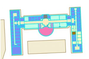
CAD layer on top of the actual feature layer.
Chapter 8. 8-1. This chapter is about using geocode data. This is in essence features that have been assigned a name or value by a human, it is then matched with data that is present online or from a database. To start creating a geocode of zip codes, use the create locator tool, and import your data, select zip for the role, then for *ZIP select GEIOID10. This creates a locator in the catalog pane. To turn it into a geocode find the locator in the catalog pane, right click it and go to properties, then geocoding options, then match options. Use the geocode address tool to create addresses using your locator, this generates points on the map. To rematch data, you can go to data for the layer, then click rematch. The collect events tool is useful for counting the number of features in a layer and generating graduated symbols for said feature.
8-2. When using a geolocator, it is possible to alter the accuracy of the algorithm. In this section we set the min and max values for accuracy to be 10. This resulted in points with low accuracy.
Chapter 9. 9-1. Chapter 9 focuses on spatial analysis tools. In section one we learned how to use buffers, which is just a polygon surrounding a map feature. To create a buffer around point data use the pairwise buffer tool, then if you want the output features to all be in the same layer set the dissolve type to be into a single feature. To calculate the frequency of points within a buffer select features that intersect the buffers and then calculate the summary of a field within the data table for your class of interest.
9-2. To create multi-layered rings, use the multipole ring buffer tool, and input your set distances. To measure data within those rings, use the spatial join feature so that the data from one layer can be summarized in the rings.
9-3. To determine distance as a function of time in arcpro, create a workflow. This is done by selecting the attributes you wish to work with, then in the analysis tab clicking on workflows, then network analysis, and service area. Once this is done select the class you wish to work with, in our case it was Facilities, then click on the service area layer ribbon, then in the travel settings select towards facility for direction. The cutoffs section is for the travel time. Click the run button on the left side of the tab to run your analysis.
9-4. This section teaches us how to use a network to create a model to show which public pools are located so that they achieve the optimal amount of attendance within a given range. This is done by creating location allocation in the network analysis tab. Then in the data group import the facilities that are going to be used, then import demand points. The demand points are essentially people that can potentially use the pool, this is how the model will draw lines later. In the travel settings group, select towards the destination for direction, then include the number of facilities you have in the facilities group. Once all information is entered, click run model (it also helps to hide the demand points).
9-5. Performing cluster analysis. Using the multivariate cluster tool, we are able to perform cluster analysis using multiple variables.
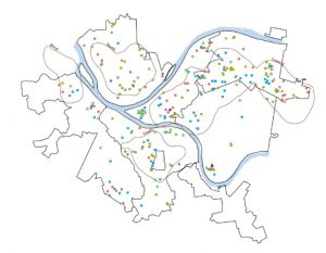
Multivariable analysis of age of arrested individuals