Chapter 4).
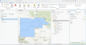
In this chapter we actively worked with geodatabases through which data can be stored, analyzed, and more. In specific terms we worked on storing feature classes and raster data. Data tables can be related and joined. Something important to remember is that attribute, field, variable, and column are interchangeable names for the columns of data tables, and record, row, and observation are interchangeable names for the rows in a data table. We worked to use a shapefile which is a spatial data format for a single point, line, or polygon layer. I included a screenshot of my work converting a shapefile to a feature class and the tools used.
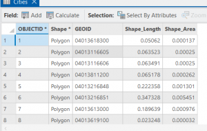
In 4-2 we worked on deleting, creating, and modifying attributes as a crucial part of processing and display of our data. I included a screenshot of modifying attribute tables, particularly delete unneeded columns. As you can see in the table, only the needed five attributes remain at the top.
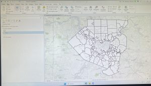
For 4-2, step 4, there was only one basemap showing activated in the contents pane, not two of them. I included the your turn work for 4-2 in which I worked to modify the attribute table first through working in the fields section of data design. I also modified an alias, particularly the name field and changed it to the alias of city. This is shown in my screenshot.
I extracted substring fields and concatenating string fields, calculating attribute fields, and sorting things around via the MaricopaTracts attribute table. There is a lot that goes on here and while I got through it no problem I don’t think I’ll be able to reproduce all of the steps right away. I think it is however super cool how we can extract parts of text strings and reassemble them into a new text field and calculate a range of values through precise expression inputs. In 4-3, I practiced carrying out attribute queries. The main function here is that essentially an attribute query selects attribute data rows and spatial features based on attribute values. There are simple and compound SQL criteria.
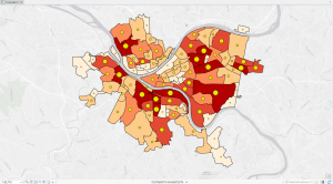
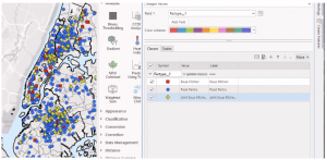
In 4-3, step 7 of the query a subset of crime types using OR connectors and parentheses section: All of my dots were staying that light sky blue color on the map even though I had burglaries as green and robberies symbolized correctly with a dark red. I had no problem with the subsequent your turn exercise in which I edited the query and symbolized the burglaries with a dark red. For the last my turn exercise in tutorial 4 in section 4-6, I tried to symbolize crimes by giving each crime a different symbol but it didn’t go too well I think because there was a null class that was showing. The map didn’t look visually appealing and was hard to read as the null symbol was covering everything.
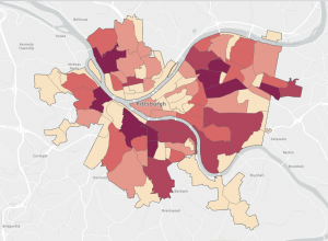
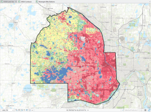
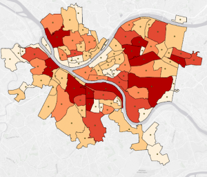
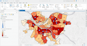
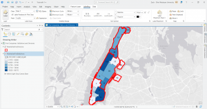
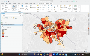
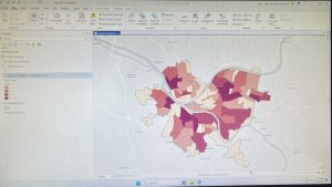
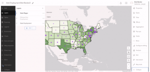
I included a screenshot of the your turn exercise for 4-4 in which I created a choropleth map using graduated colors. The reason the red dots are still present is because I was yet to turn off the crime offenses layer.
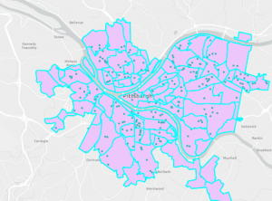
Graduated symbols for the next your turn exercise for the following tutorial 4-5 is below. I created a point layer with the output features class of BurglariesByNeighborhoodPoints and then symbolized things.
Chapter 5).
In the chapter five tutorial we explored sources of spatial data. We took a look into ArcGIS Living Atlas and both a US federal and a local data source. We worked with map projections and coordinate systems. I was unable to participate in some of the work in this tutorial as I am a strong believer in a flat Earth. Some really cool and meaningful questions come up in this chapter.
I was unable to do tutorial 5-2 step 3 of the section called set projected coordinate systems for the United States. I tried clicking the USA Contiguous Albers Equal Area Conic about three or four times and every time it would freeze my ArcGIS Pro and I would have to fully shutdown my computer to get anything to load again. I simply proceeded to the your turn exercise that followed. When I tried implementing the different projections to the US map the same thing occurred. Given this 5-2 tutorial was very short and I understood the main point, I just moved on.
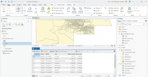
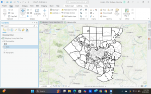
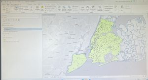
In 5-3, I added a new layer to set a map’s coordinate system and then I added a layer that uses geographic coordinates. I include a screenshot of this and the symbology work with the tracts and multiplies layers is also shown.
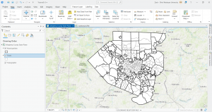
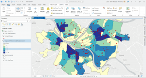
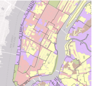
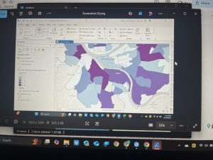
Tutorial 5-5 was super tough to get through and there were a lot of steps that required you to memorize and apply past steps and so I had to go back and remind myself but I got through it and the end result felt nice. As you can see in the screenshots below I joined data and created a choropleth map. I explored things by turning layers on and off.
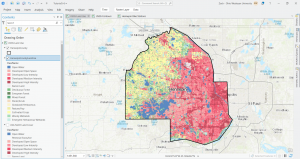
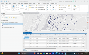
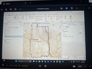
My next photo is from 5-6 where I was downloading geospatial data and extracting raster features for Hennepin County. There were a lot of technicalities and difficulties here too but with some time and going back to certain things for assistance, I was able to pull it through.
For the very last part of tutorial 5-6, in which I attempted to download local data from a public agency hub, there was NO option for bicycle count stations (step 2). I tried downloading the data for the Hennepin County Bike and Pedestrian System but this did not work well. I’ve included a screenshot of the results when I tried to access the data for bicycle count stations via the agency hub.

Chapter 6).
In chapter 6 we furthered our understanding of geoprocessing. We used geoprocessing in past chapters but we built on its capacity here. Something significant we did is we used intersect, union, and tabulate Intersection tools to combine features and attribute tables for geoprocessing.
I included a screenshot for the first your turn exercise where I dissolved fire companies to create battalions and divisions.
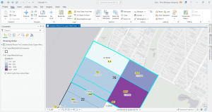
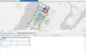
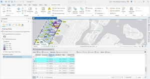
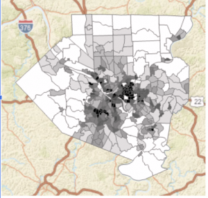
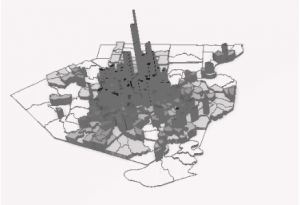
At the end in tutorial 6-7, I studied the usage of the tabulate intersection tool. I worked with some interesting maps that relate to real world matters through exploring tracts and fire company polygons. I then used the used tabulate intersection to apportion the population of persons with disabilities to fire companies. The screenshot shows a zoom to fire company 76 and the next displays the DisabledPersonsPerFireCompany table that I created after running the tool. The last thing I did in this tutorial was use the summary statistics tool to create a TotalDisabledPersonsPerFireCompany table. I like how these processes and the work we practice here can and are used in the real world for planning purposes or joined to fire companies for map creation. Overall, I am feeling a bit more comfortable with things, but there is still a decent amount of confusion and I consistently have to refer back to previous steps and chapters for support.
Start work week 5 for final assignment:
Steps 1 and 2:
Zip code Data Layer:
In 2003, the zipcodes for Delaware County were reworked. When evaluating zip codes, there is collaboration between the Census Bureau, the United States Postal Service, and the U.S. Treasurer’s office. It says this data set is updated as needed but does not give specifics. It says it is published monthly, I guess indicating that any changes will only be seen on a monthly basis.
Street Centerline Data Layer:
Ran by the The State of Ohio Location Based Response System. This is something I’ve never heard of before. Focuses on the center of pavement of both public and private roads. Some main functions are to assist emergency response teams, manage disasters, and even geocoding which we learned about this week. All fields are updated daily but 3-D fields are updated once a year.
Recorded Document Data Layer.
Involves record documents like annexations, vacations, or miscellaneous documents within the county. It says the data points show record documents within the county recorder’s plat books, cabinet/slides and instruments records. Not too familiar with these terms but above all, I have no idea what a plat book is. Can be helpful for locating lost or miscellaneous county documents.
Survey Data Layer:
Point coverage that shows surveys of the land within the county. The recorder’s office and map department manage survey points. Up to May 2004, GIS staff scanned the surveys but after 2004 the map department took over. Important for providing legal and authorized info about land features and boundaries.
GPS Data Layer:
GPS monuments in the ground or survey benchmark devices from 1991 and 1997. Why does it just include those established during these two years? I’m guessing this can be used for location data and important planning, management, and emergency services. Geographic patterns through GIS makes GIS even more powerful. I remember mentioning this in my post during week one I think it was.
Parcel Data Layer:
Includes polygons of the official boundary lines that define a specific plot of land within a public record. Public record geometries are managed by the DelCo auditor’s GIS office. Any changes made are managed by the county recorder’s office. Important for providing detailed information on land use, land ownership, and I read land value as well.
Subdivision Data Layer:
Managed by the county recorder’s office. Subdivisions mean that a large plot of land was divided into smaller parcels. The summary mentions condos as for example, a condo project can be a type of subdivision. Critical for urban planning, real estate, and governance at large.
School District Data Layer:
Shows all school districts within the county. Important for data-centered decision making to improve education and schooling circumstances, thus bettering students. I think this data layer is important for resource allocation and makes that distribution more equitable. Facilities of schools can also be managed effectively with this data.
Tax District Data Layer:
Shows all tax districts managed by the county auditor real estate office. Mentions that data is dissolved on the tax district code I guess meaning that data for a certain geographic area is done with or being merged due to an issue with whoever originally created the code. Important for municipal finance like billing and collection as well as property tax assessment. Can also be used for community planning and helping locals maybe understand what services they can get and whatnot.
Township Data Layer:
This layer shows the 19 townships within DelCo. It shows very clear legal boundaries. Important for tracking and defining property rights especially if there is a large land tract or agricultural tracts. Also important for understanding how the township plays into the administrative duties of local, state and federal levels of governance. Looking at township data can be super useful for infrastructure projects and development.
Annexation Data Layer:
Data all the way back from 1853 to the current day that shows the county’s annexations and conforming boundaries. Important for showing how boundaries change and helps with many government functions. Super significant for census and demographic data and the Census Bureau relies heavily on this data layer.
Address Point Data Layer:
Shows all certified addresses within the county and shows the location of the building’s centroid. Very helpful for reporting accidents or emergency situations. Has the capacity to reverse geocode a set of coordinates to provide the closest address which is highly useful for emergency response teams. I never really thought about this reverse geocoding but it is something that definitely occurs and is vital for say the police to find a suspect of the location of a crime.
PLSS Data Layer:
Includes the public land survey system polygons for the US Military and the Virginia Military Survey Districts of the county. I’m not familiar with these US Military the Virginia Military Survey Districts but I can assume the PLSS layer is crucial for government records and legal descriptions for like when property is bought or sold per say. I read that in some cases historical land division and ownership regulations of guidelines still impact modern day property lines and so forth.
Building Outline 2023 Data Layer:
Updated in 2023, this layer includes all the building outlines for all structures in the county. I think that this accurate representation of every structure is significant in general but I can see this layer being used a lot for urban planning considering the rise of urbanization as well as maybe things like smart cities or eco friendly cities.
Condo Data Layer:
All of the condominium polygons for the county. As mentioned earlier in the subdivision data layer section, a condominium project is an example of a subdivision so this is kind of redundant unless condos are something incredible and it gives insight into this. I understand if this is used to focus strictly on condos but I don’t see why it can’t serve the same purpose in the subdivisions layer unless I am missing something here.
Farm Lot Data Layer:
Again there is this involvement of the US Military and the Virginia Military Survey Districts of the county for this layer that shows all the farms. Critical for modern agriculture and land management, helpful for maybe the efficiency of operations. Can help farmers and can help improve land and resource management that helps the economy and everyone.
Precincts Data Layer:
Shows all of the precincts in the county. Helped run by the county board of elections. Helps to show and analyze voting patterns. This is important overall for supporting informed decision making in all election fields especially in the election and voting climate we live in today. Displays voting behavior and demographics.
Delaware County E911 Data Layer:
This is a major one used to contribute to the pursuit of accurate and efficient emergency responses. Provides emergency dispatchers with emergency location and gives these first responders significant geographic data. The summary of the layers describes that it gives a spatially accurate representation of all certified addresses so these 911 events are handled smoothly.
Original Township Data Layer:
Not much summary for this one but I guess it is used as like a legally-binding record for land ownership and administration and things like that. The layer description mentions that original boundaries of the county townships are shown. There is an indication that this layer is significant because these boundaries came before tax district changes modified their shapes and so forth.
Dedicated ROW Data Layer:
This layer shows all lines classified as right – of – way in the county. This layer maps and helps to manage areas of land use like transportation and utilities. This is important because while a probity wonder may own a part of the land, the public has the right to use the land for a certain purpose like I mentioned before. I can see how this can create conflict with landowners or homeowners and such.
Building Outline 2021 Data Layer:
Updated in 2021, this layer shows the outlines for all structures in the county. I already read about the building outline 2023 layer and so I’m confused on why this earlier layer would be used. Especially for infrastructure and buildings, the most recent and updated outlines are utilized. I can see if this is used to track changes, or comparing historical data maybe when managing a complex project or something.
Map Sheet Data Layer:
When I first heard map sheets I thought of a single standalone printed map. What I understand is that it can be a single map in a larger series that way a data can separate different types of data like roads and rivers. I guys if you have different management sheets you can better see things rather than having everything thrown into one image or whatever.
Hydrology Data Layer:
Shows all major waterways within DelCo. Enhanced in the past with LIDAR based data. This must be incredibly useful for spatially representing all water related features. This can then be used to manage and protect both man made water systems and natural bodies of water as the more common of the two here in DelCo and probably everywhere.
ROW Data Layer:
Again, this consists of all lines that are designated as right – of – way in the county. Why is this different from the one I already read about called the designated ROW data layer. Does one of them involve future planning and considerations of ROW. Does one of them involve the actual and current ROW classifications or regulations? I’ve never heard of ROW and so I’m a bit confused.
Address Points DXF Data Layer:
Shows the accurate positions of addresses within a given parcel within the county. The state of Ohio and DelCo worked collectively to formulate this layer. Again, this is another layer as to why this is different from the original address points data layer I read about. I looked into the DXF in the name which stands for Drawing Exchange Format. It says this is the file format used to distribute GIS data to people like surveyors and just the general public.
2024 Aerial Imagery Data Layer:
This layer includes the 2024 3in Aerial Imagery. This imagery was recorded in 2024 as it says drones or whatnot were flown then in the spring time. This is so very useful for enhancing the visual content that GIS works with and as a result that those who work with GIS work with. This data can allow for better mapping and visualization of the Earth’s surface for a range of applications.
2022 Leaf – On Imagery SID File Data Layer:
This layer shows imagery with a 12in resolution from the year 2022. There isn’t much summary but I can infer this is aerial or satellite images taken during like a growing season where trees and things have leaves. I guess the timing of this is super important for certain functions and analysis to be done.
Street Centerlines DXF Data Layer:
The Drawing Exchange Format showing the center of pavement of public and private roads in the county. It says that address range data which is like a span collection of addresses represented by a value pertaining to one side of the road versus the other. It says this data was collected by field observation of address locations that do exhaust and by adding or maybe even changing addresses through building permit info.
Building Outlines DXF Data Layer:
The Drawing Exchange Format for all outlines of structures in the county. A summary was not loading and I was having trouble opening things.
Delaware County Contours Data Layer:
This is a data layer from 2018 of two foot contours. These two foot contours connect points of equal elevation with a distance up and down of two feet between the lines. I wonder if LIDAR was or is used. This allows for visualization of things like elevation and terrain features. Terrain features with a specific political or whatever boundary can be visualized through this layer.
2021 Imagery SID File Data Layer:
2021 image data. I’m not sure if this pertains to general aerial imagery or leaf on imagery. I was confused on this SID acronym but I looked into it and it said that SID is a Multi-resolution Seamless Image Database.
Sidenote: I was unable to access some of the data layers whatsoever. I tried multiple times to reload things but the system would not work. I had only a couple left to read and review, not sure why these final layers malfunctioned. I read the summary from the main page and got what I could out of them without clicking on them. This occurred for only two or three layers.
Steps 4, 5, and 6:
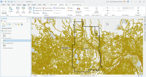
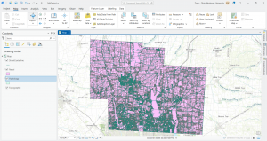
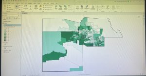
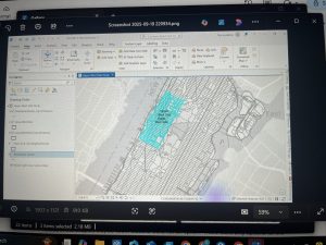
I downloaded these three data sets: Parcel, Street Centerline, and Hydrology. I then created a map that shows all three but I have no idea if I did it right. I was having trouble extracting the files and getting them to show up as I opened a new project. I bypassed that by opening a map on the ArcGIS pro home screen and then working through things. Here is a screenshot.


 Chapter 4: This chapter was very helpful in learning how to label, organize, and combine data.I did have a few struggles within this chapter. My main struggles were in 4-1 and 4-2. In 4-1, the chapter told me to paste some of the data into a different folder so that it was available in multiple places. However, I was only able to paste one of the data sets into the correct folder. The other data set didn’t give me the option to paste it. Additionally, at the end of 4-1, the instructions told me to delete the tracts file from the geodatabase. This permanently deleted the information on that file. However, in 4-2, I needed the information on the file. I think that this is a part of the chapter that I might have to go back and redo to figure out if I messed that part up. Something that I thought was interesting was the use of parentheses to order attributes when selecting them. Another thing that I thought was interesting was the ability to select for specific attributes. While this can become a little confusing if it isn’t selected perfectly, it can be super useful when trying to narrow down the data on the map. I had some more struggles in 4-5. In this section, I struggled selecting the field in the attribute table for the neighborhoods in Pittsburgh. The book told me to select fields X and Y, but neither of those fields was an option, and I was not able to create them as an option. I also had struggles with the table in 4-6. In this table, the book wanted me to insert rows to assign categories to the crime types. However, the table wouldn’t allow me to insert any rows into it.