- My name is Akiilah Whitfield, I’m a first year student at Ohio Wesleyan. I plan to double major in Environmental Science and Zoology with a minor in Astronomy. I’m excited to take this class and learn more about GIS and how it relates to my fields of study while simultaneously learning new skills that will benefit me in the future. I have interests in reading, playing the guitar, baking, building lego sets, and sometimes watching NatGeo nature documentaries. In the future I hope to possibly get my doctorate in a specialized environmental science field that is focused on animals and conservation. I want to do field research in the tropics and other densely populated vegetation places. I plan to stay in Ohio for my undergrad and then move to a new state or country when getting my masters and doctorate. I’m really excited to continue this class and learn more!

2. Through reading chapter 1, I was able to get a more clear and concise understanding of what GIS was, and what important role it serves as a means for mapping with the use of technology and science as well as the way different people and groups interpret it. I learned that GIS is a widespread tool used for different fields like public health, urban planning, agriculture, marketing, transportation, environmental planning, and more. The growth of GIS out sees some people’s understanding of it and its social implications. As stated before, GIS means different things to different people: for researchers its used for a scientific approach while for city planners and other people in the field, it’s more of a platform that answers questions like “where”. This makes GIS lack a single defined identity which causes tension and a lack of understanding within the geography field. GIS first appeared in the 1960’s paired with advances in computing and quantitative geography. One word that I learned in the reading was “spatial overlay”, which was defined by Ian McHarg as different layers of spatial information that are analyzed together. Early GIS was disregarded and referred to as the inferior computerized cartography because it didn’t have the same kind of aesthetic quality of hand-drawn maps, overlooking the true power that it had. GIS came from cartography, surveying, landscape architecture, statistics, and computer science. There was the argument between if GIS is, or is not linked to quantitative revolution. Other groups believe that GIS goes beyond quantitative methods because it incorporates institution and visualization. GIs has the ability for people to view spatial patterns which in turn makes analysis more accessible and interpretive as opposed to just being numbers. I also learned about GISystems and GIScience. GISystems is software, hardware, and procedures that are used to collect, store, analyze, and display data. GIScience is seen as the foundation of GIS which examines how spatial data is modeled, classified, analyzed, and visualized.
GIS Application 1:
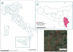
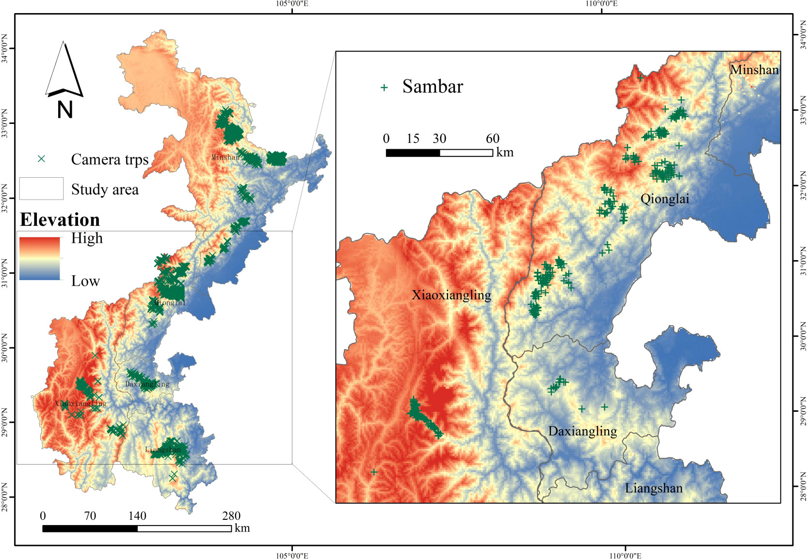
This map shows tracking and monitoring of animals and farm livestock through sensors attached to the animals used for monitoring herds that are long distance or farther away. This specific study is an experimental trial with a custom-device fit for a collar and took place in two different grazing areas in different zones territorially.
https://www.sciencedirect.com/science/article/pii/S2405844024091977
GIS application 2:
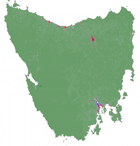
The second GIS map that I chose is related to Tasmanian Devils and the tumor disease that they were, and still are developing, killing a large portion of the population. Through GIS scientists learned that the animals would eat roadkill or other food that gave them the disease, and then would communicate with other animals that would also eat the food and in turn, also get sick. The map helps scientists understand threats to the population that killed the animals which they then investigate, helping to boost the number of Tasmanian Devils while keeping the number of infections low.
https://science.sandiegozoo.org/science-blog/mapping-devils-playground-boosting-populations-gis
5. I finished the quiz!








 Introduction:

