Address Point: Represents all certified addresses in Delaware County. Updated daily and published monthly.
Annexation: Tracks annexations and boundary changes within Delaware County since 1853. Annexation in this context refers to territorial adjustments, and the dataset is updated monthly.
Building Outline: Contains outlines of all structures within Delaware County. The dataset was last updated in 2023.
Condo: Includes all condominium-style housing within Delaware County.
Dedicated Right-of-Way (ROW): Represents all designated road right-of-way areas within Delaware County.
Delaware County Contours: Depicts two-foot elevation contours derived from 2018 topographic data, providing a detailed view of the county’s terrain.
Delaware County E911 Data: Utilizes address point data for reverse geocoding to determine the nearest emergency services location. This dataset is updated daily and published monthly, improving 911 response efficiency.
Farm Lot: Identifies farm lots within Delaware County.
GPS Monuments: Includes all GPS monuments established in Delaware County. Last updated in 2021.
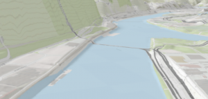
Hydrology: Displays major waterways, including lakes and rivers, throughout Delaware County. Updated monthly using LiDAR data.
MSAG (Master Street Address Guide): Contains all street addresses within Delaware County and their corresponding jurisdictions (townships, cities, and villages). Updated as needed.
Map Sheet: Comprehensive dataset containing all official map sheets for Delaware County.
Municipality: Identifies the boundaries of all municipalities within Delaware County.
Original Township: Shows historical township boundaries before tax districts altered their shapes. This dataset is static and not actively updated.
Public Land Survey System (PLSS): Displays public land survey used for defining land divisions in Delaware County. Updated as needed.
Parcel Data: Contains all parcel lines within Delaware County. These are maintained by the Delaware County Auditor’s GIS Office, updated daily, and published monthly.
Voting Precincts: Outlines all voting precincts in Delaware County, maintained by the Board of Elections.
Recorded Documents: A collection of recorded documents from Delaware County. Used for locating property-related documents.
School Districts: Defines the boundaries of all school districts within Delaware County.
Street Centerline: Represents the center of pavement for all public and private roads in Delaware County. Primarily used for transportation planning, accident reporting, and emergency response. Updated daily.
Subdivision: Records all subdivision and condominium developments in Delaware County. Updated monthly.
Survey Data: Represents survey results across Delaware County, maintained by the Map Department. Updated daily and published monthly.
Tax Districts: Defines tax district boundaries in Delaware County, managed by the Real Estate Office. Updated as needed.
Township Boundaries: Depicts the 19 current townships that make up Delaware County. Updated as needed and published monthly.
Zip Code Data: Contains all ZIP codes within Delaware County.