Gist Week 4

Chapter 1

This chapter went super smoothly for me and I ran into minimal problems if any. A couple times I used the search tool to find a specific button or task, but other than that it was straightforward to me. I included pictures of some of the maps/”your turn” section assignments. This chapter did take me a long time to complete, but I think it was mostly due to me trying to get comfortable with the software.


Chapter 2

This chapter is where I ran into more problems. First, I struggled to complete some of the labels, especially the water labels in one of the tutorials. Update, halfway through I realized that I just wasn’t pressing the “Label” button. Second, I got lost trying to make the streets into a ground layer. Third, I couldn’t do any of tutorial 2-4 (I think that’s the right one) because my Over age 60 neighborhood layer said there was no data source. Not exactly sure how that happened, but oh well. In this chapter I thought the swipe feature was really cool, and I’m excited to use that in the future. Ā Other than those few issues, this chapter was pretty smooth sailing and took a lot less time than chapter 1, since I was more comfortable with the system.


Chapter 3

This chapter went okay. The tutorials weren’t hard to follow I just ran into a couple issues that prevented me from completing the whole tutorial. In 3-1, I had problems creating and adding the charts. They just wouldn’t show up for some reason. Regardless, I was still able to get my layout with the two maps and legends completed. Tutorial 3-2 said I didn’t have sharing privileges, which I’m not sure how to fix, considering I created the GIS online account. I can try to figure it out later if need be. It also wouldn’t let me log into my ArcGIS online account so I am really confused about that. I’ll try again next week to see if I can figure it out. This made 3-3 and 3-4 relatively impossible for me to do unfortunately as well. Hopefully next week I can figure it out šŸ™‚

Gist Week 3

Chapter 4: Mapping Density


This chapter covers why it is helpful to map with density, how to decide when to map density, two ways to map density, mapping density of defined areas, and creating a density surface. The chapter starts by showing how to calculate a density value for a location. To do this, you divide the total number of features by the region for every location. Then, each area is shaded in a different color. I learned that ArcGIS can calculate density for us, which is lovely! You can also make a density map with dots, where each dot is assigned a value, and then the dots are placed on the map accordingly. It was interesting to see the comparison between the examples in the book of a shaded vs. dot map and how each can be perceived differently. Density surfaces are created in raster layers. There is also a specific formula to calculate cell size. You start by converting density units to cell units, divide by the number of cells, and then take the square root. It is also essential to find a good search radius. Something too big can disregard local patterns, but something too small can prevent the more prominent patterns from being recognized. The weighted maps were also interesting, and the farther away from the search radius you get, the less detailed the densities would be. Visually, my favorite maps to look at were the graduated maps. Seeing patterns with a smoother gradient rather than sharp lines or an abundance of dots was straightforward. However, as with everything, each map type has a time and place. For instance, a shaded map might be more suitable for showing population density, while a dot map might be better for showing the distribution of a specific species. I appreciated seeing the connection to classes from the previous chapters and how that related to density mapping. I also learned that it is good to have more sample points to make the data more representative of the population since the date between points is an estimate.Ā 


Chapter 5: Finding Whatā€™s Inside


This chapter is dedicated to the ‘Finding What’s Inside’ technique, which is a versatile tool for mapping an area to understand its dynamics. It also enables the comparison of different areas, making it a valuable resource. The chapter outlines multiple ways to apply this technique. The first method involves drawing an area boundary on top of the features. The second method uses an area boundary to select the features inside, and the third method combines the first two, creating summary data. You can also use this technique to identify patterns within a specific area or across several areas. The categories that are graphed within the area can be discreet or continuous. What’s intriguing is that the continuous data could also be data from a previous map created with GIS. These area graphs can be used to determine if an individual feature is in an area, provide a complete list of features contained in an area, or list the number of features inside an area/a group of areas. Since some linear/discrete data can fall partially within and outside of an area, you can select if you want to include all data that lives completely inside, all data that lives entirely outside, features that fall inside but extend outside of the area, or only include the portions of the data that exist inside the area. The first way to ā€œfind out whatā€™s insideā€ is to draw areas on top of features. The next is to select features inside an area. Another way is to overlay the areas and the features. Different methods work better for solving various problems. When creating these maps, using thick lines to show the areas or shading is helpful. After making these maps, statistics can be extremely useful in determining the data’s meaning and assessing visual patterns. This chapter also details how to make various maps and the steps that go along with that.Ā 


Chapter 6: Finding Whatā€™s Nearby


This chapter is about learning how to use GIS to visualize elements within a specific area. This can help monitor a location to understand what is going on inside. There are three ways to measure nearness: straight-line distance, distance/cost over a network, and cost over the surface.Ā  You can measure with distance or price. Distance is self-explanatory, but cost can be time, money, or effort. It is essential to know if the area you are calculating is flat, planar method, or curved, geodesic method, as the calculations differ for both. The planar method is better for small areas where the curvature of the Earth will be relatively nonexistent (city, county, state). The geodesic method is used for much larger areas, like a region, continent, or the Earth as a whole. When mapping, you can choose to use a single or multiple ranges. Multiple ranges allow for more comparisons, which could be helpful for specific issues. With straight-line distance, the source feature and distance are measured. GIS will then find the features within that area. For distance/cost over a network, you must specify source locations and a cost or distance for each linear feature. Then, GIS shows which segments fall within those boundaries. Lastly, for a cost over a surface, you specify features and costs, and the GIS will provide a cost for each feature. Using GIS, you can also create a buffer as a permanent or temporary boundary. One example was creating a sound buffer for streets. When making the maps, you can choose only to show the features inside the map or the features inside and outside. Both of these options work well for different purposes. This chapter also gives a tutorial on how to create these types of maps and how to read the results. I found it interesting that GIS can help develop travel routes. This can allow first responders to reach their destination quicker, potentially saving lives. I also thought that specifying more than one boundary on the same map could also be useful for different situations.Ā 

Gist Week 2

Chapter 1: Introducing GIS Analysis


This chapter begins with an overview of GIS analysis and its crucial role in understanding different geographic patterns. Since this is an introductory chapter, many concepts are introduced. GIS Analysis is the most prominent term introduced, and it explains how GIS is used to analyze spatial relationships and patterns in geographic information. He also introduces spatial patterns, which are the layout of shapes and features in a space, and spatial relationships, which are how certain geographic features interact with each other. These techniques significantly impact decision-making, as they can help us visualize certain things and significantly influence our choices. Another set of terms this chapter goes over are different types of data.Ā  I was interested in this concept because they can all be used differently for other purposes and data sets. For instance, point data can represent specific locations, such as cities or landmarks, while line data can represent linear features like roads or rivers. The different data vector points (points, lines, and polygons) help to show specific features or regions, while raster data (grid-based) helps to show a surface and how it changes. Vector points were what I associated with GIS, but it was interesting to learn about raster data since I hadnā€™t thought of the different types of data that a person could input. The attributes linked to data were also interesting to me, and they are used to help us and the computer understand the data better. The steps outlined in this chapter for GIS analysis reminded me much of the scientific method, with the various steps of testing, retesting, and analyzing while looking at an issue from multiple angles. The most significant takeaway from this chapter is the pivotal role of GIS analysis in decision-making, as it can help us visualize certain things and significantly impact our choices, thereby underlining its importance and influence. Statistics, a crucial component of GIS analysis, provide the tools to quantify and analyze patterns in spatial data, making them an indispensable part of the process.Ā 


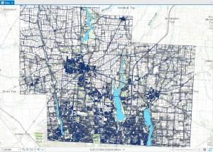
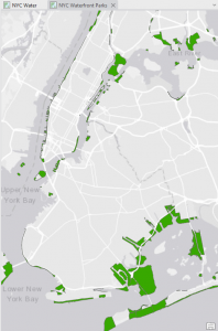
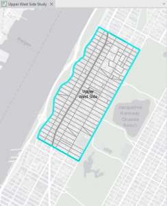
Chapter 2: Mapping Where Things Are


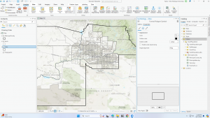
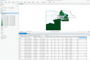
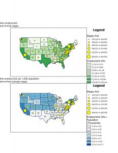
This chapter also places a strong emphasis on statistics, highlighting that a robust understanding of statistics is instrumental in interpreting spatial data. Statistics play a pivotal role in GIS analysis, providing the tools to quantify and analyze patterns in spatial data. One of the significant terms in this chapter is spatial statistics, which applies statistical techniques to spatial data to quantify and analyze patterns. The next term is descriptive statistics, which are just basic statistics. These include mean, the average of a set of data; median, the middle value in a set of ordered data; and standard deviation, the distance from the mean that a large percentage of the data is. This can help compare outliers and find where similar values are located. The chapter also highlights the process of creating a map. In making a map, the person will provide each location’s coordinates and a category value. Then, the person must specify how they want the information displayed. Too many categories can be overwhelming, while too few will show some patterns and can leave out specific details. Visual information and statistical information can be used to locate these patterns. The most significant part of mapping is deciding what, where, and how to map things. Using the correct map is essential because if not, the data can be confusing and lead to misleading results. Just like when writing, the audience is significant as well. The map could be more complex if you have scientists with a lot of background information. If the map is intended for the general public, it must be more straightforward and contain more information to give context.Ā 


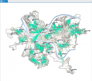
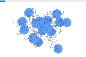
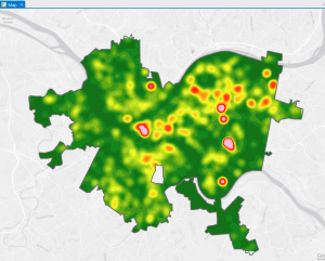
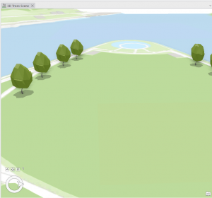
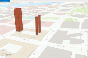
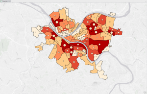
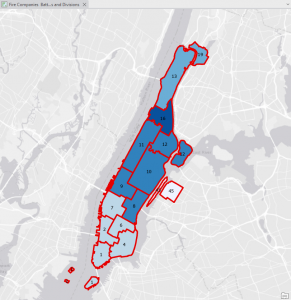
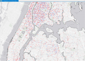
Chapter 3: Mapping the Most and Least


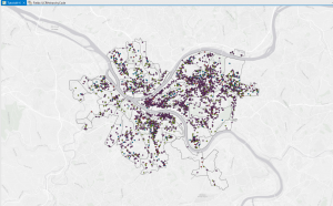
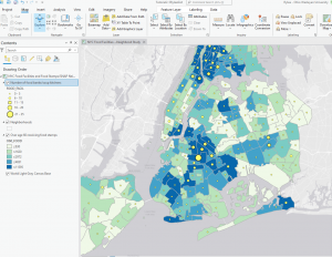
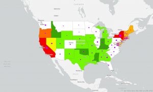
This chapter, which focuses on techniques for analyzing patterns, introduces the concept of spatial pattern analysis. This technique examines geographic arrangements to find patterns, enhancing our understanding of the distribution of certain items and the factors influencing them. Visualization plays a key role in this process, as it allows us to see high- and low-density points. When mapping, three different quantities of features will be given: discreet features, like locations or regions; continuous phenomena that show a constant value in 3D; and data summarized by area, which separates areas through shading, usually with a gradient of colors or contours. When creating maps, it is essential to use specific analysis techniques to give appropriate and helpful results. After being given a quantity, values can be given a symbol to make the map more visually appealing and understandable. This visualization aspect is so important to help see patterns, but if that isnā€™t enough, statistics can also be looked at. Classes can be added to separate higher and lower values, making the map more understandable. Classification schemes are used to create classes. I like having black-and-white categories because I tend to overthink things in grey areas and which category they should go in. I found these common schemes very helpful: quantile, equal interval, standard deviation, and natural breaks. For quantile, the number of features in each class is the same. The space between high and low values is equal for each class in equal intervals. In standard deviation, the classes are based on how far away from the mean they are. Lastly, in natural breaks, the classes are created based on groups in the data, close values. Overall, the type of map used is essential, and choosing an excellent way to analyze the data can make finding patterns tenfold easier. Selecting a map or analysis method that is less effective can lead to a lack of finding a pattern, which could have lots of impacts on society.Ā Ā 

Gist Week 1

Me in Hocking Hills!Ā 


Hello! My name is Rylea Gist, and I am a sophomore at OWU. I am majoring in environmental science and biology.


Before reading Chapter One of Nadine Schuurmanā€™s GIS: A Short Introduction, I only vaguely knew what GIS was and how widespread it was. I thought it was used primarily by farmers and scientists to study the geographical makeup of specific areas. After reading the chapter, I realized how much of my daily life is rooted in GIS, from deciding the route to specific locations to visualizing consumer data to determine the price of goods. I was super interested in the origins of GIS as well. I would never have imagined that the roots of GIS came from meticulously drawn maps layered together over a lightbox. It is crazy how quickly GIS has grown, from having to be hand-drawn and layered to now being able to put data into a computer to create the maps for you. Logically, it makes sense how and why GIS has developed, considering that humans are such visual learners, as well as the need to consider a variety of different topics at the same time. Combining several maps and seeing a pattern is much easier than looking strictly at numerical data. I also found it interesting that some scientists entirely relied on the maps created by GIS to be complete facts.

In contrast, others were more hesitant and had to ask more scientific questions about the data, its origin, and its effectiveness in different situations. This idea reminded me of my statistics class in high school, where we had to be highly cautious in reading and interpreting statistics because so many areas could be flawed. I wonder how using biased data could create a biased result and what the implications are for society. Overall, this chapter is exciting, and it excites me to keep learning about GIS and see what I can do with it in the future.

The first GIS application I found was an American scientist using GIS to track feral cats on New Zealandā€™s Auckland Island. These cats are not native to the island, and therefore, they are destroying the biodiversity. The goal is to locate and eradicate the feral cats, restore the island to its natural state, and let the native flora grow. She uses GIS to map the location of cats in conjunction with bird populations to develop a strategy to remove the cats. She also uses GIS to determine population density and the best places for helicopters to place bait.Ā 

Keywords: GIS Application Stray Cats

https://www.esri.com/about/newsroom/blog/gis-analyst-maps-feral-cats-solution/?srsltid=AfmBOopRdZXqEInheDGzv8O7Ae6S6-f0I3WkqjVH8zXjq1Y9RMR5SBCh

The following GIS application is to save monarch butterflies. The Rights-of-Way as Habitat Working Group combines data from various organizations with GIS. This data will help to visualize habitat locations and support these organizations in determining where to plant more milkweed to help the monarch butterfly population. This is so important because it is estimated that monarch butterflies are going to need 5x more milkweed to survive, so this data helps to show exactly where the milkweed should be planted to best impact the butterfly population

Keywords: GIS Applications Monarch Butterflies

https://www.esri.com/about/newsroom/blog/mapping-to-save-monarchs/?srsltid=AfmBOopJemnVkuWwbQzY5SH8FJVfcrcPdR_C1OoTkAOMpKuulrwndwbI