Smith week 5

Chapter 4:

Chapter 4 was relatively straight forward. I experienced no difficulties importing data, however it was time consuming and had a learning curve. I find myself spending less time searching for things like the catalog pane or the toolbox.

Chapter 5: 

Taught me how to work with world map projections… i was unfamiliar with how many way the map was projected. It was interesting to see even on a continental level the states change via world map… I also had a learning curve with working with the tabular data.

Chapter 6:

Chapter Six was all about creating a neighborhood.  It was cool to be able to work with the fire departments and police station layers. 

Chapter 7:

This was my favorite chapter/ most interesting to me. I thoroughly enjoyed working with the tools to create maps. I however was left with some questions like when and why should i be using these tools. 

Chapter 8:

This chapter although being small was very insightful. I got to work with zipcodes from my home state and even ended up working with zipcodes from an area at which i used to live which was super cool. 


Smith week 4

Chapter 1:

Apart from having some general issues with logging in the GIS interface is not that hard to use coming from someone who is not technologically inclined. Chapter 1 felt as basic of an intro as you could get introducing main concepts and vocabulary. I felt as if the tutorials were the perfect way to Synchronize what I was reading onto what I was doing I was not left with any questions in chapter 1 I feel confident in my skills from chapter 1.

Chapter 2:

Chapter 2 was significantly more in depth, however, made a great stepping stone from chapter 1 chapter 1 allowed me to familiarize myself with the interface, i.e. contents and catalog screens chapter 2 served as a steppingstone in allowing me to use the feature layer, labeling and data section. Creating labels for specific markers on the map and also allowed me to figure out how to change colors and label different features.

Chapter 3:

Chapter 3 was short, but overwhelming tutorial one took the maps that we’ve made and put them on a sheet of paper and made charts with them tutorial two and three were more abstract in the way that you were publishing and downloading maps which I struggled with for a little bit But the book is a good job at keeping you on track Tutorial for was creating a dashboard which was just as frustrating as tutorial two and three but I reason through.

Smith Week 3

CHAPTER 4

density maps are something I have always taken an interest in, particularly in the ecological field. It’s always interesting to see the population density maps of local species. I also don’t usually think of density maps like the book demonstrated. They use business density instead of points. The book gives a great definition of when to use mapping density; ” mapping density is especially useful. Mapping density is especially useful when mapping areas such as census tracks or countries that vary greatly in size. As mentioned previously, this is how I viewed density maps. The color gradient makes density maps easy to follow and understand. The map Mitchell uses to show logging roads on page 108 does an efficient job at showing the density of the logging roads. However, it is confusing to follow. While reading, I was initially confused about the difference between map features or feature values. The book defines features as locations of businesses and feature values as the number of employees at each business. The visual figure on page 109 does a good job of demonstrating the differences, leaving me with no further questions on the differences. My previous understanding of density maps was strictly limited to the color gradient style that we are most familiar with. While reading Mitchell’s book, I was informed on the use of density maps as dot maps for this example. They still use businesses but one dot equals five businesses to show the density. One interesting point about dot maps was the dogs are distributed randomly within each area. They don’t represent an actual feature location however, the closer that together the dots are the higher density of features in that area.

CHAPTER 5

Chapter 5 is about why map what’s inside. Mitchell says on page 134 by monitoring what’s going on in an area, people know whether to take action. He uses the example of a district attorney who would monitor drug related to arrests to find out if an arrest within 1000 feet of a school if the arrest occurred within 1000 feet, stiffer penalties would be applied. The nice part about the density map that I learned about is you can find out what’s inside a single area or inside of several areas. When I originally read about surveying multiple areas, I was initially confused about the logistics behind it, but the book uses a great example, such as ZIP Codes or watersheds. The book has a good section on whether the features inside the map are discreet or continuous. It goes on to describe discreet features as unique, identifiable features you can list,  count, or summarize. A numeric attribute is associated with them. Continuous features represent seamless geographic phenomena. The example the book uses is especially continuous categories or classes such as vegetation type or elevation range *topographical maps. The section on page 147 under comparing methods was extremely insightful. While reading through chapter 5 i found myself wondering when to use which methods the three-layered tables lay out all three methods: drawing areas and features, selecting the features inside the area, and overlay the areas in features. Was extremely useful on what each method is good for the types of features that uses and the trade-offs associated with them. another thing I found interesting in Chapter 5 was the ability to take the data from the map and put it on paper. a count is the total number of features inside the area. this was taking was we collected and allows us to use it in a data set. 

CHAPTER 6

As I read in chapter 6, I think all of the learning objectives which were: Y map what’s nearby, defining your analysis, three ways of finding what’s nearby, using straight line distance, measuring distance, or cost over a network, calculating cost over a geographic surface were addressed fully and to the greatest extent. The first section wide map what’s nearby was extremely applicable to your daily life as they mentioned you can find out what’s occurring within the set distance. You could also find out what’s within traveling range. One thing I wouldn’t have thought to take into account about measuring distance was measuring flat plane, or the curvature of the earth. A recurring concept that we have seen through all six chapters now was needing to know the specific information you are looking for from the analysis i.e. do you need a list count or summary? Once again, I found the comparing methods table to be extremely useful a compared the three methods straight line distance, distance or cost over a network,  and cost over surface. The table gave the appropriate uses the rhyming features. You should look for the measures the pros and the cons and the very next section called choosing a method put the table into action and made it very straightforward. Much later in the chapter 6, it gets very in depth on making maps using distance using costs how arc GIS works specifying network layers stops, and turns travel parameters. It’s quite impressive. How much computing you can have arcGIS do.

Smith Week 2

CHAPTER 1

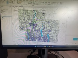
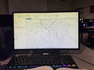
The first thing I read was something that really stuck out to me, never would I have guessed that GIS mapping has been around since before 1999. The supercomputers of that time used to take up entire rooms, now, we have the same computing power at our disposal every day. In the last sentence of the first paragraph, it says something along the lines of more people are doing spatial analysis than ever. This sparked a curiosity in me as a zoology major when Dr. Hankison asked us to participate in citizen science. This is where you voluntarily donate time to wildlife identification. So, my big question was, since there are more people engaging in GIS mapping than ever, are there voluntary websites where you can participate in research advancement? Being science-minded, logically, it makes sense that you start with a question, i.e.., “Where were the most burglaries last month?”  Understanding your data also makes sense logically before you can answer the question at hand, you must know what the parameters are and if you are required to acquire more information. Something I did not know that I learned as I read was that GIS mapping is not strictly limited to the general form of a map. GIS mapping can be used in forms such as values on a table or a chart. Yet another thing I found interesting was the layers you can add to maps, on page eight, it goes into further detail about overlaying areas with identifying features. I am quickly finding out that maps are not one-dimensional.  I did not realize the depth or amount of attribute values like categories, ranks, counts, amounts, and ratios.

CHAPTER 2

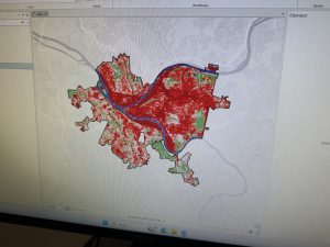
Akin to what I have previously stated about maps being omnidimensional when reading the opening paragraphs of chapter two, my view was broadened. prior to this, I would have stated that maps are finite and only show individual features, but According to Mitchell, they have the ability to show patterns as well. It was nice to see the book make connections I am passionate about, they mention how wildlife biologists study the behavior of bears and may want to find areas free of roads. As a zoologist, I feel that this was an applicable connection.  Under the section “Deciding what to map”  Mitchell doubles back on himself and makes it known that maps are not always complex and multidimensional they also can show simply where a business gets its most customers and, therefore can see where to target their ad campaigns. To build on that, you can make a seemingly one dimensional map into a very conceptual map. Mitchell goes on to explain that a business could use GIS mapping to not only see where their customers are but also categorize them by age. Prior to creating a map, you must make sure that things are mapped geographically appropriately and optionally have a category attribute with a value for each feature. I was originally confused when reading the section under assigning category values. The maps below the section offered great insight into everything I had read up to this point. It was nice to see the distinction between the “general zoning code” and the ” detailed zoning code.” Making your map is a section that I read, and I came to the conclusion that this will not be as overwhelming as originally anticipated. It seems close to using Rstudio, which I feel I am well versed in.


CHAPTER 3

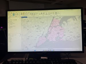
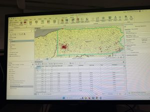
Having taken Stats here at Ohio Wesleyan University, I understand the importance of mapping the least and the greatest. statistically speaking, it is most beneficial to gain values from the whole spectrum. A business will profit best by knowing where the entire data set lies. Mitchell fortifies this with his example of the catalog company using a map of young families in zip codes with the highest incomes. This is most beneficial because if they were to market to lower-income families, the chance they would buy would be much smaller due to the lack of excess funds to be able to splurge on expensive clothes. one thing I found extremely beneficial was the breakdowns that started on page 70. I was slightly confused about natural breaks, quantile, and equal intervals, etc… and more so when to use them. The book did a great job of laying them out, and I no longer have any questions. As I was reading this, I was  wondering to myself, “So I know how to work with standard deviation what do I do with outliers?” Thankfully, the book lays it out nicely, using natural breaks to isolate the outliers.  Interestingly, most map readers can only distinguish up to seven colors on a map, but four or five is the magic number. Another thing I found interesting was how complex the GIS software is. Never would I think that it would have the capability to make continuous class ranges by default and be able to define them.  I liked the chart they used on pages 80-81. the display of different features layed it out nicely of when to use what and why.

Smith Week 1

Hello! My name is Owen Smith, I am currently a senior at Ohio Wesleyan University, majoring in zoology. I am in the application process for jobs after school, I would like to be a game warden. I was interested in taking GIS courses because I will use them in the field I plan on working in. I wanted to familiarize myself with GIS and master how it works.

As I went through the reading, it was very thought-provoking, and I had many comments and questions. My natural inclination toward GIS and mapping as a whole was strictly limited to the geospatial mapping of physical formations. Thankfully, I have taken classes with Ashley Toenjes as she has poked many holes in my definition of what GIS is. while reading, I realized how succinct her classes and definitions were with what Schuurman was saying on page 3.  When they spoke about the identity crisis that GIS faces. Another thing I found interesting was how new GIS is, in the grand scheme of mapping. Logically, it makes sense though, the computing power needed to make these extremely complex maps has only recently become accessible for most everyone.

One application of GIS that I found applied to me was the use of data analysis in the workplace. As an outdoorsy person being able to use GIS opens up a plethora of job opportunities. For example, the state of Montana is actively hiring employees to use GIS and analyze natural resource data. I chose to look into invasive plant species in Siberia. Having taken several plant/climate-based classes. So, looking into the mapping of invasive plant species and thier migration due to climate change was something that really stuck out to me.  The attached map is just one of the several images used to show the locations the invasive species were found.