Address Point
This dataset is a spatially accurate representation of all addresses within Delaware County, Ohio. The database is updated on a daily basis, with the updates being published monthly.
Annexation
This dataset contains all Delaware County, Ohio boundaries, including all annexations and conforming boundaries from 1853 to present day. The dataset is updated on an “as-needed” basis (when an annexation occurs), with the updates being published monthly.
Building Outline 2021
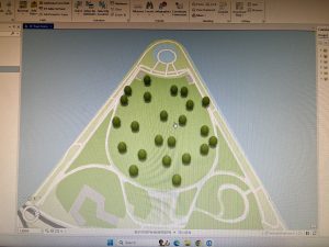
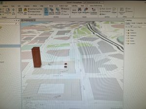
This dataset contains building outlines for all structures within Delaware County. The dataset was last updated in 2021, and is updated on an “as-needed” basis.
Building Outline 2023
This dataset contains building outlines for all structures within Delaware County. The dataset was last updated in 2023, and is updated on an “as-needed” basis.
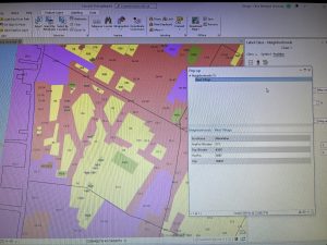
Condo
This dataset contains polygons for all condominium housing within Delaware County, Ohio.
Dedicated ROW
This dataset contains all lines that have Right-of-Way in Delaware County, Ohio. It coincides with the daily updates of Delaware County’s Parcel data. It is updated on an “as-needed” basis, being published monthly.
Delaware County E911 Data
This dataset utilizes the Address Point dataset in order to geolocate the nearest emergency services location to an address within the county. The dataset is updated on a daily basis, being published monthly.
Farm Lot
This dataset contains all farm lots in Delaware County. It is updated on an “as-needed” basis (when new surveys are taken).
GPS
This dataset contains locations for all GPS Monuments (metal discs that determine longitude and latitude) established in Delaware County, Ohio from 1991 to 1997. It was last updated in 2021, with the dataset being updated on an “as-needed” basis.
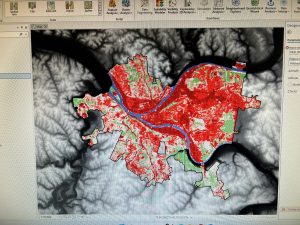
Hydrology
This dataset contains all major waterways in Delaware County, Ohio. Enhanced in 2018, the dataset is updated on an “as-needed” basis.
Map Sheet
This dataset contains all map sheets within Delaware County, Ohio.
Original Township
This dataset contains the original boundaries of townships within Delaware County, Ohio, prior to tax districts altering their shapes.
Public Land Survey System (PLSS)
This dataset contains the conclusions from Public Land surveys conducted by the U.S. Military, as well as the Virginia Military survey results. It is updated on an “as-needed” basis, with the most recent update being today (Feb 28, 2025).
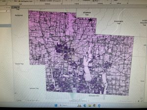
Parcel
This dataset contains parcel lines creating distinct land parcels. The dataset is updated on an “as-needed” basis.
Precinct
This dataset contains voting precinct boundaries in Delaware County, Ohio. It is updated on an “as-needed” basis, being updated by the Delaware County Board of Elections.
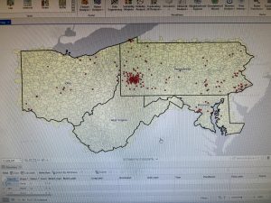
Recorded Document
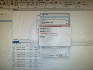
This dataset contains points that are related to recorded documents in Delaware County, Ohio. The documents are typically related to land uses, updated weekly, published monthly.
School District
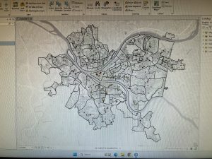
This dataset contains all boundaries for school districts within Delaware County, Ohio. It is updated on an “as-needed” basis.
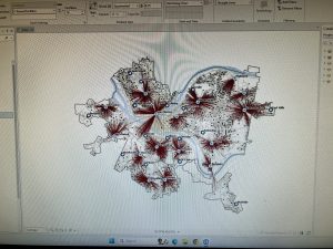
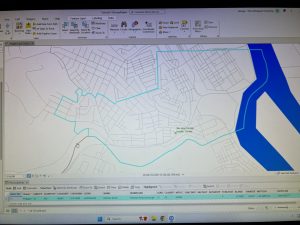
Street Centerline
This dataset contains the centerpoint of public and private roads within Delaware County, Ohio. This information is used for things from 911 responses, to appraisal mapping, and even disaster management.
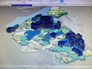
Subdivision
This dataset contains the boundaries for subdivision and condominium communities. It is updated daily, published monthly.
Survey
This dataset is a shapefile, that contains representations of where land surveys have taken place within Delaware County, Ohio. It is updated daily, being published monthly.
Tax District
This dataset contains the boundaries of all tax districts within Delaware County, Ohio. It is updated on an “as-needed” basis, being published monthly.
Township
This dataset contains the boundaries of all townships located within Delaware County, Ohio. It is updated on an “as-needed” basis, being published monthly.
Zip Code
This dataset contains the boundaries of all zip codes within Delaware County, Ohio. The boundaries have been “cleaned-up” utilizing postal data as well as census data.