Fox-Week 3

Chapter 4: Chapter 4 talks about mapping density. Mapping density is important because it allows us to see the highest and lowest concentrations of what we are looking at in a given area. This chapter outlines 2 main methods for mapping density, the first one being mapping by a defined area. We can use a dot map to represent the density of individual locations summarized by defined areas. The dots are distributed randomly within each area; they don’t represent actual feature locations. The closer together the dots are, the higher the density of features in that area. Dot density maps show density graphically, rather than showing the density value. The second method is mapping by a density surface. A density surface is usually created in the GIS as a raster layer. Each cell in the layer gets a density value, such as a number based on the number of features within a radius of the cell. This approach provides the most detailed information but requires more effort. A dot map simply represents density graphically. The dots in a dot density map represent total numbers or values in each area rather than a calculated density value. When creating a dot density map, you specify how many features each dot represents and how big the dots are. You may need to try several combinations of amount and size to see which one best shows the patterns. The larger the amount represented by each dot, the more spread out they will be. Select a value that ensures the dots are not so close as to form solid areas that obscure the patterns, or so far apart as to make the variations in density hard to see. It’s very important when mapping density, in any form, to make sure your map is still easy to understand what you’re trying to map, and picking the type of density map to create is a large part of that. 

Chapter 5: This chapter mainly focuses on the statistical analysis methods for understanding geographical relationships and patterns, including correlation and regression analysis, to better understand geographical processes. The chapter emphasizes grasping the concept, capabilities, and limitations of these tools. There are 3 ways of finding what is inside. We can draw areas and features, select the features inside that area, or overlay the areas and features. Drawing can be used when we need to find out whether something is inside or outside an area, selecting is used to get a list or summary of what’s inside the area, and overlaying the areas and features is used to find out which features are inside which areas, and summarizing how many or how much by area. When we get the results we need, GIS can create a report of the features we’ve selected. Typically, our summaries can come in either counts, just a count of the selected area, or the frequency of data within an area. The GIS uses either a vector or a raster method to overlay areas with continuous categories or classes. For the vector method, the GIS  splits category or class boundaries where they cross areas and creates a new dataset with the areas that result. For the raster method, the GIS compares each cell on the area layer to the corresponding cell on the layer containing the categories. When deciding which one to use, we need to remember that the vector method provides a more precise measure of areal extent but requires more processing and postprocessing to remove slivers and to calculate the amount of each category in each area. And the raster method is more efficient because it automatically calculates the areal extent for you, but it can be less accurate, depending on the cell size you use. A small cell size will give more accurate results but requires more storage space, processing power, and time. Raster overlay also prevents the problem of slivers. It is often faster because the computation that the GIS must do is simpler.

Chapter 6: This chapter is about finding what is nearby. Using GIS, we can find out what’s occurring within a set distance of a feature. Finding what’s within a set distance identifies the area, the features inside that area, and the area affected by an event or activity. Distance is one way of defining and measuring how close something is, but we don’t have to measure nearness using distance; we can also measure what’s nearby using cost. When mapping travel, we can use either distance or cost. Mapping travel costs gives you a more precise measure of what’s nearby than mapping distance and may require more data preparation and processing. When trying to find distance when mapping, we need to decide whether or not to take into account Earth’s natural curvature. The planar method is used when we don’t need to take into account Earth’s curves, and the geodesic method is used when we do need to take Earth’s curve into account. The planar method is appropriate when your area of interest is relatively small, such as a city, county, or state. The results of your analysis will appear as the correct shape when displayed on a flat map. Use the geodesic method when your area of interest encompasses a large region, continent, or even the entire Earth. Output layers created using this method will be displayed correctly on the curved surface of a globe. Inclusive rings are useful for finding out how the total amount increases as the distance increases. Bands are useful if you want to compare distances to other characteristics. To measure what’s nearby, we can use straight-line distance, distance or cost over a network, or cost over a surface. Once the GIS has selected the features, you can get a list, count, or summary statistic based on an attribute.

Fox – Week 2

This week, I read chapters 1, 2, and 3 of the Esri Guide to GIS Analysis. Here are some of my key takeaways from each chapter:

Chapter 1: The general idea of GIS is to look at geographical patterns in your data and their relationships, and that can involve just a few steps or very many. When starting your process, you first must ask a question. The more specific your question is, the easier it will be to decide how to continue with your process. This chapter dives into the different ways to represent geographic features, discrete, continuous phenomena, and is summarized by area, along with when to use each feature with appropriate examples. We also learn the 2 different ways of representing geographical features: vector and raster. With vector, each feature is a row in a table, and feature shapes are defined by x,y locations in space, and features can be events, locations, lines, or areas. With the raster model, features are represented as a group of cells in the same space continuously, with each layer representing one attribute. This chapter does offer a warning when we are using coordinates when mapping. This chapter warns us to check all of our data to make sure all of the data is in the same coordinate system and map projection. The rest of the chapter talks about the understanding of different geographic attributes, and provides examples of when to use each, each with its own visual.

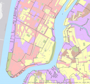
Chapter 2: This chapter begins by reinforcing the importance of geographic coordinates and why they are important for GIS. Along with reminding us that if our data already has geographical coordinates, we do not need to add any, but if our data does not, we will need to have location information, such as a street address or latitude/longitude values. The GIS will then read these and assign geographic coordinates. We also learn that even if we map our data as a single type, all data represented with the same symbol, there is still the possibility that we can further explore our map. We also learn how GIS works when creating maps; for individual locations GIS draws a symbol at the point defined by the coordinates for each address, but for linear features GIS draws lines to connect the points that define the shape of each street, and for areas such as parcels of land the GIS draws their outlines or fills them in with a color or pattern. Mapping features by category also allows us to better read our map and be able to differentiate between different subsets of categories (i.e., which roads are city/federal/highways). When mapping, we must also make sure we are keeping things to scale. To make our maps easier to read, for ourselves and others, it’s helpful to include familiar landmarks/geographical things. The patterns we see on our map can be either totally random or planned and have some correlation to one another. In order to find the pattern, if we suspect there is one, we must complete a statistical analysis with our data.

Chapter 3: This chapter talks about mapping most and least quantities and how to determine how to present the quantities. Mapping most and least is important, not only because it tells us where the most and least of a certain criteria is, but it also adds additional information that can be useful for businesses and cities. When making and presenting our map, we must always keep our audience in mind to make sure we’re providing the information needed, no more and no less. With mapping quantities, we need to know first if we are mapping counts and amounts or ratios, because depending on that, we will choose how to present our data. However, when our data cannot be represented to the best of our ability with numbers, we can use ranks to sort and represent our data. To make our maps, we should present our data within different classes. Classes should be assigned by similar values within our data, and the values between our ranges should be as large as we can make them without removing any of our data. We must create these ranges manually. When picking a classification scheme to use, first, we need to know how our data is distributed across the range. To do this, we can make a bar graph of our data, and then, based on these graphs, decide how to classify them. Whenever we create a map, we want to make sure that those who are not skilled in GIS know what they are reading and what our map is trying to represent. This chapter also provides a list of map types to use based on our data. It also tells us when to use. If our map presents the information clearly, we can compare different parts of the map to see where the highest and lowest values are. And by looking at the transition between where the least and most are, it can give you further insight into relationships between places.

Key Words: Discrete Features (actual location can be pinpointed), Continuous Phenomena (can be found or measured anywhere), Clustered Distribution (features are more likely to be found near other features), Uniform Distribution (features are less likely to be found near other features), Random Distribution (features are equally likely to be found at any given location)

Fox – Week 1

Hello. My name is Faith Fox, and I am a sophomore. I am majoring in Environmental Science and pre-law with a French minor.

After taking the syllabus quiz and reading chapter 1, I realized how GIS was viewed and how widely accepted it has become, and all the applications it has. Also, how often we look at maps and images that have been produced via GIS technology. I do agree with Waldo Tobler’s view that spatial analysis is a means to assist graphic representation, rather than an end in itself. It is important, especially in today’s environment, to incorporate and accept the use of technology. GIS incorporates ongoing research into geographical visuals. I understand the comparison of GIS to a “black box” in the sense that it is better established, it is simply assumed to be true and good. Because of this comparison, it leads me to the question of: “Can GIS users input their own biases into their inputs to shape the output in the way that they want?” And, if that is true, what exactly is stopping those users from continuing their patterns of behavior? While very similar, there is a clear difference between GIScience and GISystems. GIScience is described as the way that we are processing this information, while the GISystems are sort of the “why” of the entire process that is GIS. I did find the fact that GIS technology can be used to predict the effect of future events with visual spatial analysis very interesting. Such as the example of a city looking towards future urban growth based on multiple factors such as density, socioeconomic indicators, geographical constraints, road networks, and present land use. Through reading this chapter, I learned the difference between simply drawing out your data and using patterns, relationships, and trends within that data to create a map, or in other words, mapping vs. spatial analysis. Through reading this chapter, I realized how many different ways GIS can be used throughout multiple professional fields.

I’m very interested in the spread of different types of pollution throughout the United States and which regions of the US are affected by different types of pollution more than others. Using GIS to map pollution allows the public to see a visual representation of real time pollution data, which can allow them to track pollution levels in their areas. Mapping pollution can also highlight vulnerable communities and how they are more likely to receive the negative effects of pollution, which can raise awareness to those vulnerable communities.

Figure 1: Map showing annual emission of volatile organic compounds across the US

Works Cited
Altaweel, Mark. “Mapping Air Pollution in the United States.” Geography Realm, 2023, https://www.geographyrealm.com/air-pollution-united-states/. Accessed 21 8 2025.
Mane, Suraj. “Leveraging GIS for Monitoring Air Quality and Pollution Levels.” Geographic Book, 2024, https://geographicbook.com/leveraging-gis-for-monitoring-air-quality-and-pollution-levels/. Accessed 21 8 2025.