Dodds- data inventory

Zip Code-contains all zip codes within Delaware County

Recorded Document-points that represent recorded documents in the Delaware County

School District-consists of all school districts within Delaware County

Map Sheet– consists of all map sheets within Delaware County

Farm Lot-consists of all the farmlots in both the US Military and the Virginia Military Survey Districts of Delaware County

Township– identify township lines.

Street Centerline-Centerlines depict center of pavement of public and private roads within Delaware County

Annexation-contains Delaware County’s annexations and conforming boundaries from 1853 to present

Condo-consists of all condominium polygons within Delaware County, Ohio

Subdivision– consists of all subdivisions and condos recorded in the Delaware County Recorder’s office

Survey-points represent the location of the survey plat

Dedicated ROW- all dedicated road right of way polygons in Delaware County

Tax District– all tax districts within Delaware County

GPS– GPS monuments that were established in 1991 and 1997

Original Township–  original boundaries of the townships in Delaware County

Hydrology– major waterways within Delaware County

Precinct –  Precincts are polygons that determine each voting precinct boundaries in Delaware County

Parcel– Parcels within Delaware County

PLSS–  consists of polygons depicting the boundaries of the two public land survey districts within Delaware County

Address Point– has addresses for Delaware county

Building Outline– consists of building outlines for all structures in Delaware County

Delaware County Contours– 2018 Two Foot Contours for Delaware County

dodds – week 4

1)GIS has 5 parts: hardware, software, data, procedures, and people. It manages, captures, and stores data. Spatial data is information that represents real world data. Attribute data is information about spatial data.

Base maps are provided by arcGIS online. it increases the accessibility of GIS and map making/spatial analysis.

Web maps allow information to be retally available to many people at once. On a similar note the open data movement provides the public with accurate data.

Point, line, and polygon data is called vector data.

Things that are similar can be grouped into layers on a map.

Raster is recorded or measured data for any location on the surface to form a digital surface.

2)simple technical elements of GIS: map, analysis, insert, and view.

context planes allow you to modify the map

Shows how to connect folders to maps

3)created multiple layers to compare the differences.

Talks about data relations

Changing attributes

4)using and creating geodatabase

learned how to limit geodatabase highlighting information I think is relevant

Create lines and polygons

5)played with commands, reminds me of coding in high school

Use tasks

Enjoyed the more technical side of gis


Once I worked past all the bugs I enjoyed getting to use the software and I found that there were somethings I could figure out without the book just by poking around. I enjoyed the work i could do with the data tables and reminds me of the coding class I took in high school. I wasn’t able to get the 3d model to work but I was able to work through most of the other stuff. I will take more screen shots in the next chapters I was quite focused on getting the work done.

dodds – week 3

Chapter 5 finding what’s inside

This chapter is about finding what’s inside. It seems like a simple concept that most people understand but don’t often put into words. Looking at what is occurring inside an area can help identify problems and monitor what’s happening within the area and compared to other areas.

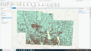
More technically this chapter is about using GIS to list, count, summarize, or view features within area boundaries. There are 2 types of boundaries. They can be contiguous(when one area stops another starts) or disjunct (disjointed and distinct). There are 2 types of features. They can be Discrete(unique, identifiable, and able to be listed or summarize a numeric attribute) or continuous(seamless geographic phenomena and able to summarize the features for each area). There are 3 ways to use GIS to identify features within an area. Drawing areas and features is a visual approach  that is good for seeing the features and the boundaries. Selecting the features inside the area is when you select an area and the GIS finds the features within the area. It is good for getting a list or summary of features inside an area. Overlaying the area and features compares layers and is good for finding which features are in several areas or the quantity of a feature is in one or more areas.  

The chapter then goes into the actual processes behind creating the map. It includes how, why, and when to use different combinations of line, area , and feature types. It adds details on the ways the results can be shown.  Included there are many helpful tips and I enjoyed the detailed breakdown on the processes . This portion will be useful to return back to once I have hands on experience and use as a guide when creating maps. However, currently I cannot put this information into practice.

Chapter 6

This chapter is about what is occurring within a set distance from a feature. Similarly to last chapter this helps monitor activity. It is important to note that the area is identified by the feature.

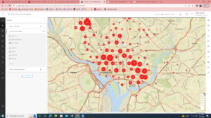
The GIS is used to list, count, summarize, or a range (distance/cost) . The GIS can define the area boundary by using 3 methods. Straight line distance is a rigid way to see features within a set distance. Cost over surface is good for calculating overland travel cost.  Distance or cost over a network is good for finding what’s within a travel distance or cost over a fixed network. The cost can be based on time, money, or effort. There are 2 ways to measure distance. The Planar method does not account for the curvature of the earth and is good for measuring over short distance. The Geodesic method takes into account the curvature of the earth and is good for measuring over large distances. There are 2 ways to utilize the area boundary created. Inclusive rings are good for finding totals of one feature within the boundary as the distance increases. Distinct bands are used for comparing distances from a feature.

The chapter goes into details about the methods in practice. Creating a buffer can be a temporary or the number of  permeant way to find what’s within a set distance of the feature. The buffers can be used for one or more features at once. Similarly to the last chapter this will be a nice reference point when I begin using GIS software. The overviews of the concepts made sense. The more technical portion of this chapter should make more sense with time.

Chapter 7

This chapter discuses using maps to track change. Tracking change is useful to predict the future, decide on an action, or generally gain insight into an area.

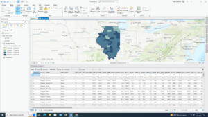
There are 2 types of change that can be mapped. There are changes in location(using past movement to predict where it will move) and changes in character or magnitude(shows the change of conditions for an area).  There are 2 features that move: Discrete features and events. there are 4 features that change in character or magnitude: discrete features, data summarized by area, continuous categories, and continuous values. There are 3 ways to measure time. They are trends(change between two or more dates or times),before and after (conditions prior and preceding an event), cycles(change over a recurring time period).  The data can be displayed in a snapshot or summary. There are 3 ways to map change. Time series is when you create one map for each time or date. Tracking maps  is when you create a single map showing the location of a feature over time. Measuring change  is when you calculate the difference in the amount of a category or a value of a numeric attribute and then display the features based on the values.

The rest of the chapter gets into the specifics of positives and negatives of all methods mentioned and the same ‘how to’ present in the other chapters. I enjoyed the examples that they added when describing the how to map. The examples stick in my head more than the descriptions. I also find that I just really enjoy maps! I have always like statistics and the maps described in this chapter remind me of a visual version of statistics.


dodds – week 2

Chapter 1 , Introducing GIS analysis

GIS is constantly changing due to the rapid evolution of new technology. GIS is evolving because people are finding new uses for GIS. It is becoming more than just mapmaking. GIS for analysis can be applied to many field to get the most accurate data and information. GIS analysis is defined as looking for patterns in your data and at relationships. Simply making maps is a form of analysis.  Steps important to analysis are listed: ask a question, understand the data, choose a method, process the data, look at the results. I enjoy lists and found this useful. Some parts are self explanatory. Understanding the Data requires finding information on what kind of data and how specific it is to determine how fit it is for the project. Looking at results includes stuff like deciding what information is helpful. Discrete: the feature’s actual locations can be pinpointed. Continuous: the features blanket the entire area you are mapping and aren’t pinpointed to one location.  Summarized data represents density of individual features within area boundaries. Categories are groups of similar things. Ranks put features in order. Counts are actual number of features. Amounts are a measurable quantity associated with a feature. Ratios show the relationship between 2 quantities. Categories and ranks are set number values within the given data layer. Calculating and summarizing are different. Calculating evolves assigning new values to features and summarizing involves using data tables to find a piece of data. This chapter contained a great overview of GIS and these were the points that stood out to me. I would be curious to see at the end of this course whether these concepts were the most important things in this chapter.

Chapter 2,  Mapping where things are

This sections covers the actual placing of articles on a map compared to the introduction found last chapter. Mapping the locations of individual features allows you to see the distribution of the feature as well as the patterns that may help mapping. It is important to create a map that shows features relevant to yourself and the audience. There are many things you can alter to help. Only included relevant data and have clear concise categories. Geographic coordinates and codes must be assigned; you will need to assign them if they are not in a GIS database.  You can map single features by repeating a symbol which may reveal patterns to your audience. You can choose subsets of your features to map. I enjoyed the example of  all crime vs. burglaries to help understand the concepts. Using different symbols can show different category within your data. You can adjust the size and range of your categories to adjust the way GIS displays your map. Keep in mind that the map needed to be discernable. Stick to less than 8 colors or symbols. Adjusting the grouping can help help keep the map clean and remain under 8 categories. Choose symbols with define shapes and colors. All of these are key to making patterns visible to your audience. I really enjoyed learning the different parts that go into making a map. This makes me view maps differently because I can imagine how simple it could be to manipulate data. I also am grateful for the opportunity to learn GIS somewhere where I can learn the ethics behind GIS as well as the application.

Chapter 3, mapping the most and the least

This chapter focused on mapping based on quantity associated with each feature. There was a lot of information present and was difficult for me to understand and summarize. It adds more information than mapping features. There are several options for displaying most and least depending on what type of feature you are looking at. Simply put, you can “map quantities associated with discrete features, continuous phenomena, or data summarized by area.” . Discrete features are defined as individual locations, linear features,  or areas. Next, this chapter discuses how the context you are mapping effects the look of your map.  . When exploring data you can map as many features as is helpful for you in pattern recognition. When presenting this should be streamlined and made ‘cleaner’.  Ratios are created by dividing one quantity. Averages are used to compare those with few features to those with many. Proportions show you how much of a whole each part represents. Densities show the concentration of features. Cases are created in 4 basic way natural breaks, quantile, equal intervals, and standard deviation. Which one use use depends on the data. Graduated colors and symbols are use similarly.  You can also use small chats such as a bar graph or pie chart. They can cause issues identifying patterns if not used in the right context. contour lines are used to show rate of change such as elevation or precipitations.  3d renderings can allow the audience to better understand the change of a continuous phenomena. Perspective can be influential when using 3d  models. This chapter was very definition heavy but I feel the concepts are easy to understand but hard for me to describe.

Chapter 4 mapping density

Mapping density shows you the highest concentration of a feature. By simply mapping features you could see patterns in density however density mapping allows for you to see the visual difference easier. They are most commonly used to map areas such as population. There are two ways to map density you can go based off of area or density surface.  each method has positives and negatives and it is important to pick the method based on your data. The chapter goes into detail about dot density maps and the proper way to display dots to be impactful but still effect in showing the data. I do not see the appeal in the dot density. Other methods seem better than others but hopefully going through this course I will understand the benefits of all types of modeling. Density surface is created using a raster layer. from my understanding it creates a new layer that overlays the gradient on the map. It is noted that this method takes more time. This process uses graduated colors and contour lines. The chapter goes into very specific details regarding the process behind making these density maps. I will likely use this chapter as a reference. My thoughts were quite scattered while reading this. There is a lot of information on may different aspects that I do not fully comprehend.

Dodds – Week 1

My name is Ellie, I am a sophomore environmental science major. I am from Louisiana but was born in Columbus. I love nature and being outside so it was easy for me to decide what to study.  I decided that GIS would fit well with my major. I am so considering adding a geography minor. I don’t have many photos but this is one of me from marching band this year!

My knowledge of GIS is limited so I really enjoyed the breakdown provided in Schuurman chapter 1. The first thing that stood out was the wide success that GIS has had on our society compared to the lack of knowledge the typical person has on GIS as a whole. It has been integrated into a vast range of disciplines such as: disease tracking, archeology, and consumer based markets such as coffee shops like Starbucks.  We discussed the use of maps as a form of influence in Human Geography and I did not realize exactly how much influence GIS could have at the time.

I had no idea there was controversy regarding GIS. The chapter gave a very inclusive and blunt overview of GIS and the  positives and negative. I enjoyed the point of view the author provides as someone within the geography community. I learned GIS is viewed differently by people within the community. Some view it as just an application and others view it as a science. The common ground between GIsystems and Giscience is the practices that defines them. GIsystems is often stated to be the data input, special analysis and mapping side of GIS. GIscience was more defined as the theories behind the system. I will be curious how I feel about this distinction after I take more geography classes.

The technical  history was my least favorite section to read but it is important to know. The fact that GIS got its beginnings prior the the rise of computers was something I had not considered as a possibility. It does make sense in hindsight though. I would enjoy learning more about the evolution of GIS as computers evolved in the early 2000’s.

I searched “GIS application honey bee” and found an article published in 2019 “High-resolution maps of Swiss apiaries and their applicability to study spatial distribution of bacterial honey bee brood diseases” This article describes the lack of GIS application to study honey bee diseases and gives the first step towards standardizing the use of GIS in Europe by providing high-resolution maps of the apiaries. This article was also highly cited in recent years.

Apiary densities (‘density-indices’) on municipal level.


Cite

on Büren RS, Oehen B, Kuhn NJ, Erler S. 2019High-resolution maps of Swiss apiaries and their applicability to study spatial distribution of bacterial honey bee brood diseasesPeerJ 7:e6393 https://doi.org/10.7717/peerj.6393

I also decided to search “GIS application East African Rift Systems”. I did a research project on the EARS for physical geography and I knew there would be some overlap.  I found the article “Impacts of Mau Forest Catchment on the Great Rift Valley Lakes in Kenya” . This  discusses the deforestation and its relation to the reduction of water in the lakes  in the area.


Cite

Boitt, M. (2016) Impacts of Mau Forest Catchment on the Great Rift Valley Lakes in Kenya. Journal of Geoscience and Environment Protection4, 137-145. doi: 10.4236/gep.2016.45014.