Deal Week 4

Chapter 1

The only question I am left with after completing chapter one is I am wondering why for the last part of tutorial three my program completely denied opening up the 3D version of the Population Density map. I had to skip the whole view and navigate a scene section because it would not allow me to open the 3D map. I don’t have any comments or notes on this chapter, what needed to be done was straightforward and I got it done. The occasional pictures of how our screens are supposed to look was very helpful to me, it was reassuring to see visually I was not doing the work completely wrong


Chapter 2

The first issue I ran into with the chapter two tutorial was in part 3 in the symbolize figure and ground features. When I went to edit the symbology of the food facilities only soup kitchen was listed. There was no option to edit food pantry or food pantry.  The only one showing up was soup kitchen, and I ensured I had the right thing input into field 1 so I don’t understand why the other two symbols were not showing up. I do not know what is up with this chapter but I was also unable to complete tutorial 4 because it says I have insufficient data in the neighborhood section. I downloaded the map just the same as I have all the others so I don’t understand what I possibly could have done to cause this. This chapter was very frustrating to me as I had two separate occasions where it was just not working and there was nothing I could do about it. The rest of the chapter was not an issue for me though. The instructions were straightforward and I was able to successfully complete everything that was working.

Chapter 3

Tutorial 1 went well, it was not difficult and I was able to complete everything. The first issue I ran into with this chapter was in tutorial 2. It would not allow me to do any of the sharing stuff. It says my account does not have publishing privileges. This means I was also not able to complete the whole of 3-3 and 3-4.  I am frustrated, I don’t have much else to say about it.


Deal Week 3

Mitchell

Chapter 4 Mapping Density 

Map density shows you the concentration of features, rather than as individual points. This is helpful because sometimes with the naked eye it is hard to tell which areas of a map are most dense when it is shown as individual dots. When deciding how to create your density map you must know the features you are mapping, and the information you need from the map. Density maps are helpful when mapping density points or lines, census tracts, countries, forest districts and more. When creating your map you must decide whether you need to map the density of features or the density of feature values. There are two ways to create a density map 1. based on features summarized by a defined area or 2. by creating a density surface.  By Defined Area: This can be done graphically, using a dot map, or by calculating  a density value for each area. To calculate density value for each area you divide the total number of features, or the total value of features, by the area of a polygon. Use this method if you have data already summarized by area or you want to compare administrative or natural areas with defined boarders. By Density Surface: Usually created as a raster layer. Each cell in the layer gets a density value based on the number of features within a radius of the cell. This produces more detailed information but requires more effort. Use this method if you want to see the concentration of point or line features. If you have data summarized by areas but want to create a density map you can use the centroids of defined areas to create the density surface, based on the values assigned to each area. When creating a density map you can display the density using graduated colors or contours.

Chapter 5 Finding What’s Inside

Finding what’s inside is important to be able to compare different areas. To find what is inside create an area boundary, and list or summarize the features inside, or combine the area boundary and features to create summary data. To determine which method is best for you, you must look to the data you have and the information you need from the analysis for example if you need a list, count, or summary. You can find what’s inside a single area or several areas. You must decide how to handle features that do not fall precisely inside or outside of your created boundary. If you need a list or count of features, you should include features that are partially in the boundary, whereas if you need to know the amount of something inside the area you should only include the portion inside the area. There are three ways of finding what’s inside. 1.Drawing Areas and Features: Good for finding out whether features are inside or outside an area 2.Selecting the features inside the area: Good for getting a list or summary of features inside an area.  3.Overlaying the areas and features: good for finding out which features are inside which areas, and summarizing how many or how much by area. GIS can create a report for you of your results of the selected features. It can also create statistical results. For overlaying you can use the same kind of analysis you would do with geographic selection if you are overlaying a single area. If you are overlaying several areas on a set of features you can summarize the features by area. To compare areas based on a particular statistic you can create a chart from the table.

Chapter 6 Finding What’s Nearby 

You can use GIS to discover what’s occurring within a set distance of a feature, and what is within travel range. Travel range is measured by time, distance, or cost. To decide which measure would be best to use for you, consider what information you. need from the analysis and decide how you would like to measure “nearness”. You can define nearness by setting a distance you specify, or if travel is involved based on distance or travel cost. If you are measuring a small distance it is suitable to use the planar method which assumes the distance you are measuring is a flat plain. If you are measuring a large distance it is suitable to use the geodesic method, which will account for the curvature of the earth. To help you determine the best method for your analysis you should also consider what end result you need, whether that be a list, a summary, or a count. You must also decide how many distance or cost ranges you need. If you are going to do more than one range you can create inclusive rings or distinct bands. If you are trying to find how the total amount increases as the distance increases you should use inclusive bands. If you are looking to compare distance to other characteristics you should use distinct bands. There are three methods of finding what’s nearby 1. Straight-line distance: to define an area of influence around a feature and create a boundary or select features within the distance  2. Distance or cost over a network: to measure travel over a fixed infrastructure 3. Cost over a surface: to measure overland travel and calculate how much area is within travel range.

Deal Week 2

Mitchell

Chapter 1 Introducing GIS Analysis

This chapter starts with a definition of GIS Analysis, it states ” GIS Analysis is a process for looking at geographic patterns in your data and relationships between features.”. This first paragraph also gives examples of how you may do this could be a very simple like by creating a map or a complex process “involving models that mimic the real world by combining many data layers”. To begin an analysis you must before anything else figure out what information you need, this is often formatted as a question. Other factors you must consider is how the analysis will be used and by who. To determine what method you will use you must know the type of data and features you are working with, you must also factor in your original question and what the analysis will be used for. Results of the analysis can be displayed in maps, values in a table, or a chart. The next section of this chapter discusses different types of geographic features. Discrete features, continuous phenomena, and features summarized by area. There are two ways of mapping geological features: Vector and raster. In the vector model feature shapes are determined by X,Y locations in space, whereas the raster model features are represented as a matrix of cells in a continuous space. The book details that while any type feature. can be represented in either model is it most common for discrete features and data summarized by area to be represented in vector, and for continuous  numeric values to be represented using the raster model. Continuous categories can be represented as vector or raster. There are 5 types of geographic attribute values: categories, ranks, counts, amounts, and ratios. You can identify these values in a geographic feature to help you determine what the feature is, to describe it, or to understand the represented magnitude associated with the feature. Categories and ranks are not continuous values. Counts, amounts, and ratios are continuous values.

Chapter 2 Mapping Where Things Are

The first paragraphs of this chapter explain the importance of investigating the patterns of multiple features on a given map. It gives the example of police using GIS in this way to track crime and decide where to assign patrols.  Which features to display and how to display them is determined by the information you need and how the map will be used. Before creating your map you must have geographic coordinates assigned to the features you wish to map. The brunt of this work is done by the GIS. An optional step before creating your map is assigning a category attribute with a value to each feature. To map single type features you simply draw all features using the same symbol. This chapter explains that GIS stores the location of each feature as a pair of geographic coordinates or as a set of coordinate pairs that define its shape whether that be a line or an area. Using a subset when mapping your features can help to reveal patterns that are less apparent when all features are mapped. Mapping by category by allocating different symbols for each category can help you to understand how a place functions. You can also display features by type to further reveal different patterns since features could belong to more than one category. When mapping using categories sometimes it is helpful to create separate maps for each category as the features may be too close together and make them hard to distinguish one from another. When mapping multiple categories it is important to map no more than 7 on a single map. The amount of categories reasonable to show on a single map can also be affected by map scale, and the features being mapped. If you have more than 7 categories sometimes you can make generalized groups for the categories to make the patterns easier to see. It is helpful to the people who will be looking at your map if you map recognizable landmarks for example: major roads or highways, administrative or political boundaries, locations of towns or cities, or major rivers.

Chapter 3 Mapping the Most and Least

This chapter begins by discussing how mapping the most and least is helpful to find places that meet ones criteria or to see the relationships between places. Mapping features based on quantities rather than just the location of the features adds another level of information to the map you are making. Quantities associated with discrete features, continuous phenomena or data summarized by area can be mapped. Count: The actual number of features on the map. Amount: the total of a value associated with each feature. Counts and amounts can be mapped for discreet features or continuous phenomena. Using counts or amounts is not suitable if you are summarizing by area as it can skew the pattern. It is recommended to use ratios to represent the distribution of features. The most common ratios are averages, proportions, and densities. Ratios show you the relationship between two quantities. Ranks order features form high to low, and depict relative values, this is useful when the direct measurement is difficult. Counts, amounts, and ratios are usually grouped into classes whereas ranks must be mapped individually. If you are looking for features that meet specific criteria or are comparing features to a specific meaningful value  you should create classes manually. But if you want to group similar values to look for patterns in the data you should use standard classification schemes. There are four standard classification schemes Natural Breaks, Quantile, Equal Interval, and standard division. To determine which scheme to use you must create a bar chart with the horizontal axis showing the attribute values and the vertical axis showing the number of features having a particular value. There are 5 given options in GIS to create maps to show quantities graduated symbols, graduated colors, chart, contours, and 3D perspective views.

Deal Week 1

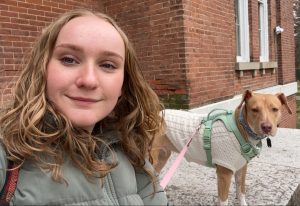
Hi guys! My name is Devyn Deal. I am a junior majoring in Environmental Studies. I have a great love for the earth and enjoy doing outdoor activities. I love to keep house plants and have quite the collection at home. Above is a photo of me and my sweet girl Nora having a little sit after a hike.

My first connection to Schuurman Chapter 1 is that I too had no clue what GIS was before coming to college. I found it very interesting to see the example of an early version of maps produced by GIS. It is extraordinary to see how far GIS mapping capabilities have come. I had never considered how game changing GIS technologies are in that humans can come to a vastly different conclusion based on the same data depending on weather they are reviewing the data via a numerical output, or through a visual output. It was interesting to learn there are two different definitions of what the GIS acronym stands for. In reading this chapter I learned the word sphericity. This chapter enlightened me on just how many uses there are for GIS. I had no clue there was so many questions and so many different types of research GIS was helpful in, I had only considered the ways presented to me in previous geography classes where we utilized GIS. For example I had never considered how valuable GIS could be in the economic world, or in public health.  I am curious to learn more about how nonprofit groups use GIS to represent themselves. I would also love to learn more about how GIS and feminism intersects. I am curious what some proposed solutions would be in the discussion of how to represent barriers on a map that are fuzzy and not do not necessarily have a precise line, like the black bear and grizzly bear example.

The first GIS application I looked into was the conservation of loggerhead sea turtles as they are an endangered species. In the example that I found satellite transmitters were attached to female loggerhead sea turtles to track their movements. This data was used to better protect the species by having a better idea of where they most frequent. Before the use of GIS it was unknown where sea turtles went after laying their eggs on shore. This study found most adult female loggerheads from Georgia, North Carolina, and South Carolina migrate to the Mid-Atlantic Bight. This study was the first to track the movement of a large amount of sea turtles rather than just one in order to get a good idea of where their home base was.

https://www.esri.com/news/arcuser/0206/seaturtles.html?srsltid=AfmBOorGNPS9umDoCnAhQRYZB0wCvjcM5jIrVWBJtLHb9R7jnnTlEyuy

The second GIS application I looked into was habitat conservation. I found a study on the conservation of the Florida everglades. The everglades are home to 68 threatened species, three national parks, 12 wildlife refuges, and a marine sanctuary. Due to human intervention 50% of its wetlands have been lost and the water quality has deteriorated. The south Florida water district and the united states army introduced a restoration plan which was termed the “largest restoration project in world history”.  It plans to rescue the everglades ecosystem through a series of ecological and water system improvements. The photo I provided depicts Comprehensive Everglades Restoration Plan projects, district lands, and developmental pressure on the everglades.

https://www.esri.com/news/arcuser/0704/iris1of2.html?srsltid=AfmBOopAvPcEMjX2qfDfTPC0ndXr92MZpRzmIHOLPACpdxO54JbmAiYz