ArcGIS Pro 3.1
Chapter 1
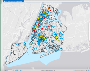
I found the previous extent button, which is located in the navigation group, really helpful for jumping back to previous areas you were analyzing. This is a lot easier than trying to move the map around and relocate the area you were in.I also found the bookmark feature beneficial for the same reason. Something I notice about the street when zooming in is that they adjust along the road to the area that you are zooming into. This is helpful because if you are trying to analyze an area that is surrounded by certain streets, then you do not have to keep moving the map over to look at the road name, it automatically adjusts toward that area. I also thought that the shortcut of holding the ctrl key and clicking a checkbox to clear all the feature classes was helpful. The symbology feature, which you get to by right-clicking the feature class is also helpful for adjusting the shape, color, and size of symbols. I think my favorite part of this chapter was being able to convert the map from a 2D map to a 3D map. I think this could potentially be helpful if you needed to know information about the shape of a building or how tall it is compared to other buildings.
Chapter 2
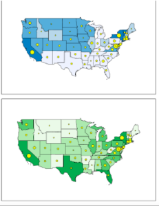
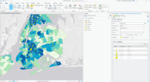
This chapter went over a lot about the abilities and uses of the symbology pane. You can label the villages and rivers by right-clicking the feature classes and selecting labeling properties. This allows you to change symbol characteristics as well as set the values for the symbols. You can also import Symbology by selecting the stacked three lines( options) and clicking Import Symbology. I thought the swipe tool, which can be accessed by clicking the feature class, selecting the feature layer at the top of the screen, and clicking swipe in the compare group. This allows you to view the layer underneath the top layer by clicking and dragging the pointer across the screen. However, you can clear the swipe tool by selecting Explore underneath the map tab. I thought the dot density symbology was an interesting way to display data. I found it interesting that when the dot value was smaller, more dots were made, and when it was larger, there were less dots. I think this is because the dot value is the number of people each dot represents, which would explain why when the dot value is bigger, fewer dots are shown and vice versa.
Chapter 3:
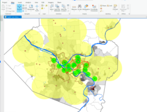
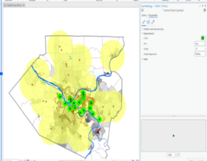
I liked learning how to create a layout and add maps to it. This seems especially helpful to look at two maps side by side. A layout can be made by clicking insert, new layout, and selecting the type and size you want. The maps are added by selecting insert, clicking map frames, and selecting the default of the map you want to add. Then, you just create a box by dragging the mouse across the layout. The maps can be edited by right-clicking and selecting properties, which opens the element tab with map options. I also thought that using the rulers and added guides to help center and align the maps was a clever way to place the maps in line with each other. Legends can also be added to the map by clicking Insert, Legend, and selecting the legend you want. By clicking and dragging the mouse, you can add the legend to the map. I also liked the addition of the bar chart, which I feel could be helpful based on what data you are looking for. The bar chart can be made by clicking the feature class, clicking data at the top of the screen, and then selecting the create chart under the visualize group. Other charts are also available under the Create chart button. The third and fourth sections of this chapter have a lot a beneficial tools and tips for presenting your data as a story map. However, the amount of content in these chapters was very dense. It is definitely something I will want to go back and review again.