1.1 – I was intimidated at first having to put my reading into practice, but the book makes it so easy. I love how it talks you through it and understands that it is the reader’s first time using the software.
1.2 – I don’t like how we learned about pop-up windows here but then didn’t use them again until chapter 3.
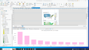
1.3- Using the attribute table confused me at first, but after working with it a few times and some trial and error I think I have it down. I will keep this section in mind though as a reference for when I have to use one next
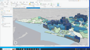
1.4- For some reason, I could not get the 3D version of the Population Density to work. I restarted and tried multiple times and was not able to get it.
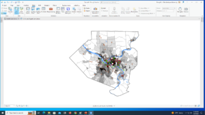

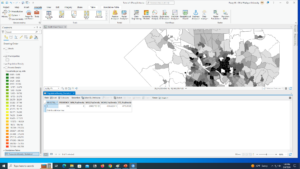
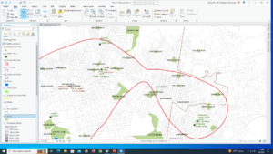
2.1 – Learning how to use a symbol was so much easier than I thought it would be.
2.2- I found this section relatively easy. It was a lot of repeating the same process over and over. It is useful to know how to turn off repeating labels.
2.3- One section in this tutorial wanted me to make ManhattanStreets a ground feature and I wasn’t sure how to do that so I skipped that step.
2.4- Creating a 3D choropleth map was the highlight of this assignment. It took me a few tries to get it right, but it was so rewarding in the end.
2.5- I really enjoyed reading about graduated sizes in Mitchell, so getting to do them was really cool. A repeating trend in this book is everything actually being a lot simpler than I thought it would be.
2.6 – This section was a little confusing for me. It felt like I was just doing what the book said but didn’t actually understand it. I’ll have to go back and read about it more and do some individual research.
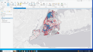
2.7- Reading about dot density maps they seemed more complex than actually making them. I also found it interesting changing the dot value around and playing with the features.
2.8- I think it is really useful that you are able to change what features show when you zoom. I had a lot of fun making this section.

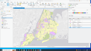
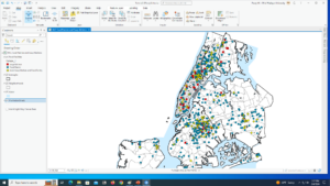
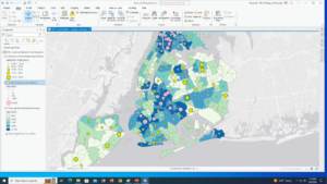
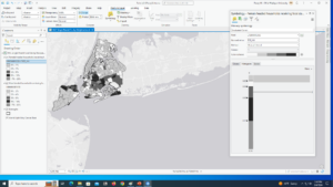
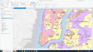
3.1- While creating my map titles I had a had time figuring out number 6 in the Insert Text section. It says to Click Text, expand Position, and for Height, type 0.45. However, my Position did not have height, but there was a size section that I found height in and use that, however, it did not look like the example.
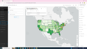
3.2 – It was a good change of pace to go to ArcGIS online after working in ArcGIS Pro itself for so long. ArcGIS online is equally as easy to navigate as the ArcGIS Pro software, and I like how the online version mirrors the functions and wording as the software.
3.3 – I felt like this section was very repetitive. I would have liked just reading about creating the website instead of actually copying and pasting what they wanted me to.
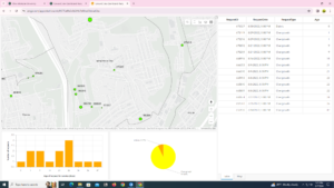
3.4 – I really liked this section! I thought it was really interesting to build my own dashboard and be able to customize it with what I think is the most important and make it how I want to look visually.
