Bahrey Week 5

GIS Tutorial for ArcGIS Pro

Chapter 4

Tutorial 4-3

It took me quite a while to get the ball rolling for this chapter. I feel like the second part of the book seems to hold your hand a little less. Kelsea and I did a lot of trouble shooting and problem solving together. Lots of creating and editing of queries but, overall, not too painful.

Chapter 5

Tutorial 5-4

I was not super put out by this chapter until Tutorial 5-5. There were a couple work-arounds in the earlier tutorials that didn’t require an incredible amount of patience, but I do not think I downloaded the data files from the public agency hub correctly and that may have set me up for failure for Tutorials 5-5 and 5-6. Still, it felt good to figure out how to add x,y data by systematically poking around because it is slightly different that the instructions in the book.

Chapter 6

Tutorial 6-6

The tutorials for this chapter felt pretty quick and I didn’t really have any hiccups. I imagine I will need to extract and merge features in a similar manner in the future.

Chapter 7

Tutorial 7-2

Maybe I was just getting a little more comfortable but this chapter felt fast too. Plenty of cool things with making, deleting, moving, and rotating polygons in this chapter. For some reason, the study area buildings disappeared when I ran the export features tool in Tutorial 7-4 but, to be honest, I didn’t find a solution and I ended up moving on.

Chapter 8

Tutorial 8-2

Not to sound like a broken record but this was the briefest of the brief. No issues in this chapter!

Urton week 4

Chapter 1:

I was pretty intimidated to start using this software because I’m not very good with computers. It took me a while to really get going with and finish this chapter but by the end of it I had a better grasp of what I was doing. This chapter covers the basics of using  Arcgis such as adding and removing a basemap, turning off and on layers, reordering feature classes, and exporting a map.  Section 1-2 goes more into depth into navigating various features. From this part I learned how to use a pop-up window, zooming in, using bookmarks and searching for features. As the tutorials went on somethings got easier but I started having more problems with not being able to follow the instructions to a T and not being able to find what was being asked. Sometimes after looking for a long time I would eventually find it or I would just have to move on like at the end of 1-3. In the second half of chapter one I learned how to work with attribute data which could be tedious but I started to enjoy it. Finally, I learned how to symbolize and label features and then show the map in 3D which was my favorite part of the chapter.

.

Chapter 2:

Chapter 2 had a lot more parts than chapter 1 so even though I had a better grasp on what I was doing it still took me a lot longer than expected. Nevertheless, I learned a lot of interesting and useful things like symbolizing qualitative attributes by using different symbols and labels. A highlight from this was honestly looking at all of the color options and their names in the symbology pane. I enjoyed seeing all of the layers start to come together to make a cohesive map in this section and learning how to manage pop ups to provide more information without mudding up the rest of the map. When it came to creating a coropleth map things became a bit more complicated and I found myself having to reread a lot but I eventually got it down. For the life of me I could not get the 3D map to work in 2-4 which I was very sad about because I like the 3D maps but I had to move on, I will probably go back and do some problem solving, though. As the chapter went on I learned more about having graduated points on graphs and customs scales that fit the population and then lastly making dot density maps with visibility ranges.

Chapter 3:

Chapter 3 was a lot shorter but dealt with a different format that before so it took me some time to learn where the different tools were. The first part went over  building layouts to display maps and charts in one space which I found very useful for future use in inserting maps into presentations and papers. The later section was where I learned how to share maps online and switched to using ArcGis online with different tools. I got lost on a lot of things in the later parts of the chapter but I got most things figured out after a while.  Creating a dashboard in ArcGis was tedious with many steps but the book made it pretty easy to follow even if I had to reread a few times. I think this process what a bit different that what I did before because it was like I was creating the dashboard for someone else and I wasn’t really sure what a dashboard was but I then understood and saw the usefulness in this application for possible future jobs I would go into.

Counahan week 4

CHAPTER 1
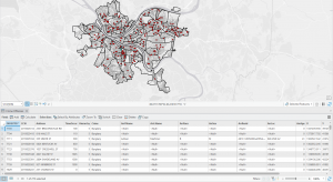
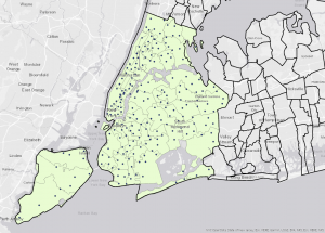
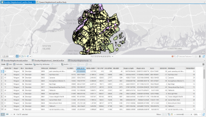
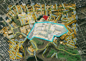
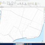
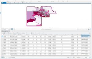
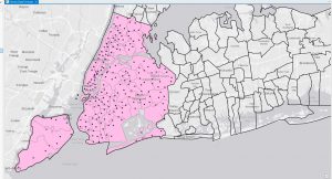
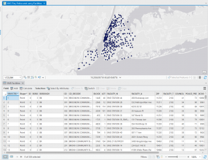
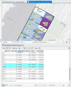
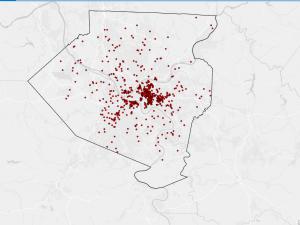
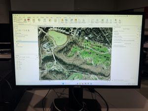
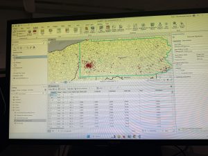
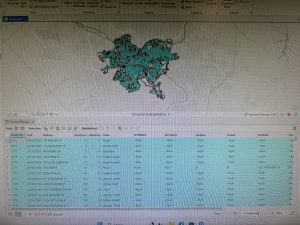
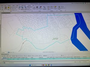
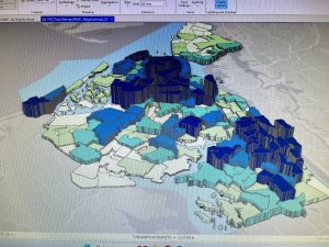
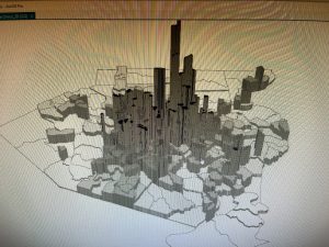
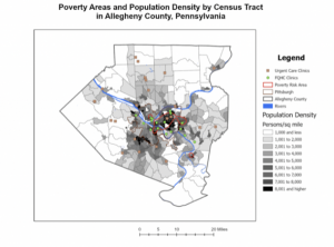
This chapter covered the basics of ArcGIS, emphasizing how to change basemaps, add features, and manage map layers. One key insight was the significance of selecting an appropriate basemap to provide meaningful context for spatial data. As I navigated through the software, I practiced zooming, panning, and adjusting layers to highlight essential details while minimizing unnecessary clutter. Accessing and utilizing the attribute table proved particularly beneficial, as it enabled efficient filtering and sorting of data, making it easier to identify trends such as regions with high population density. Additionally, I explored methods for customizing map symbols, including modifying colors, shapes, and labels to enhance readability. A standout feature was the introduction of the 3D view, which offered a fresh perspective on spatial relationships and added depth to visualizations. Although I encountered occasional difficulties, such as software crashes and missing tools, the overall experience strengthened my confidence in using ArcGIS for fundamental data visualization and organization.

CHAPTER 2
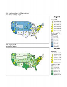
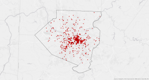
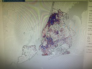
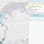
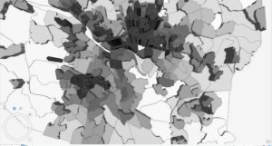
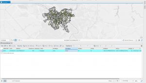
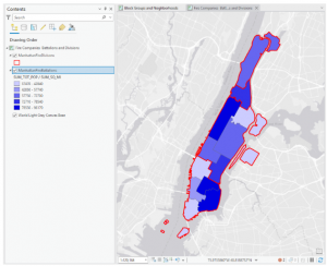
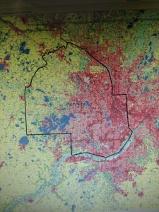
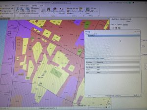
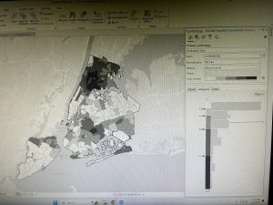
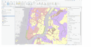
Building upon the previous chapter, this section delved deeper into refining map symbology and optimizing data presentation. I practiced adjusting colors, shapes, and symbols to create clearer distinctions between different data layers, improving overall map readability. Configuring labels and pop-ups made the maps more interactive by displaying key details, such as place names and statistical information, upon user interaction. Additionally, I experimented with definition queries, which allowed me to filter and display only specific data that met predefined conditions. This helped streamline the map’s appearance, ensuring that only the most relevant information was visible. I also explored different classification methods, including quantile and defined intervals, to better represent data distributions. Another valuable skill I developed was importing and modifying symbology for comparative analysis, such as examining income levels in relation to population density. Creating dot density maps further enhanced my ability to represent quantities visually, and learning to control label visibility at different zoom levels helped maintain a clean and uncluttered map layout.

CHAPTER 3
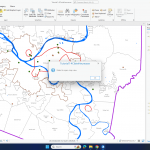
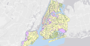
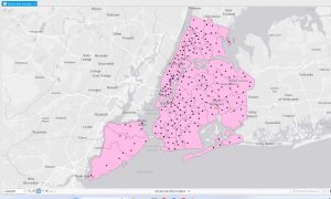
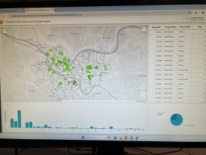
This chapter introduced more advanced ArcGIS tools, such as side-by-side map comparisons, map publishing, and interactive dashboards. Being able to compare multiple datasets within the same view was especially useful for identifying spatial relationships, such as the connection between population density and infrastructure placement. Another key takeaway was learning how to publish maps, which makes sharing data easier while maintaining control over visibility settings—an essential feature for presentations and collaborative projects. One of the most practical skills I developed was creating dashboards, which integrate charts, graphs, and maps into an interactive display. Dashboards are particularly useful for tracking real-time data and presenting findings in a clear, visually engaging format. Despite encountering some technical setbacks, such as missing legends and occasional glitches, this chapter significantly enhanced my ability to manage, analyze, and present geospatial data. I now feel more equipped to apply these ArcGIS tools in future projects and research.

Heumasse Week 4

Chapter 1: Introduction to ArcGIS Pro

This chapter introduces ArcGIS Pro and its interface, including how to open projects, manage layers, and navigate maps. It explains vector and raster data, essential for working with spatial information. The tutorial covers file geodatabases, which organize data efficiently, and basic map functions like zooming, panning, and exploring attributes. A key takeaway is how GIS helps visualize spatial relationships by layering datasets like population and land use. However, the 3D map failed to open for some reason, which made it difficult to explore certain visualizations. Questions that came up: What’s the best way to manage multiple layers? How does ArcGIS Pro handle large datasets?

Chapter 2: Map Design and Symbology

This chapter focuses on making maps clear and visually effective. It covers symbology, which helps represent different data types, and definition queries, which filter datasets. The tutorial walks through adjusting colors, labeling features, and classifying data for better readability. However, symbology is not working the way the tutorial describes, making it challenging to match the expected results. This issue made it harder to properly classify and visualize the data as intended. A key lesson is that good map design balances clarity and information. Some questions: How does symbology impact data interpretation? What are best practices for making maps both useful and visually appealing?

Chapter 3: Sharing and Presenting Maps

This chapter covers how to create layouts and share GIS work. It explains adding legends, scale bars, and titles for clear presentations. The tutorial also introduces static and interactive maps, highlighting when to use each. However, the second map in the tutorial is showing blank for me, which prevented me from completing most of the exercises. Because of this, I continued reading through the chapter instead. A major takeaway is that maps should be designed for their audience, whether in print or online. Key questions: How can layouts be optimized for different users? How can interactive maps be made accessible to beginners?

Grogan – Week 4

Chapter 1

To start this assignment, I like how the tutorial book explains how each button you click changes the map in a specific way and you can see the differences. I appreciate how straightforward they are in explaining each step of viewing the maps. As I went on, tutorials 1-2 explained the movement and navigation programs. I appreciated that one false move wasn’t going to ruin my entire progress as the undo button became my best friend several times. I was able to better understand where everything was within ArcGIS. When it came to tutorial 3, I started to work with actual data points. I was able to pull up different statistics and look at an attribute table. As well as edit it for different reasons and look at the summary statistics. Tutorial 4 I had some initial issues pulling up the symbology for the FQHC clinics but I just didn’t have the valid data source on the layer. Once I got that hiccup dealt with I had no issues with the rest of Chapter 1 practice with 3D maps.


Chapter 2

I took my time with this chapter since it was a bit more challenging. I enjoyed working on symbolizing maps and creating custom scales to suit my needs. The most confusing part for me was deciding which methods to use for choropleth maps. It seems like you really need to grasp statistical concepts, like data distribution, to make the right choice. I’m worried that when I start working with my own data, I might struggle to pick the most suitable scales for the best results. Another tricky part was the definition query, mostly because I’m not very tech-savvy, so it was a bit outside my comfort zone. However, I did learn some useful skills, like how to remove duplicate labels, adjust font sizes and colors, and explore more advanced 3D map features. One feature I found especially interesting was the Visibility Range option for feature layers. It allows a layer to appear or disappear depending on the zoom level, which helps make maps less cluttered and easier to navigate by only showing data when it’s at the right zoom level.


Chapter 3

It began by teaching map layout techniques, including adding legends, using the ruler to align elements, and exporting maps. These skills felt especially useful for creating educational maps or preparing professional presentations. The chapter also covered how to create charts based on map data, like a graph that focused on the employment statistics of just 10 states, making it easier to visualize trends without being overwhelmed by a larger dataset. The tutorial then shifted to ArcGIS Online, where I learned how to share maps and create StoryMaps. While I had some experience with ArcGIS Online, there was still a bit of a learning curve. It seemed intuitive and user-friendly but lacked some of the advanced features of ArcGIS Pro. Creating a StoryMap was fun, though it would’ve been even better to use my own words and data instead of just copying and pasting. Overall, the chapter gave me valuable experience using ArcGIS Online to create interactive maps and reach a wider audience with visually appealing presentations.


Cooper Week 5

Week 5


Chapter 4


I felt much more confident this week after all of the exercises last week! In 4-1, I had a lot of trouble creating a project. I tried this several times, and each time it wasn’t even opening the basic US map like the book said it should. I ended up completely restarting on a different computer and got it to work. The tasks in this tutorial felt a little tedious but I think I got them to work eventually. In 4-2, there were a ton of issues but I think that I was able to get things figured out, most of the issues where when tyring to type in expressions and just overall finding things. Section 4-3 was very helpful to look at different clauses and I can see why they would be useful. Sections 4-4, 4-5, and 4-6 didn’t give me a ton of issues and were pretty straight forward. 

Chapter 5


This chapter was not too bad. 5-1 was cool to compare different world maps, I honestly did not know there were so many of them. 5-2 was also useful for US specific changes. 5-3 was very useful to learn all about layers.  In tutorial 5-4, I had some trouble finding the XY Table as it would not show up after right clicking Libraries. I found it was actually labeled under “Create Points from Table” and then “XY Points.” After this fiasco, I was unable to find the proper Library data set to input into the table? I realized this was already there and then was able to get the library data points to display. I was then able to add the school districts. 5-5 was useful for using Census maps which will be very helpful in the public health field. 5-6 helped me understand raster files much more in-depth which was useful because it was a hard concept for me to grasp before.

Chapter 6


Section 6-1 was pretty simple, although I did have some trouble getting the labels to work so I just skipped that step and moved on to the next tutorial. 6-2 and 6-3 were pretty self explanatory and I didnt have any issues. 6-4 was also super quick and helpful. The append tool seems pretty useful to bring some different tables together. 6-5 and 6-6 were useful for both using different features and being able to intersect them as well as learning about land use features. In 6-7, was also useful for comparing the services of fire departments. 

Chapter 7


In 7-1, the vertex points gave me a lot of trouble. I had a really hard time getting them to drag properly. I feel like this tool could be a lot easier to use if it was designed a bit differently. I figured out the reason I was having so much trouble was because I had sketch proportionally on.  7-2 was pretty useful for actually learning how to create the polygon tools themselves. 7-3 was also cool to learn about all of the different tools to add to these features. 7-4 at the first mention of CAD gave me flashbacks to learning Autocad in my high school engineering class. It is okay thought, we persevered. It honestly took me a hot minute to get the transform feature to work properly but I got the CAD image to line up!

Chapter 8


8-1 was pretty easy. I had some trouble here and there finding some buttons but it wasn’t too bad. 8-2 was also pretty easy and I did not come across any issues.


Smith week 5

Chapter 4:

Chapter 4 was relatively straight forward. I experienced no difficulties importing data, however it was time consuming and had a learning curve. I find myself spending less time searching for things like the catalog pane or the toolbox.

Chapter 5: 

Taught me how to work with world map projections
 i was unfamiliar with how many way the map was projected. It was interesting to see even on a continental level the states change via world map
 I also had a learning curve with working with the tabular data.

Chapter 6:

Chapter Six was all about creating a neighborhood.  It was cool to be able to work with the fire departments and police station layers. 

Chapter 7:

This was my favorite chapter/ most interesting to me. I thoroughly enjoyed working with the tools to create maps. I however was left with some questions like when and why should i be using these tools. 

Chapter 8:

This chapter although being small was very insightful. I got to work with zipcodes from my home state and even ended up working with zipcodes from an area at which i used to live which was super cool. 


Kopelcheck Week 5

For each chapter I have thoughts and things I thought were interesting. Firsty for chapter 4 I will not lie when I say this was probably the most difficult chapter for me as I had a hard time navigating through the outside databases and figuring out the downloading system. Once I was able to figure it out I will say this seems very useful when applying this to a plethora of data sets. Chapter five I also struggled with importing data however I again did figure it out although I did have a hard time putting in outputs as it kept given me errors and not allowing me to run the program. For chapter 6 I like how I was able to see and click through points/streets to find more information. This chapter I had a hard time with the outputs but I eventually figured it out and I will not lie I felt extremely satisfied with myself. Chapter 7 I like the ability to use shapes and using tools that allowed me to draw my own shape. I will admit I forgot where the transparent function was so I decided to go with the hatching setting to still give that. Finally chapter 8 was interesting as it had a lot to do with zip codes as well as creating bookmarks (in a way). Overall I really enjoyed chapter 7 as it gave some fun creative aspect to GIS. I seemed to struggle the most with output inputting, I kept running into an error wall and I could not find out why. I also seemed to struggle with finding the output variables, as they did not seem to pop up. Regardless I was able to achieve results, something I will have to look in to/practice more is the output data set.

Below I have attached pictures of my work through various stages of chapters 4,5,6,7, and 8.


Naples – Week 4

Chapter 1

I was pleasantly surprised by how straight forward the tutorials are. However, it was a struggle for me to begin going through with them. I had a few problems with my hard drive before I could even get started. It is USB-C only, which requires a port that is not on the computers. So I got an adapter assuming that it would work as it has in the past. This was in fact not the case. The adapter allowed the computer to recognize that the hard drive was connected, however it was not accessible on the computer. I then had to get a USB hard drive to start the work. Once I had begun I immediately started to enjoy the process of learning the software. I have taught myself programs such as Adobe After Effects, Sony Vegas Pro, and Final Cut Pro in the past, but those were all essentially me going through the programs randomly under the guise that “you won’t break it.” This was a much smoother and enjoyable experience by miles. I did not have any issues going through the motions of the tutorials from this chapter aside from one specific instance. In Tutorial 1-3, when obtaining summary statistics I had initially gotten the wrong value for the Mean (3174.1) rather than that of what was given in the textbook (4516.6). All other of the statistical values were correct. I ran the Summary Statistics tool for a second time and I was given the correct values for all of the Statistic Types. I honestly don’t know what happened the first time. I found myself getting comfortable navigating through the different windows of ArcGIS very quickly. 

Chapter 2

Getting into the second chapter of the textbook, I had to use a little more brain power to complete the tutorials. I was still having a pretty easy time completing the tutorials, however there were more instances in this chapter where I had to reread the instructions to understand what the actions I had to complete were, rather than just going through the motions. I had made very minor mistakes throughout these tutorials. One example of a mistake I made was when creating the definition query (Tutorial 2-3) I had missed that the program automatically set the ‘OR/AND’ option to AND, preventing the facilities from showing up on the map. However I quickly was able to troubleshoot what I did wrong and successfully create the query. After this, the next problem I ran into was directly after in Tutorial 2-4. When I opened the project the “Neighborhoods” feature had an exclamation mark next to it. When I moved into the Symbology pane I was greeted by a lovely message telling me that the “Neighborhoods” layer did not have a valid data source. I troubleshooted in the program before Googling my issue to see if anyone else had run into this. Luckily for me there was a posting on the Esri website from someone with my exact issue. They had solved it by dragging the Neighborhoods feature class from the catalog pane into the contents pane. After this I deleted the original useless “Neighborhoods” feature. From here it was smooth sailing for me in Tutorial 2-4. The next issue I ran into was in Tutorial 2-6. When importing the symbology to use the swipe to compare feature I missed a step. I forgot to set the Target Field to U18MHHFOOD. Due to me forgetting to set this field correctly the swipe feature did not work. After importing the symbology again, I realized my mistake and corrected it. After this the swipe feature worked perfectly for me. Overall I thoroughly enjoyed Chapter two of the tutorials. They were challenging enough in comparison to Chapter 1, however they were not overwhelming in the slightest.

Chapter 3

Chapter 3 started off okay for me. The first few steps of Tutorial 3-1 went smoothly. This was until I reached the point where you create and insert a chart. I was able to open Chart Properties and enter the data that was provided for me. However, when the instructions begin to refer to the chart being on the screen (Adjust the size of the map pane so that the  bars on the chart are at the height you prefer) I cannot see the chart. After searching throughout the different tabs, I was able to insert the chart. However, this is not the completed chart, as I need to select the top 10 states for the chart to reflect the information the tutorial intends it too. After a very prolonged and unnecessary moment of frustration, I remembered to try and restart the software. After I restarted the software and opened the project, the chart appeared exactly where it should have been all along. Tutorial 3-3 was surprisingly challenging for me. I think that because I am used to using modern forms of social media that I assume I can use any website. While this is almost always true, I am not a natural at blog post style websites. However, once I got the hang of the phrasing the book was using it was smooth sailing. Tutorial 3-4 was very enjoyable. It wasn’t perfect as I am obviously still learning, however I enjoyed utilizing the different elements on the dashboard and incorporating them. As I had gotten the hang (generally) of how the usability of this website works in the previous tutorial I could just complete the tutorial without fighting with the website.


Flores week 4

In chapter 1 I had some difficulties learning how the program worked but when I figured it out it felt very rewarding. I found arcGIS to be very inaccessible, they use very technical language that someone who doesn’t normally work with computers won’t understand. The textbook tutorial is also very vague with its instructions at times, but they are also helpful at certain points. The instructions are also outdated and not the latest version of the program. I liked learning about how to navigate the maps, and it was really cool learning how to change the maps from 2D to 3D. In Step 2 of Use a pop-up window, There was no website hyperlink for me to click and explore, so I couldn’t open that. I also forgot to save tutorial 1-3, which doesn’t affect me but now I don’t know how to get that back. 

Chapter 2 I had an issue at the start of 2-2, the labeling and layer groups Weren’t working and wouldn’t show up on the map. Some of the instructions were telling you to do the same thing with different contents but explaining it in different ways which made it really confusing. I did like that it was New York and we used the same colors the New York City Planning department uses. It was interesting learning about choropleth maps and how they use color to represent numeric values, it makes it easier for a visual learner to understand the map and learn the information it is giving. This chapter really helped me understand how the maps work and helped me get more comfortable with the GIS application 

In chapter 3 we learn the really important skill of transferring our maps off GIS and sharing them with people who don’t have access to it. The 3-3 tutorial was really cool because it was basically teaching you how to create a website. I struggled to find out how to place the table and the map side by side. I also didn’t have the pie chart from one of the steps, but it didn’t affect the dashboard.