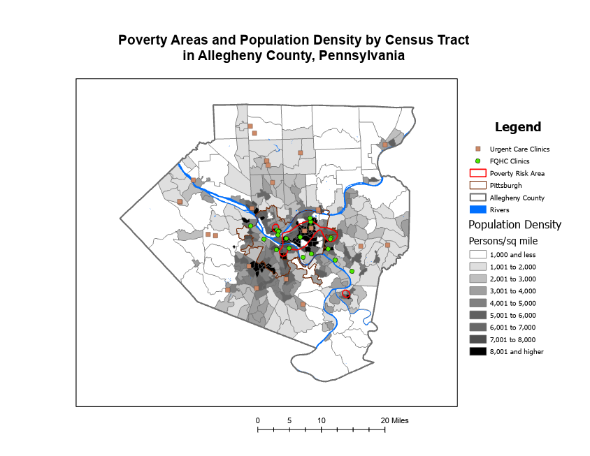
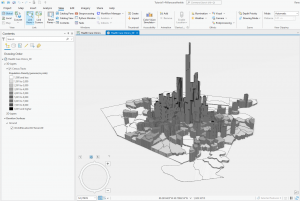
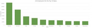
Chapter 4: Mapping Density
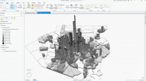
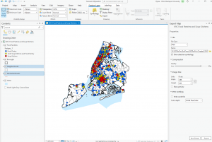
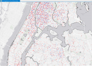
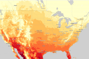
This chapter covers why it is helpful to map with density, how to decide when to map density, two ways to map density, mapping density of defined areas, and creating a density surface. The chapter starts by showing how to calculate a density value for a location. To do this, you divide the total number of features by the region for every location. Then, each area is shaded in a different color. I learned that ArcGIS can calculate density for us, which is lovely! You can also make a density map with dots, where each dot is assigned a value, and then the dots are placed on the map accordingly. It was interesting to see the comparison between the examples in the book of a shaded vs. dot map and how each can be perceived differently. Density surfaces are created in raster layers. There is also a specific formula to calculate cell size. You start by converting density units to cell units, divide by the number of cells, and then take the square root. It is also essential to find a good search radius. Something too big can disregard local patterns, but something too small can prevent the more prominent patterns from being recognized. The weighted maps were also interesting, and the farther away from the search radius you get, the less detailed the densities would be. Visually, my favorite maps to look at were the graduated maps. Seeing patterns with a smoother gradient rather than sharp lines or an abundance of dots was straightforward. However, as with everything, each map type has a time and place. For instance, a shaded map might be more suitable for showing population density, while a dot map might be better for showing the distribution of a specific species. I appreciated seeing the connection to classes from the previous chapters and how that related to density mapping. I also learned that it is good to have more sample points to make the data more representative of the population since the date between points is an estimate.
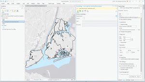
Chapter 5: Finding What’s Inside
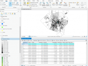
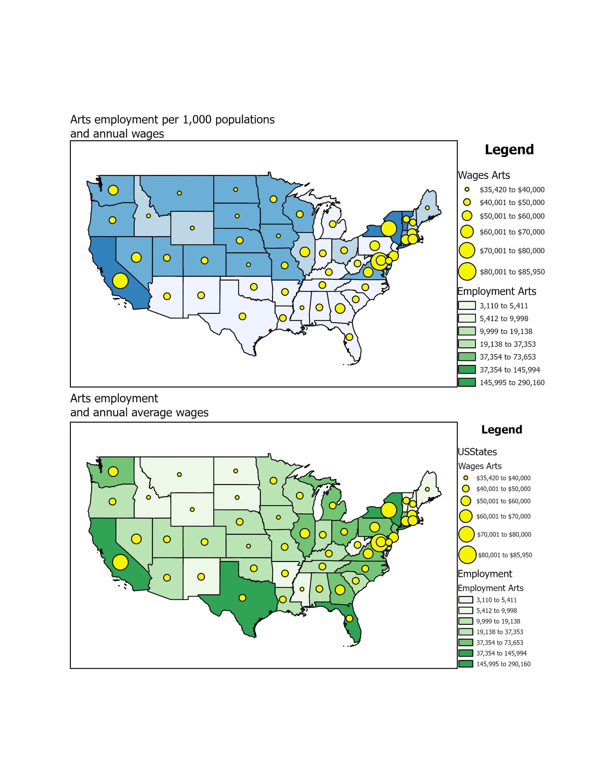
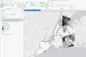
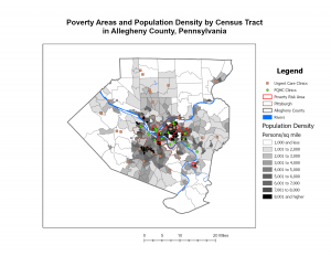
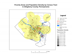
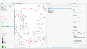
This chapter is dedicated to the ‘Finding What’s Inside’ technique, which is a versatile tool for mapping an area to understand its dynamics. It also enables the comparison of different areas, making it a valuable resource. The chapter outlines multiple ways to apply this technique. The first method involves drawing an area boundary on top of the features. The second method uses an area boundary to select the features inside, and the third method combines the first two, creating summary data. You can also use this technique to identify patterns within a specific area or across several areas. The categories that are graphed within the area can be discreet or continuous. What’s intriguing is that the continuous data could also be data from a previous map created with GIS. These area graphs can be used to determine if an individual feature is in an area, provide a complete list of features contained in an area, or list the number of features inside an area/a group of areas. Since some linear/discrete data can fall partially within and outside of an area, you can select if you want to include all data that lives completely inside, all data that lives entirely outside, features that fall inside but extend outside of the area, or only include the portions of the data that exist inside the area. The first way to “find out what’s inside” is to draw areas on top of features. The next is to select features inside an area. Another way is to overlay the areas and the features. Different methods work better for solving various problems. When creating these maps, using thick lines to show the areas or shading is helpful. After making these maps, statistics can be extremely useful in determining the data’s meaning and assessing visual patterns. This chapter also details how to make various maps and the steps that go along with that.
Chapter 6: Finding What’s Nearby
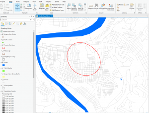
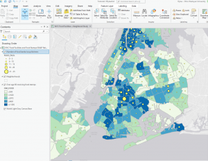
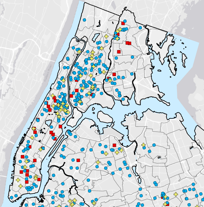
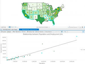
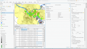
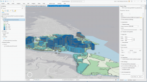
This chapter is about learning how to use GIS to visualize elements within a specific area. This can help monitor a location to understand what is going on inside. There are three ways to measure nearness: straight-line distance, distance/cost over a network, and cost over the surface. You can measure with distance or price. Distance is self-explanatory, but cost can be time, money, or effort. It is essential to know if the area you are calculating is flat, planar method, or curved, geodesic method, as the calculations differ for both. The planar method is better for small areas where the curvature of the Earth will be relatively nonexistent (city, county, state). The geodesic method is used for much larger areas, like a region, continent, or the Earth as a whole. When mapping, you can choose to use a single or multiple ranges. Multiple ranges allow for more comparisons, which could be helpful for specific issues. With straight-line distance, the source feature and distance are measured. GIS will then find the features within that area. For distance/cost over a network, you must specify source locations and a cost or distance for each linear feature. Then, GIS shows which segments fall within those boundaries. Lastly, for a cost over a surface, you specify features and costs, and the GIS will provide a cost for each feature. Using GIS, you can also create a buffer as a permanent or temporary boundary. One example was creating a sound buffer for streets. When making the maps, you can choose only to show the features inside the map or the features inside and outside. Both of these options work well for different purposes. This chapter also gives a tutorial on how to create these types of maps and how to read the results. I found it interesting that GIS can help develop travel routes. This can allow first responders to reach their destination quicker, potentially saving lives. I also thought that specifying more than one boundary on the same map could also be useful for different situations.