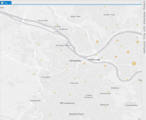
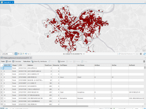
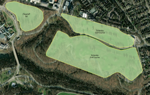
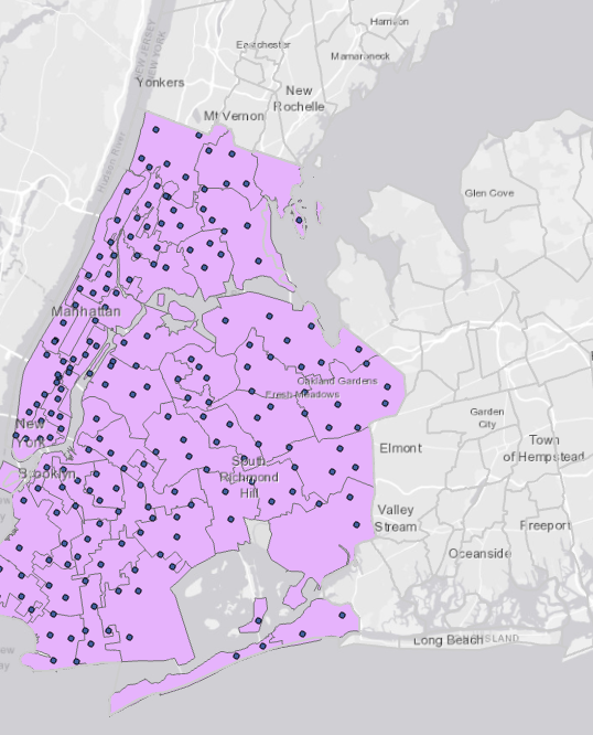
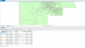
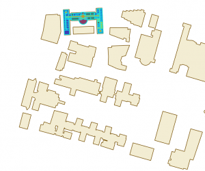
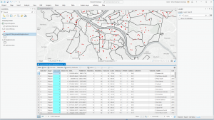
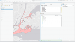
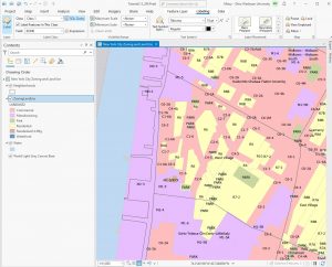
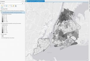
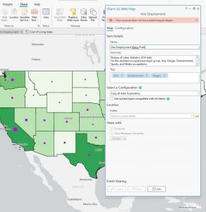
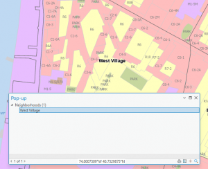
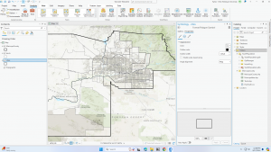
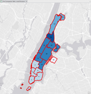
Chapter 4
Went pretty smoothly, nothing crazy happened. Here are some of my maps!
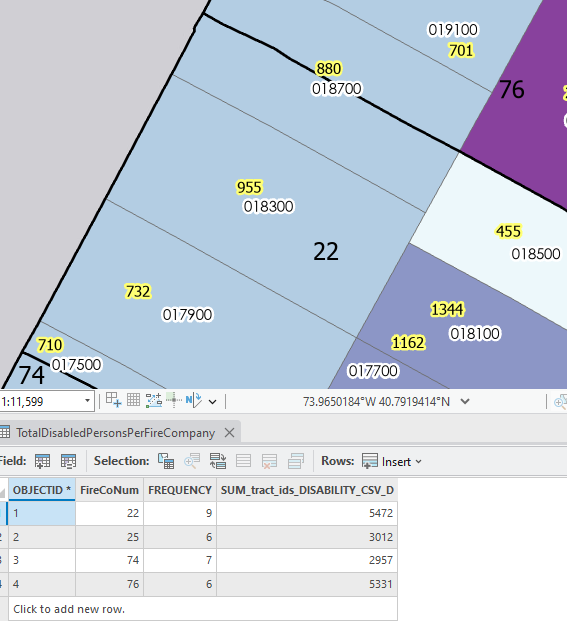
Chapter 5
This chapter was kind of rough for me. The first issue I ran into was not being able to find the NAD 1983 coordinates and the NAD 1983 UTM Zone 11N, in tutorial 5-3. This also wouldn’t let me then change from degrees to meters, but I know how to do it which is the important part. In 5-4 I couldn’t find the Display XY Data button either. In 5-5, I was unable to add my census data to the tutorial. It said that my census folder was empty, even though it contained all of the information I needed, so I couldn’t complete that whole tutorial. In 5-6 I couldn’t add the data from the Living Atlas, it wanted me to sign in, but wouldn’t accept my credentials, so again I could not complete that tutorial. So unfortunately, this chapter wasn’t the best for me.
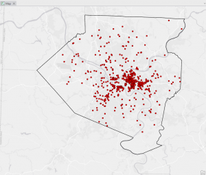
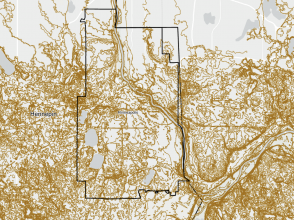
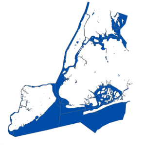
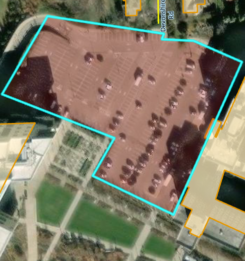
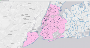
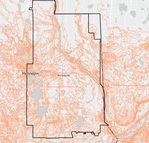
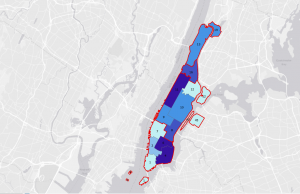
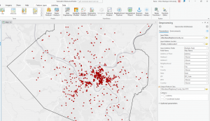
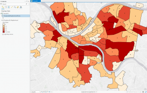
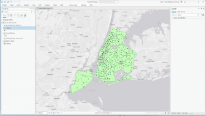
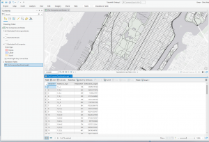
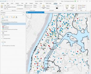
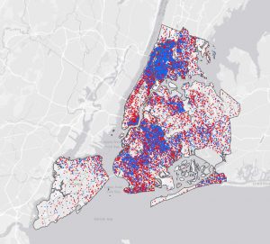
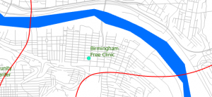
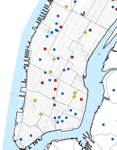
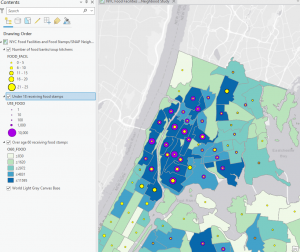
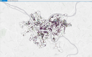
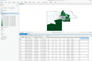
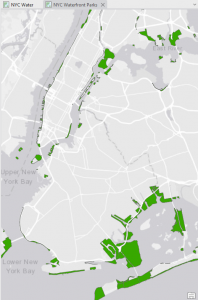
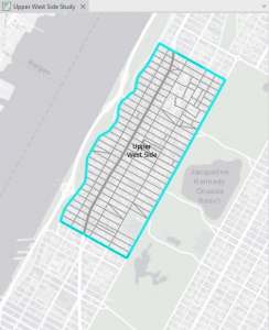
Chapter 6
This chapter went by really smoothly, which was refreshing after the hassle of the last chapter. I didn’t come across any issues. Some maps from this chapter are below 🙂
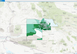
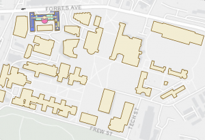
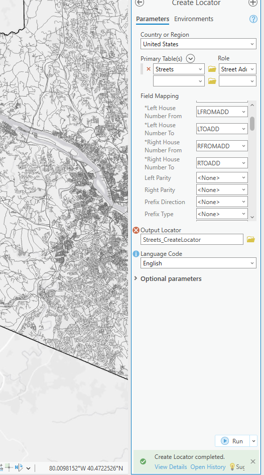
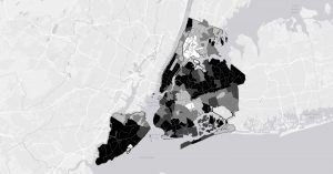
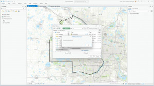
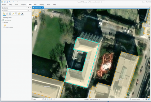
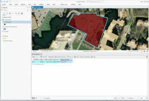
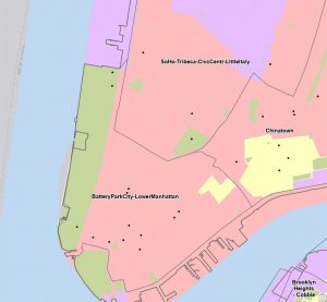
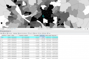
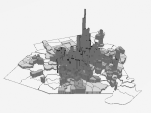
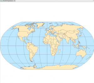
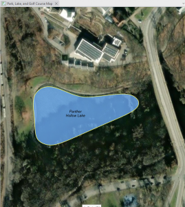
Chapter 7
This chapter was also pretty straightforward. I did enjoy getting to create and move polygons, it was more fun and relaxing than using tools and doing heavy statistical things. In 7-4 I was unable to transform the polygons, it let me add the links but not do the transform function. Other than that I got everything else done!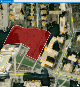
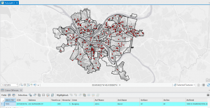
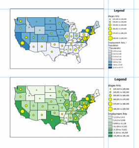
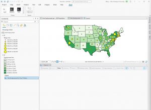
Chapter 8
This chapter was super quick and easy! Nothing crazy happened.