Chapter 4 – File Geodatabases
Tutorial 1 – To import some data, I will want to open geoprocessing, look up ‘export features’ in tools, and then find the things I would like to import. Such as a shape or dataset. I will want to set up the folder connection prior to doing this. To import a set of data into a file godatabase I will first want to have my excel file as a .csv file in order to import it. To get a data table, I will want to look up ‘export table’ in the tools. It will be the same process as the shape data. In order to use the data I will right click databases, then click ‘new file geodatabase’ which is under the catalogue. I had gotten pretty lost at this part, the MaricopaTracts had not saved where I believe the book wanted me to save it. I am going to skip to Tutorial 3 and hope I can figure out this process later.
Tutorial 2 – Due to not completing Tutorial 1 due to a few issues I couldn’t figure out. Some notes I have attached are on the general process for modifying the values for attributes. I’ll want to right click the data I want to create an atribute for in the contents page, then click “Data Designs” then Fields. I’ll want to hold Ctrl while selecting all the rows except for the ones I do not want to mess with, then save while on the Fields tab. While the tracts attribute table is open, I will want to look at the fields view, then add a new field. Then I will want to type in the name of the field and click what I want the data type to be. Then save it. Once I have figured out what I want my attribute to be I will want t ojoin the tata table tothe feature class attribute table, this is done by going to the contents pane, then right clicking the data set i wan to bind, then click join. The rest of the set seems relatively intuitive, however if I run into issues it is found in around page 96 – 97.
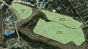
Tutorial 3 – A lot of the content here reminded me of soem intro to computer science stuff, which was making different conditional statements ‘and/or’. In order to get different things and only said things to appear on the map I would want to right click, go to properties, then go to definition queries and enter in my conditional statements. I can also use these conditionals to make the map as broad or as niche as I need it to be.
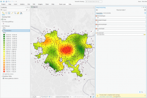
Tutorial 4 – This tutorial seemed more about putting some of the skills we have gained together. The only newer thing is the Spatial join, which would have been using the target features that we want to see change, and the join features which would have been what we are using to count the crime rates.
Tutorial 5 – Very similar to tutorial 4, but with points.
Tutorial 6 – In order to create something along the lines of a key, I will want to open “Create Table” and make some sort of code. For this particular case, I wanted to make 2 new fields within the table, which can be found by right clicking the table in the contents section, then adding 2 new fields, which are hierarchy and crimetype. The hierarchy just adds a number, which would be my metadata, while the crimetype adds some description the numbers. I can then join another larger table to my code, assuming the heirarchy/metadata remains constant, I will want to base it on the hierarchy.
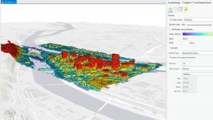
Chapter 5 – Spatial Data
Tutorial 1 – I learned how to change the map projection, right click go to properties, then go to
Tutorial 2 – We can do the same thing with smaller places.
Tutorial 3 – I couldn’t get into the living atlas due to the site being deemed insecure by my beloved browser. To center into a certain shape, I will want to make sure that in the project tab, options, map * scene, and special reference. I will want to ensure that the “Use Spatial Reference of First Operational Layer” is enabled. I am also able to change how the coordinate system works through the options found in the coordinate plane rules after right clicking the map and clicking ‘Properties’ and messing around with the coordinate functions.
Tutorial 4 – It seems relatively easy to do the steps listed here. Importing various sets of data and displaying them onto the map similar to things done in Chapter 4.
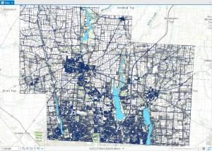
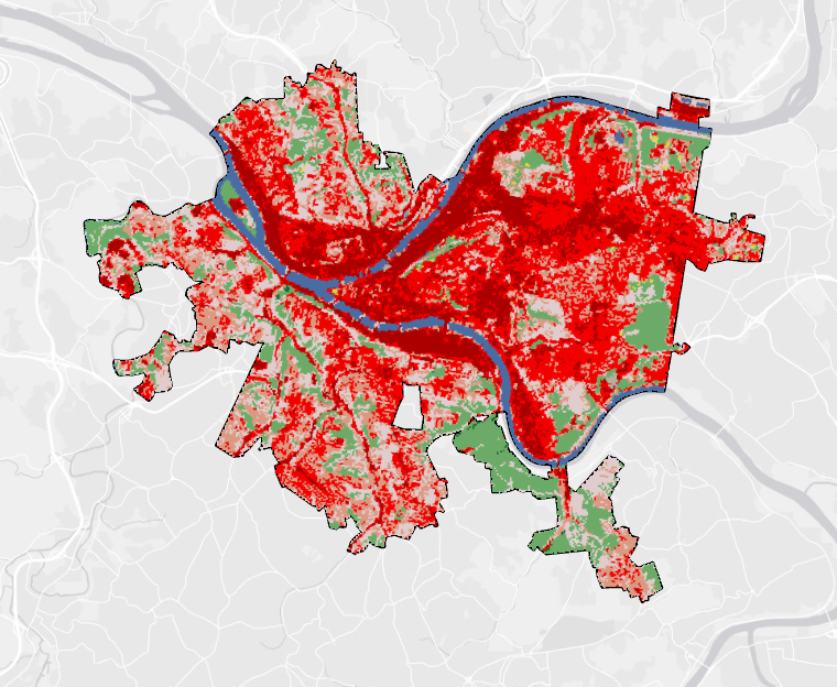
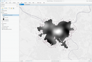
Tutorial 5 – I am able to find stuff on the census page, but it will need a lot of narrowing down. From the looks, it appears that there is a lot to do with trimming the data down to precisely only the figures that I want. I will then import the data to an actual map, and I can create layers based off of the data that i have selected.
Tutorial 6 – I am unsure as to why the lab computer does not like me looking for online data as it does not want me accessing ‘NCLD’. I can look for some extraction info when i look for “Extract by Mask” in tools. I can then go to the national map and find some information on finding contours & elevation from governmental sites. The computer did not want me accessing the hennepin hub. But they can also be used.
Good map sources:
https://apps.nationalmap.gov/downloader/
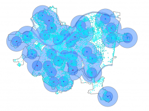
Chapter 6 – Geoprocessing
Tutorial 1 – Nothing too major other than the picking of data to use for the guides. I could not remember how to put the fire battalion numbers on the selected zones.
Tutorial 2 – We can turn a lot of map locations into very few by narrowing the data pool down by creating a certain ‘study area’. By creating a selection by attributes group with the ‘name is equal to’ function. After it has been selected, we can go into the data of the attributes we have selected, export features, and then use our new output feature class.
Tutorial 3 – Nothing major, but to merge data sets go to the merge tool.
Tutorial 4 -Nothing major, but in order to make a conglomerate data set I will want to use the append tool.
Tutorial 5 – As a reminder to myself, in order to join 2 tables, I will want to right click a table, find the join section, and then the rest is self fulfilling.
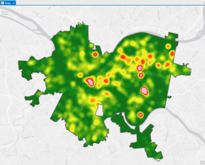
Tutorial 6 – Joining tables can be very revealing about a certain type of data set. I will want ot be careful and know what I want to join in particular though.
Tutorial 7 – Tabulating can create some good comparisons.
Chapter 7 – Digitizing
Tutorial 1 – When splitting a polygon, I will want to mess with the attributes to give them proper names.
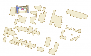
Tutorial 2 – To create a new polygon for a new class, I will want to open the create feature class tool and make sure the geometry type of a polygon. Afterwards I will change the color and look for the ‘create features’ within the edit dab. Afterward I can create features.
Tutorial 3 – Smoothing is fairly easy, but important for presentation. This is done through the smoothing tools!
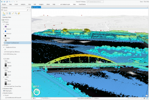
Tutorial 4 -It is fairly easy to import a computerized drawing, however in order to do anything with it, I will need to import the initial polygon, thn open its data to export features.
Chapter 8 – Geocoding
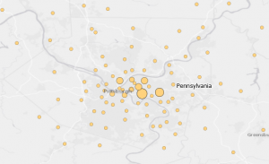
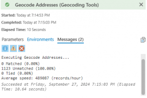
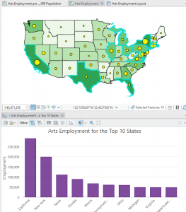
Tutorial 1 – This was fairly easy and felt like it brought everything together in a way to show a certain statistic. In this case that would be amount of people attending a certain event. If there were ‘false’ parts of the data set, there is a solution to match addresses within the data tab.
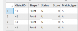
Tutorial 2 – Create locator seems to be a core part of this chapter, it can be fairly easy to use to highlight a certain set of data from the map and given data.