Gist Week 2

Chapter 1: Introducing GIS Analysis


This chapter begins with an overview of GIS analysis and its crucial role in understanding different geographic patterns. Since this is an introductory chapter, many concepts are introduced. GIS Analysis is the most prominent term introduced, and it explains how GIS is used to analyze spatial relationships and patterns in geographic information. He also introduces spatial patterns, which are the layout of shapes and features in a space, and spatial relationships, which are how certain geographic features interact with each other. These techniques significantly impact decision-making, as they can help us visualize certain things and significantly influence our choices. Another set of terms this chapter goes over are different types of data.Ā  I was interested in this concept because they can all be used differently for other purposes and data sets. For instance, point data can represent specific locations, such as cities or landmarks, while line data can represent linear features like roads or rivers. The different data vector points (points, lines, and polygons) help to show specific features or regions, while raster data (grid-based) helps to show a surface and how it changes. Vector points were what I associated with GIS, but it was interesting to learn about raster data since I hadnā€™t thought of the different types of data that a person could input. The attributes linked to data were also interesting to me, and they are used to help us and the computer understand the data better. The steps outlined in this chapter for GIS analysis reminded me much of the scientific method, with the various steps of testing, retesting, and analyzing while looking at an issue from multiple angles. The most significant takeaway from this chapter is the pivotal role of GIS analysis in decision-making, as it can help us visualize certain things and significantly impact our choices, thereby underlining its importance and influence. Statistics, a crucial component of GIS analysis, provide the tools to quantify and analyze patterns in spatial data, making them an indispensable part of the process.Ā 


Chapter 2: Mapping Where Things Are


This chapter also places a strong emphasis on statistics, highlighting that a robust understanding of statistics is instrumental in interpreting spatial data. Statistics play a pivotal role in GIS analysis, providing the tools to quantify and analyze patterns in spatial data. One of the significant terms in this chapter is spatial statistics, which applies statistical techniques to spatial data to quantify and analyze patterns. The next term is descriptive statistics, which are just basic statistics. These include mean, the average of a set of data; median, the middle value in a set of ordered data; and standard deviation, the distance from the mean that a large percentage of the data is. This can help compare outliers and find where similar values are located. The chapter also highlights the process of creating a map. In making a map, the person will provide each location’s coordinates and a category value. Then, the person must specify how they want the information displayed. Too many categories can be overwhelming, while too few will show some patterns and can leave out specific details. Visual information and statistical information can be used to locate these patterns. The most significant part of mapping is deciding what, where, and how to map things. Using the correct map is essential because if not, the data can be confusing and lead to misleading results. Just like when writing, the audience is significant as well. The map could be more complex if you have scientists with a lot of background information. If the map is intended for the general public, it must be more straightforward and contain more information to give context.Ā 


Chapter 3: Mapping the Most and Least


This chapter, which focuses on techniques for analyzing patterns, introduces the concept of spatial pattern analysis. This technique examines geographic arrangements to find patterns, enhancing our understanding of the distribution of certain items and the factors influencing them. Visualization plays a key role in this process, as it allows us to see high- and low-density points. When mapping, three different quantities of features will be given: discreet features, like locations or regions; continuous phenomena that show a constant value in 3D; and data summarized by area, which separates areas through shading, usually with a gradient of colors or contours. When creating maps, it is essential to use specific analysis techniques to give appropriate and helpful results. After being given a quantity, values can be given a symbol to make the map more visually appealing and understandable. This visualization aspect is so important to help see patterns, but if that isnā€™t enough, statistics can also be looked at. Classes can be added to separate higher and lower values, making the map more understandable. Classification schemes are used to create classes. I like having black-and-white categories because I tend to overthink things in grey areas and which category they should go in. I found these common schemes very helpful: quantile, equal interval, standard deviation, and natural breaks. For quantile, the number of features in each class is the same. The space between high and low values is equal for each class in equal intervals. In standard deviation, the classes are based on how far away from the mean they are. Lastly, in natural breaks, the classes are created based on groups in the data, close values. Overall, the type of map used is essential, and choosing an excellent way to analyze the data can make finding patterns tenfold easier. Selecting a map or analysis method that is less effective can lead to a lack of finding a pattern, which could have lots of impacts on society.Ā Ā 

Veerjee Week 2

Chapter 1:Introduction to GIS Analysis

GIS analysis is similar to something that I am sure many of us have been doing, but now we are putting it into a geographic context. Especially when looking for both patterns and relationships, sometimes these maps can be self explanatory, however the more interesting problems are finding ways to explain both the correlation and causation of what occurs and what data is shown with the maps. The GIS analysis process that the first chapter outlines reminds me of the scientific method if we were not to make a hypothesis, finding a question to ask, finding a way to frame the question while also being able to measure said data, understanding the data that is presented and gained, choosing a method of measuring the data and method to present the data for further analysis, processing the data, and looking at the results of the data. One thing that I had not considered before was the many ways of looking at the results that are gained, such as displaying them on a map, looking at a data, or within a chart. Measuring geographic features can be extremely useful, but I was unaware at first of how many different types of features there are, there are things easier to measure such as mountains, city limits, and where rivers are located, those things can be pinpointed and are considered discrete features.
Discrete features seem to answe the question of ā€˜is this feature here or not?ā€™. Continuous phenomena is something that is a value that can change during the average day, such as precipitation or temperature. Continuous data can be represented in areas enclosed by boundaries assuming that everything within the data is the same type.
Features summarized by data can represent a simple count or density of various features within a certan enclosed area.Within GIS, there are 2 different ways to represent data, through vectors and rasters. With vectors, the system uses a table with shapes & points to represent data at certain sets of coordinates and bounds, this is most similar to a graph or shapes. With a raster model, it is similar to a large excel sheet where you paint the different types of cells to represent different numbers & data points. The book states that both types of representations of the data are good, discrete features are usually represented with vectors, continuous are represented as either vector or raster, and continuous numeric values are represented with raster models.
With attributes, every feature has some attributes that are able to be used to identify whatever we are trying to represent. These attributes are the following: categories, ranks, counts, amounts, and ratios. A category is an overarching topic that contains a group of similar stuff. One example is that if I were to be mapping a city, i would put office buildings, restaurants, and shops in under the category of ā€˜Businessesā€™. With ranks, I would put something in order from high to low, or Excellent -> Poor. With ratios, I would put different colors for the amount of features in a map, if I were to try to map something similar to population density, a lighter color would reflect a lower amount of people living there, and a darker color would represent a higher population. If I were to use a count, I woult count something such as the amount of customers going into a business and make a larger circle around the business if there were more customers.

Chapter 2: Mapping where Things Are:
Looking for patterns can be key for helping me understand the are that I am mapping. Something such as a crime map can help me understand what the biggest issues of the area can be in terms of crime, maybe see what parts of the city meet more crimes vs lesser crimes, which could explain where police usually are, or if crimes get reported in general. The main decision is deciding what needs mapped, what to display and how to display them. There are different purposes for different types of maps, such as the example with the police department, a business needing to know its demographics, and other considerations need to be made. How the map gets used is something that becomes a key issue when thinking about how to create the map, while a city zoning map would be useful for bringing up to a committee meeting, it may not be as useful for other purposes such as the case of where crime occurs. The level of detail is needed to be put into consideration for what type of audience will be seeing my map, will it be for a general audience, or some seasoned professionals? Some key considerations for my maps to make sure that I know I have geographic coordinates, and hopefully have both a category & value for every main part of my map. When I assign a map feature with a type, I must have a code within the feature. These types should be stored prior to adding them to the map so I do not have to go back and add them later. Some categories can be hierarchical, and will have a ubtype, such as general zoning vs mixed usage. When I make my nmap, I need to know what features I would like to display and figure out what the symbols I will be wanting to use. With a single type, I will represent all features with the same symbol, like If I wanted to represent sales by delivery, I would represent each sale with a dot. I can also separate data and map only certain types of data, such as amazon deliveries vs uspc deliveries. I am also able to map by category, this is typically done with different colors, but I will only want to do up to 7 different categories at one time as most people wouldnā€™t be able to distinguish more than those 7. If I were to display more then 7, it would be more wise to group those categories together on a secondary map that is easier to digest such as the one on Page 40. If my map does its job and presents the information pretty clearly, there should hopefully be a pattern that is able to be more easily seen and understood.

Chapter 3: Mapping the Most and Least

The reason people map the most and least of something is to find a pattern or find qualities of features such as those within real estate. Some things I am able to map with Most -> least is any feature associated with discrete, continuous,m or data summarized by an area. The discrete features are typically represented by graduated symbols while areas are often shaded to represent quantities. Continuous phenomena are typically displayed using graduated colors while even a 3d perspective view can be used to represent the continuous surfaces. Data summarized by data is typically displayed with shading the area via the value while using a chart to use it as a representation of the data. While forming the map, I need to keep the indented audience & purpose both in mind. If I were to just use the map for presentation, I will want to explain what the data points mean, however if I were to be trying to explore the data, the map would provide a good baseline of a direction to go in when it comes to patterns and ideas. There are many numerical ideas that I will want to keep in mind, such as amounts, counts, ratios, or rankings of various areas. I will want to find the best way(s) to represent these through the data. This is typically done in the method of using gradients or small -> large shapes. Once I figure out the quantities and type of quantities, I will want to figure out how to classify the data. If they were to be individually presented, I will not need to group them. If I were to group points of data together, I will want to use classes by assigning them the same symbol. I would want to use standard classification schemes if I were to want to group similar values in order to look for patterns. Iā€™ll be able to figure out the best scheme for creating the class break by looking at the distribution of the values of data. One of the best ways I am able to do this is by creating different graphs or charts using the data. But that being said, it is incredibly important to keep things concise and understandable.


Godsey Week 2

Chapter 1: Introducing GIS Analysis

The first step in the GIS analysis process is framing a specific question, which will help decide how to approach the analysis, what methods to use, and how to display the results. The next step is to understand the data and features related to the question to determine the specific method, which is usually narrowed down based on what the results need to look like (either a quick process with limited results or a detailed analysis with precise results). Once selecting a method, the next step is to perform the necessary actions in GIS and analyze the results, whether they are displayed as a map, table, or chart. The geographical features include discrete and continuous phenomena, summarized by area. Discrete locations and lines can be pinpointed, and the feature can be present (e.g., Bodies of water, such as streams, are linear features). Continuous phenomena, such as precipitation or temperature, can be measured and recorded anywhere over the mapped area (e.g., annual precipitation/average monthly temperature values can be determined at any location). Summarized data represents the specific features within an area’s boundaries (e.g., the number of businesses in each zip code), which applies to the entire area, not a particular location. GIS uses two models, vector and raster, to represent geographical features. In the vector model, the features can be discrete locations or events, lines, and areas defined by x,y locations in space. A series of coordinate pairs represent lines demonstrating roads, streams, or pipelines. Areas (parcels of land, counties, or watersheds) are defined by borders and are represented by closed polygons. In the raster model, different features are represented by a matrix of cells (each layer representing one attribute) within continuous space. Cell size should be based on the original map scale/the minimum mapping unit to avoid using too large/too small a cell size (both of which can impact the precision of the map). The geographic attributes include categories, ranks, counts, amounts, and ratios. Categories are groups of similar characteristics (e.g., roads can be categorized as highways, freeways, or local roads). Ranks put features in order from high to low and are based on another feature attribute, such as a type or category. Counts and amounts demonstrate total numbers, with a count being the actual number of features on a map and amounts being any measurable quantity associated with a specific feature. Ratios illustrate the relationship between two quantities and show the differences between large and small areas.Ā 


Chapter 2: Mapping Where Things Are

GIS uses mapping to demonstrate the distribution of features on a map rather than at individual features, which helps the user better understand the patterns of the area they are viewing. Mapping can help explain causes for patterns and allow the user to focus their efforts on specific distributions of features. When deciding what to map, the user needs to look for geographic patterns in the data, then use different layers and symbols to represent various features based on the information and results they seek. The map used should be appropriate for the audience and the issue that is trying to be solved; smaller maps should only have the information needed to demonstrate patterns, whereas larger maps will need to present more detailed data/information while remaining readable. To create a map, the user must prepare their data by assigning each feature a location in geographic coordinates and category values. Then, the user will tell GIS if they want their features displayed in a layer as a single type or by category values. When mapping a single type, all of the features demonstrated on the map use the same symbols; although these are basic maps, they can still reveal patterns. Mapping features by category involves using a different symbol for each category value; this gives an idea of how an area functions. The user can also display a subset of categories to uncover patterns and relations between various features (if a map has more than seven categories, it can make the area clustered, so grouping some will help). When choosing symbols to display categories, using different colors for each feature will help distinguish patterns better than other shapes. Including recognizable landmarks (roads, highways, buildings) in a map is beneficial to help people connect meaning to the patterns/results found. Patterns can be seen by looking at the map, or hidden patterns need statistics to measure and quantify the relationship between features.Ā 


Chapter 3: Mapping the Most and Least

Mapping the most and least allows users to understand what areas meet their criteria, require action, or highlight relationships between places. Including features based on quantities adds another level of information beyond simple location features and brings a more in-depth understanding of the patterns/information seen. Users can map the features based on three quantities: discrete features, continuous phenomena, and data summarized by area. Discrete features are locations, linear features, or regions (e.g., line thickness determines river fish habitat). Continuous phenomena are areas/surfaces of continuous values using graduated colors, contours, or 3D views (e.g., soil fertility in an area is measured by a color gradient). Data summarized by area is demonstrated by separating different areas/features with various shading (e.g., the number of businesses in each zip code is represented by lighter/darker shading). After determining the quantities, the user must assign a symbol or group of values to each individual value into classes. Mapping individual values allows the user to see an accurate picture of the data and search for patterns within the raw data. Classes are features with similar values assigned the same symbol; users should make the differences in values between classes as great as possible to make the results as straightforward as possible. Users should create classes manually to ensure that their features meet specific requirements/compare values to meaningful values (they should specify upper and lower limits and symbols for each class). A standard classification scheme should be used if the user wants to group similar values to look for patterns in the data; the four most common schemes include natural breaks, quantile, equal interval, and standard deviation. In natural breaks or Jenks, the classes are based on natural groups of the data values. In quantile, each class has an equal number of features. In equal intervals, the difference between the high and low values is the same for each class. Standard deviation features are placed into classes based on the value variance from the mean. When making a map in GIS, it is easy to add more information than needed; remember to keep the information simple, clear, and concise.

Gist Week 1

Me in Hocking Hills!Ā 


Hello! My name is Rylea Gist, and I am a sophomore at OWU. I am majoring in environmental science and biology.


Before reading Chapter One of Nadine Schuurmanā€™s GIS: A Short Introduction, I only vaguely knew what GIS was and how widespread it was. I thought it was used primarily by farmers and scientists to study the geographical makeup of specific areas. After reading the chapter, I realized how much of my daily life is rooted in GIS, from deciding the route to specific locations to visualizing consumer data to determine the price of goods. I was super interested in the origins of GIS as well. I would never have imagined that the roots of GIS came from meticulously drawn maps layered together over a lightbox. It is crazy how quickly GIS has grown, from having to be hand-drawn and layered to now being able to put data into a computer to create the maps for you. Logically, it makes sense how and why GIS has developed, considering that humans are such visual learners, as well as the need to consider a variety of different topics at the same time. Combining several maps and seeing a pattern is much easier than looking strictly at numerical data. I also found it interesting that some scientists entirely relied on the maps created by GIS to be complete facts.

In contrast, others were more hesitant and had to ask more scientific questions about the data, its origin, and its effectiveness in different situations. This idea reminded me of my statistics class in high school, where we had to be highly cautious in reading and interpreting statistics because so many areas could be flawed. I wonder how using biased data could create a biased result and what the implications are for society. Overall, this chapter is exciting, and it excites me to keep learning about GIS and see what I can do with it in the future.

The first GIS application I found was an American scientist using GIS to track feral cats on New Zealandā€™s Auckland Island. These cats are not native to the island, and therefore, they are destroying the biodiversity. The goal is to locate and eradicate the feral cats, restore the island to its natural state, and let the native flora grow. She uses GIS to map the location of cats in conjunction with bird populations to develop a strategy to remove the cats. She also uses GIS to determine population density and the best places for helicopters to place bait.Ā 

Keywords: GIS Application Stray Cats

https://www.esri.com/about/newsroom/blog/gis-analyst-maps-feral-cats-solution/?srsltid=AfmBOopRdZXqEInheDGzv8O7Ae6S6-f0I3WkqjVH8zXjq1Y9RMR5SBCh

The following GIS application is to save monarch butterflies. The Rights-of-Way as Habitat Working Group combines data from various organizations with GIS. This data will help to visualize habitat locations and support these organizations in determining where to plant more milkweed to help the monarch butterfly population. This is so important because it is estimated that monarch butterflies are going to need 5x more milkweed to survive, so this data helps to show exactly where the milkweed should be planted to best impact the butterfly population

Keywords: GIS Applications Monarch Butterflies

https://www.esri.com/about/newsroom/blog/mapping-to-save-monarchs/?srsltid=AfmBOopJemnVkuWwbQzY5SH8FJVfcrcPdR_C1OoTkAOMpKuulrwndwbI


Villanueva Henkle Week 1


Hi, my name is Rene Villanueva-Henkle, and I am a triple major in Junior Environmental Studies, Biology, and Philosophy. I spend a lot of my time being outside, staying active, and working on building/fixing computers.

I found it interesting that after the introduction pushes this idea that all disciplines, City Planning, Construction, Conservation, and Social Work use GIS, the initial software was created by two men with an ENVS Background. While I know anyone can use this software, it makes it feel that much more special to use it within this discipline. I found the story of the creator of the initial concept of GIS pretty interesting, in that it preceded its own technology. I was having trouble understanding the difference between GISystems and GIScience, but it became clear to me after the example of John Snow. It was easier for me to see how his work mapping and tracking cholera deaths was GISystems, and him going out into the field and asking questions to the Workhouse inmates and investigating himself was GIScience.Ā 

I was also surprised to read that GIS is the program used in Traffic distribution and disruption calculations. I honestly think at times that Delaware City Planners donā€™t care about traffic, especially with the booming population coming in from Columbus workers, but I fear I will have to give them more credit. Or perhaps lenience would be the better word.Ā 

I also found the usage of GIS is E-commerce, specifically for sites like Amazon to be particularly interesting. I have noticed in the past few years that there could be as many as 5 different delivery drivers for Amazon on my block wide stretch of Sandusky within one week, all of them being regulars as well. I now realize that it is possible there are people (or automated programs) using GIS to find the most efficient route for each individual driver based on their packages each day, which is fascinating to me. I canā€™t imagine the processing power it would take to do that for every driver in central Ohio, let alone the U.S. and internationally.


First Search GIS+MOSS+POPULATION

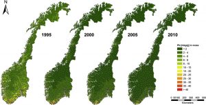
This is a pretty primitive version of GIS, but this map shows concentration of lead in moss across Norway over a 15 year span. There are also other maps showing cadmium and mercury concentration in moss, as well as the concentration of all three of these metals in the surface soil in the same places. This study revealed that the Surface soil was soaking up much more of these heavy metals than the moss was. https://doi.org/10.1016/j.atmosenv.2014.09.059


Second Search: GIS+COMPUTER+INCOME

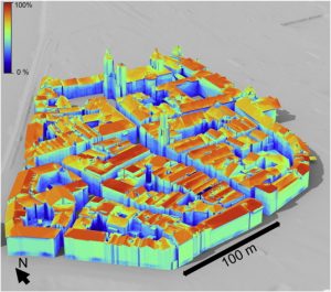
This also did not provide what I was looking for (A map of household income compared to how many computers in each household) but proved to be equally interesting. This is a 3d model of the town of Innsbruck, Austria, that is imported into GIS, and shows the locations that would be able to use solar most effectively. The group did computations to show irradiation for 183 simulated days.

https://doi.org/10.1016/j.compenvurbsys.2016.02.007

Baer Week 1


Hello everyone! My name is Samuel Baer. I am a sophomore majoring in both Environmental Science and Geography. I am a part of the honors program, the symphonic wind ensemble, and Cru. Iā€™m from Mt. Gilead, Ohio which is about 30 minutes from here. I am a commuter so it feels like Iā€™m always driving.

To me this chapter was really interesting. One of the first things that really stood out to me was the fact that GIS has been around since the early sixties. To me it just doesnā€™t feel like something that would have been made that long ago. I find it interesting that Canada was one of the first nations to develop it, but I donā€™t find it surprising due to the amount of unpopulated area in Canada. I find the idea of GIS starting in the quantitative revolution is interesting, and it makes sense to me, even though it contains a visual component. Itā€™s really fascinating how philosophical a mapping program really can be. Whether itā€™s talking about whether itā€™s more quantitative or not. Also The idea of GIScience is really interesting to me. Specifically studying how to interpret GIS. I had heard of GIS before the course but I didnā€™t realize how big of a topic it was. I think studying GIS would be more interesting to me rather than GIScience just because the idea of practice is more appealing to me. This chapter made me really excited for the course because the author is very passionate and thorough.

First Search: GIS in Subway Systems

GIS can be applied to public transportation systems such as subways, bus routes, trains etc. Mainly it is used for the navigation between stops. GIS can also be used to track patterns in traffic and even track it live. With GIS, city planners are able to plan and analyze data with more precision. The maps can be automated to plan routes and determine schedules. It also can allow planners to pick more efficient stations and maintenance facilities. https://www.iunera.com/kraken/public-transport/geographic-information-system-gis-public-transit/#:~:text=A%20GIS%20gives%20the%20transit,Useful%20in%20map%20production

Second Search: GIS uses with Watersheds
https://www.hazenandsawyer.com/projects/using-gis-to-visualize-watershed-priorities-in-real-time
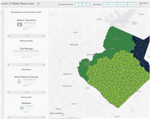
Hazen has applied GIS in Gwinnett County, Georgia. By adding layers of land use, septic parcels, and sanitation, they created an interactive map that allows them to determine where their priorities should be. They are able to slide the data, and the map will change to show where the priorities lie.

Kelner Week 1

Hi! My name is Hayden Kelner and I’m a sophomore Environmental Science and Zoology double major. I’m in Chi Phi, the Entertainment Director for CPB (Campus Programming Board), the Secretary of the Rock Climbing Club, I play bass drum in the marching band, and I work as a tour guide and student curator at the campus’s Natural History Museum. I enjoy playing videogames, board games, building Legos and model kits, and embroidering on occasion.

I had heard of GIS from my uncle’s cousin who works for the North East Ohio Regional Sewer District. He works as a field biologist and collects water samples and catches bugs to help determine quality of water as well. However, there is a whole department that works hand and hand with them that uses GIS. Similar to how the chapter mentions uses for GIS, they help by analyzing water runoff andĀ  highlight potential problems areas for other departments to survey. When I had heard that a light went off in my head that this was an important tool to have under my belt for my career ahead. While reading I was surprised to see how many uses GIS has. It’s used in ways I didn’t even know were possible like with epidemiologists. Whether it be with environmentalists, or even sales departments, it seems like GIS has use in every field. It’s uses in graphing, mapping, making models and other tools cover such a wide array of needs that it can really be molded into any way necessary. It was also really cool to read about GIS’s uses in farming. Agriculture is such an overlooked field of work and not many people give it much thought. Seeing the behind the scenes of it in a sense and seeing what processes and issues can be identified and dealt with was really interesting.

This semester I’m taking entomology,Ā so getting to see how GIS is used in that field was interesting. In this article, researchers used GIS to identify how forest dwelling insects have been disturbed over the years in Grand County, Colorado. By using GIS they were able to identify how certain beetles may react to logging and other habitat factors. By using previously gathered data they were able to use that to replicate the effects through GIS.

Source: https://www.sciencedirect.com/science/article/pii/S0304380017302053 Fig. 5

Plunkett Week 1

Hello! My name is Gabrielle Plunkett and I am a senior biology major. A fun fact about me is that I have a cat named Finn who lives in my dorm with me.

I had never heard of GIS before coming to college, and if I did I didnā€™t recognize what it was. It interests me that they refer to GIS as a ā€œscientific approachā€ due to the many different ways it can be used. It reminds me of when I took my animal behavior class and we discussed how there is no definition for the word behavior. It seems within this article people also define GIS in a myriad of ways. The term ā€œblack boxā€ seems very fitting for GIS as many seem unsure about the legitimacy of these programs. However, as they gain more knowledge and the systems become better established people stop questioning the legitimacy. Since I didnā€™t know anything about GIS I also didnā€™t know there were different types. GISystems seem to be an identity of GIS while GIScience seems to be the theory that underlies the GISystems while still being its own identity. GIS seems to primarily focus on the system and hardware as a whole. To me, GIS seems to be taking a simple question and then asking it in multiple ways while forming digital entities, models, graphs, etc. so that it can be visualized. It also seems that every step of GIS has been disagreed upon such as the definition of spatial objects. Iā€™ve read about John Snow’s mapping of Cholera before but never realized his map was a form of GIS. Seeing how GIS started from paper and pencil to the development of visualization to now is incredible. It does not surprise me that GIS quickly became widespread. Seeing a visual image of data is easier than just numbers for me, as I am more of a visual learner. Iā€™m hoping I learn more about the different ways to use GIS and eventually get a better understanding of what exactly it does by doing it.


GIS and Crows

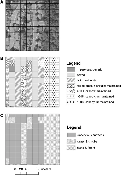
Iā€™ve noticed a lot of crows on campus so I decided to see what I could find involving GIS. One use of GIS is the tracking of the type of land cover of American Crows. This figure shows the use of ArcGIS in creating grids to signify the different land cover/land use classifications of the study sites. The article studied the fine-scale characteristics of developed landscapes that may help explain the growth of crow populations in urbanizing areas.

Source: American Crows in an urbanizing landscape

In another article studying the dispersal rate of Juvenile American Crows, researchers used a program called RAMAS GIS to simulate the population growth of the crows and then put it into a model to visualize it. They used it to model two populations ā€œurbanā€ and ā€œnon urbanā€. This interested me because I have most likely looked at a simulated population model and didnā€™t realize it was done using GIS. There was no show model or figure for this section.

Source: Dispersal by Juvenile American CrowsĀ 


Veerjee Week 1

  1. Hello! My name is Aiden Veerjee, Junior and I come from Johnstown Ohio. My major is in Quantitative Economics and I have a minor in Geography. I am in Alpha Sigma Phi, I am in the Economics & Business student board, and I am the Comptroller for WCSA (Student Government), I am also the President for our school’s Investment Club. I am also interested in Chess and Fencing, I’ve been doing a lot of reading & working out.

2. One of my professors for Economics had brought up that he had worked with a student who used GIS for a research project for modeling labor, but I had not fully realized that a lot of different disciplines had used GIS in various ways. I was especially surprised to the extent of sales that the GIS technology has achieved. I had only seen Geography mostly as the looking at political & land-maps, but not as much of the data within certain spaces & the specializing of resources / data. Before this chapter I was more unaware of the source of people using GIS systems, I had originally thought it was a more modern invention with the modernizing of computers, more internet access, and the general monetizing of data analysis. I had beenvery surprised to know that GIS had been used for a lot longer than just the twenty-first century. One of the biggest questions that I hope to answer by taking this class is how well can models actually reference or represent the different environments that it composes of. It is one thing to say that the Earth is 75% water, and another to say where that water is, what regions have access to the water, and how said water is being used. I hope that by taking the course it will help me understand methods with answering questions such as this one. I had known about how solid data can be interpreted in many different ways and different people can come to different conclusions even when the data remains the same. Even with the way that data is collected or classified can lead to loads of different issues, such as one example that the text cites with how that mountains & hills are determined. Drawing boundaries can also lead to some issues, and I would like to see how or if these issues can get rectified.

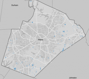
3. One topic that I have found interest in having to do with GIS is real estate. Real estate is a field that can take a lot of usage in collaboration with systems such as GIS. I had found some data on the agricultural districts within certain counties, I had wanted to see how close agriculture is to densely populated areas like cities and suburbs. I had thought before getting into the data that the agricultural districts would be further away from densely populated areas. Unsurprisingly, this had been reflected as true within Wake County NC. The blue within the image represents an agricultural district. I was surprised by some districts having a higher proximity to minor roads rather than big highways. Two different ways that this data can be used is to predict where good farmland might be for future farming. This can also be used as information for County taxation as since there is a very small amount of farmland, there may be less taxes & revenue gained through taxing agriculture.

Sources:
Wake County Map

Pratt Week 1

me and my cat cletus!

Hey everyone! My name is Maizy Pratt- I’m a senior microbiology major with a minor in environmental science. I’m pretty spread out across campus- I’m a Theta, a member of the ENVS student board, working to start a microbiology club, and I work at Del-Co as the watershed intern. I’ve always been passionate about the outdoors, but I prefer the little organisms, so I’m pursuing a career in environmental microbiology. Outside of science time, I love listening to music, working out, being outside, learning new skills, painting/drawing, and thrifting.

I found this chapter incredibly interesting. I’ve always beenĀ awareĀ  that GIS exists and that it’s a tool able to be used across so many disciplines, but I guess I never really digested it to the point that this chapter did. John Snow’s visualization of Cholera outbreaks is something that gets talked about crazy often in microbiology classes because it was one of the first epidemiological investigations, but I never thought of it as an early development in GIS. I also enjoyed the discussion of precision farming; not only is it useful for farmers to save resources when solving problems, it’s also useful when studying the impact of farming practices on the surrounding environment. As part of watershed crew duties, we take nitrate samples from different parts of the Scioto to get a good idea of what levels will hit the treatment plant in the coming days, especially after big rains. I think it would be very interesting to compare runoff data and precision farming data to understand how the nitrates make their way into the river. It makes a lot of sense to me that GIS has developed in the way it did because humans are such visual creatures. Schuurman’s comparison to visualizing genomic data made my microbio brain very happy. I can absolutely see how GIS became so widespread as it allows for a better understanding of data that would make zero sense on the surface as just a set of numbers. Go GIS!

Search one: GIS+corn+diabetes

I was not given an article by the Google gods that talked about diabetes but I did find Atrazine exposure maps of Nebraska.Ā 

“Fig. 5. Exposure to Atrazine in Nebraska in 2005 (note: this is a population grid level map generated by the pesticide weighted exposure model developed in this study; exposure to Atrazine was categorized based on natural breaks; pixels with the value of 0 were distinguished from the first category 0ā€“31.2).” (Wan 2015)

This paper explores the usage of pesticides, notably Atrazine, in different counties in Nebraska. Pesticide exposure has been shown to result in diseases such as cancer, neuro-degeneration, and reproductive issues. Wan used buffer-based exposure modeling to determine likelihood of exposure to Atrazine.


Search two: GIS+water+table

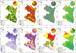
Here are some really cool maps of drainage density, lineament density, slope, land use and land cover, annual rainfall mean, soil, lithology, and geomorphology. RS-GI

S-based weighted overlay analysis and water-table-fluctuation technique were used to develop a potential map for groundwater abstraction in the northwest region of Bangladesh, which helps determine potential groundwater sources in the region. I didn’t realize how many variables go into determining groundwater availability and resources, so it was cool to learn about that.