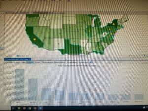
1.1 – Was a little bit difficult trying to get things going, until I realized that I needed to extract the files. Once done, the book made the steps easy and simplistic.
1.2 – A lot more steps than the previous tutorial, but the steps were easy to follow. The zoom in steps seem to be quite useful, and the search for feature steps seem thorough to me. It now feels like I am starting to actually use GIS.
1.3 – A lot easier to understand than part 2 of chapter 1. The attribute tables made more sense to me, although I am still quite confused on their overall purpose. It feels like I am taking baby steps into the world of GIS.
1.4 – This part of the chapter focused on changing fonts and point formats, along with adding new features. The 3D part did not work for me as well. Probably needs to be updated.
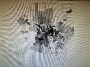
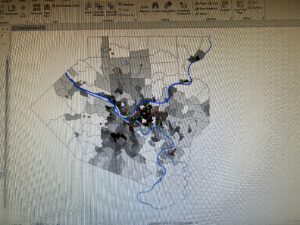


2.1 – Adding and color coding the different residential zones was easier than expected. It seemed like GIS did a majority of the work.
2.2 – Learned how to label features and to configure what pop ups that I want. I followed all the steps for pop ups, but they would not appear when I clicked on the neighborhood. ‘
2.3 – This process seemed quite easy to me, as it seemed like a combination of parts 1 and 2 of chapter 2. This section made me feel more confident, as there was some “review” from previous sections.
2.4 – This process was quite interesting to do, and I am glad that the 3D model actually worked! The steps were also easier to follow.
2.5 – By far the most simplistic steps to follow compared to the other sections. The reasoning behind using the defined interval method made sense to me.
2.6 – It seemed cool to me that you could compare similar data to two different groups. The swipe option was really interesting, as it made it easier to show the actual comparisons side by side.
2.7 – Really cool to actually learn how to use dot density. Although the amount of dots can be overwhelming, it does a good job at specifying specific locations on a map.
2.8 – This part showed how to have specific feature names and points appear and disappear as you zoom in and out. This can be useful, as having too many names/points can be overwhelming.
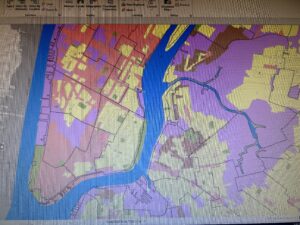
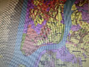
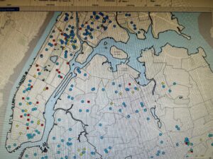


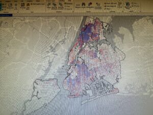

3.1 – First started off with building layouts for maps and legends in order to transition them from GIS to paper. It was also cool to actually be able to interpret the data through figures such as the bar graph.
3.2 – Sharing the GIS Pro work was easy to do, but the steps for navigating the website were difficult to understand. It may be that the website got updated, or that I am just not understanding the website.
3.3 – Worked on actually publishing something in a website and professional format on the GIS website. Took a lot of time to do so, but it was quite cool to do so.
3.4 – Was able to create a dashboard on the GIS website. The steps were fairly straightforward to follow, and I was able to share and make the URL link work.
