Chapter 1
1-1 This was a good introduction to navigation the Arc program. As someone who isn’t very technologically inclined it was difficult at first, but I think the book did a surprisingly good job at being clear in instructions. It was neat learning some of the basic features and I felt like I was learning a lot pretty quickly. The only issue I had was figuring out how to add a buffer, as my buffers were white and opaque, which made half of my map appear as missing.
1-2 The second project was much easier to me than the first, most likely because I was getting used to the controls and learning from a book rather than a video or live instruction. I liked seeing the raster layer and navigating the map to see different information and views. I could easily see the bookmarking being a useful feature when working on a project.
1-3 I had several issues come up where I got stuck, but was able to work through it after re-reading the book a few times. The information in the tutorial was very helpful and I could see how bringing up the statistics for something such as population density could be a useful feature.
1-4 The text symbol section took me a little bit to find (I was expecting it to fall under ‘symbology’ like in the previous step) but once I did locate it, it was pretty simple to adjust.The 3-D feature was also something completely different but very cool.
Chapter 2
2-1 This section was pretty short and straightforward compared to the others. I thought that adjusting the colors was sort of fun and helpful at the same time. It made the map look organized and easier to read.
2-2 The zone labelling took me a few minutes to figure out, as I was looking for the labelling option on the ‘content’ tab on the left when in reality it was on the top. After I figured this out, though, everything else went relatively smoothly. The labelling features make map reading super easy, clean-looking, and pleasing to the eye.
2-3 I found this tutorial to be pretty easy enough to follow. In fact, reading and completing the symbology section made me realize a mistake that I made in a previous tutorial and I could tell exactly where I went wrong. The only part that I got confused on in this tutorial was what a ‘ground feature’ was and how to make ManhattanStreets one, but otherwise I think it went well.
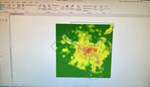
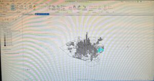
2-4 This tutorial started a bit strangely, as I had to ‘repair a layer’s data’, which wasn’t referred to in the books, However, it was a fairly simple fix, I just had to open the file for ‘neighborhoods’ for it to repair itself. The rest of the tutorial went flawlessly- the 3-D map was super cool and I could see it being very practical for emphasizing a pattern with visuals.
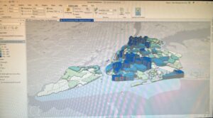
2-5 The use of graduated and proportional symbols in the symbology panel was a change from what we’ve been using. I think it’s pretty simple to navigate and can have a very cool and useful result.
2-6 I had a little bit of an issue with the rounding on this tutorial. I was able to put ‘decimal places= 0’ for the display on the contents panel, but the histogram under the symbology panel did not round at all, contrary to what the book states is supposed to happen. Interestingly enough, I had no issue with entering the upper values for the manual interval classes and histogram. The ‘swipe’ feature to reveal an underlying layer is pretty neat; I could see it being useful for presentations or just dramatic effect.
2-7 I noticed that the book is providing fewer and fewer steps for certain processes, such as opening and adjusting symbology. I haven’t had an issue with this, which shows that I’ve learned quite a bit, which is nice to think about. This tutorial was super quick and a simple introduction to dot-density maps, which are great visual tools.
2-8 This tutorial was pretty straightforward and easy for me to execute. It actually helped me understand why my labelling was acting strange in one of the earlier tutorials


Chapter 3
3-1 This tutorial was a bit of a change of pace from the map-making, so it presented a bit more difficulty for me. I was unable to find the ‘catalog’ pane and therefore unable to save the maps as a file. I also had an issue where each individual part of the legend had the bold word ‘legend’ above it instead of just at the top of each map’s whole legend, as is showed in the textbook. Fortunately, I did find creating the chart to be simple enough and was able to do so without any major issues.
3-2 This tutorial was a bit difficult for me because I could not locate the ‘MapSharing.pdf’ or even the file explorer that was supposed to contain it. However, I was able to successfully share the maps and continue the rest of the steps listed in the tutorial on my personal computer using the arcGIS website.
3-3 I quickly realized while working on this tutorial that I was supposed to open the PDF from 3-2 externally, which helps me understand how to avoid repeating the mistake. The whole create a story feature seems really cool. It’s very easy to navigate and is a clean way to present information.
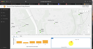
3-4 This tutorial was pretty simple and I completed it without any major issues. The only note/concern I had was in the very last step, creating a menu for the dashboard, I had no ‘menu’ option after I clicked ‘add element’, which was a little confusing.