Chapter 1:
sign in and join an organization, explore a public map, configure the map symbology, configure map pop-up windows, save a map.
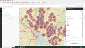
For the map that is the DC public schools, make sure that you open the map viewer and not the map viewer classic. For page 17, looking for the symbol pane go to the government shapes and scroll down until you see a purple school building. This a bit different than what the book asks but you get to the correct symbol. *I lied, its a different school icon with a darker background, the POI exists I just cant use my eyes sometimes.
Chapter 2
2A. Start a new arcGIS Pro project using an exported map and a new folder connection, Modify map layers by changing viability rearranging the order in which layers are drawn, navigate around the map and explore map features and attribute tables, use the select tool.
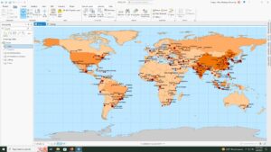
- PM concentrations are highest in Africa. If you close your contents pane you restore it by searching contents in the search bar and re-opening it. Shanghai has the largest population.
2B. customize the appearance of the map using symbols and labels, use the measure tool to find the approximate distance between cities, examine and add a basemap, create a map package for sharing.
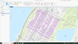
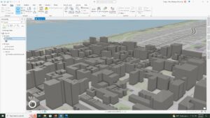
2C. Start a new project and add a layer of polygons that represent buildings in NYC, use the bookmark tool, convert a 2D map to a 3D map, and then extrude features based on the building height attribute to visualize building in a more realistic perspective.
- The tallest building is 339,758242
Chapter 3
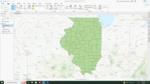
3A. add data to a project, select features by attributes, export the selection to a new datasets
- STATE_NAME, 10575 residents.
3B. join data tables, apply informative symbols, import layer symbology, use the swipe function to compare layers, overlay additional data
- 7 years of data is represented in the table.
- I do not see a clear correlation between obesity and income rates, the data is a bit hard for me to interpret from this display of whether or not there is a clear connection. Further analysis would be needed for a real conclusion.
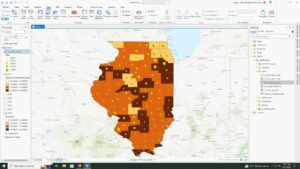
3C. add a new field, calc field values, display a new field, calc summary stats, examine info graphics
- 17.7% of the households in Illinois had an income of less than $15,000 per year.
3D.relate tables, spatially join data
- there are 4 food deserts in knox county
Chapter 4
4A. Convert shape-files to Geo-database feature classes, map x and y points, establish an attributes domain.
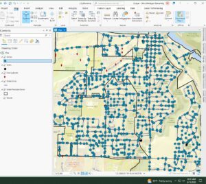
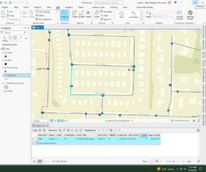
4B. configure snapping options, create a line feature, enter attribute data
- 4 vertices in the selected line
4C. split polygons, merge polygons, modify lines and points, add map notes
- object: 6, zone: 2, Shape length: 46451.125704, Shape area: 44732594.632114
- the shape value was split between the 2 new zones
Chapter 5
5A. set up a project, proceed through per-configured tasks, author a task
- Battle-no Change to territory, strategic development, riots/protests, Violence against civilians, remote violence
- 14211 fatalities between 2010 and 2018
5B. define the data, add operations to Model Builder, Fill out the tool perimeters, run the model, convert a model to a Geo-processing tool
- There were 71 fatalities against civilians in Rwanda from 2010-2018
- was told to skip the last part of this lab due to error in GIS program :/
5C. Define the data, execute a command using python, use a custom script tool, package the project
- computer doesn’t want to save the tables anymore and is continuing to error my process. will work off of a hard drive now 🙂
Overall very good. I do think some of the quirks are just “operator error” BUT it’s also interface design (you have to pay really close attention and a tiny divergence from what you are supposed to do can make the rest of the exercise impossible – like the “classic map viewer” vs “map viewer”.
But you are moving through and making progress.